10,000 search results
(0.064 seconds)
- Yardbird Numerals by Coniglio Type,
$9.95Yardbird, insinuating prison numerals, was lifted from a wooden block print poster press, that would have indeed besides providing dates for the local carnival would have just as easily ink-chucked them over the backs of those denim blues. Part of Market LTD, a collection of limited faces, mostly alpha-numeric and some just plain numeric, used primarily in retail and display situations and titling. - Revers by GRIN3 (Nowak),
$19.00Revers is a rough, grunge slab serif based on newspaper headlines from the 1950s. Language support includes Western, Central and Eastern European character sets, as well as Baltic and Turkish languages. - Xamire Monoline by Afkari Studio,
$19.00 Introducing Xamire, the epitome of elegance and modernity in typography. This monoline script font redefines sophistication, blending sleekness with a touch of artistic flair. Its seamless strokes and graceful curves exude a timeless charm, perfect for elevating any design project. Crafted with precision and attention to detail, Xamire offers versatility that transcends traditional boundaries. Whether used for branding, invitations, advertising, or editorial design, its clean lines and effortless flow add a touch of refinement to any visual creation. Embrace the allure of Xamire and unlock a world of creative possibilities. With its extensive character set and seamless connectivity, this font is designed to empower your designs, captivating audiences and leaving a lasting impression. Elevate your projects with Xamire - where modernity meets sophistication in every stroke. Highlighted Features: – Uppercase, Lowercase, Number, and Punctuation – Special alternates and ligatures – Works on PC & Mac – Simple installations – Accessible in Adobe Illustrator, Adobe Photoshop, Adobe InDesign, and even work on Microsoft Word – Fully accessible without additional design software. – Mültîlíñgúãl Sùppört for; ä ö ü Ä Ö Ü ß ¿ ¡ Hope you enjoy our font and this font is a useful font for your projects!
 - Montaigne by Fenotype,
$20.00 Delve into the world of timelessness with Montaigne. With its blend of classic elements and contemporary design, this serif family offers a comprehensive selection of eight styles and their corresponding italics. Explore Montaigne's OpenType features, including Small Caps, OldStyle numerals, and a delightful array of Swash initials and Discretionary ligatures in the Italic styles.
 - Swansea by Mysterylab,
$17.00 Swansea font is an ornate and elegant serif typeface providing both roman and italic variants. The old world strokes and flourish embellishments are fused with a modern uniformity that makes this type versatile and useful in many contexts. A collection of two character ligatures bring out additional possibilities (It's easy to override these ligatures in the Glyphs menu of most design software packages.) It's excellent for posh specialty branding applications, antique themes, fine art publications, fashion, and much more. This font also includes the complete Cyrillic character set for Russian, Belarusian, and Ukrainian.
 - PAG Trust by Prop-a-ganda,
$19.99Prop-a-ganda offers retro-flavored fonts inspired by lettering on retro propaganda posters, retro advertising posters, retro packages all the world over. This is perfect font for your retrospective project. Almost all the letters of PAG Trust are drawn by bold line, but some bars are very thin line and counters are extremely small. With this font, regular typed text transformed into unique typography. We can’t decide the impression of PAG Trust, depending on how to use it, it can be cute package, retro book cover or propaganda poster of Cuba. - Chollistio by Letterara,
$14.00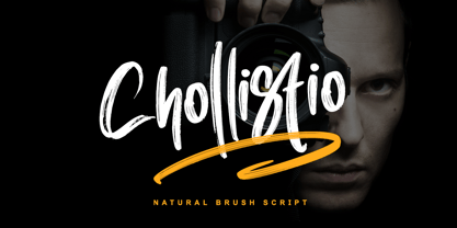 Chollistio is a handwritten font with a dry brush texture with rough details. This font has been designed to suit a variety of projects such as business branding, Instagram quotes, Christmas greeting, Poster, blog headers, Packaging, sports communities, film, photography, hobbies, and much more. This font is PUA encoded which means you can access all of the glyphs and swashes with ease!
 - Brigitta Signature by Letterara,
$12.00 Brigitta Signature is a handwritten font with a dry brush texture with rough details. This font has been designed to suit a variety of projects such as business branding, Instagram quotes, Christmas greeting, Poster, blog headers, Packaging, sports communities, film, photography, hobbies, and much more. This font is PUA encoded which means you can access all of the glyphs and swashes with ease!
 - Chaser by Larin Type Co,
$12.00 Chaser is stencil font inspired by aviation and military style includes 3 sections ( clean, rough, printed). this font is a narrow specialization, it will be an excellent option for projects in the military style in both modern and vintage versions. This font also includes several illustrations that may be useful for creating your project and will be a useful addition.
 - British Empire by Alan Meeks,
$45.00 British Empire is an attempt to re-create some of the typographic characterisics of countries within the former British Empire. It is a sans-serif with unusual up-facing serifs on some of the caps and the lower case round characters have flick round terminals Though designed as a headline face it still works well in limited text. There are four weights with four corresponding italics.
 - Carle by Kaer,
$19.00 Carle is a display font family with regular and colored styles. 3D style letters are based on impossible isometric shapes. Perfect for childish labels, illusion company, birthday posters etc. What you will get: Colored, regular and shadow styles Uppercase only (lowercase glyphs are same) Numbers and symbols Please feel free to request to add characters you need: kaer.pro@gmail.com You can use color fonts in PS since CC 2017, AI since CC 2018, ID since CC 2019, QuarkXPress since 2018, Pixelmator, Sketch, Affinity Designer Since macOS 10.14 Mojave, Paint.NET Windows only. Please note that the Canva do not support color fonts!
 - Bullet Numbers by Wiescher Design,
$9.50 This is a must read!!! BulletNumbers come in very handy for all kinds of lists that don't exceed 100 categories. I have long since been using my own BulletNumbers in positive and negative and four styles, serif, sans, engravers and script, a fitting one for every occasion. Now I perfected them for all of you. Here is how to use them: (Important! Set letterspacing to '0', otherwise the two digit numbers will overlap!!!) The numbers 1-0 reside on the standard keys. Two digit numbers 01-99 can be composed out of left and right half circles by using (lowercase) 'abcdefghij' for the first digit (left half circle) and 'lmnopqrstu' for the second digit (right half circle). The critical pairs (all combinations with 1) can be found in various places. Type '!' for 10, '#' for 11, '$' 12, '%' for 13, '&' for 14, '(' for 15, ')' for 16, '*' for 17, '+' for 18, ',' for 19, '-' for 21, '.' for 31, '/' for 41, ':' for 51, ';' for 61, '?' for 81, '_' for 91. The two arrows are on the < and > keys. '100' can be found with shift+option+1. Last but not least, the capital letter bullets A-Z can be found on the shift+letter A-Z. Yours very practical Gert Wiescher
 - Geometron Pro Angular by Marius Mitran,
$39.00 Geometron has its origin in a custom typeface that I was commissioned to design for an architectural project. The concept was a "back to basics", minimalist typeface constructed mainly with straight lines and circles or circular arcs, but without departing from the classical style of Roman & Greek lettering. Notable requirements were: an extensive character set needed for multi-language documentation, as well as a full collection of symbols and alternate glyph forms (e.g. superiors & inferiors) for scientific use. Special care was taken to obviate the almost identical similarities that were prone to appear between letters like uppercase "i" and lowercase "L" or between Latin and Greek letters such as "a" and "alpha". This was also a prerequisite for scientific notation where ambiguity is not acceptable. All in all, the font would have to blend a modern design with a wealth of functional features. Consequently, all of these were made possible by choosing the OpenType format for development, resulting in a comprehensive and feature-rich font family specifically targeted for use in high-end design/typesetting applications.
 - Geometron Pro Radial by Marius Mitran,
$39.00 Geometron has its origin in a custom typeface that I was commissioned to design for an architectural project. The concept was a "back to basics", minimalist typeface constructed mainly with straight lines and circles or circular arcs, but without departing from the classical style of Roman & Greek lettering. Notable requirements were: an extensive character set needed for multilanguage documentation, as well as a full collection of symbols and alternate glyph forms (e.g. superiors & inferiors) for scientific use. Special care was taken to obviate the almost identical similarities that were prone to appear between letters like uppercase "i" and lowercase "L" or between Latin and Greek letters such as "a" and "alpha". This was also a prerequisite for scientific notation where ambiguity is not acceptable. All in all, the font would have to blend a modern design with a wealth of functional features. Consequently, all of these were made possible by choosing the OpenTypeÆ format for development, resulting in a comprehensive and feature-rich font family specifically targeted for use in high-end design/typesetting applications.
 - 99 Names of ALLAH Spiral by Islamic Calligraphy75,
$12.00 We have transformed the “99 names of ALLAH” into a font. That means each key on your keyboard represents 1 of the 99 names of ALLAH Aaza Wajal. The fonts work with both the English and Arabic Keyboards. We call this Calligraphy "Spiral" because of the spiral like design. The first "Alef" has a "hamzit wasel", this indicates that you can pronounce the names both ways, "AR-RAHMAAN" or "R-RAHMAN". (in the zip file you will find a pdf file explaining the differences in the "harakat", pronunciation and spelling according to the Holy Quran). The "Ye" doesn't have 2 dots at the end of a name, instead we chose to include a small "ye" on the letter "ye". Also, we used the traditional "soukoun" instead of the Quranic "soukoun". Decorative letters used in this calligraphy: "Mim, Aain, Sin, HHe, He, Kaf, Alef & Ye". Purpose & use: - Writers: Highlight the names in your texts in beautiful Islamic calligraphy. - Editors: Use with kinetic typography templates (AE) & editing software. - Designers: The very small details in the names does not affect the quality. Rest assured it is flawless. The MOST IMPORTANT THING about this list is that all the names are 100% ERROR FREE, and you can USE THEM WITH YOUR EYES CLOSED. All the “Tachkilat” are 100% ERROR FREE, all the "Spelling" is 100% ERROR FREE, and they all have been written in accordance with the Holy Quran. No names are missing and no names are duplicated. The list is complete "99 names +1". The +1 is the name “ALLAH” 'Aza wajal. Another important thing is how we use the decorative letters. In every font you will see small decorative letters, these letters are used only in accordance with their respective letters to indicate pronunciation & we don't include them randomly. That means "mim" on top or below the letter "mim", "sin" on top or below the letter "sin", and so on and so forth. Included: Pdf file telling you which key is associated with which name. In that same file we have included the transliteration and explication of all 99 names. Pdf file explaining the differences in the harakat and pronunciation according to the Holy Quran. --------------------------------------------------------------------------------------------------------------------------- Here is a link to all the extra files you will need: https://drive.google.com/drive/folders/1Xj2Q8hhmfKD7stY6RILhKPiPfePpI9U4?usp=sharing ---------------------------------------------------------------------------------------------------------------------------
 - Gonk Droid by Edd's Aurebesh Fontworks,
$5.00 Making some Star Wars stuff? This Aurebesh font is designed to look like something you would see on a piece of quick and dirty graphic design in the Star Wars universe, like a wanted poster or a warning sign. The font includes the additional Aurebesh glyphs beyond the 26 basic characters (all in lowercase & uppercase) as well as numbers and symbols.
 - College Game JNL by Jeff Levine,
$29.00 The hand lettered credits for the 1940 horror film “The Invisible Woman” look more like they would show up in a movie about a college football game. A bold, condensed slab serif type design, it’s perfect for many sports-themed graphics projects. The digital version has been aptly named College Game JNL, and is available in both regular and oblique versions.
 - Gradl Initialen ML by HiH,
$12.00 Max Joseph Gradl designed Art Nouveau jewelry in Germany. At least some of his designs were produced by Theodor Fahrner of Pforzheim, Germany -- one of the leading manufacturers of fine art jewelry on the Continent from 1855 to 1979. I don't know if he designed for Fahrner exclusively, but every example I found was produced by that firm. I assume it was also the same M.J, who edited a book, Authentic Art Nouveau Stained Glass which was reissued by Dover and is still available. For an artist as accomplished as Gradl was, he is very tough to research. There just does not seem to have been much written about him. The jeweler is visible in most of his typeface designs. They exhibit a sculptural quality as if they were modeled in clay (or gold) rather than drawn on paper. His monograms, especially, reflect that quality. Those shown in plates 112 through 116 in Petzendorfer actually appear to have been designed specifically for fabricating in the form of gold or silver pendents. Of the initial letters that came out of Germany during this period, these by Gradl seem unusually open and lyrical. They seem to be dancing on the page, rather than sitting. Please note that Gradl designed only the decorated initials. All other characters supplied were extrapolated by HiH, including the accented initials. Orn.1 (unicode E004) is based on a jeweled gold clasp designed by Gradl (please check out Gallery Image on Myfonts.com). Also included are an art nouveau girl’s face, a swan and the face from Munch’s “Scream”, from scans of old printer’s ornaments. Gradl Initialen M represents a major extension of the original release, with the following changes: 1. Added glyphs for the 1250 Central Europe, the 1252 Turkish and the 1257 Baltic Code Pages. Added glyphs to complete standard 1252 Western Europe Code Page. Special glyphs relocated and assigned Unicode codepoints, some in Private Use area. Total of 341 glyphs. Both upper & lower case provided with appropriate accents. 2. 558 Kerning Pairs. 3. Added OpenType GSUB layout features: salt, dlig, ornm and kern. 4. Revised vertical metrics for improved cross-platform line spacing. 5. Refined various glyph outlines. 6. Alternative characters: 16 upper case letters (with gaps in surrounding decorations for accents above letter). 8. Four Ornaments: face1, face2, swan and orn1 (silhouette of Gradl clasp) The zip package includes two versions of the font at no extra charge. There is an OTF version which is in Open PS (Post Script Type 1) format and a TTF version which is in Open TT (True Type)format. Use whichever works best for your applications.
 - Faqro Extended by ffeeaarr,
$9.00 Ditch the generic, embrace the expressive. In a world saturated with pixels and noise, your brand deserves to stand out. Our meticulously crafted digital tech fonts are more than just letters – they're the secret weapon to unlocking your brand's full potential
 - Wells Grotesque Pro by Red Rooster Collection,
$60.00 Inspired by the H.G.Wells science fiction novel War of the Worlds, first published in 1898. Wells Grotesque also contains Small Caps, Old Style Figures and alternate glyphs, plus all the high-end features expected in a quality OpenType Pro font.
 - ITC Atmosphere by ITC,
$29.00The Algerian designer Taouffik Semmad created the fonts in 1997. Taouffik Semmad grew up speaking Algerian-Arabic dialect and French, studied Russian, and is now living in Montreal. This could perhaps explain his current passion, to "find a universal writing", which he admits is a Utopian idea. Created with brush and Chinese ink, the characters of ITC Atmosphere came from Semmad's hand but only after they were fully formed in his mind's eye. - Carlton by ITC,
$29.99Carlton is based on a typeface designed by Prof. F. H. Ehmcke. In 1908, Ehmcke released his Ehmcke-Antiqua design through the Flinsch typefoundry in Germany. Ehmcke-Antiqua was later distributed by the Bauer typefoundry in Frankfurt am Main. The Caslon Letter Foundry in England discovered the design and released their own typeface based upon the model, which they named Carlton. Carlton entered the Stephenson Blake program after they acquired the Caslon Letter Foundry in the late 1930s. As hot and cold metal typesetting became outdated technologies, Carlton and Ehmcke-Antiqua fell out of general use. In the 1990s, Letraset revived this classic design, distributing it under its English name, Carlton. Carlton's clean and generous capitals, as well as its understated yet detailed lower case, have found popularity again in recent years. The elegance of Carlton is best used for displays with large letter and word spacing. Carlton shows all of the hallmarks of a delicate serif typeface design; its forms capture a distinct moment that was common within Central European type design during the first third of the 20th Century. Carlton is similar to several other expressive typefaces from the early 1900s, including Bernhard Modern, Koch Antiqua, Locarno, and Nicolas Cochin." - ITC Franklin by ITC,
$40.99 The ITC Franklin™ typeface design marks the next phase in the evolution of one of the most important American gothic typefaces. Morris Fuller Benton drew the original design in 1902 for American Type Founders (ATF); it was the first significant modernization of a nineteenth-century grotesque. Named in honor of Benjamin Franklin, the design not only became a best seller, it also served as a model for several other sans serif typefaces that followed it. Originally issued in just one weight, the ATF Franklin Gothic family was expanded over several years to include an italic, a condensed, a condensed shaded, an extra condensed and, finally, a wide. No light or intermediate weights were ever created for the metal type family. In 1980, under license from American Type Founders, ITC commissioned Victor Caruso to create four new weights in roman and italic - book, medium, demi and heavy - while preserving the characteristics of the original ATF design. This series was followed in 1991 by a suite of twelve condensed and compressed designs drawn by David Berlow. ITC Franklin Gothic was originally released as two designs: one for display type and one for text. However, in early digital interpretations, a combined text and display solution meant the same fonts were used to set type in any size, from tiny six-point text to billboard-size letters. The problem was that the typeface design was almost always compromised and this hampered its performance at any size. David Berlow, president of Font Bureau, approached ITC with a proposal to solve this problem that would be mutually beneficial. Font Bureau would rework the ITC Franklin Gothic family, enlarge and separate it into distinct text and display designs, then offer it as part of its library as well. ITC saw the obvious value in the collaboration, and work began in early 2004. The project was supposed to end with the release of new text and display designs the following year. But, like so many design projects, the ITC Franklin venture became more extensive, more complicated and more time consuming than originally intended. The 22-font ITC Franklin Gothic family has now grown to 48 designs and is called simply ITC Franklin. The new designs range from the very willowy Thin to the robust Ultra -- with Light, Medium, Bold and Black weights in between. Each weight is also available in Narrow, Condensed and Compressed variants, and each design has a complementary Italic. In addition to a suite of new biform characters (lowercase characters drawn with the height and weight of capitals), the new ITC Franklin Pro fonts also offer an extended character set that supports most Central European and many Eastern European languages. ITC Franklin Text is currently under development.
 - Lamaesa by Carlos Maeso González,
$15.90 Lamaesa is a versatile and original design sans serif typeface. Designed to be used primarily on medium and large point sizes. Designed so you do not get tired of reading it, but at the same time, so that you notice its particularity. Oriented for use in headlines and continuous text, with a solid appearance, but with a slight aroma of handwriting, which gives it an ambivalent and original character. It is perfect for magazines, company letters, websites, advertisements, restaurant menus, and any support and function where it is essential to attract attention in an elegant and non-abusive way. Basic Latin characters. It consists of 217 glyphs (ISO 8859-15): uppercase, lowercase, numbers, currency symbols, and special characters. It consists of six fonts: light, normal and bold as well as their oblique equivalents. Carlos Maeso González is the designer of the typeface “Lamaesa”.
 - Steiner - Unknown license

- Litho Display by Arkitype,
$9.00 Litho Display is a bold display typeface, it has 8 fonts in the family with four different styles. Litho Display has been created with bold headline and poster typography in mind. It is perfect for use on typography heavy posters, packaging or on screen idents. The four different styles Litho Display comes in is Regular, Rounded, Rough and Press each with an italic pairing. With these styles Litho Display is versatile for various different uses whether it needs to be clean type for a poster or on screen or a more rough and rustic style for some packaging.
 - LD Cottage by Illustration Ink,
$3.00LD Cottage resembles the antique writing you would find in an ancient fairytale or story. Enjoy this fun font and let your imagination take flight! - Girls Girls Girls by Comicraft,
$19.00Yeah, Baby! You wanted the World’s Greatest Comic Book Fonts and we gave them to you! They're Sexy DropCaps! They're Saucy Dingbats! GIRLS!GIRLS!GIRLS! - Scary Sign by Java Pep,
$9.00 Scary Sign is inspired by scary novels and is styled as a rough font. It's perfect to place in your project which has horror, scary, dark, or spooky themes. But this font also perfects for other themes according to your creativity. You will get a free 12 swash bonus to complement the Scary Sign font.
 - Nagomi by Typodermic,
$11.95 Introducing Nagomi, a stunning brush display typeface that boasts a uniquely beautiful aesthetic. With its delicate strokes and flowing lines, this typeface brings a sense of tranquility and serenity to any design. Whether you’re working on a digital project or crafting something by hand, Nagomi is sure to enhance your work with its natural, organic feel. One of the standout features of Nagomi is its natural design. This typeface captures the essence of nature with its graceful curves and understated elegance. Its brush strokes evoke the feeling of leaves rustling in the wind or the gentle flow of a stream. When you use Nagomi in your designs, you’ll feel as if you’re bringing a touch of the natural world to your work. But Nagomi is more than just a typeface—it’s an experience. Its subtle beauty and gentle charm make it a true joy to use. Whether you’re designing a logo, creating a poster, or crafting a handwritten note, Nagomi will help you express yourself with grace and ease. So why not try Nagomi today and discover the natural beauty for yourself? Most Latin-based European writing systems are supported, including the following languages. Afaan Oromo, Afar, Afrikaans, Albanian, Alsatian, Aromanian, Aymara, Bashkir (Latin), Basque, Belarusian (Latin), Bemba, Bikol, Bosnian, Breton, Cape Verdean, Creole, Catalan, Cebuano, Chamorro, Chavacano, Chichewa, Crimean Tatar (Latin), Croatian, Czech, Danish, Dawan, Dholuo, Dutch, English, Estonian, Faroese, Fijian, Filipino, Finnish, French, Frisian, Friulian, Gagauz (Latin), Galician, Ganda, Genoese, German, Greenlandic, Guadeloupean Creole, Haitian Creole, Hawaiian, Hiligaynon, Hungarian, Icelandic, Ilocano, Indonesian, Irish, Italian, Jamaican, Kaqchikel, Karakalpak (Latin), Kashubian, Kikongo, Kinyarwanda, Kirundi, Kurdish (Latin), Latvian, Lithuanian, Lombard, Low Saxon, Luxembourgish, Maasai, Makhuwa, Malay, Maltese, Māori, Moldovan, Montenegrin, Ndebele, Neapolitan, Norwegian, Novial, Occitan, Ossetian (Latin), Papiamento, Piedmontese, Polish, Portuguese, Quechua, Rarotongan, Romanian, Romansh, Sami, Sango, Saramaccan, Sardinian, Scottish Gaelic, Serbian (Latin), Shona, Sicilian, Silesian, Slovak, Slovenian, Somali, Sorbian, Sotho, Spanish, Swahili, Swazi, Swedish, Tagalog, Tahitian, Tetum, Tongan, Tshiluba, Tsonga, Tswana, Tumbuka, Turkish, Turkmen (Latin), Tuvaluan, Uzbek (Latin), Venetian, Vepsian, Võro, Walloon, Waray-Waray, Wayuu, Welsh, Wolof, Xhosa, Yapese, Zapotec Zulu and Zuni.
 - Thrusters by Typodermic,
$11.95 Welcome to the world of Thrusters—the angular, twin-line display typeface inspired by the timeless classic, Space Duel. Thrusters is the perfect way to bring the retro, arcade vibes to your designs! This bold and futuristic typeface is the ultimate tribute to the iconic arcade legacy, and it’s available in four different forms that can be used as layers to create stunning multicolor effects. Whether you’re creating a high-energy video game title screen, a promotional poster for a local arcade, or even a custom t-shirt design, Thrusters has got you covered. With its sharp angles and sleek curves, Thrusters is sure to turn heads and capture attention. It’s the perfect way to add some excitement and nostalgia to any design project. So what are you waiting for? Blast off into the world of retro gaming with Thrusters today! Most Latin-based European writing systems are supported, including the following languages. Afaan Oromo, Afar, Afrikaans, Albanian, Alsatian, Aromanian, Aymara, Bashkir (Latin), Basque, Belarusian (Latin), Bemba, Bikol, Bosnian, Breton, Cape Verdean, Creole, Catalan, Cebuano, Chamorro, Chavacano, Chichewa, Crimean Tatar (Latin), Croatian, Czech, Danish, Dawan, Dholuo, Dutch, English, Estonian, Faroese, Fijian, Filipino, Finnish, French, Frisian, Friulian, Gagauz (Latin), Galician, Ganda, Genoese, German, Greenlandic, Guadeloupean Creole, Haitian Creole, Hawaiian, Hiligaynon, Hungarian, Icelandic, Ilocano, Indonesian, Irish, Italian, Jamaican, Kaqchikel, Karakalpak (Latin), Kashubian, Kikongo, Kinyarwanda, Kirundi, Kurdish (Latin), Latvian, Lithuanian, Lombard, Low Saxon, Luxembourgish, Maasai, Makhuwa, Malay, Maltese, Māori, Moldovan, Montenegrin, Ndebele, Neapolitan, Norwegian, Novial, Occitan, Ossetian (Latin), Papiamento, Piedmontese, Polish, Portuguese, Quechua, Rarotongan, Romanian, Romansh, Sami, Sango, Saramaccan, Sardinian, Scottish Gaelic, Serbian (Latin), Shona, Sicilian, Silesian, Slovak, Slovenian, Somali, Sorbian, Sotho, Spanish, Swahili, Swazi, Swedish, Tagalog, Tahitian, Tetum, Tongan, Tshiluba, Tsonga, Tswana, Tumbuka, Turkish, Turkmen (Latin), Tuvaluan, Uzbek (Latin), Venetian, Vepsian, Võro, Walloon, Waray-Waray, Wayuu, Welsh, Wolof, Xhosa, Yapese, Zapotec Zulu and Zuni.
 - Music To My Eyes by Comicraft,
$19.00 This singsong font is Chock Full o’Notes to help semibreviate your lettering with melodic minims, quarter notes and quavers! NOTE, however that we cannot take responsibility for any arrangement that my seem out of tune to the trained eye.
 - Bridone by Tipo Pèpel,
$22.00 Introducing the innovative and original Josep Patau’s new recipe, salsa and wild-type master. 1. In a font, combine a bit of slightly outdated British slab types from the late Victorian period. If you find Vincent Figgins’s variety, do not discard. You'll find plenty to choose from in his specimens, some of then with unexpected vitality an enviably condition, despite it’s age. As aging wine, they had improve their quality with time. Cut Didones into thin slices and add. 2. In a blender, whisk the strength of these Slab serif with highly contrasted strokes from Bodoni or Didot’s neoclassical types. Adjust the mix to get a sweeter or spicier taste, but do not forget to emphasize the contrast to avoid the dressing off. 3. On the page, set the wide variety of weights as your menu demands. If you want to feed fill the stomach of the hungriest holders, use Bridone Titling as main course. If you are serving a traditional menu, starter, main and dessert, then simmer a combination of weights and sizes according to your space. It will not disappoint, much less your guests . 4. Spread thoroughly the page, serve and enjoy . If you like natural, switch to Bridona, your pages will thank you.
 - Thickset by Josh Grzybowski,
$19.99 She may not be the heaviest font on the street but Thickset can throw her weight around with the best of them. Designed as a display font, Thickset is a solid slab-serif with thin counters that makes it ideal for publications like fashion and editorial magazines. But don’t get me wrong, she’s more than willing to give anything a try. Just as long as you respect her in the morning. In addition to ligatures and fractions, Thickset’s other OpenType features include old style numbers and small caps.
 - Tyrium by Kavoon,
$12.00 Tyrium is the font pack. The Normal font combines with the alternate character font to make each word unique. Then add the Splatters font as your tagline and — the ideal logo! What's included: - .TTF and .OTF files - Opentype features. - Splatters combines perfectly with Tyrium to create cool typography or logo design. - A range of multilingual support.
 - Mr Halloween by Orenari,
$17.00 Boo! Welcome Halloween with Mr. Halloween font! Mr. Halloween font is specially designed for Halloween or another spooky yet horror occasion. This font has rough texture, so it will bring the creepy atmosphere in every glyph. It's really horror when your project didn't meet the perfect font. So let Mr. Halloween be friends with your design and craft projects.
 - Harlan by Trial by Cupcakes,
$29.00 Harlan is from another place and time. But not just one specific place or time– with its barely-there, knife's-edge serifs, and its smooth curves and flourishes, Harlan feels both vintage and modern; both feminine and masculine. Inspired by the Baltimore bar "WC Harlan", which in turn was inspired by the old candle-lit bars of France, the tucked-away osterias of Italy, and the antique books and journals one might find in a patron's hand. It's a font you'll reach for when you're looking for something refined and elegant, but not too stylized or stuffy.
 - Liebling by Font-o-Rama,
$25.00Liebling (in English: Sweetheart) was developed according to the sans serif font Mein Schatz with the purpose of having two typefaces which match perfectly. The contrast between thicks and thins was set very low. Just enough to contrast with same-weight Mein Schatz. One of the typeface’s characteristic features, also like its partner, is the availability of ligatures within an expert set. Liebling offers the characters sh, sp, st, ty among others and alternative letters for v and w. The majuscules of the expert set have curved elements allowing the designer to put the typeface to a highly individualistic use for displays and headlines. Another feature of the typeface are two different figure systems. In addition to the old style figures for use in continuous text, Liebling offers regular table figures within the expert set. - Leather by Canada Type,
$24.95 Over the past few years, every designer has seen the surprising outbreak of blackletter types in marketing campaigns for major sports clothing manufacturers, a few phone companies, soft drink makers, and more recently on entertainment and music products. In such campaigns, blackletter type combined with photos of usual daily activity simply adds a level of strength and mystique to things we see and do on a regular basis. But we couldn't help noticing that the typography was very odd in such campaigns, where the type overpowers all the other design elements. This is because almost all blackletter fonts ever made express too much strength and time-stamp themselves in a definite manner, thereby eliminating themselves as possible type choices for a variety of common contemporary design approaches, such as minimal, geometric, modular, etc. So extending the idea of using blackletter in modern design was a bit of a wild goose chase for us. But we finally found the face that completes the equation no other blackletter could fit into: Leather is a digitization and major expansion of Imre Reiner's forgotten but excellent 1933 Gotika design, which was very much ahead of its time. In its own time this design saw very little use because it caused problems to printers, where the thin serifs and inner bars were too fragile and broke off too easily when used in metal. But now, more than seventy years later, it seems like it was made for current technologies, and it is nothing short of being the perfect candidate for using blackletter in grid-based settings. Leather has three features usually not found in other blackletter fonts: - Grid-based geometric strokes and curves: In the early 1930s, blackletter design had already begun interacting back with the modern sans serif it birthed at the turn of the century. This design is one of the very few manifestations of such interaction. - Fragile, Boboni-like serifs, sprout from mostly expected places in the minuscules, but are sprinkled very aesthetically on some of the majuscules. The overall result is magnificently modern. - The usual complexity of blackletter uppercase's inner bars is rendered simple, geometric and very visually appealing. The contrast between the inner bars and thick outer strokes creates a surprising circuitry-like effect on some of the letters (D, O, Q), wonderfully plays with the idea of fragile balances on some others (M, N and P), and boldly introduces new concepts on others (B, F, K, L, R). Our research seems to suggest that the original numerals used with this design in the 1930s were adopted from a previous Imre Reiner typeface. They didn't really fit with the idea of this font, so we created brand new numerals for Leather. We also expanded the character set to cover all Western Latin-based languages, and scattered plenty of alternates and ligatures throughout the map. The name, Leather, was derived from a humorous attempt at naming a font. Initially we wanted to call it Black Leather (blackletter...blackleather), but the closer we came to finishing it, the more respect we developed for its attempt to introduce a plausible convergence between two entirely different type categories. Sadly for the art, this idea of convergence didn't go much further back then, due to technological limitations and the eventual war a few years later. We're hoping this revival would encourage people to look at blackletter under a new light in these modern times of multiple design influences.
 - Print Shop Classics JNL by Jeff Levine,
$29.00 Print Shop Classics JNL is comprised of twenty-six decorative letterpress ornaments from vintage source material along with the words "Welcome" and "Introducing" on the period and comma keys.
