4,659 search results
(0.051 seconds)
- Arastin by Graptail,
$17.00 Arastin come with the lowercase and uppercase of the display romantic style like a script, italic, and caps. Its outer curve flows without interruption. In one swift move, from nose to tail. This characteristic is mirrored throughout the typeface and defines both its details as well as its overall type colour. Its wide range of stylistic alternates allows versatile design options and works perfectly for headlines, logos, posters, packaging, T-shirts, postcards and much more. Also supported PUA encoded. Simply copy and paste the alternate characters using the Character Map (Windows), Font Book (Mac) or a software program such as PopChar (for Windows and Mac).
 - Neonlife by Popskraft,
$19.00 This font comes from the romance of 20th century tube signs that will likely disappear forever. But let's not be upset — the Neonlife font embodies not only the warmth and comfort of neon signs, but also the energy of a modern style. And welcome to New Neon Life! The font family contains 6 sizes to help you choose the best size for different occasions. Neonlife is a unique solution for cool typography, branding, headings, in short, everything that makes our world unique and special. Although this font is not designed for large amounts of text, all characters are perfectly balanced and can be used like any regular font.
 - Tresor by Resistenza,
$39.00 Tresor is a new Sans Serif font family with contrast. It has a classic look and a romantic twist thanks to its extended set of decorative alternates and ligatures. Tresor, meaning “treasure” in French, is full of jewels, including a beautiful collection of swashes. More than 1000 glyphs accessible through OpenType features invite you to customize your test. This stylish & modern font family includes 2 different styles and 3 different weights. The thinnest weight is Tresor 100, with Tresor 200 and 400 you get an extra thickness, heavier weights that are perfect for small sizes. Tresor works beautifully for headlines, weddings invitations, instagram posts, packaging design, stationery and logos.
 - Assasins by Supersemarletter,
$12.00 Assasins is a beautiful handwritten font, created with the help of a joyful brush pen. It looks lovely on invitations, thank you cards, quotes, greeting cards, logos and every other design which needs a romantic, trendy touch. This font is PUA encoded which means you can access all of the glyphs and swashes with ease! Font Features : • Regular version • Character set A-Z in uppercase and lowercase • Ligatures in Lowercase and special • Alternates option • Numerals & Punctuation • Accented Characters • Multiple Languages Supported Recommended to use in Adobe Illustrator or Adobe Photoshop with opentype feature. If you have questions, just send me a message and I'm glad to help. Best Regards, Supersemar Letter
 - Et Cetera by Scholtz Fonts,
$25.00 Et Cetera is a beautiful, hand-lettered script. It abounds in OpenType features such as terminal swashes and ligatures and is best used with OpenType savvy software with the “standard ligatures” and “contextual alternates” features turned ON. Et Cetera is comprehensive and vigorous. Most letters in the font are connected, but, as in typical handwriting fonts, not all are connected. Most characters have a consistent shape within the font, but not all. Some characters in Et Cetera are sensitive to their position in the text and change depending on the adjoining characters. This contributes to the casual and relaxed style of Et Cetera; not allowing the features of the font to get between the reader and the message. A wealth of OpenType features lie beneath the mellow exterior of Et Cetera. These Open Type features make few demands on the user which makes for a versatile script font that requires no expertise from the user, performs well at larger sizes, and remains legible even when setting copy at very small sizes. Et Cetera comes in three styles, Black, Regular & Line. Et Cetera Black is dramatic and bold, making a powerful statement. Et Cetera Regular is elegant and romantic, perfect for wedding stationery and clothing brands. Et Cetera Line is delicate and feminine, portraying a smooth, flowing effect. Et Cetera is a breezy, light, yet expressive font that is perfect for titling work, product packaging and romantic stationery.
 - Metolurgy2 - Unknown license

- We Love Nature Leaves by kapitza,
$79.00 We Love Nature Leaves is an extensive and versatile collection of foliage illustrations. This font consists of 52 highly detailed drawings of twigs and leaves which can be used on their own or in combination with the other illustrations in the ‘We Love Nature’ font collection. All illustrations are drawn by hand and of the highest quality.
 - Shield Classic 2 Letters by MonogramBros,
$12.00 Shield Classic 2 Letters Monogram Font is a perfect shaped monogram font consisting of 52 letters and 1 basic frame. With just a single font file you will be able to create beautiful monograms in just a matter of minutes after the purchase! Shield Classic 2 Letters Monogram Font comes with font file in OTF format.
 - Fontazia Stiletto by Deniart Systems,
$20.00 The Fontazia Stiletto font was inspired by my personal obsession with shoes. This is a stylized version of some of the lovely footwear found in my personal closet as well as some of my equally obsessed friends. You'll find 52 assorted shoe illustrations ranging from sandals to boots, some a little strange, but all in good fun.
 - Gellatio by Din Studio,
$25.00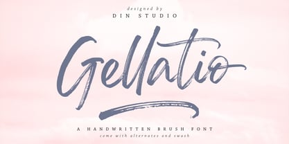 Gellatio is a chic Brush Font. It will make your design project more beautiful. This font is suitable for any design like branding, fashion, print templates, quotes, wedding and more. Features : 88 Beautiful Alternates 6 Beautiful Ligatures 52 Swashes PUA encoded Multi-lingual Support Numerals and Punctuation (OpenType Standard) Full Support Thanks for visiting and purchasing my font.
 - Feeling Passionate by Din Studio,
$25.00 Feeling Passionate is a casual and beautiful brush font. It will make your design project more beautiful. This font is suitable for any design like branding, fashion, print templates, quotes, wedding and more. Features : 78 Beautiful Alternates 15 Beautiful Ligatures 52 Swashes PUA encoded Multi-lingual Support Numerals and Punctuation (OpenType Standard) Thanks for visiting and purchasing my font.
 - We Love Nature Blooms by kapitza,
$85.00 A beautiful new addition to our We Love Nature flower font collection. We Love Nature Blooms consists of 52 highly detailed drawings of buds and blooms which can be used on their own or in combination with the other illustrations in the ‘We Love Nature’ font collection. All illustrations are drawn by hand and of the highest quality.
 - Monospaceland by Pepper Type,
$25.00 Monospaceland is a round monospaced typeface in 7 weights with rich language support (Cyrillic included), small capitals, and some double-width alternatives for added fun. It includes obliques and reverse obliques, making a total of 21 fonts. Plus, the family pack comes with a two-axis variable font to allow setting arbitrary weight and slant angle.
 - Black Mustang by Linecreative,
$16.00 Black Mustang is is an Condensed font with a modern look, go for the alternates titling or manually choose from the Glyph Palette from more alternative characters to give it a borderless design. Black Mustang offers you: - Upper and Lowercase characters (All Caps) - Stylistic alternates (Uppercase 52 charcters, Lowwercase 26 characters) - Numbers and Punctuation - Multilingual Support (Latin Western Europe)
 - "OldStyle 1" refers to a typeface that draws inspiration from the early forms of serif typography, characteristic of the period when printing was first invented and became widespread. This era, rough...
- Biotrip Sans — a typeface that breathes. I've brought to life a friendly typeface family that is, above all, a journey. A journey (Trip) from the purity of geometry to the warmth of the organic (Bi...
- ATF Garamond by ATF Collection,
$59.00 The Garamond family tree has many branches. There are probably more different typefaces bearing the name Garamond than the name of any other type designer. Not only did the punchcutter Claude Garamond set a standard for elegance and excellence in type founding in 16th-century Paris, but a successor, Jean Jannon, some eighty years later, cut typefaces inspired by Garamond that later came to bear Garamond’s name. Revivals of both designs have been popular and various over the course of the last 100 years. When ATF Garamond was designed in 1917, it was one of the first revivals of a truly classic typeface. Based on Jannon’s types, which had been preserved in the French Imprimerie Nationale as the “caractères de l’Université,” ATF Garamond brought distinctive elegance and liveliness to text type for books and display type for advertising. It was both the inspiration and the model for many of the later “Garamond” revivals, notably Linotype’s very popular Garamond No. 3. ATF Garamond was released ca. 1918, first in Roman and Italic, drawn by Morris Fuller Benton, the head of the American Type Founders design department. In 1922, Thomas M. Cleland designed a set of swash italics and ornaments for the typeface. The Bold and Bold Italic were released in 1920 and 1923, respectively. The new digital ATF Garamond expands upon this legacy, while bringing back some of the robustness of metal type and letterpress printing that is sometimes lost in digital adaptations. The graceful, almost lacy form of some of the letters is complemented by a solid, sturdy outline that holds up in text even at small sizes. The 18 fonts comprise three optical sizes (Subhead, Text, Micro) and three weights, including a new Medium weight that did not exist in metal. ATF Garamond also includes unusual alternates and swash characters from the original metal typeface. The character of ATF Garamond is lively, reflecting the spirit of the French Renaissance as interpreted in the 1920s. Its Roman has more verve than later old-style faces like Caslon, and its Italic is outright sprightly, yet remarkably readable.
 - Mella johni by Sulthan Studio,
$12.00 The font that I made last year and was just ready today, is very attractive with the latest trendy style, it will really satisfy you if you use it in all your work, be it on social media or your handiwork. because this font has many alternative letters according to your wishes such as capital letters which have four replacement letters and lower case letters which have various swashes and alternatives and also heart connectors. Of course this font will have many choices of how to use the characters and is also very cute. has 591 glyphs equipped with uppercase letters, lowercase letters, numbers, punctuation marks and also language support. Thank you for checking out and purchasing my font
 - Ride my Bike Serif by Latinotype,
$39.00 Ride my bike Serif is a new version of successful handmade typeface Ride My Bike designed by Coto Mendoza. Inspired by street style and the new culture that moves pedaling around the city. Perfect for use in headlines, brands and fashion photography compose alternative, thanks to its leading characters, terminals, alternate characters and ligatures that you can find in the Pro version. This time with serif. The ‘Ornaments’ font in this family has 121 dingbats, very fun to compliment and accentuate the handmade design. If you do not want to ride so fast, you can find a version without OpenType features - Essential. Come! Get on it and let’s go ride my bike! Photography by Nico Alari.
 - Toastie by Stiggy & Sands,
$29.00 Toastie began as a digitization of a film typeface from LetterGraphics known simply as "Flair 312". The original specimen included standard Capitals and Lowercase and Numerals, a bare bones character set. We've fleshed out the Toastie font to include a full standard character set, an extended international set, SmallCaps, etc. so it can be a powerhouse animated typestyle. See the last graphic for a comprehensive character map preview. Opentype features include: - Full set of Inferiors and Superiors for limitless fractions. - Tabular and Proportional figure sets. - Stylistic Alternates for a variation of the lowercase r characters. Approx. 591 Character Glyph Set: Toastie comes with a glyphset that includes standard & punctuation, international language support, and additional features.
 - Dvarlin Staves by Sins,
$37.48 Dvarlin Staves is a collection of 512 rune glyph's divided into six font family's. The three main font's are Root, Caber and Bole, while Remnant, Branch and Blossom are taller versions of the main set. They all come in four weights: Light, Regular, Semibold and Bold. As well as a Italic and a Slant style for the purpose of adjusting letters on a curved line. It also features codex:437 glyph set and an extended array of letters and corner alternatives, including the default runic glyph's. The collection stands at 72 styles that contains a total of 36 864 glyph's. For extra supporters consider gifting some Staves away to a crafty friend.
 - Abduction IV - Unknown license

- We Love Nature Forest by kapitza,
$79.00 We Love Nature Forest is inspired by long walks in the woods and features decorative wintery pine needles, fir branches and cones. Perfect for designing your seasonal cards. It consists of 52 highly detailed, hand drawn illustrations. The illustrations can be used on their own to create beautiful designs, or in combination with other illustrations in the We Love Nature font collection.
 - P22 Cage by P22 Type Foundry,
$24.95 Based on the handwriting and sketches of American experimental composer John Cage, this set was produced in conjunction with The Museum of Contemporary Art in Los Angeles and the John Cage Trust. This unique collection includes 52 graphic extras culled from the composer's notes and scores, as well as the "Cage Silence" font inspired by Cage's seminal work 4' 33".
 - Flogotop by Smartfont,
$29.00 FLOGOTOP works great in branding, logos, headlines, posters. The different weights and combinations give you full range to explore a whole host of applications, from tech startup, local events to concerts, festivals. FLOGOTOP LOGOMARK 52 logo marks inspired by geometry and clean, crisp, and universally symbolic design language. Make stunning logo designs with this eye-catching set of versatile shapes.
 - We Love Nature Blooms Outline by kapitza,
$85.00 A beautiful new addition to our We Love Nature flower font collection. We Love Nature Blooms Outline consists of 52 highly detailed outline drawings of buds and blooms which can be used on their own or in combination with the other illustrations in the ‘We Love Nature’ font collection. All illustrations are drawn by hand and of the highest quality.
 - Agustrush by eyetype,
$16.00 Agustrush a work that is purely a result of handwriting, has a natural characteristic. this is perfect for invitations, signatures, blogs, social media, business cards, product brands. Agustrush a work that is purely handwritten, has its own characteristics with the style of monoline It is perfect for invitations, signatures, blogs, social media, business cards, product brands, also equipped with 52 ligature.
 - Agness by Gassstype,
$29.00 Hello Everyone, introduce our new product Font AGNESS This Is Hand Drawn Font Simple.This is a Textured Natural Style and classy style with a clear style and dramatic movement. This font AGNESS is great for your next creative project such as logos, printed quotes, invitations, cards, product packaging, headers, Logotype, Letterhead, Poster, Design. You can activate 52 Alternate glyphs OpenType panel.
 - Derailer by Aerotype,
$29.00 Derailer’s eclectic character set is comprised mainly of disparate sans serif characters that claim to play well together. OpenType users also benefit from 52 ligature features that automatically substitute a unique pairing of letters when any upper or lower case character is keyed twice in a row. Derailer Pro extends the character set to support Eastern European Latin, Baltic, Greek and Turkish.
 - Atlantic Doodles by Atlantic Fonts,
$26.00 Like another popular “doodle”, Atlantic Doodles can really liven things up. Give your scrapbooking, invitations, gift tags and other creative endeavors the attention they deserve with this versatile collection of 52 hand-drawn swashes, flourishes, spots, and decorations. Designed to coordinate with your favorite Atlantic Fonts. Atlantic Doodles shown with Catbird, Suntea, Rowboat, Mountain Goat, Merci, Once, Trailmap, Farmstand and Steamboat.
 - Liaisons by The Ampersand Forest,
$35.00 A Belle Époque humanist serif in two styles: crisp, high-contrast Haut-Monde and soft, low-contrast Demimonde… When you design a lot of display pieces, you’re often in need of tall, slim type. Liaisons provides that, in a distinct fin-de-siècle style inspired by the great posters of the Gilded Age from Sweden, Denmark, France, and Scotland. (The ampersand alone is a bit of a love letter to Charles Rennie Mackintosh!) Both styles use the same slim skeleton, and are named after the stratum of society where one might find… a “dancing partner.” HAUT-MONDE is a high contrast face of the sort that says “High Society.” Elegant and sleek, it speaks to the refinement of the moneyed classes of a bygone era. Great for high-end products, too! DEMIMONDE is soft and low-contrast — more reminiscent of hand-lettering on Art Nouveau/Jugendstil/Wiener Werkstätte advertisements and posters. A comfortably chic display face all around! Both typefaces feature full Western and Eastern Latin character sets, as well as full Cyrillic/Slavic ones. And, perhaps best of all, both typefaces feature capitals with high, middle, and low waists, so you can change up the look as you see fit! Part of The Ampersand Forest's Sondheim Series
 - PF Bague Sans Pro by Parachute,
$79.00 PF Bague Sans Pro is a versatile monoline typeface with a distinct and eye-catching personality. Despite its inspiration from early 20th century geometrics, it diverts from the mechanical rigidity of those typefaces by incorporating humanist characteristics, such as subtle variations in stroke width and open counter shapes with vertical endings. This is a very clean and legible typeface with a warm and well-balanced texture which is ideal for intense editorial use in magazines and newspapers. Bague Sans’ most remarkable feature is its vast array of uppercase alternates and ligatures which truly shine when set at display sizes. This typeface is automatically transformed into a flexible, charming and stylish typeface with strong modern aesthetics. From classic to modern, from excessive to neutral. Bague Sans Pro is a multipurpose typeface which offers enormous possibilities and variations for editorial design, branding and corporate identity. Bague Sans Pro signifies freedom and personal style. This superfamily includes 18 weights from Hairline to Ultra Black with a consistent and well-refined structure. Each style consists of 1063 glyphs with more that 330 alternates and ligatures and an extended set of characters which support simultaneously Latin, Cyrillic and Greek. Download the complehensive PDF Specimen Manual to explore the unlimited text variations of Bague Sans Pro.
 - Linotype Ergo Paneuropean by Linotype,
$103.99Linotype Ergo was designed by American Gary Munch, and was a winner in Linotype's Second International Digital Design Contest in 1997. Conceived as a blend of traditional and modern type concepts, it works as a legible text family as well as a lively display or headline font. The word ergo means consequently," but it also comes from the Greek word "ergon" for "work." Consequently, Munch sees this family as full of energy -- an ideal font for working hard to make a point, and able to get it across with friendly vigor. The strokes of the characters are carefully designed to accommodate the tendency of the eye to enlarge horizontals and perceive verticals as lighter. The lowercase forms have open, friendly counters and are enhanced by small quirks, such as the slightly leaning s and the wide t. The deep branching of curves from main strokes helps this humanist sans to be very readable at smaller sizes. Linotype Ergo has four normal-width weights, five condensed weights, and two compressed weights - all with companion Italics! The family also includes a clever "Sketch" font for use in headlines, bringing the total number of font styles to 23. Ergo is available with Greek and Cyrillic and as W2G fonts with Hebrew." - Drakoni Sans by Mans Greback,
$59.00 Drakoni Sans is a bold and rounded font that exudes a strict and angular aesthetic. Its clean lines and subtle curves give it a humanist touch, making it perfect for a wide range of designs. Designed with a vision of comic book headlines, Drakoni Sans is both playful and professional. Its bold and powerful presence commands attention, while its rounded edges and angled cuts add a touch of personality and charm. Available in four styles - Regular, Italic, Bold, and Bold Italic - Drakoni Sans offers versatility and flexibility for any project. Its clean and clear letterforms make it ideal for logos, headlines, and other display purposes. Whether you're looking to add a touch of softness to your designs or to create a bold and commanding presence, Drakoni Sans is the font for you. The font is built with advanced OpenType functionality and has a guaranteed top-notch quality, containing stylistic and contextual alternates, ligatures and more features; all to give you full control and customizability. It has extensive lingual support, covering all Latin-based languages, from Northern Europe to South Africa, from America to South-East Asia. It contains all characters and symbols you'll ever need, including all punctuation and numbers.
 - Kometa by Kiril Zlatkov Type Foundry,
$40.00 Kometa Sans is a contemporary grotesk with a certain personality. She has a steady geometric skeleton, but its appearance is rather humanistic. The precise details of the artwork, the carefully drawn true italics, the six types of numerals, the variety of alternates, the broad range of open-type features and the extensive glyph set can meet most of the contemporary typographer’s demands for a neutral, but not boring type family for both long text and display use. Among the distinctive qualities of Kometa are also the forms of ligatures (both default and discretionary). They follow the natural constructive transitions between oval parts and stems, which is an advantage to mark, at least for designers who respect the beauty of clean forms. Note the specially designed Kometa Unicase sub-family, substantially enough to exist as a separate typeface. Its elegant and expressive letterforms are boosting further the power to create outstanding design work. Kometa Unicase has original and playful, yet reasonable approach to letterforms variety. Kometa has a very broad usability range – from logotypes and poster designs to corporate identities and complex editorial projects. The contemporary Cyrillics of Kometa allows easily completion of graphically consistent multilingual corporate and artistic design projects. Designed by Kiril Zlatkov and Vassil Kateliev.
 - Linotype Ergo W2G by Linotype,
$124.99Linotype Ergo was designed by American Gary Munch, and was a winner in Linotype's Second International Digital Design Contest in 1997. Conceived as a blend of traditional and modern type concepts, it works as a legible text family as well as a lively display or headline font. The word ergo means consequently," but it also comes from the Greek word "ergon" for "work." Consequently, Munch sees this family as full of energy -- an ideal font for working hard to make a point, and able to get it across with friendly vigor. The strokes of the characters are carefully designed to accommodate the tendency of the eye to enlarge horizontals and perceive verticals as lighter. The lowercase forms have open, friendly counters and are enhanced by small quirks, such as the slightly leaning s and the wide t. The deep branching of curves from main strokes helps this humanist sans to be very readable at smaller sizes. Linotype Ergo has four normal-width weights, five condensed weights, and two compressed weights - all with companion Italics! The family also includes a clever "Sketch" font for use in headlines, bringing the total number of font styles to 23. Ergo is available with Greek and Cyrillic and as W2G fonts with Hebrew." - FF Signa Slab by FontFont,
$72.99 FF Signa is a typically Danish typeface, rooted in architectural lettering rather than book typography. Originally designed for signage—hence the name—FF Signa is now a typographic family with three widths. All weights include italics, small caps, and several styles of figures. Because of the quality of this “vernacular-lettering-into-typeface” conversion, FF Signa received a Danish Design Prize in 2002. FF Signa is radically different from most sans serif text typefaces that were published during the 1990s. It neither belongs in the “humanist sans” category, nor is it on the list of typefaces based on 19th-century grotesques. Its concise letterforms and a minimum of detail produce clear and harmonious word images. Yet its proportions are classical, and the underlying geometry has been subtly adjusted in order to create letterforms which are at once interesting, harmonious, and contemporary. These features make FF Signa pleasant for reading, even at very small sizes. The typeface has developed into a versatile family, with Condensed, Extended, and Correspondence versions. Later on Signa Serif, Stencil variants and a Signa Slab family added even more versatility. The resulting FF Signa type system may be used for corporate identities, brochures, magazines, communication, books, and on-screen publications.
 - Audace Std by Typofonderie,
$59.00 Between geometry & shapes inspired by nature, in 4 fonts Audace was born as a response to a simple brief: how to visually express human interaction and technology with abstract forms? The starting point is a humanistic sanserif, to which are added external references: design pieces, furniture, buildings. Architects shape our world with the intention to reconnect nature, human and address a perfect functionality. Not so far to typeface design which combines a personal vision and ensures good legibility in a certain context. Audace — like the works of those artists, designers, architects — is clearly influenced by the tension of the line, the play with negative space, the dynamics, the surprise, the nature that will influence the shapes of the letters. So if a v is asymmetrical, and the y based on similar asymmetry but in reverse, these two shapes help to distinguish from one to the other. This is a consequence of the influence of forms from design and art in the design of the Audace. And this small example illustrates the confrontations of the designer’s influences: the search for the most unique shapes, but without compromising on function: to be read, to be legible, even at very small size in the worst conditions. Audace, between geometry and shapes inspired by nature
 - Epica Pro by Sudtipos,
$49.00 Epica is a contemporary interpretation of the Venetian Renaissance types. A humanist type family with a contemporary design. This family encompasses different typographic scenarios with emphasis in style and functional equilibrium. Its letterforms show the visual richness of Epica that includes some calligraphic reminiscences perfectly legible in small and display sizes. Its strong personality makes it distinguish, because it perfectly combines the elegance of antique typographies and the forcefulness of contemporary ones. This family has been designed in two different moments. Epica Serif, which have a more classical design, was finished 5 years ago in its first version. The first sketches were drew 8 years ago during the Master of Type Design at the University of Buenos Aires. Through the years was re design in several times to the point of reaching its current version. On the other hand, Epica Sans was completed in 2020 and is the counterpart of Epica Serif. A complementary system designed to enrich the serif version and give new options for hierarchy and composition. This is a versatile type family perfectly fit for books, editorial, and usage in print and on screens. It possesses great legibility in body texts, which makes it ideal for extended reading and supports a variety of languages.
 - Mayberry by Ascender,
$92.99The Mayberry® is an extensive family of 14 OpenType fonts. Mayberry was initially designed by Steve Matteson to emulate the technical behavior of a font family called Tiresias™ for use in set top TV devices and user interfaces. Mayberry is a significant improvement in aesthetics and functionality over Tiresias. Mayberry includes true italics and a wide range of weights to provide the highest quality and readability on low resolution devices, while also featuring a range of OpenType features that will appeal to creative professionals. Mayberry is a slightly condensed humanist sans serif which allows for more readable text in a narrower column. Open counters and upright stress help keep the design of Mayberry readable at low resolutions. A significant amount of care has been given to design subtleties allowing the design to function well at large sizes. The Mayberry character set supports Cyrillic, Greek, Central and Eastern European, Turkish and Baltic, Mayberry also includes a slashed zero for use where absolute distinction between 'O' and zero is a concern. Also included are typographic features such as old-style figures, fractions, superior and inferior numbers for use with applications that provide advanced OpenType typographic support. A set of closed captioning symbols and arrows add to the font's versatility in interface design.

