10,000 search results
(0.054 seconds)
- Altero by Stefano Giliberti,
$15.00 Altero is a font family for larger-than-life words. It supports 112 languages, features a total of 334 glyphs and includes an italicized version.
 - Galberta by IbraCreative,
$17.00 Galberta, a cutting-edge futuristic font, embodies the essence of tomorrow’s typography with its sleek and innovative design. Its geometric, sans-serif characters seamlessly blend bold, crisp lines and subtle curves, exuding a sense of modernity and minimalism. The font’s minimalist aesthetic is complemented by its distinct fusion of sharp angles and graceful arches, creating a visually captivating harmony. Galberta offers a dynamic and versatile typeface that can effortlessly elevate the aesthetics of any design, from sci-fi movie posters to forward-thinking digital interfaces, making it the embodiment of typographic innovation in the digital age.
 - Egbert by Groen Studio,
$16.00 Egbert is a Serif font family, which has a strong and bold character with 8 variants, Marston gives a clear and elegant look to logos, quotes, advertisements and more. Egbert is a versatile typography filled with the character you want. with Marston you work.Egbert has standard styles, Stylistic Alternates and ligatures. and includes upper and lower case letters, numbers and punctuation marks. Multilingual support for various languages including: French, German, Spanish, Portuguese, Italian, Dutch, Finnish, Swedish, and more. Marston works great in any branding, logos, magazines, films. The different weights give you full range to explore a whole host of applications, while the outlined fonts give a real modern feel to any project.OpenType features can be accessed by using OpenType smart programs such as Adobe Photo Shop, Adobe Illustrator, Adobe Indesign, Corel Draw and Microsoft Office. can also be accessed through the character map.
 - Alveru by Sakha Design,
$12.00 Alveru is a minimal and neat sans serif font. It can easily be matched to an incredibly large set of projects, so add it to your creative ideas and notice how it makes them stand out!
 - Qailbert by Dicubit,
$9.00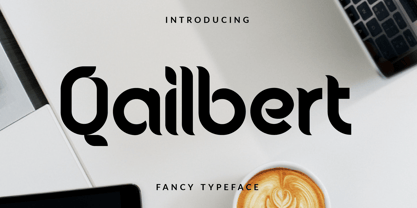 Qailbert is a fancy elegant typeface/font designed with carefully handcrafted. This perfectly made to be applied in logo, stationery, books, packaging, fashion, magazines, t-shirt, greeting or wedding cards, vintage design, novels, labels and many advertising purposes.
 - Ambergate by Greater Albion Typefounders,
$19.00 Ambergate is a new typeface family redolent of the late 19th and early 20th centuries. It’s a display family of four small capitals roman faces, incised and elaborated with filigree scrollwork. The four typefaces which comprise the family recapture the elegance of traditional flourished sign writing and make and provide ideal lettering for period inspired design work such as posters, signage and book covers.
 - Ecbert by Runsell Type,
$16.00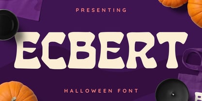 Ecbert font is perfect for many of your projects like logos & branding, photography, invitations, watermarks, advertisements, product designs, stationery, wedding designs, labels, product packaging, special events and much more.
 - Galber by Craft Supply Co,
$20.00 Introducing Galber - Compressed Sans Serif: A commanding typeface that captures the eye with its bold, condensed design. With its impactful lines and modern allure, Galber adds a strong touch to your projects. Elevate your designs with Galber's assertive style, making a striking statement that simply can't be ignored. This typeface is ideal for greeting card, packaging, brand identity, poster, or any purpose to make your design project look eye catching and trendy. Feel free to play with this typeface!
 - Malberg by Eko Bimantara,
$24.00 Malberg is condensed sans serif family. Consist of 9 styles from thin to heavy with matching obliques. Fit for display and short text for various design purposes.
 - Arbeit by Studio Few,
$12.00 Arbeit is a functional Neo-Grotesque typeface.
 - David Aubert by TeGeType,
$29.00 The name of this typeface, David Aubert, comes from the calligrapher of Philippe Le Bon and Charles Le téméraire, both Dukes of Burgundy who worked and lived in Brussels in the 1500s. This revival of his writing is a good example of the bâtarde bourguignonne style.
 - Alberta Script by Factory738,
$15.00 Alberta Signature Script is ideal for branding projects, logos, wedding designs, social media posts, advertisements, product packaging, product designs, label, photography, watermark, invitation, stationery, and any other project that requires a handwritten touch. Alberta Signature Script (Regular, Caps, and Tails) Basic Latin A-Z and a-z Numerals & Punctuation Stylistic Alternates Multilingual Support for ä ö ü Ä Ö Ü … Free updates and feature additions Thanks for looking, and I hope you enjoy it.
 - Albertus Nova by Monotype,
$50.99 Albertus® Nova is a faithful digital revival of Berthold Wolpe’s earlier design of Albertus and is one of the five designs in The Wolpe Collection of typefaces. This new design enlarges the typeface set from its previous two weights into a robust set of five ranging from thin to black, all with extended language support including Cyrillic and Greek. Berthold Wolpe began working on Albertus in 1932, at the encouragement of Stanley Morison. Morison saw an example of Wolpe’s engraved lettering and liked it so much that he commissioned a typeface based on the design. Since then, the original Albertus typeface has been used on book covers, in branding, on signs and in video games.
 - FS Albert Arabic by Fontsmith,
$150.00 Brother To create a truly global font family, FS Albert needed an Arabic script sibling. Emanuela Conidi set about the delicate task of creating an alphabet to harmonise visually with its Latin sans serif counterpart so that the two could be used side-by-side in bilingual publications. Working with the Kufic style of script, with its simpler, geometric forms, Emanuela sculpted letters with the a similar optical size, weight and rhythm as FS Albert, with open counters and monolinear strokes. It never hurts to Naskh But there’s more to FS Albert than a simple, geometric structure. To match Albert’s cheery, charming character, FS Albert Arabic needed an injection of warmth and informality. Emanuela incorporated some of the more expressive, calligraphic shapes of the Naskh script style, which lent the letterforms a looser, softer, more handwritten quality, while remaining functional and structured. The Naskh influence is most noticeable in the bowl of characters such as Jim, Qaf and Nun, in the curved tail of Waw and Reh, and the deep joining of Tah. Follow the script The end result is an Arabic script that’s the perfect partner to FS Albert: open counters, monolinear strokes and a friendly, rounded appearance. FS Albert Arabic is available in Opentype format, in five weights from Thin to ExtraBold. It supports Persian and Urdu, with proportional and tabular numerals for both, plus full vocalisation and the Hijra feature.
 - Fat Albert BT by Bitstream,
$50.99 Ray Cruz releases another typeface family, this time inspired by 1970's pop culture. Fat Albert Regular, Outline and Shadow are bold poster types that evoke the fun and funk of an era gone by. Go on bro, get Fat Albert and get down.
 - FS Albert Paneuropean by Fontsmith,
$90.00The x factor How do you make a font like FS Albert unique, distinctive? “When designing a font I try to question every letter,” says Jason Smith, “but all you need is a few that have an x factor. With FS Albert, they’re the lowercase ‘a’ and ‘g’ and the uppercase ‘I’ and ‘J’. “I remember a friend saying, ‘Why on earth have you designed the ‘a’ like that? Isn’t it too friendly for this kind of font?’ And, in a way, that’s what I wanted – honesty and warmth, because a lot of big brands at the time really needed to show a more human side.” Range of weights and styles FS Albert is a charismatic type: a warm, friendly sans serif face with a big personality. Open, strong and amenable, and available in a wide range of weights and styles, FS Albert suits almost every task you put it to. Fontsmith has crafted five finely-tuned upright Roman weights and four italic weights, as well as a special Narrow version to provide the best coverage and give headlines and text an easy-going character. The chunky kid “FS Albert was inspired by – and named after – my son, who was a bit of a chunky kid,” says Jason Smith. “I designed an extra bold weight because I always felt that the really big font heavy weights had the most personality. “I recently told Albert this story. He laughed, and forgave me for thinking he was a fat baby. He liked the big personality bit, though.” 1000s of glyphs Not content with a character set that covered Europe and the whole of the Western world, the studio decided to go further afield. There are now FS Albert character sets that cover western and eastern European languages, including those of Russia, as well as Cyrillic, Arabic and Greek scripts. In fact, the font now covers more than 100 languages, making it ideal for bringing a consistent typographic style to the communications of global brands. - Intruder Alert - Unknown license

- P22 Albers by P22 Type Foundry,
$24.95 This set of typefaces was produced in conjunction with the Guggenheim Museum and the Josef Albers Foundation. Josef Albers was one of the most important artists and educators of the twentieth century. He was a member of the Bauhaus first as a student and then as a teacher from 1920 until its closing in 1933. He then moved to America, where he continued making art and teaching at numerous institutions until his death. Known principally as an abstract painter, he was also an accomplished designer, draftsman, typographer, and photographer. His works explore permutations of form, color, and perception using a restricted visual vocabulary. Created when he was at the Bauhaus, his Kombinationschrift alphabets exemplify the school's ethos. Using 10 basic shapes based on the circle and the rectangle, he created a system of lettering that was meant to be efficient, easy to learn, and inexpensive to produce. These 10 shapes in combination could form any letter or number. The letterforms of this computer version were taken directly from Albers' drawings and notes.
 - Architype Albers by The Foundry,
$50.00 Architype Konstrukt is a collection of avant-garde typefaces deriving mainly from the work of artists/designers of the inter-war years, whose ideals have helped to shape the design philosophies of the modernist movement in Europe. Due to their experimental nature character sets may be limited. Architype Albers draws on early grid-based attempts by Josef Albers, in 1926, to design an alphabet by reducing the forms to purely geometric elements – the square, triangle and parts of a circle – and in the process creating an unusual stencil effect typeface.
 - Alber New by moretype,
$35.00 Alber New is the revamped version of Alber originally released in 2006. While retaining its original appeal Alber New has been overhauled from the ground up with improved outlines, spacing and kerning. Alber New also boasts an extending character set including small caps, subscript and superscript allowing it to cope with the most demanding of jobs.
 - Lewis F. Day 191 - Unknown license

- F. O. T. R. by JAF 34,
$9.90 F. O. T. R. is experimental sans serif display font. Space travelling is near so I decided to bring you a brand new typeface based on insight into the future. Clean shapes, a lot of atypical alternates and the futuristic appearance. F. O. T. R. typeface is conceptually connected with a chronophotography project FUTURE OF THE RHYTHM.
 - Planes-S-Modern - Unknown license

- Mod Quad S - Unknown license

- genotype S BRK - Unknown license

- Jenna s Kitties - Unknown license

- Collective S (BRK) - Unknown license

- Dipple KK S - Unknown license

- Collective S BRK - Unknown license

- TypographerGotisch Schatten S - Unknown license

- Mod Circle S - Unknown license

- S Water Jump by Supfonts,
$10.00 Water Jump will be perfect for wedding lettering, beautiful frame for your home, book covers, greeting cards, logos, marketing, magazines or anything that requires cute handwritten lettering :) What's inside: Multilingual support Cricut support If you have any questions, please contact me directly or in instagram @superdizigner
 - Neuzeit S LT by Linotype,
$30.99 Designed by Wilhelm C. Pischner, Neuzeit-Grotesk first appeared in 1928 with the font foundry D. Stempel AG. In 1966, Neuzeit S was introduced by Linotype-Hell AG, intended for large bodies of text and predecessor of Siemens corporate design. Neuzeit S is timeless, combining strength of form and objectivity and legible even on inferior papers.
 - H-AND-S by AND,
$89.00 A common creation: (to pass from one hand to the other): For the first time, various hand-signs from diverse sources are unified into one single visual style. This compendium is the result of 15 years of incubation and 7 years of creation. In his travels throughout the world, graphic designer Jean-Benoit Levy, principal of the visual studio AND, has collected pictures of multiple hand signage. Uncertain what to do with those signs, he kept them year after year until the idea came to unify almost 200 handsigns into one single family. In accordance with this entire collection, the name of the typeface is a mix: "h-and-s". A global collection: (To put in good hands): We all have one thing in common: Hand-signs are an international language, they are meant to be understood by all of us. Each of us regularly comes in contact with modern hieroglyphs such as the hand-sign-codes that are so prevalent in our daily life. This way of communication belongs to no one in particular and to all of us in general. Even if the sense of certain signs varies from one culture to the other, there is a common hand-sign language. We are surrounded by this language of handsigns each time we step in a store, we eat, open a container of milk, we clean up, use package of wash-powder, by shaving, when we work, use tools, at home, by tearing the envelope of a condom, by traveling, etc. When we encounter these signs, we all understand them easily. A visual connection: (To go hand in hand): This typeface is a global visual statement. Collecting, ordering, redrawing, unifying. Reconstructed and assembled into one original alphabet, H-AND-S is a unique and complex signs program. Our choice is based on daily gestures and global hand-codes. Logically this typeface starts with the "American Sign Language" and expands on two type-variations, each on two levels of keyboard. The international team of H-AND-S would like to send his special thanks to all of the anonymous graphic designers throughout the world who designed different hand-signage and who influenced and inspired to create such a sign collection into one unified family. We, the global nomad team of AND, hope that you will enjoy our H-AND-S. Additional Credits Production: Studio AND. www.and.ch. Concept, Idea & Creative Direction: Jean-Benoît Lévy, Switzerland / USA. Research & Sketches: Eva Schubert, Germany. Illustration, Graphic Design & Visual Fusion: Diana Stoen, USA. Transfer, Adaptation & Refining: Moonkyung Choi, Korea. Finalization & Checking: Sylvestre Lucia, Switzerland. Coaching & Technical Advice: Mike Kohnke, USA. Creative Energy & Implementation: Joachim Müller-Lancé, Germany / USA.
 - Grotesk S SB by Scangraphic Digital Type Collection,
$26.00Since the release of these fonts most typefaces in the Scangraphic Type Collection appear in two versions. One is designed specifically for headline typesetting (SH: Scangraphic Headline Types) and one specifically for text typesetting (SB Scangraphic Bodytypes). The most obvious differentiation can be found in the spacing. That of the Bodytypes is adjusted for readability. That of the Headline Types is decidedly more narrow in order to do justice to the requirements of headline typesetting. The kerning tables, as well, have been individualized for each of these type varieties. In addition to the adjustment of spacing, there are also adjustments in the design. For the Bodytypes, fine spaces were created which prevented the smear effect on acute angles in small typesizes. For a number of Bodytypes, hairlines and serifs were thickened or the whole typeface was adjusted to meet the optical requirements for setting type in small sizes. For the German lower-case diacritical marks, all Headline Types complements contain alternative integrated accents which allow the compact setting of lower-case headlines. - Grotesk S SH by Scangraphic Digital Type Collection,
$26.00Since the release of these fonts most typefaces in the Scangraphic Type Collection appear in two versions. One is designed specifically for headline typesetting (SH: Scangraphic Headline Types) and one specifically for text typesetting (SB Scangraphic Bodytypes). The most obvious differentiation can be found in the spacing. That of the Bodytypes is adjusted for readability. That of the Headline Types is decidedly more narrow in order to do justice to the requirements of headline typesetting. The kerning tables, as well, have been individualized for each of these type varieties. In addition to the adjustment of spacing, there are also adjustments in the design. For the Bodytypes, fine spaces were created which prevented the smear effect on acute angles in small typesizes. For a number of Bodytypes, hairlines and serifs were thickened or the whole typeface was adjusted to meet the optical requirements for setting type in small sizes. For the German lower-case diacritical marks, all Headline Types complements contain alternative integrated accents which allow the compact setting of lower-case headlines. - Corporate S WGL by URW Type Foundry,
$210.99 The Corporate ASE typeface trilogy was designed by Prof. Kurt Weidemann, a well-known German designer and typographer, from 1985 until 1990. This superb trilogy consisting of the Corporate A (Antiqua), Corporate S (Sans Serif), and Corporate E (Egyptian) is a design program of classical quality, perfectly in tune with each other. Weidemann says: “My ASE trilogy, quite like triplets, is in perfect harmony and covers all needs of modern typography!” Initially exclusively designed for DaimlerChrysler as a corporate font, the ASE trilogy may be now licensed and used without restriction. URW++ digitized the ASE for DaimlerChrysler and Prof. Weidemann and is the exclusive licensing agent for this outstanding and extremely popular typeface program. Meanwhile, URW++ enhanced the Corporate ASE family in regular, bold, italic, and bold italic by Greek, Cyrillic, and all additional Latin characters to cover Eastern Europe including the Baltic Rim, Romania and Turkey. Corporate ASE in regular, bold, italic, and bold italic is now available in the WGL 4 character complement.
 - Dry Billow S by Tadiar,
$13.00 DryBillows Font is unusual decorative font carefully designed and well looking with Latin Extended character set. It is good for Text and Headers with lowercase and uppercase letters both! DryBillows ideally works in luxury, fashion, cosmetics, wine and food areas. Please see the large preview images to see how it works.
 - S&L Gothic by BA Graphics,
$45.00A new gothic; great for books and magazines. - Abberancy - Unknown license


