10,000 search results
(0.085 seconds)
- IA Airship Captain by Invisible Art Studio,
$14.99 IA Airship Captain is a good readable comic book dialogue font made with a marker with wavy lines, giving it uniqueness and recognition. The family includes Regular, Italic, Bold, and Bold Italic. And contains a large number of kerning pairs. Added extended Latin, extended Cyrillic and contextual autoreplacing crossbar "I" in words like I, I'm, etc.
 - EM by Wilton Foundry,
$29.00 Time to EMbrace the new EMerging typeface from WiltonFoundry : EM consisting of EM Regular, EM Italic, EM Bold, EM Bold Italic. Loosely based on our very popular Cyan typeface, EM is EMphatically the most distinctive and modern typeface we’ve created yet. Slight variations between thick and thin with stenciled effects, and Flared stem EMphasis for character. Go get’EM!!
 - IngrianaCasual by Ingrimayne Type,
$9.95 IngrianaCasual features a hand-drawn sans-serif family with an italics that has semi-script lower-case letters. The five upright weights are relaxed and informal and the five italics styles are decorative and elegant. The family is very legible and can be be used for many purposes including brochures and advertising, though probably not for book text.
 - Claude Sans by ITC,
$40.99Claude Sans is the work of British designer Alan Meeks. The conservative roman weight is complemented by a more extravagant italic. The proportions are based on those of the original Garamond typeface of Claude Garamond, from whom this type gets its name. Claude Sans can be used alone or combined with Claude Sans italic and bold weights. - Cal Roman Black by Posterizer KG,
$19.00 Cal Roman Black is one more font from the PKG “Cal” (Calligraphic) group. This time for calligraphic sketches we used a wide brush instead of the iron pen. Instead of minuscule letters, there are Small Caps (which are almost the same weight as capitals). There was an intention to keep the spacing as small as possible, because of that, there is no obvious difference in the stroke thickness of the capitals and the lowercase capital letters. The difference in height is only one-third of the brush-width. Cal Roman Black font is rhythmic, informal, dark and hefty... romantic and strong at the same time (just like Ferdinand). As such, this font is widely used in the typographic creation of shorter and closely packed text forms such as magazine headlines, brochures and book covers, t-shirt designs, logos, posters, movie spots, banners...
 - Escritura Hebrew by Vanarchiv,
$21.00 It was my first attempt to drawing a Hebrew alphabet to mach directly with other typeface (Latin) which I already designed. The Latin version is an handwriting display typeface influenced by chancery handwriting from the Italian Renaissance (broad-nib pen). One of the most typographic characteristic is there wavy forms, especially the serifs, where contains some of the main calligraphic references from this font family. The Hebrew script contain reverse contrast, the vertical proportions are more tall and the stroke weight is slightly more strong than latin lowercase to produce a correct visual balance between them, especially on small sizes (text proportions). This Hebrew square book-hand was influenced by Sephardic script style. The Latin characters contains interrupted strokes, the same was made for Hebrew letterforms to transpose correctly the same calligraphic approach between these two different alphabets.
 - Aila by TipoType,
$30.00 Aila is a surprising slab serif built on the structure of a realistic Roman, but with unique organic features that make this typeface an exercise in tension between structure and rhythm. This expressive tension is displayed in heavier styles (Aila Bold and Aila Black), and is strongly evident in the italic forms. Aila's italics offer an interesting re-interpretation of the cursive ductus of classic italic forms, to offer rhythmic and swift variants, which are the ideal counterpoint to the regular set in body text. Each style of the Aila family offers an extended character set specially designed for editorial design projects.
 - Nixon Script by Barnbrook Fonts,
$30.00 NixonScript is a display typeface inspired by the typographic emancipation given voice by 1950s and '60s north American vernacular type. NixonScript's starting point was lettering found on a 1960s camera found in a Chicago junk shop, but its development saw it transformed from a punchy sans-serif to a more thoughtful serif, with a lowered x-height and a vibe of almost priestly piousness. Rather than a simple regular italic, a bold italic is offered. During its development, the regular version seemed almost placid but with the double emphasis of bold and italic, NixonScript gained an energetic, self-congratulatory form.
 - TWT Prospero by Three Islands Press,
$24.00TWT Prospero is the kind of typeface you seldom find in blocks of continuous text these days. Similar fonts based on late-18th-century work by Bodoni, the Didots, and others tend to be reserved for display type: their exaggerated contrast and vanishing hairlines can make you squint and strain at small sizes. But TWT Prospero, with its moderate contrast and fairly robust hairlines, is impressively legible in book text while remaining ideal for use in display situations. The full family has seven styles: roman, italic, bold, bold italic, condensed roman, condensed italic, and condensed bold. - Palo by TypeUnion,
$39.00 Palo is a 72 style utility type system built around 4 widths and 9 weights plus matching italics. It's semi grotesque appearance gives it a unique personality while the stylistic alternates give a true sense of flexibility and customisation. Design features within Palo are evident without being excessive. 3 stylistic sets provide a range of functional to fluid design approaches. Case sensitive punctuation & ligatures offer a professional feel. The italics have been optically adjusted to improve their weight balance and on select lower case glyphs they feature unique designs to make the italics a feature unto their own.
 - Collingar by Sarid Ezra,
$15.00 Introducing, Collingar - An Aesthetic Serif Font with italic version! Collingar is a classic and modern serif with a bunch of ligatures that will make your poster, cover or logo even more stunning and stand out! With italic version that you can use as a complimentary! You can use this font as a complement of your script collections or use this font as a stand alone font for several purposes such as a wedding invitations or even your own branding! This fonts support Multi Language and already PUA Encoded! Features : Regular & Italic Version Uppercase & Lowercase Number & Symbol Ligatures Multilingual and PUA Encoded
 - Kidyzen by Niznaztype,
$10.00 Kidyzen is a sans handwritten typeface. Inspired from the character of kids writing in their book. Kidyzen have unique style because it like same with typing of children. Kidyzen is perfect for comic, illustration, cartoon, kids design and very suitable for speech bubble text. It have very fun, cute, easy communication, easy reading and unique styles. You can use it for kids t-shirt, cover book, tagline, poster, branding, advertising, wall painting letter and graphic designs that use kids character . Kidyzen have 6 styles, there are regular, italic, bold, bold italic, thin and thin italic. Be enjoy it with my fonts.
 - HollaBear by Designova,
$9.00 A cute and funny kid-friendly typeface inspired from bears and handmade with passion and joy. Will you believe if we say, HollaBear is made by bear cubs. The typeface is essentially simple but very uniquely expressive when it comes to the design of posters, flyers, cartoons graphics, logotype, web and display usage. Please see the examples shown above to get an idea about the capability of this typeface. HollaBear comes with Extended Latin character sets including Western European, Central European and South Eastern European character sets. The typeface comes in 6 variants (Regular, Italic, Outline, Outline Italic, 3D and 3D Italic).
 - Airco Std by Typofonderie,
$59.00 Designed between italic and script styles Airco is a typeface designed between italic and script styles. The letterform finish is rounded. Designed ultra slanted (27°), the shapes evoke a fast and assertive movement. The result is a human typeface, dynamic, that will visually work well in technology and sport, without ever being dry, rigid or dehumanized. The structure of the letters is influenced by Renaissance italics, at the difference that in the case of Airco, the lowercases and capitals are visually homogeneous thanks to the giants lowercases. In fact, the default numerals can be used in capital as well lowercases settings.
 - Risoluto by Jawher Matmati,
$39.99 Risoluto is an italic font made to mimic the beautiful italic typefaces used in the 19th and 20th century by music publishers. It was based on an italic typeface found in a publication by Max Eschig from the 1950s. Hundreds of specimen for each glyph were studied and carefully drawn in a way to have a sharp rendering without losing any of the old charm. The oblique "g" is one of the characteristics of such old typefaces. Risoluto covers a large range of languages and symbols and offers stylistic alternates for numerals, contextual ligatures and music accidentals.
 - Ribbon Cursive by Okaycat,
$29.50 Ribbon Cursive was developed largely from Mercator's Italic Hand, which originated from Italy, during the Renaissance. Ribbon Cursive is fancy, legible, and luxurious text. Works great if you are designing a logo, or use it to create some beautiful titling. Use it for advertisement copy, or even for short to medium-length bodies of text. It should be noted that, due to the heavy embellishment of all the capital letters, this font will not work well if your text is set in all capitals! Ribbon Cursive is contains the full West European diacritics and a full set of ligatures, making it suitable for multilingual environments and publications.
 - Enotria by Aspro Type,
$39.99 Enotria is a contemporary neo-grotesk typefaces inspired by the Swiss school but with a Calabrian’s soul (south Italy region). It is composed by 8 weights and 7 widths for 112 styles with also 4 stylistic set for the letters, 2 stylistic set for numbers, 1 more stylistic set for symbols and punctuations, for three languages scripts. Enotria sports elegant 8° italic angle and a lot of adjustment between the letters for a better legibility as well as true fractions, ordinals, tabular and old style figures, numerators and denominators. Enotria typefamily is more then a typeface, it is a huge design and typographic system, flexible and suitable for any occasion.
 - Fodecumbers Display by Zamjump,
$9.00 Fodecumbers is a strong FontFamily and Sans sophisticated look. Inspired by dynamic squares can be felt through controlled letterforms and a modern twist. Balance of hard lines and smooth curves. Each font in the family can be standalone, dynamic, and authoritative on its own, or mix it with italics for the tagline in a logo. it's really worth it. Fodecumbers includes all thirteen uppercase fonts: Four weights, two outlines, seven italics. FEATURES Four weights / Italics / Lines / Numbers & Punctuation / Extensive Language Support USE Fodecumbers works well in every branding, logo, magazine, film. The different weights give you the full Fodecumbers is a strong FontFamily and Sans sophisticated look. Inspired by dynamic squares can be felt through controlled letterforms and a modern twist. Balance of hard lines and smooth curves. Each font in the family can be standalone, dynamic, and authoritative on its own, or mix it with italics for the tagline in a logo. it's really worth it Fodecumbers includes all thirteen uppercase fonts: Four weights, two outlines, seven italics. FEATURES Four weights / Italics / Lines / Numbers & Punctuation / Extensive Language Support USE Fodecumbers works well in every branding, logo, magazine, film. The different weights give you the full range to explore a whole host of applications, while the fonts outlined give a real modern feel to any project. Any specific license questions or questions, feel free to contact zamjump@gmail.com zamjump
 - Ambra Sans by Zetafonts,
$39.00 Designed by Cosimo Lorenzo Pancini with Francesco Canovaro as a development and reinvention of Tarif by Andrea Tartarelli, Ambra Sans is a humanist sans typeface family, drawn around a lively, expressive skeleton but developed with a contemporary, post-digital sensibility that implies low contrast and tall x-height. In designing Ambra Sans, the authors wanted to research the elusive natural signature of handmade humanist letter shapes, in the effort of preserving it while still developing all the capabilities of type as a technical tool in the digital age. Like a frail insect preserved in amber, humanist design is the "ghost in the machine" of this font, that aims at seducing the viewers with its soft, welcoming text flow, firmly opposing the rigid, formal tone of most sans serif fonts. Born to provide a useful tool to graphic designers with branding and editorial needs, Ambra Sans develops around two subfamilies with slight but fundamental differences. The display family offers a taller x-height, optimizing readability and spacing in headings and display use, while offering a single story lowercase g to provide more consistent branding usage. The text family, on the other side, goes for a smaller x-height to give more traditional proportion to the text and removes the slight tapering in the stems to provide better rendering on screen in small formats. Both subfamilies of Ambra Sans develop around a wide range of seven weights with corresponding true italics, with Ambra Display sporting an extra heavy weight for maximum versatility. In total the family counts 30 fonts, each with over 600 glyphs for a wide language coverage. Open type features and glyph alternates further enrich the usage possibility of this typeface that wants to offer contemporary designer an alternative, unexpectedly human approach to contemporary sans type, softly preserving the spirit of handmade calligraphy while encasing its frail nature in a transparent, strong and powerful design language.
 - Franca by René Bieder,
$29.00 Franca is a neo-grotesk family in nine weights plus matching italics. The inspiration for the design came through the constant interest in new interpretations of the classic grotesk model and a study of "neutral“ typefaces like Helvetica, Univers or Normal Grotesk. During the studies, additional attention was given to the American representatives of the genre, resulting in the initial impetus for a reinterpretation, combining both paths into one contemporary design. This is reflected in the name, blending together the names of the most popular typefaces of each genres, (Fran)klin and Helveti(ca). Due to its large x-height and plain design, the family is perfectly suited for all kinds of text. Its mid-weights are optimized for usage in long paragraphs, while the bolder weights, due to a short descender and ascender, create a compact and confident look in headlines or short copy. In order to create strong and dynamic italics, the oblique glyph shapes come with a faint calligraphic hint, defined by a higher stroke contrast and a steeper connection between stems and arcs in, for example, h n m and u. This is followed by different standard shapes for a and y, supporting the dynamic movement of the lowercase in general. A wide range of OpenType features such as ligatures, old style figures, fractions, case-sensitive shapes and many more, are available for professional and contemporary typesetting. This is completed with eleven alternative glyph sets, enabling a quick customization of the typeface. The family supports up to 92 languages and comes with 500+ glyphs per font.
 - Feedback BB - Personal use only

- Certified - Unknown license

- Ashes 1 - Unknown license

- Planetary Orbiter Outline - Unknown license

- Hess Old Style by Red Rooster Collection,
$45.00 Originally designed by Sol Hess as just a roman and italic for Lanston Monotype, circa 1920-23.
 - Shore Bodoni by BA Graphics,
$45.00A Bold new re cut of Bodoni, designed with a more contemporary look. Also has matching Italic. - Torino Modern by BA Graphics,
$45.00A redesign of Torino, a great feel with many possible uses. Also has a matching Italic version. - Prangs by Sudtipos,
$59.00 The late-19th-century Prussian-American printer and publisher Louis Prang, the “father of the American Christmas card”, was well-known for his efforts to improve art education in the United States. He published many instructional books and even founded a training school for art teachers. One of the books he published included a series of alphabets for sign painters, lithographers, illuminators, architects and civil engineers. There was nothing truly original there — in the book’s preface, Prang says that the alphabets were “based on foreign forms and adapted for American taste”. The one alphabet that caught my attention in that book was one simply called “Italic”. It’s a high- contrast modern, a Didone really, but with an interesting little twist: the lowercase is almost entirely connected, which makes for an interesting mix of modern typography and classic calligraphy. That stuff is right up my alley now. Whenever my eyes happen on a modern, it’s easy, even almost impulsive for me to envision swashes coming out of serifs and terminals. The caps melt and the minuscules dance with them. And so I brought my vision to life. Prangs is an italic set of three weights, each containing more than 1400 glyphs with plenty of OpenType features and Latin language support. This set celebrates the convergence of three centuries of fancy display alphabets. These fonts should work wherever moderns are used to elevate and scripts are used to appeal — namely today’s branding, packaging and glossy publications.
 - Scripty by Turtle Arts,
$20.00Scripty is a hand drawn, calligraphy longhand handwritten font. With careful spacing, the letters can be used together to create words that look like theyπve been written with an old≠fashioned fountain pen, or used alone as embellishment to more plebean text. - Sweet Mia by Angele Kamp,
$24.00 Sweet Mia is a playful modern calligraphy font with a dancing baseline. This sweet font has nice smooth lines and is perfect for crafters and cutting machines. Sweet Mia will look gorgeous on cards, mugs, quotes, logos and all your other lovely projects.
 - Berlion by Blankids,
$23.00 Introducing of our new product the name is Berlion a Handwritting Script Font, Berlion inspired by Bouncy Calligraphy style with a fun theme very good for Logotype, kids poster, flyer, childrenbook, cartoon, comic etc FEATURES : Uppercase Lowercase Number Punctuation Multilingual PUA Encode Opentype
 - Giarek by Nirmana Visual,
$24.00 Inspired by the elegance of classic typography and the beauty of calligraphy, this font exudes a sense of refined aesthetics. Its graceful strokes and balanced proportions make it an excellent choice for luxury branding, high-end invitations, editorial design, and formal occasions.
 - Lindore by Irina Vascovet,
$16.00 Lindore is a handwritten pointed pen calligraphy script that has a fun and whimsical personality. Perfect for posters, wedding invitations, and all of your favorite quotes! We would love to see how you use the font! Use #lindorefont to tag us on Instagram!
 - Ving Smith by Stringlabs Creative Studio,
$25.00 Ving Smith is a Script Font with Handwritten Style. The Ving Smith font made with digital brush pen strokes that making this font look authentic. This font is perfect for fashion brand, wedding invitation, business card, logo brand, signature, and then calligraphy.
 - Butter Jelly by Typesthetic Studio,
$13.00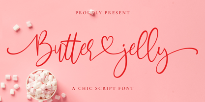 Butter Jelly is a modern calligraphy font with handwritten, sophisticated flows. It is full of hearts and glyphs. With exaggerated strokes and a bouncy baseline, Butter Jelly is perfect for logos, wedding stationery, cards, gift designs, photography, watermark, product packaging and handwritten quotes.
 - Shiny Aisyah by Stringlabs Creative Studio,
$25.00 Shiny Aisyah is a Script Font with Handwritten Style. The Shiny Aisyah font made with digital brush pen strokes that making this font look authentic. This font is perfect for fashion brand, wedding invitation, business card, logo brand, signature, and then calligraphy.
 - Melisa Script by Lucky Type,
$18.00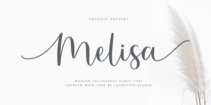 Introduce the latest modern calligraphy font Melisa Script which features a starting and ending swashes. Melisa Script has some beautiful ligatures for your pretty designs. Melisa Script is perfect for wedding stationery, feminime logos, branding and more! Thank you so much for watching.
 - Stand By Me by Natural Ink,
$12.00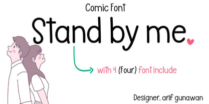 Stand By Me Display is a modern calligraphy design, including Regular. This font is casual and beautiful with swash. Can be used for various purposes. such as logos, product packaging, wedding invitations, branding, headlines, signage, labels, signatures, book covers, posters, quotes, and more.
 - Plumero Script by Sudtipos,
$39.00 Plumero is the wild, playful side of calligraphy. The disciplined elegance of old lettering is replaced with the fresh, joyful swashes of youth. Attractive and care-free, Plumero catches the eye and leaves its viewer with an indelible impression of its unmistakable signature.
 - De Gozaru by Bejeletter,
$14.00 De Gozaru, is a classic calligraphy font with a beautiful arch. This font is available in several modern swirls that can make your work look elegant, sweet and perfect. This font also has several alternatives that can allow you to improvise your writing.


