10,000 search results
(0.033 seconds)
- Fallery Script by Zane Studio,
$15.00 Fallery Script is a calligraphy script font that comes with exquisite character changes, a kind of classic decorative copper script with a modern twist, designed with high detail for an elegant style. Fallery Script is interesting because it is smooth, clean, feminine, sensual, glamorous, simple and very easy to read, because of its many fancy letter relationships. I also offer a decent number of stylistic alternatives for some of the letters. Classic style is very suitable to be applied in various formal forms such as invitations, labels, restaurant menus, logos, fashion, make up, stationery, novels, magazines, books, greeting/wedding cards, packaging, labels or all kinds of advertising purposes.
 - Fruitcake Fanatics by Bogstav,
$18.00 I have had the name "Fruitcake Fanatics" in my mind for quite some time now...but I needed a font that suited the name...then one day...actually last Wednesday, I was playing around with some letters (which eventually would turn out to be this font!) and suddenly it struck me: I got the letters for my Fruitcake Fanatics font! Another story could be - what does the name mean?! Well, to tell you the truth, I don't know - but what I do know is that the font is playful and unpredictable and loads of fun!
 - Dryer Grain by Patrick Dewenter,
$- This typeface is intended for use with single words or phrases at a large point size. Suggesting some sort of calligraphic inspiration, I sketched a couple of these letters while creating a logo concept and decided to make a complete alphabet. The stroke through the letterforms adds some interest and elegance, although I believe this typeface expresses a sort of vehement or serious character. This is my new, and first, typeface. I plan to create more in the future. If you use it for anything interesting, I'd love to see!
 - Bookish by Hackberry Font Foundry,
$24.95 This all started with a love for Jenson. I know there're hundreds of variations on that theme. But, that is where I began, several years ago. How far it came, as usual as I wandered through the vagaries of font design, is not unusual. If you've read any of my font design books, you know my design processes are quite loose and spontaneous. I wanted the general feel of a favorite old font, but softer, easier, and more comfortable. I built these on the same vertical metrics as my Librum Publishing Group. However, this family is not part of that group. I used the metrics because that shows my current taste in fonts. This family does work with the Librum group—but to be honest, I haven't experimented enough to come up with a good companion. I suspect I'll need to make another companion family. I may need make a non-modulated bold version also. But, that remains to be seen. I'm pleased with this.
 - Musty Scoot by Bogstav,
$15.00 Got a pair of jeans that goes well with both party and casual living? A shirt that would fit well to a Hollywood movie premiere and would be suitable to pick up the kids from the kindergarten? If so, you know exactly what I mean, when I say that the Musty Scoot font is suitable for anything! Well, almost anything...maybe not that highway sign, or that security sign at the airport!!! But suitable for anything for children, toys, adventures, handcraft, invitation, restaurants, playgrounds, libraries...etc etc Each letter has 7 slightly different versions, which automatically cycles as you type. There is even a version of right/left sided arrow to choose from!
 - Raspberry Sherbet by Hanoded,
$15.00 I have actually never had a sherbet. When I made this font family, I wish I had one, as it was a whopping 38 degrees (Celsius, not Fahrenheit…) outside. Raspberry Sherbet is a cute little font family, consisting of a rounded fat kids font and an inline version. Comes with all the bells & whistles, plus a super duper cooling effect when you use it!
 - Malibu Punch by Rachel White Art,
$12.00 Malibu Punch. I am loving this sassy script font! There are two versions: rough, with tons of texture, and smooth! I made it with an itty bitty brush and pretty watercolors. It's got loads of texture - check out those edges! Wobbly, rough watercolor edges! The capital letters work together, so it's like two fonts in one! The lowercase script is so sassy and full of attitude. Great for branding, logos, and quote art.
 - Snuggle Punk by PizzaDude.dk,
$17.00 To snuggle is "settle or move into a warm, comfortable position" - that is exactly what I did with making this chunky seriffed font. Well, maybe not a position, but a comfortable mood! I tried to mix some gentle grafitti moves and comic letters, and then a touch of the classic goofy pizzadude style - and the result is this cheeky font called Snuggle Punk. Full of round corners and fat lines - sounds like a nice cup of coffee! :)
 - Hello Arsenio by Figuree Studio,
$18.00 Say hello to Hello Arsenio font. Made with love and joy. Kids look, so it will make your design more beautiful, cute, fun, and colorful.
 - Days Are Longer by PizzaDude.dk,
$13.00 Days are beginning to get longer! Spring is on its way, and I love it! Springtime can be surprisingly mild and warm, and my font “Days Are Longer” is just like that! And even playful with a gentle twist of handcrafted warmth!
 - Desphalia Pro by Ingo,
$42.00 A classic “American” sans serif with a kink Desphalia belongs to the kind of sans serif fonts that were created in the 19th century. You could also name it “American Gothic”, a sans serif in the style of fonts like Franklin Gothic, News Gothic and similar. Above all, the high x-height characterizes this typeface style, as do the identical heights of uppercase and ascenders. However, I allowed myself a few peculiarities ;-) On the one hand, there is the gently sloping horizontal middle line on letters such as H, E, F, A and e. The M also got gently slanted sides. Some of the lower-case letters have an up- or down-stroke: a d m n p u. This "kink" on the shaft also serves to better distinguish the small l from the capital I — as can be seen clearly with the term »Illinois«. In keeping with the tradition of American typefaces, Desphalia does not have a true italic. Rather, the letters of the “Italic” have the same character forms as the normal upright variant, but in oblique — and so it is not called “Italic” but “Oblique”. Style Set 01: Another American peculiarity is the capital I with dashes above and below. It is included in the Desphalia as an alternate character form. An alternative small l with the “kink” in the ascender is also included — as is a y with the “kink” in the descender. Style Set 02: The corresponding “straight” forms a d l m n p u without the break are included as alternatives in a separate style set. Small caps are uppercase letters that are optically the same size as lowercase letters. They offer a very classy way of emphasis. Desphalia is available in the widths Condensed, Normal and Expanded, the weights include Thin, Light, Book, Bold, Black. Using the variable font, all intermediate levels can be freely selected. The figures are optionally available as tabular figures, proportional lining figures or old style figures.
 - Jangly walk - 100% free

- Western Suburbs JNL by Jeff Levine,
$29.00 The cover of a 1932 edition of “Sunset magazine” (a publication for homeowners living in the west and southwest area of the United States) featured a lovely Art Deco serif alphabet that is now available as Western Suburbs JNL in both regular and oblique versions.
 - Simple Mints by PizzaDude.dk,
$16.00 You may already found out that "Simple Mints" is a wordplay. The font itself is playful as well - the 5 different versions of each letter makes sure that your text is lively and playful! Inspiration comes from both grafitti and comics...and my usual kind of sloppy handwriting - a mix that makes a great impression! :)
 - Allumi Std by Typofonderie,
$59.00 Technology in mind in 12 fonts Allumi is a different font. Different from anything Jean François Porchez has designed in the past. Allumi is a sleek typeface designed with technology in mind. It’s a perfect font family for any communication concerning design, robotics, or functionality. Pushed to its extreme limits, the Allumi shapes are neither perfectly round or geometrically square. It’s a human design with a high tech touch. Allumi can be described as the Eurostyle (designed by Aldo Novarese in 1964) of the new century, mixed with Frutiger. Allumi is a serious typeface because of the unique design and sturdy form. The pure shapes can create a global presence today with an eye on the world of tomorrow. Two widths The Allumi family has been built around two series of widths, standard and extended. Italics have been carefully designed as slanted roman with all necessary optical and human corrections to create a perfect and neat italic. I Love Typography 2009
 - Fan Script by Sudtipos,
$99.00 A friend of mine says that sports are the ultimate popular drug. One of his favorite things to say is, “The sun’s always shining on a game somewhere.” It’s hard to argue with that. But that perspective is now the privilege of a society where technology is so high and mighty that it all but shapes such perspectives. These days I can, if I so choose, subscribe to nothing but sports on over a hundred TV channels and a thousand browser bookmarks. But it wasn't always like that. When I was growing up, long before the super-commercialization of the sport, I and other kids spent more than every spare minute of our time memorizing the names and positions of players, collecting team shirts and paraphernalia, making up game scenarios, and just being our generation’s entirely devoted fans. Argentina is one of the nations most obsessed with sports, especially "fútbol" (or soccer to North Americans). The running American joke was that we're all born with a football. When the national team is playing a game, stores actually close their doors, and Buenos Aires looks like a ghost town. Even on the local level, River Plate, my favorite team where I grew up, didn't normally have to worry about empty seats in its home stadium, even though attendance is charged at a high premium. There are things our senses absorb when we are children, yet we don't notice them until much later on in life. A sport’s collage of aesthetics is one of those things. When I was a kid I loved the teams and players that I loved, but I never really stopped to think what solidified them in my memory and made them instantly recognizable to me. Now, thirty-some years later, and after having had the fortune to experience many cultures other than my own, I can safely deduce that a sport’s aesthetic depends on the local or national culture as much as it depends on the sport itself. And the way all that gets molded in a single team’s identity becomes so intricate it is difficult to see where each part comes from to shape the whole. Although “futbol” is still in my blood as an Argentinean, I'm old enough to afford a little cynicism about how extremely corporate most popular sports are. Of course, nothing can now take away the joy I got from football in my childhood and early teens. But over the past few years I've been trying to perceive the sport itself in a global context, even alongside other popular sports in different areas of the world. Being a type designer, I naturally focus in my comparisons on the alphabets used in designing different sports experiences. And from that I've come to a few conclusions about my own taste in sports aesthetic, some of which surprised me. I think I like the baseball and basketball aesthetic better than football, hockey, volleyball, tennis, golf, cricket, rugby, and other sports. This of course is a biased opinion. I'm a lettering guy, and hand lettering is seen much more in baseball and basketball. But there’s a bit more to it than that. Even though all sports can be reduced to a bare-bones series of purposes and goals to reach, the rules and arrangements of baseball and basketball, in spite of their obvious tempo differences, are more suited for overall artistic motion than other sports. So when an application of swashed handlettering is used as part of a team’s identity in baseball or basketball, it becomes a natural fit. The swashes can almost be visual representation of a basketball curving in the air on its way to the hoop, or a baseball on its way out of the park. This expression is invariably backed by and connected to bold, sleak lettering, representing the driving force and precision (arms, bat) behind the artistic motion. It’s a simple and natural connective analysis to a designer, but the normal naked eye still marvels inexplicably at the beauty of such logos and wordmarks. That analytical simplicity was the divining rod behind Fan Script. My own ambitious brief was to build a readable yet very artistic sports script that can be a perfect fit for baseball or basketball identities, but which can also be implemented for other sports. The result turned out to be quite beautiful to my eyes, and I hope you find it satisfactory in your own work. Sports scripts like this one are rooted in showcard lettering models from the late 19th and early 20th century, like Detroit’s lettering teacher C. Strong’s — the same models that continue to influence book designers and sign painters for more than a century now. So as you can see, American turn-of-the-century calligraphy and its long-term influences still remain a subject of fascination to me. This fascination has been the engine of most of my work, and it shows clearly in Fan Script. Fan Script is a lively heavy brush face suitable for sports identities. It includes a variety of swashes of different shapes, both connective and non-connective, and contains a whole range of letter alternates. Users of this font will find a lot of casual freedom in playing with different combinations - a freedom backed by a solid technological undercurrent, where OpenType features provide immediate and logical solutions to problems common to this kind of script. One final thing bears mentioning: After the font design and production were completed, it was surprisingly delightful for me to notice, in the testing stage, that my background as a packaging designer seems to have left a mark on the way the font works overall. The modern improvements I applied to the letter forms have managed to induce a somewhat retro packaging appearance to the totality of the typeface. So I expect Fan Script will be just as useful in packaging as it would be in sports identity, logotype and merchandizing. Ale Paul
 - Lifeform by Supremat,
$12.00 Lifeform is a modern display font created as a result of my experiments on the forms of letters. While working on the font, I had ambivalent feelings, on the one hand I liked the individual curved lines, on the other hand they seemed very strange, alien and illogical. It was like looking into a microscope and seeing something strange. I wanted to develop and study these forms as something new, because I had never seen anything similar before. The result is a contrasting font that has both curves and sharp, and smooth lines that resemble some kind of organic matter. The font is well suited for large headlines, posters and covers. Its strange design catches the eye and will not leave the viewer indifferent.
 - Bear Story by Mvmet,
$12.00 Bear Story is a cute animal themed display font. Create something with it from regular typing notes, to t-shirts, kids’ book designs, greeting cards, stickers, posters, or anything that needs a casual touch. Fall in love with its incredible style and use it to create lovely designs!
 - Sale Inline by Mvmet,
$10.00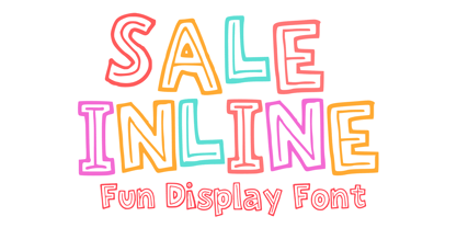 Sale Inline is a fun and playful inline font. You can use it for anything ranging from t-shirts, kids’ book designs, greeting cards, stickers, and posters, or anything that needs a casual touch. Fall in love with its incredibly versatile style and use it to create lovely designs!
 - Birka by Linotype,
$29.99Birka is the first typeface I designed from scratch. It took a whole year of my weekend and evening hours and is the typeface that teached me everything I know about type design. It is easy too see that I had Garamond in mind when drawing it. Birka is beautiful" was the comment of the well known Swedish designer Bo Berndal when he first saw it. That comment gave me the courage to design more and more typefaces. In a Danish article about Scandinavian type design, Birka was taken as example of a typical Swedishness in typography. I am not sure what the writer had in mind, but it surely sounded well. Birka has its name from the ancient Viking town Birka, whose remains are found not far away from Stockholm. Birka was released in 1992." - Rainmaker Script by Fenotype,
$35.00 I started Rainmaker Script by hand sketching a huge amount of letters to find the right tone. After having enough I picked the characters that I liked and begun composing a font out of them. With this method I ended up with the Rainmaker Script - an elegant signature style connected script with natural variation in the rhythm. Rainmaker Script is great for branding, headlines and packaging. It’s equipped with (automatic) Contextual Alternates that keep the flow natural and variable. There’s also Swash, Stylistic and Titling Alternates, and even more alternates can be found for some characters from the Glyph Palette. From the Glyph Palette you’ll also find a handful of ending swooshes and ornamental strokes that can be combined with the font. All the extras in Rainmaker Script are PUA encoded so you can access them in most graphic design software.
 - Whalebone by Hanoded,
$15.00 For some reason I had to think of Moby Dick (the classic book by Herman Melville) when I was busy working on this font. No, I don’t live near the sea, nor do I have a pet whale. It’s just one of those things… Whalebone (named after Captain Ahab’s prosthetic leg) is a handmade, all caps brush font. It wasn’t actually made with a brush; I used a broken satay skewer and Chinese ink. Whalebone comes with discretionary ligatures for double letter combinations.
 - Yeezus by JAF 34,
$9.90 Yeezus is an attempt for an essential of rave subculture. Yeezus is also inspired by the futuristic and acid designs from curent visual trends. Yeezus is one of the modern headline fonts that you find a special, radical and a pleasured to use. Love it or hate it. There is no other way.
 - Barachiel Alternate by Stefani Letter,
$14.00 Barachiel is a beautiful script and Monogram font designed with an incredibly modern feel. Whether you’re looking for fonts for Instagram or calligraphy scripts for DIY projects, Still Love will turn any creative idea into a true piece of art! This font is PUA encoded which means you can access all of the glyphs and swashes with ease! It features a varying baseline, gorgeous glyphs, and stunning alternates.
 - Gyanko by Nurrontype,
$14.00 Gyanko is one of a kind display font. With tight and equal side bearing, bold weight, and rhyme! It comes with Regular and Stencil version. Use it with tight space for the best result. Of course it's support multilingual. I also add some alternate, so you can have more option when you using the interlock feature. Have fun with Gyanko!
 - Deluta by Dharma Type,
$14.99 You can not find such a lovely, unique and funny blackletter. Enjoy and have fun with this font. There are two other fonts designed by in the same concept. -Xesy -Ekistra -Deluta Black
 - Guilloche A by Wiescher Design,
$80.00 Guilloches were – in the old days – used to make the falsification of banknotes more difficult. The engraving of these intricate lines was done by a highly specialized mechanical machine, which was operated by an equally highly specialized engraving artist. Once the settings for a specific curve were changed back to zero it was very difficult, if not impossible to set them back to the old design. I have designed a useful set of Guilloches that join to form ribbons that create a kind of op-art 3d effect. Under the keys A-U and a-u you find joining pieces. Under the keys V-Z and v-z I placed start- and endpieces. 0-4 are different lenght straight extensions and 5-9 are not quite so straight extensions. All other keys are corner pieces that can be used as stand-alones or put in rows to make for superb decoration. With a little bit of experimentation and maybe colored overlays you can achieve super-phantastic designs. Your elegant type designer Gert Wiescher.
 - War by Suomi,
$19.00 The matrix screen types from the movie War Games stuck in my mind, so I decided to make few versions.
 - Kristen Curly - Personal use only

- FG Muriel by YOFF,
$14.95FG Muriel is an all-caps font with different letters for caps and lowercase which can be combined to make it look like true handwriting. I love this font! - 1483 Rotunda Lyon by GLC,
$38.00 Towards the end of the 1400s, in Lyon (France), was living Barthélémy Buyer, descendant of a rich family of merchants. In the end of 1472, he engaged a typographist from Liège (Belgium): Guillaume Le Roy. The first book stemming from their print shop was the Compendium breve ( by Pope Innocent III.) using Blackletter “textura”. Many books followed, most often illustrated with wood carving. In 1483, to print a French translated “Eneide”, they used a venetian “Rotunda” blackletter. Our font was inspired by this “Rotunda” set, with historical forms and ligatures enriched with accented letters and other characters not existing in the original.
 - Metro New One by JAB'M,
$15.00The main inspiration is from Art Nouveau which flourished in Europe at the end of the 19th and beginning of the 20th centuries. This design included furniture (Majorelle, Lalique) and architecture (Victor Horta, Henry Van de Velde, Gaudi, Alfons Mucha). But Hector Guimard remains the favorite for all aspects of its art and, of course, its typefaces used on the Parisian Metropolitan posters. In particular, the various kerning of the various letters he used to make the poster a whole design from singular designs, leading to numerous variations. As a designer, I first worked with the individual glyphs Hector Guimard designed and I discovered that they vary constantly from a poster to another, depending on the overall result he was looking for. Another difficulty in transferring his design to printing is that there was no lower case. I was excited to create the whole font from the original designs of Hector Guimard, incorporating its variations and "crazy kerning". After several attempts, it appeared to be impossible to include all variations and I slightly moved to my own new design as a complete font, upper and lower case, with kerning. I voluntarily limited the ascenders and descenders to the usual typography so that it can be used from 10 / 12 points. This version can be used to edit letters and books in the context of Art, specially Art Nouveau and Art Deco of course, posters of any kind. - Trick Or Treat by Comicraft,
$19.00Bats, Cats, Ghosts and Ghouls, Zombies, Witches and Spiders galore. Cackling to herself alone in her coven, our very own Scary Godmother, Lilou, threw eyes of newts and wings of bats into her cauldron and sent her unearthly children down the street with mischief in mind. Our Halloween Dingbats have every kind of Spooky Monster she could imagine, and a few more besides. Keep your porch light on. Trick or Treat - ocr-t by FaceType,
$7.00 Being a geometric sanserif ocr-t comes in eleven weights from ultrawhite to infrablack (brightwhite, white, silver, lightgrey, grey, darkgrey, anthracite, black, jetblack). With more than 600 glyphs it covers all your typographic needs and manages to stay at the same place no matter which width you’re using. Its readability and legibility is more than fine although it needs no kerning. The infrablack is really black, in order to achieve this, the form of letters change from darkgrey to anthracite from upright to some kind of upright italic. This also gives opportunity to mix two weights with same colour but different architecture. Find also stylistic sets, alternate letters, lots of bullets, different arrows, hands and well: kind of hearts.
 - Overskrift by PizzaDude.dk,
$17.00 Overskrift is headline in danish. My mind was set on making a font suitable for headlines, and that is exactly what this font is useful for - but, I found it suitable for many other things as well. I was thinking about packaging, posters, postcards and other things that needs a super legible handmade font! I have added 5 different versions of each letter, and they automatically cycle as you type!
 - Cher Font - Unknown license

- Robusto by Galapagos,
$39.00Thirteen or 14 years ago I admired, out loud, a book I found on a shelf in Matt Carter's office. That Christmas I was pleasantly surprised to find that Matt had found another copy of the book and he gave it to me. The book was about the life of Oswald Cooper and it contained numerous specimens of Cooper's lettering jobs. Among them was an interesting image of 7 letter that spelled out the word 'Robusto'. These letters were used as the model for the font Robusto. All I needed to do was develop 221 other glyphs to finish the font. - Lemon - Unknown license

- Formetic by Bülent Yüksel,
$19.00 The Formetic family can be used for logos, advertising slogans, posters and banners,etc. Designed for use in many different kinds of materials. The design is Sans-serif, modern, geometric and I created digital fonts when designing this first for numbers and players names for a football team. Formetic comes in 6 styles, 3 weighted with corresponding Oblique versions.
 - Heartsome by Hanoded,
$15.00 Heartsome is a ‘forgotten’ word. It was mostly used in Scotland and it means: ‘giving cheer, spirit or courage’. I had never heard of it, but I thought it deserved a second chance, so I named this font Heartsome! Heartsome is a handmade Didone; I used a brand new bottle of Chinese ink and a brand new synthetic pencil to paint the glyphs. Brand new, because all of my drawing materials seem to have evaporated when we moved into our new house… A synthetic brush, because I don’t want animals to suffer because I feel the need to create fonts.


