10,000 search results
(0.258 seconds)
- Bodoni Classic Swashes by Wiescher Design,
$39.50 Bodoni Classic Swashes is my personal addition to Bodoni’s family of typefaces. Bodoni did not design a decorative version. His quest was for purity in book design. Even though in his days it was not called design; he thought of himself purely as a printer. But I think, especially after visiting the Bodoni museum in Parma, if Giambattista were alive today he would design a decorative typeface. Yours classico, Gert Wiescher
 - Tombouctou by Hanoded,
$15.00 Tombouctou is the French name for Timbuktu, a city in central Mali. I have been to Timbuktu several times; usually arriving after a three day boat trip up the Niger river. Timbuktu is a smallish city, literally in the middle of nowhere, with a treasure trove of UNESCO listed sights. Tombouctou font is a handmade brush font. It is nice and elegant and will give your designs an ‘oriental’ touch.
 - Flatmarker by Irina Kryvets,
$11.00 Flatmarker is the rough, marker-like, handwritten look of the handmade font. Grunge effect of the font gives the script a high recognition value and uniqueness. Flatmarker is very versatile and works great for almost any subject matter, including birthdays cards, weddings, coffee shops, restaurants and many more. Font have natural hand brushed strokes to give your project that natural and realistic look. I hope you enjoy it!
 - Boo Boo Kitty by Lauren Ashpole,
$15.00 Boo Boo Kitty is a blocky font with a halftone style gradient texture. One of the big inspirations for this font was retro comic printing so I tried to keep the background slightly messy to capture that look. It was originally released in 1997 as an all-caps font with mixed plain and textured characters but was recently updated it to include lowercase letters and full versions of both background options.
 - Badoni by Chank,
$49.00"Grunge Typography? I invented it!" claims Chank Diesel. Badoni was created in 1993 for use in CAKE, a fanzine that reveled in grunge music. As creative director of CAKE, Chank wanted the magazine's design to reflect the music it glorified. Kurt Cobain was alive and miserable. Soundgarden had long hair. Seattle was everywhere. Chank's answer was Badoni, a gritty and distressed typeface that is a sign of the grunge glory years. - Buddy Slender by Hackberry Font Foundry,
$24.95 Buddy Slender is the narrower version of the companion sans for Contenu, the book font family designed for a book on book family design called Practical Font Design. It's a loose, free, easy to read sans, so when my wife suggested Buddy, it clicked. This is the 2-font Buddy Slender family of Regular & Bold. I made a new more limited feature set for these fonts due to their designed usage.
 - HGB Memento by HGB fonts,
$32.00 HGB Memento was designed to replace 12 bronze plaques with the names of those who died in World War I. The 12 plaques were stolen in 2016. Stone tablets were made on which the original writing was engraved using sandblasting. Memento is therefore suitable for commemorative plaques and for texts of a sacred nature. Extremely short ascenders and descenders allow very narrow lines. The design language of the Memento comes from the 1920s with echoes of Art Nouveau and Art Deco.
 - Barranco by W Type Foundry,
$20.00 Barranco is a 3d layered fontfamily of 3 weights (thin, medium, black), plus shadows and one inline effect layer. It’s inspired by the caps neo-humanist typefaces of the 80’s with a mix of new trends such as the new layered typefaces and super heavy font families. Each font also comes with a set of Stylistic Alternatives for letters A I K W Q, and extensive language support. Barranco is really nice for magazines design, trademarks, logos and posters.
 - Possum Saltare NF by Nick's Fonts,
$10.00Lewis F. Day, in his Alphabets Old and New, presented these letters as examples of rustic Roman lettering of the first through third centuries, AD. An uppercase-only typeface, most of the lowercase positions are occupied by letterform variants. It should be noted that the name does not refer to a savory dish made from a nocturnal American marsupial; it’s Latin for “I can dance”. Both versions of the font include 1252 Latin, 1250 CE (with localization for Romanian and Moldovan). - Ongunkan Old Turkic Yenisei by Runic World Tamgacı,
$50.00 The Yenisei Inscriptions consist of a total of 158 Turkish inscriptions, kurgans (graves) and rock stones that have been found along the Yenisei River, which passes through the Khakasya, Tuva and Altai Autonomous Republics in Russia. The inscriptions were written with Turkish Stamps, which we know as the Orkhon Alphabet. In addition, there are dozens of versions of the Turkish Runic script, apart from the Yenisei inscriptions and the Orkhon inscriptions. I will present the other versions here as soon as possible.
 - Aqua Casual by Scholtz Fonts,
$18.00 The script equivalent of the cool, header font. This font is essentially embedded, by its styling, in the 20th century. Inspired by fragments of some pre-20th century script fonts, I modernized it and added lower case characters. The result captures the cool elegance of the 1920s & 30s, yet also embodies the free optimism of the 60s. Aqua Casual is a fully professional font, carefully letterspaced and kerned. All upper and lower case characters, punctuation, numerals and accented characters are present.
 - Deco Donut by Just My Type,
$20.00 On the very northern edge of South Tucson lies an Old Pueblo institution, Le Caves Bakery, Home of the Vegetable Donut. That’s what they were called when Le Caves opened; now you’d say Vegan Donut, or No Animal Products Used. Radical concept in the Brave New World of 1935. I started with the letters from their sign and extrapolated the rest of the font from those. Deco Donut Fat is extrapolated from Deco Donut. If you want a donut, type a 0 (zero).
 - Olivera by Artisan Studio,
$15.00 Olivera has Stylistic standard, Stylistic Initial, Stylistic Teminal and ligatures and includes uppercase and lowercase letters, numbers and punctuation marks. Multilingual Support OpenType smart programs such as Adobe Photo Shop, Adobe Illustrator, Adobe Indesign, Corel Draw and Microsoft Office. A total of 462 Glyphs: Ligatures: Ju Ct ff Cl all gh of ck tt ut nt ak ll pp il rt it ot st at rr om mm ar ss as or ox ow on tt ut ut Ct st at ot rt it Cl Swashes access: A B C D E F G H I J K L M N O P Q R S T U V W X Y Z 7 alternative sets access: a b c d e f g h i j k l m n o p q r s t u v w x y z
 - Stonetype by Kustomtype,
$20.00 Stonetype is a typeface that was used by stonemasons in the 70s & 80s of the last century. When I was starting as a stonemason, these were the first characters I had to draw, by hand, back then on grave monuments and memorial plaques. The idea was born to digitize all the material, to be saved for eternity. By digitizing all and fine tuning, plus the addition of some main characters, Stonetype has now grown into a user-friendly typeface that can, now still, be used by stonemasons, to improve their creation process times. But Stonetype can also easily be used in modern and contemporary designs. Stonetype is the perfect fit for graphic design, editorial design, magazines, posters, logotypes, brands and corporate design. Stonetype is designed by Coert De Decker in 2019 and published by Kustomtype Font Foundry.
 - Vtg Stencil Italy No. 2 by astype,
$29.00 The Vtg Stencil fonts from astype are based on real world stencils from several countries. The Italian stencils that I chose as a model for this font are roughly based on classic French stencil letters. Please compare the figures (numbers) with their French counterparts. However, the Italian stencils are made with a different production technique. The design of the letters is clearly not punch-cut into the plates, maybe they are drilled, milled or etched. Details such as the serifs look bold and clumsy, and when using the stencils as they are meant, with viscous sign paint, smaller details easily fade away. So I took my freedom to design a font close to the original design but adding several typographic tweaks to let it shine, hoping to get closer to the intended design idea of these Italian stencils. Enjoy the vintage!
 - Coal Brush by Hanoded,
$15.00 Coal Brush is a bit of a misleading name. It looks as though it was made with a brush, but it was, in fact, made with a almost dried out old marker pen. But a font named ‘dried out old marker pen’ doesn’t really fly, so I decided to pimp the name. There you have it, you can’t even trust an honest typographer! Marker pen or brush, Coal Brush is a very sweet little font. It is all caps, but upper and lower case differ and can be mixed freely. Plus there’s a hidden stash of alternates for the lower case letters and an alternate ampersand! I actually threw that in to make up for my lie. So, use it for your books, your posters, your rap albums, rock operas, grilled food restaurants and designer BBQ sauces. It’s yours for the taking!
 - Old Man Eloquent by Three Islands Press,
$29.00 John Quincy Adams, sixth President of the United States, didn't hit his stride until he'd left that lofty office. It was during his many years in Congress that he assured his legacy, not least because of his long, masterful oratory opposing slavery. His speeches, in fact, won him the nickname "Old Man Eloquent." So when I decided to simulate Adams's penmanship in his legendary diary (which he kept for nearly 70 years), it seemed fitting to call the font by that name. I focused on his handwriting from about 1810, when he was Ambassador to Russia, but also consulted pages from later years. Old Man Eloquent has both regular and bold weights. The OpenType version has more than 450 glyphs, including alternate uppercase characters, old-style and lining figures, and numerous ligatures; all formats contain several common (English) words.
 - Atlantica by Jonahfonts,
$35.00 My pet peeve for many years has been with the 'rn' in small texts, especially with my smart phone. I felt that perhaps others may have the same peeve. I decided to try and fix that with Atlantica. As you can see in poster No. 4. "With the combination of 'rn' in small text it tends to appear as 'm'. Therefore it may be read as 's t e m' instead of 's t e r n'. Altalntica has an alternate 'rn'. By invoking the < Contextual-Alternate > feature. Atlantica will replace each 'rn' - or you may individually change them if you desire". Also note the deep cuts to help legibility for smaller texts. This combination apparently does not appear in many words, but when it does it can suggest a different word as in; eastern, stern, tarnish, Tornado, Turn and in some names as well.
 - Brinar by Hackberry Font Foundry,
$24.95 I've been working on a usable sans serif for body copy since the mid-1990s (though I certainly did not know it at the time). This one works well. It started life back in the mists of time as a scan of an old German font by Carl Fahrenwaldt. It was developed fully as a synergized serif with strong traditional roots and released as Bergsland Pro. Now it finally makes it to where I was headed all along as a sans text font. This is a well modulated humanist, sans serif font family with many OpenType features and over 600 characters: Caps, lower case, small caps, ligatures, swashes, small cap figures, old style figures, numerators, denominators, accents characters, ordinal numbers, and so on. It is designed for text use in body copy. But it also works very well for elegantly stylized display.
 - Cosmic Hippie by Hipfonts,
$9.00 Transport yourself back to the vibrant era of the 1970s with Comisc Hippie, a groovy font that embodies the essence of that extraordinary decade. This typeface is a nostalgic journey through time, with its swirling curves and playful letterforms. Inspired by the counterculture movement, Comisc Hippie exudes a sense of peace, love, and individuality. Its bold and psychedelic style captures the free-spiritedness of the era, making it an ideal choice for adding a touch of retro charm to your designs. Whether you're working on posters, album covers, or any project that calls for a dose of nostalgia, Comisc Hippie will transport you to a groovy world of colorful expression and timeless coolness. Let the spirit of the 70s shine through with this font that embodies the era's iconic aesthetics.
 - Dead Mans by Comicraft,
$19.00 Shiver me Timbers and Splice me Mainbrace! There's strange goings on in Smugglers' Cove... A gathering of thieves, brigands, piratefolk and back-stabbing blackguards the likes of which have not been seen since the days of Redbeard! Someone'll be swinging from the yardarm or walking the plank if the map identifying the location of the fonts created for Grim Todd McFarlane's SPAWN: THE DARK AGES doesn't turn up soon!
 - Futura by URW Type Foundry,
$89.99 Futura is THE prototype of a geometric or constructed linear sans serif and the font most commonly font of its kind used to date. Futura, very much influenced by the Bauhaus movement in Germany, was designed in 1927 by Paul Renner. Although being around for almost 90 years, Futura seems eternally young and fresh which also explains its continuous popularity with designers and typographers. Futura simply means efficiency and functionality documented by both its many usages as corporate type (e.g. Volkswagen, formerly IKEA, Vuitton, Shell, formerly HP, SMA and many more) as well as in various famous film projects (e.g. Kubrick, Anderson etc.). Futura’s iconic status was probably established when it walked on the moon with the Apollo 11 crew in 1969. It was used for the lettering of the plaque that was left up there.
 - Augify by Letterhend,
$19.00 Augify Display s a sophisticated serif with unique letterform. It has many beautiful ligatures which you can play around to match your project, whether for a standout headline, or for a tagline, you name it. The unique letterform makes this font one of a kind! Perfectly to be applied to the other various formal forms such as invitations, labels, logos, magazines, books, greeting / wedding cards, packaging, fashion, make up, stationery, novels, labels or any type of advertising purpose. Features : uppercase & lowercase numbers and punctuation multilingual alternates & ligatures PUA encoded We highly recommend using a program that supports OpenType features and Glyphs panels like many of Adobe apps and Corel Draw, so you can see and access all Glyph variations. How to access opentype feature : letterhend.com/tutorials/using-opentype-feature-in-any-software/ Email us to letterhend@gmail.com if you need something! Happy Designing!
 - Gaffuk by Twinletter,
$12.00 Gaffuk is a handwritten font that smooths out each character This font is specially designed to have a beautiful and harmonious appearance in the use of your project. This font is equipped with three alternatives to beautify and enhance your needs in providing clear information to the audience but also having a beautiful visual appearance. not only that, but we also complete this font with ligatures and alternates. This handwritten font is perfect for children’s magazines, drink banners, games, posters, beverage, outdoor events, thumbnails, food banners, cheerful writing, film titles, quotes, titles, logos, and various kinds of projects you need, of course, your various design projects will be perfect and extraordinary if you use this font because this font is equipped with a complimentary font family, both for titles and subtitles and sentence text. start using our fonts for your amazing projects.
 - Bourgeois Slab by Barnbrook Fonts,
$75.00 Bourgeois Slab is built upon the framework of Bourgeois, our popular geometric type family. As with the sans-serif Bourgeois, Slab’s letter forms are thoroughly contemporary in look and feel. Echoing mid-century modernism in style, Slab’s overall look is friendly and businesslike, more expansive and expressive than Bourgeois’s pared-down asceticism. The slab-serif’s development and vigorous uptake during the early-Victorian-era Industrial Revolution, means that we endow slab-serif faces with characteristics of sturdiness, durability and trustworthiness. At the same time, we appreciate the slab-serif’s raison d’etre: They’re made to grab your attention. Bourgeois Slab and Slab Condensed when combined, offer 24 styles suited for text of all kinds and sizes. Both are particularly good for for text-heavy projects and for designers seeking a robust, authoritative-but-genial voice for branding and logo work.
 - Gailenia by HandletterYean,
$20.00 A special person deserves a special font. That is why we present you Gailenia. Make your design or any project of yours look stunning and wonderful with all the features of this font, like alternates, swashes, titling, and stylistic alternates. This font looks amazing for packaging, business cards, invitations, posters, labels, and any kind of design. Accessible in Adobe Illustrator, Adobe Photoshop, Adobe InDesign, & CorelDraw. Multilingual Support: ä ö ü Ä Ö Ü ß ¿ ¡ To access the alternate glyphs, you need a program that supports OpenType features such as Adobe Illustrator CS, Adobe Photoshop CC, Adobe Indesign, and CorelDraw. For more information about how to access alternate glyphs, please go to this link ( goo.gl/ZT7PqK ) Check out our font collection for more great and artistic fonts. Pick your most favorite font and use it as you like to reach your goals.
 - Leaden Skies by Kitchen Table Type Foundry,
$16.00 A ‘Leaden Sky’ is a dark grey sky without clouds. We don’t see too many of them here in Holland, as we usually have lots of clouds. Yesterday, however, the sky turned a sinister greyish green and it spewed out an an enormous amount of hailstones the size of walnuts. Leaden Skies is a handmade, all caps display font. I made it with a brush and Chinese ink. It comes with extensive language support and a set of alternates for the lower case glyphs.
 - Carniola by Linotype,
$29.99Franko Luin, Carniola's designer, on this typeface: Carniola is a pastiche of different type designs from the beginning of the 20th century, mostly American. I am not very fond of it, but was convinced to release it by someone who needed a typeface with a time typical feeling. On the other hand: why not use the original typefaces from that period? Carniola has its name from the Latin name of Kranjska/Krain, a principality in the former Habsburg monarchy (Austria-Hungary), now part of modern Slovenia. - Flagellum Dei by Hanoded,
$20.00 Flagellum Dei is Latin for ‘The Scourge of God’. It is a title given by later generations to Attila the Hun (406-453 C.E.). Flagellum Dei is also a rather scary font, which I made with the use of a stiff brush and some China ink. Of course you could use this quite versatile font to scare the bejesus out of your friends, but I’d much rather see it used on book covers, posters and album artwork. Flagellum Dei comes with a horde of diacritics.
 - Jantze by Fontosaurus,
$19.95The Jantze font is a project undertaken by Dan Bailey of Fontosaurus and Michael Jantze, creator of the nationally-syndicated comic strip, The Norm. All their royalties from the font will go to The Lance Armstrong Foundation. For those that have been living under a rock for the last five years, Lance is a professional bike racer that overcame advanced testicular cancer to not only come back to his sport, but to dominate its premiere event, the Tour de France. In climbing to the top of his sport, he has become a legend among cyclists and a beacon of hope for those battling cancer and their families. His foundation provides financial grants to researchers working to improve our odds against the disease, individuals stricken with cancer, and survivors of the disease that are advocates for survivorship issues in their communities. Michael Jantze and Dan Bailey would like you to consider the quote from Ralph Waldo Emerson that brought us to this project: "The purpose of life is not to be happy. It is to be useful, to be honorable, to have it make some difference that you have lived and lived well. We hope that you will help us help Lance Armstrong's legacy be more than that of just sports legend. We hope that you will help those that may someday help you as much as we hope that you will never have to suffer the ravages of cancer. We hope. - The Great Wall by Gie Studio,
$9.00 The Great Wall, as the name of this font is created and inspired by a legendary world masterpiece, with a special uniqueness in a style that is very firm but looks elegant, so it is suitable for you to use for a variety of designs that accentuate the professional and charming. Various advantages of this font : This font consists of four (4) very interesting styles, please choose ! With a rather thick but consistent style line, accentuating the firmness and professionalism of the users of this font. This font is complete with Uppercase, Lowercase, Numeral, Punctuation, Multilingual support and ligature letters in each style. Can be applied in various software, such as Ms.office, Photoshop, Coreldraw, Adobe Illustrator, Inkscape and others. There are many purposes that are very suitable to use this font, among others: writing the name of a professional profession, for book covers, fashion branding, watches, jewelry, marketing products, magazines and more. With you using this font for any purpose, I hope your business will be more successful and known to the world as the name of this font. Thank you, I say for your visit and purchase.
 - Bendigo by ITC,
$29.00The lively calligraphy font Bendigo was created by Phill Grimshaw in 1993 and looks as though it were written by an energetic hand. Generous capitals fit harmoniously with more reserved lower case letters and the right slant of both emphasizes the dynamic feeling of the font. Bendigo should be used in point sizes of 14 or larger and its strong character makes it particularly good for headlines. - Gogles by Aqeela Studio,
$18.00 Inspired by strange classic typography, Gogles has its own unique style. This font is best suited for headlines of all sizes, as well as for blocks of text that have maximum and minimum variations. The Gogles style applies to all types of graphic designs on the web, print, moving images and more, and is perfect for t-shirts and other items such as posters and logos.
 - Alexa by Adobe,
$29.00In 1994, John Benson designed Alexa, Caliban and Balzano, three typefaces with a similar style. Characteristic of all of them is their calligraphic touch and the likeness to handwriting. Alexa shows a hint of a broad tipped pen style and its legible figures are reserved yet lively. Alexa is best for short and midsized texts as well as headlines and gives texts a personal, classic look. - Splinky - Unknown license

- Merry Bright by Romie Creative,
$12.00 Hello everyone, I would like to introduce my newest font Merry Bright Script is a beautiful modern calligraphy typeface, I hope you will be interested in this font, if you want to use it for your work. This font can be used easily and simply because there are many features in it. contains a full set of lowercase and uppercase letters, a wide variety of punctuation marks, numbers, and multilingual support. font also contains a lot ligatures and contains many alternative Style Sets such as the stroke alternative of the heart to combine with two words, for example: Ashley-Haston. You can see an example in the image above. Merry Bright is perfect for today's emerging market design, this font has a stylish, trendy, natural and soft font, with this font you can take advantage of any opportunity is a great way to highlight the celebration the best of parties, because this font will be an advocate for the cause such as wedding invitations, branding, parties, graduations, birthdays, gatherings, etc. Thank You, Romie Creative
 - Boisterous Fun by Missy Meyer,
$12.00 Have you ever been drawing out the letters for a font, then you start making some multi-letter ligatures? Then you think up some more to make, and you make those too? And you keep making them, until you have over a hundred of them? No? Just me? Boisterous Fun is a font that started out simple -- a nice handwriting style with a single stroke width. But add in the ligatures, plus a dozen single-letter alternates and my usual crowd of accented characters for language support, and this baby has grown to over 600 characters total. It's a great casual font for branding or packaging, but it's also smoothed so it's easy for cutting. Boisterous Fun includes: - The usual A-Z, a-z, 0-9, and lots of punctuation; - Over 300 extended Latin characters for language support; - 140 alternates and ligatures for variety, all PUA-encoded for easy use! I had a ton of fun making it, and I hope you have a ton of fun using it!
 - P22 Tyndale by IHOF,
$24.95Quill-formed roman/gothic with an olde-worlde flavor. Some background in the designer's own words: "A series of fonts came to mind which would be rooted in the medieval era -for me, a period of intense interest. Prior to Gutenberg's development of commercial printing with type on paper in the mid-1400s, books were still being written out by hand, on vellum. At that time, a Bible cost more than a common workman could hope to earn in his entire lifetime. Men like William Tyndale devoted their energies to translating the Scriptures for the benefit of ordinary people in their own language, and were burned to death at the stake for doing so. Those in authority correctly recognized a terminal threat to the fabric of feudal society, which revolved around the church. "This religious metamorphosis was reflected in letterforms: which, like buildings, reflect the mood of the period in which they take shape. The medieval era produced the Gothic cathedrals; their strong vertical emphasis was expressive of the vertical relationship then existing between man and God. The rich tracery to be seen in the interstices and vaulted ceilings typified the complex social dynamics of feudalism. Parallels could be clearly seen in Gothic type, with its vertical strokes and decorated capitals. Taken as a whole, Gothicism represented a mystical approach to life, filled with symbolism and imagery. To the common man, letters and words were like other sacred icons: too high for his own understanding, but belonging to God, and worthy of respect. "Roman type, soon adopted in preference to Gothic by contemporary printer-publishers (whose primary market was the scholarly class) represented a more democratic, urbane approach to life, where the words were merely the vehicle for the idea, and letters merely a necessary convenience for making words. The common man could read, consider and debate what was printed, without having the least reverence for the image. In fact, the less the medium interfered with the message, the better. The most successful typefaces were like the Roman legions of old; machine-like in their ordered functionality and anonymity. Meanwhile, Gutenberg's Gothic letterform, in which the greatest technological revolution of history had first been clothed, soon became relegated to a Germanic anachronism, limited to a declining sphere of influence. "An interesting Bible in my possession dating from 1610 perfectly illustrates this duality of function and form. The text is set in Gothic black-letter type, while the side-notes appear in Roman. Thus the complex pattern of the text retains the mystical, sacred quality of the hand-scripted manuscript (often rendered in Latin, which a cleric would read aloud to others), while the clear, open side-notes are designed to supplement a personal Bible study. "Tyndale is one of a series of fonts in process which explore the transition between Gothic and Roman forms. The hybrid letters have more of the idiosyncrasies of the pen (and thus, the human hand) about them, rather than the anonymity imbued by the engraving machine. They are an attempt to achieve the mystery and wonder of the Gothic era while retaining the legibility and clarity best revealed in the Roman form. "Reformers such as Tyndale were consumed with a passion to make the gospel available and understood to the masses of pilgrims who, in search of a religious experience, thronged into the soaring, gilded cathedrals. Centuries later, our need for communion with God remains the same, in spite of all our technology and sophistication. How can our finite minds, our human logic, comprehend the transcendent mystery of God's great sacrifice, his love beyond understanding? Tyndale suffered martyrdom that the Bible, through the medium of printing, might be brought to our hands, our hearts and our minds. It is a privilege for me to dedicate my typeface in his memory." - Rachert by ahweproject,
$9.00 Rachert is a retro bold font that will bring you back to the 70s. Fall in love with its unique character and use it to create gorgeous wedding invitations, beautiful stationery art, eye-catching social media posts, and much more! Rachert is PUA encoded which means you can access all glyphs and swashes with ease!
 - Renitha by Allouse Studio,
$16.00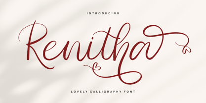 Proudly Presenting, Renitha a Lovely Calligraphy Font Renitha is perfect for any titles, logo, product packaging, branding project, megazine, social media, wedding, or just used to express words above the background. Renitha also come with Multi-Lingual Support. Enjoy the font, feel free to comment or feedback, send me PM or email. Thank You!
