10,000 search results
(0.047 seconds)
- Qanoar by Hishand Studio,
$15.00 Classy look font of Qanoar. a modern serif font family that drawn inspiration from elegant, modern, but classic at the same time. just have a look at this beautiful handcrafted serif typeface. Use it for logo, design, branding, and many more. Complete with ligatures alternates regular italic icon kerning multilingual support
 - Merlina by Prasetype,
$9.00 Merlina is an elegant, thin lettered sans serif font. This font is PUA encoded which means you can access all of the glyphs and swashes with ease! Add it confidently to your favorite creations and let yourself be amazed by the outcome generated. complete with ligatures regular kerning multilingual support
 - Holland Treasure by Lone Army,
$10.00 Introducing Holland Treasure, a hybrid font that merges script and sans serif styles. With two variations, Holland Treasure Display and Holland Treasure Regular, this font set is designed for both display and text purposes. Experience the modern luxury of Holland Treasure as it adds elegance and sophistication to your designs.
 - Aerolite Pro by CheapProFonts,
$10.00 The history of Aerolite, from Jan Paul: "The Aerolite fonts are essentially stripped down versions of a complex outline typeface I designed for the first Midnight Oil album in 1978, affectionately known as "The Blue Meanie". Many years later I saw the font "powderworks" and asked Brian Kent if he would be interested in digitizing Aerolite. Brian is a font (!) of knowledge and was of invaluable help by getting Aerolite to where it is today. Special care was taken in keeping the distinct character while as Aerolite Regular also providing a legible, thouroughly kerned body type which can be used in all sizes for large volume text." For the Pro version the kerning has been tweaked further, and the character set completed and expanded - and the alternate uppercase A (also with accents) is available as OpenType stylistic alternates. It is now ready for your next international science or sci-fi project. ALL fonts from CheapProFonts have very extensive language support: They contain some unusual diacritic letters (some of which are contained in the Latin Extended-B Unicode block) supporting: Cornish, Filipino (Tagalog), Guarani, Luxembourgian, Malagasy, Romanian, Ulithian and Welsh. They also contain all glyphs in the Latin Extended-A Unicode block (which among others cover the Central European and Baltic areas) supporting: Afrikaans, Belarusian (Lacinka), Bosnian, Catalan, Chichewa, Croatian, Czech, Dutch, Esperanto, Greenlandic, Hungarian, Kashubian, Kurdish (Kurmanji), Latvian, Lithuanian, Maltese, Maori, Polish, Saami (Inari), Saami (North), Serbian (latin), Slovak(ian), Slovene, Sorbian (Lower), Sorbian (Upper), Turkish and Turkmen. And they of course contain all the usual "western" glyphs supporting: Albanian, Basque, Breton, Chamorro, Danish, Estonian, Faroese, Finnish, French, Frisian, Galican, German, Icelandic, Indonesian, Irish (Gaelic), Italian, Northern Sotho, Norwegian, Occitan, Portuguese, Rhaeto-Romance, Sami (Lule), Sami (South), Scots (Gaelic), Spanish, Swedish, Tswana, Walloon and Yapese.
 - Cairo by Viswell,
$19.00 CAIRO is a modern and sleek font that exudes simplicity and sophistication. This minimalist sans-serif font features clean, crisp lines with subtle contrasting strokes, adding just the right amount of edge to its overall design. The font's simple and unassuming style makes it a versatile choice for a wide range of design projects, from branding and advertising to editorial layouts and web design. The font comes in two styles: Regular and Oblique. The Regular style is perfect for headlines and titles, while the Oblique style adds a touch of elegance. The Oblique style is also ideal for creating emphasis and drawing attention to key elements within a design. CAIRO's design is inspired by the contemporary architecture. Its clean, minimalist look reflects the modern and forward-thinking nature of the city, making it a perfect choice for designers who want to create a bold, sophisticated look for their projects.
 - Paradiso - Personal use only

- Ren & Stimpy - Unknown license

- Zuerbig - Unknown license

- Rundfunk - Unknown license

- ideoma MIAGUIII - Personal use only

- ideoma TECHNIT - Personal use only

- Caslon 540 by Bitstream,
$29.99William Caslon’s design as made regular by ATF at the beginning of this century. - FF Angie by FontFont,
$65.99 FF Angie Regular won the Brattinga prize at the 1990 Morisawa awards in Japan.
 - PF DIN Stencil Pro by Parachute,
$65.00 DIN Stencil Pro on Behance. DIN Stencil Pro: Specimen Manual PDF. Despite the fact that over the years several designers have manually created stencil lettering based on DIN for various projects, there had never been a professional digital stencil version of a DIN-based typeface until 2010 when the original DIN Stencil was first released. The Pro version was released in 2014 and adds multiscript support for Cyrillic and Greek. DIN Stencil Pro was based on its original counterpart DIN Text Pro and was particularly designed to address contemporary projects, by incorporating elements and weights which are akin to industries such as fashion, music, video, architecture, sports and communications. Traditionally, stencils have been used extensively for military equipment, goods packaging, transportation, shop signs, seed sacks and prison uniforms. In the old days, stencilled markings of ownership were printed on personal possessions, while stencilled signatures on shirts were typical of 19th century stencilling. Two companies dominated the market in the mid-twentieth century: the Marsh Stencil Machine Company in the United States and the Sächsische Metall Schablonen Fabrik in Germany. Ever since the late 1930s, it was the German Sächsische Metall Schablonen Fabrik which used heavily the new DIN 1451 standard font (introduced in 1936), attempting to overthrow the reign of the Didot-style modern roman which was at the time the most common stencil letter in Germany. These letters were manufactured mainly as individual zinc stencils which could be ordered in sizes between 10 and 100mm. The DIN Stencil family manages to preserve several traditional stencil features, but introduces additional modernities which enhance its pleasing characteristics which make it an ideal choice for a large number of contemporary projects. Furthermore, the spacing attributes of the glyphs were redefined and legibility was improved by revising the shape of the letterforms. The DIN Stencil Pro family is an enhanced version of the popular DIN Stencil. It consists of 8 diverse weights from the elegant Hairline to the muscular Black and supports Latin, Cyrillic, Greek, Eastern European, Turkish and Baltic. The new version 3.0 includes several additions such the recently unicode encoded character of the German uppercase Eszett (ẞ), the Russian currency symbol for Rouble (₽), Ukrainian Hryvnia (₴), Azeri and Kazakh letterforms.
 - Daisy Rider by Blythe Green,
$13.00 Daisy Rider is a handcrafted, mixed-case, semi-script font with an authentic feel and lots of extras! It's perfect for: logos, branding, wedding invitations, business cards, greeting cards, posters, magazines, social media, planners, prints, and more. NOTE: Since this is a semi-script font, I programed Daisy Rider with many alternate characters and ligatures that ensure the characters work seamlessly together (unlike what you're seeing with the sample text on My Fonts). See the sample images for reference. Once you download the file, you can access these features through any Open Type program such as Adobe Creative Suite, Microsoft Word, etc. FEATURES: 60 ligatures to help make your type look as handwritten as possible Alternate characters to give a unique touch to each word Multilingual accents + characters
 - Cake Shop by Chank,
$20.00 Cake Shop has a lengthy history. Originally designed during the Eighties by Aussie artist David Art Wales, the font was inspired by the awkward but charming hand-lettered signs in a Maltese cake shop near his Sydney home. "These signs were hand-drawn by someone who clearly had no experience but who'd really put their heart and soul into the job. There was a real sincerity to the characters that I wanted to capture." For a brief time during the early Nineties, MTV used Cake Shop for all their on-air interstitials. Since then, it's become a go-to font for everything from children's books to album covers and ice cream branding. In a recent update, Wales added airier spacing to more closely resemble the original signs the font was based on.
 - Maestrale by Catharsis Fonts,
$25.00 Maestrale is a paradigm-breaking new take on calligraphy, built around a compact, serif-style core and outrageously long, flamboyant extenders. At large sizes, its confident, charismatic lettershapes are ideally suited for branding and decorative uses, whereas longer texts at smaller sizes naturally weave themselves into a flowing texture. The font comprises 1299 glyphs, including many stylistic alternates, ligatures, small capitals, and initial, terminal, and linking forms, and offers extensive OpenType programming to support them. The calligraphic form of Maestrale is complemented by a matching text font (Maestrale Text) with short extenders, available in three cuts (a serif-style Roman, an upright Cursive, and a tilted Italic). Maestrale is all about the lowercase; its capitals are deliberately understated so as not to steal the limelight. In fact, the font works very well when set exclusively in lowercase. Maestrale�s small capitals are fitted into the core space of the lowercase, allowing them to be freely interspersed with lowercase characters. Alternately, an OpenType feature is available to replace a and e in small-caps text with their lowercase equivalents for a fresh unicase look. Since alternates and ligatures play such an important role, Maestrale offers three different modes of use. The most straightforward approach is simply to start typing using Maestrale Pro � the extensive OpenType programming will ensure that collisions between extenders are avoided and attractive ligatures are substituted for common glyph combinations. A more interactive approach is provided by the font Maestrale Manual, which allows the user to manually select alternate forms and ligatures even in typographically unsavvy applications, such as PowerPoint (as long as standard ligatures are supported). Stylistic alternates are simply represented as ligatures of their base forms with one or more instances of the rarely-used by easily-accessed characters "~" (ASCII tilde) and "`" (spacing grave accent); linking forms are built with �_� (underscore), multi-character ligatures with "|" (pipe), and initial and terminal forms with the �less than� and �greater than� characters. For instance, the Maestrale wordmark in the posters above was simply typeset with the string (`ma`est|r_a```l```e)| in Maestrale Manual (The parentheses represent �less than� and �greater than� characters here.) Feel free to type this string into the test line below and see what happens! Make sure Standard Ligatures are enabled. An instruction sheet listing all alternate forms and their accessibility is available from the Gallery tab on this page. The third mode of usage is aimed at professional designers, who make use of sophisticated software with extensive OpenType support. These power users are advised to use the font Maestrale Pro again, where all glyphs are accessible as stylistic alternates. Maestrale Text is a less extravagant but more versatile variation on the design of Maestrale, replacing Maestrale�s swashes with efficiently compact extenders. It is intended to serve as a perfectly matching text companion to Maestrale calligraphy, but constitutes a full-fledged typeface in its own right. It is equally at home at display sizes as it is in pull quotes, titles, and high-impact blocks of text. Maestrale Text comes in three complementary faces: A serif-style Roman, an upright Cursive, and a tilted Italic. Maestrale is the Italian word for �masterful�. It is also the traditional Italian name for the northwesterly mediterranean wind, better known by its French name, Mistral. Acknowledgements: I am grateful to the helpful souls on the Typophile forums for extensive feedback and encouragement on Maestrale, and to the TypeDrawers forum for feedback on Maestrale Text. This font is dedicated to Simone.
 - Quirky by Scholtz Fonts,
$19.95 The idea for Quirky was born while I was looking at a book of etchings by British artist Graham Clarke. His signature, crawling spider-like across the page, fascinated me with its casual, almost messy, inky dark and light drama. I started scribbling the alphabet as I imagined he would write it, based on his signature, then continued, adding curls, making the characters more angular, and refining the dramatic play between dark and light. Finally, Quirky appeared. Apparently casual, Quirky is, in fact, a true connected script. Quirky is characteristic of contemporary handwriting: It appears loose, angular, unstructured, and free, while maintaining good form and legibility. Its baseline is varied, creating an impression of impatient handwriting, without losing legibility. Quirky comes in five styles: condensed -- the most dramatic form, with great drama between thick and thin condensed black -- as with condensed but allows the user to provide exceptional emphasis wide -- increased readability wide black -- increased readability and emphasis splat -- messy and ink-blotted -- a hint of grunge Use Quirky for advertising, for humorous greeting cards, for a funky fashion look or tongue-in-cheek spooky media. Quirky is a fully professional font with extensive use of OpenType Ligatures. For example: most common double letter combinations such as "ee" are rendered as two, slightly different shaped "e"s. This variation in letter shapes removes the cues by which the reader identifies that he is viewing a FONT and thus conveys a strong sense of hand-lettered text. Language support includes all European character sets and has been designed to be used with the following languages: Afrikaans, Albanian, Basque, Bemba, Cornish, Danish, Dutch, English, Estonian, Faroese, Filipino, Finnish, French, Galician, Ganda, German, Icelandic, Indonesian, Irish, Italian, Kinyarwanda, Luo, Malagasy, Malay, Manx, Morisyen, North Ndebele, Norwegian Bokmål, Norwegian Nynorsk, Nyankole, Oromo, Portuguese, Romansh, Sango, Shona, Somali, Spanish, Swahili, Swedish, Swiss German and Zulu.
 - Prêt-à-porter by Latinotype,
$39.00 Prêt-à-porter is a project developed as part of a series of type experiments appearing on the blog ‘Letritas’. Prêt-à-porter is a very expressive friendly font with a handwritten look, smooth curves and strong identity. Its counterforms make it a carefree, wild, cheerful, light and highly readable typeface. This type system consists of two Script families—Contrast and Linear—and a Slab family. The Contrast set works as a complement, providing more elegance and formal refinement. Both Linear and Contrast come in 5 weights plus Ornaments, which can be used as initial and terminal forms since they have been designed for connecting with each letter. Linear and Contrast families include ligatures and the whole font family supports 208 different languages.
 - Konsens by Hubert Jocham Type,
$39.00 Germany has a strong heritage of industrial typefaces. These fonts seem like being constructed by engineers. The shapes seem to be built with circles and squares. DIN Mittelschrift is one very famous example, or the font on the old German car number plates. Since the Romain du Roi we know that it is tricky to draw a geometrical typeface. For optical reasons you have to go away from circles and lines with exactly one weight. Therefore the aim is not to construct a typeface but to draw it the way it seems constructed finally. The design of a typeface is like stage production. Like heavily made up actors the characters of a typeface must be exaggerated to work well. Particularly in small sizes.
 - KonsensSten by Hubert Jocham Type,
$39.00 Germany has a strong heritage of industrial typefaces. These fonts seem like being constructed by engineers. The shapes seem to be built with circles and squares. DIN Mittelschrift is one very famous example, or the font on the old German car number plates. Since the Romain du Roi we know that it is tricky to draw a geometrical typeface. For optical reasons you have to go away from circles and lines with exactly one weight. Therefore the aim is not to construct a typeface but to draw it the way it seems constructed finally. The design of a typeface is like stage production. Like heavily made up actors the characters of a typeface must be exaggerated to work well. Particularly in small sizes.
 - HWT Lustig Elements by Hamilton Wood Type Collection,
$24.95 'Euclid. A New Type,' originally designed in the 1930s by modern American designer Alvin Lustig (1915-1955), has been revived as 'Lustig Elements' through a collaboration of designers Craig Welsh and Elaine Lustig Cohen. Only twelve letterforms from the original font design had been retained in archive material in the many decades since its initial development. Lustig Elements combines four simple, geometric shapes aligned to an underlying grid with letterform designs that hold true to the spirit of the original font. Lustig Elements initially came to life in 2015 as wood type cut at Hamilton Wood Type & Printing Museum. The digital version expands on the basic character set with a pro expanded latin character set, small caps and even an Inline variation.
 - Agatha Bergman by PeachCreme,
$22.00 Introducing our new modern signature font "Agatha Bergman". We would say that "Agatha Bergman" is a result of our latest experiment since a few new things have been done: "Agatha Bergman" is a voguish sophisticated signature-style script with three different uppercase alternatives for each letter and a unique short swash for each lowercase letter. We usually used to make long and wavy swashes, however, that's not the case this time. Also, the stylistic alternates were coded as both ligatures and swashes so that turning on the “Standard ligatures” was enough to access them. The font includes 152 fancy standard ligatures and 6 discretionary ligatures, and while working on them we tried to consider those letter combinations that are often met in surnames, e.g. -ovsky.
 - Andada - 100% free

- Signika - 100% free

- Krays by Pesotsky Victor,
$10.00 «KRAYS» is an ultra-thin font display. Simple structure and fine uniform strokes contrast with bold squares in the structural units. The combination of gravity and lightness. Krays supports Basic Latin and Extended Latin, Cyrillic — in total about 90 languages are supported. The font has one Regular weight. All uppercase. Krays font was designed by Viktor Pesotsky.
 - Fun Line by FunFont,
$19.00 FunLine is a modern script font, crafted with monoline strokes characterized by curved lines and seamless connections, presenting a classic font with a modern touch. The font family comprises three weights; Light, Regular, and Bold. Suitable for your design needs. The Arabic version will be released, accompanied by the addition of Arabic, Urdu, Pegon, Persian, and Kurdish languages.
 - Cagile by Java Pep,
$17.00 Cagile is a family font that comes with 4 styles like regular, italic, semi-bold, and semi-bold font. Cagile presents a minimalist but classy look, all characters are can represent what a project purpose that you want. The font is also nice and standout working for wedding invitations, logo, pull quotes & monograms, headlines, title, and more.
 - Avegas Royale by Java Pep,
$15.00 Avegas Royale font is modern sans serif font that is made in 4 styles regular, italic, bold, and bold-italic. The shape is made to contrast curves and lines between light and thick so that it looks more stylish and stands out. This font that perfect for logo, headline, advertising, quote text, invitation card, branding identity, and more.
 - Sunbird by Hanoded,
$15.00 Sunbird is a happy, rounded, cartoonish font family. It comes in three weights: regular, medium and black - each with its very own Italic style. Sunbird is quite versatile: it looks good as a display font, but setting a (short) text in it could work as well. Its versatility makes Sunbird an ideal font for product packaging and posters.
 - Fun Line Arabic by FunFont,
$29.00 FunLine is a modern script font, crafted with monoline strokes characterized by curved lines and seamless connections, presenting a classic font with a modern touch. The font family comprises three weights; Light, Regular, and Bold. Suitable for your design needs. The Arabic version will be released, accompanied by the addition of Arabic, Urdu, Pegon, Persian, and Kurdish languages.
 - SF Sultan by Sultan Fonts,
$19.99Sultan is a font family for print and web. It includes four coordinated weights: Light, Regular, Medium, and Bold. Sultan supports Arabic, Latin, Persian, Urdu, and Kurdish. Graphic designers can use the variable Sultan font to reach wider options in working with the text, such as changing the weight, width, and slant of the font to create different effects. - Rose jane script by Sipanji21,
$15.00 "Rose Jane" is a vintage-themed script font enriched with stylistic alternates and swashes to elevate your designs' impact. With its timeless and graceful style, this font adds a nostalgic touch of elegance to your projects. Additionally, the font offers two distinct styles: regular and shadow effects, providing options for depth and dimension in your designs. .
 - Dussa by Attype Studio,
$12.00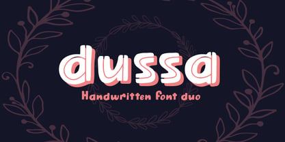 Dussa is a Handwritten summer font duo, make an amazing combination between Display and Regular style. Dussa is perfect for summer event, summer party, branding, logo, invitation, quotes, apparel design, product packaging, merchandise, game titles, cute style design, Book/Cover Title and more. What's Included : - Multilingual Support - Font Duo --- Hope you enjoy with our font! Attype Studio
 - Entuista by Azzam Ridhamalik,
$10.00 Introducing Entuista, a squary and chunky typeface with a touch of unique retro style. It has 2 style font, regular and oblique with extra Extruded Font version on each style. So you won't need extra effort for create an extrude effect for this fonts, that means it will save your precious time to make amazing stand out designs.
 - Penmanship by Essqué Productions,
$9.00 This font was designed with scholastic visuals in mind. Whether advertising for a school event, or creating handwriting worksheets for young children, this font covers all the basics with Latin alphabet languages. Three fonts with identical spacing to make interchangeable. Spacebar adds a regular space between words/sentences. To connect words with ledger lines, use the underscore (_).
 - Mogathe by Invasi Studio,
$16.00 Mogathe was inspired by the west life era. Mogathe is a slab serif font with a vintage western look and feel. Four varieties are available: Regular, Stamp, Spurs, and Spurs Stamp. The use of this font results in carefully-crafted styles. Mogathe font is ideal for branding projects or packaging that need a vintage western feel.
 - Big Wave by Vozzy,
$10.00 Introducing a vintage look label font named Big Wave. This font have a lot of additional characters and multilingual support (you can see them at the screenshot) and including 7 styles - Regular, Full, Shadow, Texture, Shadow FX, Texture FX and Outline. This font will good viewed on any retro design like poster, t-shirt, label, logo etc.
 - Brinton Signature by Aminmario Studio,
$20.00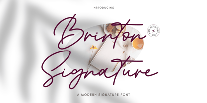 Introducing Brinton Signature Font Brinton Signature is a modern signature font. Its charm makes it appear wonderfully, readable, and, ultimately, incredibly versatile. Comes in Regular and Italic styles. This font will look outstanding in any context, whether it’s being used on busy backgrounds or as a standalone headline! Thank you for the purchase. Happy creating design :)
 - Pana Summer by Attype Studio,
$12.00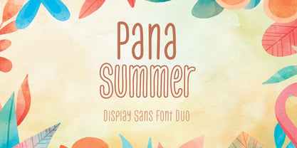 Pana Summer is a Display summer font duo, make an amazing combination between outline and regular style. Pana Summer is perfect for summer event, summer party, branding, logo, invitation, quotes, apparel design, product packaging, merchandise, game titles, cute style design, Book/Cover Title and more. What's Included : - Multilingual Support - Font Duo --- Hope you enjoy with our font! Attype Studio


