8,068 search results
(0.036 seconds)
- CartoGothic Std - 100% free

- Bergamo Std - 100% free

- Sure, let's dive into the imaginative world of a font named "Whatever." Imagine this font as the epitome of casual chic, the kind of lettering that doesn't fuss over the formalities of typography. It...
- Picture this: you've just stumbled upon a treasure trove of fonts, and there, gleaming in the midst of them all, is "More than Enough" by Kimberly Geswein. This font is like the cool breeze on a swel...
- Ah, "Derail," the font that decided to be the life of the graphic design party, where it loudly proclaims, "Who needs the straight and narrow path?". Imagine if a typeface had a rebellious teenage ph...
- Alright, picture this: Zekton Free, a font that looks like it moonlights as a futuristic secret agent. Designed by the font wizard Ray Larabie, this typeface isn't just another font in the crowd. Oh ...
- PykesPeakZero - 100% free

- Ultras Liberi - Unknown license

- Pea Jennifer - Unknown license

- FZ JAZZY 12 CRACKED - Unknown license

- Zombie Holocaust - Unknown license

- Swily Bright by Jolicia Type,
$19.00
- Angelin Love by Letterara,
$12.00
- ITC Newtext by ITC,
$40.99 - fancyPens by JOEBOB graphics,
$9.00
- ITC Usherwood by ITC,
$29.99
- Scrawlerz by Hanoded,
$15.00
- Designer by Artyway,
$12.00
- Nice Summer by Yoga Letter,
$16.00
- RM Opensans by Ray Meadows,
$19.00
- Foolish Hand by Sipanji21,
$10.00
- Techno Retro JNL by Jeff Levine,
$29.00
- Goldmint by Fridaytype,
$17.00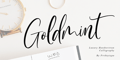
- Ovala SRF by Stella Roberts Fonts,
$25.00
- RM Slabb by Ray Meadows,
$19.00
- Painters Roman NF by Nick's Fonts,
$10.00
- Sundowners by PintassilgoPrints,
$29.00
- 1906 Fantasio by GLC,
$38.00
- Fontazia Mazzo by Deniart Systems,
$15.00
- OK Corral by FontMesa,
$20.00
- Easter Moment by AEN Creative Studio,
$15.00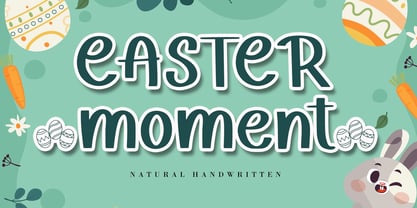
- Box Lunch JNL by Jeff Levine,
$29.00 - Thymesans by Chank,
$49.00 - Mevada SRF by Stella Roberts Fonts,
$25.00
- Kolkman by Ingrimayne Type,
$8.95
- Night Michy by Zeenesia Studio,
$16.00
- Zagora by CastleType,
$19.00
- Chunder by Chank,
$49.00 - Fela by Picador,
$24.00
- Bobbin Cyrllic by Typoforge Studio,
$25.00


