10,000 search results
(0.056 seconds)
- Expline Variable by Formatype Foundry,
$140.00 Expline typeface finds its roots in modernist design but subtly pays homage to early Modern Industrial Grotesks. This fusion creates a font that encapsulates the essence of tradition while embracing the contemporary. The font incorporates sharp details in select characters and curves, imparting a delicate sweetness while preserving the robust character associated with Grotesk fonts. This unique blend allows Expline to strike a perfect balance between display and text usage, making it a versatile choice for a variety of design projects. Expline's flexibility shines through its extensive weight options. The font family offers eight distinct weights, each thoughtfully crafted to establish a clear typographic hierarchy. Designers can easily choose the right weight to suit the specific needs of their projects, whether it's a bold headline or a refined body text. This variety ensures that your typography will always make the right visual impact. Expline typeface doesn't stop at weights. It provides expansive character sets across each weight, encompassing all Western European diacritics, Punctuation, Mathematics, and Numerics. This ensures that your typography will seamlessly support various languages and punctuation marks, making it a global choice. In addition, the font boasts OpenType features, granting the flexibility to explore multiple subsets. This includes alternate capital letterforms, tabular and lining numerals (both proportional and old-style), enabling endless typographic possibilities. Whether you're designing for print or web, these features allow you to fine-tune your typography for a perfect fit. Expline is a font that bridges the gap between modernist design principles and early industrial influences, resulting in a Neo-Grotesk font with a contemporary twist. Its comprehensive weight options, expansive character sets, and OpenType features make it a versatile choice for any medium between print and screen.
 - Expline by Formatype Foundry,
$39.00 Expline typeface finds its roots in modernist design but subtly pays homage to early Modern Industrial Grotesks. This fusion creates a font that encapsulates the essence of tradition while embracing the contemporary. The font incorporates sharp details in select characters and curves, imparting a delicate sweetness while preserving the robust character associated with grotesk fonts. This unique blend allows Expline to strike a perfect balance between display and text usage, making it a versatile choice for a variety of design projects. Expline's flexibility shines through its extensive weight options. The font family offers eight distinct weights, each thoughtfully crafted to establish a clear typographic hierarchy. Designers can easily choose the right weight to suit the specific needs of their projects, whether it's a bold headline or a refined body text. This variety ensures that your typography will always make the right visual impact. Expline typeface doesn't stop at weights. It provides expansive character sets across each weight, encompassing all Western European diacritics, Punctuation, Mathematics, and Numerics. This ensures that your typography will seamlessly support various languages and punctuation marks, making it a global choice. In addition, the font boasts OpenType features, granting the flexibility to explore multiple subsets. This includes alternate capital letterforms, tabular and lining numerals (both proportional and old-style), enabling endless typographic possibilities. Whether you're designing for print or web, these features allow you to fine-tune your typography for a perfect fit. Expline is a font that bridges the gap between modernist design principles and early industrial influences, resulting in a Neo-Grotesk font with a contemporary twist. Its comprehensive weight options, expansive character sets, and OpenType features make it a versatile choice for any medium between print and screen.
 - Sharp End by Asritype,
$18.00 Sharp End fonts support Latin Based Languages only (see Tech Specs). Sharp End's creation is inspired by Gothic sharpness shape but only applied to the ends of normal letters. Make the font look beautiful and elegant, look as semi-serif, as calligraphic touch or others. The base of the Capital Characters is set a little bit lower than the small cases/lowercases. On small/normal size typing, the difference is less visible (obscure), but will be more visible/more clear as the typing set larger. Thus, Sharp End fonts will work well for both text and display. The fonts has also character variants. The character variations (in PUA) set in 5 stylistic sets ss01 ... ss05 (see Sharp End opentype features poster). So, these character variations will be easier accessible in more common application such as MS Words, Text Edit or the others. The glyphs may also be accessed via Character Map, Character viewer, insert character, insert symbol or other similar tools. You can use Sharp End for most of typing and design means such as: greeting, invitation, wedding and other cards; books, magazines, news, banners, logos, Pamphlets, advertising etc., for printing or digital/web display. As addition, with 3 weight variants, the regular will fit for longer text for normal use, while the bold and semi-bold is more suited for the covers, impressions, titling, Logos, design or other usage. With its smoothness curve and sharp ends, Sharp End will pairs well to most fonts of various kinds: Sans Serif, Serif, Handwritten, Scripts and others. As the example in one poster, Sharp End is paired with Astonice and Apresia Script (ornamented script font, one of the richest letter variations and ornaments). Thank you for visiting. Again, thank you very much for downloading this awesome fonts.
 - ChefScript by Andinistas,
$79.95 Chef Script is an experimental font designed by Carlos Fabian Camargo G. Its fantasy design contains 1463 glyphs to compose words, phrases and short messages on small and large sizes. The idea was born in a sketchbook that was perfected again by hand and achieving "non-neutral drawings" on tracing paper. With bezier digitization the empty and full parts of letters appeared with soft and eloquent curves as calligraphic result produces optimal readability. Chef Script combines warmth and good humor running in countless design applications such as labels and base plates, covers, posters, movie titles, seals and any printed design that needs an unusual typographic tool. In that sense, Chef Script is influenced by Speedball lettering manual (1957), Ross F. George. The illustrative nature of "ChefScript-complete" does not look anything like the traditional type design hierarchies. Therefore offers 7 hierarchical resource groups to design comfortable contexts flavored with illustration and typography: • ChefScript-Basic: Letters with horizontal and vertical thrifty proportions mimic an uninterrupted calligraphy brush made with flat tip. Thus its letters have ascenders and descenders strokes perpendicular to its base line and equal to the height of the lowercase. • ChefScript-Swashes: Letters expressive and unique flourishes to design highlighted words or phrases. • ChefScript-Caps: Uppercase with lowercase height give the impression of interrupted uppercase italics writing within what is written with uninterrupted lowercase letters producing strong contrast within a paragraph fragment. • ChefScript-Containers: Container drawings designed to exchange with infinite possibilities each order so that its inferior serve to store information written or drawn. • ChefScript-Dingbats: Pictograms that communicate: kitchen, chef, restaurant, food, etc. • ChefScript-Numbers: Bulky and useful numbers to highlight prices or figures containing points or dollar signs. • Chef Script-Words: Predesigned words with uninterrupted letters diagonally leveled highlighting various thoughts in writing.
 - Solantra by Stephen Rapp,
$44.00 Solantra is a solidly crafted handwritten script. I’ve long felt that beautiful writing is more pleasing to the eye than the more attention grabbing swashes and flourishes. That being said, both have their role in design and Solantra has a large slice of each. Solantra combines vintage style handwriting with all its quirks and English Roundhand of that same era. The result is a solid setting script filled with charm and personality. With default Adobe Illustrator settings for Ligatures and Contextual Alternates active, the vintage charm is in full display. Want to add more flair? There are loads of more embellished letters inside the full version. Solantro takes into account how scripts are actually written so that connections from letter to letter are more fluid and rhythmic than the average script font. In natural script/handwriting most letters end at the bottom right and move up to connect with the next. Some letters like o, v, and w, however; end at the top right. Rather than force these letters to dip down and go back up they should ideally connect from that upper right point. This is accomplished through a series of alternate letters and ligatures with extensive contextual feature programming. So, for example, you might get one version of a ligature in the middle of a word and a different one at the beginning or end of that word. Solantra also takes into account another often overlooked feature of natural handwriting. When you write you inevitably pick your pen up from the paper at times. This is often just to reposition the hand, but in the days of writing with dip pens this was also needed to attain a fresh supply of ink. Having these occasional breaks in connections makes the writing less static and more rhythmic. While the Basic versions are limited to a standard character set and several ligatures and alternates for better settings of text, the full pro versions contains 1292 glyphs and an abundance of features. Even with numbers there are options like Oldstyle numbers, fractions, and ordinals. Central European language support is included as well as some select ligatures that use accents. To see more on the technical aspects and instructions on using Solantra, please check out the user’s guide in the Gallery section. **Note: The Pro versions of Solantra which do not have the word “Basic” attached to the title, have everything in them. So if you license a Pro version there is no need to get the Basic versions.
 - Conspired Lovers by Harald Geisler,
$39.00 Conspired Lovers is based on five years of love-letter writing. A font to capture the intentions of love letters more than any other font. How did the Project start? In the last five years I wrote love letters with two persons. I became used to the joy of handwriting with ink and nib on fine paper. Through practice a experimentation my style continuously refined. As life moves on, suddenly I found myself with no one to write love letters to. It's a luxury to have someone to write letters to. Missing the joy of writing and listening to Gregory Porter’s “Be Good”, the decision was made to take this 5 years of writing and make this dance on paper a font. A handwritten typeface for everyone to use. This font was created in July, 2012 and named Conspired Lovers. A font to capture and convey your message in a special way to the beloved one close to your heart. With a long practice of writing crafted into the unique design I hope that you and the recipient of your writing will soon enjoy this design. The Open-type version features 350+ glyphs including alternates and ligatures. All lowercase and most uppercase letters are connected, to create a realistic hand-writing-calligraphy on your creations. Conspired Lovers is international and supports a wide range of eastern european languages with accented letters to reach everyone in Sweden, France, Hungary and almost everywhere around the globe. A trailer for Conspired Lovers can be seen here: http://vimeo.com/haraldgeisler/conspired-lovers If you're looking for more heart related fonts also check out my other fonts.
 - Lippy Sans by Thinkdust,
$10.00 Lippy Sans is a brand new typeface designed to give a 100% lipstick feel. The reason the lipstick feel is so authentic is because the original sketches were actually drawn in lipstick, taken into illustrator, retraced and then edited carefully in fontlab. If you're after a lipstick typeface with an authentic feel, then Lippy Sans is the one for you.
 - Docklan by Gustav & Brun,
$10.00 The display font Docklan arose from experiments of candle-grease and black ink. Book covers, music festivals, wedding invitations or just an essay in school – Docklan will allow you to make a statement in any setting! The lowercases are miniatures of the upper-ones and it comes with a set of basic English/Latin letters and some west European diacritics.
 - Miyagi by Thinkdust,
$10.00 Miyagi brings the classic Yagi Link Double to the digital world, a modern form for a timeless typeface. Miyagi pays tribute to the decade it was created while pushing it into the boundaries of the future as well, a double image to match its double lines. Complex in design but easy to read, Miyagi embodies the stylistic ideas inherent in typeface design.
 - Fidelia Script by Melli Diete,
$59.00 Fidelia – OpenType-Pleasure and fun treasure. 3 options in each weight – All in one! Fidelia is a dynamic & modern headline script typeface. You can dive with her into the miracles of Open Type Waters, or simply use the glyphs palette of your layout program the choose between every variation. Fidelia has many alternate letters, ligatures, fleurons, ornaments & ampersands for typographic variety. Play!
 - Sidesakey by Aminmario Studio,
$20.00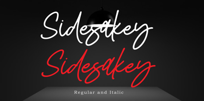 Sidesakey simplifies elegance into one truly stunning handwritten font. With its relaxed feel, Sidesakey is incredibly versatile, suitable to each of the design projects you may have in mind! Use it to create beautiful greeting cards, wedding invitations, logos, website titles and much more! Comes in Regular and Italic styles. Thank you for your purchase! Hope you enjoy with our font
 - Miso by Mårten Nettelbladt,
$- Miso was designed for architects' drawings. It’s a clean and narrow typeface suitable for small text but also for headlines and logos. The spacing of Miso follows the logic of mono-stroke fonts as found in CAD software. The starting point for this typeface was the lettering style of the International Organization for Standarization found in ISO 3098-0:1997.
 - Printa by Latinotype,
$19.00 It is inspired by mandalic structures. Its visual language is based on misregister and flaws in textiles printed by serigraph technique in the ’70s. This typeface allows you to combine two characters (front/uppercase; back/lowercase) into a single one to create print repeat patterns. This way you can get many different combinations. Printa is ideal for those who seek handmade designs.
 - Retail Establishment JNL by Jeff Levine,
$29.00 The 1935 catalog for Vitrolite (a brand of pigmented structural glass) featured artist renderings of how the glass could be applied to business exteriors. One of the lettering styles used in these examples was an Art Deco lower case. This design has been turned into a digital typeface called Retail Establishment JNL and is available in both regular and oblique versions.
 - Santa Mensch by Vic Fieger,
$1.99Let's say a San Francisco punk group used letters from a theatre marquee to create a flyer in 1979 for one of their shows. Then the flyer showed up in the background of a newspaper photograph, and the photo, twenty-five years later, was enlarged and the lettering on the flyer was turned into a font. Santa Mensch has arrived. - Brush With Death by Cyberian Khatru,
$20.00 This font was made possible by creating a custom brush in Illustrator. I started with a flat brush dipped in India ink to create the stroke. From a scan of that stroke I made a vector tracing which I then I altered as necessary to get the desired dimensions. The lower case letters have a thinner stroke than the capitals.
 - Loudine by PintassilgoPrints,
$19.00 Loudine is a striking decorative display typeface, great for posters, book covers and magazine headlines. It comes in two widths, each of them packed with a set of stylistic alternates: just turn on the feature in an OpenType savvy program to instantly get into a new mood, with filled counters and slightly different lettershapes. Be sure to play it loud!
 - Keybies by Aah Yes,
$0.35Keybies is a font that produces an octave of a piano keyboard, with several variations. Type K or k repeatedly into the textbox above to see. The complete instructions are provided in the download file. One use is to print it in grey and draw big black dots on the relevant keys for chord diagrams, to help children or beginners. - Grafiker by Hanoded,
$15.00 Grafiker means 'Graphic Designer' in German. This fat, colored, uneven font with a 1001 uses was loosely based on the work of designers Oskar Kokoschka (1886 - 1980) and Jean Carlu (1900 - 1997). The glyphs were hand-drawn with a 0.5 roller ball and colored in with Chinese ink, using a stiff brush. The result is a lively, rather unusual font.
 - Lined by Oscar Pastarus,
$18.00The Lined font started out with some scribbles - playing with lines and making shapes fold, underlap and overlap, eventually evolving into letters. This is a display/ornamental font and it was made in 2009, it's meant for decorative use and not in large bodies of text. For example it does well used as a headline font. It is proportionally spaced and uppercase only. - Boomerang JY by JY&A,
$39.00Based around the Australian boomerang, Greg Bastin’s design originally appeared on private Christmas cards and individual projects. It was formalized into a font in 2002 by David Philpott (JY Circles) and brings a quirky antipodean style to the JY&A Fonts range. This display family is available in Solid and Outline forms, the latter containing patterns that parody those of Aboriginal culture. - HWT Bon Air by Hamilton Wood Type Collection,
$24.95 Bon Air was one of a series of script typefaces cut into wood by the Hamilton Manufacturing Company for the Morgan Sign Machine Co. (makers of the Line-o-Scribe showcard press) in the mid 20th Century. These were some of the last new designs cut into wood by Hamilton until the museum revival in the early 2000s. Bon Air was created in 1958 and trademarked in 1961. The wood type made for Morgan was used largely in department stores to make their own signage. The script styles are reminiscent of sign painters alphabets and evoke a Mad Men era advertising aesthetic. The font was only cut in four sizes: 12, 18, 36 and 72 line. It was distributed by Morgan for use in their presses, but as type high wood type, it could be used on any press. The font was issued with several alternate letters and ligatures to simulate the effect of hand lettering. Its lively strokes and odd details give it an exotic flavor suitable for advertising display work. The digital version includes all of the original alternates plus new characters to fill out a full European character set.
 - RePublic by Suitcase Type Foundry,
$75.00In 1955 the Czech State Department of Culture, which was then in charge of all the publishing houses, organised a competition amongst printing houses and generally all book businesses for the design of a newspaper typeface. The motivation for this contest was obvious: the situation in the printing presses was appalling, with very little quality fonts existing and financial resources being too scarce to permit the purchase of type abroad. The conditions to be met by the typeface were strictly defined, and far more constrained than the ones applied to regular typefaces designed for books. A number of parameters needed to be considered, including the pressure of the printing presses and the quality of the thin newspaper ink that would have smothered any delicate strokes. Rough drafts of type designs for the competition were submitted by Vratislav Hejzl, Stanislav Marso, Frantisek Novak, Frantisek Panek, Jiri Petr, Jindrich Posekany, and the team of Stanislav Duda, Karel Misek and Josef Tyfa. The committee published its comments and corrections of the designs, and asked the designers to draw the final drafts. The winner was unambiguous — the members of the committee unanimously agreed to award Stanislav Marso’s design the first prize. His typeface was cast by Grafotechna (a state-owned enterprise) for setting with line-composing machines and also in larger sizes for hand-setting. Regular, bold, and bold condensed cuts were produced, and the face was named Public. In 2003 we decided to digitise the typeface. Drawings of the regular and italic cuts at the size of approximatively 3,5 cicero (43 pt) were used as templates for scanning. Those originals covered the complete set of caps except for the U, the lowercase, numerals, and sloped ampersand. The bold and condensed bold cuts were found in an original specimen book of the Rude Pravo newspaper printing press. These specimens included a dot, acute, colon, semicolon, hyphens, exclamation and question marks, asterisk, parentheses, square brackets, cross, section sign, and ampersand. After the regular cut was drafted, we began to modify it. All the uppercase letters were fine-tuned, the crossbar of the A was raised, E, F, and H were narrowed, L and R were significantly broadened, and the angle of the leg and arm of the K were adjusted. The vertex of the M now rests on the baseline, making the glyph broader. The apex of the N is narrower, resulting in a more regular glyph. The tail of Q was made more decorative; the uppercase S lost its implied serifs. The lowercase ascenders and descenders were slightly extended. Corrections on the lower case a were more significant, its waist being lowered in order to improve its colour and light. The top of the f was redrawn, the loop of lowercase g now has a squarer character. The diagonals of the lowercase k were harmonised with the uppercase K. The t has a more open and longer terminal, and the tail of the y matches its overall construction. Numerals are generally better proportioned. Italics have been thoroughly redrawn, and in general their slope is lessened by approximatively 2–3 degrees. The italic upper case is more consistent with the regular cut. Unlike the original, the tail of the K is not curved, and the Z is not calligraphic. The italic lower case is even further removed from the original. This concerns specifically the bottom finials of the c and e, the top of the f, the descender of the j, the serif of the k, a heavier ear on the r, a more open t, a broader v and w, a different x, and, again, a non-calligraphic z. Originally the bold cut conformed even more to the superellipse shape than the regular one, since all the glyphs had to be fitted to the same width. We have redrawn the bold cut to provide a better match with the regular. This means its shapes have become generally broader, also noticeably darker. Medium and Semibold weights were also interpolated, with a colour similar to the original bold cut. The condensed variants’ width is 85 percent of the original. The design of the Bold Condensed weights was optimised for the setting of headlines, while the lighter ones are suited for normal condensed settings. All the OpenType fonts include small caps, numerals, fractions, ligatures, and expert glyphs, conforming to the Suitcase Standard set. Over half a century of consistent quality ensures perfect legibility even in adverse printing conditions and on poor quality paper. RePublic is an exquisite newspaper and magazine type, which is equally well suited as a contemporary book face. - Blue Goblet Serif by insigne,
$6.99 Blue Goblet is a series of fonts and ornaments by Cory Godbey and Jeremy Dooley. This best selling series has now been extended to include a new member, Blue Goblet Serif. Blue Goblet Serif comes with a variety of weights and also an outline version. Blue Goblet is hand-lettered by the artist, Cory Godbey, and is organic, spontaneous and exuberant. Characters bounce and dance above and below the baseline and x-height, making this a whimsical and fun script. Not only is Blue Goblet Serif a excellent choice, it also is a member of a wide family of different fonts. You can use it side by side with the original Blue Goblet, and there are a wide range of ornaments available, totaling over 350 illustrations! These illustrations include frames, florals and other text ornaments that can be inserted into your text and resized at will. This makes the Blue Goblet series a great pick when you want a type system that works very well together for a very unique and consistent look. The Blue Goblet series continues to grow and be expanded, making it a valuable investment. Blue Goblet Serif also includes auto replacing ligatures that make it appear that the script was drawn by the artists own hand, just for you! Blue Goblet Serif also includes a wide variety of alternates that can be accessed in any OpenType enabled application. Blue Goblet includes over 150 OpenType glyphs, and is loaded with features including an even more unique alternate alphabet. Included are swash alternates, style sets, old style figures and small caps. Please see the informative PDF brochure to see these features in action. OpenType enabled applications such as the Adobe suite or Quark can take full advantage of the automatic replacing ligatures and alternates. This family also includes the glyphs to support a wide range of languages. Blue Goblet Serif is great choice for display and short blocks of display text, children's books, packaging, or other unique applications. Fill in the counter spaces with color for a unique look, or alternate the different weights. Use Blue Goblet whenever you want to inject a sense of fun and whimsy to your designs. Give the Blue Goblet series a try today!
 - Bethlehem Ephrath by HiH,
$10.00 One menorah that I have long found particularly appealing was named The Tree of Life Menorah, a replica of which I gave as a gift one holiday to a kindly old couple who were neighbors and became friends. It had a simple, organic elegance that I see in the best of Art Nouveau sculpture. To me personally, Judeism is a celebration of life, like the triumph of the flower that blossoms in the crack of the city sidewalk. Just as Hanukkah celebrates the rededication of the temple and the miracle of the oil, it celebrates the victorious quest for freedom of the Hebrew people led by Judah Maccabee. Hanukkah represents determination and courage and faith — and it represents the presence of God in the lives of His people. It is interesting to note that the founding of the Albanian nation in the early twentieth century grew out of the resistance of the Albanian people to the imposition of Greek language and culture in the aftermath of the dissolution of the Ottoman Empire. The typeface, HADASSAH, designed by Henri Friedlander (1904-1996), is my favorite Hebrew typeface. Thirty years in the crafting, I believe it is unsurpassed for its shear beauty, combining a subtle modulation of stroke with a simplicity and clarity of form. No doubt, that is why it has become so popular. For me, the Sîyn/Shîyn characters are especially satisfying. For a Hanukkah message in Hebrew, I would choose HADASSAH LIGHT for a headline and print it as large as I could. If, however, you are looking for a friendly, warm face for a seasonal message in a roman-letter based language, may I suggest BETHLEHEM EPHRATH. It will be as comfortable as a bulky, hand-knit sweater on a frosty afternoon and reflects the solid, encompassing, family orientation of this holiday. It was on the way to Ephrath that Jacob’s beloved wife Rachel gave birth to Benjamin and then died from her labor. It was to Ephrath that Naomi and Ruth returned and in Ephrath that we have the wonderful, heart-warming story of the marriage between Ruth and her Redeemer-Kinsman, Boaz. And it was to Ephrath that prophet, Samuel, went to find a new king and there in Ephrath that the prophet annointed a small shepherd boy named David. The Proverbs tell us to seek wisdom. Never underestimate the impact you have on others. Words of kindness can change people’s lives. The Talmud says that the highest form of wisdom is kindness. Be wise this holiday season. The font BETHLEHEM EPHRATH is based on the typeface Accent with the permission of URW++ of Hamburg, Germany. Like most display fonts, it is most effective at 18 points and larger. Like most script fonts, it is most effective when set with both upper and lower case. Although this font is readable in all caps (many scripts are not), that does not make it a good idea. Do so only with caution.
 - Times Europa Office by Linotype,
$50.99The Times Europa Office family is designed after the model of the original serif family produced by Walter Tracy and the Linotype Design Studio in 1974. A redesign of the classic Times New Roman typeface, Times Europa was created as its replacement for The Times of London newspaper. In contrast to Times New Roman, Times Europa has sturdier characters and more open counter spaces, which help maintain readability in rougher printing conditions. Times Europa drastically improved on the legibility of the bold and italic styles of Times New Roman. Overall, text set in Times Europa is easier to read, and quicker to digest. Akira Kobayashi, Linotype’s Type Director, brought Times Europa up to speed for the new millennium in 2006. Now optimized for office communication instead of newspaper design, Times Europa Office offers a familiar yet refreshingly new appearance for serif text. Because of The Times of London’s specific printing conditions in the early 1970s, Times Europa originally had some intentional errors built into its letterform design. These inconsistencies created an even image in newspaper text in the long run. However, these design elements bear no role on modern office communication and its needs. Kobayashi redrew these problem forms, eliminating them completely. Now Times Europa’s font weights appear clearer and easier to read than ever before. - Quire Sans by Monotype,
$155.99 My goal was to make a design that might fit in anywhere,” says Jim Ford about his Quire Sans™ typeface. “I wanted it to be highly functional and sexy at the same time.” With one foot comfortably in the realm of oldstyle design and traditional book typography, and the other in evolving electronic media, the Quire Sans family does, indeed, fit in just about anywhere. As for sexy, someone once quotably wrote, “A great figure or physique is nice, but it's self-confidence that makes someone really sexy.” Yes, Quire Sans is sexy, performing confidently in virtually any setting. 2014-06-26 00:00:00.000 57.9900 F43063-S193385 42831 Neue Frutiger World Monotype https://www.myfonts.com/collections/neue-frutiger-world-font-monotype-imaging https://cdn.myfonts.net/cdn-cgi/image/width=417,height=208,fit=contain,format=auto/images/pim/10000/279026_ed8c8093fe1ac59ebe9e3ee1d9262c8e.png Neue Frutiger World is designed for global use with an impressive range of 10 weights, from Ultra Light to Extra Black, with matching italics. It embodies the same warmth and clarity as Adrian Frutiger’s original design, but allows brands to maintain their visual identity, and communicate with a consistent tone of voice, regardless of the language. Neue Frutiger World supports more than 150 languages and scripts including Latin, Greek, Cyrillic, Georgian, Armenian, Hebrew, Arabic, Thai and Vietnamese. “Before Neue Frutiger World it was not an easy task for western brands to find families in Arabic, Hebrew, Thai and Vietnamese which match with their Latin,” says Monotype type director Akira Kobayashi, who led the Neue Frutiger World project. “They may find a type with closer expression, but there was no guarantee if the bold version in the non-Latin family matches the bold in their Latin. Neue Frutiger World offers a better solution.” In addition to Neue Frutiger World’s linguistic versatility, it works hard across environments – suited to branding and corporate identity, advertising, signage, wayfinding, print, and digital environments. The Neue Frutiger World fonts can be paired with Monotype’s CJK fonts: M XiangHe Hei (Chinese), Tazugane Gothic (Japanese), Tazugane Info (Japanese), and Seol Sans (Korean). These were all designed to address brands’ needs to expand into Asian cultures and solve for global typographic challenges.
 - Longtype by Luxfont,
$18.00 Introducing original Longtype font family. Elongated in height and fully balanced in width. This font looks unusual and evokes a flight of imagination. Typeface in combination with the simplest graphic design techniques instantly turns into a modern object that attracts attention. Use it in short texts or headlines, add some color to enhance the effect. Fits well with modern minimal abstract design. Longtype is a stand-alone typeface that can be the centerpiece of a cover. And 3 types of thickness included in the family will give more freedom for creativity. Features: Elongated form 6 fonts in family: - Thin, Thin Italic - Regular, Italic - Bold, Bold Italic Kerning ld.luxfont@gmail.com
 - Moreske 2D by 2D Typo,
$36.00 The name Moreske, Maureske, Morisca, Morisco comes from Spanish “Mauritanian”. This ornament is based on the greenery motif with strongly stylized stems and leaves fancifully interlacing. Such ornaments were widely used in the 16th century in various decorations from architecture to household goods, and book covers in particular. The font contains high quality vector graphics with elaborate attention to details. This collection consists of friezes (borders) and closed compositions in the shape of circles, squares, rectangles and triangles that can be organized into repeats (patterns). Morseke 2D can be easily used not only in a traditional approach, but also in grunge stylistics enriching your compositions.
 - TG Glifko by Tegami Type,
$30.00 TG Glifko is a new contemporary sans-serif grotesque typeface with a combination of large and small aperture, make Glifko feel quirky, dynamic, and unusual. TG Glifko works excellent for display applications and still looks gorgeous in small size. It comes in seven different weights, from ultra-light to extra black, and matches with italic. They also supported various OpenType features, like stylistic alternates, case-sensitive forms, numerators, denominators, superscripts, subscripts, fraction, and multilingual support, coverage more than 200 languages. We are pleased to see our typefaces used by many people. If you are one of them who use our typefaces in your project, feel free to send some in-use sample images to us at info@tegamitype.com. We may upload them on our social media and our website www.tegamitype.com If you have any question or concerns regarding our products, please send us an email at info@tegamitype.com
 - Edgewater by cm5dzyne,
$16.00Initially created for use in a logo and with a limited number of characters, Edgewater evolved into a full typeface suitable for everything from projects requiring a space-age, futuristic feel to logotype for the most refined, conservative corporations. Edgewater was joined in November, 2008, by Edgewater Hairline, which supports more than 30 languages and is especially attractive in larger point sizes. The hairline version also is a nice complement to the other fonts in the Edgewater series, though still striking enough to stand on its own as the dominant visual in a virtually unlimited number of displays. Timeless, unique and flexible. - Elongated Roman by Red Rooster Collection,
$45.00 Elongated Roman is a Didone-style serif typeface. It was originally designed in 1950 by typographers at Stephenson Blake. After International TypeFounders, Inc. acquired exclusive licensing rights to the Stephenson Blake Collection, Steve Jackaman (ITF) digitally revived the typeface in 1997 for the Red Rooster Collection. Much like other Didone typefaces, Elongated Roman’s strong contrast between thick and thin strokes and hairline serif design strengthen its elegance as a “modern face.” Unlike other Didone typefaces in the Red Rooster Collection, Elongated Roman was designed with display size in mind thanks to its strong variance in stroke weight.
 - Gelato Script by Eclectotype,
$40.00 The original Gelato Script has been updated and improved, not once, but twice. This version is kept here for legacy and compatibility issues, but I would encourage new users to check out Gelato Luxe or Gelato Fresco instead. Gelato Script is a smooth-flowing typeface with an air of familiarity. Influenced by both formal scripts and mid-Twentieth Century hand lettering. The power of OpenType is used with precision in the Contextual Alternate feature to make sure letters connect seamlessly, t’s cross where they can and swashes don't crash into neighboring glyphs. 781 glyphs make up this font, which is capable of speaking in many different languages. Alternate forms are grouped into stylistic sets to make it easy to change the mood of the text. For example, ss01 makes droopable letters drop below the baseline to break it up a little if required. I recommend using it sparingly, one glyph at a time, but if you do enable it for a whole chunk of text, the clever OpenType programming ensures that it doesn't go overboard. Sets 2, 3 and 4 bring about alternate forms of S, s, B and Q. Set 5 changes AE and OE to some perhaps controversial Upper/lowercase ligatures. Engage ss06 for the underline feature. After a word, simply type two or more underscores and a line extends backwards under the word you just typed. Don't worry if you have to break for a descender, the OpenType programming will take care of making sure it connects properly to the preceding character. Sets 7 and 8 are for alternate ampersands, and ss09 swaps the script r for a regular shaped r. There are swash capitals available for most uppercase letters, and the OpenType programming makes sure there is room for them under or over the following letters. There’s also a good amount of ligatures thrown in. The localised forms feature can be set for Polish, where acutes get steeper and lslash takes on its script form; Dutch, where IJ and ij digraphs become cool ligatured combinations; and Romanian and Moldovan, where cedillas are subsituted for comma accents. The stylistic alternates feature groups together a few of the stylistic sets for users that can't get to them directly. Gelato Script is a highly usable, powerful typeface. Perfect for everything from food packaging to wedding invitations, sports team logos to magazine headings. Use it however you see fit. Just one thing - it’s not designed for all-caps settings, so avoid that at all costs!
 - Qualitype by Bülent Yüksel,
$19.00 QUALITYPE + VARIABLE FONT FAMILY "QualiTYPE" font extends its use by providing weights from "Thin" to "Black". Natural curves, ridges, and curved bodies grow in character as the font gains weight. "Qualitype" is an exciting serif font with contemporary twists. It has a distinctive sound that preserves the simplicity and elegance of classic "serif" fonts with a fresh, stylish rework. Her personality is bold and fills the space without shouting, she looks elegant and confident. The low X-height provides a great amount of visibility at all weights and is optically corrected for better readability. In the process of working on "Qualitype" we wanted to expand the functionality of the typeface a bit more, so after a few tries two different fonts were born: "Old", "Neo" and "italics" versions. "Qualitype" is perfect for use in magazines, in the fashion industry, in the branding of premium goods and services. "Qualitype" is quite versatile and suitable for use both in headings and in text arrays. In addition, we have done manual hinting in the typeface, and now it can be used with a clear conscience in the web and applications. “Quality” typeface consists of 56 styles: 2 style, 2 Shining, 7 weights and italics. Each typeface style consists of 860+ glyphs (except for the decoratives). “Qualitype” supports over 80+ languages. A variant version of the basic styles has been prepared for the most demanding users. Using the variability slider, you can adjust and select the individual thickness regardless of the current weight distribution. An important clarification - not all programs support variable technologies yet, you can check the support status here: https://v-fonts.com/support/. OPENTYPE FEATURES aalt, dnom, onum, pnum, tnum, lnum, numr, frac, zero, sing, sups, subs, case, c2sc, smack, salt, hist, titl, holing, dig, liga, ss01, ss02, ss03, ss04, ss05, ss06, ss07, ss08, ss09, ss10, kern FEATURE SUMMARY: - 4 Axes: 2 Style: Old and Neo. 7 weights: Thin, Light, Book, Regular, Medium, Bold and Black. 2 Shining: Dark and Lamp. Matching italics (12º) for all weights and style . - Matching small caps for all weights and widths. - Lining and old style figures (proportional and tabular). - Alternate characters (a, d, g, m, n, p, q, r, u, y). - Unlimeted fractions. - 24 Dingbats. - Extended language support. - Extended currency support. You can contact me at buyuksel@hotmail.com, pre-purchase and post-purchase with questions and for technical support. You can enjoy using it.
 - VTC-KomikaHeadLinerChewdUp - Personal use only

- Mellnik Text by ParaType,
$25.00Mellnik is a sans serif of humanist style (in a way) that was developed by Oleg Karpinsky and released by ParaType in 2006. The type family contains 9 styles with a number of alternate characters in each ones. For use as a text font in long text passages of advertising booklets, catalogues or magazines, as well as for accident setting. Mellnik may be also applied as a corporate typeface. Giant ink traps (or something like that) produce an original image of the family. Five condensed styles were added in 2007 by the same designer. Mellnik Text in 12 styles (added in 2008) has more narrow proportions and it is rather appropriate for text setting. - The Zig Zag ML font, crafted by the designer known as koeiekat, is an intriguing typeface that captures attention with its distinctive style. The word "Zig Zag" in its name already hints at the angul...
- Benton Sans Std by Font Bureau,
$40.00 In 1903, faced with the welter of sanserif typefaces offered by ATF, Morris Fuller Benton designed News Gothic, which became a 20th-century standard. In 1995 Tobias Frere-Jones studied drawings in the Smithsonian and started a redesign. Cyrus Highsmith reviewed News Gothic, and with the Font Bureau studio expanded it into Benton Sans, a far-reaching new series, with matched weights and widths, offering performance well beyond the limits of the original; FB 1995-2012
 - Tomate by Re-Type,
$45.00 Tomate started in 2006 as a brush lettering exercise for a poster and was later used for the ReType identity. In 2008 its author decided to turn it into a super fat typeface suitable for packaging and mass consumption products. The possibilities of ultra heavy forms are explored in this alphabet; trying to solve the design problems that these sort of forms present. Tomate shows influences from the beautiful Goudy Heavyface Italic which is a design the author admires.
 - BAQ Rounded by Thinkdust,
$10.00 BAQ Rounded sets itself up as a simplistic and blocky font, but it hides a deeper form. With indents in all the right places, this font creates a double image in our mind, of the form we see and the form we know, letters that bulge into blobs and letters that are easy to follow. This double image results in a casual, over the top yet easy to read font designed for relaxing and carefree messages.
