10,000 search results
(0.032 seconds)
- Tall Order JNL by Jeff Levine,
$29.00 The condensed style and square character shapes of a vintage typeface originally known as Raleigh has been re-interpreted by Jeff Levine Fonts as Tall Order JNL. There is an alternate A, K, M, N and S on the respective lower case keys.
 - Pinot Grigio Modern by Alan Meeks,
$45.00 A modern update of the unique sans display font Peignot originally designed in 1937 by A. M. Cassandre. The font has been modernised by making all the terminals soft and making a larger x height and lessening the contrast between thick and thin.
 - Kyrial Sans Pro by Mostardesign,
$- Designed in 2011 by Olivier Gourvat, this font family has generous proportions with a range of weights make it a versatile family for print, text, signage, branding and web design work. Kyrial Sans Pro offers lots of OpenType goodness and broad language support.
 - Stainless by Gassstype,
$27.00 Here comes a New Font,Introducing Stainless is a Race Theme Display Font.This Handmade Display Font with a stylish touch inspired by the famous minimalist logo . Stainless has is perfect for the purposes of designing templates, brochures, videos, advertising branding, logos and more.
 - Kasdio by Din Studio,
$29.00 Kasdio is a casual brush font. Made for any professional project branding. Every letter has a unique and beautiful touch. Includes: Kasdio (OTF) Features: Beautiful Ligatures PUA Encoded Multilingual Support Numerals and Punctuation Thank you for downloading premium fonts from DIn Studio
 - LTC Glamour by Lanston Type Co.,
$24.95 Glamour was originally released by Lanston Monotype in 1948. It is based on Corvinus designed by Imre Reiner. P22 Designer Colin Kahn has added some unusual variants to this family illustrating that Glamour can be taken too far and have somewhat unglamorous results.
 - Trade Printer JNL by Jeff Levine,
$29.00Trade Printer JNL is another font design inspired by an old rubber stamp sign printing set. In this case, the lettering has a classic "wood type" look, reminiscent of the letterheads, billheads and fliers made by local printers of the 1880s-1920s. - Esenka by Differentialtype,
$10.00 Esenka is a family sans that comes with 9 weights, 9 italics and 2 outlines. Esenka has an expanded uppercase alternate, with a choice of 2x and 3x width options. Esenka is PUA encoded which mean you can access alternate with ease.
 - Thunderhouse by Aerotype,
$29.00 A tasty jambalaya of two different weights of wood type, Thunderhouse has alternates for every capital and lowercase letter, consecutive characters are controlled with the OpenType Ligature feature. Thunderhouse Pro extends the character set to support Eastern European Latin, Baltic, Greek and Turkish.
 - Sanger phet by Zaki Creative,
$10.00 Sanger Phet is a soft and sweet calligraphic typeface, with characters dancing along the baseline. It has a casual and elegant touch. Can be used for various purposes such as logos, wedding invitations, headings, t-shirts, letterheads, signage, labels, news, posters, badges etc.
 - Catthy Wellingten by Stringlabs Creative Studio,
$29.00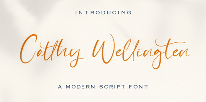 The Catthy Wellingten is a modern script font. It has a playful and feminine look, which is great for wedding invitations and anniversaries, blogs and logos. Catthy Wellingten is a handwritten font, described by an elegant touch, perfect for your favorite projects.
 - Frykas by Edyta Demurat,
$24.00 Frykas is warm and friendly, hand-drawn font. It has a simple form with subtle irregularities, but no swashes or ornaments. This condensed font family with five styles will be a great solution for posters, titles, short sentences or whenever you need impact.
 - Crypto Scam by Gassstype,
$29.00 Here comes a New Font,Introducing Crypto Scam is Modern Typeface with a Textured inspired by the famous minimalist logo and Blocking has 2 Regular and Stencil styles is perfect for the purposes of designing templates, brochures, videos, advertising branding, logos and more.
 - People Dingbat by Beewest Studio,
$30.00 People Dingbats Font is high quality dingbats font. Whether you’re using it for crafts, digital design, fashion design, presentations, book cover, magaizine or making greeting cards, this font has the potential to become your favorite go-to font, no matter the occasion!.
 - Carltine by Muksal Creatives,
$10.00 Carltine is a unique and modern family of Sans serif fonts. Simply Conception has 18 families Regular and italic font, starting from the small thin to the largest black. This typeface is versatile and can be used successfully in magazines, posters, branding, websites.
 - Mafond by Etewut,
$25.00 Mafond is a fresh slab serif. It supports all european languages. The family is rounded as never before and includes 5 styles. Each of them has alternates for basic latin and a couple of ligatures. In case of success Mafond becomes Yofond.
 - TT Ricordi by TypeType,
$49.00 TT Ricordi useful links: Specimen | Graphic presentation | Customization options The TT Ricordi font family is a collection of three display heading serifs designed to significantly diversify the traditional font palette. Each font from the TT Ricordi family was drawn by a separate designer and has its own story. With that, all three fonts are close in thickness and similar in their character compositions and are featured in the uppercase set and the small capitals set, which replaces lowercase characters. The fonts have the broad support of Latin languages and support basic Cyrillic. The project originates from the pre-coronavirus tourist trips to Italy, during which our art director Yulia Gonina has accumulated many photographs of historical inscriptions and tablets. Many of these inscriptions had interesting character or unusual character shapes. We wanted to work with them, to try to reinterpret them, and, if possible, make them ultramodern and accessible to the modern font user. The fonts from the TT Ricordi typeface turned out to be quite display and contemporary, but at the same time, they retained subtle references to historic inscriptions. The fonts fit perfectly both on the covers of book classics and in glossy magazine layouts. They can also be used in posters and packaging, or as the main expressive element of company branding. In addition, all three serifs from the TT Ricordi font family go well with functional sans-serifs such as TT Norms Pro or TT Commons. TT Ricordi Nobili is a display serif with a rich Roman ancestry and contemporary world views. It stands out from the crowd with its subtlety and elegance. The font was drawn by Anna Tikhonova and was inspired by an inscription carved into the stone floor of a cathedral in Florence. Because people walked over the inscription, some of the letters got thinner and worn out over time. It is this feeling of disappearing or flickering elements that we wanted to capture and implement in the project. The TT Ricordi Nobili has high contrast, even though the font itself is quite thin. The serifs in the font are not massive at all, but at the same time, they are display serifs. There is a certain tension in TT Ricordi Nobili, and the viewer perceives this tension. We can say that behind the external classic facade lies a rather modern plot. The font has a large set of discrete ligatures which allow to create interesting combinations and expand the capabilities of the font. There are 709 glyphs in the TT Ricordi Nobili font, and a whole set of useful features, such as: aalt, ccmp, locl, numr, ordn, tnum, pnum, case, dlig, ss01, ss02, ss06, ss07, ss08, ss09, ss10, calt. TT Ricordi Todi is a wide serif with a classic base and a contemporary nature. The font turned out to be refined yet sharp, and in places even pushy and aggressive. The font was drawn by Yulia Gonina, and the project was based on plaques with engraved street names from the small Italian town of Todi. The main challenge was to decipher the characteristic features of the signs and emphasize them in a modern way. In addition, it was necessary to draw a Cyrillic alphabet that would not be inferior to the Latin alphabet in its expressiveness. The TT Ricordi Todi has fairly wide character proportions, and there is practically no contrast in them. The main feature of the font is the combination of smooth round shapes with deliberately squared shapes. In addition, the font is characterized by crisp and sharp character details, exaggerated ascenders and descenders, and muted contrast. Among the interesting font peculiarities, you can choose between the characteristic long descenders and ascenders and their more tempered versions, you can find a stylistic set with triangular dots, alternative versions of the EF characters and two letter ? shapes, round and squared. There are 876 glyphs in the TT Ricordi Todi font, and a whole set of useful features, such as: aalt, ccmp, locl, numr, ordn, tnum, pnum, case, dlig, salt, ss01, ss02, ss03, ss04, ss05, ss06, ss07, ss08, ss09, ss10, calt. TT Ricordi Fulmini is a fashionable contemporary serif firmly holding on to its historic roots. The font turned out to be like a thistle flower: bright and catchy, but still subtle and delicate. TT Ricordi Fulmini was drawn by Marina Khodak, and the initial inspiration for the project was the inscription on the altar from the National Gallery of Umbria in Perugia. As the font was pulled into “contemporaneity”, it was completely transformed and revealed its new side. The main catchy detail in the TT Ricordi Fulmini is the aggressive and rather sharp diagonal serifs. In addition, in the process of working on the font, several graphic solutions emerged, for example, the mono-serifs and the very calligraphic connections of diagonal strokes with their historic spirit. We wanted to keep them, and thus 4 thematic stylistic sets appeared in the font, thanks to which we can greatly change the perception of TT Ricordi Fulmini. In addition, the font has a set of interesting discrete ligatures. There are 793 glyphs in the TT Ricordi Fulmini font, and a whole set of useful features, such as: aalt, ccmp, locl, numr, ordn, tnum, pnum, case, dlig, ss01, ss02, ss03, ss04, ss05, ss06, ss07, ss08, ss09, ss10, calt. TT Ricordi supports more than 180+ languages, such as: Acehnese, Afar, Albanian+, Aleut (lat), Alsatian, Aragonese, Arumanian+, Asu, Aymara, Azerbaijani +, Banjar, Basque +, Belarusian (lat), Bemba, Bena, Betawi, Bislama+, Boholano+, Chamorro+, Chichewa, Chiga, Colognian+, Cornish, Corsican +, Cree, Croatian, Czech+, Danish, Dutch+, Embu, English+, Esperanto, Estonian+, Faroese+, Fijian, Filipino+, Finnish, French, Frisian, Friulian+, Gaelic, Gagauz (lat), Galician+, Ganda, German+, Gusii, Haitianm, Creole, Hawaiian, Hiri Motu, Hungarian+, Icelandic+, Ilocano, Indonesian+, Innu-aimun, Interlingua, Irish, Italian+, Javanese, Jola-Fonyi, Judaeo-Spanish, Kabuverdianu, Kalenjin, Karachay-Balkar (lat), Karaim (lat), Karakalpak (lat), Karelian, Kashubian, Kazakh (lat), Khasi, Kinyarwanda, Kirundi, Kongo, Kurdish (lat), Ladin, Latvian, Leonese, Lithuanian, Livvi-Karelian, Luba-Kasai, Ludic, Luganda+, Luo, Luxembourgish+, Luyia, Machame, Makhuwa-Meetto, Makonde, Malagasy, Malay+, Maltese, Manx, Maori, Marshallese, Mauritian Creole, Minangkabau+, Moldavian (lat), Montenegrin (lat), Morisyen, Nahuatl, Nauruan, Ndebele, Nias, Norwegian, Nyankole, Occitan, Oromo, Palauan, Polish+, Portuguese+, Quechua+, Rheto-Romance, Rohingya, Romanian +, Romansh+, Rombo, Rundi, Rwa, Salar, Samburu, Samoan, Sango, Sangu, Sasak, Scots, Sena, Serbian (lat)+, Seychellois Creole, Shambala, Shona, Silesian, Slovak+, Slovenian+, Soga, Somali, Sorbian, Sotho+, Spanish+, Sundanese, Swahili, Swazi, Swedish+, Swiss German +, Tagalog+, Tahitian, Taita, Talysh (lat), Tatar+, Teso, Tetum, Tok Pisin, Tongan+, Tsakhur (Azerbaijan), Tsonga, Tswana +, Turkish+, Turkmen (lat), Uyghur, Valencian+, Vastese, Vepsian, Volapük, Võro, Vunjo, Walloon, Welsh+, Wolof, Xhosa, Zaza, Zulu+, Belarusian (cyr), Bosnian (cyr), Bulgarian (cyr), Erzya, Karachay-Balkar (cyr), Khvarshi, Kumyk, Macedonian+, Montenegrin (cyr), Mordvin-moksha, Nogai, Russian+, Rusyn, Serbian (cyr)+, Ukrainian.
 - Aramis - Unknown license

- Phinney Jenson by HiH,
$12.00 Phinney Jenson ML is a font with deep historical roots firmly planted in the fertile soil of the Italian Renaissance. Twenty years after Lorenzo Ghiberti finished his famous East Doors, the Gates of Paradise, of Santa Maria del Fiore in Florence and about fifteen years before Sandro Botticelli painted his “Birth of Venus,” a French printer by the name of Nicolas Jenson set up a small print shop in the powerful city-state of Venice. The fifteenth century marked the end of the plague and the rise of Venetian power, as the merchants of Venice controlled the lucrative trade of the eastern Mediterranean and sent their ships as far as London and even the Baltic. In 1470, Jenson introduced his Roman type with the printing of De Praeparatio Evangelica by Eusebuis. He continued to use his type for over 150 editions until he died in 1480. In 1890 a leader of the Arts & Crafts movement in England named William Morris founded Kelmscott Press. He was an admirer of Jenson’s Roman and drew his own somewhat darker version called GOLDEN, which he used for the hand-printing of limited editions on homemade paper, initiating the revival of fine printing in England. Morris' efforts came to the attention of Joseph Warren Phinney, manager of the Dickinson Type Foundry of Boston. Phinney requested permission to issue a commercial version, but Morris was philosophically opposed and flatly refused. So Phinney designed a commercial variation of Golden type and released it in 1893 as Jenson Oldstyle. Phinney Jenson is our version of Phinney’s version of Morris' version of Nicolas Jenson’s Roman. We selected a view of the Piazza San Marco in Venice for our gallery illustration of Phinney Jenson ML because most of the principal buildings on the Piazza were already standing when Jenson arrived in Vienna in 1470. The original Campanile was completed in 1173 (the 1912 replacement is partially visible on the left). The Basilica di San Marco was substantially complete by 1300. The Doge’s Palace (not in the photo, but next to the Basilica) was substantially complete by 1450. Even the Torre dell'Orologio (Clock Tower) may have been completed by 1470—certainly by 1500. Phinney Jenson ML has a "rough-and-ready" strength, suitable for headlines and short blocks of text. We have sought to preserve some of the crudeness of the nineteenth-century original. For comparison, see the more refined Centaur, Bruce Rogers's interpretation of Jenson Roman. Phinney Jenson ML has a strong presence that will help your documents stand out from the Times New Roman blizzard that threatens to cover us all. Phinney Jenson ML Features: 1. Glyphs for the 1252 Western Europe, 1250 Central Europe, the 1252 Turkish and the 1257 Baltic Code Pages. Accented glyphs for Cornish and Old Gaelic. Total of 393 glyphs. 400 kerning pairs. 2. OpenType GSUB layout features: onum, pnum, salt, liga, dlig, hisy and ornm. 3. Tabular (std), proportional (opt) & old-style numbers (opt). 5. CcNnOoSsZz-kreska available (salt).
 - Salma Pro by Alifinart Studio,
$- Introducing Salma Pro, a modern and sleek sans-serif font that boasts a new design and a strong character. As the successor of the previous version (Salma Alfasans), Salma Pro is an extended version that offers an abundance of features, good legibility, and a wide range of styles, making it perfect for any project. Crafted with great passion and conscientiousness, Salma Pro's unique design is a work of art. You will see beautiful details in every letter, making it perfect for branding, logos, and other design projects. Whether you're using it for headlines or body text, Salma Pro's good legibility ensures that it looks great at any size. Why you need Salma Pro in your font collection: Versatility: With 1400+ glyphs and three different widths to choose from, Salma Pro offers a wide range of styles and features, making it the perfect choice for any project. Reliability: This font is designed specifically for professional designers and offers superior functionality and quality. You can trust Salma Pro to deliver consistent and high-quality results. Unique Design: Salma Pro has a unique and authentic design that will make your work stand out. It's perfect for branding, logos, and other design projects. Good legibility: The font is designed to be highly legible, both at large and small sizes, making it a great choice for both headlines and body text. Language support: Salma Pro supports Latin Extended, Cyrillic, and Greek languages, making it a great choice for projects with a global audience. Multipurpose: It can be used for various purposes such as branding project, logo or logotype, promotion, e-pub, website, mobile app, and many more. Time-saving: With its abundance of features and styles, Salma Pro will save you time and make your job easier. Compatibility: Salma Pro is very compatible when used as a logo and branding projects. Because it has beautiful and authentic details. Passion and conscientiousness: Salma Pro is created with great passion and conscientiousness, giving you the best design result. In conclusion, Salma Pro is a must-have font for professional designers. Its versatility, reliability, unique design, and wide range of features make it an essential tool for any designer. Don't wait any longer, get your hands on Salma Pro now and elevate your design work. Upgrade your font collection today and experience the versatility and power of Salma Pro. Features: Small capitals Tabular and proportional lining figures Tabular and proportional oldstyle figures Scientific inferior and superior characters Numerator, denominator, and fraction characters Circled and squared numbers Standard and discretionary ligatures Arrows, triangles, squares, and circles symbols 16 stylistic sets Contextual alternates Slashed zero And many more advanced typography features. Language Support: Salma Pro supports Latin Extended (including Vietnamese), Cyrillic, and Greek. Suggested Uses: Salma Pro is ideal for branding projects, logos and logotypes, promotions, e-books, websites, mobile applications, and more. This versatile font can be used in a wide range of projects to elevate your designs and make your work stand out. ------ Alifinart Studio alifinart@gmail.com alifinart.com Instagram | Behance
 - FF Pastoral by FontFont,
$50.99 A sturdy workhorse with the grace of a gazelle, the FF Pastoral typeface family marries pure craftsmanship with rapturous excesses of form. With his fifteenth release under the FontFont brand, prolific French designer Xavier Dupré has filled a typographic toolbox with plentiful options ranging from a tender, feathery Thin to a robust, healthy Black. At a glance, FF Pastoral appears deceptively simple, particularly in the middle weights. That surface serenity is intentional and allows for easy reading and quick comprehension of short blocks of copy. Upon closer inspection, FF Pastoral is complex and nuanced, carrying a balanced tension in its forms. This plays particularly well in magazine spreads and corporate logos, where uniqueness is a virtue. In creating his latest design, Dupré drew inspiration from a tasteful mix of references, combining diverse elements with a deft hand. While its letter shapes were informed by humanist-geometric hybrid Gill Sans, FF Pastoral’s proportions have been optimized for contemporary typography. Slightly condensed but generously spaced, FF Pastoral features a tall x-height, open counters, and subtle, sprightly italics slanted at just 5°. Proportional oldstyle figures are the default in the family, with tabular and lining numbers and fractions accessible through OpenType features. Elegant details evocative of calligraphy judiciously pepper the FF Pastoral glyph set. The ‘e’ bears an oblique crossbar, while the right leg of the ‘K’ and the ‘R’ are insouciantly curved in both the upright and italic variants. Further flourishes appear throughout the italics, notably in the ‘T’ and the ‘Z’, the gloriously looped tail of the ‘G’, and an extraordinary ampersand. Sharp-eyed fans of Dupré’s work may feel like they’re in familiar territory, and they would be right. An early version of FF Pastoral sprang to life in 2017 as Malis, a family in four weights on the heavier side of the spectrum. Over time, Dupré refined his original design, expanding it with four lighter styles and including true italics for all. The lightest weights are ethereal, with exquisitely delicate strokes drawing the eye in and across a line of type. The most substantial styles are tremendous in their power, allowing text to make a deep impression in print or on screen. Fully fleshed out, FF Pastoral works sublimely in a vast array of text and display settings. Dupré sees his latest FontFont offering as a ‘cultural’ typeface, perfect for the pages of an oversized coffee-table book or business communications where warmth and informality will win the day. Born in Aubenas, France (1977), Xavier Dupré is a gifted user of type as well as an award-winning type designer and lettering artist. After training in graphic design in Paris, Dupré studied calligraphy and typography at the Scriptorium de Toulouse. Since releasing FF Parango in 2001, Dupré has published such FontFont classics as the FF Absara and FF Sanuk superfamilies, FF Megano, FF Tartine, and FF Yoga. A designer of Khmer fonts as well as Latin typefaces, Dupré splits his time between Europe and Asia.
 - Tokyo Olive by Dharma Type,
$14.99 Tokyo Olive was designed as an homage to nostalgic display types and advertisements in the mid-late 80s. The mid-late 80s was the era of the post-modernism and fancy-decorative design especially in Japan In other words, it was the mixture of superficial form-operation and girly taste. This curious design movement vanished without a trace in the 90s, but it had its moments. Tokyo Olive has voluminous and simple geometric skeleton (for post-modern) with rounded and craft-style stencil joints (for fancy decoration). We added a classic open style as a little spice. The mixture of those essences makes new impression we have never seen before. Tokyo Olive family consists of 5 styles for stacking color font. Please use Photoshop or Illustrator, or your favorite graphic design apps that can handle layers. Layers are the printing plates of wood type. You should be able to change text color for each layer. Tokyo Olive "Standard" style is the base of this font family. You can add open effect by stacking "Fill" layers over the Standard layer. Instruction 1. Type your text as you like. 2. Set font-name "Tokyo Olive" and font-style "Standard". 3. Set color of "Standard" layer. 4. Duplicate the "Standard" layer to make "Fill" layer. 5. Set font-style "Half Fill" or "Full Fill" and new color of upper layer. Tokyo Olive Standard, Half Open, and Full Open style can be used solely.
 - ITC Werkstatt by ITC,
$29.99ITC Werkstatt is a result of the combined talents of Alphabet Soup's Paul Crome and Satwinder Sehmi, along with Ilene Strizver and Colin Brignall. It is inspired by the work of Rudolph Koch, the renowned German calligrapher, punchcutter, and type designer of the first third of this century, without being based directly on any of Koch's typefaces. Werkstatt has obvious affinities with the heavy, woodcut look of Koch's popular Neuland, but also with display faces like Wallau and even the light, delicate Koch Antiqua. Brignall began by drawing formal letters with a 55mm cap height, which Sehmi reinterpreted using a pen with a broad-edge nib. “Not an easy process,” says Brignall, “since one of the features of Koch's style is that while it was calligraphic in spirit, most of the time his counter shapes did not bear any resemblance to the external shapes, as they would in normal calligraphy. This meant that Sehmi could not complete a whole character in one go, but had to create the outside and inside shapes separately and then ink in the center of the letters.” The process was repeated, only without entirely filling in the outlines, for the Engraved version. Crome handled the scanning and digitization, maintaining the hand-made feel while creating usable digital outlines. “The collaboration of artisans with particular skills,” says Brignall, “in a modern-day, computer-aided studio environment, seems very much in step with the 'workshop' ethos that Rudolph Koch encouraged and promoted so much.” - Lust by Positype,
$49.00 Lust’s original masters were completely redrawn, expanded, with a new optical size added based on customer requests. Lust now sports 6 fonts, instead of the original 4: Standard, Display, Fine, and complementing Italics. The character set has been expanded as well to include more OpenType features and more swashes. The Lust Collection is the culmination of 5 years of exploration and development, and I am very excited to share it with everyone. When the original Lust was first conceived in 2010 and released a year and half later, I had planned for a Script and a Sans to accompany it. The Script was released about a year later, but I paused the Sans. The primary reason was the amount of feedback and requests I was receiving for alternate versions, expansions, and ‘hey, have you considered making?’ and so on. I listen to my customers and what they are needing… and besides, I was stalling with the Sans. Like Optima and other earlier high-contrast sans, they are difficult to deliver responsibly without suffering from ill-conceived excess or timidity. The new Lust Collection aggregates all of that past customer feedback and distills it into 6 separate families, each adhering to the original Lust precept of exercises in indulgence and each based in large part on the original 2010 exemplars produced for Lust. I just hate that it took so long to deliver, but better right, than rushed, I imagine.
 - Pinel Pro by URW Type Foundry,
$39.99 The characteristic ‘French face’ was originally made in 1899 under the supervision of Joseph Pinel. Thus, what was originally French 10 pt. Nº 2, got its present name. The Frenchman Joseph Pinel called himself a "typographical engineer", but was at the time employed as a type draughtsman at the Linotype Works in Altrincham. It appears that this and some other faces that he supervised, were, except for use on the Linotype, also meant for manufacturing matrices for the Dyotype. This composing machine was an invention of Pinel. The Dyotype was a rather complicated machine and consisted, like the Monotype, of two separate contraptions, a keyboard which produced a perforated paper ribbon and a casting machine which produced justified lines of movable type. Unlike the Monotype which has a square matrix carrier, the Dyotype had the matrices on a drum (in fact two drums, hence the name of the machine). A Pinel Diotype company was founded in Paris and a machine was built with the help of the printing press manufacturer Jules Derriey. As is often the case, a lack of sufficient capital prevented the commercializing of this ingenious composing machine. Coen Hofmann digitized the font from a batch of very incomplete, damaged and musty drawings, which he dug up in Altrincham. He redrew all characters, bringing up the hairstrokes somewhat in the process. The result is a roman and italic, while the roman font also includes Small Caps
 - Ah, Cable by Phuxer Designs, the font that purportedly could tie the digital world together, or so it claimed, with a wink and a nudge. Imagine if a 1980s sci-fi movie and a contemporary digital art ...
- Ah, Kitsu XD, the font that decided it wasn't enough just to carry letters; it had to bring a dash of mischief and a bucketful of personality along for the ride too. Imagine a font that got up one mo...
- Ollie by Eclectotype,
$40.00 Meet Ollie, a casual signage script whose friendly, bouncy exterior belies a heart of sophisticated OpenType programming. This font is designed to make the most of OpenType savvy applications, and as such is recommended for professional design use. Or to put it another way: Make sure that contextual alternates and ligatures are always turned on! Ollie includes about 900 glyphs, many of which are automagical substitutions to keep the text flowing smoothly, and to pseudo-randomly pick different glyphs to avoid repetition. With contextual alternates turned on (as they should be by default), most lowercase letters will alternate between at least two different forms. The powerful OpenType programming makes the font itself ‘look back’ (up to eight characters) on previously used letters; typing “banana” will give you three different a’s and two different n’s (the last a is a special ‘end form’ character). The calt feature controls many other ‘special effects’ which all add together to give a smooth-flowing, hand-lettered look. These effects include start and end forms (and indeed, ‘loner’ forms) of many letters, which are automatically substituted in at beginnings or ends of words, or when the previous or next letter doesn't connect. Another special feature tests to see if there is room for the crossbar of t (or tt ligature) to extend further over the previous or next letter, or both, as is often the case. The last main effect of the calt feature is to substitute certain letters typed before any ‘e’ character, to make for a more natural connection (see the pe combination in ‘Eclectotype’ in the first poster). Ligatures should be on by default, for a much nicer looking tt combination, and a few others besides. The swash feature should be used sparingly (one glyph at a time, really) to apply a more extravagant look to g,j and y in the lower case, and quite a few of the upper case too. Oldstyle figures are included, as well as the lining defaults. Now to delve into the stylistic alternates... These are all included in the salt feature, or for uses of applications that support them, separated into stylistic sets thus: ss01 - (with swash feature on) L and G swashes get even swashier. ss02 - standard s changes to a connected script s form. ss03 - r takes on a script form. ss04 - z also gets a scriptier look. [the previous three sets also change any versions of s, r or z with diacritics] ss05 - a useful underline function. When enabled, typing two or more underscores will extend a cool underline under the previous letters. More underscores = longer underline. ss06 - the Polish script lslash changes to its more standard form. ss07 - E, S and B change to a more top-heavy alternate form. ss08 - An alternate form for A characters. ss09 - Alterative rounder forms of M and N. ss10 - An alternate ampersand. That about wraps up the features. Now all that’s left is for you to license the font and get experimenting!
 - Selfie Neue Rounded by Lián Types,
$29.00 INTRODUCTION When I started the first Selfie back in 2014 I was aware that I was designing something innovative at some point, because at that time there were not too many, (if any) fonts which rescued so many calligraphy features being at the same time a monolinear sans. I took inspiration from the galerías’ neon signs of my home city, Buenos Aires, and incorporated the logic and ductus of the spencerian style. The result was a very versatile font with many ligatures, swashes and a friendly look. But… I wasn’t cognizant of how successful the font would become! Selfie is maybe the font of my library that I see the most when I finally go out, (type-designers tend to be their entire lives glued to a screen), when I travel, and also the font that I mostly get emails about, asking for little tweaks, new capitals, new swashes. Selfie was used by several renowned clients, became part of many ‘top fonts of the year’ lists and was published in many magazines and books about type-design. These recognitions were, at the same time, cuddles for me and my Selfie and functioned as a driving force in 2020 to start this project which I called Selfie Neue. THE FONT "Selfie for everything" Selfie Neue, because it’s totally new: All its glyphs were re-drawn, all the proportions changed for better, and the old and somehow naive forms of the first Selfie were redesigned. Selfie Neue is now a family of many members (you can choose between a Rounded or a Sharp look), from Thin to Black, and from Short to Tall (because I noticed the feel of the font changed notoriously when altering its proportions). It also includes swashy Caps, which will serve as a perfect match for the lowercase and some incredibly cute icons/dingbats (designed by the talented Melissa Cronenbold) which, as you see in the posters, make the font even more attractive and easy to use. You'll find tons of alternates per glyph. It's impossible to get tired with Selfie! Like it happened with the old Selfie, Selfie Neue Rounded was thought for a really wide range of uses. Magazines, Book-covers, digital media, restaurants, logos, clothing, etc. Hey! The font is also a VF (Variable Font)! So you can have fun with its two axes: x-height and weight, in applications that support them. Let me take a New Selfie! TECHNICAL If you plan to print Selfie Neue VF (Rounded or Sharp), please remember to convert it to outlines first. The majority of the posters above have the "contextual" alternates activated, and this makes the capitals a little smaller. I'd recommend deactivating it if you plan to use Selfie for just one word. Use the font always with the "fi" feature activated so everything ligatures properly. The slant of the font is 24,7 degrees, so if you plan to have its stems vertical, you may use Selfie with that rotation in mind. THANKS FOR READING
 - TT Runs by TypeType,
$39.00 TT Runs useful links: Specimen PDF | Graphic presentation | Customization options TT Runs Version 2.0—an Unusual Wide-Proportioned Sans Serif! An update that expands the font's capabilities. TT Runs is a font designed for the sports industry. Before starting the development, we researched the identities of various Olympic venues and analyzed current sports brands. We put in maximum effort to design a unique yet elegant modern font well-suited for the sports sector. TT Runs has wide and unusual proportions that are different from traditional ones. It is because of the reversed contrast, which refers to the distinction between the upper and lower parts of letters. The uppercase letters have distinctive inverted proportions, particularly noticeable in characters like K, C, S, and R. This design choice gives the font an original personality and makes the letters look stylish and suitable for both athletic and casual sportswear. While updating the font, we kept its distinctive characteristics and preserved the graphical look of the majority of the characters. However, we thoroughly redesigned the outlines and italic font styles and updated the font's technical aspects entirely. As a result, TT Runs has become more convenient to use, and its range of applications has significantly broadened. - More projects and countries! The set of each font style has expanded from 791 to 917 characters. We added new languages and characters of the expanded Latin and Cyrillic writing systems. - Perfect italics! The new italic font styles are flawless from both graphical and technical points of view. The updated variable font. We have united the roman and italic font styles. You can now change the font on the axes of slope and weight, choosing the suitable values. - The new set of OpenType features! We added the updated numerators with currency symbols, numbers in filled circles, and localization features for the Dutch, Catalan, Turkish, Serbian, Bashkir, Chuvash, Bulgarian, and Romanian languages. TT Runs is an expressive font. It looks aesthetically pleasing on both athletic and casual clothing and is well-suited for printing on any material. Due to its proportions, the font is an ideal choice for headings, offering excellent readability and an elegant appearance in bigger blocks of text. Created with the sports industry in mind, this font brings a touch of style to any modern project. FOLLOW US: Instagram | Facebook | Website TT Runs OpenType features: aalt, ccmp, locl, subs, sinf, sups, numr, dnom, frac, ordn, tnum, onum, lnum, pnum, case, dlig, liga, salt, ss01, ss02, ss03, ss04, ss05, ss06, ss07, ss08, ss09, ss10, ss11, ss12, calt. TT Runs language support: English, Albanian, Basque, Catalan, Croatian, Czech, Danish, Dutch, Estonian, Finnish, French, German, Hungarian, Icelandic, Irish, Italian, Latvian, Lithuanian, Luxembourgish, Maltese, Moldavian (lat), Montenegrin (lat), Norwegian, Polish, Portuguese, Romanian, Serbian (lat), Slovak, Slovenian, Spanish, Swedish, Swiss German, Valencian, Azerbaijani, Kazakh (lat), Turkish, Uzbek (lat), Acehnese, Banjar, Betawi, Bislama, Boholano, Cebuano, Chamorro, Fijian, Filipino, Hiri Motu, Ilocano, Indonesian, Javanese, Khasi, Malay, Marshallese, Minangkabau, Nauruan, Nias, Palauan, Rohingya, Salar, Samoan, Sasak, Sundanese, Tagalog, Tahitian, Tetum, Tok Pisin, Tongan, Uyghur, Afar, Asu, Aymara, Bemba, Bena, Chichewa, Chiga, Embu, Gikuyu, Gusii, Jola-Fonyi, Kabuverdianu, Kalenjin, Kamba, Kikuyu, Kinyarwanda, Kirundi, Kongo, Luba-Kasai, Luganda, Luo, Luyia, Machame, Makhuwa-Meetto, Makonde, Malagasy, Mauritian Creole, Meru, Morisyen, Ndebele, Nyankole, Oromo, Rombo, Rundi, Rwa, Samburu, Sango, Sangu, Sena, Seychellois Creole, Shambala, Shona, Soga, Somali, Sotho, Swahili, Swazi, Taita, Teso, Tsonga, Tswana, Vunjo, Wolof, Xhosa, Zulu, Ganda, Maori, Alsatian, Aragonese, Arumanian, Asturian, Belarusian (lat), Bosnian (lat), Breton, Bulgarian (lat), Colognian, Cornish, Corsican, Esperanto, Faroese, Frisian, Friulian, Gaelic, Gagauz (lat), Galician, Interlingua, Judaeo-Spanish, Karaim (lat), Kashubian, Ladin, Leonese, Manx, Occitan, Rheto-Romance, Romansh, Scots, Silesian, Sorbian, Vastese, Volapük, Võro, Walloon, Walser, Welsh, Karakalpak (lat), Kurdish (lat), Talysh (lat), Tsakhur (Azerbaijan), Turkmen (lat), Zaza, Aleut (lat), Cree, Haitian Creole, Hawaiian, Innu-aimun, Lakota, Karachay-Balkar (lat), Karelian, Livvi-Karelian, Ludic, Tatar, Vepsian, Guarani, Nahuatl, Quechua, Russian, Belarusian (cyr), Bosnian (cyr), Bulgarian (cyr), Macedonian, Serbian (cyr), Ukrainian, Gagauz (cyr), Moldavian (cyr), Kazakh (cyr), Kirghiz, Tadzhik, Turkmen (cyr), Uzbek (cyr), Azerbaijan, Lezgian, Abazin, Agul, Archi, Avar, Dargwa, Ingush, Kabardian, Kabardino-Cherkess, Karachay-Balkar (cyr), Khvarshi, Kumyk, Lak, Nogai, Rutul, Tabasaran, Tsakhur, Buryat, Komi-Permyak, Komi-Yazva, Komi-Zyrian, Shor, Siberian Tatar, Tofalar, Touva, Bashkir, Chechen (cyr), Chuvash, Erzya, Kryashen Tatar, Mordvin-moksha, Tatar Volgaic, Uighur, Rusyn, Karaim (cyr), Montenegrin (cyr), Romani (cyr), Dungan, Karakalpak (cyr), Shughni, Mongolian, Adyghe, Kalmyk, Talysh (cyr) .
 - TT Lakes Neue by TypeType,
$39.00 Introducing TT Lakes Neue in version 2.0! Please note that the TT Lakes font has been removed from platforms, but you can still order it by sending a request to the studio's commercial department: commercial@typetype.org We have released a continuation of the geometric sans serif inspired by Finnish functionalism. The new version provides more opportunities, because we not only increased the character set and improved the font technically, but also reworked its visual character. What changed? Font character. TT Lakes Neue 2.0 has become calmer, as we have removed the display details in the characters of the main set, making the font more versatile. New stylistic sets were created, thanks to which the nature of the font can be controlled, making it more expressive. Changed the forms of the characters "Кк", "ЖЖ", "Дд", "Лл", lowercase "b" and alternative "g". Added alternative forms for all types of the number "1", for the characters "Mm", "DD", "Ll". Added technological character sets, with which the font looks stylish and expressive. You may notice that in these sets, the forms of lowercase characters with arches (r, m, n) are changed, and there are gaps in the places of infusions and connections of all characters. Scope of application. The scope of TT Lakes Neue 2.0 have become even more diverse, because the sans serif has become more neutral in character and more functional. TT Lakes Neue 2.0 is the perfect font for the gaming industry. Suitable for game interfaces of different genres. Technological sets can be used in architectural projects, in the headlines of posters and magazines, on outdoor signs. The font is suitable for logo design, looks great in branding. Character set and technical characteristics. We have significantly improved the set of the font, increasing the number of characters from 736 to 921. The font has become more functional due to the updated technical stuffing and new features, of which there are now 36 instead of 24. Added characters of extended Latin, fractions, arrows. Created new kerning and hinting. Updated variable font. Added new OpenType features. The TT Lakes Neue font has 5 subfamilies: Compressed, Condensed, Regular, Extended, Expanded. In total, there are 91 styles in the font: 9 upright and 9 slanted in each subfamily and 1 variable font. Each style has 921 characters and 36 OpenType features.
 - Huntsville by Martype co,
$25.00 Introducing Huntsville Monoline Signature, a brand new font with monoline style and signature feels, also made from hanwriting skill to make it more useable and stylish. This font also suitable for Branding Design, Logotype, Wedding Invitation, Headline, Posters, Business Card and etc. Yes this font comes with more than 200+ alternates and ligatures to complete your design and make more attractive than other font. Support for 66 languages Afrikaans, Albanian, ,Basque, Bemba, Bena, Breton, Catalan, Chiga, Cornish, Danish, Dutch, English, Estonian, Faroese, Filipino, Finnish, French, Friulian, Galician, German, Gusii, Indonesian, Irish, Italian, Kabuverdianu, Kalenjin, Kinyarwanda, Luo, Luxembourgish, Luyia, Machame, Makhuwa, Meetto, Makonde, Malagasy, Manx, Morisyen, North, Ndebele, Norwegian, Bokmål, Norwegian, Nynorsk, Nyankole, Oromo, Portuguese, Quechua, Romansh, Rombo, Rundi, Rwa, Samburu, Sango, Sangu, Scottish, Gaelic, Sena, Shambala, Shona, Soga, Somali, Spanish, Swahili, Swedish, Swiss, ,German, Taita, Teso, Uzbek (Latin), Volapük, VunjoZulu, Thanks! Happy Desigining :) Umar
 - Hargloves Sans by Heypentype,
$20.00 Hargloves sans remixes between grotesque proportions and 80’ industrial inspired-typefaces. Yes, it is a major improvement from original Hargloves fonts with completely different projections. Hargloves Sans intended primarily for text, editorial or long-form text. This new design emphasized on reader joy experience when reading text without losing typeface characters. Hargloves Sans support almost all Latin script language, roughly around 356 latin language according to hyperglot analytics. This language coverage is heypentype priority to serve all possible Latin script language all over the world. The premise is simple, because it is text typeface it should cover all Latin script languages whether its popular language or not. Hargloves Sans have a higher x-height compared to Hargloves. Higher x-height will give a seamless, undistracted reading. The open counter on nearly squared proportions is Hargloves Sans main character. There’s a lot of feature coming for this typeface in the future.
 - Trippy Tarot by Mix Fonts,
$13.00 MIX TRIPPY TAROT is a witchy handwritten serif, sans serif AND a dingbat set. The perfect balance of cute and creep to complete any of your crafty woowoo, astrology, zodiac, mystic, spellbook, or magic projects. This family of fonts come with an abundance of glyphs, alternates and ligatures. The dingbat set is a collection of 36 doodles that perfectly go with the regular or serif Trippy Tarot font (or any other font, for that matter)! WHAT YOU'LL GET: Mix Trippy Tarot Regular Mix Trippy Tarot Little Sans Mix Trippy Tarot Dingbats Mix Trippy Tarot Regular comes with the following glyphs: ABCDEFGHIJKLMNOPQRSTUVWXYZ abcdefghijklmnopqrstuvwxyz 0123456789 !@$#%^&*()`~♥❤•· ÷×+−±≈=≠≥≤[]:;’”,.|/?{}“”‘’-–—_… ©®™‹›«»°¹²³ªº¡¿₱¢€£¥½¼¾¶§№† ÁÀÂÄÃÅĂĀĄÆĆĈČÇÐĐÉÈÊËĖĒĘĜĤIÍÌÎÏĪĮĴŁŃÑŇ ÓÒÔÖÕŌŐØŒŔŘŚŜŠȘŤȚÚÙÛÜŮŰŬŪŲẂẀŴÝŶŸŹẐŽŻÞ áàâäãåăāąæćĉčçðđéèêëėēęĝĥıíìîïīįĵłńñň óòôöõōőøœŕřśŝšșťțúùûüůűŭūųẃẁŵýŷÿźẑžżþß Ligatures: ee ff fl ft ll mm nn ss tt Alternate: Q Mix Trippy Tarot Regular comes with the following glyphs: ABCDEFGHIJKLMNOPQRSTUVWXYZ abcdefghijklmnopqrstuvwxyz 0123456789 !@$#%^&*()`~♥❤•· ×+−=[]<>:;’”,.\|/?{}“”‘’-–—_…©®™‹›«»°¹²³ªº¡¿₱¢€¥Þþß Fellow witches, enjoy!
 - Poruka by Tour De Force,
$30.00 Poruka is slanted script typeface with connected letters with gently condensed look. Letters are designed as monoline forms with decent dose of elegancy and stylistic uniformity. Poruka is imagined mainly as typeface for shorter texts or headlines, where text needs to stand out from other elements of content. It can be used successfully both as webfont and on printed materials – all kinds of invitations, labels, packages, posters and editorial use. Poruka comes with two Stylistic Sets – 01 which activates uppercase letters with full font height (from the top of ascender to the bottom of descender) and 02 – which activates handwritten forms on "b", "d", "h" and "l" letters. Also, Poruka is equipped with Swashes and Discretionary Ligatures which doesn't really represent classical pack of expected ligatures, but more as graphical version of a couple of words like "yes", "no", "wait", "ciao" and a few more.
 - Mattius Rossy by Zamjump,
$17.00 Mattius Rossy is a handwritten font suitable for branding, signatures, wedding invitations, promotions, product packaging and other necessities. This font is modern, simple, but still authentic. You will get a full set of lowercase and uppercase letters, numbers and punctuation marks, multilingual symbols, ligatures, dashes, and swashes. This is tutorial to use ligature and swash : To use swash you can type a + underscore + underscore ( a_ _ ) without space. this only applies up to ( j_ _ ) for ligatures available only ( ee, ff, ll, oo, rr, ss, tt ). "To generate all ligatures, go to Adobe Illustrator - Type - Glyphs." Please send me a message if you are having trouble either installing or using this font. We want to hear your feedback to further improve our product. If you're using this product and come across a problem or come across something we might have missed, feel free to drop us a message.
 - Marmellata Jar 02 by Fontscafe,
$39.00 So you just designed a night club brochure, and now need to change gears to help you make a design that oozes with love and togetherness? Let our Marmellata fonts help you get into the mood! A part of our Marmellata package and also available individually, the Jar 02 is something to be tried to be believed. This font takes you to that special place in your heart, reserved for your most cherished memories... It is great because of its simplicity, very much like all things from childhood! Don’t get us wrong though, this is not just a ‘childish’ font. While it would work great for children’s designs, we believe it would also be very fitting in designs that call for a touch of nostalgia, love, comfort, well-being and happiness. And yes, we agree that all children remind us of all of the above!
 - Rensor S by Smartfont,
$25.00 Rensor S is minimalist font with smooth and elegant rounded edges. It has been designed with a clean, modern design aesthetic. Rensor S is perfect for poster design, ui design, mobile apps, branding and logo development, wayfinding and signage, digital art and much more.
 - Jobseeker JNL by Jeff Levine,
$29.00 At one time or another, everyone has filled out a job application. Jobseeker JNL emulates a hand-printed alphabet and numerals as one would find on such forms, but it is also useful for any project where a simple handwritten block print is needed.
 - Bright Orchid by Balpirick,
$15.00 Bright Orchid is a Bold Handbrushed Font. Bright Orchid is perfect for product packaging, branding project, megazine, social media, wedding, or just used Bright Orchid has multilingual support. Enjoy the font, feel free to comment or feedback, send me PM or email. Thank you!
