10,000 search results
(0.055 seconds)
- HardQuestions - Personal use only

- The End. - Unknown license

- Oblique Rain by NREY,
$19.00 Introducing a cool monoline script font family - Oblique Rain. Typeface is based on handwriting text, like school work or retro letters. Works great applied to logos, prints, quotes, magazine headers, clothing, and many others! Features: Uppercase Lowercase Numeral & Punctuation Standart Ligatures Stylistic Alternates PUA Encoded Multilingual Support I hope you enjoy it! Thanks!
 - ASTYPE Ornaments Thanksgiving by astype,
$39.90 Thanksgiving uses the following OpenType features to set up to four different color layers. Small Caps/changing direction Superscript/Superior (Apples) Subscript/Inferior (Leaves) Numerator (Loops) Denominator (Flowers) Note: To get the most out of this ornament font you should use an application capable of handling different leadings like Adobe InDesign or Illustrator.
 - The Destiny by Lemonthe,
$15.00 The Destiny is a monoline handwritten font. It has a clean, thin and smooth vibe and it will be a hit for any design that you want to add it to. Suitable for any projects such as logos & branding, signature, invitation, stationery, wedding designs, social media posts, product designs, label, photography, and more!
 - Brazil Pixo Reto by Just in Type,
$20.00In Brazil, young people sign their gang names on the top of São Paulo City buildings. Their letters are tall and structured just like the buildings that they have to scale. For them, typography has become an extreme sport. The font Brazil Pixo Reto pays homage to these new athletes of design. - Madera Variable by Monotype,
$229.99Malou Verlomme’s Madera is a typeface made strictly for graphic designers, created as an indispensable type toolbox that can meet the needs of both print and digital environments. Verlomme has drawn on his extensive experience creating bespoke type for major brands, and Madera is a “typographic synthesis” of this work. Although designed as a restrained sans serif, the typeface has some punchy personality – with sharpened apexes that inject flavour into the design, particularly in the darker weights and when set at all caps. Madera sits alongside fellow geometric designs such as Proxima Nova, Gotham or Avenir, offering a straight-talking tone of voice but with some extra bite. If you’re a large corporation, with a typeface being used in many different environments you want something that's just the right balance of visibility and legibility to sustain an extensive amount of communication.” “The design is very solid but it doesn’t go out of its way to attract attention,” explains Verlomme. “It still has a fair amount of warmth and personality, in a very understated manner. The Madera typeface family has 32 fonts: Upright, Condensed and Italics. It is available in OpenType CFF and TTF fonts formats. Each typeface contains over 650 glyphs with extensive Western, Central and Eastern European language support. It also supports OpenType typographic features like alternatives, ligatures and fractions. Madera Variables are font files which are featuring two axis and have a preset instance from Hairline to Extra Black. - Navine by OneSevenPointFive,
$15.00 Navine is a rectangular sans serif typeface with 3 widths, each with 9 uprights, and the corresponding italics. Navine is crafted with powerful OpenType features, alternate glyphs, kerning pairs, superiors, inferiors, and much more. Navine blends beautifully into your creative designs.
 - Truck Machine by Putracetol,
$28.00 Truck Machine is a heavy display font. This font has a very bold body, with unequal widths for the characters. Plus this font has a large number of ligatures, 160 ligatures. So that makes this font more cool and unique. It is suitable for your projects that require fonts with bold and strong characteristics. Such as branding, logos, titles, headlines, printing, magazines, quotes, posters, fashion, t-shirts, apparel and others. This font is also support multi language. To access the alternate glyphs, you need a program that supports OpenType features such as Adobe Illustrator CS, Adobe Photoshop CC, Adobe Indesign and Corel Draw.
 - Malden Sans by Monotype,
$49.00 Malden Sans is a mischievous grotesque sans serif with charming details that gives designers a solid typographic voice. It was created by Michele Patanè with regular and condensed widths, as a utilitarian typeface family for print and digital environments. It was originally designed as part of a type system for cinema magazines, and embodies the devil-may care attitude of the silver screen. Designer Michele Patanè looked back to an earlier era of typography to create the typeface, embracing unusual details, rather than ironing them out. “There is a very naive way of using typography in the 30s and 40s, something not as clean as how it’s used in the late 50s and 60s when everything passed through a rationalisation of the typographic palette,” he explains. “In film magazines you can still see a bit of roughness, and I like that.” This is a design that’s desperate to be used in editorial environments, and has been created to stand up to lower quality paper. It would be equally at home on posters, packaging, and even in digital environments where designers are looking for something more expressive than another geometric sans serif. Malden Sans includes a Normal and Condensed range, with 7 weights in the normal and 6 in the Condensed, both including italics.
 - Franie by That That Creative,
$50.00 Franie is a variable geometric sans serif font family with 72 styles. Fully customize the width, weight and italic angle. This modern clean typeface is perfect for contemporary layouts for print, magazines, posters, web, social media, branding logos, or whatever.
 - Abigaila Delinta by Letterena Studios,
$9.00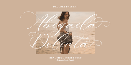 Abigaila Delinta feels equally charming and elegant. It will add a luxury spark to any design project that you wish to create! This font is PUA encoded which means you can access all of the amazing glyphs and ligatures with ease!
 - Nutnik by Hanoded,
$20.00 Nutnik was made using cut out cardboard letters, black paint and some brushes. The result is a highly legible, yet grungy font. It comes with all the diacritics you could possibly wish for and stylistic alternates for the lower case letters.
 - Quasix by Typodermic,
$11.95 Introducing Quasix—the typeface that defies logic! With its compact industrial headline design, this font is the perfect choice for anyone looking to add an edge to their design work. But beware, its quirky design might have you scratching your head at first. Just like the inside of a machine, Quasix is full of moving parts, each with its own unique purpose—but don’t worry, you don’t have to be an engineer to appreciate its beauty. This typeface is perfect for those who want to convey the concept of engineering devices without using typical techno typefaces or cliche physical symbols like gears and bolts. Quasix will elevate your design to the next level, and its versatility makes it suitable for a range of themes, from retro to modern and even futuristic. Don’t be afraid to get creative with Quasix—this typeface was made to be bold and unconventional. Let it take center stage and watch as it transforms your design into something truly unique. Quasix defies convention and breaks the mold, making it the perfect choice for those who aren’t afraid to think outside the box. Try it out and see for yourself! Most Latin-based European writing systems are supported, including the following languages. Afaan Oromo, Afar, Afrikaans, Albanian, Alsatian, Aromanian, Aymara, Bashkir (Latin), Basque, Belarusian (Latin), Bemba, Bikol, Bosnian, Breton, Cape Verdean, Creole, Catalan, Cebuano, Chamorro, Chavacano, Chichewa, Crimean Tatar (Latin), Croatian, Czech, Danish, Dawan, Dholuo, Dutch, English, Estonian, Faroese, Fijian, Filipino, Finnish, French, Frisian, Friulian, Gagauz (Latin), Galician, Ganda, Genoese, German, Greenlandic, Guadeloupean Creole, Haitian Creole, Hawaiian, Hiligaynon, Hungarian, Icelandic, Ilocano, Indonesian, Irish, Italian, Jamaican, Kaqchikel, Karakalpak (Latin), Kashubian, Kikongo, Kinyarwanda, Kirundi, Kurdish (Latin), Latvian, Lithuanian, Lombard, Low Saxon, Luxembourgish, Maasai, Makhuwa, Malay, Maltese, Māori, Moldovan, Montenegrin, Ndebele, Neapolitan, Norwegian, Novial, Occitan, Ossetian (Latin), Papiamento, Piedmontese, Polish, Portuguese, Quechua, Rarotongan, Romanian, Romansh, Sami, Sango, Saramaccan, Sardinian, Scottish Gaelic, Serbian (Latin), Shona, Sicilian, Silesian, Slovak, Slovenian, Somali, Sorbian, Sotho, Spanish, Swahili, Swazi, Swedish, Tagalog, Tahitian, Tetum, Tongan, Tshiluba, Tsonga, Tswana, Tumbuka, Turkish, Turkmen (Latin), Tuvaluan, Uzbek (Latin), Venetian, Vepsian, Võro, Walloon, Waray-Waray, Wayuu, Welsh, Wolof, Xhosa, Yapese, Zapotec Zulu and Zuni.
 - Night Scream by Ditatype,
$29.00 Night Scream is a spine-chilling display font that brings a horrifying twist to your designs. With its big letters and bold weight, this font commands attention and instills fear. The details of the letters are carefully crafted to resemble menacing plant roots, adding a nightmarish and eerie touch to the font. Each letter in this font is bold and impactful, demanding to be noticed. The large size of the letters adds to the font's imposing presence. The root-like details in Night Scream give the font an organic and otherworldly appearance, reminiscent of sinister, twisted plant life. These details add an element of the unknown and create an atmosphere of dread, immersing the viewer into a world of dark and chilling horrors. For the best legibility you can use this font in the bigger text sizes. Enjoy the available features here. Features: Multilingual Supports PUA Encoded Numerals and Punctuations Night Scream fits in headlines, logos, movie posters, flyers, invitations, branding materials, print media, editorial layouts, headers, and any project that requires a terrifying touch. Find out more ways to use this font by taking a look at the font preview. Thanks for purchasing our fonts. Hopefully, you have a great time using our font. Feel free to contact us anytime for further information or when you have trouble with the font. Thanks a lot and happy designing.
 - Versatile Azalea by Letterhanna Studio,
$19.00 Versatile Azalea brush font is textured brush font using a contemporary approach to design, equipped with a lot of underline swashes. Versatile Azalea is suitable for a number of display or decorative designs. It will add a luxury spark to any design project that you wish to create! Fall in love with its incredibly versatile style and use it to create spectacular designs! FEATURES - Uppercase and Lowercase letters - Numbering and Punctuations - Multilingual Support - Ligatures - Underline swashes
 - Lalalo by Cuda Wianki,
$25.00 Lalalo is a casual, modern sans-serif font family based on hand-lettering. It's oval letter shapes provide soft and friendly appearance. Lalalo font is very legible with a warm touch perfectly suited for children books. Lalalo family consists of 6 weights ( Extra Light, Light, Regular, Semibold, Bold, ExtraBold). You can use it with normal fill or outlined. You can mix various colors and stroke widths to gain interesting results. There is also a set of nice frames available.
 - Ringo by typoland,
$9.00 Whassup y’all! Me and my bros got this li’l gang together: we is Ringo, and we got da bling, yo! We is da typeface family for ya all! We got some real sweet stuff for ya, some nice characters. We got all ’em OpenType features like fractions and proportional figgers, we even got da cubic root, man! And check out da question mark, man, is real sweet. And the ampersand, yeah! I luv ’em ampersands. Now my brothers over here got some light action for ya, and they got some real bold action for ya. We got some nice foxy curves goin’ on, some nice tension, and some nice relaxation. My bro Light over here is kind of like the subtle guy, ya know. He’s in for the female fans, ya know. Heh! Hell, yeah! And man, we speak like 84 languages: we speak the German, and the French, and the Spanish, and we speak the Polish, and the Czech, and the Hungarian, and we even speak Shambala and Swahili and Rundi, and we got some Esperanto thing as well for ya. And check out my bro Black right over here, he’s like the action superhero, man! He’s got impact, man! Yeah yeah, but you know, my bros Regular and Bold are the real deal. Them is like da word of da street, man! Like da word of you, and you. And we got a message for y’all: life is hard, life is real, but you should work your mojo, be smooth, be nice, chill. We got all them kerning pairs, and all them weights, and we got ’em alternate letters. So check us out, yo!
 - Torus Pro by Monotype,
$40.00 Torus Pro is a rounded monoline typeface. As its name suggests, this is a more professional version of my original Torus family released in 2017. Each glyph has been scrutinised and redrawn where necessary. In addition, there are now italics, small caps, old style figures, and numerous other improvements. Torus Pro includes many new decorative alternates and ligatures that will add distinctive flourishes to your typographic compositions. With up to nine alternates for some glyphs, these additional styles include stencilled, simple dots, looped and smooth swashes, plus a more aggressive angled option for those looking for something a little different. When used subtly, these alternates and glyph combinations will add flair and personality to your own creations. Perfect for titling and branding, Torus Pro also packs a punch without these features activated, as well as being a comfortable read in long runs of text. There are 12 fonts altogether, ranging from Thin to Heavy weights in both roman and italic. The variable font versions of the family allow you to define the weight exactly to your liking. Torus Pro has an extensive character set that covers all Latin European languages. Key features: 6 weights in both roman and italic Variable fonts included with full family 212 Alternates 20 Ligatures Small Caps Full European character set (Latin only) 1450+ glyphs per font.
 - Plinc Swiss Interlock by House Industries,
$33.00 Swiss Interlock represents the extraordinary meeting of two disparate cultural phenomena of the mid-twentieth century. Its compact frame combines the International Style of the late 50s, which championed the clarity of sans serif, with the interlocking lettering characteristic of 60s counterculture aesthetics. The remarkable result is a tightly woven face with unexpected letter pairs that warm an otherwise cold industrial appearance. Swiss Interlock’s unusual origins make it comfortable on everything from album cover artwork and snack food packaging, to home improvement applications and automotive-themed advertsing. Like all good subversives, House Industries hides in plain sight while amplifying the look, feel and style of the world’s most interesting brands, products and people. Based in Delaware, visually influencing the world.
 - Anelo by SullivanStudio,
$9.95 Anelo is about beauty with objectivity. A handmade sans serif with a humanist style. 889 Latin and Greek glyphs covering lots of Western and Eastern European alphabets. You can use Anelo from a LaTeX equation (there are 117 Greek/Coptic glyphs; please see image #6 in the gallery for an example of an Anelo/Computer Modern combination) to billboards and traffic signs. Its crisp, upright, handmade aspect takes communication to a direct and personal level. Anelo has some important OpenType features, like kerning, standard ligatures, old style/tabular/proportional figures and diagonal fractions. There are 25 currency symbols, including Euro ₠ €, Shekel ₪ and Bitcoin ₿. Each Anelo style has a condensed version, which gives room to many interesting combinations. For best results on screen, the Semibold Family is recommended.
 - Cita Pro by XdCreative,
$29.00 About Cita Pro Hi there please say hello to "Cita Pro" the latest collection from @faldykudo, Cita Pro is a serif typeface with a taste of old style, its very beautiful with a timeless aesthetic and has a very wide range for various design situations. Cita Pro is perfect for both display and body text because it has a very good readability. Cita Pro has 14 style and 7 weights, - from Thin to Bold and Matching calligraphic italic. Cita Pro also has special alternate characters in complete uppercase from A-Z . it is to give a different look for your display design. thanks, hope you would like and accept "Cita Pro" as part of your family. thank you in advance
 - PF Fusion Sans Pro by Parachute,
$79.00 Fusion Sans is an amalgamation of traditional early nineteenth-century sans-serif letters. Despite its monotone structure it retains certain features common to roman. For instance lowercase ‘a’ and the two-storey ‘g’ are normal roman characters, while most letters are designed with a thinning of stroke at the junction of rounds to stems. Other letters are borrowed from earlier gothics, like lowercase ‘t’ which was first seen on a typeface that was developed by Paul Rand for Westinghouse in 1960. Fusion Sans is a tall family of 4 weights which is suitable for long headlines. The new ‘Pro’ version developed in 2006, provides support for all European languages including Greek and Cyrillic while it comes loaded with 19 special OpenType features.
 - Centric Serif SG by Spiece Graphics,
$39.00 Here is a boxy, extremely squared alternative to display designs like Eden or Glamour. In comparison, Centric Serif does not share the fragile and delicate nature of these old 1930s classics. Instead it is fairly robust with a splayed M and a simple flattop A. It is interesting to note that Centric Serif (unlike Centric Geo) sports serifs in exaggerated and curiously bizarre ways. Centric Serif is now available in the OpenType Std format. Some new stylistic alternates and historical forms have been added to this OpenType version. Advanced features work in current versions of Adobe Creative Suite InDesign, Creative Suite Illustrator, and Quark XPress. Check for OpenType advanced feature support in other applications as it gradually becomes available with upgrades.
 - School Age by Jeff Levine,
$29.00 The “Trixy Toy Educator” was a 1930s-era set of letters and numbers (along with a few animal shapes) for teaching children, and was manufactured by the Durrel Company of Gardner, Massachusetts. Die cut from thick cardboard, the 40 piece set also included a rack to display the characters, presumably for little ones to practice the correct order of the alphabet and basic numerals or to spell simple words like ‘dog’ or ‘cat’. Whomever came up with the idea, they used the most rudimentary and unusual ‘type design’ shapes in the A-Z and 0-9, but they were just odd enough to inspire a digital type version of them. School Age JNL is available in both regular and oblique versions.
 - Centric Geo SG by Spiece Graphics,
$39.00 Here is a boxy, extremely squared alternative to display designs like Eden or Glamour. In comparison, Centric Geo does not share the fragile and delicate nature of these old 1930s classics. Instead it is fairly robust with a splayed M and a simple flattop A. It is interesting to note that Centric Serif (unlike Centric Geo) sports serifs in exaggerated and curiously bizarre ways. Centric Geo is now available in the OpenType Std format. Some new stylistic alternates and historical forms have been added to this OpenType version. Advanced features work in current versions of Adobe Creative Suite InDesign, Creative Suite Illustrator, and Quark XPress. Check for OpenType advanced feature support in other applications as it gradually becomes available with upgrades.
 - Afri by Krown Creative Factory,
$15.00 Afri is a funky Native typeface which in a way could be considered as a serif it features edged and freely expressed glyphs. It can be used to create a range of design projects like posters, advertising and marketing flyers and even to printed items. It just requires you to use your imaginative strength and your design projects will look more native and even better pass your message. With this typeface you can create a party poster, movie flyer, advertising and marketing posters, it can also be used on branding items, Native craft design, book covers, music cover arts, or any purpose of your choice to make your designs look African but not too tribal, feel free to play with this typeface.
 - Aabak by Polimateria,
$39.00 Aabak is a sumptuous modern typeface family. The high contrast, super elegant, didone like shapes were infused with a little fluidity from 60’s psychedelic lettering, the results is a contemporary face that screams freshness. It is ideal for branding, advertising, headlines, posters, movie titles, and much more! This design deliberately sabotages a lot of white space to have that compressed punchy look. The tear drop terminals and the melting serifs create a surprisingly superb combo. Sharp joints were smoothen to convey a warm and subtle feeling. Aabak comprises a total of 18 styles, 6 weights in 3 different cuts: Upright, Italic and Swash. The Swash styles have also a terminal forms feature that gives that extra lush feel. Have fun playing with it!
 - Wittenberger Fraktur by Monotype,
$29.99One of the earliest Monotype faces, issued about 1906 in two weights, normal and semibold. Based on Schelter & Giesecke's School Fraktur which was in turn based on type favored by early 16th century printers in Wittenberg. It was the door of the Schlosskirche in Wittenberg on which Luther nailed his 95 theses. For this reason, types similar to Wittenberger Fraktur are particularly associated with Lutheran theology. There are two s versions in the DFR-layout. They enable you to typeset the old way, where the long s with the form like an f is used in the beginning and middle of a syllable or word and the typical round s, also called final s, is used at the end of syllable and end of words. - Imperial Granum by Greater Albion Typefounders,
$18.00 Imperial Granum is designed primarily as a Roman Title and lettering face, combining formality and dignity with a delightful touch of 'Arts and Crafts' like hand drawn design. The regular form of Imperial Granum (which is inspired by a beautifully hand-lettered early 20th century food advertisement) offers two sizes of capitals, in order to provide true 'small-capitals' lettering. Similarly, the Ornamental form consists exclusively of capitals and is designed to be able to mix and match with the regular form. The miniscule form can, of course, be used in its own right, but is primarily intended to complement the regular and ornamental forms. All three faces are offered in regular and bold weights. Explore some Edwardian Arts and Crafts typographical fun today!
 - AW Conqueror Std Sans by Typofonderie,
$59.00 AW Conqueror Sans was born out of this desire to fuse geometric and humanistic sans. It remains a typeface fundamentally influenced by both Bauhaus spirit — with its simplified geometric forms — and Jan Tschichold’s attempts to link this modular spirit to Eric Gill’s humanist sans serif. AW Conqueror Sans is a claimed French synthesis of Germanic Modernism and English classical tradition. Spheres of influence The core set of capitals are based on the proportions of the Roman capitals like Futura, Erbar, Nobel, Johnston, Gill Sans. During the 1930s, the Futura was a true success. Since then, Monotype offered a geometric version of the Gill Sans, and Linotype added Futura-like variants to WA Dwiggins’ Metro. AW Conqueror Sans is kind of a “fusion” of this approach. The lower case “b, d, p, q” are also directly influenced by Eric Gill’s, while the “y” is influenced by some of Jan Tschichold’s alphabets. In italics, drawn narrower, AW Conqueror Sans reinterprets Gill’s idea: a rigorous italic like a roman but which sometimes reveals some aspects of a Renaissance italic. AW Conqueror Sans and its extensions AW Conqueror Sans is the initial reference point for an extended family, including AW Conqueror Inline, Slab, Carved, Didot. The potential of these mixed families is powerful. Because AW Conqueror typefaces are based on an identical structure, and compatible proportions.
 - Beth Harmone by MotionTail,
$18.00 Based on our experience as a graphic designer who works for a lot of companies, we often are requested to design a logo in a unique style but with an elegant shape. So, we try to brainstorming and create this font to make the idea is going out. This is perfect for BRANDING and LOGO DESIGN. You will get classy, elegant, and certainly unique logos with this font. Beth Harmone is also included full set of: · uppercase letters · multilingual symbols · numerals · punctuation Wish you enjoy our font. :)
 - Bechamel by Andinistas,
$29.00 Hello! Do you need letters that look like they are drawn with a brush so that your creative work shines and stands out? We present Bechamel, a family of script fonts designed to be combinable with Bechamel Roman. BECHAMEL SCRIPT was hand drawn to design words and phrases in logos, packaging, posters, envelopes and greeting cards. BECHAMEL SCRIPT has high expressiveness because its energetic set of letters are meticulously drawn with calligraphy and lettering. In addition each of its incredible cursive letters give you the possibility to add a central vein to change the color, enhancing its impressive artisan splendor. These are the possibilities you receive by acquiring BECHAMEL: A) BECHAMEL-SCRIPT & VEIN: Cursive letters with carousel effect and OPENTYPE contained in: 26 Uppercase letters, 26 Small letters, 10 Numbers, 3 Fractions, 31 Punctuation marks, 77 Signs for languages belonging to Western Europe, 113 Signs for Central European languages. 20 Lowercase wipes, 13 uppercase alternatives for WORD START, 44 lowercase alternatives for HALF of word, 20 lowercase alternatives for WORD FINAL. NOTICE: Alternatives appear by clicking on glyph panel in Adobe Illustrator, Inkscape or Photoshop CC. B) BECHAMEL-WORDS: 57 words with capital letters underlined and combinable with BECHAMEL-SCRIPT 1, 2 and 3 ideal to connect and decorate your designs increasing expressiveness and authentic handwritten look of your ideas C) BECHAMEL-ORNAMENTS: 30 wonderful drawings made up of stars, borders, waves, hearts, dots, arrows, bow ties, etc., all specially coordinated to accompany your composite designs in BECHAMEL-SCRIPT and BECHAMEL-WORDS. Well, I hope that my work will be useful and above all that you have fun with it. If you have questions write to me that I will be happy to help you: • INTAGRAM: instagram.com/andinistas • BEHANCE: be.net/andinistas • FACEBOOK: fb.com/carlosfabiancamargoguerrero • TWITTER: twitter.com/andinistas
 - Makeba Retro Funky Groovy by Beast Designer,
$15.99 Makeba Retro Funky Groovy Font is a fun and funky display font that brings back the spirit of the 70s. Its bold, rounded letters feature groovy curves and playful embellishments that exude a retro vibe. This font is perfect for creating eye-catching titles and headlines for posters, album covers, and other retro-inspired designs. The font’s energetic and upbeat personality is sure to make any project stand out.
 - Ramadan Elegant by Marmara,
$23.00 If you are a graphic designer, magazine editor, fashion stylist, industrial designer, publisher, printer or have a creative business, this font is for you, I believe it is a font that should be in your font folder for all your work.. Make awesome logotypes; When you write any word, it almost gives a logotype effect, I enjoyed working on it very much, I'm sure you will like it too...
 - Shaky Monday by Bogstav,
$17.00 It’s Monday, the weekend’s just ended and there’s a looong way to friday. But let’s get things shaking, even though Monday is considered the worst day of the week (by many, but not all, people!) I like Mondays, that’s why I made this font - in order for you to have a great day using this comic thin lined party font! Fun fact: This font was finished on a Tuesday! :)
 - Caramel Chestnut by Letterhend,
$19.00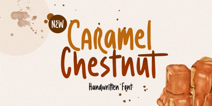 Introducing, Charamel chestnut! this font is a carefully crafted display font but still have an organic touch. this font is perfect for branding, packaging, headline, title, etc. Features : uppercase & lowercase numbers and punctuation multilingual alternates and ligatures PUA encoded We highly recommend using a program that supports OpenType features and Glyphs panels like many of Adobe apps and Corel Draw, so you can see and access all Glyph variations.
 - Sailing Heart by Din Studio,
$22.00 Say hello to Saling Heart Script... Saling Heart is a beautiful script font, made to look naturally brushed. The texture from the brush font will make your design more beautiful and powerful. This font is suitable for any design like branding, quotes, wedding invitation, lettering project and etc. Included: - Sailing Heart Regular - Sailing Heart Solid Features: - Many Alternates (lowercase) - Accents (Multilingual Characters) - Ligatures - PUA encoded - Numerals and Punctuation (OpenType Standard)
 - Matteo scary by Scratch Design,
$14.00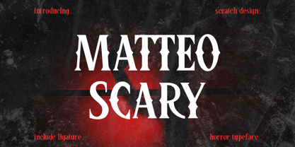 Please Welcome Matteo Scary. Matteo Scary is a horror and creepy font inspired by classic horror movie posters. It gives us the spirit of horror, spooky, frightening and suitable for poster movies, especially Halloween-themed, horror or thriller. This font is perfect also for branding, book cover, magazine header, and others which has horror or spooky vibes. What’s included? Uppercase & lowercase Number & Punctuation Ligatures Multilingual support Enjoy this font!
 - Donnager by Harvester Type,
$15.00 Donnager is a rough, hard and futuristic typeface. It is inspired by square shapes, dystopia and futurism. The name is inspired, like the font itself, by the Dead Space universe. I can just see this font on the cover of some dystopian comic book! The font has alternate glyphs. The uses are unlimited, as there are different styles, weights, and even a variant version. Logos, posters, headers, branding, prints and more!

