6,902 search results
(0.019 seconds)
- Big Foot Forest by RodrigoTypo,
$30.00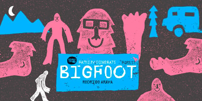
- Forest Glade Cyrillic by Ira Dvilyuk,
$16.00 Forest Glade playful Cyrillic script font with the dancing baseline is perfect for use in all your design projects be it logos, signatures, labels, packaging design, blog headlines. Also, it will look great in mugs, cards, gorgeous typographic designs, wedding stationery, and much more. Forest Glade playful Cyrillic sctipt font includes a full set of gorgeous uppercase 2 sets of lowercase letters, numerals, a large range of punctuation and 27 ligatures, giving realistic hand-lettered style. Forest Glade Symbols is a font with 26 unique, hand-drawn illustrations and elements that can help to make your design more original. A different symbol is assigned to every uppercase and lowercase a standard character so you do not need graphics software just simply type the letter you need. Multilingual Support for 27 languages: Afrikaans, Albanian, Basque, Bosnian, Catalan, Danish, Dutch, English, Estonian, Faroese, Filipino, Finnish, French, Galician, Indonesian, Irish, Italian, Malay, Norwegian Bokmål, Portuguese, Slovenian, Spanish, Swahili, Swedish, Turkish, Welsh, Zulu And Cyrillic glyphs support for Russian, Belorussian, Bulgarian, and Ukrainian languages.
 - Gill Floriated Capitals by Monotype,
$29.99 Gill Floriated is based on a single character which Eric Gill drew as a decorated initial for use on a specimen setting of his Perpetua type. Although Gill was at first reluctant to produce a full alphabet, Monotype advisor Stanley Morison was able to persuade him to draw a few more characters from which the Type Drawing Office was able to create a full set. Issued in 1937 for display casting, it was revived by Monotype in 1995 for electronic publishing. Best used sparingly as dropped initials.
 - PR Xmas Doodles 01 by PR Fonts,
$10.00 This font includes elements of snowy landscapes, holly borders, bells, candles, reindeer, and tree ornaments.
 - Pillow Fort by Fromletterel,
$12.00 Pillow Fort is a quirky handwritten font to energize your designs, this font really fits cute and casual concept. Others than that Pillow Fort also fits the degins that need magical fantasy vibe. This font will be suitable for branding, greeting cards, quotes and other beautiful projects.
 - Accia Forte by Mint Type,
$39.00 Accia Forte is a strong serif typeface with high contrast, large x-height and prominent serifs. Its loud contemporary feel will be ideal for titles as well as posters and web appearance. The font family contains 8 weights from Thin to Extra Bold, with matching true italics. It supports extensive language support including Cyrillic, as well as numerous OpenType features such as small caps, ligatures, several sets of figures, case-sensitive punctuation, ordinals. Accia Forte is a member of Accia Type System. It encompasses five typefaces ranging from sans-serif to expressive serif, giving you the possibility to create sophisticated cohesive designs. Accia Type system consists of Accia Sans, Accia Flare, Accia Piano, Accia Moderato, and Accia Forte.
 - Totem Forms by LMD,
$20.00Totem Forms is based on a series of aluminum and rubber wall constructions currently showing in Europe and the United States. Mirek's work has been shown internationally for many years and this is his first foray into type development. - URW Form by URW Type Foundry,
$35.99 URW Form by Volker Schnebel is the quintessence of a modern sans. Originally inspired by the timeless classic Futura, URW Form is a mix of classic and modern geometric typefaces, yet still incorporates the fundamental rules of design and looks and functions like a contemporary sans. In addition to its strong identity, URW Form has all the quality characteristics we come to expect from a Schnebel typeface. Available in 80 styles and four widths, there is also a much sought-after semi-condensed extension to broaden its creative spectrum. Weights range from the filigree Thin to the forceful Poster, making it a truly versatile sans serif typeface.
 - Fort Collins by Letterhend,
$13.00 Fort Collins is a pair of fonts that bring the classy yet casual feel in the same time. The condensed sans combined with the natural hand writing script are the perfect match for you who needs a typeface for headline, logotype, apparel, invitation, branding, packaging, advertising etc. This typeface is comes in uppercase, lowercase, punctuation, symbols & numerals, stylistic set alternate, ligatures, etc also support multilingual.
 - Black Forte by TypeClassHeroes,
$15.00 Black Forte is a sans serif display with various width and weight that you can explore and combine. use this font for any branding, product packaging, invitation, quotes, t-shirt, label, poster, logo etc. Feature Uppercase & Lowercase Number & Symbol International Glyphs Multilingual support Feel free to drop us a message f you have any questions Hope you enjoy it.
 - Konstantin Forte by Wiescher Design,
$39.50My son Konstantin needs a bold face for his bold recipes. So I made Konstantin Forte for him — and the rest of the world. Your bold family designer, Gert Wiescher. - Fort Mayhem by Letterhend,
$17.00 Fort Mayhem is a display marker font with hand drawn feel. The strokes make this font outstanding and looks great for title. This type of font perfectly made to be applied especially in logo, headline, signage and the other various formal forms such as invitations, labels, logos, magazines, books, greeting / wedding cards, packaging, fashion, make up, stationery, novels, labels or any type of advertising purpose. Features : 3 Styles-Regular, Extrude, & Online numbers and punctuation multilingual alternates / swashes and ligatures PUA encoded We highly recommend using a program that supports OpenType features and Glyphs panels like many of Adobe apps and Corel Draw, so you can see and access all Glyph variations.
 - Fort Yukon by Larin Type Co,
$15.00 Inspired by wildlife, Fort Yukon is a bold and authentic vintage family font. This will inspire any design project that needs a vintage style. This font family is composed of 14 styles which perfectly complement each other. You can use them to create a logo or use for your business, branding, t-shirts, book covers, stationery, marketing, blogs, magazines and more.
 - ND Form by NeueDeutsche,
$55.00 An innovative font merging the essence of schablonen lineal with modern design. Composed of carefully shaped rectangles and semi circles, this typeface encapsulates geometric precision and contemporary aesthetics. "ND Form" breathes life into your creations, infusing each character with a fusion of structure and creativity. Elevate your projects with the sleek, distinctive allure of "ND Form," where geometry meets artistic expression.
 - Orator 10 by Tilde,
$39.75 - Scriptissimo Forte by Wiescher Design,
$39.50 Scriptissimo-Forte is the bold version of Scriptissimo. When using the normal cut of Scriptissimo I sometimes had the feeling that I could well use a bolder cut to make a bigger impression, so I simply made that cut for myself. I think you can use it too; try it out. Yours very bold scriptissimo, Gert Wiescher
 - Dingbatz Formz DSG - Unknown license

- Goudy Ornate MT by Monotype,
$29.99Over the course of 50 years, the charismatic and enterprising Frederic W. Goudy designed more than 100 typefaces; he was the American master of type design in the first half of the twentieth century. Goudy Old Style, designed for American Type Founders in 1915-1916, is the best known of his designs, and forms the basis for a large family of variants. Goudy said he was initially inspired by the cap lettering on a Renaissance painting, but most of the flavor of this design reflects Goudy's own individualistic style. Recognizable Goudy-isms include the upward pointing ear of the g, the diamond-shaped dots over the i and j, and the roundish upward swelling of the horizontal strokes at the base of the E and L. The italic was completed by Goudy in 1918, and is notable for its minimal slope. Goudy Bold (1916-1919) and Goudy Extra Bold (1927) were drawn not by Goudy, but by Morris Fuller Benton, who was ATF's skillful in-house designer. Goudy Catalogue was drawn by Benton in 1919-1921 and was meant to be a medium weight of Goudy Old Style. Goudy Heavyface was designed by Goudy for Monotype in 1925, and was intended to be a rival to the successful Cooper Black. Goudy Modern was designed by Goudy in 1918; its small x-height, tall ascenders and shorter caps impart a spacious and elegant feeling. Benton designed Goudy Handtooled, the shaded version that has just a hairline of white through its bold strokes. The Goudy faces, especially the bolder weights, have long been popular for display and advertising design. They continue to pop up all over the world, and still look reassuring to our modern eyes." - LTC Goudy Ornate by Lanston Type Co.,
$24.95 Goudy Ornate (also known as Ornate Title) was designed in 1931 by Frederic Goudy. He states "It is a simple, decorative face that has been used by some good presses for use on title-pages where size is more important than blackness of line." The new Lanston version includes a lower case and full character set designed in the style of Frederic Goudy.
 - Archive Gothic Ornate by Archive Type,
$19.95 - Zig Zag ML - Personal use only

- Gradl Initialen ML by HiH,
$12.00 Max Joseph Gradl designed Art Nouveau jewelry in Germany. At least some of his designs were produced by Theodor Fahrner of Pforzheim, Germany -- one of the leading manufacturers of fine art jewelry on the Continent from 1855 to 1979. I don't know if he designed for Fahrner exclusively, but every example I found was produced by that firm. I assume it was also the same M.J, who edited a book, Authentic Art Nouveau Stained Glass which was reissued by Dover and is still available. For an artist as accomplished as Gradl was, he is very tough to research. There just does not seem to have been much written about him. The jeweler is visible in most of his typeface designs. They exhibit a sculptural quality as if they were modeled in clay (or gold) rather than drawn on paper. His monograms, especially, reflect that quality. Those shown in plates 112 through 116 in Petzendorfer actually appear to have been designed specifically for fabricating in the form of gold or silver pendents. Of the initial letters that came out of Germany during this period, these by Gradl seem unusually open and lyrical. They seem to be dancing on the page, rather than sitting. Please note that Gradl designed only the decorated initials. All other characters supplied were extrapolated by HiH, including the accented initials. Orn.1 (unicode E004) is based on a jeweled gold clasp designed by Gradl (please check out Gallery Image on Myfonts.com). Also included are an art nouveau girl’s face, a swan and the face from Munch’s “Scream”, from scans of old printer’s ornaments. Gradl Initialen M represents a major extension of the original release, with the following changes: 1. Added glyphs for the 1250 Central Europe, the 1252 Turkish and the 1257 Baltic Code Pages. Added glyphs to complete standard 1252 Western Europe Code Page. Special glyphs relocated and assigned Unicode codepoints, some in Private Use area. Total of 341 glyphs. Both upper & lower case provided with appropriate accents. 2. 558 Kerning Pairs. 3. Added OpenType GSUB layout features: salt, dlig, ornm and kern. 4. Revised vertical metrics for improved cross-platform line spacing. 5. Refined various glyph outlines. 6. Alternative characters: 16 upper case letters (with gaps in surrounding decorations for accents above letter). 8. Four Ornaments: face1, face2, swan and orn1 (silhouette of Gradl clasp) The zip package includes two versions of the font at no extra charge. There is an OTF version which is in Open PS (Post Script Type 1) format and a TTF version which is in Open TT (True Type)format. Use whichever works best for your applications.
 - Label Pro XL by Kustomtype,
$15.00 LABEL PRO XL is a massive high quality collection of classic, modern and vintage labels. Containing more than 150 glyphs, LABEL PRO XL is convenient and essential in numerous business sectors; such as food or non-food labeling, B2B and B2C sales; stickers, stamps or advertising designs etc. LABEL PRO XL offers you a quick & easy solution for all vector designs and application software. The LABEL PRO XL font is fully handtraced, a first-class and worldwide highly appreciated quality. LABEL PRO XL, a complete font that contains twelve different styles, tons of combinations, cool swaches & flags, LABEL PRO XL is particularly developed for creative people.
 - Brother XL&XS by TipoType,
$19.00 Brother XL & XS is an expansion of Brother 1816, one of the best sellers of 2016: myfonts.com/fonts/tipotype/brother-1816 We decided to add new widths to the type system, designing a condensed version (XS) that is perfect for narrow spaces without loosing legibility, and an expanded version (XL) with a lot of character for display uses but without abandoning funcionality. Both typefaces where created to adapt in diverse design languages being able to be “retro” or “modern” making it very flexible and working well in texts or titles, in print or screens. Brother XL & XS mixies Geometric shapes with Humanistic strokes at the same time. You can choose between a pure geometric or humanistic style, condensed or expanded, or even mix between XS, XL, or its alternate characters to create the feeling that you need for your projects. Its humanistic nature makes it easy to read, legible in small sizes; perfect for branding, editorial and signage. It has a total of 32 fonts, which are divided into 2 groups: XS (16 condensed weights) & XL (16 expanded weights). Each weight has +460 characters, +20 alternates, angular and straight edges, swashes, fractions, ordinals and much more.... Brother has also been specially designed for web (using hinting instructions), making it work in small and large sizes on different types of screen resolutions.
 - ML Tokyo Aurora by Supfonts,
$18.00 Hi ! I just now launch my new font Family called "Tokyo Aurora". The Tokyo Aurora font is a simple font, comes with alternate symbols and some ligatures. I wanted this font looks elegant, readable, stylish, and catchy. You can use this font for watermark on photography, signature or signature logo design, quotes, album cover, business card, and many other design project.
 - Norwich Aldine ML by HiH,
$12.00 Norwich Aldine ML is a all-cap typeface with enlarged serifs, designed and produced in wood by William Hamilton Page of Norwich, Connecticut in 1872. Norwich Aldine ML is a fine example of the strength of decorative wood types: large, simple type forms that provide the visual boldness sought by advertisers of the Victorian period. While our marketing has gotten so very sophisticated, there is always a place for a simple, visually strong typeface. Although about 14 miles inland, Norwich, Connecticut lies at the head of the Thames River. The river is both wide and deep, and therefore was not bridged in the early 20th century. Until then, if you wanted to get from Groton on the west bank to the whaling port of New London on the east bank by land, you had to go by way of Norwich. Because of its size, the Thames is navigable all the way from Norwich to New London. Docks were built in Norwich around 1685 and the city became Connecticut’s 2nd largest port by 1800. With the construction of the Norwich & Worcester Railroad in 1835, Page could easily ship his wood type north by rail or south by coastal schooner. Included with our font, Norwich Aldine ML, are two 19th century printer’s ornaments of sailing ships similar to those that sailed up the Thames to Norwich. Reference: Moon’s Handbooks, Connecticut 2nd Edition (Emeryville CA 2004) The family has expanded from one to four fonts: 1. Norwich Aldine ML: the concept font, computer-sharp corners and smooth curves, as we imagine it was designed. 336 Glyphs including some reduced-width alternatives for better letter spacing. 2. Norwich Aldine Worn ML: the way actual wooden type would look after have been used for a while. 332 Glyphs 3. Norwich Aldine Distressed ML: the way the wooden type would look after it had really been used, perhaps abused. Alternatives to the more popular letters reflect the damage that typically occurs on a well-wormn font, with nicks, cuts and scratches and the overall wear that reduces the overall height and leads to uneven inking due to varying heights in the chase. A couple of bullets look like bullet holes. 345 glyphs. 4. Norwich Aldine Cyrillic: Cyrillic includes alll English and Cyrillic letters for MS Windows Code Page 1251, ISO 8859-5 and MacOS Cyrillic. 235 glyphs. We did Cyrillic because is was fun and we felt the basic design cried out for Cyrillic. While obviously subjective, we hope you will agree.
 - Habana Deco ML by HiH,
$12.00 Habana Deco ML was inspired by a hand-lettered sign on the stucco exterior of a small pharmacy in modern-day city of Havana, Cuba. It, in turn, was based on the fat-faced Art Deco lettering of the late 20s and early 30s, especially the Futurismo posters out of Italy, as well as alphabets designed in The Netherlands, France, USA and even the Soviet Union. There are 24 stylistic alternate glyphs (SALT), many inspired by a variety of these sources, including a couple from the sign in the front of the Congress Hotel in South Beach, Miami. The others features of the Habana Deco include 363 glyphs, 184 kerning pairs (KERN), 14 ornaments and shapes (ORNM) and 15 discretionary ligatures (DLIG). This is a font with which you can have fun. The zip package includes two versions of the font at no extra charge. There is an OTF version which is in Open PS (Post Script Type 1) format and a TTF version which is in Open TT (True Type)format. Use whichever works best for your applications.
 - FarHat-Acordes b y # - Unknown license

- Pep O Mint Normal - Unknown license

- We Love Nature Forest by kapitza,
$79.00 We Love Nature Forest is inspired by long walks in the woods and features decorative wintery pine needles, fir branches and cones. Perfect for designing your seasonal cards. It consists of 52 highly detailed, hand drawn illustrations. The illustrations can be used on their own to create beautiful designs, or in combination with other illustrations in the We Love Nature font collection.
 - Gothic Special Normal Italic by Wooden Type Fonts,
$15.00 A revival of one of the popular wooden type fonts of the 19th century, suitable for text or display, short descenders, tall ascenders, the narrow, italic version, completing the Gothic Special family of 5 fonts in total, sans serif.
 - Relic Forest Island 3 by Jehansyah,
$9.00 Relic forest island III, This is the newest font from the previous generation, Relic island I and Relic Island II, this design comes with a more detailed touch with very charming carvings, comes with several families that you can make your best design choice for later this year and in the future, with several monograms and families that you can choose according to your design, this design will add inspiration to your project, and see, how it will work for you, and make this font your best choice thank you very much
 - OL Hebrew Formal Script With Tagin by Dennis Ortiz-Lopez,
$30.00 This font contains every variant found in the Hebrew Bible such as the “mutilated” Waw in Numbers 25: verse 12, the small Heh in Genesis 2: verse 4 and the Nun Inversum before Numbers 10: verse 35 and after verse 36 and elsewhere as well as oversized consonants and various double-wide consonants used in inscriptions.
 - Dingbatz Formz 2 DSG - Unknown license

- FM Bolyar Ornate Pro by The Fontmaker,
$29.00 FM Bolyar Ornate Pro is the latest member of our renowned Bolyar mega family and the perfect companion for our very successful FM Bolyar Pro . Developed to a new level of excellence this new improved ornate design is quite able to satisfy every typographic taste and meet the ever growing design requirements for high quality typefaces. If you are addicted to classic vintage style, then you could easily use Bolyar Pro Ornate for almost any project of desire - from letterheads, logos and catchy headlines to elegant packaging, book covers and wine labels. Alternates, Swashes and Ligatures will help you customize almost every single letter and fit perfectly to your artwork. Bolyar Ornate Pro provides a broad range of advanced typographical features such as: Five weights ranging from thin (100) to black (900) with full multilingual support of all Latin based languages as well as Cyrillic; 1000 glyphs per weight including three multilingual stylistic sets, swash designs and useful discretionary ligatures; Sub- and superscript basic Latin and Cyrillic glyphs as well as figures. Two positional models for lowercase accessed as OpenType case sensitive forms ñ base to base (default) and spur to spur (vertical center).
 - Nouveau Stencil Ornate JNL by Jeff Levine,
$29.00 A 1902 publication entitled "Lettering for Schools & Colleges" had an example of an ornate, hand drawn stencil alphabet in the Art Nouveau style. This is now available digitally as Nouveau Stencil Ornate JNL, in both regular and oblique versions.
 - Bodoni Classic Bold Ornate by Wiescher Design,
$39.50 Bodoni Classic Bold Ornate is another puzzlestone in my ever growing Bodoni Classic family. This time the letters are ornated within the limits of the letter, this keeps the classic form of the typeface intact and still gives it ample decoration. Please use this font only sparingly to decorate text or use it as initials only. Your Bodonimaniac, Gert Wiescher
 - Prissy Frat Boy - Unknown license

- Foundry Form Serif by The Foundry,
$90.00 Foundry Form Serif was drawn concurrently as a sans and a serif, with matching capital and x-height proportions for harmonious use. The Foundry Form Serif design has a strong horizontal emphasis, slightly condensed proportions for economic use of space, and open counters ensuring legibility at small sizes. Both families function independently. Foundry Form Serif includes a true italic; the angularity and sharp serifs help to retain maximum clarity, with the contrasting stroke widths adding refinement.
 - Scriptissimo Forte Swirls by Wiescher Design,
$39.50 Scriptissimo-Forte-Swirls is the bold version of Scriptissimo but with lots of swirls. Sometimes a job just calls for lots of embellishments, that's what this version is good for. Yours very swirly, Gert Wiescher.


