1,098 search results
(0.007 seconds)
- Dominatrix BB by Blambot,
$20.00Dominatrix is a dirty little font who won't let up until you say the safe word. And I'm not telling you what the safe word is. This font comes with autoligatures so consecutive duplicate letters won't look identical. It also has more European characters than you can shake a leather whip at. - Ettore by Comics Font Store,
$9.00 ETTORE is a font for onomatopoeia. Friendly-looking, it is inspired by the lettering of the classic French comics with an adventurous and humorous font-style. It is chunky, marked, with low contrast. The kerning is perfectly balanced. It is made with a chisel-tipped marker determining its thick, square, flat stroke.
 - Architype Catalogue Solid by The Foundry,
$50.00 Architype Crouwel is a collection of typefaces created in collaboration with Wim Crouwel, following his agreement with The Foundry, to recreate his experimental alphabets as digital fonts. Crouwel's most recognized work was for the Van Abbe and Stedelijk museums (1954 –72) where he established his reputation for radical, grid-based design. Architype Catalogue’s soft ‘padded’ letterforms were originally created by Wim Crouwel for the Stedelijk museum’s 1970 exhibition of sculptor Claes Oldenburg.. Crouwel said, ‘When you look at Oldenburg’s work, with all those soft objects, it gets into your system, so you try to integrate that feeling in the design. Claes was very taken with the catalogue's typeface, and asked me if I would do the whole alphabet for him, so I did. I cut it all out in pink paper and pasted it together’.
 - the EV$NT - Personal use only

- London Doodles by Outside the Line,
$19.00 London is always hip. With William and Kate and the 2012 Summer Olympics it made sense that London Doodles would be second in the City Series following Paris Doodles. 29 illustrations and a script word London. Kate’s ring, the Queen’s carriage, crown, skyline, cityscapes, cars, double-decker bus, castles, bridge, tea items, flag and more.
 - Vegacute by PizzaDude.dk,
$20.00Vegacute is probably the most romantic font from pizzadude.dk to date! With it's elegant swings and jumpy x-height it stays true to the handwritten sketches that served as a model for this font. Use it for headlines or logos; use it for massive text or letters; either way, Vegacute wins with its retro-cuteness! - Vermicello by ParaType,
$30.00 An original display typeface was designed for ParaType in 2007 by Isabella Chaeva. Informal handwriting shapes of letters are formed by several separate elements — traces of monoline writing tool like broad felt-tipped pen. The name of the font reveals the fact that curvy strokes resemble worms. For use in advertising and display typography.
 - Sailor Marie by Otto Maurer,
$23.00 Sailor Marie is dedicated to my little lovely Daughter Marie. Sailor-Marie is an Oldschool Tattoo-Style Font, made for all Tattooartists of the world. The Tattoos of the 50th like Sailor Jerry are always designed with Fonts like this. The Font comes with many Opentype Feature and an GraphicFontfile wit Banner and more.
 - Allaina by Creativemedialab,
$22.00 Allaina is a stylish and elegant Serif family consisting of three styles, Regular, Medium and Bold with matching italics. It has many alternates and some unique attractive ligatures. This pretty serif family could be used for fashion, label packaging or elegant vintage style lettering. Combining standard letters with alternative letters wil give you beautiful and unique words.
 - ITC Humana Serif by ITC,
$29.99ITC Humana font is the work of British designer Timothy Donaldson, an extended and versatile font family with a large array of variations. Donaldson first created ITC Humana Script with a broad-tipped pen and then went on to design the corresponding roman. ITC Humana is the perfect font for anything requiring both clarity and a touch of personality. - Mirabelle by Magpie Paper Works,
$14.00 Mirabelle from Magpie Paper Works is a family of four hand-lettered fonts designed to coordinate with each other or stand alone as display faces. Each font was created with a felt-tipped pen & ink, and includes a full set of capital and lowercase letters, as well as multi-lingual support, currency figures, numerals, and punctuation.
 - Planca by Vertigo,
$18.00 Planca is a sans serif typeface with medium contrast and distorted rhythm of the line. Spaced and mastered for optimal readability. All lines are of equal thickness. Its morphology is based on the study of traditional writing with a wide tip stick. It comes in 4 different weights (Light, Regular, Bold and Black) and provide multilingual support.
 - Hippyfreak by Type Innovations,
$39.00 Hippyfreak was created by manipulating my Beatnik font. I stretched and distorted the outlines until I got an interesting effect reminiscent of the Hippie generation. It has a cool and hip rhythm and movement. Great to use for those funky headlines, or whenever a retro look is desired. Works great at all point sizes. Groovin' baby.
 - Abelia by Hanoded,
$15.00 Abelia is a rough(ish), cursive, handwritten font. It was made with an almost dried up felt tip pen, so as to create some roughness in the edges. It comes with a generous amount of diacritics. For those who are just dying to know: Abelia is a honeysuckle-like flowering shrub, native to Eastern Asia and Mexico.
 - Meika by vuuuds,
$17.00 Introducing Meika Font! Meika is modern stencil serif font, every single letters have been uniquely crafted. This font including beautiful alternate glyph. You can access the alternate glyph via Font Book (Mac user) or Windows Character Map (Windows user), I've been put the link tutorial inside the zip file. Foreign languages support: ÀÁÂÃÄÅÆÇÈÉÊËÌÍÎÏÐÑÒÓÔÕÖØÙÚÛÜÝàáâãäåæçèéêëìíîïðñòóôõöøùúûüýÿ Thanks for looking.
 - Pen Lettering Sans JNL by Jeff Levine,
$29.00 A 1935 song with the unusual title of "Dinner for One Please, James" had its title hand lettered on the cover of the sheet music with simple, condensed letters made by a round point dip pen. This has been reproduced in a digital font as Pen Lettering Sans JNL, and is available in both regular and oblique versions.
 - LineWire by The Northern Block,
$16.70 A modern geometric typeface influenced by the work of Dutch designer Wim Crouwel . The angular nature of the design lends itself strongly towards large display applications but because each character is formed from a consistent grid, stylish body copy can also be achieved. Details include 6 weights, a complete character set, manually edited kerning and Euro symbol.
 - Smart Frocks NF by Nick's Fonts,
$10.00 A sign in a London storefront, ca. 1930, pitching—surprise!—Smart Frocks provided the visual cues for designing this typeface. Singularly stylish, hip and haughty and decidedly Deco, this is the smart font to use! This font contains the complete Latin language character set (Unicode 1252) plus support for Central European (Unicode 1250) languages as well.
 - Notes by Resistenza,
$39.00 Notes Is a handwritten-Italic font style, casual and fresh. Our recipe for this project is a perfect blend of typography and handwriting. Works well in small sizes and has several ligatures. Notes Family has many cuts, Pen, Pencil, Marker and Felt Tip. This font family can be used for many purposes like publishing, quick notes, adding captions, signage.
 - Deco Pen JNL by Jeff Levine,
$29.00 Hand lettering found across the sheet music cover of 1931's "Bend Down, Sister" [from the Eddie Cantor film "Palmy Days"] covered a couple of varying Art Deco styles; both made with a round-tipped pen nib. Deco Pen JNL combines the best of both styles into one design that's available in both regular and oblique versions.
 - Asbury Park JNL by Jeff Levine,
$29.00 In the 1930s the WPA (Works Progress Administration) sponsored a Federal art project. Many posters were produced that featured government-sponsored cultural events, health and safety tips and various other topics. One such poster from Pennsylvania has the words “Work with Care” in a hand-lettered inline sans design. This became the basis for Asbury Park JNL.
 - EURONEW - Unknown license

- ARIA - Unknown license

- TRACK - Unknown license

- Rummy by Bunny Dojo,
$23.00 Rummy is powerful, precise, and packed with personality. Simple and initially unassuming, Rummy may seem a reluctant hero. But, when called upon, Rummy will lend you all of its considerable strength and versatility in order to win the day. Influenced by sports branding and 1940s film, Rummy is an underdog that won't let you down. Need more height? Try Rummy Tall!
 - ITC Humana Sans by ITC,
$29.99ITC Humana Sans font is the work of British designer Timothy Donaldson, an extended and versatile font family with a large array of variations. Donaldson first created ITC Humana Script with a broad-tipped pen and then went on to design the corresponding roman. ITC Humana Sans is the perfect font for anything requiring both clarity and a touch of personality. - Backstage Pass NF by Nick's Fonts,
$10.00Turn on the mirrored ball, and haul out the gold chains and white suits! This Disco dazzler is a new take on Bass Rainbow, designed by Saul Bass in the 1970s. Hip, hot and heavy, this typeface is ready to get down. This font contains the complete Latin language character set (Unicode 1252) plus support for Central European (Unicode 1250) languages as well. - Corinthia by TypeSETit,
$24.95 A festive, elegant script, Corinthia flows with perfect connections and beautiful curves. It’s a delightful design that offers wide usage... Available in OpenType format, this award winning font comes with over 500 glyphs, and character sets for European languages. All three weights are perfect for creating elegant design work from packaging and romance novels, to invitations and social expression products.
 - Human Rase by Graffiti Fonts,
$19.99This is a simple and legible tag style font as written with a bullet tip marker. HumanRase includes characters for all uppercase and lowercase keys as well as numbers, punctuation and dozens of other symbols (many more characters than most other tag style fonts). This font works well at large sizes but is also very legible when used for body copy. - Statue Of Liberty's Underwear by Vic Fieger,
$6.99Inspired by a handwritten Cyrillic placard seen in a book about the Soviet Union, Statue of Liberty's Underwear was envisioned as having been written with a very thick pen with a flat tip held horizontally. Additionally, the letterforms were sculpted to resemble lettering common in early 20th-century Russian constructivism pieces. A Cyrillic alphabet, or "azbuka", set was included in the font. - Rocksolid by Aah Yes,
$9.95Rocksolid's appearance is somewhere between a font resembling large, carved blocks of stone and a negative outline grunge font, and it is surprisingly responsive to simple effects in graphics programs. Mostly it is intended for titles, display and headlines. There's an extensive set of accented characters and punctuation. The zip contains both OTF and TTF versions - install either OTF or TTF, not both. - Mignonette by Magpie Paper Works,
$46.00 Hand-drawn with calligraphy ink and an antique dip pen, Mignonette is ready for all uses charming and rustic. She's heavy on the bottom and hairline at the top, and includes all sorts of additional numerals, currency figures as well as multi-language support. Mignonette shines in both correspondence and display; she has a particular affinity for offbeat and heartfelt branding.
 - Tarot by Great Lakes Lettering,
$25.00 Let Tarot wisp you away onto an enchanted journey. This whimsical serif typeface is perfect for headlines, small bodies of text, and feels like magic when paired with scripted type. Inspired partly by Helsing, Tarot features a similar essence, along with an alluring and spontaneous handwritten presence. Tarot is a charming font used to make anything created feel bewitched. Presto!
 - Felt Noisy by PintassilgoPrints,
$24.00 Counting four variations for each letter and two for the numbers, Felt Noisy delivers a cool organic feel with a strong and spontaneous attitude. The typeface was drawn with a bad felt tip pen and resulted in two rather nice fonts that will stylishly fit many visual projects out there that don't look for any transparency at all. Give it a go!
 - Dime Store by Breauhare,
$35.00 Dime Store is a font inspired by childhood memories of dime stores in downtowns and shopping malls in the 1970s. The font was tweaked and digitized by Bob Alonso, who also digitized Breauhare’s Cooper Goodtime font. Dime Store is a cool, hip, nostalgic way of creating a decorative display, and at times it seems to have a slightly futuristic look, too.
 - Feast by Great Lakes Lettering,
$40.00 Feast is a calligraphy style font designed by Alissa Mazzenga. Her hand-sculpted letterforms emanate a powerful, yet delicate presence. Their magic resides in the ethereal movement of fluid wisps of ink, forming soft arched lines and design that stands alone. This hand written style font is based on Alissa's signature calligraphy style and pairs beautifully with fonts like Frosted and Icing.
 - Foreign Film JNL by Jeff Levine,
$29.00 The Art Deco hand lettered opening credits for the 1936 French drama “La Belle Équipe” [English title: “They Were Five”] provided the inspiration for Foreign Film JNL, which is available in both regular and oblique versions. According to Wikipedia, the film “…tells the story of five unemployed workers who win the jackpot in the national lottery but their solidarity then proves fragile.”
 - Magnifique by Joe Hewitt Design,
$14.99 High Society, upper class and very posh indeed! Magnifique is a modern, elegant, stiff upper lipped serif typeface. Classy, luxurious and opulent, Magnifique is ideal for markets such as fashion, jewellery, perfumes and grand events. The typeface contains uppercase and small caps. The glyph set includes all languages covered in Basic Latin, Latin-1 Supplement and Latin Extended-A scripts.
 - Sugar Magic by Zeenesia Studio,
$15.00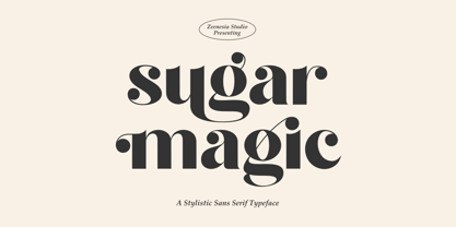 ntroducing Sugar Magic Sugar Magic is a modern and elegant sans serif font. Sugar Magic is well-suited for advertising, branding, logotypes, packaging, titles, headlines and editorial design. I created more much alternates variant and much natural ligatures to make this font very classy and look so beauty. Sugar Magic was built with openType features make your project wil be perfect.
 - Brush With Death by Cyberian Khatru,
$20.00 This font was made possible by creating a custom brush in Illustrator. I started with a flat brush dipped in India ink to create the stroke. From a scan of that stroke I made a vector tracing which I then I altered as necessary to get the desired dimensions. The lower case letters have a thinner stroke than the capitals.


