10,000 search results
(0.022 seconds)
- Donut by Vladvertising,
$20.00 Yummy dönut ya? Does this type make me look fat?
 - Angry bitch - Unknown license

- Calvin and Hobbes - Unknown license

- ITC Isadora by ITC,
$29.99This calligraphic typeface, designed by Kris Holmes in 1989, manages to look both confident and relaxed, while showing great intricacy and beauty upon closer inspection; it is named after the dancer Isadora Duncan. - Wingardium by Fromletterel,
$12.00 Wingardium is a stylish and delicatw script font, it is suitable for any project such as logo, branding, label, photigraohy, watermark, special events and all kind of project that needs natural writing vibe.
 - Starry Night by Lauren Ashpole,
$15.00 This slighty messy handwritten font was inspired by the scrawl of a teenager given a marker. Meaning it was inspired by my own quick writing at the time. Right down to the stars.
 - Hello Mellinda by MJB Letters,
$16.00 Hello Mellinda is a sweet and delicate handwritten font. Dainty and joyful, this font will be ideal for writing wedding invitations, cards, or any other design that may need a romantic, personalized touch!
 - Show Card Sans JNL by Jeff Levine,
$29.00 Show Card Sans JNL (available in both regular and oblique versions) is based on a chart showing the basic construction of sans serif lettering in the 1922 instruction book “Modern Show Card Writing”.
 - Hola by Cuda Wianki,
$35.00 Hola! This is our new handwritten font. It's casual, young and pretty, perfect for logotypes, magazines, writing notes and comments. Thanks to many ligatures and alternate characters it is varied handwriting font. Enjoy!
 - Positive Attitude by Seemly Fonts,
$12.00 Positive Attitude is a simple and thin lettered font. Dainty and joyful, this font will be ideal for writing wedding invitations, cards, or any other design that may need a romantic, personalized touch!
 - Something by Krntype Studio,
$16.00 Introducing Something! A stylish signature font. designed to display luxury and shopisticated writing. With this font, you can built an amazing work. Such as stylish branding & logos, packaging, handwritten quotes, merchandising, advertising, etc.
 - Willynta by Patria Ari,
$15.00 Introducing, Willynta, a beauty handwritten script with a twist of fun! The natural hand writing script is suitable for you who needs a typeface for headline, logotype, apparel, invitation, branding, packaging, advertising etc.
 - P22 Roanoke Script by IHOF,
$24.95 Roanoke Script is a hand-written script inspired by 18th century forms. The visual effect is of a steel nib pen writing on uncalendered paper. Ideal for a few words in display sizes.
 - Easy Stencil JNL by Jeff Levine,
$29.00 Easy Stencil JNL is a simple sans serif stencil design [based on a hand lettered example] from the 1922 publication “Modern Show Card Writing” and is available in both regular and oblique versions.
 - Landscape by Rochart,
$10.00 Landscape is a modern hand writing script. It's great for logotype, Branding Design, Logo Design, Digital Lettering Arts, T-Shirt/Apparel, Poster, Magazine, Signs, Advertising Design, wedding invitation and any hand lettered needs.
 - Night Train by FontMesa,
$19.95 Night Train is a new font built from the ground up; while Night Train may resemble an old classic wood type there are a few lines that make this font a little more modern setting it apart from other wood type revivals. If you're a railroad enthusiast you're sure to enjoy the steam locomotive graphic located on the less than and greater than keys on all versions of this font, due to the fine detail of this train illustration the best printing results will be at 600dpi or higher on a laser printer. An alternate K and R are within the Night Train fonts, for Win Type1 these alternates are on the left and right bracket keys, for Truetype and OpenType you may access the alternates by using the Character Map in Windows or Adobe Illustrator, for OpenType you may also find them on the stylistic alternates page of the glyph map in Illustrator. There's something new with Night Train that the sign making people will love, for the first time FontMesa is pleased to offer a block shadowed version in four directions. One fill font is all that is needed for all four open faced fonts, you'll need an application that works in layers in order to use the fill font with the open faced fonts, simply place the fill font in its own layer then move it behind one of the open faced fonts of Night Train. The Night Train name has been on my list to use as a font name for a few years, a friend from years ago used to sail his boat in the Mackinac race from Chicago to Mackinac Island, the name of that boat was the Night Train. Watching the 2010 Olympic four man U.S. bobsled team win gold with their sled also called Night Train has inspired me to complete this font.
 - ITC Bodoni Seventytwo by ITC,
$29.99Giambattista Bodoni (1740-1813) was called the King of Printers; he was a prolific type designer, a masterful engraver of punches and the most widely admired printer of his time. His books and typefaces were created during the 45 years he was the director of the fine press and publishing house of the Duke of Parma in Italy. He produced the best of what are known as modern" style types, basing them on the finest writing of his time. Modern types represented the ultimate typographic development of the late eighteenth and early nineteenth centuries. They have characteristics quite different from the types that preceded them; such as extreme vertical stress, fine hairlines contrasted by bold main strokes, and very subtle, almost non-existent bracketing of sharply defined hairline serifs. Bodoni saw this style as beautiful and harmonious-the natural result of writing done with a well-cut pen, and the look was fashionable and admired. Other punchcutters, such as the Didot family (1689-1853) in France, and J. E. Walbaum (1768-1839) in Germany made their own versions of the modern faces. Even though some nineteenth century critics turned up their noses and called such types shattering and chilly, today the Bodoni moderns are seen in much the same light as they were in his own time. When used with care, the Bodoni types are both romantic and elegant, with a presence that adds tasteful sparkle to headlines and advertising. ITC Bodoni™ was designed by a team of four Americans, after studying Bodoni's steel punches at the Museo Bodoniana in Parma, Italy. They also referred to specimens from the "Manuale Tipografico," a monumental collection of Bodoni's work published by his widow in 1818. The designers sought to do a revival that reflected the subtleties of Bodoni's actual work. They produced three size-specific versions; ITC Bodoni Six for captions and footnotes, ITC Bodoni Twelve for text settings, and ITC Bodoni Seventytwo - a display design modeled on Bodoni's 72-point Papale design. ITC Bodoni includes regular, bold, italics, Old style Figures, small caps, and italic swash fonts. Sumner Stone created the ornaments based on those found in the "Manuale Tipografico." These lovely dingbats can be used as Bodoni did, to separate sections of text or simply accent a page layout or graphic design." - ITC Bodoni Twelve by ITC,
$29.99Giambattista Bodoni (1740-1813) was called the King of Printers; he was a prolific type designer, a masterful engraver of punches and the most widely admired printer of his time. His books and typefaces were created during the 45 years he was the director of the fine press and publishing house of the Duke of Parma in Italy. He produced the best of what are known as modern" style types, basing them on the finest writing of his time. Modern types represented the ultimate typographic development of the late eighteenth and early nineteenth centuries. They have characteristics quite different from the types that preceded them; such as extreme vertical stress, fine hairlines contrasted by bold main strokes, and very subtle, almost non-existent bracketing of sharply defined hairline serifs. Bodoni saw this style as beautiful and harmonious-the natural result of writing done with a well-cut pen, and the look was fashionable and admired. Other punchcutters, such as the Didot family (1689-1853) in France, and J. E. Walbaum (1768-1839) in Germany made their own versions of the modern faces. Even though some nineteenth century critics turned up their noses and called such types shattering and chilly, today the Bodoni moderns are seen in much the same light as they were in his own time. When used with care, the Bodoni types are both romantic and elegant, with a presence that adds tasteful sparkle to headlines and advertising. ITC Bodoni™ was designed by a team of four Americans, after studying Bodoni's steel punches at the Museo Bodoniana in Parma, Italy. They also referred to specimens from the "Manuale Tipografico," a monumental collection of Bodoni's work published by his widow in 1818. The designers sought to do a revival that reflected the subtleties of Bodoni's actual work. They produced three size-specific versions; ITC Bodoni Six for captions and footnotes, ITC Bodoni Twelve for text settings, and ITC Bodoni Seventytwo - a display design modeled on Bodoni's 72-point Papale design. ITC Bodoni includes regular, bold, italics, Old style Figures, small caps, and italic swash fonts. Sumner Stone created the ornaments based on those found in the "Manuale Tipografico." These lovely dingbats can be used as Bodoni did, to separate sections of text or simply accent a page layout or graphic design." - ITC Bodoni Ornaments by ITC,
$29.99Giambattista Bodoni (1740-1813) was called the King of Printers; he was a prolific type designer, a masterful engraver of punches and the most widely admired printer of his time. His books and typefaces were created during the 45 years he was the director of the fine press and publishing house of the Duke of Parma in Italy. He produced the best of what are known as modern" style types, basing them on the finest writing of his time. Modern types represented the ultimate typographic development of the late eighteenth and early nineteenth centuries. They have characteristics quite different from the types that preceded them; such as extreme vertical stress, fine hairlines contrasted by bold main strokes, and very subtle, almost non-existent bracketing of sharply defined hairline serifs. Bodoni saw this style as beautiful and harmonious-the natural result of writing done with a well-cut pen, and the look was fashionable and admired. Other punchcutters, such as the Didot family (1689-1853) in France, and J. E. Walbaum (1768-1839) in Germany made their own versions of the modern faces. Even though some nineteenth century critics turned up their noses and called such types shattering and chilly, today the Bodoni moderns are seen in much the same light as they were in his own time. When used with care, the Bodoni types are both romantic and elegant, with a presence that adds tasteful sparkle to headlines and advertising. ITC Bodoni™ was designed by a team of four Americans, after studying Bodoni's steel punches at the Museo Bodoniana in Parma, Italy. They also referred to specimens from the "Manuale Tipografico," a monumental collection of Bodoni's work published by his widow in 1818. The designers sought to do a revival that reflected the subtleties of Bodoni's actual work. They produced three size-specific versions; ITC Bodoni Six for captions and footnotes, ITC Bodoni Twelve for text settings, and ITC Bodoni Seventytwo - a display design modeled on Bodoni's 72-point Papale design. ITC Bodoni includes regular, bold, italics, Old style Figures, small caps, and italic swash fonts. Sumner Stone created the ornaments based on those found in the "Manuale Tipografico." These lovely dingbats can be used as Bodoni did, to separate sections of text or simply accent a page layout or graphic design." - ITC Bodoni Brush by ITC,
$29.99Giambattista Bodoni (1740-1813) was called the King of Printers; he was a prolific type designer, a masterful engraver of punches and the most widely admired printer of his time. His books and typefaces were created during the 45 years he was the director of the fine press and publishing house of the Duke of Parma in Italy. He produced the best of what are known as modern" style types, basing them on the finest writing of his time. Modern types represented the ultimate typographic development of the late eighteenth and early nineteenth centuries. They have characteristics quite different from the types that preceded them; such as extreme vertical stress, fine hairlines contrasted by bold main strokes, and very subtle, almost non-existent bracketing of sharply defined hairline serifs. Bodoni saw this style as beautiful and harmonious-the natural result of writing done with a well-cut pen, and the look was fashionable and admired. Other punchcutters, such as the Didot family (1689-1853) in France, and J. E. Walbaum (1768-1839) in Germany made their own versions of the modern faces. Even though some nineteenth century critics turned up their noses and called such types shattering and chilly, today the Bodoni moderns are seen in much the same light as they were in his own time. When used with care, the Bodoni types are both romantic and elegant, with a presence that adds tasteful sparkle to headlines and advertising. ITC Bodoni™ was designed by a team of four Americans, after studying Bodoni's steel punches at the Museo Bodoniana in Parma, Italy. They also referred to specimens from the "Manuale Tipografico," a monumental collection of Bodoni's work published by his widow in 1818. The designers sought to do a revival that reflected the subtleties of Bodoni's actual work. They produced three size-specific versions; ITC Bodoni Six for captions and footnotes, ITC Bodoni Twelve for text settings, and ITC Bodoni Seventytwo - a display design modeled on Bodoni's 72-point Papale design. ITC Bodoni includes regular, bold, italics, Old style Figures, small caps, and italic swash fonts. Sumner Stone created the ornaments based on those found in the "Manuale Tipografico." These lovely dingbats can be used as Bodoni did, to separate sections of text or simply accent a page layout or graphic design." - ITC Bodoni Six by ITC,
$40.99Giambattista Bodoni (1740-1813) was called the King of Printers; he was a prolific type designer, a masterful engraver of punches and the most widely admired printer of his time. His books and typefaces were created during the 45 years he was the director of the fine press and publishing house of the Duke of Parma in Italy. He produced the best of what are known as modern" style types, basing them on the finest writing of his time. Modern types represented the ultimate typographic development of the late eighteenth and early nineteenth centuries. They have characteristics quite different from the types that preceded them; such as extreme vertical stress, fine hairlines contrasted by bold main strokes, and very subtle, almost non-existent bracketing of sharply defined hairline serifs. Bodoni saw this style as beautiful and harmonious-the natural result of writing done with a well-cut pen, and the look was fashionable and admired. Other punchcutters, such as the Didot family (1689-1853) in France, and J. E. Walbaum (1768-1839) in Germany made their own versions of the modern faces. Even though some nineteenth century critics turned up their noses and called such types shattering and chilly, today the Bodoni moderns are seen in much the same light as they were in his own time. When used with care, the Bodoni types are both romantic and elegant, with a presence that adds tasteful sparkle to headlines and advertising. ITC Bodoni™ was designed by a team of four Americans, after studying Bodoni's steel punches at the Museo Bodoniana in Parma, Italy. They also referred to specimens from the "Manuale Tipografico," a monumental collection of Bodoni's work published by his widow in 1818. The designers sought to do a revival that reflected the subtleties of Bodoni's actual work. They produced three size-specific versions; ITC Bodoni Six for captions and footnotes, ITC Bodoni Twelve for text settings, and ITC Bodoni Seventytwo - a display design modeled on Bodoni's 72-point Papale design. ITC Bodoni includes regular, bold, italics, Old style Figures, small caps, and italic swash fonts. Sumner Stone created the ornaments based on those found in the "Manuale Tipografico." These lovely dingbats can be used as Bodoni did, to separate sections of text or simply accent a page layout or graphic design." - Caswallon Demo - Unknown license

- Talvez assim - Personal use only

- Alleghieri Demo - Unknown license

- Carinthia Demo - Unknown license

- Sepultura Demo - Unknown license

- Buree Chalk by Nurf Designs,
$16.00 Buree Chalk is a unique handwritten font with a chalk texture. Fall in love with it and bring your projects to the highest levels!
 - Mummbler by PizzaDude.dk,
$20.00 Mummbler is your tiny, crunchy and lovely serif font with tall ascenders and deep descenders. Romantic, perhaps - but definately worth your next print project!
 - Gelatique by Forberas Club,
$16.00 Gelatique font create with carefully monoline style. Can be use for wedding party, invitation, memorable moment, love story and many more with special moment.
 - Tomiley by Forberas Club,
$16.00 Tomiley font create with carefully monoline style. Can be use for wedding party, invitation, memorable moment, love story and many more with special moment.
 - Make Fun Of Me by PizzaDude.dk,
$20.00 This 3D lettering font was done with my inky ballpoint pen. Comes with ligatures for double lettering and alternate letters in upper- and lowercase.
 - Catbird by Atlantic Fonts,
$26.00 Friendly and spontaneous, Catbird loves to have fun. Catbird approaches life with undaunted exuberance and adds a delightful and curious energy to every project.
 - Zinekiss by Pedro Teixeira,
$12.00 Zinekiss - for the love of black ink and zine culture. Zinekiss, is a font with a very natural/organic handrawn script of black ink
 - Rainee by Forberas Club,
$16.00 Rain is modern handwritten. Recommended to use this font for signature, wedding party, invitation, memorable moment, love story and many more with special moment.
 - Ratumba by Forberas Club,
$16.00 Ratumba font create with carefully. Can be use for wedding party, invitation, cute, tag, memorable moment, love story and many more with special moment.
 - Melody Cinta by Forberas Club,
$16.00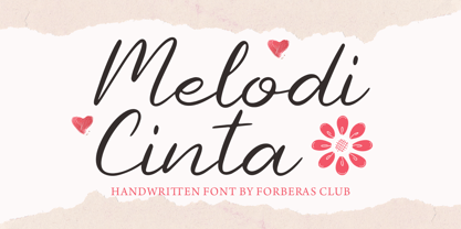 Melody Cinta is modern handwritten. Recommended to use this font for wedding party, invitation, memorable moment, love story and many more with special moment.
 - Sweet Rolling by Forberas Club,
$16.00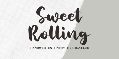 Sweet Rolling is modern handwritten. Recommended to use this font for wedding party, invitation, memorable moment, love story and many more with special moment.
 - TXT Monkeyshine by Illustration Ink,
$3.00This font is all monkey business. Add character and whit to scrapbook journaling, invitations, signs, flyers, and announcements. This lettering has a juvenile, handwritten style. - Z3non by SB type,
$35.00 A bold retro-future font ~ cosmic, weighty & groovy. Each letterform began with a rounded edge box as the base and ovals as a way to create negative space. In instances where the oval was not enough, a series of simple additional arced or straight cuts were made. What resulted is a unique and original font with a lot of personality. Stylistically, the font has a space-age vibe while possessing sleek, futuristic characteristics that ultimately make it feel fresh. It is not meant to be a go-to font for articles with a lot of text, but meant to expand ones library and in the right moment it will bring a lot of energy and major impact. Please note that this family has a limited character set and does not contain €, $, ¢, £, ¥ and other punctuation marks. Please check the glyphs tab to ensure this font will work for you!
 - Raljon by Mmarkk,
$22.22 Raljon is a display typeface created by designer and lettering artist Mark Robinson. It is a collaboration between the Mmarkk and Teen-Beat Graphica visual design studios. This single font was created over a period of five years. Mark took great care in finessing each character and making sure that each character would stand on its own and yet simultaneously, be an integral part of the whole. The typeface is inspired by Gothic letterforms, horror novels, speed metal bands of the 1980s, techno and electronic music of the 1990s, and Washington, DC football teams whose stadiums lie in the Maryland suburbs. While it doesn’t have multiple weights, Raljon does have a deep depth and breadth. It has a seemingly endless amount of alternate characters and ligatures. There are nine letter Ms, eight letter As and Fs, seven Rs and Ts, and the list goes on. Even the figures have alternates.


