10,000 search results
(0.262 seconds)
- Salonika by Aboutype,
$24.99Broad pen script typeface based on late 1960s Turkish signage. - Murray Hill by Bitstream,
$29.99An original informal script designed for ATF by Emil Klump. - Bank MF by Masterfont,
$59.00 You will distinguish these elegant strokes from a mile away.
 - Another Passion by Sarid Ezra,
$19.00 Introducing, Another Passion Script Family, make your own handwritten! Another Passion Script Family contain 4 FONTS including ligatures and underline. Also comes with italic, bold, and bold italic. Another Passion Script is a handwritten font that you can use to make a logo for branding, beautiful fashion design, or handwritten quote. Also already PUA Encoded. Foreign Languages Support: ÀÁÂÃÄÅÇÈÉÊËÌÍÎÏÐÑÒÓÔÕÖØÙÚÛÜÝßàáâãäåæçèéêëìíîïðñòóôõöøùúûüýÿ What Will You Get: Another Passion Regular Another Passion Italic Another Passion Bold Another Passion Bold Italic
 - Stefania by insigne,
$21.99Stefania is an elegant chancery script, designed with wedding invitations specifically in mind. A contemporary take on chancery scripts, Stefania retains a traditional calligraphic feel. Its features include a more pronounced slant for an elegant and dynamic flow and plenty of swash capitals. With ample flourishes and frills, including a score of alternate characters, Stefania works well in a variety of creative uses. This formal script is perfect for projects that call for a sophisticated appearance. - Brewery Factory by Larin Type Co,
$15.00 Brewery Factory This is a vintage font collection inspired by old brewery, pubs, bars and the style of their design. This collection includes 16 font styles - Serif and Script has a regular, rough, vintage, halftone style, as well as a regular and rough style for Serif and Script there are shadows in two versions - short and long. The script font includes alternatives for Uppercase and Lowercase, as well as swashes. This font is easy to use has OpenType features.
 - Sonora by profonts,
$51.99 Sonora is a brandnew profonts script typeface family supplied in the new OpenType Pro font format. Sonora contains six styles as light, medium, bold and the corresponding italics. The character set covers about 1.500 glyphs for the complete Latin character set (West, East, Baltic, Turkish, Romanian), and a huge number of handmade ligatures and alternates to make it a perfect OpenType Pro connecting script. Sonora is a very distinguished, elegant and versatile, intentionally non-slanted script font.
 - Valentine by profonts,
$51.99 Valentine is another brand-new profonts script typeface family with versions in light, light italic, medium and medium italic, supplied in the new OpenType Pro font format. Valentine contains about 1.100 glyphs for every weight, covering the complete Latin character set (West, East, Baltic, Turkish, Romanian), and a huge number of handmade ligatures, character combinations and alternates to make it a perfect OpenType Pro connecting script. Valentine is a very distinguished, elegant and versatile script font.
 - Beauty Mermaid by Scratch Design,
$10.00 Introducing Beauty Mermaid script! It's a modern and beautiful script font with texture brushed ink style. It's highly recommended for you who want to make some designs with a texture like a realistic signature style. This font will work for invitation design, logos, wedding invitations, posters, packaging, book cover title, quote, social media post, etc. Open your Opentype features using the script font to use the ligatures and swashes. Also, this font includes alternates for uppercase and lowercase characteristics.
 - Santa Fe by profonts,
$51.99 Santa Fe is a profonts script typeface family supplied in the new OpenType Pro font format. Santa Fe contains six styles as light, medium, bold and the corresponding italics. The character set covers about 500 glyphs for the complete Latin character set (West, East, Baltic, Turkish, Romanian), and a large number of handmade ligatures and alternates to make it a perfect OpenType Pro connecting script. Santa Fe is a very distinguished, elegant and versatile, intentionally non-slanted script font.
 - Emelynd by Heinzel Std,
$14.00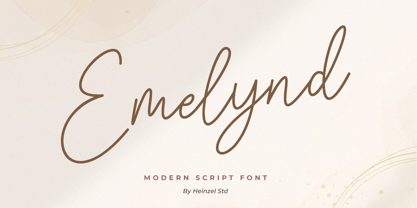 Emelynd Script is a new modern, and fresh script with a handwritten style, looking elegant and natural. It's perfect for any awesome project that need handwriting taste. It includes ligatures, alternates and multi-lingual support. Emelynd Script would perfect for photography, watermarks, social media posts, advertisements, logos and branding, invitations, product designs, labels, stationery, wedding designs, product packaging, special events or anything that need handwriting taste. Thank you for your purchase! Hope you enjoy with our font
 - Mosaic by Paul O'Connell,
$9.95 This innovative styled Mosaic font was created to suit various design applications within the typeface market and is aimed at people looking for a modern styled brush script typeface that doesn't fit in with the regular trends of script fonts. Designed and produced by Paul O'Connell of POCT, it is a slick and light hearted script typeface that reflects many irregularities, but still manages to retain a very balanced and modern feel with just a touch of fun too.
 - Strong Heart by Sarid Ezra,
$13.00 Introducing my another font duo, Strong Heart! This is my newest font, I made two very different style that will compliment each other. Strong Heart contain two font, Script with lovely vibes, and Caps with strong form. The script also comes with ligatures that will make the signature font more real. This fonts are totally applicable in any project, like your social media post, merchandise, signature, etc. Font Features: Script Ligatures Number and Symbol Multi Language Support PUA Encoded
 - Black Forest by Haksen,
$12.00 Black Forest is a beautiful high fashion font duo that makes for gorgeous logos, posters, wedding invitations, blog posts, social media, and more!I love using them together with layer masks in Photoshop, so it looks like the script is running through the lines of the sans. The sans looks stunning. Black Forest Script includes ligatures to make everything look totally hand-done, and alternates for each letter. What Includes: Black Forest Script OTF Black Forest Sans OTF Thanks
 - Montiago by Cooldesignlab,
$10.00 Introducing a new unique and beautiful outline font - Montiago script. This beautiful script is for those who need elegance and style for their designs and is perfect for wedding invitations, date cards, and feminine branding. Montiago script includes a complete set of Basic Characters, Numerals, and Lowercase Punctuation. Also contains binders and lots of styling alternatives to perfectly recreate natural calligraphy (check the preview to see them all). Thank you very much for visiting my store!
 - The Oncial font by Match Software is a modern interpretation of an ancient script style that has its roots in the early Christian and medieval periods. This typeface is designed to evoke the feeling ...
- Sandokan by Matyas Machat,
$30.00 Sandokan is a brush script font with a character and morphology that nears Oriental calligraphy, Art Nouveau typefaces, psychedelic “flower power” fonts from the Sixties and Tuscan poster fonts from the 19th century. Its main features are the high contrast between thick and thin strokes and the extreme slanted angle in the typewriter imprints, creating inverse shadowing. The letter set is further accentuated by exotic decorative details and the often unusual connectors between small letters. The typeface supports all languages using the universal Latin character set. Sandokan is a slightly sweetened cultural cocktail. As such it looks best on everything that needs to come across as exotic and rather solid but unmistakeably eccentric - such as labels and packaging on exotic delicacies or circus posters.
 - Hello Radio by Invasi Studio,
$18.00 Say hello to Hello Radio font, the perfect font to add a touch of vintage charm to your designs! With its monoline stroke script style, this font brings back the good old days with a fun and quirky twist. The best part? It supports multilingual characters, so you can spread the retro vibes in any language you desire. Every character in Hello Radio font has a delightful imperfect shape, giving your designs a natural and handcrafted feel. It's like having your vintage radio station right at your fingertips! This font is a true team player, cooperating effortlessly with other elements in your design. Whether you're creating traditional-style logos, labels, package designs, or awesome lettering for t-shirts, Hello Radio Font has got you covered.
 - Bellatrice Natural by IbraCreative,
$17.00 Bellatrice Natural is a captivating natural signature font that effortlessly combines elegance with a touch of organic charm. Its fluid strokes emulate the graceful movements of handwritten script, lending a personalized and authentic feel to any design. The gentle curves and slightly irregular lines of Bellatrice evoke the warmth and individuality of a handcrafted signature, making it an ideal choice for projects that seek a distinctive and human touch. The font’s natural flow and intricate details create a harmonious balance, resulting in a timeless and sophisticated signature style that can elevate a variety of creative endeavors, from invitations and branding to personal correspondence. Bellatrice is a testament to the artistry of a well-crafted signature font, capturing the essence of natural handwriting with grace and finesse.
 - San Andre by Mans Greback,
$59.00 San Andre is a sport script font. Drawn and created by Mans Greback in 2021, this logotype lettering has a distinct retro style and a strong vintage personality, with a combination of soft brushes and strict backbones. Use multiple underscores to make swashes of different lengths. Examples: Andreas______ Athletics_______ (Download required.) San Andre is built with advanced OpenType functionality and has a guaranteed top-notch quality, containing stylistic and contextual alternates, ligatures and more features; all to give you full control and customizability. The font has extensive lingual support, covering all Latin-based languages, from North Europa to South Africa, from America to South-East Asia. It contains all characters and symbols you'll ever need, including all punctuation and numbers.
 - Sagona by René Bieder,
$39.00 Sagona is a contemporary slab serif building on the clarendon/ionic model dating back to the 19th century. Like its most famous representative Clarendon, Sagona features strong serifs and a variable stroke contrast resulting in a versatile typeface working great in headlines and small text sizes. Where great typefaces like Sentinel, Belizio or FF Hertz are staying close to the industrial and strict appearance, Sagona is focusing on a warm and welcoming approach, emphasizing a subtle elegance especially in the mid weights. The family comes in nine weights with matching true italics. It is equipped with a large set of alternative glyphs, ligatures, old style numbers, initials and finitials, two sets of arrows and many more opentype features making it a perfect choice for professional type setting.
 - Opake by Ndiscover,
$36.00 Opake™ is an experimental typeface design that steps away from regular design conventions. Instead of basing the design on a calligraphic tool or geometric shapes, Opake™ is the result of the exercise of creating letters with a single continuous loop line. This unseen technique makes the overall design very unique. Though unconventional, the design resonates with some familiarity because of its calligraphic stroke terminations and some shape decisions that might resemble Cooper Black. In the end Opake™ is a cutting edge non-connecting script font, with a warm and happy feeling. Ideal for large headlines and general display use, but also branding, posters and apparel. If you like unconventional solutions and edgy design, Opake is the font to go for.
 - Progeny by Type Associates,
$35.00 Progeny is a single-stroke freehand informal script that began life as a logo for a fast food company. That logo was rejected but when I added a suite of swash caps and a few extra ligatures and my trademark underlines it all started to come together as a font. Then I used it successfully for another logo and I proceeded to complete the weight variations that emerged during the first logo design, rounding the lighter weights to give a more friendly, softer look. That treatment didn't suit the bold weight but sharp corners did not detract from the robust, legible headliner that emerged. All weights work in all-lowercase, all-capitals, lowers with swash or regular initial caps and surprisingly – in all-caps with swash initials.
 - HU Ketchup by Heummdesign,
$15.00 HU Ketchup is special headline font that has waving strokes like script font. It can be used to stress out something important, and for any artwork that has retro vibe. It also looks good with food packaging, so it has diverse usage. HU Ketchup - это особый шрифт заголовка, который имеет волнистые штрихи, как шрифт скрипта. Его можно использовать, чтобы подчеркнуть что-то важное, а также для любых произведений искусства в стиле ретро. Он также хорошо смотрится с пищевой упаковкой, поэтому имеет разнообразное применение. Το HU Ketchup είναι μια ειδική γραμματοσειρά επικεφαλίδας που έχει κυματοειδείς πινελιές όπως γραμματοσειρά σεναρίου. Μπορεί να χρησιμοποιηθεί για να τονίσει κάτι σημαντικό και για οποιοδήποτε έργο τέχνης έχει ρετρό ατμόσφαιρα. Φαίνεται επίσης καλό με τη συσκευασία τροφίμων, επομένως έχει διαφορετική χρήση.
 - Occam by Veil of Perception,
$20.00 Occam is an informal calligraphic script face. The letter forms were drawn and constructed rather than penned or brushed but reflect a definite flat pen influence. The ascenders and descenders incorporate an abstract implied loop form. Some curves that would normally be round are pointed and some transitions that would normally be sharp and pointed have been made round. A few exit strokes curve back instead of moving up and out for a little different look. This font could be put to good use as a contrasting style combined with sans and serif faces in applications such as newsletters, brochures, invitations and annual reports. It could be used for heads, subheads, pull quotes, drop caps and as a title font for covers.
 - Hello Solvita by Gatype,
$13.00 Hello Solvita is a fancy retro script font. With bold high-contrast strokes, a playful character with a bit of binder and an alternative style.To give you extra creative work. Hello Solvita This font is great for logo designs, social media, Movie Titles, Book Titles, short text even long text fonts and great for your secondary text fonts with sans or serif. Create stunning masterpieces with the Hello Solvita font. Hello Solvita features OpenType style alternatives, International binders and support for most Western Languages included. To enable the OpenType Stylistic alternative, you need a program that supports OpenType features such as Adobe Illustrator CS, Adobe Indesign & CorelDraw X6-X7, Microsoft Word 2010 or later. Thank you very much for viewing and Enjoying it.
 - Hijabella by IbraCreative,
$17.00 Hijabella, a natural handwriting font, weaves an organic elegance into the realm of digital typography. With fluid strokes and a graceful rhythm, this font emulates the authenticity of hand-scripted messages. Each letter carries a unique charm, reflecting the imperfections and nuances found in real handwriting. The subtle variations in line thickness and the gentle slant of characters create an inviting and personal touch, reminiscent of pen meeting paper. Whether used for invitations, heartfelt notes, or creative projects, Hijabella’s natural flow captures the essence of a handwritten message, adding warmth and sincerity to the digital medium. Its versatile and effortless aesthetic makes it a perfect choice for those seeking a font that seamlessly blends the convenience of technology with the personal touch of genuine penmanship.
 - Bill Hiffith Handwritten by Colllab Studio,
$19.00 "Hi there, thank you for passing by. Colllab Studio is here. We crafted best collection of typefaces in a variety of styles to keep you covered for any project that comes your way! Bill Hiffith is an Organic Script, a gorgeous font that can be used for making multiple things. it includes smooth brush stroke, simple and soft. Its elegant taste is one of the most gorgeous fonts. This typography is reflected in this exquisite font family. The type is clean and simple yet fun and stylish. It is beautiful, better for headlines style design or logo design. Or you can have it on your website’s body style. Grab it now, Bill Hiffith could elevate your elegance brand design. A Million Thanks Colllab Studio www.colllabstudio.com
 - Raimes by Craft Supply Co,
$20.00 Introducing Raimes – Script Typeface Charming and Playful Script Meet Raimes, the Script Typeface that effortlessly infuses charm and playfulness into your designs. Whimsical Elegance Raimes boasts a whimsical elegance that’s perfect for a wide range of creative projects, adding a delightful touch of fun to your content. Versatile for Creative Projects Raimes’ versatility shines through, making it an ideal choice for various creative endeavors, including branding, invitations, and more. A Script Typeface That Delights Raimes ensures that your content is not only visually pleasing but also engaging. It leaves a memorable and delightful impression on your audience. In Conclusion In summary, Raimes – Script Typeface is the font that will bring charm and playfulness to your design projects. Its versatility makes it a great choice for branding, invitations, and a variety of creative endeavors. Raimes captivates your audience, leaving them with a delightful and memorable experience, ensuring accessibility to a broad readership.
 - Golden Youth Font Duo by Set Sail Studios,
$14.00 Introducing the Golden Youth Font Duo; A stylish & modern harmony of sans & script typefaces. With a tall condensed sans-serif font and a free-flowing script companion, Golden Youth offers beautiful contrasting typography for a diversity of design projects, including; logos & branding, packaging design, social media posts, advertisements & product designs. Golden Youth contains 2 font files, designed to work as a perfect companions or simply as strong standalone typefaces; Golden Youth Script • A clean, free-flowing, monoline script font containing upper & lowercase characters, numerals and a large range of punctuation. Also includes a full set of alternate characters and a large range of ligatures, accessible by turning on 'Stylistic Alternates' and 'Discretionary Ligatures' using OpenType software. Golden Youth Caps • A tall condensed sans-serif font containing uppercase only characters, numerals and a large range of punctuation. Creates a perfect pairing contrast with the Golden Youth Script fonts.
 - Andmesh by Rhd Studio,
$18.00 Andmesh Script is a calligraphic script font that comes with exquisite character changes, a kind of classic decorative copper script with a modern twist, designed with high detail for an elegant style. Andmesh Script is interesting because it is smooth, clean, feminine, sensual, glamorous, simple and very easy to read, because there are many fancy letter joints. I also offer a number of decent stylistic alternatives for multiple letters. Classic styles are very suitable to be applied in various formal forms such as invitations, labels, restaurant menus, logos, fashion, make up, stationery, novels, magazines, books, greeting / wedding cards, packaging, labels or all kinds of advertising purposes. . Andmesh Script has , including multiple language support. With OpenType features with alternative styles and elegant binding. The OpenType feature works automatically, but you can access it manually and for the best results required for your creativity in combining these Glyph variations.
 - Ghosting by Rhd Studio,
$18.00 Ghosting Script is a calligraphic script font that comes with exquisite character changes, a kind of classic decorative copper script with a modern twist, designed with high detail for an elegant style. Ghosting Script is interesting because it is smooth, clean, feminine, sensual, glamorous, simple and very easy to read, because there are many fancy letter joints. I also offer a number of decent stylistic alternatives for multiple letters. Classic styles are very suitable to be applied in various formal forms such as invitations, labels, restaurant menus, logos, fashion, make up, stationery, novels, magazines, books, greeting / wedding cards, packaging, labels or all kinds of advertising purposes. . Ghosting Script has , including multiple language support. With OpenType features with alternative styles and elegant binding. The OpenType feature works automatically, but you can access it manually and for the best results required for your creativity in combining these Glyph variations.
 - Breadley Sans by Ardyanatypes,
$14.00 Introducing Breadley Sans, a modern, elegant tagline sans serif type look. This font equipped with 5 levels of thickness, from thin to black suits your needs. Pairs well with modern san serifs and scripts as pictured, or stands strongly on its own as a heading and brand representative for an elegant look. This Breadley Sans overcome with the professional modern characteristic font which could bring elegant and appealing identity to your company for business utilities use like business card, name tag, uniform as brand elevation Advertising usage? sure! This modern Breadley Sans Serif typeface obviously fit to embossed as a letter signboard or even splash it along your office with an elegant look cutting sticker. The type shape of this elegant Breadley Sans, also stunning for books cover or magazine writing You can view all of the available characters in the screenshots above, and you can try out the modern & elegant of Breadley Sans now for any design matter Breadley Sans is also equipped with many languages, so it is easy to use for any country and language usage, and also equipped with Ligatures and alternative stylistic to make your design more attractive. A guide to accessing all alternatives Adobe Photoshop go to Window – glyphs Adobe Illustrator go to Type – glyphs Thank you and have a nice day
 - Outspace Fighter by Ditatype,
$29.00 Outspace Fighter is an electrifying game-themed display font designed in uppercase, capturing the essence of futuristic space battles. This font is made in boxy shapes with sharp corners, evoking a sense of strength and precision. Each uppercase letter is meticulously crafted to exude a futuristic aesthetic, mirroring the angular and geometric forms found in the vast expanse of outer space. This design choice gives the font a sleek and modern appeal, perfect for conveying the intensity of space battles. With low-contrast letters, this font places emphasis on the overall form and structure of the font. The subtle differences in stroke width create a balanced and unified visual experience. This design choice ensures legibility while maintaining a cohesive and visually appealing composition, allowing your audience to effortlessly engage with your game-themed designs. You can also enjoy the available features here. Features: Stylistic Sets Multilingual Supports PUA Encoded Numerals and Punctuations Outspace Fighter fits in headlines, logos, posters, titles, branding materials, print media, editorial layouts, website headers, and any other projects. Find out more ways to use this font by taking a look at the font preview. Thanks for purchasing our fonts. Hopefully, you have a great time using our font. Feel free to contact us anytime for further information or when you have trouble with the font. Thanks a lot and happy designing.
 - Odradeck by Harvester Type,
$20.00 Odradeck is a typeface that originated from the idea of creating a tall, but narrow font, while combining brutalism and technogenic. The difficulty was not to go to extremes and make the font moderately neutral in order to significantly increase the range of font applications. Odradeck came out with a strict, industrial, geometric, but moderately neutral semi-mono font with two axes of variability: height and slant. To all this, + 300 glyphs were added and, as a result, support for +80 languages. The structure of the font allows you to use it in a limited space, and its flexibility will allow you to fill and use this space to the maximum. You can apply it in a very wide range of designs. Whether it's a logo, packaging, banner, title, text, poster, merchandising, identity, branding or product design. Language support: Afrikaans, Albanian, Asu, Basque, Bemba, Bena, Breton, Catalan, Chiga, Colognian, Cornish, Croatian, Danish, Dutch, Embu, English, Esperanto, Estonian, Faroese, Filipino, Finnish, French, Friulian, Galician, Ganda, German, Gusii, Icelandic, Inari Sami, Indonesian, Irish, Italian, Jola-Fonyi, Kabuverdianu, Kalenjin, Kamba, Kikuyu, Kinyarwanda, Lower Sorbian, Luo, Luxembourgish, Luyia, Machame, Makhuwa-Meetto, Makonde, Malagasy, Manx, Meru, Morisyen, North Ndebele, Norwegian Bokmål, Norwegian Nynorsk, Nyankole, Oromo, Portuguese, Quechua, Romansh, Rombo, Rundi, Rwa, Samburu, Sango, Sangu, Scottish Gaelic, Sena, Serbian, Shambala, Shona, Soga, Somali, Spanish, Swahili, Swedish, Swiss German, Taita, Teso, Uzbek (Latin), Volapük, Vunjo, Walser, Zulu.
 - Syntax Next by Linotype,
$50.99 Syntax was designed by Swiss typographer Hans Eduard Meier, and issued in 1968 by the D. Stempel AG type foundry as their last hot metal type family. Meier used an unusual rationale in the design of this sans serif typeface; it has the shapes of humanist letters or oldstyle types (such as Sabon), but with a modified monoline treatment. The original drawings were done in 1954; first by writing the letters with a brush, then redrawing their essential linear forms, and finally adding balanced amounts of weight to the skeletons to produce optically monoline letterforms. Meier wanted to subtly express the rhythmical dynamism of written letters and at the same time produce a legible sans serif typeface. This theme was supported by using a very slight slope in the roman, tall ascenders, terminals at right angles to stroke direction, caps with classical proportions, and the humanist style a and g. The original foundry metal type was digitized in 1989 to make this family of four romans and one italic. Meier completely reworked Syntax in 2000, completing an expanded and improved font family that is available exclusively from Linotype GmbH as Linotype Syntax. In 2009 the typeface family was renamed into a more logical naming of "Syntax Next" to fit better in the Platinum Collection naming." Syntax® Next font field guide including best practices, font pairings and alternatives.
 - Winsel Variable by insigne,
$129.99 At this pivotal juncture, where every choice casts long shadows, the imperative of pinpointing the archetype of typefaces is of paramount importance. One mere oversight, and the soul of your endeavor risks being lost in the mists of time. Yet, amidst these crossroads, "Winsel" emerges as the North Star in your typographical odyssey. Birthed in the revered sanctums of insigne design, this typeface is a magnum opus, echoing the artistic brilliance of British poster craft from epochs of golden jazz to times of renaissance. Winsel, in its sheer magnificence, stands as a testament to artistry, each stroke demanding undivided reverence. Be it the valiant weights reminiscent of a guardian sentinel or the graceful finesse mirroring a maestro's touch, Winsel is an unparalleled behemoth. Imbued with the finesse of OpenType, it's poised to embrace the multifaceted European Latin tapestry, while its Small Caps and Titling Caps take pride of place across its grand suite of nine weights. Sculpted with precision, Winsel is the beacon that challenges the ordinary and pledges to be an immortal testament. Seldom has the cosmos aligned to present such an illustrious moment. Fortified with Winsel, you stand on the precipice of legend. Carve your tales into the annals of perpetuity, voice your ethos with unyielding conviction, and let each letter be a symphony of undying commitment. In this epoch, in this narrative, Winsel beckons you to etch history.
 - Tazugane Info by Monotype,
$187.99 Tazugane Info is a screen-ready Japanese font family, that follows on the debut of Monotype's first original Japanese typeface – Tazugane Gothic. It offers a more restrained personality, with calligraphic design details pared back to create a geometric letterform – a good alternative for designers looking for a matter-of-fact alternative to the warmer Tazugane Gothic tone of voice. Tazugane Info was updated to support the “Reiwa” new era symbol. Reiwa can be written as two kanji: 令和. This update to Tazugane Info includes Reiwa designed as a single ligature and is encoded as U+32FF. “While Tazugane Gothic fits perfectly when your job requires an organic and friendly tone of voice, Tazugane Info provides a more solid look,” says Kobayashi. “I hope that having two options will make it easier to choose an appropriate tone of voice to convey information or brand messaging.” Its strokes create a smooth uninterrupted flow that's designed for use on-screen. Although books, newspapers and magazines are traditionally set vertically in Japan, smartphones, information panels and car navigation systems are all set horizontally – and Tazugane Info has been tailored to this environment, featuring a new set of kana phonetic symbols. Tazugane Info is available in 10 weights, and includes the complete set of kanji and latin found in Tazugane Gothic.
 - Gaulois by Canada Type,
$24.95 A couple of years before the second World War, Marcel Jacno, the popular French graphic designer who in the 1930s designed iconic posters for Gaumont and Paramount and famously illustrated the Gaulish helmet that first adorned the Gauloises cigarette packs in 1936, was asked by Deberny & Peignot to design a calligraphic typeface for the advertising market. Jacno's Scribe design, billed by D&P as a "virile ad writing" typeface, was released to some great fanfare in 1937, enjoyed some time of French spotlight, and was ready to make waves in the rest of Europe before the war broke out and snuffed its chances at international recognition. However, samples of it can still be found in some specialty post-war publications as an example of a trend that lasted a couple of decades, when Western European type manufacturers commissioned famous visual artists to design typefaces in order to capitalize on the artists' fame - the trend that brought us standards like Futura and the long list of Lucien Bernhard and Imre Reiner faces. This exclusive digital version of Jacno's design expands on the original concept with a large character set that includes plenty of alternates, a couple of different ways for seamless lowercase connections, three sets of figures, and extended Latin language support, adding up to over 540 characters in a one big, contextually-programmed font.
 - Stamen by Wordshape,
$20.00 Stamen is the answer to a big question: What would happen if one tried to create a typeface that was ‘out of time’? If a type designer was to turn off the internet and put away the type specimens and just try to explore limbic, phantom history, what might that look like? No slavish explorations of the past. No gropings toward the future. No exhaustive core sample of the contemporary. Instead, using what one remembers of history and our collective vision of the future (usually a future imagined from the past) and channeling that into something that is, hopefully, new… The Bentons meet Frutiger for a Manhattan on a space station while Matthew Carter sways to the sweet sounds of the chorale that occasionally played through the halls of Stephenson Blake. This smear of implicit history expressed without explicit reference—this is Stamen: a family of 12 typefaces with a ton of alternate characters. The bold weight was designed for the LP “I Thought the Future Would Be Cooler” ( http://ittfwbc.com/ ) by the band YACHT in response to their request for a typeface that was ‘lost in time’, and refers to neither strict historical models nor purely futuristic forms. I built a small family out from there. It works well in text, but just as well for display setting. I think you’ll enjoy using it.