10,000 search results
(0.019 seconds)
- Orthotopes - Personal use only

- Ablati by Hackberry Font Foundry,
$24.95 Ablati is the commercial release of the font designed during the production of our new font design book, “Practical Font Design”. It is a new serif font in my continuing objective of designing book fonts that I can really use. In many ways, Ablati is a very different direction for me. Designed to produce gaphics to use in the font design book, I was forced to really reconsider many of my working methods to make them work for outside readership. Like all designers, my internal design processes can get really sloppy. The book helped me clean up my act. Taking my inspiration from one of my favorite fonts of all time {though I've never really been able to use it much}, Romic, by Colin at Letraset, I decided to design a unilateral serif font. In most ways, this is a normal serif for me in that it has caps, lowercase, small caps with the appropriate figures for each case. This font has all the OpenType features in the new set developed for the book. There are several ligatures for your fun and enjoyment: bb gg ff fi fl ffi ffl ffy fj ft tt ty Wh Th and more. Several alternative forms, a dozen ornaments, and more. Like all of my fonts, there are: caps, lowercase, small caps, proportional lining figures, proportional oldstyle figures, & small cap figures, plus numerators, denominators, superiors, inferiors, and a complete set of ordinals 1st through infinity. Enjoy! The Oldstyle and Small Cap fonts are an attempt to have most of the OpenType characters available to people still using Type 1 and TrueType fonts.
 - Luis Serra by Homelessfonts,
$49.00 Homelessfonts is an initiative by the Arrels foundation to support, raise awareness and bring some dignity to the life of homeless people in Barcelona Spain. Each of the fonts was carefully digitized from the handwriting of different homeless people who agreed to participate in this initiative. Please Note: these fonts include only the latin alphabet; no accented characters, no numbers or punctuation. MyFonts is pleased to donate all revenue from the sales of Homelessfonts to the Arrels foundation in support of their mission to provide the homeless people in Barcelona with a path to independence with accommodations, food, social and health care. Luis Serra was born in Alicante. There he grew up and even started a family His life was there. But at the age of 35 he split up with his wife and decided to go to Barcelona in search of a new life. And it wasn’t easy for him. He had to turn his hand to all kinds of jobs and didn’t manage to find the stability he needed. Luis is a shy, retiring person who takes great pleasure in the little things in life such as walking in the mountains or celebrating the victories of his football team, Barça. After four years living in Barcelona, Luis found himself in a position he’d never imagined. “The street’s much worse now, there’s more trouble, there’s more tension,” says Luís. In the street he had to learn, as he always had, to move fast, to find a place to sleep and something to eat. Luís is one of those people who don’t let circumstances mould him, but adapts to them and always tries to do his best.
 - Crippy MF by Masterfont,
$59.00 Horror movies? Tattoo? Yes, here is the ideal font for you.
 - FG Tonya by YOFF,
$13.95 Here you have FG Tonya who's a social, charmingly writing female.
 - Bumpy Road - Unknown license

- Vegas by ITC,
$29.99Vegas is the work of British designer David Quay, an excellent choice where a bright, glitzy effect is desired. Like most scripts, the capitals work as initials in conjunction with the lowercase. The lowercase letters should be set very closely or touching to create a true script effect. - Reepy by The Design Speak,
$100.00 Reepy is a font designed with horror in mind and works for all your scary needs. The design concept was designed with Tim Burton and Jordan Peele's "Us". It is ideal to be used in communicating something a creepy or frightening and this is where the name comes from.
 - Brussels by Solotype,
$19.95The Stephenson Blake foundry in England, made two fonts, Flemish Expanded and Flemish Condensed. In our view, one was too wide, the other too narrow; so we redrew it and renamed it Brussels. Why not? Belgium is one of the few places where you may still hear Flemish spoken. - Andovai by Eurotypo,
$39.00 Andovai, a modern Roman cursive family, fast and slightly aggressive as today's Rome, deriving its name in Roman dialect of the phrase "Ma 'ndo vai...", the meaning of which in Italian is "Dove vai?" (Where are you going?) ... in a game to define a current and irreverent gestural typography.
 - Rotham Industria by Greater Albion Typefounders,
$18.00 Rotham Industrial. Stylised lettering for industrial flavoured projects. Imagine, if you will letters shaped from metal tube, or perhaps from a solid rod, or perhaps made from brass handrails? You get the idea. A stylised and fun typeface for those occasions where you want to suggest an engineering influence.
 - Lampion by Hanoded,
$15.00 Lampions are paper lanterns. They are very popular in Asian countries, where they are used at festivals. Lampions are mostly made from rice paper cuttings which are glued to a bamboo frame. Lampion font is a tall, narrow and very legible typeface, which comes with extensive language support.
 - Tachyon by Fonthead Design,
$15.00Tachyon is a family designed by Ethan Dunham that has clean simple lines. The family comes in four weights, regular, light, thin and hairline. The hairline version is extremely light and useable only at larger point sizes. This family is perfect where a high-tech look is needed. - Chilia by Craft Supply Co,
$15.00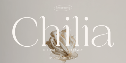 Chilia is a stylish serif font where contemporary upper serifs meet a feminine allure, making it ideal for beauty and display purposes. With its unique blend of modern and elegant features, Chilia adds a touch of sophistication with eye-catching presence that perfect for captivating displays that demand attention.
 - Mix Stitch by Mix Fonts,
$13.00 Mix Stitch, is an embroidery lesson disguised as a font, fit for handmade and DIY themed projects. Can be used to emulate embroidery in images, or as a guide to teach kids how to write. So many uses for this fun font, I don't even know where to begin.
 - Netherland Perpendicular by Greater Albion Typefounders,
$16.00 Netherland Perpendicular, a family of five typefaces, is Greater Albion’s end of year Blackletter release for 2015. It is designed in the fine traditions of Victorian Revival Blackletter, where historical veracity is ever sacrificed to aesthetic calm. The five typefaces share uniform metrics, making for charming colour overlay effects.
 - Shred by Canada Type,
$24.95 Shred is the result of staring at so-called three-dimensional shapes for days on end, then capping the meditation by eating the white light at the end of the tunnel and sweating it out a blade a second. Bliss is overrated. Sharpness is where it's at. Get slicin'.
 - Cracksmoon by Zamjump,
$15.00 Cracksmoon was hand-drawn with a marker pen and converted to font - and like the marker, it has natural edges and realistic shapes. Includes bonus ligatures and style swashes. Perfect for designs where you need a font that's a little rougher around the edges. Including : Alternate Multilingual support
 - Cargi by Studio Principle Type,
$12.00 A condensed neo-grotesque typeface with a quirky personality. Cargi contains 9 weights, obliques and a variable version. Low contrast and clean forms create legibility at small sizes, but display uses are where the real character of Cargi comes out to play. 319 glyphs to support 100+ languages.
 - Blitzplakat by FaceType,
$12.00 Unearthed by our friend Dimitris Karaiskos in an antique shop in Vienna, we digitized it and added more glyphs. Blitzplakat is the name of this pre-Letraset system, where you could make your own little advertising posters by cutting out these letters and sticking them on paper like stamps.
 - Azariel by Scriptorium,
$18.00Azariel is a decorative calligraphic script font designed to have linking characters in the lower case and elaborate swashed capital letters which overlap and nestle with adjoining characters. It's very elegant - excellent for invitations and other decorative uses where you want something a bit less formal but very stylish. - 3D Blocky by Okaycat,
$29.50 3D Blocky is a hand-drawn 3-D font. Composed of friendly & fun letters, this font is sure to become a favorite for you. There is a sprinkling of dingbats scattered around the alternates, just there to make this font extra fun and useful . Check it out! 3D Blocky is extended, containing West European diacritics & ligatures, making it suitable for multilingual environments & publications.
 - OnO Display Pro by David Engelby Foundry,
$30.00 Go grab this rock’n’roll display typeface especially suited for posters and headlines in general. This typeface also has many banner dingbats which can be combined in many ways, but there are also finished banner dingbats ready to use. The quality doesn’t stop there, as you can also make use of Central European characters, adjusted Scandinavian characters and fine ligatures. Enjoy!
 - Tropical Jungle by Colllab Studio,
$19.00 "Hi there, thank you for passing by. Colllab Studio is here. We crafted best collection of typefaces in a variety of styles to keep you covered for any project that comes your way! Tropical Jungle is a fun wild font, inspired by the wild life of the jungle. Inspired by the tropical rainforests of South America, Africa, and Asia, this font will inspire you to get out there and explore! Tropical Jungle is a bold, quirky typeface that captures the joyous spirit of life on earth or at least, of the parts we’re most familiar with: monkeys swinging through trees, tigers stalking their prey through the jungle, butterflies flitting from flower to flower. You can tell just from looking at it that this is going to be a fun-loving font that will bring a smile to your face and a bounce to your step. With over 500 glyphs, this stack of jungle animals will be a joy to use! We made sure our font was easy to read in any application so you don’t have to worry about your documents cluttering up. We know you can’t wait to get started using it in your next project. So go ahead! Grab Tropical Jungle now! A Million Thanks Colllab Studio www.colllabstudio.com
 - Dancebats by Canada Type,
$24.95 According to the two most popular statistics companies in England and North America, eight out of every ten people like to dance. Talk about useless information! But with such a market statistic, we thought there would be some collections of dingbats out there with dancers in them. And surprise, surprise; we found not even one! So this was our opportunity to be the first to issue such a collection, and we are very pleased with the results. Dancebats is a font of 75 silhouettes of people dancing. All kinds of dancing. Ballet, techno, slam, rock, swing, aerobic, hip hop, jump, lounge, and much more. Take a close look at the silhouettes and find out why these are shapes that belong on every party design, bar none. The Dancebats outlines were tweaked for use at all sizes, from the very large, as in posters and signs, to the medium height, as in party flyers, invitations and publications, to the very small, as in web banners and pin-on buttons. We are anticipating these silhouettes to be used soon all over posters, signs and web sites everywhere, so get your hands on a copy and give yourself some ammunition for your next party design.
 - Libertine by Canada Type,
$24.95 Taking its cue from the lettering of 1930s Dutch commercial artist Martin Meijer, Libertine is a script where expert calligraphy and total wrist control are on display. With strokes stopping and starting at very steep angles and extreme contrasts, every character is a high riff jolting from within a stunning epic that brands the message home. This is the rebel yell, the adrenaline of scripts. Libertine comes in three interchangeable fonts, each of which containing extended language support. The complete set comes with a fourth font that includes tons of alternates and ligatures and, more importantly, Libertine Pro, the 1160+ character behemoth that combines all four fonts for advanced typography environments, where automatic ligatures, stylistic alternates, and position-sensitive forms are seamlessly put to good use.
 - Grandis by Eimantas Paškonis,
$- Grandis ("chainlink") was initially intended for a first person shooter’s UI, so this guided the design. The font had to be readable while maintaining sci-fi feel and also to not rely on kerning (most video games don’t support it). This meant a large x-height, steep diagonals and squared bowls to reduce the amount of white space between letters. Tabular numbers as default facilitate UI design where timers or tables are involved. What makes the font stand out from similar grotesks is the letters’ classical proportions with wide bowls and narrow rectangles. The result is a readable, versatile workhorse with an interesting dynamic rhythm and where extreme weights/widths can also be used for display purposes. Supports multilingual Latin and Cyrillic, including Bulgarian and Serbian alternates.
 - Contype by Wiescher Design,
$39.50 Once I had a young, very eager and interested designer in my employ. We got into talking about where our letterforms come from and the habits in perception we are used to. He did not quite believe me. So I said, let's try to design a typeface where everything is just the opposite of what we are used to. We really had a hard time, our habits crept up on us all the time. But after a couple of weeks we finally finished this typeface and wanted to call it crazytype, but my young apprentice who did most of the manual labor said Contype sounded crazier. So it became Contype and it's really crazy, with a small asian touch to it. Yours very crazy Gert Wiescher
 - Interlace by Holland Fonts,
$30.00Designed inspired by video technology and meant for the use on television, but never really made it there. Yet... - Ice Creamery by FontMesa,
$29.00Ice Creamery is a new variation of our Saloon Girl font family complete with italics and fill fonts which may be used to layer different colors into the open parts of each glyph. We don’t recommend using the fill fonts for Ice Creamery as stand alone solid fonts, Ice Creamery Chocolate was designed as a the stand alone solid font for this font family. Fill fonts go back to the 1850's where they would design matched sets of printing blocks and the layering of colors took place on the printing press, they would print a page in black then on a second printing they would print a solid letter in red or blue over the letters with open spaces to fill them in. Most of the time the second printing didn't line up exactly to the open faced font and it created a misprinted look. With the fill fonts in Ice Creamery and other FontMesa fonts you have the option to perfectly align the fill fonts with the open faced fonts or shift it a little to create a misprinted look which looks pretty cool in some projects such as t-shirt designs. I have some ice cream making history in my family, my Grandfather Fred Hagemann was the manager of the ice cream plant for thirty years at Cock Robin Ice Cream and Burgers in Naperville IL. In the images above I've included an old 1960's photo of the Cock Robin Naperville location, the ice cream plant was behind the restaurant as seen by the chimney stack which was part of the plant. If you were to travel 2000 feet directly behind the Cock Robin sign in the photo, that's where I started the FontMesa type foundry at my home in Naperville. My favorite ice cream flavor was their green pistachio ice cream with black cherries, they called it Spumoni even though it wasn't a true Spumoni recipe. Their butter pecan ice cream was also incredibly good, the pecans were super fresh, their Tin Roof Sundae ice cream was chocolate fudge, caramel and peanuts swirled into vanilla ice cream. One unique thing about Cock Robin and Prince Castle was they used a square ice cream scoop for their sundaes. - CemeteryWalk by Ingrimayne Type,
$5.00 I created CemeteryWalk in 2018 to illustrate a program for a local cemetery walk. CemeteryWalk places letters on pictures of gravestones. In 2022 I expanded the family by placing three different sets of letters on the gravestones. Each of the four different sets of letters on gravestones has two styles, one with black letters on white gravestones and the other with white letters on black markers (the bold style). The bold style can be placed beneath the plain style to add color or texture. All eight styles are caps only, with the lower-case letters having different shapes for the tombstones but the same letters as in the upper case. There is only one set of accented characters and it is where the upper-case letters are found. Each also has an alternate set of characters that are somewhat similar in appearance and it can be accessed using the OpenType feature of stylistic sets. A final typeface in the family is a picture font of items that may be found on old tombstones.
 - PF Fuel Pro by Parachute,
$79.00 This typeface was inspired by the rough surroundings of a modern city and reflects the contradicting nature of an emerging global youth culture. Ever since its first release—back in late 1999— it is constantly on our ‘most wanted’ list and has been part of numerous product campaigns. Music, mobile telephony, food and beverages, politics, you name it. Coca-Cola used it, José Cuervo used it for about 3 years. The new ‘Pro’ version goes one step ahead. You may now capture the essence of the younger generation in every major European language. PF Fuel has been extended with the full array of Cyrillic characters as well as matching frames for this extra stamped look. Furthermore there more alternate characters than ever. Create a custom look, when same characters sit close, or one next to the other. You may find these useful—alternate characters either in the lowercase positions, or access them through the ‘stylistic alternates’ OpenType Pro feature. If you need some extra fuel, this is where to get it!
 - Mayfest by pentagonistudio,
$17.00 Mayfest Is An Elegant Display serif Inspired By Luxury and Elegant Character. FAQ's : Where are the OTF's? They are included in a download link( in a text file) in your main download file. 1 user 2 computers installation (Desktop License) You may NOT use for broadcast or Cinema/Motion Picture. You may NOT resell this font in any platform without further permission from designer. Do NOT embed font files in app/game/e-pub (for desktop license) You may NOT use the fonts in templates for sale/free. ( web/print/app ) For other license use please contact us. SOFTWARE REQUIREMENTS : Fonts and alternate : No special software required they may be used in any basic program /website apps that allows standard fonts That's it folks! You can go ahead and get cracking :) Follow My Shop For Upcoming Updates Including Additional Glyphs And Language Support. And Please Message Me If You Want Your Language Included or If There Are Any Features or Glyph Requests, Feel Free to Send me A Message. Have a Good Day !
 - Morro by Great Scott,
$16.00 Morro is based on simple geometric shapes – circles, triangles and rectangles. Imagine cutting circles, triangels and rectangles from paper and arranging them into letters where the outer edges form a filled figure. Arranging figures like this to form letters is nothing unique. You can find several beautiful examples of alphabets that inspired the creation of Morro. Everywhere from a 1936 booklet by Draughtsman called ”Modern lettering for all branches of commercial arts” to obvious examples is from the paragon of the design industry - Milton Glaser - with his typeface Baby Teeth. What sets Morro apart from other digitized versions of Glasers' ”Baby teeth”, or other similar designed fonts, is that Morro is expanded into lower case and also supports Basic latin, Western European, Central European, south Eastern European and Pinyin. There are also stylistic alternatives to some of the glyphs. Morro Regular works like a stencil and is accompanied by a block shadow style and an outline. The Morro family of fonts are layered and can be superimposed on each other to create several types of text effects.
 - ITC Eborg by ITC,
$29.99Designed by the highly regarded American designer George Ryan of the Galapagos Design Group. George is the veteran of a number of successful display fonts and there is no reason why ITC Eborg, with it's striking appearance, should not follow suit. Is it a bold casual sans serif or a disciplined brush script? Probably the former but only just. Whatever it's category though, ITC Eborg has the pedigree to become a highly successful and much sought after font. It has been carefully designed to maximize it's usage potential with conventional capitals combining well with a lowercase in which the x-height is just about right for both large display application whilst retaining good legibility at some of the smallish point sizes. ITC Eborg, with it's warm friendly qualities which are very much in evidence, and in a world where it has become so important to convey that casual approachable air," even in the most aggressive of advertising, be it product or service, it is definitely a style to fill the need." - Lanche by pentagonistudio,
$19.00 Lanche Is An Modern Elegant Serif Font Inspired By Elegant Serif Typeface FAQ's : Where are the OTF's? They are included in a download link( in a text file) in your main download file. 1 user 2 computers installation (Desktop License) You may NOT use for broadcast or Cinema/Motion Picture. You may NOT resell this font in any platform without further permission from designer. Do NOT embed font files in app/game/e-pub (for desktop license) You may NOT use the fonts in templates for sale/free. ( web/print/app ) For other license use please contact us. SOFTWARE REQUIREMENTS : Fonts and alternate : No special software required they may be used in any basic program /website apps that allows standard fonts That's it folks! You can go ahead and get cracking :) Follow My Shop For Upcoming Updates Including Additional Glyphs And Language Support. And Please Message Me If You Want Your Language Included or If There Are Any Features or Glyph Requests, Feel Free to Send me A Message. Have a Good Day !
 - Rapid Writing by Misprinted Type,
$38.00 Rapid Writing is based on the Rapid and Muscular Methods of writing, where the whole arm instead of the wrist is used to write. Copybooks and vertical writing fostered form at the expense of freedom. Speed and muscular movement have fostered freedom at the expense of form. This font is based upon form and movement and brings spontaneity and freedom to calligraphy! The font is full contrast, swashes, round forms, ligatures, contextual alternates and other surprises. OPENTYPE FEATURES • 34 Contextual Alternates • 32 Standard Ligatures • Several Stylistic Alternates (2 options for A-Z/0-9) • Ending Swashes (Each character (A-Z) has up to 12 swash endings) Not to mention the font has 710 glyphs. HOW TO USE THE ENDING SWASHES It’s very simple! Simply write the word+ > (greater symbol). For example: Typography> Typography>> Typography>>> etc. After each “>” you get a different ending swash for each character. So there are lot’s of different combinations and alternatives to suit your needs! The font also comes with a PDF Manual. If you have any questions, please get in touch at hello@eduardorecife.com
 - Mosquito Formal by Monotype,
$29.00Mosquito Formal, by Éric de Berranger, takes the original jaunty design of Mosquito and dresses it in a tuxedo. The stressed character strokes, simple, straightforward shapes, relatively large x-height, open counters and hint of Peignot are still there, but the cursive strokes and lively terminals have been replaced with traditional designs. The result is a more serious-and more sophisticated typeface. The idea," says Éric de Berranger, "was to assuage the drawing of Mosquito. To 'calm' it; and eliminate its idiosyncrasies while preserving character structure and general appearance." Although still distinctive, as Éric de Berranger puts it, "Mosquito Formal is more to be read than seen, it is more invisible and thus, more readable than my earlier design." He does, however, use both typefaces in his graphic design projects: Mosquito for headlines and in applications where the lively design is appropriate, and Mosquito Formal for those instances that require a quieter more sophisticated look. Mosquito Formal is available in three weights with complementary italic designs in addition to a suite of small caps and old style figures. " - Rosemary by Chank,
$99.00Here is a nice sign-painterly display font inspired by the 1920s. - Mabsut MF by Masterfont,
$59.00 Feel naughty, childish and happy - here is the perfect font for you.

