10,000 search results
(0.019 seconds)
- Wakerobin by Monotype,
$50.99 Wakerobin takes its charming swagger from the hand-painted billboard, poster and signage lettering of the mid-19th century. These showy styles did everything they could to stand out from the background cacophony of advertising, with signwriters using sharp and high contrast serif letters, squared block shapes, or art nouveau forms to grab the attention of passersby. Wakerobin embraces the spirit of these letterforms, bringing these various styles together in one typeface - as if users had their own sign painter on hand. Just as lettering artists had to adapt to a variety of sizes - from wide streetcar lettering to compressed forms that squeezed into narrow Victorian windows - the variable version of Wakerobin scales up and down in width to fit whatever environment the user’s working in. The static fonts come in three widths and five weights. As well as its adaptability, Wakerobin is bursting with vintage flavour, making it hard to ignore. Its distinctive, spiky serifs would be right at home on food and drinks packaging, as well as shop windows, adverts, and any other place that calls for some typographic showmanship. It performs particularly well in busy environments, or anywhere with a lot of visual noise - just as its historic predecessors did. And while Wakerobin is first and foremost a display typeface, it’s surprisingly elegant when used at text size, or in the lighter end of the weight spectrum.
 - Axial cut by deFharo,
$21.00 Axial Cut is a sans serif typeface (Latin Extended-A), a contemporary and rounded evolution of geometric fonts for screen, but this time the letters are built on an axial axis that results in trapezoidal counter-shapes, joints with reduced antlers and rounded corners that correct optical effects in small sizes to make the typography more legible, and at the same time, in large sizes it shows its original shapes. The Axial Cut typeface family is made up of four weights: Light, Regular, Medium and Bold, each with 785 characters. I have taken particular care with the metrics and dimensions of each letter or sign, with a very careful and precise kerning configuration to achieve the For maximum readability, these are fonts with slightly higher ascenders than capitals and short descenders to make it more compact. The editing possibilities and unique designs with these complex typefaces are very wide, the fonts have a complete set of uppercase letters and a lowercase set with alternative characters as well as lowercase letters and numbers in different positions (lowercase, denominators, numerals, and uppercase) that They also work as automatic fractions, they also incorporate small capital letters and three sets of alternative numbers (Normal, Old style numbers, Square numbers), etc. Discover other alternative signs, characters and Open Type functions in the PDF: Specimen & The Cheat Sheet.
 - Pagnol by Typorium,
$15.00 The Pagnol typeface has been designed with a principle developed by A. M. Cassandre in 1937, when the great French designer created the Peignot typeface following paleographic studies on the evolution of letterforms. Researches in the history of writing have proved that the lowercase "a" is at its origin nothing but the "A" shape transformed through centuries by scribes until the invention of printing. A large number of lowercases meanwhile kept their original shapes. If the scribes’ hand didn’t find the necessity to simplify them, it is only because these letters could be easily written. Integrating the classical shapes of capitals to the lowercases has already been used, keeping the lowercases which are only a deformation of capitals. Nevertheless, the respect of readability imposes to keep ascendants and descendants from traditional lowercases which serve as optical focus points in a text and make reading easier. The particularity of Pagnol is to use rounded shapes on top and bottom of pointed capital letters to make them fit with corresponding lowercases (Aa, Mm, Nn, Vv, Ww, Zz). Lowercases proportions are wide, to be in tune with classic lowercase shapes in order to optimize readability. Five weights in roman and italic have been designed to offer a wide palette of typographic possibilities in all sizes and all paper and screen supports.
 - ITC Tyke by ITC,
$29.99Tomi Haaparanta got the idea for the Tyke typeface family after using Cooper Black for a design project. He liked Cooper's chubby design, but longed for a wider range of weights. “I wanted a typeface that was cuddly and friendly,” recalls Haaparanta, “but also one that was readable at text sizes.” He started tinkering with the idea, and Tyke began to emerge. Even though Haaparanta knew his boldest weight would equal the heft of Cooper Black, he began drawing the Tyke family with the medium. His goal was to refine the characteristics of the design at this moderate weight, and then build on it to create the light and bold extremes. Haaparanta got the spark to design type in 1990, when he attended a workshop held by Phil Baines at the National College of Art and Design in Dublin. “I've been working and playing with type ever since,” Haaparanta recalls. He released his first commercial font in 1996, while working as an Art Director in Helsinki. After about two dozen more releases, he founded his own type studio, Suomi Type Foundry, early in 2004. At five weights plus corresponding italics, Tyke easily fulfills Haaparanta's goal of creating a wide range of distinctive, completely usable designs. The light through bold weights perform well at both large and small sizes, while the Black is an outstanding alternative to Cooper for display copy. - Wakerobin Variable by Monotype,
$209.99Wakerobin takes its charming swagger from the hand-painted billboard, poster and signage lettering of the mid-19th century. These showy styles did everything they could to stand out from the background cacophony of advertising, with signwriters using sharp and high contrast serif letters, squared block shapes, or art nouveau forms to grab the attention of passersby. Wakerobin embraces the spirit of these letterforms, bringing these various styles together in one typeface - as if users had their own sign painter on hand. Just as lettering artists had to adapt to a variety of sizes - from wide streetcar lettering to compressed forms that squeezed into narrow Victorian windows - the variable version of Wakerobin scales up and down in width to fit whatever environment the user’s working in. The static fonts come in three widths and five weights. As well as its adaptability, Wakerobin is bursting with vintage flavour, making it hard to ignore. Its distinctive, spiky serifs would be right at home on food and drinks packaging, as well as shop windows, adverts, and any other place that calls for some typographic showmanship. It performs particularly well in busy environments, or anywhere with a lot of visual noise - just as its historic predecessors did. And while Wakerobin is first and foremost a display typeface, it’s surprisingly elegant when used at text size, or in the lighter end of the weight spectrum. - PGF Now by PeGGO Fonts,
$24.00 Geometric Sans with Humanistic proportions Typeface (Roman a.k.a. ‘Capitalis Monumentalis’), Inspired on vintage minimalism, with a subtle Art Déco air, where the configuration of the basic and open shape (long ascenders/descenders and a moderate ‘x’ height) star a crisp and luminous look, manufactured under an analytical and handmade process as used to be in ancient times. Among its graphic virtues are a special focus on relaxed and fluid reading rhythm while looking clear and sophisticated, an upright version representing a formal voice paired with an Italic with a more expressive vocal tone, easily distinguished as a second quoted content in Editorial and Branding communicational contexts. Equipped with generous stylistic options controlled by OpenType features as: 17 glyphs variations stored as stylistic sets Standard and Discretionary Ligatures Lining and Old Style Numeral forms Tabular forms Superior and Inferior Scientific Numeric Notation Numerators and Denominators for fractional compositions Pre-Composed Fractions, ordinals Dotted Zero for alphanumeric contexts Circled numbers An Art Déco style Border Set Bullets set for multiple levels ordered list Arrow set Monetary Symbols Mathematical Operators Publishing and Social Media Markers Wide range of Diacritics allowing you to set contents in more than 200 Latin base languages. The access to all these options is also possible via character set panel. With no hesitation, PGF Now is a highly valuable publishing and Branding tool that deserves to flaunt in the more elegant contexts but also daily situations that need a clear and modern voice.
 - Medieval Borders by Aah Yes,
$5.00 This is a large group of typefaces inspired by those borders and patterns you see going across documents from the Middle Ages and Medieval times, eventually becoming this collection of fonts where you can scroll various repeating patterns across a page, for example. You can get a repeating pattern that scrolls seamlessly by repeating the same letter. The default text displaying on the web-page is bbbbbbbb, for example. There's over 2 dozen basic styles, and each style has 52 designs within it, using the characters Upper Case A - Z and lower case a - z, with the lower case being the negative/reverse colour of the Upper Case version, it will be the corresponding design just reverse coloured and with an edging strip. There's also a space - but nothing else. The styles in these fonts usually have groups of six characters (A to F, G to L, M to R, S to X), and where the second group is a variation on the first - usually thicker lines - and the third grouping is another variation on that, usually thicker lines again, making the first 24 letters. (Sometimes there's three groups of eight characters). The pattern within a group normally starts off plain then gets busier as it progresses - such as there'd be a more complex pattern of circles and diamonds as you go through the letters. Then the letters Y & Z are somewhat different to the rest. There's four versions starting with Z, and they're a little bit different, and they're grouped in fives - getting bolder as you progress through the letters, but with similar patterns within each group of 5, and that makes the first 25 characters. The letter Z character is extra busy. Again, lower case is the reverse colour of the Upper Case. Mostly you can get patterns and borders that combine seamlessly by using letters within the same group of 6 or 8 (like maybe abdcedcb). There are a few occasions when that doesn't work out, because there may be circles or diamonds at the sides of the letters that don't match up with another letter that has a different pattern at the side. But you can create a pattern with the exact level of complexity you want perfectly easily. You can see examples of this in the poster images. Neighbouring letters without embellishments at the sides of the letters will usually fit together. Have fun with it, that's what it's there for. aah yes fonts
 - ITC Franklin by ITC,
$40.99 The ITC Franklin™ typeface design marks the next phase in the evolution of one of the most important American gothic typefaces. Morris Fuller Benton drew the original design in 1902 for American Type Founders (ATF); it was the first significant modernization of a nineteenth-century grotesque. Named in honor of Benjamin Franklin, the design not only became a best seller, it also served as a model for several other sans serif typefaces that followed it. Originally issued in just one weight, the ATF Franklin Gothic family was expanded over several years to include an italic, a condensed, a condensed shaded, an extra condensed and, finally, a wide. No light or intermediate weights were ever created for the metal type family. In 1980, under license from American Type Founders, ITC commissioned Victor Caruso to create four new weights in roman and italic - book, medium, demi and heavy - while preserving the characteristics of the original ATF design. This series was followed in 1991 by a suite of twelve condensed and compressed designs drawn by David Berlow. ITC Franklin Gothic was originally released as two designs: one for display type and one for text. However, in early digital interpretations, a combined text and display solution meant the same fonts were used to set type in any size, from tiny six-point text to billboard-size letters. The problem was that the typeface design was almost always compromised and this hampered its performance at any size. David Berlow, president of Font Bureau, approached ITC with a proposal to solve this problem that would be mutually beneficial. Font Bureau would rework the ITC Franklin Gothic family, enlarge and separate it into distinct text and display designs, then offer it as part of its library as well. ITC saw the obvious value in the collaboration, and work began in early 2004. The project was supposed to end with the release of new text and display designs the following year. But, like so many design projects, the ITC Franklin venture became more extensive, more complicated and more time consuming than originally intended. The 22-font ITC Franklin Gothic family has now grown to 48 designs and is called simply ITC Franklin. The new designs range from the very willowy Thin to the robust Ultra -- with Light, Medium, Bold and Black weights in between. Each weight is also available in Narrow, Condensed and Compressed variants, and each design has a complementary Italic. In addition to a suite of new biform characters (lowercase characters drawn with the height and weight of capitals), the new ITC Franklin Pro fonts also offer an extended character set that supports most Central European and many Eastern European languages. ITC Franklin Text is currently under development.
 - Flamingo by URW Type Foundry,
$35.99 The design of the typeface Flamingo by Dior Sirous was inspired by this beautiful bird, creating long slim lines with soft curves at the ends. It is best suited for display use in Art Deco style.
 - Punavuori by Fenotype,
$14.95 Punavuori is a clean geometric unicase font. It's best for display use in magazines, books & posters. Punavuori font was originally designed in 2002. Now it's been remade with the complete character set and five different versions.
 - Heartway by ARToni,
$19.00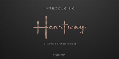 Heartway is a lovely and timeless handwritten font. It is the best choice for creating eye catching logos, branding and quotes. Every letter has a unique and beautiful touch, which will make your design come alive!
 - Forum Titling by Red Rooster Collection,
$45.00An original design based on the Frederick Goudy design first shown in 1912. Originally a caps only design in one weight. Produced as a foundry face by Lanston Monotype 1924. Featured in: Best Fonts for Tattoos - Denmas by Beewest Studio,
$50.00 Denmas Font is Engaved Bold Decorative Font that ornamental. This Font is Best as tittle of the novel, Poster, Theatre, Logo and also tatoo. This font is bold , strong , classic and luxurious in the same time.
 - Offaly by Fontdation,
$20.00 Introducing Offaly, a funky geometric sans serif font. Offaly comes with a smooth and clean characteristics. Combine the upper and lowercase to get the harmonic letter combinations. Suits best for branding, headline, quote/poster design, etc.
 - Linja by Fenotype,
$14.95 Linja is an elegant ultra condensed font. It's best for display use in magazines, books & posters. Linja font was originally designed in 2002. Now it's been remade with the complete character set and six different versions.
 - Millar by The Northern Block,
$16.70 An elegant monoline typeface with smooth corner detailing. The simple linear design is best suited to identity, editorial and on screen uses. Details include 7 weights, a complete character set, manually edited kerning and Euro symbol.
 - Winterlust by Epiclinez,
$20.00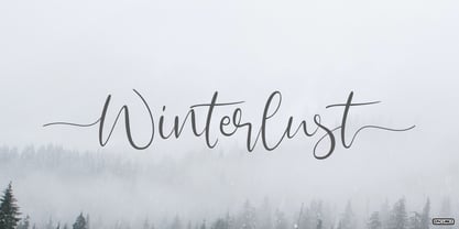 Winterlust is a lovely and timeless handwritten font. It is the best choice for creating eye catching logos, branding and quotes. Every letter has a unique and beautiful touch, which will make your design come alive!
 - Oabestira by Mabhal Studio,
$15.00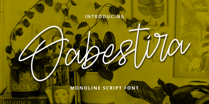 Oabestira is an asymmetrical and timeless handwritten font. It is the best choice for creating eye-catching logos, branding and quotes. Every letter has a unique and beautiful touch, which will make your design come alive!
 - Kalash by Tomass Gavars,
$7.00 Kalash is minimalistic monospaced font family. Each glyph has eased 45° angled cut and has the right properties to fit with various styles. Combine multiple weights for best results. Each font includes 230 Glyphs & Latin support.
 - Reymond by Rockboys Studio,
$18.00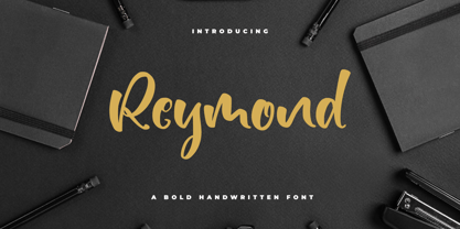 Reymond is a lovely and timeless handwritten font. It is the best choice for creating eye catching logos, branding and quotes. Every letter has a unique and beautiful touch, which will make your design come alive!
 - TXT Personality by Illustration Ink,
$3.00You'll find this the best font to inspire your creativity. It's simple and clever, with tons of personality. It's a good choice for school newsletters, kids' party invitations, and scrapbook pages emphasizing your children's great accomplishments. - Beyond Babylon by URW Type Foundry,
$35.99 Babylon was a civilisation that stretched from Bagdad to the Persian Gulf. There is an Old and new Babylonia, the era of Babylon civilization and the biblical Babylon. The oldest scriptures to be found since the rise of civilisation are Babylonic. The Christian, the Jewish and the Arabic culture find its origin in the Middle East. And share more or less the same history, the same roots and DNA. One people, but in reality a melting pot of close related cultures whom could not be more far apart, hostile and suspicious towards each other. An eye for an eye, tooth for a tooth. One could say this disagreement is still alive today and has deeply infected all of our systems. Beyond Babylon is sculpted after Hebrew, Arabic character style elements in a European writing. It questions what happened after the great Babylonic confusion. Did the words finally come across? Did they realize the distant and gap was maybe smaller than expected. This typeface is related to my former character Eurabia. As an artist I like to play with contradictions. Use opposite elements and mould them in to one understandable piece and in addition a thought to chew on. Otherwise the experimental ore shape lovin' typeface user could be very happy with an addition feature to the existing characters. One option more to express your selves in writing. Also this typeface is really suitable for theme writing or advertising. ----------- Babylon war eine Zivilisation die sich von Bagdad bis zum Persischen Golf erstreckte. Es gibt das alte und das neue Babylon, die Ära der Babylon Zivilisation und das biblische Babylon. Die ältesten Schriften, welche seit dem Aufstieg der Zivilisation gefunden wurden, sind babylonisch. Die Christen, die Juden und die arabische Kultur finden ihren Ursprung im Mittleren Osten. Sie teilen mehr oder weniger die gleiche Geschichte, die gleichen Wurzeln und DNA: Ein Volk. Aber in Wirklichkeit waren sie ein Schmelztiegel aus eng verwandten Kulturen, welche sich nicht ferner sein könnten: feindselig und misstrauisch zueinander. Auge um Auge, Zahn um Zahn. Man könnte behaupten, diese Unstimmigkeit bestehe noch heute und hätte all unsere Systeme stark infiziert. Beyond Babylon ist eine europäische Schrift, geformt nach hebräischen und arabischen Stilelementen der Zeichen. Sie hinterfragt die Geschehnisse nach der der Babylonischen Sprachverwirrung. Kamen die Worte endlich an? Haben sie realisiert, dass die Weite des Spalts zwischen ihnen vielleicht geringer war als erwartet. Diese Schrift ist verwandt mit meinen vorigen Zeichen der Eurabia. Als Künstlerin mag ich es mit Widersprüchen zu spielen, gegensätzliche Elemente zu einem vernehmbaren Ganzen zu verschmelzen und einen kniffligen Gedanken zu erzeugen. Andererseits könnte der experimentelle oder formenverliebte Nutzer sehr glücklich über eine zusätzliche Funktion der bestehenden Zeichen sein. Eine weite Möglichkeit sich im Schreiben auszudrücken. Diese Schrift ist auch für Werbung sehr geeignet.
 - HWT Borders One by Hamilton Wood Type Collection,
$24.95 Wood Type Catalogs of the 19th century often offered tools and accessories alongside alphabets of wood type. Probably the most closely related was wood type borders and ornaments. Decorative Borders were often sold by the foot and accompanied by corner pieces that matched the designs. These borders could be assembled in almost any size dimensions as needed. The digital version uses the same principals of modular assembly to create the exact size border that is needed. Along with the borders, included in this font are a selection of "streamers". These banners would have been made to order with the font designs reversed out along a horizontal banner with decorative end caps. The digital version allows for a modular assembly by selecting choice of end caps and then typing the = as many times as needed to achieve the desired length. 10 styles of 9 piece borders can be created in any size variations as well as 8 styles of streamers in any desired length. Some of the designs can be mixed and matched for unusual contemporary design interpretations of these historic styles. It is recommended that the line height (leading) is set to the same size as the point size setting, this will visually lock all elements together.
 - Adero by Eko Bimantara,
$22.00 Adero is a futuristic and versatile display font family designed to meet the needs of modern design projects. With its wide and minimalist style, Adero offers designers a unique blend of futuristic and functional design elements that make it a perfect choice for a wide range of applications. Featuring nine weights, from Thin to Black, and matching obliques, Adero provides designers with a wide range of options to choose from when creating designs. The font’s letterforms are carefully crafted with attention to detail, resulting in a modern, clean look that is both attractive and easy to read. Adero’s minimalist design makes it ideal for a variety of design applications, including branding and logo design, product design, advertising, web and various digital design. The font’s wide proportions and large x-height make it a great choice for bold and attention-grabbing designs, while its sleek and functional style makes it perfect for more understated design applications. Whether you’re creating a futuristic poster or a sleek website design, Adero is a versatile and powerful tool that can help you achieve your design goals. With its unique blend of wide proportions, minimalist design, and futuristic style, Adero is an excellent choice for any modern design project.
 - Coil by Brownfox,
$44.99 Coil feels comfortable like a well-worn pair of shoes. It could easily pass for an assertive industrial European sans serif of the early 1960s with its slight reverse contrast, monotonous proportions, and squared-off curves, if not for its less predictable side. What appears initially as ellipses upon closer inspection turns out to be irregular shapes, closer to an inverted egg than an oval. The s looks topsy-turvy with its higher curve that is larger than the lower. Some terminal strokes overhang the bowl (as in the a), others open flat (as in the Q, the f, the j, and the t). The resulting effect shakes up this seemingly “retro” face just to make it new. Our midcentury recollections are slightly distorted and reinterpreted by this ironic typeface making it fresh while deceptively cozy and familiar. Coil’s high x-height and even texture make it readable even in small sizes despite its tight apertures. Available in four weights with their italics, with two sets of figures, fractions, and alternates for Extended Latin and Cyrillic scripts. Designed by Vyacheslav Kirilenko and Gayaneh Bagdasaryan, 2020-21.
 - Whimsies by Typephases,
$25.00The Whimsies series goes further in our fixation with invented little people: the three dingbats of this series contain mostly imaginary situations, drawn first with ink on paper. All but a tiny fraction of the illustrations (a total of 114) have been drawn from one's imagination, with no previous models. The themes depicted here are varied and often humorous, though the humour is on the darker side, you are warned. The themes have a definite retro - victorian feel, with top hats, moustaches, long coats, walking canes and the like. Together with their close relatives, our Illustries, Bizarries, Ombres, Absurdies and Genteta dingbats (we give this bizarre collective the common name of Whimbats) you can use the Whimsies in an endless variety of projects, ranging from small spot illustration to whole pages, page spreads or posters applications. You can use them as they come in the digital font, or customize them easily in your favourite graphics program. A touch of texture or color will give them a completely new look. The vectorial nature of digital fonts means you can enlarge them to any size, with no loss of crispness in their outlines. - Stray by Tour De Force,
$25.00 Stray might be the lonesome cowboy in this big odd world, but it's his just public façade. Stray is handsome player that works well with any team or in any environment. He doesn't have a horse, but he can be the one, he can carry any weight. OK, let's talk serious now: Stray is distinctive geometric sans serif family in 9 weights and matching Italics. By it's design, Stray flirts with humanistic typefaces in some elements, while on the other side, we can see vintage letter forms as well. It is well balanced typeface, fully legible in any (reasonable) size, with power to present versatile tasks and situations. Specific joining of letter stem and bowl is one of design characteristics of Stray, so it is not just another geometric sans family, it really differs in it's own details. Contains extended Latin character map support and Cyrillic (no localizations, sorry). As any serious working horse family, it is equipped with decent OpenType features like Small Caps (for basic Latin only), Fractions, Tabular Figures, Denominator, Numerator, Ordinals and Ligatures. It also comes with small interesting set of dingbats. This Stray is not homeless, he just looks for the proper job :-)
 - Hortensia by Canada Type,
$24.95 Hortensia, designed around 1900 by Emil Gursch for his own Berlin foundry, is a typeface most expressive of the post-Victorian aesthetic that was all the rage in both Europe and America during the second half of the 19th century and up until the Great War. It is a reduced aesthetic of sharp points and natural curves that almost want to apologize for their own elegance, but clearly embody the simple excitement about the blossoming of industry and crafts during the period. This deco script trend would get a re-run for about a decade on either side of the second World War — especially in the entertainment and financial industries — before giving way to art nouveau and big brush faces. Hortensia was Gursch's most popular typeface, used extensively and prominently in many beautiful type catalogs, and a commonly seen design element in Germany for quite a while after its release. This digital version brings plenty of fixes and additions to the original metal Hortensia design, including many alternates sprinkled throughout the character set, and support for a wide range of Latin-based languages (including Central European, Baltic, Turkish and Welsh).
 - Algerian Mesa by FontMesa,
$25.00 Inspired by the old Stephenson Blake Caps only font Algerian from 1908, this version, named Algerian Mesa, has been freshened up with a new matching lowercase. The original Algerian, on page 142 of the 1908 Stephenson Blake specimen book, was a small caps to a more decorative lining caps and the plain black version, without the shadow line, was named Gloria. Also on page 142 of the 1908 Stephenson Blake specimen book is a shaded Latin font that gave me the idea for the Alt version of Algerian Mesa. The Alt version works well at smaller point sizes combined with the regular Algerian Mesa font on the same page. New for 2016 were Opentype features including original alternates, oldstyle numerals and case sensitive forms, also new is a fully usable Alt version. New for 2022 are the higher x-height, 90% small caps, 80% small caps and all new italic versions. Also new for 2022 are straight sided accent marks replacing the flared or curved accents. While Algerian Mesa includes some alternates our related Tavern font will still remain the version with more alternates and more weights.
 - Rosmerta by Reyrey Blue Std,
$18.00 Introducing, Rosmerta Typeface. It's elegant, classy, and a little vintage look. Rosmerta Typeface has a few stylistic alternatives and ligatures so that you can mix and match your best combination. Rosmerta Typeface is perfectly suitable for a layout design for quotes or body copy, best used as a display for headings, logos, branding, magazines, product packaging, invitations: logotypes, and much more. Don't wait to add this font to your collection and explore the uniqueness of this typeface! Features : All Uppercase and Lowercase Number & Symbol Supported Languages Ligatures Stylistic Alternate PUA Encoded Hope you enjoy our font!
 - Mantul Pro by Struggle Studio,
$12.00 Mantul Pro is inspired by the sans-serif style and a little modern touch, making this font luxurious & neat. Mantul itself has a meaning (Mantap Betul = Really Good), because it requires very good accuracy in doing so making this font the best. After a long journey of doing this font work, finally finished.made very carefully has 19 font styles that are luxurious & extraordinary.This font is done for a very long time, and therefore the font can be considered as a very extraordinary and best font. Can be used for designs, logos, labels, badges, clothing designs, letterhead and titles, stationery, etc.
 - Belfast Grotesk by TypoBureau Studio,
$17.00 Belfast Grotesk™ 9 weights, 18 uprights and Oblique. Each typeface contains over 700+ glyphs with latin extensive Western, Central and Eastern European language support, Free updates and feature additions. Belfast Grotesk™ influenced by the grotesk typefaces developed in the early 20th century. Attempts to follow the best traditions of Grotesk typefaces. A good amount of contrast between the stroke thickness of each weight. Belfast Grotesk™ was developed with unique glyphs to offer best flexibility. a good legibility in short texts. OPENTYPE FEATURES Including tabular figures, alternate characters, ligatures, fractions, case-sensitive forms, superscripts, subscripts etc.
 - Aquabay by Scratch Design,
$12.00 Aquabay is a natural handwritten font that has cute spirit. This font comes with upper and lowercase Basic Characters, Numbers, Marks and Punctuation. As a feature you have also the standard Ligatures and Swashes. Aquabay has an authentic shape like typical handwritten so this font is perfect to apply to the casual and cute design. This font will be perfect for posters, branding, name cards, website, books, comics, presentations, or packaging designs. What are you waiting for? Download now Aquabay font and make your design artwork more wonderful! Thank you for checking and visiting our store, and feel free to drop me a message if you had any questions! Visit our Instagram :) www.instagram.com/scratchdesignbali
 - VLNL Wurst by VetteLetters,
$35.00 VLNL Wurst started as a final result in the Typographic Chinese Whispers project for Typeradio.org, in collaboration with the Type & Media master course. A soundtrack of festive Bavarian music accompanied by burping, followed by loud crunching and munching, inspired Alexandre Saumier Demers to create this typeface family. The fraktur letter forms were composed with sausages to form a recipe available in three flavours: Brat, Blut and Bier Wurst. This 'charcuterie typographique' is ideal for an established butcher shop, a local grocery store or a casual BBQ with friends. Wurst is so tasty, you can't get enough of it! A "Wurst Schreiber" script was developed to automatically draw the sausages around the skeleton.
 - Patron by Vesturbær,
$45.00 Patron is a modern, mono-linear, sans-serif font family with large x-height and softened edges containing 12 fonts. This typeface was born as a corporate font design for non-profit sector and today it is available for public. At the moment Patron is offered as a PostScript-flavored OTF, but its construction is tuned to display well on screen as well. Works on a TrueType version with individual glyph hinting are being carried out. In addition, Patron has alternative family (Patron Alt) with enhanced personality, suitable mainly for headlines. Patron is graduation work of Matěj Hlaváček at AAAD in Prague, Studio Of Typography. Supervised by František Štorm, Tomáš Brousil and Karel Haloun.
 - Zombie Punks by Wing's Art Studio,
$15.00 Zombie Punks - The Retro Horror Video Font Introducing the first in a range of new font designs inspired by 80s VHS covers and the nostalgic video rental store experience. Starting off with a classic horror flavour, Zombie Punks is a grungy, hand-drawn brush font supplied in two styles with additional underlines and paint spills. The perfect choice for use on movie posters and trailers, album covers, books and much more. This all-caps design features punctuation, numerals and language support along with an alternative set of characters ensuring that you’ll never have to repeat your e’s or t’s for a more convincing and natural hand-made look. Check out the visuals for more details and cool usage examples.
 - Ririen Notes by Scratch Design,
$9.00 Ririen's Notes have a 100% level of cuteness & natural handwritten font. This font is complete with families such as regular, bold, outline style, ligatures, all punctuation, and multi-language support. Ririen's Notes has an authentic shape and looks like a natural teenage girl handwritten so this font is perfect to apply to the casual and cute design. This font will be perfect when you using for posters, name cards, books, comics, presentations, or packaging designs. What are you waiting for? Download now Ririen's Notes font and make your cute design artwork! Thank you for checking and visiting our store, and feel free to drop me a message if you had any questions! Visit our Instagram :) www.instagram.com/scratchdesignbali
 - Nightmare Street by Wing's Art Studio,
$12.00 Take a midnight stroll if you dare through the shadowy terrace of terror, in Nightmare Street! A bloodcurdling design supplied in two styles with additional underlines and paint spills, Nightmare Street is an 80s inspired horror font straight from the video store. It’s the perfect choice when you want a hand-made look for your movie posters and trailers, album covers, books and Halloween promos. This font includes complete uppercase and lowercase characters plus punctuation, numerals and language support. It also comes with a full set of alternatives ensuring that you’ll never have to repeat your e’s or t’s for a more convincing and authentic hand-drawn look. Check out the visuals for more details and usage examples.
 - Recton by Ws Studio,
$15.00 Recton is a sophisticated and charming serif with a fashionable touch. Specially designed for luxury, elegant, feminine projects, Recton is perfect for creating modern and chic designs such as logos, packaging, editorials and more. A trendy, classy & modern style serif font for your fancy projects. Elegant, fashion and classic style in the Recton font will be great for any branding project. Many alternatives and binders will help you create a unique and original logo or website header design. Follow My Store For Upcoming Updates Including Additional Glyphs And Language Support. And Please Message Me If You Want Your Language Included or If Any Features or Glyph Requests Feel Free To Message Me. Have a nice day !
 - Devils Haircut by PintassilgoPrints,
$24.00 Devils Haircut is an explosive font duo, consisting of two completely different styles, creative and expressive in their own way, with a touch of punk and counter-culture aesthetic. Together they make a decidedly eye-catching pair and a rad option for numerous display moods, from album covers to food packaging, from title screens to editorial pages. Both fonts are all caps with different designs stored on upper- and lower-case slots, so you can reach the alternate forms easily through the keyboard. Or use the Contextual Alternates OpenType feature to instantly cycle the alternate glyphs and get an even more uneven look. Make Devils Haircut yours and fire up your designs, hell yes!