10,000 search results
(0.035 seconds)
- Fander by Roman Melikhov,
$23.00 Fander font family is designed to create minimalist logos, wordmarks, titles, taglines. Each letter of the font has up to 12 alternates. You can mix default characters and alternate characters to get the best combinations.
 - Artiste by ITC,
$29.00A casual, open brush script style designed with a shadow effect for a three-dimensional impression by British designer Martin Wait. This typeface looks best with tight letter and word spacing in large display settings. - Richfont BT by Bitstream,
$50.99Based on Mr. Hubbard's own hand printing, Richfont Medium is an extremely casual design. Actually light in weight, it renders best at 14 point and above. Richfont Light and Bold are available from the designer. - Mossimo by ActiveSphere,
$30.00 Mossimo is a fat slab typeface, and works best in text and display applications, such as headline, posters, signage, magazine, product branding, corporate branding, logos and titles. Several alternate characters are included in this typeface.
 - Sailfin by ActiveSphere,
$30.00 Sailfin is a condensed geometric typeface, and works best in text and display applications, such as headline, posters, signage, magazine, product branding, corporate branding, logos and titles. Several alternate characters are included in this typeface.
 - Exchange Student by Okaycat,
$8.99 I used to be an exchange student in Canada. I noticed my handwriting was quite different from the handwriting of people who are from countries where the roman alphabet is used. So, I thought why not make a font based on my natural handwriting. This font can be used whenever a cute and different style like mine is needed. "Exchange Student" is extended, containing the full West European diacritics & a full set of ligatures, making it suitable for multilingual environments & publications. Enjoy!
 - Hokitika by Hanoded,
$15.00 Hokitika is a township in the West Coast Region of New Zealand's South Island. It has some amazing beaches, stunning scenery, but above all, it has Pounamu (greenstone or jade). This is THE place to buy a beautiful Maori greenstone pendant. Don't buy it for yourself, as it is supposed to bring bad luck. Hokitika font is a tall and thin all caps Art Deco typeface. It is classy, elegant and very legible. Comes with a full range of diacritics.
 - LOLO Cursive by Okaycat,
$32.50LOLO Cursive is sweet & funky lettering written with distinct character. Create a memorable look with this flowering, freehand script. In this font I envisioned a style with a grassroots flavor, yet a fashionista's edginess. Small, distressed detailing contrasts beautifully with the rolling curves of this feminine hand-style. The strokes are punky yet refined - for widest appeal. LOLO Cursive is extended, containing West European diacritics & ligatures, making it suitable for multilingual environments & publications. Go ahead and have fun with it! - Emirates by Sensatype Studio,
$15.00 Emirates font is a well-balanced contemporary font with beautiful curved and ligatures. It is a display serif font with moderate contrast that perfect for branding projects, logo, wedding designs, social media posts, advertisements, product packaging, product designs, label, photography, watermark, invitation, stationery, and any projects, it makes with a high level of legibility. What's Included: Character set A-Z Uppercase & Lowercase Numerals & Punctuation Accented Characters (West Europe) Ligature & Stylistic alternate Works on PC & Mac Wish you enjoy our font. :)
 - Circling Vultures BB by Blambot,
$6.00 Circling Vultures is an old west slab serif font offered in degrees of aging; Circling Vultures BB is clean, with sharp edges and lines, Circling Vultures Decay BB has rounded corners and distressed lines, Circling Vultures Rot BB is the most worn out option in the set, with flecks of missing "ink" apparent. Each option comes with two variants; a standard upper/lowercase, and an option with smaller caps in the lowercase keys for a total of six fonts in the set.
 - Tin Pan Alley JNL by Jeff Levine,
$29.00 According to Wikipedia, Tin Pan Alley is the name given to the collection of New York City music publishers and songwriters who dominated the popular music of the United States in the late 19th century and early 20th century. The name originally referred to a specific place: West 28th Street, between Fifth and Sixth Avenues in Manhattan. With this in mind, Tin Pan Alley JNL, a typeface based on the bold hand lettering from a vintage piece of sheet music is aptly named.
 - Zabars by K-Type,
$20.00 ZABARS is a full font developed from the six characters in the spectacular logo of the Zabar’s speciality foodstore in New York City. The Zabar’s lettering is a jewel, possessing greater sophistication and subtlety (and a more contemporary flavor) than the usual bifurcated (split serif) font which might simply suggest ‘Circus’ or ‘Old West’. And it’s been given an even fresher twist through the addition of a new lowercase which helps add to the 1960s countercultural aspect of the font’s personality.
 - Lord Grayson by Gleb Guralnyk,
$15.00 Introducing a vintage font "Lord Grayson". This typeface has a victorian medieval look. It's a decorative classic style font with lot's of ligatures and stylistic alternates. This OpenType features will help you to create a unique lettering compositions. Use capital letters to access all this features. Nevertheless it can be a quite simple font if you'll type a small letters, which can be usefull for small supporting text. This font has a west european multilingual support (check out the screenshot with avaiilable characters).
 - Boostart by Maulana Creative,
$13.00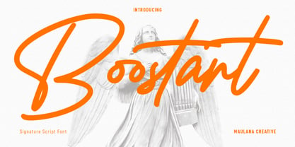 Boostart West is an expressive slanted modern signature script font. With bold consist stroke, fun character with a bit of ligatures and alternates. To give you an extra creative work. Boostart font support multilingual more than 100+ language. This font is good for logo design, Social media, Movie Titles, Books Titles, a short text even a long text letter and good for your secondary text font with sans or serif. Make a stunning work with Boostart font. Cheers, Maulana Creative
 - Grayson Rough by Gleb Guralnyk,
$14.00 Introducing a modern display font Grayson Rough. It's a textured grunge typeface that has a lot of ligatures and stylistic alternates. The OpenType features can help you to create awesome and unique lettering compositions with unexpected characters combinations. Use capital letters to access all this features. Nevertheless Grayson Rough can be a quite simple font if you type a small letters, which can be useful for short supporting text. This font has west european multilingual support (check out the screenshot with available characters).
 - San Angelo NF by Nick's Fonts,
$10.00A heavy unnamed Gothic typeface from the 1890 William H. Page Foundry woodtype specimen book provided the template for this bold, brash, no-nonsense face. It's designed to set tight, so your headlines will definitely get noticed. Named for a town in West Central Texas which is noted for being the home of the Buffalo Soliders in the late 1800s. Both versions of this font contain the Unicode 1252 (Latin) and Unicode 1250 (Central European) character sets, with localization for Romanian and Moldovan. - Egyptian Slate by Monotype,
$34.99 Just as the camera adds weight to human faces, serifs can add weight to typographic faces. Rod McDonald trimmed and adjusted his new Egyptian Slate design as it emerged from its sans serif predecessor, the Slate typeface family. Slate is a great sans serif design, and the addition of his Egyptian Slate to your typeface library will make it even more versatile. Egyptian Slate is a solid and stylish slab serif design that will look superb in the spotlight of your choosing. Available in six weights – from a svelte light to a commanding black – each upright member of the Egyptian Slate family has a complementary italic. Egyptian Slate fonts are available as either OpenType Std or OpenType Pro fonts; the later options offers an extended character set that supports most Central European and many Eastern European languages. Egyptian Slate™ font field guide including best practices, font pairings and alternatives. Featured in: Best Fonts for Logos, Best Fonts for Websites
 - Frenkel MF by Masterfont,
$59.00 A practical font family with 2 weights for all your needs: headlines, body text, signage etc. High legibility at small sizes.
 - Couponim MF by Masterfont,
$59.00 A practical font family with 4 weights for all your needs: headlines, body text, signage etc. High legibility at small sizes.
 - PR Ex Cathedra by PR Fonts,
$10.00 This font is closely based on classical proportions, with flared terminals. Small Capitals are 7/8 the size of the capitals
 - TeoriaMF by Masterfont,
$59.00 A practical font family with 4 weights for all your needs: headlines, body text, signage etc. High legibility at small sizes.
 - Craska by Device,
$39.00 A bold and arresting geometric font built from parallel stripes. Most effective in short headings or logos at larger, display sizes.
 - Hollywood MF by Masterfont,
$59.00 High legibility at small sizes. An extended sans serif typeface with rounded endings that provides unique softness appearance without losing legibility.
 - Technomat by Storm Type Foundry,
$10.00Technomat takes inspiration from matrix or thermal dot printers. Minimalistic construction and soft edges makes it legible from 3 point size. - Vinegar Pro by Jelloween,
$19.95Vinegar Pro is a modern, legible serif typeface. It contains a wide range of characters, sexy ligatures, lining & old style numerals. - Stranger Blue by PizzaDude.dk,
$15.00 Stranger Blue is a soft-edged and playful comic font with bouncy ligatures. Multilingual support and legible at even small sizes
 - Angel Eyes by Autographis,
$39.50 Angel Eyes is a wide, swinging stylized brush script with a lot of personality, a unique look and very good readability.
 - Millenium Pro Var by TypoStudio Pro,
$200.00 La famille Millenium est composée de modèles dont le poids varie progressivement. Elle est très étendue. Elle va de "Super Thin" à "Extra Black". Unique au monde, sa finesse permet de concevoir un style très léger même pour l'impression d'affiches et d'autres grands formats. Conçu dès l'origine comme un caractère variable, le Millenium offre une gamme de 900 variations possibles et une infinité de créations...
 - Grogoth by Anomali Creative,
$19.00 Broken letters[1] (German: gebrochene Schrift literally "broken writing"; English: blackletter) or Gothic letters, also known as German letters, are the typeface used in Europe West from the 12th century to the 17th century. Meanwhile, Danish spoke it until 1875 and German, Estonian and Latvian spoke it well into the 20th century. Fracture is one of the broken typefaces that is often considered to represent the entire broken typeface. Broken letters are sometimes also called Old English, but not in the Old English or Anglo-Saxon sense that was born centuries earlier. This group of letters is so named because it contains Latin letters that have breaks in the curvature of the letters, either in part or in whole designs. The fracture arises from a sudden dip when writing certain parts of the letter. In contrast, letters with perfect, unbroken curves, such as Antikua, are created from smooth, flowing writing movements. Grogoth is a font inspired by the Blackletter typeface, made with a modern impression but still looks strong and unique. In addition, Young Best font is also supported with multilingual characters that can be used in several international languages. Grogoth font is very suitable for use in making music album cover designs, tattoo logos, wishkey labels, packaging pomades and so on which are made with dark and strong concepts. Thank you, and don't forget to check out our other products.
 - Flintlock by CozyFonts,
$25.00 The Flintlock Font Family has a Bold personality. The 'Rough' version of the Flintlock Font has a hand-carved or hand-etched edge, carefully crafted for each of over 300 glyphs. Caps, lower case, all numbers, fractions, accents and European characters that work in over 70 languages. 'Classically Built with a Vintage Flair'. Vintage in the American West Tradition that might have been forged and implemented from the 1860s through the 1930s and consequently fresh again. Flintlock Rough can be envisioned on many things dated from 1860 to present day. The font is available in 3 basic weights as of this release date. There are other versions on the drawing board... Flintlock Rough works extremely well with Posters, Branding, Movie Titles, Invites, Stationary, Signage, Embroidery, Letterpress, Ads, Logos and anything that feels Industrial or Hand-Crafted, eg. Coffee, Breweries, Antiques, Woodcuts, Western Styles, Sports Styles, Holidays, Menus, and more. Flintlock Flat & Flintlock Flat Italic are the siblings to Flintlock Rough without the hand-carved edge but rather clean with slightly rounded corners and edges. Extremely Legible, Bold and best used in all the same application descriptions mentioned above and more, specifically contemporary uses and settings, eg. Sports, Titles, Branding, Headlines, Logos and more. Curiously the Flat & Italic versions of Flintlock work extremely well in 1960s and 1970s settings.
 - Black Witcher by Ditatype,
$29.00 Black Witcher is a spine-chilling display font that will cast a spell of fear on your designs. With its big letters and bold weight, this font demands attention and exudes an aura of dread. The horror theme is brought to life with meticulously crafted tree root details on each letter, adding a nightmarish and eerie touch to the font. Each letter in this font is bold and impactful, making a powerful statement in your designs. The large size of the letters enhances the font's haunting presence. The tree root details in Black Witcher give the font a sinister and otherworldly appearance, as if the letters are entangled with ancient and malevolent roots. These haunting details add a sense of mystery and foreboding, immersing the viewer into a world of dark and chilling horrors. For the best legibility you can use this font in the bigger text sizes. Enjoy the available features here. Features: Alternates Multilingual Supports PUA Encoded Numerals and Punctuations Black Witcher fits in headlines, logos, movie posters, flyers, invitations, branding materials, print media, editorial layouts, headers, and any horror-themed project. Find out more ways to use this font by taking a look at the font preview. Thanks for purchasing our fonts. Hopefully, you have a great time using our font. Feel free to contact us anytime for further information or when you have trouble with the font. Thanks a lot and happy designing.
 - ITC Oldbook by ITC,
$29.99For some time, Eric de Berranger had wanted to create a distressed typeface design - one that gave the appearance of antique printing and showed signs of wear, yet was still highly readable. He was busy designing a new face called Maxime, when an idea struck: I realized that I could use these lettershapes as the basis for my antique typeface," he says. The two faces ended up being designed in tandem. While ITC Oldbook clearly captures the flavor of aged, uneven and imperfect printing, it also meets de Berranger's goal of being exceptionally readable in text sizes. Beginning with well-drawn characters was the key, and these were carefully modeled into the distressed forms. "The process was more difficult than I originally thought," says de Berranger. "The antique letters had to be tested and modified several times to work correctly." ITC Oldbook elegantly simulates antique printing in both text and display sizes. And while stroke weights are uneven and curves are irregular, the design has remarkably even color when set in blocks of text copy. Add to this the design's inherent legibility, and ITC Oldbook acquires a range far beyond replication of things old; it's suitable for any project that calls for warm and weathered typography. ITC Oldbook is available in roman and bold weights with complementary italic designs. Small caps, old style figures and a suite of alternate characters and ornaments provide additional flexibility and personality to the design." - Creepy Tales by Ditatype,
$29.00 Creepy Tales is a spine-chilling display font that will send shivers down your spine. With its big letters and bold weight, this font demands attention and exudes fear. The horror theme is brought to life with meticulously crafted dripping ink details on each letter, adding a nightmarish and eerie touch to the font. Each letter in this font is bold and impactful, making a powerful statement in your designs. The large size of the letters further intensifies the font's haunting presence. The dripping ink details in this font give the font an organic and unsettling appearance, as if the letters are oozing with dread. These haunting details add a sense of macabre and create an atmosphere of suspense, immersing the viewer into a world of dark and chilling horrors. For the best legibility you can use this font in the bigger text sizes. Enjoy the available features here. Features: Multilingual Supports PUA Encoded Numerals and Punctuations Creepy Tales fits in headlines, logos, movie posters, flyers, invitations, branding materials, print media, editorial layouts, headers, and any project that requires a terrifying touch. Find out more ways to use this font by taking a look at the font preview. Thanks for purchasing our fonts. Hopefully, you have a great time using our font. Feel free to contact us anytime for further information or when you have trouble with the font. Thanks a lot and happy designing.
 - Et Cetera by Scholtz Fonts,
$25.00 Et Cetera is a beautiful, hand-lettered script. It abounds in OpenType features such as terminal swashes and ligatures and is best used with OpenType savvy software with the “standard ligatures” and “contextual alternates” features turned ON. Et Cetera is comprehensive and vigorous. Most letters in the font are connected, but, as in typical handwriting fonts, not all are connected. Most characters have a consistent shape within the font, but not all. Some characters in Et Cetera are sensitive to their position in the text and change depending on the adjoining characters. This contributes to the casual and relaxed style of Et Cetera; not allowing the features of the font to get between the reader and the message. A wealth of OpenType features lie beneath the mellow exterior of Et Cetera. These Open Type features make few demands on the user which makes for a versatile script font that requires no expertise from the user, performs well at larger sizes, and remains legible even when setting copy at very small sizes. Et Cetera comes in three styles, Black, Regular & Line. Et Cetera Black is dramatic and bold, making a powerful statement. Et Cetera Regular is elegant and romantic, perfect for wedding stationery and clothing brands. Et Cetera Line is delicate and feminine, portraying a smooth, flowing effect. Et Cetera is a breezy, light, yet expressive font that is perfect for titling work, product packaging and romantic stationery.
 - Brush Poster Grotesk by TypoGraphicDesign,
$19.00 The typeface Brush Poster Grotesk is designed in 2017 for the children exhibition 1,2,3 Kultummel from Labyrinth Kindermuseum Berlin by xplicit, Berlin (Annette Wüsthoff, Alexander Branczyk, Mascha Wansart (illustrations)). Manuel Viergutz extended the font with some further glyphs & extras. The rough sans serif display typeface is created analogous by hand and brush. 875 glyphs incl. 150+ decorative extras like arrows, dingbats, emojis, symbols, geometric shapes, catchwords, decorative ligatures (type the word LOVE for or SMILE for as OpenType-Feature dlig) and stylistic alternates (3+ stylistic sets). For use in logos, magazines, posters, advertisement plus as webfont for decorative headlines. The font works best for display size. Have fun with this font & use the DEMO-FONT (with reduced glyph-set) FOR FREE! Font Name: Brush Poster Grotesk Font Weights: Regular + Misprint + EXTRAS (Illustration) + DEMO (with reduced glyph-set) Font Category: Display for headline size Glyph Set: 875 glyphs Language Support: 28+ for extended Latin. Afrikaans, Albanian, Catalan, Croatian, Czech, Danish, Dutch, English, Estonian, Finnish, French, German, Hungarian, Icelandic, Italian, Latvian, Lithuanian, Maltese, Norwegian, Polish, Portugese, Romanian, Slovak, Slovenian, Spanisch, Swedish, Turkish, Zulu Specials: 150+ decorative extras like arrows, dingbats, emojis, symbols, geometric shapes, catchwords, decorative ligatures (type the word “LOVE” for ❤ or “SMILE” for ☺ as OpenType-Feature dlig ) and stylistic alternates (3+ stylistic sets), German Capital Eszett Design Date: 2017 Type Designer: Annette Wüsthoff, Manuel Viergutz, Alexander Branczyk, Mascha Wansart (Illustration)
 - Aviano Contrast by insigne,
$22.00 The Aviano series returns, refined and sophisticated with an extended, high-contrast sans-serif family. Aviano Contrast is a contemporary typeface radiating with luxury. It's classic elegance makes it perfect for high-end applications such as cosmetic, jewelry or fashion brands. Aviano Contrast's extended forms give the face a smart look, and the curves are carefully honed to be sinuous and seductive. This high-contrast face is in a class of its own, composed in the style of a classic Didone but lacking the typical serifs. Aviano Contrast comes in six different weights and is packed with OpenType features. Need swash forms? Ball terminals? Art Deco alternates inspired by the inscriptions and signage of the '20s and '30s? Aviano Contrast includes 230 alternate characters. Twelve style sets are available, including four complete sets of art deco-inspired alternates, small forms, swash, titling and a wide array of other alternates to make your designs unique. As a complement to these characters, Aviano Contrast also includes 40 discretionary ligatures for artistic typographic compositions. Please see the informative .pdf brochure to see these features in action. OpenType capable applications such as Quark or the Adobe Creative suite can take full advantage of the automatically replacing ligatures and alternates. This family also includes the glyphs to support a wide range of languages. The rest of the Aviano series pairs very well with this face. These include Aviano, Aviano Serif, Aviano Sans, Aviano Didone, Aviano Flare, Aviano Future and Aviano Slab.
 - Stay Calm by Nathatype,
$29.00 A typography can often be a deniable, yet crucial factor in designs’ displays and nuances. Additionally, it may be hard to find prominent, elegant, catchy fonts, whereas customers can easily forget designs without the right typography and remember nothing about your brands. Even the most interesting designs will look dull and too ordinary with inappropriate fonts. Therefore, we would like to introduce you to the Stay Calm, the perfect font option to create prominent designs. Stay Calm is an elegant, prominent display serif font to attract everybody's attention. It has bigger and thicker font proportions than the other ordinary serif fonts as its character to ease people to see it in big text sizes. Such unique characters as curvy thin lines and big, protruding dots, make this font suitable to create unique, interesting designs and applicable for bigger text sizes. You may also enjoy the available features here. Features: Ligatures Multilingual Supports PUA Encoded Numerals and Punctuations Stay Calm fits best for various design projects, such as brandings, posters, banners, headings, magazine covers, quotes, invitations, name cards, printed products, merchandise, social media, etc. Find out more ways to use this font by taking a look at the font preview. Thanks for purchasing our fonts. Hopefully, you have a great time using our font. Feel free to contact us anytime for further information or when you have trouble with the font. Thanks a lot and happy designing
 - Noctis by Italiantype,
$39.00 Noctis was originally born as a single weight display typeface, designed by Luca Terzo who took inspiration by the unusual wedge serifs of Aldo Novarese's 1972 typeface for H. Berthold A.G., Primate. The design was developed by the Italian Type team into a full family of five weights from thin, each with its own true italic, and with a complementary set of decorative patterns. The strong Didonesque contrasts make this typeface both impressive at display sizes and easily readable in text size, while the sharp shapes of the triangular serifs and the distinctive letter shapes show their strength in logo design and impressive editorial use. Inspired by the elegant, self conscious and over-the-top aesthetics of Italian fashion scene of the eighties and nineties, Noctis finds its strength in its strong textural nature, that is explored in the Noctis Texturae subfamily, where each letter is used as a tile to produce seamless patterns that can be used to extend the branding capabilities of Noctis. Noctis features an extended latin character set of 481 glyphs covering over 190 languages, and includes advanced open type features like standard and discretionary ligatures, positional numerals, stylistic alternates and case sensitive brackets. Mixing versatility and personality, Noctis is ready to be like a top model on the design catwalk, making your projects looking classic but contemporary, finely tuned but assertive, and elegant as the best Italian luxury fashion.
 - IM FELL French Canon - Unknown license

- Trasandina by TipoType,
$24.00 Trasandina is a very unique font-family: a modern, versatile, workhorse typeface with a special personality, given by the mix of humanist and geometric models, remaining far from both extremes. This typeface has 9 styles plus their matching italics, it has an incredible wide range of weights, from very thin to an ultra thick stem. This was made following the Luc(as) de Groot’s Interpolation Theory. Trasandina’s versatility also resides in the +800 characters that each weight includes, having several open type features and language support for more than 200 languages. This font has been specially designed for web (using hinting instructions), making it work in small and large sizes on different types of screen resolutions. Trasandina’s most interesting feature is its flexibility: On one hand, is easy to read thanks to its humanistic letterforms which allow this typeface to be legible in small sizes while remaining neutral (specially around its middle weights). And, at the same time, it’s perfect for logos and posters that need a lot more personality, this is mainly due to its more geometric nature in light and bold weights. Thank you for your support! It’s people like you that allow our team to keep enjoying creating new fonts. That’s why we’d like to hear from you! Send us your work using our fonts: info@tipotype.com, and you'll have a special 50% OFF on Tipotype at Myfonts
