10,000 search results
(0.047 seconds)
- DIN Next Arabic by Monotype,
$155.99 DIN Next is a typeface family inspired by the classic industrial German engineering designs, DIN 1451 Engschrift and Mittelschrift. Akira Kobayashi began by revising these two faces-who names just mean ""condensed"" and ""regular"" before expanding them into a new family with seven weights (Light to Black). Each weight ships in three varieties: Regular, Italic, and Condensed, bringing the total number of fonts in the DIN Next family to 21. DIN Next is part of Linotype's Platinum Collection. Linotype has been supplying its customers with the two DIN 1451 fonts since 1980. Recently, they have become more popular than ever, with designers regularly asking for additional weights. The abbreviation ""DIN"" stands for ""Deutsches Institut für Normung e.V."", which is the German Institute for Industrial Standardization. In 1936 the German Standard Committee settled upon DIN 1451 as the standard font for the areas of technology, traffic, administration and business. The design was to be used on German street signs and house numbers. The committee wanted a sans serif, thinking it would be more legible, straightforward, and easy to reproduce. They did not intend for the design to be used for advertisements and other artistically oriented purposes. Nevertheless, because DIN 1451 was seen all over Germany on signs for town names and traffic directions, it became familiar enough to make its way onto the palettes of graphic designers and advertising art directors. The digital version of DIN 1451 would go on to be adopted and used by designers in other countries as well, solidifying its worldwide design reputation. There are many subtle differences in DIN Next's letters when compared with DIN 1451 original. These were added by Kobayashi to make the new family even more versatile in 21st-century media. For instance, although DIN 1451's corners are all pointed angles, DIN Next has rounded them all slightly. Even this softening is a nod to part of DIN 1451's past, however. Many of the signs that use DIN 1451 are cut with routers, which cannot make perfect corners; their rounded heads cut rounded corners best. Linotype's DIN 1451 Engschrift and Mittelschrift are certified by the German DIN Institute for use on official signage projects. Since DIN Next is a new design, these applications within Germany are not possible with it. However, DIN Next may be used for any other project, and it may be used for industrial signage in any other country! DIN Next has been tailored especially for graphic designers, but its industrial heritage makes it surprisingly functional in just about any application. The DIN Next family has been extended with seven Arabic weights and five Devanagari weights. The display of the Devanagari fonts on the website does not show all features of the font and therefore not all language features may be displayed correctly.
 - DIN Next Devanagari by Monotype,
$103.99DIN Next is a typeface family inspired by the classic industrial German engineering designs, DIN 1451 Engschrift and Mittelschrift. Akira Kobayashi began by revising these two faces-who names just mean ""condensed"" and ""regular"" before expanding them into a new family with seven weights (Light to Black). Each weight ships in three varieties: Regular, Italic, and Condensed, bringing the total number of fonts in the DIN Next family to 21. DIN Next is part of Linotype's Platinum Collection. Linotype has been supplying its customers with the two DIN 1451 fonts since 1980. Recently, they have become more popular than ever, with designers regularly asking for additional weights. The abbreviation ""DIN"" stands for ""Deutsches Institut für Normung e.V."", which is the German Institute for Industrial Standardization. In 1936 the German Standard Committee settled upon DIN 1451 as the standard font for the areas of technology, traffic, administration and business. The design was to be used on German street signs and house numbers. The committee wanted a sans serif, thinking it would be more legible, straightforward, and easy to reproduce. They did not intend for the design to be used for advertisements and other artistically oriented purposes. Nevertheless, because DIN 1451 was seen all over Germany on signs for town names and traffic directions, it became familiar enough to make its way onto the palettes of graphic designers and advertising art directors. The digital version of DIN 1451 would go on to be adopted and used by designers in other countries as well, solidifying its worldwide design reputation. There are many subtle differences in DIN Next's letters when compared with DIN 1451 original. These were added by Kobayashi to make the new family even more versatile in 21st-century media. For instance, although DIN 1451's corners are all pointed angles, DIN Next has rounded them all slightly. Even this softening is a nod to part of DIN 1451's past, however. Many of the signs that use DIN 1451 are cut with routers, which cannot make perfect corners; their rounded heads cut rounded corners best. Linotype's DIN 1451 Engschrift and Mittelschrift are certified by the German DIN Institute for use on official signage projects. Since DIN Next is a new design, these applications within Germany are not possible with it. However, DIN Next may be used for any other project, and it may be used for industrial signage in any other country! DIN Next has been tailored especially for graphic designers, but its industrial heritage makes it surprisingly functional in just about any application. The DIN Next family has been extended with seven Arabic weights and five Devanagari weights. The display of the Devanagari fonts on the website does not show all features of the font and therefore not all language features may be displayed correctly. - DIN Next Cyrillic by Monotype,
$65.00DIN Next is a typeface family inspired by the classic industrial German engineering designs, DIN 1451 Engschrift and Mittelschrift. Akira Kobayashi began by revising these two faces-who names just mean ""condensed"" and ""regular"" before expanding them into a new family with seven weights (Light to Black). Each weight ships in three varieties: Regular, Italic, and Condensed, bringing the total number of fonts in the DIN Next family to 21. DIN Next is part of Linotype's Platinum Collection. Linotype has been supplying its customers with the two DIN 1451 fonts since 1980. Recently, they have become more popular than ever, with designers regularly asking for additional weights. The abbreviation ""DIN"" stands for ""Deutsches Institut für Normung e.V."", which is the German Institute for Industrial Standardization. In 1936 the German Standard Committee settled upon DIN 1451 as the standard font for the areas of technology, traffic, administration and business. The design was to be used on German street signs and house numbers. The committee wanted a sans serif, thinking it would be more legible, straightforward, and easy to reproduce. They did not intend for the design to be used for advertisements and other artistically oriented purposes. Nevertheless, because DIN 1451 was seen all over Germany on signs for town names and traffic directions, it became familiar enough to make its way onto the palettes of graphic designers and advertising art directors. The digital version of DIN 1451 would go on to be adopted and used by designers in other countries as well, solidifying its worldwide design reputation. There are many subtle differences in DIN Next's letters when compared with DIN 1451 original. These were added by Kobayashi to make the new family even more versatile in 21st-century media. For instance, although DIN 1451's corners are all pointed angles, DIN Next has rounded them all slightly. Even this softening is a nod to part of DIN 1451's past, however. Many of the signs that use DIN 1451 are cut with routers, which cannot make perfect corners; their rounded heads cut rounded corners best. Linotype's DIN 1451 Engschrift and Mittelschrift are certified by the German DIN Institute for use on official signage projects. Since DIN Next is a new design, these applications within Germany are not possible with it. However, DIN Next may be used for any other project, and it may be used for industrial signage in any other country! DIN Next has been tailored especially for graphic designers, but its industrial heritage makes it surprisingly functional in just about any application. The DIN Next family has been extended with seven Arabic weights and five Devanagari weights. The display of the Devanagari fonts on the website does not show all features of the font and therefore not all language features may be displayed correctly. - DIN Next Paneuropean by Monotype,
$92.99DIN Next is a typeface family inspired by the classic industrial German engineering designs, DIN 1451 Engschrift and Mittelschrift. Akira Kobayashi began by revising these two faces-who names just mean ""condensed"" and ""regular"" before expanding them into a new family with seven weights (Light to Black). Each weight ships in three varieties: Regular, Italic, and Condensed, bringing the total number of fonts in the DIN Next family to 21. DIN Next is part of Linotype's Platinum Collection. Linotype has been supplying its customers with the two DIN 1451 fonts since 1980. Recently, they have become more popular than ever, with designers regularly asking for additional weights. The abbreviation ""DIN"" stands for ""Deutsches Institut für Normung e.V."", which is the German Institute for Industrial Standardization. In 1936 the German Standard Committee settled upon DIN 1451 as the standard font for the areas of technology, traffic, administration and business. The design was to be used on German street signs and house numbers. The committee wanted a sans serif, thinking it would be more legible, straightforward, and easy to reproduce. They did not intend for the design to be used for advertisements and other artistically oriented purposes. Nevertheless, because DIN 1451 was seen all over Germany on signs for town names and traffic directions, it became familiar enough to make its way onto the palettes of graphic designers and advertising art directors. The digital version of DIN 1451 would go on to be adopted and used by designers in other countries as well, solidifying its worldwide design reputation. There are many subtle differences in DIN Next's letters when compared with DIN 1451 original. These were added by Kobayashi to make the new family even more versatile in 21st-century media. For instance, although DIN 1451's corners are all pointed angles, DIN Next has rounded them all slightly. Even this softening is a nod to part of DIN 1451's past, however. Many of the signs that use DIN 1451 are cut with routers, which cannot make perfect corners; their rounded heads cut rounded corners best. Linotype's DIN 1451 Engschrift and Mittelschrift are certified by the German DIN Institute for use on official signage projects. Since DIN Next is a new design, these applications within Germany are not possible with it. However, DIN Next may be used for any other project, and it may be used for industrial signage in any other country! DIN Next has been tailored especially for graphic designers, but its industrial heritage makes it surprisingly functional in just about any application. The DIN Next family has been extended with seven Arabic weights and five Devanagari weights. The display of the Devanagari fonts on the website does not show all features of the font and therefore not all language features may be displayed correctly. - Monterey Script by The Styled Script,
$25.00 Monterey Script was built with OpenType features and includes beginning and ending swashes, numbers, punctuation, alternates, ligatures and it also supports other languages. It is perfect for adding an elegant touch to all of your branding and wedding needs!
 - Blanche by ErlosDesign,
$17.00 Blanche Font is a modern calligraphy font with handwritten, sophisticated flows. It is full of hearts and glyphs:). It is perfect for branding, wedding invites, and cards. Blanche Font includes a full set of lovely uppercase and lowercase letters, multilingual symbols, numerals, punctuation and ligatures. Also it includes: -long lowercase beginning and ending swashes -lowercase ending heart swashes, which serve to connect two words or letters (This is so perfect for invitations, monograms) -short lowercase ending heart swashes. The font has a smooth texture, so it would be perfect for your design. The file you will get is: • Works on PC & Mac • Simple installation • Can be accessed in Adobe Illustrator, Adobe Photoshop, Adobe InDesign, and even works in Microsoft Word. • Encoded PUA Character - Can be accessed completely without additional design software. Enjoy!
 - More Printing Helpers JNL by Jeff Levine,
$29.00More Printing Helpers JNL gathers another assortment of vintage printing embellishments and ornaments from the late 1800s. Within the standard twenty-six alphabet keys are pointing hands, corner pieces, border elements and decorative center and end pieces. On the lower case, certain elements have been flipped or inverted for matching effects. Some additional positions are available on the 1 through 9 keys and on the colon and semicolon. A bonus to this font: three expandable panels. the first (with decorative end caps) is attained by typing the left parenthesis for the left side, the hyphen for the center lines and the right parenthesis for the right side. The second one features ribbon ends, and the combination of the less than-equal-greater than keys creates this panel. The third design can be made by typing the left brace/vertical bar/right brace keys. - Fugel by Attype Studio,
$15.00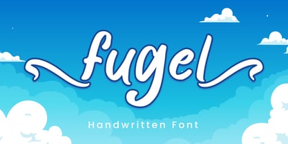 Fugel is a delicate and incredibly distinct handwritten font with beginning & ending swashes. Fall in love with its incredibly versatile style and use it to create spectacular designs! Fugel is perfect for branding, logo, invitation, stationery, social media post, product packaging, merchandise, blog design, game titles, cute style design, Book/Cover Title and more. What's Included : - Fugel.otf - Beginning & Ending Swash - Multilingual Support --- Hope you enjoy with our font! Attype Studio
 - Lunarmod by MADType,
$21.00 Lunarmod is an attempt at creating a full font from a single basic shape, a box with oval ends. It ended up being very modular and looks slightly alien or spacey, hence the name Lunarmod.
 - Cassandre by Lunas Type,
$19.00 Introducing, Cassandre! Cassandre is a hairline and modern signature handwritten font. Cassandre comes with ending swashes to add charming feel. Just type "-" at the end of the letters to access swashes. Or you can access it via alternates option. Cassandre is perfect for many design needs such as merch, T-shirts, logo, titles, wedding, book covers, social media posts, websites, events, and many more. What's you get : - Ending Swashes - Numeral & Punctuation. - Ligature. - Multilingual Support. Enjoy Designing! Thanks! Lunas Type
 - Liza Pro by Underware,
$50.00 Lettres d’amour! Flirting, fashionable, provocative, emotional, casual, moderate, extremely sensible & beautiful - Liza Pro covers it all. Liza Pro, Underware’s dear creation, is a live-script typeface. Thanks to its extremely intelligent OpenType architecture, she approaches human hand lettering as closely as technically possible. Liza Pro deeply analyzes the text. Out of a stock of 4000 hand crafted characters, Liza creates the most optimal combination. All of this works automatically. All you need to do is start typing your lettres d’amour, and Liza makes the text always look different. She gives your creative piece the impression par excellence. Erotique mais intelligent. She is as clever as we could imagine. She kept all folks at Underware busy for a couple of years. It all started one rainy night back in May 2004 but quickly changed into a fatal affair exceptionnelle. But now, 5 years later we are quite sure: this is something serious. Yes, we are talking about real love. L’amour pour la vie. Liza Pro has Underware’s world-dominating Latin Plus character set, supporting a total of 219 languages (Latin 1 + 2 and beyond). Liza Pro is a package of 4 fonts which work together. Liza Display Pro rocks the script lettering to the max. The build-in Out-of-ink feature, LetterSwapper and Protoshaper makes this font a realtime-digital-calligrapher. She’ll swash up your text drastically, giving long strokes, loops and swashes to letters if their context allows. Liza Text Pro has a more silent, moderate character - she’s well behaving sister of Liza Display Pro, designed to walk long pieces of text in a lively script style. Liza Caps Pro adds more possibilities and functionality to these two script fonts. It bridges the gap in case running script lettering doesn’t do the job, but it also works perfectly on its own. Every capital letter appears in various shapes to obtain the manual lettering feeling. Liza Ornaments Pro is for extra delicatesse et est plus charme. Four heart winning fonts, pour la langue l’amour!
 - Prillwitz Pro by preussTYPE,
$49.00 Johann Carl Ludwig Prillwitz, the German punch cutter and type founder, cut the first classic Didot letters even earlier than Walbaum. The earliest proof of so-called Prillwitz letters is dated 12 April 1790. Inspired by the big discoveries of archaeology and through the translations of classical authors, the bourgeoisie was enthused about the Greek and Roman ideal of aesthetics. The enthusiasm for the Greek and Roman experienced a revival and was also shared by Goethe and contemporaries. »Seeking the country of Greece with one’s soul«. All Literates who are considered nowadays as German Classics of that time kept coming back to the Greek topics, thinking of Schiller and Wieland. The works of Wieland were published in Leipzig by Göschen. Göschen used typefaces which had been produced by until then unknown punch cutter. This punch cutter from Jena created with these typefaces master works of classicist German typography. They can stand without any exaggeration on the same level as that of Didot and Bodoni. This unknown gentleman was known as Johann Carl Ludwig Prillwitz. Prillwitz published his typefaces on 12th April 1790 for the first time. This date is significant because this happened ten years before Walbaum. Prillwitz was an owner of a very successful foundry. When the last of his 7 children died shortly before reaching adulthood his hope of his works was destroyed, Prillwitz lost his will to live. He died six months later. His wife followed him shortly after. The typeface Prillwitz as a digital font was created in three optical styles (Normal, Book and Display). The typeface Prillwitz Press was created especially for a printing in small sizes for newspapers. »Prillwitz Press« combines aesthetic and functional attributes which make written text highly readable. It was originally designed for a newspaper with medium contrast to withstand harsh printing conditions. Its structure is quite narrow which makes this typeface ideal for body text and headlines where space is at premium. For the Normal – even more for the Book – a soft and reader-friendly outline was created through a so-called »Schmitz« and optimized in numerous test prints. The arris character and the common maximal stroke width contrast of the known classicist typefaces (Didot/Bodoni) were edited by the study of the original prints. This was also done in order to reach a very good readability in small type sizes. This typeface is perfectly suited to scientific and belletristic works. Accordingly it has three styles: Regular, Bold and Italic as Highlighting (1). The typeface Prillwitz is a complete new interpretation and continuing development of the conservated originals from 1790. They have been kept in the German Library in Leipzig. It was always given the priority to keep the strong roughness and at the same time optimizing the readability of this striking font. The type family has all important characters for an efficient and typographic high quality work. ----------- (1) Accentuation of particular words or word orders (e.g. proper names, terms etc.). Typographic means for Highlighting could be Italic, SmallCaps or semi-bold.
 - KG Chasing Cars by Kimberly Geswein,
$5.00 This cute bunting style font includes extras like a cupcake, anchor, and a fleur de lis. Use the ( ) { } [ ] to make end pieces and join them with the underscore __.
 - Gestura by NamelaType,
$17.00 Gestura is a Connecting script font that has an angled terminal upturned tail at the end of the ascender, and a flat terminal at the end of each letter, giving a bold impression in a script font. Gestura consists of 14 styles from Light to Black with each matching italics, 2 Variable Font; Upright and Oblique.
 - Diolitha by Attype Studio,
$16.00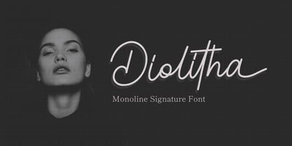 Diolitha is monoline signature font with ending swash. Fall in love with its incredibly versatile style and use it to create spectacular designs! Diolitha is perfect for branding, logo, invitation, stationery, social media post, product packaging, merchandise, blog design, game titles, cute style design, Book/Cover Title and more. What's Included : - Ending Swash - Ligatures - Multilingual Support
 - Stay Bright by Ivan Rosenberg,
$12.00 Stay Bright is a modern font duo consisting of a signature style script and elegant serif font. Both fonts includes multilingual support for Western and Central Europe. Is ideal for weddings invitations, baby showers, blog website, instagram, branding, invitations, business cards, and many more. This font also include complete set of alternates and stylistic ends for lowercase characters. Stay Bright Script : It contains one set of opentype stylistic lowercase alternates and one set of opentype stylistic ends. Script version contains 55 LIGATURES. Stay Bright Font Duo contains following characters: AÁĂÂÄÀĀĄÅÃÆBCĆČÇDÐĎĐEÉĚÊËĖÈĒĘFGĢHIÍÎÏÌĪĮJKĶLĹĽĻŁMNŃŇŅŊÑOÓÔÖÒŐŌØÕŒPÞ QRŔŘŖSŚŠŞTŦŤŢUÚÛÜÙŰŪŲŮVWẂŴẄẀXYÝŶŸỲZŹŽŻ aáăâäàāąåãæbcćčçdðďđeéěêëėèēęfgģhiíîïìīįjkķlĺľļłmnńňņŋñoóôöòőōøõœpþqrŕřŗsśšş ßtŧťţuúûüùűūųůvwẃŵẅẁxyýŷÿỳzźžż
 - Bluehonest by Allouse Studio,
$16.00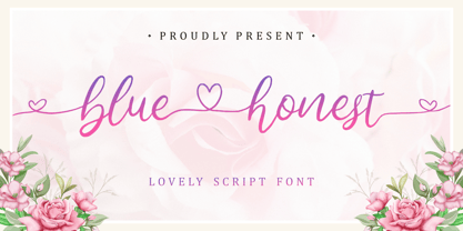 Lovely Script Font. Bluehonest come with many stylistic-alternates to fulfill your need. Lovely Alternates Uppercase, Regular and Lovely Beginning and Ending Swash, Big Love ending swash to pairing initials/name/anything, Multi-Lingual Support. We highly recommend using a program that supports OpenType features and Glyphs panels like many of Adobe apps and Corel Draw, so you can see and access all Glyph variations. Bluehonest is perfect for any tittles, logo, product packaging, branding project, megazine, social media, wedding, or just used to express words above the background.
 - Segatha by Ef Studio,
$15.00 Segatha is a beautiful casual handwritten font with beginning and ending lowercase swashes, 94 ligatures that add more beautiful and aesthetic fonts to perfect your extraordinary project. very suitable for branding, invitations, watermarks, photography, and more.
 - Brokson by Andrey Sharonov,
$25.00 This font pair was crafted by hand under inspiration of old-fashioned typography on different vintage labels, packages, sighs and others. It’s will be a godsend for those who want to add vintage mood to design project. Collection includes Script, Serif and it’s variations like Regular, Rough and Aged. This pair perfectly cooperating with each other. Brokson can be used in different purposes: lettering and logotype, labels, t-shirts, product packaging, advertising and many others. In addition to the basic set, Brokson Script has beautiful alternatives of Uppercase characters, variations of the end for Lowercase and some ligatures. Also, there are two types of end-swashes and eight lengths of each style. Brokson Serif was designed as a secondary and additional font after Script, but in the process of their use I realized it also look great as a priority. Quick combinations for Opentype features: Uppercase Alternates - just add for example «2, 3, or 4» after Uppercase; End-letter - just add «2» at the end of the word; End-swashes (tails) - just add _1, _2, _3… or /1, /2, /3…up to 8, where number is length of tail. This combinations works only with activated Standard Ligatures option in Opentype panel (Adobe Illustrator / Photoshop). Multilingual Support Danish, Dutch, English, Estonian, Faroese, Finnish, French, German, Hungarian, Icelandic, Italian, Norwegian, Polish, Portuguese, Slovene, Spanish, Swedish, Turkish.
 - Diablito One by RodrigoTypo,
$25.00 is an entertaining font with pointed endings, contains inline and many dingbats, besides having a free version!
 - Wood Sans by TypoGraphicDesign,
$19.00 The typeface Wood Sans is designed from 2021 for the font foundry Typo Graphic Design by Manuel Viergutz. The display typeface is a digital version of original wood letters from a german flea market find. 8 font-styles (Clean, Clean Invest, Clean Mix, Rough, Rough Misprint, Rough Alt, Rough Dark & Icons) with 450 glyphs (Adobe Latin 2) incl. 100+ decorative extras like icons, arrows, German Capital Sharp S, dingbats, emojis, symbols, geometric shapes, catchwords, decorative ligatures (type the word #LOVE for ♥︎or #SMILE for ☺ as OpenType-Feature dlig) and stylistic alternates (3 stylistic sets). For use in logos, magazines, posters, advertisement plus as webfont for decorative headlines. The font works best for display size. Have fun with this font & use the DEMO-FONT (with reduced glyph-set) FOR FREE! ■ Font Name: Wood Sans ■ Font Styles: 8 font-styles (Clean, Clean Invert, Clean Mix, Rough, Rough Misprint, Rough Alt, Rough Dark & Icons) + DEMO (with reduced glyph-set) ■ Font Category: Display for headline size ■ Font Format:.off (for Print) + .woff (for Web) ■ Glyph Set: 450 glyphs (Latin 2 incl. decorative extras like icons) ■ Language Support: 69 languages: Afrikaans, Albanian, Asu, Basque, Bemba, Bena ,Breton ,Catalan ,Chiga ,Cornish ,Danish ,Dutch ,English ,Estonian ,Faroese ,Filipino ,Finnish ,French ,Friulian ,Galician ,German ,Gusii ,Indonesian ,Irish ,Italian ,Kabuverdianu ,Kalenjin ,Kinyarwanda ,Luo ,Luxembourgish ,Luyia ,Machame ,Makhuwa-Meetto ,Makonde ,Malagasy ,Manx ,Morisyen ,North Ndebele ,Norwegian Bokmål ,Norwegian Nynorsk ,Nyankole ,Oromo ,Portuguese ,Quechua ,Romansh ,Rombo ,Rundi ,Rwa ,Samburu ,Sango ,Sangu ,Scottish Gaelic ,Sena ,Shambala ,Shona ,Soga ,Somali ,Spanish ,Swahili ,Swedish ,Swiss German ,Taita ,Teso ,Uzbek (Latin) ,Volapük ,Vunjo ,Welsh ,Western Frisian ,Zulu ■ Design Date: 2021 ■ Type Designer: Manuel Viergutz
 - Eco Hand Kid by TypoGraphicDesign,
$19.00 The typeface Eco Hand Kid is designed from 2022 for the font foundry Typo Graphic Design by Manuel Viergutz as a political statement #climatejustice 4 font-styles (Cond, Bold, Outline, Icons) with 948 glyphs (Adobe Latin 3) incl. 100+ decorative extras like icons, arrows, dingbats, emojis, symbols, geometric shapes, catchwords, German Capital Sharp S, zodiac signs, ligatures (type the word #LOVE for ♥︎ or #SMILE for ☺ as OpenType-Feature dlig) and stylistic alternates (8 stylistic sets). For use in logos, magazines, posters, advertisement plus as webfont for decorative headlines. The font works best for display size. Have fun with this font & use the DEMO-FONT (with reduced glyph-set) FOR FREE! Font Specifications ■ Font Name: Eco Hand Kid ■ Font Styles: 4 (Cond, Bold, Outline, Icons) + DEMO (with reduced glyph-set) ■ Font Category: Sans Serif Display for headline size ■ Glyph Set: 948 glyphs (Adobe Latin 3) incl. 100+ icons (decorative extras like arrows, dingbats, emojis, symbols) ■ 93 languages: Afrikaans Albanian Asturian Asu Basque Bemba Bena Breton Catalan Chiga Colognian Cornish Croatian Czech Danish Dutch Embu English Esperanto Estonian Faroese Filipino Finnish French Friulian Galician German Gusii Hungarian Igbo Indonesian Irish Italian Kabuverdianu Kalaallisut Kalenjin Kamba Kikuyu Kinyarwanda Latvian Lithuanian Lower Sorbian Luo Luxembourgish Luyia Machame Makhuwa-Meetto Makonde Malagasy Maltese Manx Meru Morisyen North Ndebele Norwegian Bokmål Norwegian Nynorsk Nyankole Oromo Polish Portuguese Quechua Romanian Romansh Rombo Rundi Rwa Samburu Sango Sangu Scottish Gaelic Sena Serbian Shambala Shona Slovak Soga Somali Spanish Swahili Swedish Swiss German Taita Teso Turkish Upper Sorbian Uzbek (Latin) Volapük Vunjo Walser Welsh Western Frisian Yoruba Zulu ■ Design Date: 2022 ■ Type Designer: Manuel Viergutz
 - Creatie by MaxnorType,
$12.00 Creatie is a lovely modern script font. This beautiful hand-lettered script font is perfect for styling logos, stationery, social media, websites and much more! Creatie was created with multilingual support, ligatures, contextual alternates, stylistic alternates, swash and wings, allowing you to create a great look to your projects. These features work well in programs that support OpenType features, such as Adobe Indesign, Illustrator, and Photoshop. The start wings and end wings use contextual alternates and ligature features, making it easy to access and change the wing style simply by changing the number on the end of the wing formula.
 - P22 Morris by P22 Type Foundry,
$24.95 William Morris (1834-1896) was probably the most influential figure in the decorative arts and private press movements of the late 19th and early 20th century. In reaction to the increasing lack of quality that the industrial revolution brought on, Morris sought a return to the ideals of the medieval craftsman. Dissatisfied with the commercially available typefaces of the day, he undertook the design of the fonts for his books himself. The P22 Morris font set features new versions of Morris's famous type designs for his Kelmscott Press. The two main fonts include full international character sets for Western European languages. P22 created MORRIS GOLDEN with a rough edge to simulate the look of printing on handmade paper. There is a more "refined" recent version of Golden, but its sterile digitization does not approach the effect that Morris achieved in his Kelmscott books. You'll notice the handmade effect less in the smaller sizes but will find it quite decorative in the larger sizes. (Morris cut his Golden type in only one size for the Kelmscott Press, approximately equal to 14 points.) P22's version of MORRIS TROY is more smooth than Morris Golden and is true to the original Morris design. It is based on the Kelmscott Troy type (an 18 point font) and its smaller counterpart, the Chaucer type (a 12 point font). American Type Founders made an unauthorized version of Troy, "Satanick," 189?, contrary to Morris's wish that it not be made available commercially.(Legend has it that the naming of Satanick comes from William Morris telling the agent inquiring about making copies of his fonts available to go to hell) Several digital versions of Troy (and Satanick) have appeared over the years. The P22 version offers a much more accurate rendering than any previous version. Morris designed the original Troy font to be spaced very tightly; our version reflects and honors his intention. The MORRIS ORNAMENTS are based on those Morris designed and used in his Kelmscott Press books. Characters in the positions of the letters A to Z are decorative drop cap initials. Characters in the number key positions reproduce other Morris embellishments. (See the accompanying key chart.) As with all headline fonts and complex dingbats characters, this font is best used at larger point sizes (e.g., 48, 72, 120). Use in body text or at small point sizes on-screen may not achieve desired results. P22 is grateful to William S. Peterson, Steven O. Saxe and the Lightsey-Offutt Library who gave invaluable research assistance to this project.
 - Milky Line by Sakha Design,
$12.00 Milky Line is a modern and elegant display font! Each letter is thoughtfully crafted with clean lines and stylish details, resulting in a sophisticated and refined look. Perfect for creating eye-catching headlines, titles, and branding materials that exude an air of professionalism and high-end quality.
 - Bulgari by Slex Studio,
$15.00 Bulgari is an organic handwritten font suitable for branding, wedding invitations, promotions, product packaging and other necessities. This font is modern, simple, but still authentic. You'll get a full set of lowercase and uppercase letters, numbers and punctuation, multilingual symbols, lowercase start and end swashes, and ligatures.
 - Mythical Christmas by Allouse Studio,
$16.00 Mythical Christmas Script bring you the joyfull feel with bouncy calligraphy styles with Beginning and Ending swash to play around, these also come with Multi-Lingual Support. Mythical Quirky give you an a handwriting serif styles and just including Uppercase Lowercase Number and Multi-Lingual Support. Enjoy these Lovely Couple Font! We highly recommend using a program that supports OpenType features and Glyphs panels like many of Adobe apps and Corel Draw, so you can see and access all Glyph variations. Mythical Christmas is perfect for any tittle, logo, invitation, product packaging, branding project, megazine, social media, wedding, or just used to express words above the background. Enjoy the font, feel free to comment or feedback, send me PM or email. Thankyou!
 - Southern Nights by Breauhare,
$35.00 Based on the hit album by Glen Campbell, Southern Nights is the font with a style that’s “free as a breeze,” as the song says. It’s fun and casual, yet it has a flair for fashion and elegance. It also has an art nouveau look which lends itself to greeting cards as well as the branding of perfume, clothing, retailing, dining, and other luxury/high-end uses. This font includes alternate characters for the upper R, S, and T, the lower g and z, plus ligatures that include a double lower t and double lower l (L). As the song might say, I apologize to anyone who can truly say that they have found a better font! Digitized by John Bomparte.
 - Des Montilles by Supfonts,
$18.00 Des Montilles is a casual handwritten font. Perfect for greeting cards, wedding stationery, photographer watermarks logos, modern websites, apparel design and more. Des Montilles features handwritten ligatures, beginning and end swashes for lowercase letters and heart connections
 - Carambola by Hanoded,
$15.00 Carambola is a beautiful art deco typeface based on several posters from the 1920's. It is an elegant and stylish font with generous curves and sharp ends. Carambola is multilingual and comes in all caps only.
 - Awesome Heather by Supfonts,
$15.00 Awesome Heather is a casual handwritten font. Perfect for greeting cards, wedding stationery, photographer watermarks logos, modern websites, apparel design and more. Awesome Heather features handwritten ligatures, beginning and end swashes for lowercase letters and heart connections
 - Armstrong by Device,
$39.00 An elegant geometric linking script that uses OpenType programming to intelligently substitute "beginning" and "ending" characters with uniquely designed variants. The family also includes swash alternates that can be toggled on or off in the Opentype panel. (Note: Please view the image above for correct end and beginning letters as they will appear in Indesign, Illustrator, etc. The Myfonts previews below are not Opentype savvy, and so these specially designed versions do not substitute themselves.)
 - Chillight by Zamjump,
$19.00 Chillight is a serif typeface that is unique and has character, having a narrow, sharp width and ends. making it effective when used at large sizes for logotypes or headlines.
 - Lento by Etewut,
$22.00 Introducing Lento monoline script with happy end! 5 styles are included: regular, double, rough, display and bold. - Basic latin - Extended latin - Ligatures - Alternative symbols - Initial and Final symbols Enjoy Lento!
 - Reika by Andrey Sharonov,
$20.00 Reika is a super soft and positive script inspired by the summer funny mood, simple street food and fresh drinks. It’s all about smiles, delicious, not too serious time spending with family or friends. Reika looking smooth thanks to 95 ligatures like an ak ch ck th in im ax ux and many others. Script includes Stylistic Alternates of some Uppercase and Lowercase and 12 lengths of End-Swashes (tales). You can use this font for example in logo and package design, in food business, kids and confectionery products. Reika support Western European characters and works with following languages: English, Danish, Dutch, Estonian, Faroese, Filipino, Finnish, French, German, Hungarian, Icelandic, Irish, Italian, Norwegian, Polish, Portuguese, Spanish, Swedish, Turkish. Quick combinations for Opentype features: Alternates - just add «2» End-letter - just add «underscore» End-swashes (tails) - just add -1, -2, -3…up to -12, where number is length of tail. This combinations works only with activated Standard Ligatures option in Opentype panel (Adobe Illustrator / Photoshop).
 - Ulian by Typodermic,
$11.95 In the world of typography, there’s always a desire for something new and innovative that can make your design stand out. If you’re looking for a typeface that is as unique as it is bold, look no further than Ulian. Ulian is a striking display typeface that fuses the best of two worlds: the flat sides of traditional blackletter and the contemporary shapes of modern letterforms. The result is a typeface with a refreshing twist that is sure to capture the attention of your audience. One of the most striking features of Ulian is its distinctive flat sides. These straight lines give the typeface a bold and confident feel, perfect for grabbing attention and making a statement. But Ulian doesn’t stop there; it also features elements of modern typefaces, including curved serifs and varying thickness in the strokes. The squared geometric typefaces have also been incorporated into the design, adding a touch of sleekness and modernity. This combination of traditional and contemporary design elements creates a unique visual impact that is both striking and memorable. Ulian also comes with a range of variants, including Regular, Italic, Bold, and Bold-Italic. This versatility allows you to use the typeface across a range of applications, from logos to headlines and everything in between. But Ulian doesn’t just look good—it’s also functional. In OpenType-capable applications, you can access old-style lowercase numerals, giving you even more flexibility in your designs. Overall, Ulian is a one-of-a-kind typeface that is sure to elevate your design game. With its distinctive flat sides, modern letterforms, and unique flair, it’s the perfect choice for anyone looking to make a dauntless statement. So why settle for ordinary typography when you can have Ulian? Most Latin-based European writing systems are supported, including the following languages. Afaan Oromo, Afar, Afrikaans, Albanian, Alsatian, Aromanian, Aymara, Bashkir (Latin), Basque, Belarusian (Latin), Bemba, Bikol, Bosnian, Breton, Cape Verdean, Creole, Catalan, Cebuano, Chamorro, Chavacano, Chichewa, Crimean Tatar (Latin), Croatian, Czech, Danish, Dawan, Dholuo, Dutch, English, Estonian, Faroese, Fijian, Filipino, Finnish, French, Frisian, Friulian, Gagauz (Latin), Galician, Ganda, Genoese, German, Greenlandic, Guadeloupean Creole, Haitian Creole, Hawaiian, Hiligaynon, Hungarian, Icelandic, Ilocano, Indonesian, Irish, Italian, Jamaican, Kaqchikel, Karakalpak (Latin), Kashubian, Kikongo, Kinyarwanda, Kirundi, Kurdish (Latin), Latvian, Lithuanian, Lombard, Low Saxon, Luxembourgish, Maasai, Makhuwa, Malay, Maltese, Māori, Moldovan, Montenegrin, Ndebele, Neapolitan, Norwegian, Novial, Occitan, Ossetian (Latin), Papiamento, Piedmontese, Polish, Portuguese, Quechua, Rarotongan, Romanian, Romansh, Sami, Sango, Saramaccan, Sardinian, Scottish Gaelic, Serbian (Latin), Shona, Sicilian, Silesian, Slovak, Slovenian, Somali, Sorbian, Sotho, Spanish, Swahili, Swazi, Swedish, Tagalog, Tahitian, Tetum, Tongan, Tshiluba, Tsonga, Tswana, Tumbuka, Turkish, Turkmen (Latin), Tuvaluan, Uzbek (Latin), Venetian, Vepsian, Võro, Walloon, Waray-Waray, Wayuu, Welsh, Wolof, Xhosa, Yapese, Zapotec Zulu and Zuni.
 - Allow me to introduce you to the unsung hero of the typography world, Uecker, carefully crafted by the typographic maestro, Allen R. Walden. Imagine a font that decided to put on its Sunday best, but...
- Ah, Chemical Gus! If fonts were characters at a science fair, Chemical Gus would undoubtedly be the eccentric, wild-haired inventor whose experiment table teems with bubbling potions and mysterious, ...
- Whisky by Corradine Fonts,
$24.95 Whisky is a blackletter font family with a casual touch that makes it look friendly and current. The stroke varies its thickness and angle endings making it form very dynamic bodies of text. The family includes seven weights, each with a fill and a inline version that allow you to develope more colorful applications overlaping them as layers. Also by using Open Type features you can access to an extended set of characters wich contains swashes and alternative endings to make more playful compositions.
 - Tempora LGC Uni - 100% free

