4,289 search results
(0.027 seconds)
- Demon - Unknown license

- Psychatronic - Unknown license

- Cat Women - Unknown license

- Coriander by Adobe,
$29.00Coriander is the work of British designer Timothy Donaldson. It started out as a doodle one afternoon Donaldson was bored and uninspired. He wrote the word Coriander" and was then distracted by the sun beating through an adjacent window. He taped the writing paper up on the window as a shade. He took it down a few months later, folded it up, and stuck it in his pocket. When the piece of paper fell out of his pocket a week later, he was inspied to draw the rest of the characters, two alphabets in his sketchbook. The final digitized characters were created by Donaldson using a Wacom tablet and later refined on the screen." - Mounchera by Variatype,
$22.00 Mounchera is a modern and luxury serif font inspired by the art deco style and includes discretionary ligatures and stylistic alternates. Perfectly match the contemporary design theme for many projects such as logotypes, corporate branding, poster design, business cards, headline cover, and more. FONT FEATURES 304 Glyphs Additional Accents 68 Languages Kerning Ligatures Alternates SOFTWARE RECOMMENDATION Adobe Photoshop CC 2020 or later Adobe Illustrator CC 2020 or later
 - Absolutely, I'd love to share a bit about the font "Walter." Conceived by the talented Jenny Barck, a name not widely known in every household but revered among certain circles of typography enthusia...
- Diecast by Device,
$39.00 A companion piece to Mulgrave, this font is the intermediary design between the chunky Victorian style that Mulgrave reproduces and the Ministry of Transport sans introduced in 1933 and digitised as Ministry. Although they date from between 1910 and 1933, these signs show the beginnings of several features Ministry later incorporated, notably the thinner strokes and the more modern forms of the G, M, R and S. The letter widths are approaching a monospace - the L, F and E are relatively wide compared to the W and M, a feature that may have something to do to the casting process. These idiosyncracies were all ironed out when the first version of the MOT alphabet was produced. The Device digitization, as with Mulgrave, stays true to the worn and repainted original metal source material and preserves the unusual widths.
 - Southwest Serenade JNL by Jeff Levine,
$29.00 The 1940s-era hand-lettered title on vintage sheet music for the song hit "Donkey Serenade" had an interpretation of the classic typeface "Broadway" used in a Mexican/Southwest motif with wavy lines cutting through the letters. Adapting Playwright JNL (itself, a hand-lettered interpretation of "Broadway") to this style, the festive design is now a digital typeface called Southwest Serenade JNL.
 - Summer Safari JNL by Jeff Levine,
$29.00 Inspired by an image of a 1960s rock and roll concert poster for “The Beach Boys Summer Safari”, this typeface captures the casual, informal lettering of the main headline and makes it available digitally. Evoking sunny days of fast cars, pretty girls and riding the waves, the playfully hand lettered Summer Safari JNL is available in both regular and oblique versions.
 - Deliria by Pedroglifos,
$11.00 Deliria is a decorative serif typeface that evokes a trippy feel from its wave-like body. The perfect balance between the flowing motion, and a fixed structure allows it to maintain readability while providing a unique aesthetic to your project. A great candidate for logos, single names, book titles and general decorative display. Combines well with simple sans or sharp serif fonts.
 - Segina by Creativemedialab,
$22.00 Segina combines a high-contrast serif with a modern psychedelic font that is slightly wavy unique, and attractive. Segina consists of two Regular and Display options, each containing six weights from thin to Black. And also variable format with two axes, weight, and optical size. Segina has alternative characters that can be combined to create a beautiful heading, title or logotype.
 - Michua by Macrotipo,
$35.00 Michua is a sans serif font based on the principles of freedom and spontaneity, designed with curved ends and sticks with a slight wave. Its development is aimed at both screen display and its use in print media. Thanks to the flexibility offered by OpenType features we included special characters such as ligatures and old style numbers, offering a fairly comprehensive set extension.
 - Queenlery by Letterara,
$21.00 Queenlery is an elegant, wavy, and delicate sans serif font. It features a classy look that can be used for logos, branding, poster, advertising, promotion, invitations, stationery, wedding designs, social media posts, and much more! Have fun with this cool font and explore its endless variations. This font is PUA encoded which means you can access all of the glyphs.
 - Cosmed Retro by HansCo,
$15.00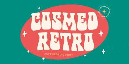 Cosmed Retro font is a retro psychedelic font style with wavy touch. Use this display font to add that special retro touch to any design idea you can think of! Very suitable for logotype, Stickers, Packaging design, Cricut Project, headlines, brand identity, t shirt or apparel industry, posters, magazines, books, YouTube, Instagram, websites, or any of your creative design projects. Enjoy!
 - Fatkat by HansCo,
$15.00 Fat Kat is a bold retro serif fonts that feels clean and fun an incredible modern retro aesthetic. This font features a ligature feature on capital letters which allows the font to look unique with a wavy style. Use this Fat Kat serif font to add that special modern retro touch to any design idea you can think of! Enjoy!
 - Action Is - 100% free

- BE CROSS - Unknown license

- Apologetic by Heyfonts,
$18.00 Anglepoise Typeface Anglepoise - Tropical often incorporate organic and flowing design elements, mimicking the curves and shapes found in nature, such as palm fronds, waves, or exotic flowers. These elements can add a sense of fluidity and movement to the typography. if you are looking for a font that embodies a tropical or exotic aesthetic, you may be interested in fonts that are inspired by or commonly associated with tropical themes. Such fonts often feature characteristics that evoke feelings of warmth, relaxation, and the natural beauty of tropical environments. Here's a general description of what you might expect from a font with a tropical theme: Organic and Flowing: Tropical fonts often incorporate organic and flowing design elements, mimicking the curves and shapes found in nature, such as palm fronds, waves, or exotic flowers. These elements can add a sense of fluidity and movement to the typography.
 - Fissue by Heyfonts,
$18.00 Fissue – Tropical Font often incorporate organic and flowing design elements, mimicking the curves and shapes found in nature, such as palm fronds, waves, or exotic flowers. These elements can add a sense of fluidity and movement to the typography. if you are looking for a font that embodies a tropical or exotic aesthetic, you may be interested in fonts that are inspired by or commonly associated with tropical themes. Such fonts often feature characteristics that evoke feelings of warmth, relaxation, and the natural beauty of tropical environments. Here’s a general description of what you might expect from a font with a tropical theme: Organic and Flowing: Tropical fonts often incorporate organic and flowing design elements, mimicking the curves and shapes found in nature, such as palm fronds, waves, or exotic flowers. These elements can add a sense of fluidity and movement to the typography.
 - Tushy Perfume by Forberas Club,
$16.00 It's Tushy not stussy, even it's Pretty but ain't lazy. yoo what's up, this font is dedicated for you to be your crafting material. Super ready for any craft project as branding image, any tags, card maker, invitation card, greeting card, wedding decoration for your farmhouse wedding or rustic look, or decorative material.
 - Blood Of Dracula - Unknown license

- Decaying - Unknown license

- Sabon by Linotype,
$45.99 In the early 1960s, the German Master Printers’ Association requested that a new typeface be designed and produced in identical form on both Linotype and Monotype machines so that text and technical composition would match. Walter Cunz at Stempel responded by commissioning Jan Tschichold to design a new version of Claude Garamond’s serene and classical Roman. Its bold, and particularly its italic styles are limited by the requirements of Linotype casting machines, forcing the character widths of a given letter to match between styles, giving the italic its characteristic narrow f. The family’s name is taken from Jacques Sabon, who introduced Garamond’s Romans to Frankfurt. Sabon has long been a favorite of typographers for setting book text, due to its smooth texture, and in large part because Tschichold’s book typography remains world famous.
 - Print Damosel JNL by Jeff Levine,
$29.00 Kevin Curtis runs a site called Damosel's Printer's Blocks, specializing in rare an unusual examples from the years when letterpress was the main source of printed material. He graciously provided the source material for Print Damosel JNL. The collected images represent a varied cross-section of ornamentation, embellishments, attention getters, decorations and whimsical illustrations.
 - Jasmine Tea by Goodigital13,
$20.00 Characters So beautiful on invitation like greeting cards, branding materials, business cards, quotes, posters, and more!!
 - Broone by Asenbayu,
$15.00 Broone is a stunning versatile decorative display font. The proportion of wavy shapes with serif outlines can add a youthful and natural touch to any design project. You can use this font in modern and retro designs. This font is suitable for attractive packaging label designs, unique desired logos, poster designs, fashions and much more. This font contains standard glyph, alternates, ligatures, symbol, punctuation and multilingual supports.
 - Lamiran by RagamKata,
$14.00 Lamiran is a Distorted Wavy Font . You're not going to write a novel with this font, I will tell you that but... if you want something seriously psychedelic thats part art and part font, then this is the font for you. Using it sparingly to mix and match with a clean sans serif or go all out for a good time. Thanks, Have a wonderful Day. Ragamkata
 - Sixties Flashback by Mysterylab,
$15.00 Here's a lettering style that just might be exactly on your wavelength. Add just the right dose of vintage freak-a-delia to your retro graphics with this original psychedelic-style design. Great for music posters, album graphics, book titles, etc. Evoke a warpy, wavy, whimsical vibe that harks back to the carefree 1960s or early 1970s era with Sixties Flashback; it's pure hippie, trippy fun!
 - Spring Season JNL by Jeff Levine,
$29.00 Spring Season JNL is a decorated and stylized Art Deco slab serif design from1935 which is based on the hand lettered title on the sheet music for “Paris in the Spring”. The characters are cut through with both a straight line and a wavy, spoked line which looks something like a thorny vine. Spring Season JNL is available in both regular and oblique versions.
 - Bangel by Art Grootfontein,
$19.00 Bangel is a contemporary display font family with a strong personality. The eye-catching letter design is quite geometric, but also pretty expressive and fun. It supports broad latin languages and comes with 4 styles + a special free Wave bonus. Bangel is a pretty good choice for logotypes, branding, headlines and posters. This typeface is also a powerful option for use on social media, web & UI design.
 - Butterfield by Scriptorium,
$18.00Butterfield is based on poster lettering from posters for rock shows at the Fillmore in the 1960s. It is particularly influenced by the lettering of Wes Wilson, but has added features and improvements to make it more generally useful. It is one of the most effective examples of the psychedelic style. Combining the basic font with Photoshop's wave pattern produces the unique look seen above. - Mint Dayz by Four Lines Std,
$15.00 Unleash a wave of nostalgia with Mint Dayz, the font that seamlessly blends retro charm with modern legibility. This font captures the essence of yesteryears, infusing a sense of vintage elegance into your designs. Also Mint Dayz places a premium on readability and legibility. Each character is carefully crafted to ensure your message is crystal clear, making it suitable for a wide range of design projects.
 - Evil Of Frankenstein - Unknown license

- Krank by Matt Grey Design,
$12.00 A minimalist, stackable and dynamic squared off typeface, perfect for posters and large print and screen material.
 - Letterpress Stock Cuts JNL by Jeff Levine,
$29.00 Letterpress Stock Cuts JNL is another assemblage of classic cartoons and illustrations re-drawn from vintage source material.
 - The Aquarium font, designed by Chloe, is a captivating and whimsical typeface that effortlessly evokes the fluid and flowing nature of underwater life. Its unique character is derived from the way ea...
- Seitu by FSD,
$520.00 This variable font is a Fabrizio Schiavi typographic interpretation and development of the legendary coop logotype designed by Albe Steiner and later improved by Bob Noorda in 1985
 - Ghylde by Krismagraph,
$17.00 Ghylde is an elegant & modern Serif Display typeface that stands out. Ghylde will be best suited for creating logotypes, branding, headlines, corporate identities, and marketing materials for the web & as well as any minimal designs. Please see the included demographics to get an idea about the capability of this typeface when used for branding and marketing material design. Thank you.
 - Honeybutter by Zansari,
$12.00 Honeybutter is a modern-vintage inspired hand lettered font. This refreshing take on a the vintage sans serif style is perfect just on its own or for pairing with other similar vintage inspired fonts. Highly recommended for digital lettering, logos, marketing material, print, branding material, quotes, overlaying on photography, and much more. This font was carefully designed by hand in Auckland, New Zealand
 - Spice Girls by Suza Studio,
$18.00 Spice Girls is an elegant & modern Calligraphy Look typeface that stands out. Spice Girls is best suited for creating logotypes, branding, headlines, fashion, romantic novels, corporate identity and marketing materials for the web & as well as any minimal designs. Please see the included demographics to get an idea of what this typeface is capable of when used for branding and marketing material design.


