10,000 search results
(0.01 seconds)
- A Fire Inside The Walls - 100% free

- Three the Hard way shadowed - Unknown license

- M Ling Wai F HK by Monotype HK,
$523.99 M Ling Wai is a humanistic script based on a real handwritten style. It has a feminine, urban and lively character filled with literate finesse. M Ling Wai was written with a thin ball pen by a young woman in a unique, personal, running writing style, such that it is real, natural and feminine. Contrast of strokes is low and the text is visible and eye-catching. Its light to medium stems (豎) make it suitable for small text and subheading with little conglutination. All strokes are highly irregular, inconsistent, irregularly oriented and tightly coupled or connected. Spatial distribution, positioning, size and relative proportion of radicals fully reflect a natural and personal favor. It is one of the first proportional width font in a full scale. It is best suited for casual lively text, illustrations, set upright (non-slanted), non-condensed.
 - 3 The Hard Way RMX by Fenotype,
$29.95
- M Ling Wai P HK by Monotype HK,
$523.99 M Ling Wai is a humanistic script based on a real handwritten style. It has a feminine, urban and lively character filled with literate finesse. M Ling Wai was written with a thin ball pen by a young woman in a unique, personal, running writing style, such that it is real, natural and feminine. Contrast of strokes is low and the text is visible and eye-catching. Its light to medium stems (豎) make it suitable for small text and subheading with little conglutination. All strokes are highly irregular, inconsistent, irregularly oriented and tightly coupled or connected. Spatial distribution, positioning, size and relative proportion of radicals fully reflect a natural and personal favor. It is one of the first proportional width font in a full scale. It is best suited for casual lively text, illustrations, set upright (non-slanted), non-condensed.
 - 3 The Hard Way Overrun by Fenotype,
$29.95
- KG Ways To Say Goodbye by Kimberly Geswein,
$5.00 This unique handwriting font features extremely tall, loopy descenders and ascenders. The capitals, when used by themselves, offer a totally different look.
 - Born This Way FONT (lady gaga) - Unknown license

- Ale and Wenches BB - Personal use only

- HS Al Basim A by Hiba Studio,
$59.00 HS Albasim A is an Arabic display typeface. It is useful for headlines, books covers and other graphic projects. It is a collaborative effort, as "HS Albasim A" first letters were designed and drawn by Basim Salem Al Mahdi from Iraq and then developed and digitalized as a typeface by Hasan AbuAfash from Palestine. The font is based on the simple lines of Fatmic Kufi but was it distinguished by two main ideas: First, it contains a nice serf in the vertical strokes of its letters. The second, some of storks in its letter differ in the thickness instead of being similar, as it is in the Fatmic Kufi style. The font contains only two weights: regular and bold. Both of them support the OpenType features of Arabic, Persian and Urdu.
 - Maybe I Was Joking by PizzaDude.dk,
$20.00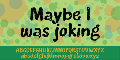
- Jedi - Unknown license

- Back In The USSR DL - Personal use only

- city burn night after night and we spraypaint the walls - Unknown license

- Walto Neue - Personal use only

- Viper Squadron Solid - Unknown license

- Flexion Pro by Red Rooster Collection,
$60.00 Flexion developed out of design philosophy and ambigramatic artwork of John Langdon. Based on the contents in John’s book Wordplay, author Dan Brown hired John to create ambigrams for his forthcoming novel Angels & Demons. Mr. Brown was so impressed with his work he even named the main character Robert Langdon after John. After the success of Angels & Demons, Dan Brown wrote The Da Vinci Code. When the movie adaptation of that book was in the works, Dan suggested that John create titles for the movie based on ambigrams. John contacted Hal Taylor to create a font based on the lettering treatment to be used for the credits at the end of the movie. Unfortunately, it was decided that the film was running long and the original title concept was scrapped. By this time, Hal was well into developing a full type family, including small caps, alternate characters, lining and ranging figures. John was impressed with the way the design was turning out and decided that it had enough merit to be released as Flexion.
 - onetrickTony by JOEBOB graphics,
$19.00 This handwritten font is the result of trying to write in a different way to what I'm used to: sometimes taking a left turn when going straight was the more obvious way. Or the other way around. The result was quite readable and it turned out that I could make surprisingly matching monographs with it.
 - OnepunchJim by JOEBOB graphics,
$9.00 OnepunchJim got its name from the way it was created; every character was made in one 'punch'. Very suitable for kids stuff.
 - BobTag by JOEBOB graphics,
$- BobTag was written on paper taped to a wall for extra grungyness. Looks like it was actually written on an irregular surface. Caps only.
 - Devil Kalligraphy by Lián Types,
$17.00Devil Kalligraphy was performed by Argentina Lián Types in 2007. The shapes of each caracter have a strong personality. It was based on antique writings. Devil Kalligraphy was inspirated in calligraphy styles. Gothic and Uncial themselves. A mix with lots of personal qualities. Devil Kalligraphy has ligatures which look evil. Ascendents and descendents were designed to look that way too. Kerning was designed taking into account the way calligraphers used (and still use) to write: Pattern looking. - Secret Handshake by PizzaDude.dk,
$15.00A nice trashy font for those grungy posters...or was it the other way around? - Transdoshan Scratch by Edd's Aurebesh Fontworks,
$5.00 Working on a Star Wars project? This font is in Aurebesh, the main written language of the Star Wars universe. In this case I designed a font that looks like it has been scratched into a wall. All the additional letters from the Aurebesh character set are includes, as well as numbers and symbols.
 - Eckhardt Bold JNL by Jeff Levine,
$29.00 Eckhardt Bold JNL continues a series of sign painter-inspired type designs and is named in honor of the late Al Eckhardt, a talented sign man who was a good friend of Jeff Levine for about 18 years until his passing. The font is available in both regular and oblique versions and was inspired by an example found in the 1928 edition of E.C. Mattthews' "How to Paint Signs and Sho' Cards". Both squat and wide for maximum use in wall and window applications, the original name for the design is "Heavy Plug". Plug was the sign painter's term at the time for describing this type of letter form.
 - BillieBob by JOEBOB graphics,
$- BillieBob was made by cramping straight shapes into squares. Somewhat reminds me of pre cold-war Russian type.
 - Vintage Comics JNL by Jeff Levine,
$29.00 Vintage Comics JNL was inspired by the way the word “comics” was hand lettered on many of the comic book covers of the 1940s, and is available in both regular and oblique versions.
 - Five Star Final by Solotype,
$19.95Introduced by the American Type Founders Co. at the time of the Spanish American War and advertised as suitable for "War Scare Headlines"! Used by many papers for years after because the narrow type was suitable for narrow single column heads. - Ano Angular by Alias,
$60.00 Ano Angular was originally designed for a fashion company. It was to be used as a headline type, half way between the logo we had designed — made up of straight lines only — and our circle-based Ano typeface, which was to be used for text. Its design is based on the idea of mixing circles with triangles into letter shapes in a modular, constructed way. The effect is digital, mathematical, remeniscent of the typography of 1980s arcade games such as Asteroids.
 - Graffiti PTx by Pedro Teixeira,
$15.00 This font was inspired on graffiti texts, sentences of street walls. The intention it's to give an style of old school words spreaded on some walls around the world. This can be cool for an design of a poster, headlines and so on.
 - Ghouliez by MADType,
$21.00 This face was drawn on paper with a calligraphy pen and way too much ink. It's perfect for that spooky globular look.
 - Gaulois by Canada Type,
$24.95 A couple of years before the second World War, Marcel Jacno, the popular French graphic designer who in the 1930s designed iconic posters for Gaumont and Paramount and famously illustrated the Gaulish helmet that first adorned the Gauloises cigarette packs in 1936, was asked by Deberny & Peignot to design a calligraphic typeface for the advertising market. Jacno's Scribe design, billed by D&P as a "virile ad writing" typeface, was released to some great fanfare in 1937, enjoyed some time of French spotlight, and was ready to make waves in the rest of Europe before the war broke out and snuffed its chances at international recognition. However, samples of it can still be found in some specialty post-war publications as an example of a trend that lasted a couple of decades, when Western European type manufacturers commissioned famous visual artists to design typefaces in order to capitalize on the artists' fame - the trend that brought us standards like Futura and the long list of Lucien Bernhard and Imre Reiner faces. This exclusive digital version of Jacno's design expands on the original concept with a large character set that includes plenty of alternates, a couple of different ways for seamless lowercase connections, three sets of figures, and extended Latin language support, adding up to over 540 characters in a one big, contextually-programmed font.
 - Hellshock by Comicraft,
$19.00 Check into your local lunatic asylum with this font, etched on the walls of his padded cell by Comicraft's left-handed right-hand man, Dave Lanphear, for Jae Lee's Image comic 'Hellshock'. Artwork from Elephantmen: War Toys by Starkings & Moritat
 - VLNL Duct by VetteLetters,
$35.00 Duct tape is one of the most versatile adhesive materials known today. From fixing the bumper of your car that keeps falling off, to creating a sturdy wallet. From alternative wrapping to sticking a friend to the wall, Duct tape is there. And it will stay there. It will stick to anything and hold for a very darn long time too! The cloth-backed tape was invented some time during World War II, and also proved itself useful as a base material for lettering. VLNL Duct was originally designed by DBXL as a logo for temporary Amsterdam restaurant BAUT. DBXL imagined an owner taping the name on the window of his shop using Duct tape. The font was used for all communication of the restaurant. Duct is a sturdy, rough all-caps typeface that will stick to anything.
 - Buttercut by PizzaDude.dk,
$15.00 Buttercut was inspired by classic slab serif fonts, such as Roboto Slab and Rockwell. However, Buttercut is way more bouncy and “off grid” - maybe the reason for that is that it was influenced by both grafitti and comics?!
 - Cherily Blussom by PizzaDude.dk,
$15.00 Cherily Blussom was made with an inky pen, and little was done to correct the blurry edges. That's why Cherry Blussom stands out in such an authentic way! Comes with both ligatures and alternates - combine them and spice up your text!
 - Candycorn Overdose by Fontosaurus,
$19.95Candycorn Overdose represents how I used to feel on the morning after Halloween, way back when I was young enough to go out begging for candy. - Bremen by Bitstream,
$29.99Bremen was designed at Bitstream by Richard Lipton and released in 1992. It is based on German poster art from the period between the World Wars. - KG Love You Through It by Kimberly Geswein,
$5.00 My beautiful mom was diagnosed with breast cancer in August 2011. Our family's resolution was to love my mom through this time- to stay by her side and remind her each day that she is not alone and that she is loved as she walks this difficult road. This font was made in her honor.
 - Village Hall JNL by Jeff Levine,
$29.00 A 1918 poster issued during World War I from the YWCA encouraged women to pitch in to the war effort by joining the “United War Work Campaign”. The Art Nouveau hand lettering of that poster was a slight throwback to the “Western” or “Victorian” style of typography because of the characters having split serifs. This is now available as Village Hall JNL, in both regular and oblique versions
 - Wolfsburg by MADType,
$21.00 Wolfsburg is a classic blackletter stencil typeface. It is reminiscent of the days before computers when the best way to reproduce letters quickly was to stencil them.


