10,000 search results
(0.012 seconds)
- Village Hall JNL by Jeff Levine,
$29.00
- Borough Hall JNL by Jeff Levine,
$29.00 - Flirtation Walk JNL by Jeff Levine,
$29.00
- Fall Fashion JNL by Jeff Levine,
$29.00
- Mess Hall JNL by Jeff Levine,
$29.00 - Ball Game JNL by Jeff Levine,
$29.00
- Milk and Balls by Alit Design,
$12.00
- Falling Inlove Script by Rastype Studio,
$12.00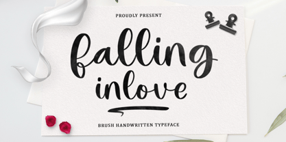
- Cattle Call JNL by Jeff Levine,
$29.00
- Captain Tall Shipwreck by Alphabet Agency,
$20.00
- KG Falling Slowly by Kimberly Geswein,
$5.00
- Ball And Chain by Funk King,
$5.00
- Antique Wells Extra by Wooden Type Fonts,
$15.00 - Fall in Love by Namara Creative Studio,
$20.00
- Dance Hall JNL by Jeff Levine,
$29.00
- Walks Of Life by Epiclinez,
$18.00
- Hall Of Fun by Konstantine Studio,
$15.00
- Evening Walk JNL by Jeff Levine,
$29.00
- Study Hall JNL by Jeff Levine,
$29.00 - Intellecta Roman Tall by Intellecta Design,
$27.90
- Moonlit Walk JNL by Jeff Levine,
$29.00
- Casting Call JNL by Jeff Levine,
$29.00
- Antique Wells Expanded by Wooden Type Fonts,
$15.00
- Long Tall Palito by Pedro Teixeira,
$15.00
- Wells Grotesque Pro by Red Rooster Collection,
$60.00
- Linotype Space Balls by Linotype,
$29.99 - Rolling Ball Cursive by Gerald Gallo,
$20.00
- Lecture Hall JNL by Jeff Levine,
$29.00
- Las Valles Textured by Kaligra.co,
$29.00
- Maria-Ballé-Initials by ARTypes,
$35.00 - Tall Order JNL by Jeff Levine,
$29.00
- Calling Card JNL by Jeff Levine,
$29.00 - Just Fall Holidays by Outside the Line,
$19.00
- Samaritan Tall Lower by Comicraft,
$49.00
- Tall Skinny Condensed by Outside the Line,
$19.00
- Tall Scrawl NF by Nick's Fonts,
$10.00 - A Fire Inside The Walls - 100% free

- All Over Again - Personal use only

- All Star BV - Unknown license

- KR All American - Unknown license


