10,000 search results
(0.024 seconds)
- Violety Dreams by Nathatype,
$29.00 Violety Dreams is a serene and elegant serif font that will transport your designs to a realm of beauty and sophistication. With its timeless letterforms and delicate swinging strokes on select letters, this typeface evokes a sense of tranquility and grace. This serif uniqueness in its graceful swinging strokes, which adorn certain letters, adding a touch of whimsy and charm. These elegant extensions create a sense of movement and fluidity, capturing the essence of grace and elegance. Inspired by the ethereal nature of dreams and the delicate beauty of violet flowers, Violety Dreams embodies a sense of tranquility and enchantment. The serif letterforms are meticulously crafted to exude elegance and sophistication, while the swinging strokes add a unique touch of whimsicality. This font strikes a perfect balance between classic charm and imaginative flair. The letterforms are designed with precision and clarity, ensuring legibility and readability. Each letter retains its distinctive shape, while the swinging strokes create a visual interest and draw the eye. You can use it in big text sizes to be greatly legible and enjoy the available features here. Features: Stylistic Sets Multilingual Supports PUA Encoded Numerals and Punctuations Violety Dreams is well-suited for headings, titles, invitations, wedding stationery, luxury branding, editorial layouts, branding materials, and any design project that calls for an elegant and dreamy typography. Find out more ways to use this font by taking a look at the font preview. Thanks for purchasing our fonts. Hopefully, you have a great time using our font. Feel free to contact us anytime for further information or when you have trouble with the font. Thanks a lot and happy designing
 - PF Bague Round Pro by Parachute,
$79.00 Bague Round is a soft contemporary geometric typeface which blends distinct minimalist characteristics with mainstream details. It originates from Bague Universal, a superfamily with a warm well-balanced texture and a distinct personality. Usually, round sans letterforms tend to look rather organic and playful at heavier weights. This problem was avoided in Bague Round by applying all necessary optical corrections at the rounded corners in order to retain its robust qualities. Mechanical replacement of the stem endings with standard arcs was not implemented and each round form of the horizontal, vertical and diagonal strokes was treated differently from the other. Whilst the rounded endings at heavier weights become gradually more flat at acute corners, the round stems in letters such as A, b, m, p, s are perfectly matched with sharp diagonals in letters such as M, N, w, v, in a very distinct manner. A remarkable feature of Bague Round is its vast array of uppercase alternates and ligatures which truly shine when set at display sizes. Make your selection from 6 distinct groups of alternates as well as a rich set of discretionary ligatures and watch it transform into a flexible, charming and stylish typeface with strong modern aesthetics. This typeface offers enormous possibilities and variations for editorial design, branding and corporate identity. The Bague Round type family includes 14 weights from Thin to Ultra Black and matching true-italics with a consistent and well-refined structure. Each style consists of 1017 glyphs with more that 280 alternates and ligatures and an extended set of characters which supports Latin, Cyrillic and Greek. PDF Specimen Bague Round on Behance
 - Robur by Canada Type,
$24.95 It shouldn't be a surprise to anyone that these letter shapes are familiar. They have the unmistakable color and weight of Cooper Black, Oswald Cooper's most famous typeface from 1921. What should be a surprise is that these letters are actually from George Auriol's Robur Noir (or Robur Black), published in France circa 1909 by the Peignot foundry as a bolder, solid counterpart to its popular Auriol typeface (1901). This face precedes Cooper Black by a dozen of years and a whole Great War. Cooper Black has always been a bit of a strange typographical apparition to anyone who tried to explain its original purpose, instant popularity in the 1920s, and major revival in the late 1960s. BB&S and Oswald Cooper PR aside, it is quite evident that the majority of Cooper Black's forms did not evolve from Cooper Old Style, as its originators claimed. And the claim that it collected various Art Nouveau elements is of course too ambiguous to be questioned. But when compared with Robur Noir, the "elements" in question can hardly be debated. The chronology of this "machine age" ad face in metal is amusing and stands as somewhat of a general index of post-Great War global industrial competition: - 1901: Peignot releases Auriol, based on the handwriting of George Auriol (the "quintessential Art Nouveau designer," according to Steven Heller and Louise Fili), and it becomes very popular. - 1909-1912: Peignot releases the Robur family of faces. The eight styles released are Robur Noir and its italic, a condensed version called Robur Noir Allongée (Elongated) and its italic, an outline version called Clair De Lune and its condensed/elongated, a lined/striped version called Robur Tigre, and its condensed/elongated counterpart. - 1914 to 1918: World War One uses up economies on both sides of the Atlantic, claims Georges Peignot with a bullet to the forehead, and non-war industry stalls for 4 years. - 1921: BB&S releases Cooper Black with a lot of hype to hungry publishing, manufacturing and advertising industries. - 1924: Robert Middleton releases Ludlow Black. - 1924: The Stevens Shanks foundry, the British successor to the Figgins legacy, releases its own exact copies of Robur Noir and Robur Noir Allongée, alongside a lined version called Royal Lining. - 1925: Oswald Cooper releases his Cooper Black Condensed, with similar math to Robur Noir Allongée (20% reduction in width and vectical stroke). - 1925: Monotype releases Frederick Goudy's Goudy Heavy, an "answer to Cooper Black". Type historians gravely note it as the "teacher steals from his student" scandal. Goudy Heavy Condensed follows a few years later. - 1928: Linotype releases Chauncey Griffith's Pabst Extra Bold. The condensed counterpart is released in 1931. When type production technologies changed and it was time to retool the old faces for the Typositor age, Cooper Black was a frontrunning candidate, while Robur Noir was all but erased from history. This was mostly due to its commercial revival by flourishing and media-driven music and advertising industries. By the late 1960s variations and spinoffs of Cooper Black were in every typesetting catalog. In the early- to mid-1970s, VGC, wanting to capitalize on the Art Nouveau onslaught, published an uncredited exact copy of Robur Black under the name Skylark. But that also went with the dust of history and PR when digital tech came around, and Cooper Black was once again a prime retooling candidate. The "old fellows stole all of our best ideas" indeed. So almost a hundred years after its initial fizz, Robur is here in digital form, to reclaim its rightful position as the inspiration for, and the best alternative to, Cooper Black. Given that its forms date back to the turn of the century, a time when foundry output had a closer relationship to calligraphic and humanist craft, its shapes are truer to brush strokes and much more idiosyncratic than Cooper Black in their totality's construct. Robur and Robur Italic come in all popular font formats. Language support includes Western, Central and Eastern European character sets, as well as Baltic, Esperanto, Maltese, Turkish, and Celtic/Welsh languages. A range of complementary f-ligatures and a few alternates letters are included within the fonts.
 - Semiramis - Unknown license

- Goodfellow - Unknown license

- Hyacinth - Unknown license

- Stonecross - Unknown license

- Baraquiel - Unknown license

- Summerisle Demo - Unknown license

- Scrawlies - Unknown license

- Queensland - Unknown license

- Munich - Unknown license

- Pavane - Unknown license

- Gara Gara by Daylight Fonts,
$50.00 This is a new generation of Garamond. This delicate and powerful Roman will captivate you and those who have seen your typography!
 - Narrow Stencil JNL by Jeff Levine,
$29.00 Narrow Stencil JNL is based on a set of 12 inch tall letter and number stencils, generally used for marking and identification.
 - Blurt by Robert Petrick,
$19.95 Blurt is a bold, versatile, spunky easy to read letter form that will let your product and your text message be noticed.
 - Angelyta by Skiiller Studio,
$15.00 Angelyta is an incredibly sweet and cool handwritten font with amazing swashes. It will add a romantic spark to any design project!
 - LD Socialite by Illustration Ink,
$3.00LD Socialite is a modern font full of fun! This font will add some style to your digital and paper scrapbooking projects. - Shooma MF by Masterfont,
$59.00 Ever wondered how your great text will look like as if it just came out of an ATM machine? Here it is!
 - Overlia by Nissa Nana,
$23.00 Overlia is a beautiful script font that is classy, elegant, and modern. It will add a romantic touch to any crafting project!
 - LD Lanky by Illustration Ink,
$3.00Long, tall and fun, that's what this cool font is. Download "Lanky" for scrapbook and greeting card journaling, captions, titles, and sentiments. - Jam Grotesque by JAM Type Design,
$25.00 Inspired by the beautiful typefaces like Helvetica and Neue Haas Unica, this beautiful typeface looks fantastic in print as well as online.
 - Malkoff by Page Studio Graphics,
$40.00A calligraphic typeface for use in announcements, invitations, greetings, and more. Informal letterforms, but with many flourishes and swashes included as well. - Chat Love by Sakha Design,
$9.00 Chat Love is a cute and adorable display font. Fall in love with it and bring your projects to the highest levels!
 - Enphand by Dieza Design,
$10.00 Enphand is a stylish and easy handwritten font with a contemporary touch. This will add a unique spin to each design project!
 - Wicked Sick by Forberas Club,
$16.00 Wicked Sick is handwritten font. Will be nice if you application this font for book cover, tees, movie, poster and many more.
 - Wah Wah Narrow by Font&Co.,
$29.00 Wah Wah Narrow is a compact, eye-catching, flat-sided display font that will tightly pack the empty space in your layout!
 - SuperBlack by Scannerlicker,
$22.00 SuperBlack is a saucy counterless typeface, ideal for display purposes. Whenever you need impact with a playful feel, SuperBlack will pop out.
 - Rubens Expanded Regular by Wooden Type Fonts,
$15.00 A sans serif with splayed ends, descenders of the lower case dropping below the baseline, very tall x-height. The expanded version.
 - GHEA Narek Serif by Edik Ghabuzyan,
$65.00 This font family can be used as Display as well as text font. The font family includes Armenian, Cyrillic and Latin alphabets.
 - Crunchy by Mans Greback,
$59.00 Vintage handwriting font with stylistic alternate alphabet, contextual alternates, swashes, initial and final alternates, as well as ligatures and 200+ special characters.
 - Pomthinq by Stringlabs Creative Studio,
$29.00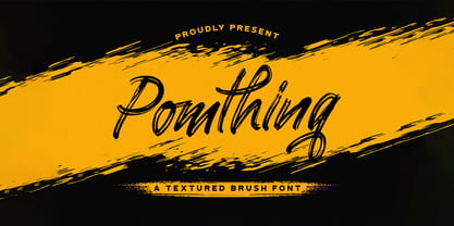 Pomthinq is a remarkable brush script font. Fall in love with its incredibly versatile style and use it to create spectacular designs!
 - Selfila by Skiiller Studio,
$19.00 Selfila is an incredibly stunning script font featuring beautiful and rich swashes. It will elevate any design idea! Containing 150+ OpenType feature.
 - Allanis by Nurf Designs,
$10.00 Allanis is a classic and original handwritten font with a light feel. It will add a beautiful spark to any design project!
 - Cross Stitch Delicate by Gerald Gallo,
$20.00 Cross Stitch Delicate is based on upper case characters 21 stitches tall and contains the characters A-Z and numbers 0-9.
 - Cafe Aroma by BA Graphics,
$45.00A great looking script can be used for many applications; it even works extremely well as text. Has a old fashioned charm. - Reynard by Scriptorium,
$12.00Reynard is an arts and crafts period font with a bit of a Celtic inclination. Very well suited to formal, elegant titles. - Shadeerah by ARToni,
$14.00 Shadeerah is a stunning sans serif font with incredible feel and look. It will add a unique charm to any design project!
 - Refuse Pro by The Type Fetish,
$25.00 Refuse has an extended Latin, extended Cyrillic and Greek alphabet so it will work with most languages in Europe and the Americas.
 - Joyscript by Jonahfonts,
$25.00 Inspired by many hand-lettered European package designs. This script face is suitable for logos, casual headlines and designs calling for attention.


