10,000 search results
(0.016 seconds)
- Congyang by Gatra Std,
$10.00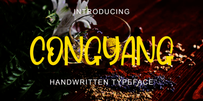 Introducing a cute handwriting "CONGYANG" Handwritten Typeface! If you are needing a touch of casual modern display for your designs, this font was created for you! What's Included: Uppercase and Lowercase Number and Punctuation Support Language This font works best in a program that supports OpenType features such as Adobe Indesign, Adobe Illustrator CC and CS, or Adobe Photoshop CC and CS also CorelDraw More Questions? Here are some (potential) answers! Do not to resell this font in any way. Multilingual Support is included for Western European Languages Have a Wonderful Day, Gatra Std
 - PR-Uncial by PR Fonts,
$10.00 This is our first font, based on Peter's own personal way of writing uncials, The rounded letters of the fourth to eighth centuries. The characters in the caps position are more closely related to the classical Roman forms, and the lowercase position has letters that are the more rounded, medieval forms, at the same size, so they can be freely mixed, for a hand lettered appearance. This typeface is currently used for the titles in the TNT Television show "the Librarians". It was originally designed in 1998, and is now available in Open Type Format.
 - Shankara by Gatra Std,
$10.00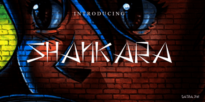 Introducing a cute handwriting "SHANKARA" Handwritten Display Font! If you are needing a touch of casual modern display for your designs, this font was created for you! What's Included: Uppercase and Lowercase Number and Punctuation Support Language This font works best in a program that supports OpenType features such as Adobe Indesign, Adobe Illustrator CC and CS, or Adobe Photoshop CC and CS also CorelDraw More Questions? Here are some (potential) answers! Do not to resell this font in any way. Multilingual Support is included for Western European Languages Have a Wonderful Day, Gatra Std
 - Lampor by Gatra Std,
$10.00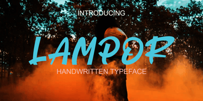 Introducing a cute handwriting "LAMPOR" Handwritten Display Font! If you are needing a touch of casual modern display for your designs, this font was created for you! What's Included: Uppercase and Lowercase Number and Punctuation Support Language This font works best in a program that supports OpenType features such as Adobe Indesign, Adobe Illustrator CC and CS, or Adobe Photoshop CC and CS also CorelDraw More Questions? Here are some (potential) answers! Do not to resell this font in any way. Multilingual Support is included for Western European Languages Have a Wonderful Day, Gatra Std
 - Dalbo by Gatra Std,
$10.00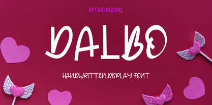 Introducing a cute handwriting "DALBO" Handwritten Display Font! If you are needing a touch of casual modern display for your designs, this font was created for you! What's Included: Uppercase and Lowercase Number and Punctuation Support Language This font works best in a program that supports OpenType features such as Adobe Indesign, Adobe Illustrator CC and CS, or Adobe Photoshop CC and CS also CorelDraw More Questions? Here are some (potential) answers! Do not to resell this font in any way. Multilingual Support is included for Western European Languages Have a Wonderful Day, Gatra Std
 - Arquitecta Office by Latinotype,
$16.00 We have adapted the version of our Arquitecta font for use in Microsoft Office™. It only has 4 variants: regular, italic, bold and bold italic. Font weights have been named in a way that can be clearly shown up in the font list in Office™ programs for the sake of a good hierarchy (the bold variant is quite bold and does not look the same as the original font). Arquitecta Office update: Improvements of proportions and drawing. The set was extended to the current one of Latinotype.
 - Simply Nouveau JNL by Jeff Levine,
$29.00 As Word War I raged on during 1917, a large number of songs were written as morale builders for both the soldiers leaving for overseas service as well as their friends, family and loved ones. One such song, "Send Me Away with A Smile" has its title hand lettered in a simple, yet somewhat stylized sans serif design that was so much a part of the Art Nouveau style of that era. Simply Nouveau JNL captures and preserves that design within a digital typeface; available in both regular and oblique versions.
 - Scritta Nuova by Anatoletype,
$16.00 Scritta Nuova was born to transpose my personal handwriting and evolved today into a smart typeface that maintains the original feel with improved legibility and visual balance. The steady rhythm and roundness of Scritta Nuova give the impression of a smooth, girlish and gentle writing. It also evokes retro calligraphic styles taught in Italian schools around the 1950s, which might have influenced in one way or another my original handwriting. Note that the capital letters can be nicely set next to each other without overlapping, unlike script typefaces with swashy capitals created as initials.
 - Kyiv by Apostrof,
$40.00 The font Kyiv is an attempt to unite old-style antiqua with the Ukrainian tradition and modern requirements. Besides having usual italics the Renaissance tradition of "semi-italics" renewed, compact weights are also provided. Special charm is added by decorative motives of chestnut leaves and flowers. The weights are included in a way to promote the solution of various tasks both text, and an accidental set in various combinations. The font Kyiv was awarded the 2nd prize in category of text fonts in the first Ukrainian typeface competition Ruthenia in 2010.
 - Bonnycastle by Three Islands Press,
$39.00 Sir Richard Henry Bonnycastle (1791–1847) was an English officer and military engineer who served in the War of 1812 and ultimately settled in Canada. I stumbled upon copies of some of his charts and maps, became infatuated with the hand-lettered titles—and the result is the eponymous Bonnycastle. The font has a bold weight and an italic style but is intended as an eye-catching standalone, evocative of its period in history. Use as a titling face on branding materials, event posters, book covers, presentation graphics, historical illustrations, and the like.
 - Botswana by Gatra Std,
$10.00 Introducing a cute handwriting "BOTSWANA" An Unique Sans-Serif Font! If you are needing a touch of casual modern San-Serif for your designs, this font was created for you! What's Included: Uppercase and Lowercase Number and Punctuation Support Language This font works best in a program that supports OpenType features such as Adobe Indesign, Adobe Illustrator CC and CS, or Adobe Photoshop CC and CS also CorelDraw More Questions? Here are some (potential) answers! Do not to resell this font in any way. Multilingual Support is included for Western European Languages
 - Doomberg by Gatra Std,
$10.00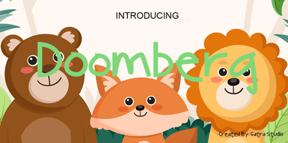 Introducing a cute handwriting "DOOMBERG" Handwritten Display Font! If you are needing a touch of casual modern display for your designs, this font was created for you! What's Included: Uppercase and Lowercase Number and Punctuation Support Language This font works best in a program that supports OpenType features such as Adobe Indesign, Adobe Illustrator CC and CS, or Adobe Photoshop CC and CS also CorelDraw More Questions? Here are some (potential) answers! Do not to resell this font in any way. Multilingual Support is included for Western European Languages Have a Wonderful Day, Gatra Std
 - Gentho by Gatra Std,
$10.00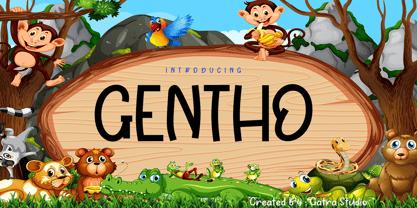 Introducing a cute handwriting "GENTHO" Handwritten Display Font! If you are needing a touch of casual modern display for your designs, this font was created for you! What's Included: Uppercase and Lowercase Number and Punctuation Support Language This font works best in a program that supports OpenType features such as Adobe Indesign, Adobe Illustrator CC and CS, or Adobe Photoshop CC and CS also CorelDraw More Questions? Here are some (potential) answers! Do not to resell this font in any way. Multilingual Support is included for Western European Languages Have a Wonderful Day, Gatra Std
 - Quirick by Gatra Std,
$10.00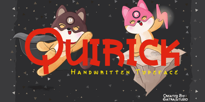 Introducing a cute handwriting "QUIRICK" Handwritten Display Font! If you are needing a touch of casual modern display for your designs, this font was created for you! What's Included: Uppercase and Lowercase Number and Punctuation Support Language This font works best in a program that supports OpenType features such as Adobe Indesign, Adobe Illustrator CC and CS, or Adobe Photoshop CC and CS also CorelDraw More Questions? Here are some (potential) answers! Do not to resell this font in any way. Multilingual Support is included for Western European Languages Have a Wonderful Day, Gatra Std
 - Bleheri by Gatra Std,
$15.00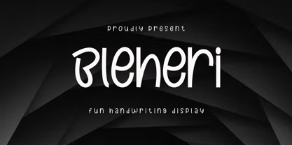 Introducing a cute handwriting "Bleheri" display font If you are needing a touch of casual modern calligraphy for your designs, this font was created for you! What's Included: - Uppercase and Lowercase - Number and Punctuation - Support Language This font works best in a program that supports OpenType features such as Adobe Indesign, Adobe Illustrator CC and CS, or Adobe Photoshop CC and CS also CorelDraw More Questions? Here are some (potential) answers! Do not to resell this font in any way. Multilingual Support is included for Western European Languages Have a Wonderful Day!
 - Klepon by Gatra Std,
$15.00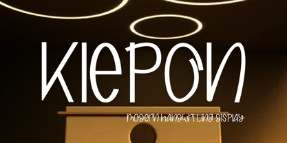 Introducing a cute handwriting "Klepon" display font If you are needing a touch of casual modern calligraphy for your designs, this font was created for you! What's Included: - Uppercase and Lowercase - Number and Punctuation - Support Language This font works best in a program that supports OpenType features such as Adobe Indesign, Adobe Illustrator CC and CS, or Adobe Photoshop CC and CS also CorelDraw More Questions? Here are some (potential) answers! Do not to resell this font in any way. Multilingual Support is included for Western European Languages Have a Wonderful Day, Gatra Std
 - Limboek by Gatra Std,
$10.00 Introducing a cute handwriting "Limboek" Handwritten Display Font! If you are needing a touch of casual modern display for your designs, this font was created for you! What's Included: Uppercase and Lowercase Number and Punctuation Support Language This font works best in a program that supports OpenType features such as Adobe Indesign, Adobe Illustrator CC and CS, or Adobe Photoshop CC and CS also CorelDraw More Questions? Here are some (potential) answers! Do not to resell this font in any way. Multilingual Support is included for Western European Languages Have a Wonderful Day, Gatra Std
 - Rantang by Gatra Std,
$12.00 Introducing a modern&elegant "Rantang" signature script If you are needing a touch of casual elegant signature script for your designs, this font was created for you! What's Included: Uppercase and Lowercase Ligatures Alternates Number and Punctuation Support Language This font works best in a program that supports OpenType features such as Adobe Indesign, Adobe Illustrator CC and CS, or Adobe Photoshop CC and CS also CorelDraw More Questions? Here are some (potential) answers! Do not to resell this font in any way. Multilingual Support is included for Western European Languages
 - Architype Schwitters by The Foundry,
$99.00 Architype Konstrukt is a collection of avant-garde typefaces deriving mainly from the work of artists/designers of the inter-war years, whose ideals have helped to shape the design philosophies of the modernist movement in Europe. Due to their experimental nature character sets may be limited. Architype Schwitters was developed from the phonetic experiments made by Kurt Schwitters with his 1927 universal alphabet, where he attempted to link sound and shape. He ‘played with’ using heavier, wider, rounded forms to convey the vowels, creating a unique visual speech texture.
 - Mumford by fragTYPE,
$16.00 Mumford began as a revival of the early designs for sans serif fonts of the late 19th and early 20th centuries, but along the way it morphed into a reinterpretation of this style and it adaptation to more contemporary shapes. It's strong contrast, signature of the design, works along it 9 weight variables each with their corresponding oblique. Each variable includes extended language support (+ Cyrillic), fractions, tabular figures, ligatures and opentype features. Mumford was design with strong graphic display design in mind, perfectly suited for poster, magazine headers, titles and editorial design.
 - Charlonka by PleasureFonts,
$22.00 I‘d like to introduce “Charlonka“ to you. When my daughter finished high school, she wanted to get rid of her entire school stuff. So I saved a few sheets of her beautiful handwriting and promised her to create a typeface out of it. That‘s how the idea of Charlonka was born, a typeface family out of Charlotte‘s handwriting (by the way: that‘s her name). Some characters of Charlonka have extended crossbars, like in upper case A or H, and reduced descenders, like in lower case g or y.
 - Stadium JNL by Jeff Levine,
$29.00 Block-style typefaces make excellent sports-themed fonts, and Stadium JNL is no exception-- but this lettering style is also filled with nostalgia for decades past. Modeled from one of the many classic designs found in the Speedball® Lettering Textbook, this style of alphabet was quite popular in signage of the 1920s and 1930s. Stadium JNL fills the bill either way-- a font that is just as much at home on a gridiron or baseball diamond, or as lettering for a garage, warehouse or attention-getting ad copy.
 - Gineso Titling by insigne,
$19.00 Before the Great War, there were great posters. Posters of elegance and grandeur. Posters calling people to the pleasures of sunny southern France and to the perfections of northern Italy’s dolce vita. Le Havre, based on a poster by AM Cassandre, was one of my first typefaces that took inspiration from this genre. Now, the golden memories of years past are the inspiration for insigne design’s new Gineso Titling as well. Gineso revives the retro forms of past poster design with its newly crafted sense of humanity, which is amplified by a great variety of texture options. While the new forms are perfect for posters, this titling font is also ideal for bringing the charm of pre-war Southern Europe to a new bottle of wine, to fine foods and beverages, and to high-end logotypes. For the grandeur and elegance you need in your titling, look to Gineso Titling.
 - Modern Vision - 100% free

- Alpha Bravo by Wiescher Design,
$39.50 AlphaBravo was born on a napkin. I was just doodling, playing around with letterforms when the ballpoint glided a little bit too far and suddenly I had my first letter with the dash sticking out on the left of the e’s horizontal line. I quickly checked on how many letters I could let a line stick out! Then I wrote a couple of words that way and letters joined in the most unusual places, creating new closed forms. I gave the font a try and quickly discovered, that I had stumbled onto an interesting new typeface. I didn't know how to call it, so I simply used the first two letters of the alphabet, Alpha and Bravo. Looking forward to Charlie and Delta, your very curious, Gert Wiescher.
 - Haven by Signature Type Foundry,
$33.00 Haven font family is based on the compositionality of constructive elements that create the final shape of individual letters. Mechanical connecting was continuously adjusted by a type designer’s feeling. In this way Haven differs from similar typefaces of the 1960s and 1990s. Six fonts of different stroke intensity create a rich family of typefaces for a variety of uses in typography for special occasions. Although the typeface was drawn for headings, it is suitable for typesetting of long texts in a book. Even in extreme reduction it retains its technical basis, negating classic book alphabets, and it adds an experimental look to the text. Both extreme fonts Thin and Black create strong contrast and their magnification brings attention to their interconnection of all details. Serif version Haven Serif is also being prepared.
 - Cascadeur by NaumType,
$19.00 Cascadeur is a variable modular sans with 3 axes, a modernistic hommage to space-age typography. It was designed by Peter Bushuev and released in April of 2020. Cascadeur was born from a type design study and went a long way to its final form. The main feature is a structure of the font: it based on 4 lines grid, has very tight spacing to achieve maximum space coverage and set of inventive letterforms. It is also a variable font and has 3 axes: weight, slant, and roundness. Cascadeur has alternates for almost every letter (2-4) so you can find a rhythm and a unique pattern for your design piece. It is a perfect choice for posters, album covers, big headlines, oversize typography, identity and packaging, editorial design.
 - Wall Scrawler by Comicraft,
$39.00 This slick, marker style font was created by our fontmeister, Mr Fontastic, based on the slick, marker style of... Well, Mr Fontastic himself! Check it out in the pages of Marvel's classic DAREDEVIL story GUARDIAN DEVIL. DD scribe and indy movie maker Kevin Smith himself told us it was the coolest font he'd ever seen in his entire life! No, sorry, that is a lie, but he did tell us he liked the design work Mr Fontastic created for the JAY & SILENT BOB trades, No, seriously, he did. We wouldn't lie to you. Well, except for that last time. By the way, this font also doubles as a dynamite sound effect font, that's why we're charging you twice as much as usual. No, sorry, lying again. About the price, not the sound effect thing.
 - Titla Brus by ParaType,
$25.00 Font family Titla Brus was developed as an extension of Titla, released earlier in 2009. New slab serif family consists of 20 members the normal and condensed proportions that present 6 weights from Light to Ultra. The fonts can be used in combination with Titla or by itself in different display matters. Typefaces demonstrate original and catchy way of using serifs -- in some places there are traditional slab serifs, in other places -- one-sided and often there are no serifs in the places where they normally should be. This approach brings to the letter shapes an unusual appearance and peculiarity. Design was developed by Oleg Karpinsky. Released by ParaType in 2011--2013 at first as a set of ten condensed styles and later in extended version enhanced by ten normal styles.
 - Quodlibet Serif by Signature Type Foundry,
$43.00 The new typeface system is based on legibility of Renaissance and Baroque Antiqua. It maintains the quality of drawings without an overpowering historical legacy. The current concept makes the system a universal whole. Abrading of sharp edges which could catch one’s attention leads to a fine rounding of details. In this way, a sans drawing does not look hard and sterile unlike most of its contemporaries. Special attention was paid to every detail of each letter. The professional question of how to incorporate brightening wedges into the dark places of individual strokes’ onsets was resolved by rounded shapes that have their graphic response in the detail of the serifs. Particularly in larger sizes the typeface offers drawing sophistication and dimensional interconnection. Apart from Cyrillic alphabet, the alphabet design includes Vietnamese accents.
 - Hippie Freak JNL by Jeff Levine,
$29.00 What does a 1932 movie about a love affair between a circus' trapeze artist and a sideshow "little person" have to do with the 1960s counter-culture? They both share some commonalities. The title card for Tod Browning's "Freaks" inspired the lettering design for Hippie Freak JNL. It's in a retro style that was embraced by the youth movement that had its epicenter in the Haight-Ashbury district of San Francisco. Circus performers with birth defect abnormalities were displayed in what was referred to as "freak shows"; while young men with long hair and beards who sought peace, love and an end to the war in Vietnam were commonly referred to as "hippie freaks". As the saying goes "the more things change, the more they stay the same".
 - Quodlibet Sans by Signature Type Foundry,
$43.00 The new typeface system is based on legibility of Renaissance and Baroque Antiqua. It maintains the quality of drawings without an overpowering historical legacy. The current concept makes the system a universal whole. Abrading of sharp edges which could catch one’s attention leads to a fine rounding of details. In this way, a sans drawing does not look hard and sterile unlike most of its contemporaries. Special attention was paid to every detail of each letter. The professional question of how to incorporate brightening wedges into the dark places of individual strokes’ onsets was resolved by rounded shapes that have their graphic response in the detail of the serifs. Particularly in larger sizes the typeface offers drawing sophistication and dimensional interconnection. Apart from Cyrillic alphabet, the alphabet design includes Vietnamese accents.
 - Ongunkan Lycian by Runic World Tamgacı,
$50.00 Lycia (Lycian: 𐊗𐊕𐊐𐊎𐊆𐊖 Trm̃mis; Greek: Λυκία, Lykia; Turkish: Likya) was a geopolitical region in Anatolia in what are now the provinces of Antalya and Muğla on the southern coast of Turkey, bordering the Mediterranean Sea, and Burdur Province inland. Known to history since the records of ancient Egypt and the Hittite Empire in the Late Bronze Age, it was populated by speakers of the Luwian language group. Written records began to be inscribed in stone in the Lycian language (a later form of Luwian) after Lycia's involuntary incorporation into the Achaemenid Empire in the Iron Age. At that time (546 BC) the Luwian speakers were decimated, and Lycia received an influx of Persian speakers. Ancient sources seem to indicate that an older name of the region was Alope (Ancient Greek: Ἀλόπη, Alópē). Lycia fought for the Persians in the Persian Wars, but on the defeat of the Achaemenid Empire by the Greeks, it became intermittently a free agent. After a brief membership in the Athenian Empire, it seceded and became independent (its treaty with Athens had omitted the usual non-secession clause), was under the Persians again, revolted again, was conquered by Mausolus of Caria, returned to the Persians, and finally fell under Macedonian hegemony upon the defeat of the Persians by Alexander the Great. Due to the influx of Greek speakers and the sparsity of the remaining Lycian speakers, Lycia was rapidly Hellenized under the Macedonians, and the Lycian language disappeared from inscriptions and coinage.
 - FS Irwin by Fontsmith,
$80.00 New York vibes FS Irwin was born in New York while Senior Designer, Fernando Mello, was studying an intensive 5 week typeface design course at the Cooper Union. His brief was to design a perfectly clear typeface that could communicate well, without loud or overtly mannered design features. Fernando was influenced by the subway font in New York: ‘It is very in your face and clear, always in bold. It doesn’t shout much but at the same time is very present and unique. The design is completely different but it was this spirit I wanted to capture for FS Irwin.’ And the vibe of the city: ‘In a similar way to London, New York is so mixed and so cosmopolitan. I was amazed by the different styles and identities I saw there, and tried to encapsulate this essence to create something new, relevant and very now.’ Incisive quality Rather than focusing on quirks or distinctive characteristics, the key to FS Irwin is the quality of its design and spirit of simplicity. The design, proportions and details are usable and authentic and it is suitable for countless situations, without running the risk of being instantaneously noticeable. Families like this can be used on nearly anything, from more playful designs to serious corporate IDs. ‘Extensively tested and precisely drawn text-oriented typefaces are what I enjoy designing the most. There is a beauty and a different approach, a different way of making them interesting, sellable and usable rather than adding flicks or unexpected details.’ Inscriptions and calligraphy FS Irwin’s origin lies in Fernando’s studies in inscriptional lettering and writing-calligraphic exercises at the Cooper Union. Mello started the process by digitising his explorations and adapting them into a more workable sans serif structure. The traditional forms of writing which gave the basis to Latin type as we know it today were the perfect place to start. This influence can be seen in the proportion of the capitals and in slight writing-calligraphic details in the lowercase, such as the slightly angled, chiselled spurs and their open terminals.
 - Rufina STD by TipoType,
$13.00 Rufina was as tall and thin as a reed. Elegant but with that distance that well-defined forms seem to impose. Her voice, however, was sweeter, closer, and when she spoke her name, like a slow whisper, one felt like what she had come to say could be read in her image. Rufina's story can only be told through a detour because her origin does not coincide with her birth. Rufina was born on a Sunday afternoon while her father was drawing black letters on a white background, and her mother was trying to join those same letters to form words that could tell a story. But her origin goes much further back, and that is why she is pierced by a story that precedes her, even though it is not her own. Maybe her origin can be traced back to that autumn night in which that tall man with that distant demeanor ran into that woman with that sweet smile and elegant aspect. He looked at her in such a way that he was trapped by that gaze, even though they found no words to say to each other, and they stayed in silence. Somehow, some words leaked into that gaze because since that moment they were never apart again. Later, after they started talking, projects started coming up and then coexistence and arguments, routines and mismatches. But in that chaos of crossed words in their life together, something was stable through the silence of the gazes. In those gazes, the silent words sustained that indescribable love that they didn't even try to understand. And in one of those silences, Rufina appeared, when that man told that woman that he needed a text to try out his new font, and she saw him look at her with that same fascination of the first time, and she started to write something with those forms that he was giving her as a gift. Rufina was as tall and thin as a reed, wrote her mother when Rufina was born.
 - Esmeralda Pro by Sudtipos,
$59.00 From the beginning “Esmeralda” was born with a strong influence of the classical “capitalis monumentalis”, carved in stone. In the same way, the origin of this majuscule writing emerged from the brush, from a way of writing made merely by hand. For this reason, these two universes were intended to lie beneath the shape of each letter, redefining them. And this combination of styles should also be reflected in a lower case set that also allows to open up the spectrum of usage possibilities. Foundational calligraphy represented a solid base for the development of lower case glyphs, ensuring proper interaction with the upper case letters. “Esmeralda” features a great number of ligatures that mix classic structures with a more contemporary impression. With more than eleven hundred glyphs, it provides a multiplicity of uses across a wide combinatory of ligatures, alternative signs, initial caps, miscellaneous and connectors; each one of them accessible through Open Type. “Esmeralda” is perfect to speak with a classical yet fresh, modern – and a little bit bold – tone of voice. Designed by Guille Vizzari, together with the tough and remarkable work of Ale Paul, in use “Esmeralda” stands out in a subtle and unexpected way that’s almost unnoticeable. Its delicate yet solid curves, serifs and endings give each composition a fine, elegant and exquisite feeling, along with a firm and sturdy look. “Esmeralda” was initially born as a typographic project developed by Guillermo Vizzari – tutored by Ale Paul and Ana Sanfelippo – under completion of the Specialization in Typography Design at University of Buenos Aires, Argentina, during the years 2011 and 2012.
 - Happyjamas by PizzaDude.dk,
$20.00Happyjamas is a playful serif font - the pizzadude way! :) - Budskab by Bogstav,
$17.00 This is the kind of font which is up to trouble. Not trouble in a bad way, but trouble like when you are in no way prepared what is going to happen. The font is handmade and playful - and to help that playfullness come to live, the 5 different versions of each letter helps! Watch your words change while you write with Budskab! And, by the way..."budskab" is message in danish...just thought you should know!
 - Rocky Mountain Spotted Fever - Unknown license

- DT Skiart Lexiconic by Dragon Tongue Foundry,
$10.00 Apparently, Lexicon is the most expensive font in the world. ‘Skiart Lexiconic’ has been on a long growing path getting to where it is now. This font family was originally inspired by the san serif font ‘Skia’, by Mathew Carter for Apple. ‘Skiart’ was designed to feel more like a serifed font, but without any actual serifs. It took a small step between sans serif and serif fonts. Next on the path towards a serif font came Skiart Serif Mini, with tiny serifs added. This was a true serif font, although they were subtle. Then came ‘Skiart Serif Leaf’. and now... We present to you... DT Skiart Lexiconic. Having evolved from the Skiart family, we chose to give it the serifed styling of Lexicon. This is no way a copy or clone of Lexicon. It still has the basic bones of the original Skiart font, but the position, shape and size of the serifs were very much influenced by the world famous Lexicon font. DT Skiart Lexiconic is not the most expensive font in the world.

