10,000 search results
(0.544 seconds)
- Manchester by BA Graphics,
$45.00A Bold Powerful Condensed serif face; great for book jackets, magazines, ads and just about any application. - The Blockletter font is a typeface characterized by its heavy, bold, and solid appearance, often reflecting the style of collegiate or sports lettering. Its main characters are typically wide and squ...
- Blackhaus by Canada Type,
$25.00Almost a half of a millennium after being mistaken for the original 4th century Gothic alphabet and falsely labeled "barbaric" by the European Renaissance, the blackletter alphabet was still flourishing exclusively in early 20th century Germany, not only as an ode to Gutenberg and the country's rich printing history, but also as a continuous evolution, taking on new shapes and textures influenced by almost every other form of alphabet available. Blackletter would continue to go strong in Germany until just before the second World War, when it died a political death at the height of its hybridization. For almost 50 years after the war, blackletter was very rarely used in a prominent manner, but it continued to be seen sparely in a variety of settings, almost as a subliminal reminder of western civilization's first printed letters; on certificates and official documents of all kinds, religious publications, holiday cards and posters, to name a few. In the early 21st century, blackletter type has been appearing sporadically on visible media, but as of late 2005, it is not known how long the renewed interest will last, or even whether or not it will catch on at all. The last few years before World War II were arguably the most fascinating and creative in modern blackletter design. During those years, and as demonstrated with the grid-based Leather font, the geometric sans serif was influencing the blackletter forms, taking them away from their previous Jugendstil (Art Nouveau) hybridizations. Blackhaus is a digitization and elaborate expansion of a typeface called Kursachsen Auszeichnung, designed in 1937 by Peterpaul Weiss for the Schriftguss foundry in Dresden. This is one of very few designs from that time attempting to infuse more Bauhaus than Jugendstil into the Blackletter forms. This is why we used a concatenation of the words blackletter and Bauhaus to name this face. The result of injecting Bauhaus elements into blackletter turned out to be a typeface that is very legible and usable in modern settings, while at the same time harking back to the historical forms of early printing. The original 1937 design was just one typeface of basic letters and numbers. After digitizing and expanding it, we developed a lighter version, then added a few alternates to both weights. The Rough style came as a mechanically-grunged afterthought, due to current user demand for such treatment. Having the flexibility of 2 weights and many alternates of a blackletter typeface is not a very common find in digital fonts. More specifically, having the flexibility of 2 weights and alternates of a 20th century blackletter typeface is almost unheard of in digital fonts. So the Blackhaus family can be quite useful and versatile in an imaginative designer's hands. - Postea by TypeTogether,
$47.00 The Postea font family is Veronika Burian and José Scaglione’s take on German geometric typefaces, reshaped with the right attributes for setting paragraphs and headings, and perfect for branding and text use. Some typefaces are a rough tool, like a pumice rock: abrasive to the senses, unforgiving, and unhelpful for most reading situations. Postea is an obsidian: smooth and classy, with attractive nuances in any light. The classic curves and purposeful details keep its individuality intact while allowing it to fit an incredible range of geometric font needs. Because of these qualities, Postea makes normal reading in paragraphs a cinch and your branding memorable. Compared to midcentury attributes of restraint and a sparse appearance, Postea’s deliberate play between character widths injects life and distinctiveness into its personality. The default ‘t, f’ have lyrical doses akin to a robust evening drink and are rounded out with a serpentine ‘s’ and rotund ‘o, g, b’. Another nice surprise awaits: spacing for the Hairline weight is tighter for optimal use in large headings and titles, while the regular weights have the expected, slightly looser spacing for text. Setting the test word ‘bogarts’ brings all this together nicely, invoking a balance between a constructed and human feel while brushing away the dust from a century of derivatives. Postea is opinionated and its modern stylistic sets allow it to be accommodating with softer, specially-designed alternative characters. SS01 replaces ‘b, f, M, m, t’, while SS02 changes only the lowercase ‘a’ to the round style, and SS03 swaps out the angled ‘y’ for a straight version. The fourth and sixth stylistic sets are packed with wallpaper-worthy geometric patterns, ornaments, arrows, and symbols aplenty. Postea’s 14 styles (seven upright and italic) and two variable fonts are accompanied by an all-new family of icons in three weights, which we developed a new, easy way to activate. Simply bookend the desired icon name with colons (:arrowUp: :chargingStation: :aid: :firstAid:), making sure to capitalise each word after the first word, then highlight and activate SS05. Icons include wayfinding, social interface, sanitary precautions like face masks, thermometers, and hand washing, and much more. Postea is resilient in the number of ways the family can be used, and its recognisable characters make it a prime selection for branding, signage, corporate typefaces, and magazines. Beginning with midcentury virtues, Postea is the rational response for text — a lyrical take on geometric sans serifs.
 - Pollen by TypeTogether,
$49.00 This typeface finds a perfect balance between technical excellence, careful design of letter forms for extended reading, and a measured dose of charm and personality. Its informal feel allows for successfully typesetting a wide range of applications, from magazines and fiction books to advertising and websites. Calligraphy, be it done with the broad-edge pen, brush, or other tools, has been fundamental in the development of Pollen. Its influence is clearly visible in the construction of the top serifs contrasting the curved bottom serifs and the fluid aspect of terminals and tails, such as on “g” and “r”. The shapes of the diagonal letters are based on a less formal calligraphic model, but still uses the broad edge pen. The letters were then subject to a further process of pencil drawing and digital re-interpretation, which gave them the final shape. The designs of “e” and “c” are derived from drawings made with only one continuous line, with the pencil always touching the paper. The letters “g” and “y” express the intention to bring informal elements to a typeface intended for long text reading, usually characteristic of casual writing. Pollen consists of 3 basic styles with an extended OpenType Pro character set and large language support, perfectly serving the most common typographic needs.
 - Bird Script by Lián Types,
$24.95 Characterized by quickness, lightness, and ease of movement, Bird Script is a font which challenges many aspects of type-design: every single stroke, comes directly from the author’s hand and tries to reflect not only the tool used, but also his feelings at the moment of writing. Bird Script is a font filled up with the energic gestures of what it’s called gestural calligraphy, a not very explored field in typography, where hardly ever a letter comes the same way two times: When manipulating the pen, the letterer seeks for the beauty of the differences and the grace of a confident execution. Originally done with a flat speedball pen nib nº5 and retouched with pencil for the bolder elements, it turned into a very pleasant to the eyes font which dances between the formal rules of typography and the artistic look of calligraphy. Bird Script Pro and Bird Script Light Pro come with many ligatures, alternates and ornaments. Into the standard ligatures we find lots of pairs of two and three ligated letters so when they are activated the font seems alive. However if none of them are activated, the font gives a really particular text pattern, specially in smaller sizes. Get Bird Script, add rhythm to your work.
 - Recolors by Din Studio,
$29.00 It can be a time-consuming, difficult process to find an elegant font to present classic impressions to your audience despite the abundant options available for you. Moreover, it takes the risks to disappoint and to leave bad impressions to your audience without having the right font. Therefore, let us introduce you to our serif font, Recolor. It is a capitalized serif font to help you create elegant, classic nuances on your designs. Our serif font has tiny lines to add formal, professional touches on each quality, consistent letter to ease the reading process. However, such capitalized font designs are eligible to apply for big text sizes for a legibility reason. Additionally, you can enjoy the available features here. Features: Multilingual Supports PUA Encoded Numerals and Punctuations Recolor fits best for various design projects, such as brandings, posters, banners, headings, magazine covers, quotes, printed products, merchandise, social media, etc. Find out more ways to use this font by taking a look at the font preview. Thanks for purchasing our fonts. Hopefully, you have a great time using our font. Feel free to contact us anytime for further information or when you have trouble with the font. Thanks a lot and happy designing.
 - Mildred by Burghal Design,
$29.00Remember when a coyote was a light-boned rangy member of the canine family and not the name (spelled C-A-O-T-I) of your neighbor's four year old daughter? When a cricket was a leaping, chirping insect and not the name (spelled K-R-I-Q-U-I-T-T-E) of your purple-haired, pierced-tongued waitress? When Madison and Austin were cities, when brie was a variety of cheese, when radon and alar were hazardous substances and NOT FIRST NAMES? Burghal Design remembers the good old days, when people were not named Whisper, Zandren, Skylar or Dakota but were called Eleanor, Arthur, Edward and Irene. In the spirit of these classic monikers, we give you Mildred, a script font family for proud and simple folk: the down to earth Mildred Plain, hearty Mildred Stout, the barely-there Mildred Scrawn,and the barfly Mildred Cocktail. There's also the slightly more formal (but still all-purpose) Mildred Fancy, bolder Mildred Strong, and the wisp of Mildred Mild. Rounding out the family is Mildred Ornaments, a collection of symbols that can be used for snowflakes, for bullets, or just for fun. Mildred: just an old-fashioned, hard working font. - Change Serif by Borutta Group,
$39.00 Change Serif is a typeface family designed as a part of Mateusz Machalski's PhD project, carried out in 2015-2021. The main goal was to create a typeface allowing for the typesetting of complex humanistic texts, containing many historical letterforms. The starting point was the preparation of most of the glyphs provided in unicode for Latin, Cyrillic and Greek. From the formal point of view, the Change family is based on Renaissance proportions with contemporary details. Classic upright version is paired with expressive and calligraphic italics, inspired by the works of Robert Granjon. Each of the styles contains about 4,000 characters, allowing for a broad range of typesetting capabilities – multiscript publications, historical translations, and texts transcription. The crucial aspect was to treat all scripts equally. All OpenType features, such as swashes, final forms, decorative ligatures, can be found in Latin, Cyrillic and also Greek. The name of the typeface refers to the design process in which there are constant changes and corrections. On the other hand, it means to convey how this project influenced my perception of typography and allowed me to embrace it as a medium of artistic expression. Due to its similar proportions, Change works perfectly with the Gaultier typeface.
 - Saint Bartogenia by Mans Greback,
$79.00 Saint Bartogenia is a handscript font that elegantly bridges the gap between handwriting and formality. Exuding a beautiful and lovely aura, this font is a perfect choice for wedding invitations and other elegant stationery. Its script form is both classy and fine, mirroring the artistry of traditional calligraphy with a modern twist. The thin, delicate lines of Saint Bartogenia create a sense of sophistication and grace, making each character swirl across the page like a light wind. Use underscore _ anywhere in a word to make a swash. Example: Ele_gant Use multiple underscores to make longer underlines. Example: Wonder___world The font is built with advanced OpenType functionality and guaranteed top-notch quality, containing stylistic and contextual alternates, ligatures and more automatic and manual features; all to give you full control and customizability. It has extensive lingual support, covering all Latin-based languages, from North Europa to South Africa, from America to South-East Asia. It contains all characters and symbols you'll ever need, including all punctuation and numbers. Saint Bartogenia is a manifestation of Mans Greback's commitment to combining aesthetic beauty with practical usability, making it a go-to choice for designers seeking to infuse their projects with a touch of finesse.
 - Azbuka by Monotype,
$29.99 The Azbuka™ typeface family has its roots in a fairly pedestrian source. “The idea came in part from an old sign in London that read ‘SPRINKLER STOP VALVE’,” says Dave Farey, designer of the typeface. Like all good sign spotters, Farey took a photograph of the sign and filed it away for possible use in a lettering or typeface design project. In Prague a number of years later, the street signs reminded Farey of the London signage - and his camera came out again. Comparing the two back in his studio, he realized that the signs from London and Prague were not as similar as he initially thought. However, they were enough alike to serve as the foundation for a no-frills, 21st century sans serif typeface family. “I wanted to draw a wide range of weights, italic and condensed designs all in one go,” recalls Farey, “rather than add on to the family later.” His goal was to create a family that could be used for text and display copy, with sufficient weights to provide a broad typographic palette. Indeed, the completed design, created in collaboration with fellow type designer Richard Dawson, consists of twenty typefaces in eight weights ranging from extra light to extra black. The five mid-range designs have complementary italics. Seven condensed designs round out the family. Azbuka’s lighter weights perform remarkably well in blocks of text composition. “They’re clean and legible - and perhaps a little boring,” says Farey, “but they are perfect for copy with a down-to-earth, yet contemporary flavor.” The heavier weights are equally well suited for a variety of display uses. The designs are authoritative but not overbearing and will readily make a strong statement without calling attention to themselves. The condensed weights of Azbuka are ideal for those instances where you have a lot to say - and not much room to say it. The name Azbuka? It’s Russian for “alphabet.” And what more appropriate name could there be for this utilitarian, industrial-strength type family than alphabet? The Azbuka family is available as a suite of OpenType Pro fonts. Graphic communicators can now work with this versatile design while taking advantage of OpenType’s capabilities. The Azbuka Pro fonts also offer an extended character set that supports most Central European and many Eastern European languages
 - Katarine by Suitcase Type Foundry,
$75.00From today's point of view Katarine has a rather unusual origin. Initially an all-caps display face, what was to become the Medium weight of the family was augmented with a lower case, then the character set was completed by adding all the missing glyphs. The next step was the creation of the Light and the Bold weights with matching Italics. This working method compromised the relationships between the characters across the different weights After some consideration the decision was made to start over and draw the complete family from scratch. This time the "conventional" process was followed — first the Light and Bold weights were designed. Those extremes were used to interpolate the Regular, Medium and Semibold weights. When compared to the original, the glyphs of the new fonts are slightly wider. The construction of the letters is sturdy, with an x-height that varies from the heaviest to the lightest weights. The relationship of the stem weight between the horizontal and vertical strokes is carefully balanced. Characters are open and firm; the italics have room to breathe. The original fonts included two sets of small caps — Small Caps and Petite Caps. However neither set were suited for emphasis, with the Small Caps being too tall and the Petite Caps too short. We decided to replace them both with one set of traditional small caps, slightly taller than the x-height, perfectly suited for emphasis in text usage. The original version of Katarine was partly incorporated into the new OpenType versions. Thus most of the original arrows, frames and boxes can be found in the new Katarine. Each individual weight now contains 830 glyphs, nine sets of numerals, small caps, numerous ligatures and fractions. An additional font named Numbers contains numerals in circles and squares, and is now augmented with accented caps and a number of terminal alternatives, which can easily be accessed through stylistic sets. We also added two extra variants, Experts Regular and Experts Black (in inverted form). Katarine Std preserves the solid construction and excellent legibility of the original family, but has now become a fully featured OpenType typeface. Katarine is suited for a broad range of applications, from simple layouts to intricate corporate systems. It is the typeface of choice where the cold, austere character of modern sans serifs are inappropriate, yet simple shapes and good legibility are required. - Neon Street by Ditatype,
$29.00 Neon Street is a captivating display font that takes inspiration from the dazzling glow of neon lights found on vibrant city streets. With its bold uppercase letterforms and neon-style inline elements, this typeface exudes energy and creates a visually stunning experience. Each letter is meticulously crafted with neon-inspired strokes that run through the center, adding a dynamic and luminous effect. This inline style brings a sense of urban excitement and nostalgia, evoking the vibrant atmosphere of neon-lit cityscapes. Inspired by the enchanting allure of neon signs, Neon Street infuses a sense of liveliness and modernity into each character. The font captures the captivating glow of neon lights, casting a radiant and vibrant hue that is both eye-catching and mesmerizing. This neon style adds a touch of urban energy, making the font truly stand out with its electrifying charm. The uppercase letter forms of Neon Street are bold and assertive, commanding attention with their distinctive design. Enjoy the various features available in this font. Features: Alternates Multilingual Supports PUA Encoded Numerals and Punctuations Neon Street is perfect for headlines, signage, logos, and any design that aims to make a bold statement with a touch of neon-inspired flair. This font will also inject your project with a vibrant and captivating element, whether you're creating posters, branding materials, digital artwork, or anything in between. Find out more ways to use this font by taking a look at the font preview. Thanks for purchasing our fonts. Hopefully, you have a great time using our font. Feel free to contact us anytime for further information or when you have trouble with the font. Thanks a lot and happy designing.
 - Gladysh by Sealoung,
$15.00 Introducing our latest font creation, a harmonious blend of elegance and boldness – Gladysh Elegant Condensed Serif Typeface. This unique font is meticulously crafted to cater to a diverse range of design needs, providing a versatile solution for both modern and classic projects. Key Features: Thin and Bold Styles: Strike the perfect balance between subtlety and prominence with our meticulously designed thin and bold variations. Whether you're crafting a sleek corporate logo or designing a minimalist poster, these styles offer the flexibility to express your creativity. Italic Grace: Elevate your design with the added touch of sophistication. The italic variations of ThinBold introduce a graceful slant, ideal for conveying a sense of movement, emphasis, and a touch of editorial flair. Perfect for fashion, editorial, or any project where a dynamic aesthetic is desired. Versatility in Application: From branding and advertising to web design and print materials, ThinBold Italic Typeface adapts seamlessly to various design contexts. Experiment with different weights and italics to achieve the visual impact you desire. Clean and Readable: Despite its stylish intricacies, ThinBold remains highly legible. Each character is meticulously crafted to ensure clarity and readability, making it an excellent choice for body text as well as headlines. Extensive Character Set: The font includes a comprehensive character set, encompassing a variety of accents and special characters to support multiple languages. This ensures that your design projects can maintain a consistent and professional look across diverse linguistic requirements. Elevate your design projects with the Gladysh Elegant Condensed Serif Typeface – where sophistication meets versatility. Download and incorporate this font into your toolkit for a sleek, contemporary, and dynamic visual identity.
 - Sofa Serif Hand by FaceType,
$24.00 All handmade – the versatile Sofa Serif Family. Sofa Serif’s handcrafted character is friendly and eye-catching. Stylish features and alternates add personality and let you create unique logos and stunning headlines. The family boasts 5 weights from Monoline to Fat, each containing more than 1000 glyphs, plenty of OpenType features and full ISO latin 1 & 2 language support. In addition, extra shadow-, 3D-, inline- and hatched-styles round out the package. 7 font-styles are especially created to be used as layers/layered styles. Sofa Serif has a sister: view Sofa Sans here. · High contrast is one of Sofa Serif’s key features. To maintain a wide range of use, choose from two optical sizes: Standard and Display with a maximum of contrast especially in the heavier weights. This makes it a flexible solution for any display and editorial need. · Sofa Serif includes a variety of OpenType alternates which add uniqueness to your work. OpenType features include Swashes- and Titling-Alternates, Beginnings and Endings and a number of alternates within various Stylistic-Sets for even more variation. OpenType Swashes- and Titling-Alternates are smart features which automatically adjust all swashy letters to the available white space. Switch one on and let Sofa Serif do the rest. · Please download the Sofa Serif Font Guide for all details. · Sofa Serif is an organic, rough and decorative hand-drawn/handmade all-caps display-family for packaging, posters, book-covers, wedding-, kids-, food- and logo-design and will best stand out in huge grades. Its handmade origin is subtle yet visible. · Have fun! · View other fonts from Georg Herold-Wildfellner: Sofa Serif | Sofa Sans | Mila Script Pro | Pinto | Supernett | Mr Moustache | Aeronaut | Ivory | Weingut · Language Report for Sofa Serif / 203 languages supported: Abenaki, Afaan Oromo, Afar, Afrikaans, Albanian, Alsatian, Amis, Anuta, Aragonese, Aranese, Aromanian, Arrernte, Arvanitic, Asturian, Atayal, Aymara, Bashkir, Basque, Bemba, Bikol, Bislama, Bosnian, Breton, Cape Verdean, Catalan, Cebuano, Chamorro, Chavacano, Chichewa, Chickasaw, Cimbrian, Cofan, Corsican, Creek, Crimean Tatar, Croatian, Czech, Danish, Dawan, Delaware, Dholuo, Drehu, Dutch, English, Estonian, Faroese, Fijian, Filipino, Finnish, Folkspraak, French, Frisian, Friulian, Gagauz, Galician, Ganda, Genoese, German, Gooniyandi, Greenlandic, Guadeloupean, Gwichin, Haitian Creole, Han, Hawaiian, Hiligaynon, Hopi, Hotcak, Hungarian, Icelandic, Ido, Ilocano, Indonesian, Interglossa, Interlingua, Irish, Istroromanian, Italian, Jamaican, Javanese, Jerriais, Kala Lagaw Ya, Kapampangan, Kaqchikel, Karakalpak, Karelian, Kashubian, Kikongo, Kinyarwanda, Kiribati, Kirundi, Klingon, Ladin, Latin, Latino Sine, Latvian, Lithuanian, Lojban, Lombard, Low Saxon, Luxembourgish, Maasai, Makhuwa, Malay, Maltese, Manx, Maori, Marquesan, Meglenoromanian, Meriam Mir, Mohawk, Moldovan, Montagnais, Montenegrin, Murrinhpatha, Nagamese Creole, Ndebele, Neapolitan, Ngiyambaa, Niuean, Noongar, Norwegian, Novial, Occidental, Occitan, Oshiwambo, Ossetian, Palauan, Papiamento, Piedmontese, Polish, Portuguese, Potawatomi, Qeqchi, Quechua, Rarotongan, Romanian, Romansh, Rotokas, Sami Inari, Sami Lule, Sami Nothern, Sami Southern, Samoan, Sango, Saramaccan, Sardinian, Scottish Gaelic, Serbian, Seri, Seychellois, Shawnee, Shona, Sicilian, Silesian, Slovak, Slovenian, Slovio, Somali, Sorbian Lower, Sorbian Upper, Sotho Northern, Sotho Southern, Spanish, Sranan, Sundanese, Swahili, Swazi, Swedish, Tagalog, Tahitian, Tetum, Tok Pisin, Tokelauan, Tongan, Tshiluba, Tsonga, Tswana, Tumbuka, Turkish, Turkmen, Tuvaluan, Tzotzil, Uzbek, Venetian, Vepsian, Volapuk, Voro, Wallisian, Walloon, Waraywaray, Warlpiri, Wayuu, Welsh, Wikmungkan, Wiradjuri, Wolof, Xhosa, Yapese, Yindjibarndi, Zapotec, Zulu, Zuni
 - Kungfu Brush by Ditatype,
$29.00 Kungfu Brush is a captivating game-themed display font designed in uppercase, infusing the essence of martial arts and the artistry of brush strokes. It features a distinct brush-style accent that brings a sense of handcrafted artistry to each letter. Inspired by the fluid movements of martial arts, the font captures the energy and elegance of brush strokes. This unique feature adds a touch of creativity and authenticity, making this font stand out from conventional display fonts. Designed with fairly low contrast, Kungfu Brush prioritizes a balanced and harmonious visual experience. The subtle differences in stroke width across the letters create a smooth and comfortable reading experience. With its uppercase design, Kungfu Brush exudes power and strength. Each letter commands attention and showcases the boldness of martial arts. The font's uppercase style adds a sense of authority and captures the spirit of determination found in the martial arts realm. You can also enjoy the available features here. Features: Multilingual Supports PUA Encoded Numerals and Punctuations Kungfu Brush fits in headlines, logos, posters, titles, branding materials, print media, editorial layouts, website headers, and any projects that aim to capture the essence of combat, adventure, and discipline. Find out more ways to use this font by taking a look at the font preview. Thanks for purchasing our fonts. Hopefully, you have a great time using our font. Feel free to contact us anytime for further information or when you have trouble with the font. Thanks a lot and happy designing.
 - Devil Inside by Ditatype,
$29.00 Devil Inside is a spine-chilling display font that will send shivers down your spine. Designed in a large, bold font, this typeface demands attention and exudes an aura of darkness. Each letter is meticulously crafted with a square shape, high contrast, and haunting brush details, adding an eerie and sinister touch to the font. The large size of the letters enhances the font's ominous presence, making it impossible to ignore. The square shape of each letter adds a sense of rigidity and sharpness, while the high contrast brings an element of drama and intensity. These design choices contribute to the font's unsettling and sinister look, immersing the viewer into a world of darkness and fear. The brush details in Devil Inside give the font an organic and handcrafted appearance, as if it were inscribed with ancient symbols by a malevolent force. These haunting details add a sense of craftsmanship and enigma, creating an atmosphere of mystery and foreboding. For the best legibility you can use this font in the bigger text sizes. Enjoy the available features here. Features: Alternates Multilingual Supports PUA Encoded Numerals and Punctuations Devil Inside fits in headlines, logos, movie posters, flyers, invitations, branding materials, print media, editorial layouts, headers, and any horror-themed project. Find out more ways to use this font by taking a look at the font preview. Thanks for purchasing our fonts. Hopefully, you have a great time using our font. Feel free to contact us anytime for further information or when you have trouble with the font. Thanks a lot and happy designing.
 - Gopixel by Ditatype,
$29.00 Go Pixel is an exciting game-themed display font designed in uppercase, capturing the essence of retro pixel art. The consistent proportions of this font create a harmonious and balanced visual experience. Each uppercase letter is crafted with precision, ensuring uniformity and maintaining the overall aesthetic appeal. This design choice guarantees that every character fits seamlessly together, resulting in a cohesive and visually pleasing typographic composition. The uneven borders of Go Pixel add a touch of vintage charm and quirkiness to the font. Each letter is outlined with varying thickness, mimicking the imperfections found in retro pixel art. This unique feature gives the font a distinct personality and captures the nostalgia of classic video games. With low contrast, it embraces a softer and more subtle approach to readability. The slight variation in stroke width allows for a smooth and comfortable reading experience. While the low contrast may be unconventional, it enhances the overall retro feel of the font, immersing your audience in the world of classic gaming. Enjoy the available features here. Features: Multilingual Supports PUA Encoded Numerals and Punctuations Go Pixel fits in headlines, logos, posters, titles, branding materials, print media, editorial layouts, website headers, and any projects that aim to evoke a sense of fun and nostalgia. Find out more ways to use this font by taking a look at the font preview. Thanks for purchasing our fonts. Hopefully, you have a great time using our font. Feel free to contact us anytime for further information or when you have trouble with the font. Thanks a lot and happy designing.
 - Kari Display by Positype,
$49.00 Kari Display is the product of a long standing idea I had to give the well-received Positype typeface, Kari, plastic surgery. Just referring to giving a typeface plastic surgery, or letter lipo, stuck in the back of my head until I was able to pick the project up. The ultimate objective was to refine Kari Display to a point where each glyph was expressed as simple as possible... and in that simplicity a sexiness would appear. Kari is a beautiful script, but it is very 'controlled' and orderly and I wanted Kari Display to break that mold with much more movement, curviness, greater modulation and a more elegant feel on the page. I did not want to take it too far, limiting the use of the typeface, but rather opted for a delicate balance of thick and thin against the added movement of the glyphs. The wealth of sketches and proposed variants during the concepting phase was encouraging and I really pushed to add as many alternate characters, ligatures, swashes (and more) as I possibly could. Just about every character has at least one or more alternates AND the complete offering of alternates completely covers a wide range of Latin-based language groups including Central European diacritics. If you are using any type of OpenType enabled application, then the Kari Display Pro typefaces are the way to go. They include everything found in the 3 separate variants for each style as well as entirely expanding offering of additional swash and ligature sets.
 - Bestgift by Nathatype,
$29.00 Bestgift is a striking display font available in regular and outline styles, both featuring a very thick weight and low contrast. With its commanding presence and versatile design, this typeface is the perfect choice for a wide range of creative projects. The very thick weight of Bestgift commands attention and ensures a strong visual impact. Each character is robust and substantial, making a bold statement in any composition. The thick strokes exude confidence and stability, adding a sense of reliability to your designs. With low contrast letters, it offers a balanced and uniform appearance. The consistent stroke width throughout the font creates a cohesive and harmonious visual experience. This display font comes in both regular and outline styles, providing flexibility and versatility to suit different design needs. The regular style exudes solidity and strength, while the outline style adds a touch of modernity and sophistication. This combination allows you to create captivating designs with contrasting elements, adding depth and visual interest to your compositions. For the best legibility you can use it in the bigger text. Enjoy the available features here. Features: Ligatures Multilingual Supports PUA Encoded Numerals and Punctuations Bestgift fits in headlines, logos, attention-grabbing titles, product packaging, branding materials, editorial layouts and website headers. Find out more ways to use this font by taking a look at the font preview. Thanks for purchasing our fonts. Hopefully, you have a great time using our font. Feel free to contact us anytime for further information or when you have trouble with the font. Thanks a lot and happy designing.
 - Easy Fleurons by Intellecta Design,
$18.95 Easy Fleurons are highly decorative yet generic enough to add very interesting detail to just about any design.
 - Airora by Letterara,
$12.00 Airora is a sweet and cool script font, perfect for adding a playful feel to any design idea!
 - LD Teensel by Illustration Ink,
$3.00LD Teensel is the perfect font for a fun, handwritten look for teens, tweens, or any age. Enjoy! - Gargoyle by Calligraphics,
$30.00Gargoyle is designed for use in headings, informal announcements or any project where a friendly look is desired, - Westo by AuburnForest,
$19.99 Westro is great for portraying western look and feel in a poster, banner or any kinds of headlines.
 - MHF Gothic by MetalHead,
$14.95 Equal parts Sabbath and Blackletter. Its distinctive serifs will make any metalhead want to stand up and shout!
 - Monogram kk sc - Personal use only

- monogram kk - Personal use only

- Stray by Tour De Force,
$25.00 Stray might be the lonesome cowboy in this big odd world, but it's his just public façade. Stray is handsome player that works well with any team or in any environment. He doesn't have a horse, but he can be the one, he can carry any weight. OK, let's talk serious now: Stray is distinctive geometric sans serif family in 9 weights and matching Italics. By it's design, Stray flirts with humanistic typefaces in some elements, while on the other side, we can see vintage letter forms as well. It is well balanced typeface, fully legible in any (reasonable) size, with power to present versatile tasks and situations. Specific joining of letter stem and bowl is one of design characteristics of Stray, so it is not just another geometric sans family, it really differs in it's own details. Contains extended Latin character map support and Cyrillic (no localizations, sorry). As any serious working horse family, it is equipped with decent OpenType features like Small Caps (for basic Latin only), Fractions, Tabular Figures, Denominator, Numerator, Ordinals and Ligatures. It also comes with small interesting set of dingbats. This Stray is not homeless, he just looks for the proper job :-)
 - Andrei - 100% free

- Monas by TypeClassHeroes,
$14.00 Introducing Monas is a Modern Modern Display Font, access your OpenType features to access the large selection of alternate letters and ligatures. Use this font for any branding, product packaging, invitation, quotes, t-shirt, label, poster, logo etc. Feature Uppercase & Lowercase Number & Symbol International Glyphs Multilingual support Alternative Ligature Feel free to drop us a message any time Hope you enjoy it.
 - Aiger by HansCo,
$15.00 Aiger is a slab type font with rounded characters on each side. Use this display slab font to add that special retro vintage touch to any design idea you can think of! Very suitable for logotype, Stickers, Packaging design, Cricut Project, headlines, brand identity, t shirt or apparel industry, posters, magazines, books, YouTube, Instagram, websites, or any of your creative design projects. Enjoy!
 - Stuffy by Gassstype,
$23.00 Introducing of our new product, Stuffy - Handwritten Script Font font with a natural handwritten feel. This handmade font will make your design has a beautiful natural touch for each details. It is perfect for any design project as Invitation,logo, book cover, craft or any design purposes. This font is PUA encoded which means you can access all of ligatures.
 - Mister Golden by Nathatype,
$29.00 Mister Golden is a beautiful handwritten font. It brings an attractive typeface. Made for any professional projects. The font is suitable for any project like logo, t-shirt printing, wedding invitations, and greeting cards to social media quotes, branding, and more! Outstanding in a wide range of contexts. Featured : Standard Ligatures Stylistic Sets Multilingual Support PUA Encoded Numerals and Punctuation
 - Hosrein Gomer by madeDeduk,
$16.00 Hosrein Gomer is a Modern Ligature Font, use this font for any branding, product packaging, headline, invitation, fashion, label, poster, logo etc. Feature Uppercase & Lowercase Number & Symbol International Glyphs Multilingual support Alternative Ligature Feel free to drop us a message any time and follow my shop for upcoming updates Shoot me on email at: dedukvic@gmail.com Hope you enjoy it.
 - Rainbow Lemonade by Nathatype,
$29.00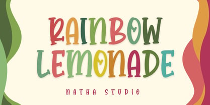 Rainbow Lemonade is a beautiful handwritten font. It brings an attractive typeface. Made for any professional projects. The font is suitable for any project like logo, t-shirt printing, wedding invitations, and greeting cards to social media quotes, branding, and more! Outstanding in a wide range of contexts. Featured : Standard Ligatures Stylistic Sets Multilingual Support PUA Encoded Numerals and Punctuation
 - Clobot by Tama Putra,
$15.00 Clobot is a tough and strong decorative display typeface. It is suitable for any design needs, branding, art quote, cover title, t-shirts, any lettering design needs and more. It has many alternative and ligature glyphs which make it very versatile font and it’s also multi-lingual. It comes with stylistic alternates and 10 stylistic sets. It provides flexibility to enhance your designs.
 - Moonsilver by HIRO.std,
$16.00 MOONSILVER is a Display font. This font describes about taft, funny, square, brave, vintage, retro FEATURES - Support Opentype Features - Uppercase - Numbering and Punctuations - PUA Encoded Characters - Multilingual Support - Works on PC or Mac USE MOONSILVER works great in any branding, logotype, magazines, poster, social media posts, clothing, advertisements, film title and any projects that need funny, strong, retro and vintage taste.
 - Evelyn by Larin Type Co,
$12.00 Evelyn is a hand drawn bold brush font. Fall in love with its incredible charm and turn any design idea into a stunning progect one. This font will fit into any project, use this font for branding or create a logo, a beautiful frame for your home, or use book covers, stationery, marketing, a blog, magazines and much more for your small business.
 - Tango Mango by TypeClassHeroes,
$14.00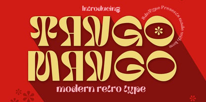 Introducing Tango Mango Modern Retro Font, access your OpenType features to access the large selection of alternate letters and ligatures. Use this font for any branding, product packaging, invitation, quotes, t-shirt, label, poster, logo etc. Feature Uppercase & Lowercase Number & Symbol International Glyphs Multilingual support Alternative Ligature Feel free to drop us a message any time Hope you enjoy it.


