5,343 search results
(0.027 seconds)
- Gandur New by Blackletra,
$50.00 Gandur is a display textura in three weights, split into two families: Alte — the German word for old — and New. Gandur was inspired by other geometric texturas, specially Max Bittrof’s Element (1933). The design began by adhering to a strict hexagonal grid, but during its development, slowly moved from a purely geometric to a more pen-based design (this is especially true in the heaviest weights). The differences between Alte and New are essentially morphological, with reflections in the character set and OpenType features. Gandur New has a more humanistic, contemporary structure and is more ‘romanized’ then Alte. Gandur New also features small capitals. Gandur Alte, on the other hand, remains truer to historical forms, most notably: S s X x Z z. Gandur Alte also features the long-s, which can be accessed via a Stylistic Set or the glyph palette. (As is historically accurate, a short-s will be used at the end of words automatically when the historical Stylistic Set has been activated).
 - Size by SD Fonts,
$34.00 Retro style is hip, so are early 20th century poster fonts. Size is based on these extra condensed letter forms. In the 19th century the need to communicate commercial messages on limited poster space brought up extremely condensed fonts creating a new typographical look. Since not really legible in small sizes these fonts nearly disappeared with the change in the commercial communication in the 20th century. For a couple of years now, these extra condensed fonts have a revival copying the exact historical appearance of its predecessors. Size, though also seeking the inspiration in the historical draft, furthermore aims to interpret this compressed look in a more vivid way by not closing in on the open counters of the round letters, but having its stroke endings slightly curved. Since other characters are defined by straight strokes, Size displays a look more vital and candid, but still distinct, compared to its historical predecessors.
 - Gandur Alte by Blackletra,
$50.00 Gandur is a display textura in three weights, split into two families: Alte — the German word for old — and New . Gandur was inspired by other geometric texturas, specially Max Bittrof’s Element (1933). The design began by adhering to a strict hexagonal grid, but during its development, slowly moved from a purely geometric to a more pen-based design (this is especially true in the heaviest weights). The differences between Alte and New are essentially morphological, with reflections in the character set and OpenType features. Gandur New has a more humanistic, contemporary structure and is more ‘romanized’ then Alte. Gandur New also features small capitals. Gandur Alte, on the other hand, remains truer to historical forms, most notably: S s X x Z z. Gandur Alte also features the long-s, which can be accessed via a Stylistic Set or the glyph palette. (As is historically accurate, a short-s will be used at the end of words automatically when the historical Stylistic Set has been activated).
 - Lycanthrope - 100% free

- Spiderfingers - 100% free

- Bekuri by Twinletter,
$17.00 The Bekuri font is the perfect visual harmony for music-style projects, festivals, and special events. With seductive and graceful characteristics, this font carries a special tone suitable for celebrating historical moments in your designs. With a family that includes regular, shadow, outline, and distort, Bekuri provides unlimited flexibility to depict your message with a powerful style. However, what makes this font stand out is the ligatures that add a unique and artistic feel to each character, giving you the freedom to explore your creativity in every project. Its ability to support multiple languages makes it an invaluable asset in reaching a global audience. Bringing visual beauty and musical charm to every touch, Bekuri is the key to bringing the feel of festivals and big events to every design. So, if you are looking for a font that celebrates the musical style in all its glory, Bekuri is an undeniable choice.
 - Cal Uncial Rough by Posterizer KG,
$19.00 Cal Uncial Rough is a calligraphic font based on sketches written with cane calligraphy pen and ink on coarse-textured paper. Because of the fact that the Uncial don't have lowercase letters, there are small capitals instead of the lowercase. As the Latin version of the Uncial was created from the Greek Uncial script (translating the Bible from Greek into Latin), in addition to the standard Latin graphemes, the font contains the Greek alphabet (and also the Cyrillic letters (Ustav), derived from the Greek Uncial too). Regardless of the stylistic connection, there is a difference between the morphology of related Greek, Latin and Cyrillic letters. Most of the graphemes are based on traditional roman and insular uncial calligraphy. Cal Uncial Rough is suitable for the preparation of calligraphic sketches as well as an application in typography that should bring us closer to historical topics (European literature, quotes, history, film ...).
 - Linotype Xmas Pi by Linotype,
$40.99You need traditional christmas symbols to illustrate your text? How about using these historic designs that had been used in good old typography. xmas is not too far and always comes in winter time. Happy Xmas. - 2009 Handymade by GLC,
$38.00 This font is not a historical one. Although to make it was quite time-consuming (each glyph was hand-drawn separately, except for the ligatures), this cartoon or comics style font is just made for fun.
 - P22 1722 by IHOF,
$39.95 An historical font based on early 18th century printing, with the visual effect of uneven inking and indifferent presswork on handmade paper. Ideal for evoking the period. Effective in continuous text setting or in display sizes.
 - Mivron by Aah Yes,
$4.95Mivron is a stand-out type of sans-serif block text especially suited for headlines and display work. There's a wide range of accented characters making this font appropriate for a wide variety of languages. The zip contains OTF and TTF versions - only install one version of a font on the same machine, either the OTF or TTF, but not both as that could cause various conflicts and erratic behaviour. - Redtowns by Lettersiro,
$15.00 Redtowns is our newest font that was made manually using brush pen and paper. This font is great for project like clothing, signatures, watermarks, use with photography, posters, and branding. Redtowns also comes with underline swashes that can be paired perfectly. Just do with your own creativity, this is easy use font, will make your project easier. What's oncluded: -Redtowns TTF -Redtowns Swashes TTF - OpenType Features: stylistic alternates, swash, ligature
 - Lowndes by Greater Albion Typefounders,
$8.50 Lowndes is designed as a Blackletter display face with a spirit of fun rather than historical accuracy, and with an emphasis on legibility and clarity. It's ideal for festive design such as cards, posters etc... Have fun!
 - Venus by Linotype,
$29.00The Venus type family is a historic hot metal face with left slanted weights that is used for the german cartographic map production. There are also special typefaces required like the Roemisch and Topografische Zahlentafel type family." - Venus Egyptienne by Linotype,
$29.00The Venus type family is a historic hot metal face with left slanted weights that is used for the german cartographic map production. There are also special typefaces required like the Roemisch and Topografische Zahlentafel type family." - P22 Amelia by IHOF,
$24.95 An alphabet of initials and ornaments in the William Morris style. Perfect drop caps to evoke historical tales and medieval manuscripts. Please note: This font is only 30 characters A-Z plus 4 empty decorative initials borders.
 - Stoxina by FSdesign-Salmina,
$39.00 Stoxina. Pixel and Swashes. The screeching contrast between the historically extraneous ages of Baroque and the computer era characterises this new member oft the Atoxina family, “Atoxina family” with experimental character. Hazard the style-split, with Stoxina.
 - Sylvia by Alias Collection,
$60.00 Not quite a sister typeface to Aminta, more a cousin.
 - Hot Sauce by Letterhead Studio-YG,
$29.00 Bistro and Hot Sauce have been prepared quickly. In Bistro you will find 10 fine traces from coffee cups, and in HotSauce 10 pleasant-for-eyes stains from sauce. Both fonts are created in the 1998. OpenType revision, with extended Latin characters, made in 2009.
 - Textus Receptus by Lascaris,
$60.00 Textus Receptus is a historical revival based on the Roman and Greek types used by Johann Bebel (and later also Michael Isengrin) in Basel in the 1520s. The Roman is a low-contrast medium-to-heavy Venetian reminiscent of Jenson or Golden Type. The unusual polytonic Greek, not previously digitized, is lighter in weight and supplied with all the ligatures and variants of the original. Yet when used without historial forms the Greek has a surprisingly contemporary feel: it’s quirky and playful as a display face, but still easily legible in running text. Bebel’s Greek extended and refined the one used for the first printed Greek New Testament, Desiderius Erasmus’ Novum Instrumentum Omne, published in Basel in 1516 by Johann Froben. The name of the font was chosen in honor of this edition, which was so influential that it was later called the Textus Receptus (the “received text”), serving as the basis for Luther’s German Bible in 1522 and much subsequent scholarship for over 300 years. Following 16th century practice, Textus Receptus contains 130 ligatures and stylistic alternates for Greek, accessible either with OpenType features or with five stylistic sets. The Greek capitals, often printed bare in early editions, have been equipped with accents and breathings for proper polytonic or monotonic typesetting. The Roman includes both standard and historical ligatures along with the abbreviations and diacritics typically employed in early printed Latin. For expanded language coverage it has the entire unicode Latin Extended‑A range and part of Latin Extended-B. The capital A is surmounted by a horizontal stroke, as in some 16th century Italian designs, and the hyphen and question mark have both modern and historical form variants. Mark-to-base positioning correctly renders fifty combining diacritics, and with mark-to-mark positioning the most common diacritics may be stacked, permitting, for example, accents and breathings on top of length-marked vowels. Numerals include old-style, proportional lining and tabular lining. For further details, please download the 31-page Textus Receptus User Guide.
 - Grotbox by Aah Yes,
$4.95Grotbox is an interesting, if not startling, distressed punk font. There are two varieties: one with upright characters; the other with the characters rotated out of whack for extra informality. Legibility is maintained, despite the wild industrial feel of the typeface, and it's designed to grab the attention. The zip package contains both OTF and TTF versions - install either OTF or TTF, not both versions of a font on the same machine. - Troyline by Sarid Ezra,
$13.00 Troyline is my newest font duo. Contain two fonts, the organic script and sans. Comes with Rough and Stamp style. You can use this font for every project. Suitable for branding logo, hand lettering, or apparel design. This font duo also support multilingual, number and symbol, alternates, swash, and underline. Also this font already PUA Encoded. What will you get: Troyline Script (OTF/TTF) - Rough & Stamp Troyline Sans (OTF/TTF) - Rough & Stamp
 - Roemisch by Linotype,
$29.99The Roemisch type family is a historic hot metal face with left slanted weights that is used for the german cartographic map production. There are also special typefaces required like the Venus type family and Topografische Zahlentafel type family." - Fraktura - Personal use only

- Durer Gothic - Unknown license

- Iron Maiden - Unknown license

- Offroad by Grype,
$16.00 Geometric typefaces can harken back and visually tie themselves to so many genres, from constructivist posters, to techno club flyers, to raw industrial era power. The Offroad family finds its origin of inspiration in the O’Neal MX logo for their motocross division, represented in its truest form in the MX styles of this family, and expanded to a type megafamily. Offroad grabs hold of that unique pseudo-unicase style and runs with it to create a range of widths and weights that are perfect for historical through modern use. It embodies the hardcore motocross rigidity from the limited inspiration of the original logotype and expands to include a full and expansive glyphset, and a comprehensive range of widths and weights, creating a straightforward, uncompromising collection of typefaces that lend a solid foundation and a broad range of expression for designers. Here's what's included with the Offroad Collection bundle: 382 glyphs per style - including Capitals, Lowercase (Unicase Style), Numerals, Punctuation and an extensive character set that covers multilingual support of latin based languages. (see the 6th graphic for a preview of the characters included) 45 fonts in 6 width subfamilies: Extra Condensed, Condensed, Standard, Expanded, & Wide. 5 weights per subfamily with obliques: Light, Book, Regular, Bold, & Black. Fonts are provided in TTF & OTF formats. The TTF format is the standard go to for most users, although the OTF and TTF function exactly the same. Here's why the Offroad Collection is for you: You're in need of a geometric pseudo-unicase family with a big range of weights and widths You're a die-hard motocross fan, and want to design anything within that genre You're a club flyer designer, and need a kick-ass techno style font family You're totally into constructivist design, and want to create designs within that genre You just like to collect quality fonts to add to your design arsenal
 - Aspire by Grype,
$18.00 Geometric/Technical style logotypes have been developed for car chrome labels since the early 1980’s. The styles are loaded with inspiration for great font families, but surprisingly, many of these sleek logotypes are lacking an expansive family to enhance and express their brand in a richer sense, becoming true brand workhorses. The Aspire family finds its origin of inspiration in the ACURA automotive company logo, and from there expands to an 6 font family of weights & oblique styles. Aspire pays homage the techno display styling of the inspiration logotype, further evolving beyond its brand inspired origin to give birth to a font family that pulls on modern and historical styles. It adopts a sturdy yet approachable style with its uniform stroke forms and curves, and goes on to include a lowercase, numerals, and a comprehensive range of weights, creating a straightforward, uncompromising collection of typefaces that lend a solid foundation and a broad range of expression for designers. Here’s what’s included with the Aspire Family bundle: 477 glyphs per style - including Capitals, Lowercase, Numerals, Punctuation and an extensive character set that covers multilingual support of latin based languages. (see the 6th graphic for a preview of the characters included) Stylistic Alternates - alternate characters that remove the angled stencil cuts for a more standardized text look. 3 weights in the family: Light, Regular, & Black. 3 obliques in the family, one for each weight: Light, Regular, & Black. Fonts are available in TTF & OTF formats. The TTF format is the standard go to for most users, although the OTF and TTF function exactly the same. Here’s why the Aspire Family is for you: - You’re in need of automotive sans font family with a range of weights and obliques. - You’re love that ACURA letter styling, and want to design anything within that genre. - You’re looking for an alternative to Eurostile with more stylized letterforms. - You’re looking for a clean techno typeface for your starship console labelling. - You just like to collect quality fonts to add to your design arsenal.
 - Sunblock Pro by Grype,
$19.00 Clean and geometric deco sans typefaces have been used in a range of scientific publications, corporate logotypes, and beauty products over the years. However, a typeface of this style has yet to have an expansive range of widths and weights to become a design workhorse, until now. The Sunblock family finds its origin of inspiration in the Coppertone sunscreen company logo, and from there expands to type megafamily. Sunblock celebrates the rounded geometric forms of deco and bauhaus lettering through a compressed lens, transcending its brand inspired origin to give birth to a font family that pulls on modern and historical styles. It inherited its soothing tone from the limited character logotype that inspired it, and goes on to include a lowercase, small caps, and a comprehensive range of widths and weights, creating a straightforward, uncompromising collection of typefaces that lend a solid foundation and a broad range of expression for designers. Here's what's included with the Sunblock Collection bundle: 643 glyphs per style - including Capitals, Lowercase, Numerals, Punctuation and an extensive character set that covers multilingual support of latin based languages. (see the 7th graphic for a preview of the characters included) 21 fonts in 5 width subfamilies: Ultra Condensed, Extra Condensed, Condensed, Semi Condensed, & Standard. 5 weights per subfamily (except Ultra Condensed): Thin, Light, Regular, Bold, & Black. Fonts are provided in both TTF & OTF formats. The TTF format is the standard go to for most users, although the OTF and TTF function exactly the same. Here's why the Sunblock Collection is for you: You're in need of a deco geometric font family with a big range of weights and widths You're love that Coppertone letter styling, and want to design anything within that genre You're looking for an alternative to Chalet Comprime with a more versatile range of styles You're looking to start up your own derivative Sunscreen product line You just like to collect quality fonts to add to your design arsenal
 - Bluebeard by Canada Type,
$24.95Named after the famous French fairy tale, Bluebeard is a surprisingly legible, slightly worn-out mix of majestic blackletter majuscules and roman minuscules. Perfect for designs of old settings, like books of fairy tales, old war books, or anything historical. - P22 Kingsclere by IHOF,
$29.95 The Kingsclere font was desigend by Ted Staunton after finding inspiration in the town of Remedios, Cuba on a 17th century Spanish tombstone inscription. These historic letterforms lend themselves to many uses where vernacular lettering from a bygone era is desired.
 - Chivel Mind by Stringlabs Creative Studio,
$29.00 The Chivel Mind is a new vintage font. The combination of class and a nostalgic, retro feel make this font a true standout. It’s inspired by old-school caps and labels, and will turn any design project into a historical masterpiece.
 - Walske by Bryantamanh,
$12.00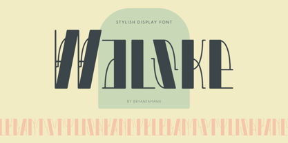 Introducing Walske. Stylish, Classic, Modern, Elegant display font. Inspired by ancient historical architecture that makes the font has a unique personality, you can use it for every project in different themes for branding, headline/title, posters, packaging, & more. Multilingual support.
 - P22 Elizabethan by IHOF,
$24.95 Elizabethan is part of the fonts designed by Ted Staunton for his historic novel centered around a family bible and the handwritten annotation through seven generations. The Elizabethan font is based on a style known as “secretary hand” circa 1610.
 - Grenadier by Alexey Timokhovsky,
$15.00 Grenadier font is based on historic blackletter forms, carefully reviewed and modernized. It got bright temper with harsh notes. Very good for packaging, branding and large sized typesetting. Grenadier has Latin and Cyrillic sets with an equal attention to details.
 - Delmonico by Rocket Type,
$12.00 Evoking a historical tone, Delmonico is a vintage display typeface featuring tall, condensed proportions just like its namesake chimney-style cocktail glass. This family includes uppercase, lowercase and small caps, as well as 22 stylistic alternate glyphs for distinctive expression.
 - Salloon by Ingrimayne Type,
$8.95 The original version of Salloon was what has become Salloon-Wide. It was designed a year or two before 1990. The narrower version, which is now the regular version of the face, was constructed a few years later. There never has been a true lower-case set of letters for these fonts, but the narrower version introduced a second set of caps by removing the side bumps from the letters. Although Salloon may look like an old font, no historic font closely resembles it. Fonts with bold, thick stems such as Salloon invite interior decoration. The five striped versions and the shattered version of the font were produced a year or two after the construction of the narrower Salloon when the arrival of a font distortion program made it easy to cracked and stripe fonts. In 2019 an outline style and two highlighter styles were added to be used in layers with the Salloon-Regular and one highlighter style was added to be used with Salloon-Wide.
 - Bizarries by Typephases,
$25.00 This series, with 104 illustrations in three files, collects original ink drawings with absurdities, bizarre people, whimsical personalities and risky behaviors! There is a very peculiar sense of narrative in the sucession of characters, even if they came out rather spontaneously and their order is random.With a vintage look and feel, these people seem to come out of a time capsule from Victorian times. Almost everything in the Bizarries (and also in their close relatives, our Illustries, Whimsies, Ombres, Absurdies and Genteta dingbats) is invented and drawn with no references —just a handful of images were sketched from historical photography. These illustrations can be very useful for a variety of projects, either in black and white, or colored in a paint or drawing application. You can use them at any size, from a small spot illustration to a huge poster, depending on your needs. The outlines remain crisp and clear no matter how much you enlarge, reduce, distort or tweak their shapes.
 - Nomad SS by Sensatype Studio,
$15.00 NOMAD is a vintage vibes font are produced with modern style and ready for historical projects. Based on our experience as a graphic designer who works for a lot of companies, we often are requested to design a graphic with a vintage feels and modern style. So, we try to brainstorming and create this font to make the idea is going out. This is perfect for show off in historical style and vintage vibes. You will get vintage, modern, and certainly unique style with this font. NOMAD font is also included full set of: All Uppercase letters Multilingual characters Numerals Punctuations Wish you enjoy our font. :)
 - Geographica Hand by Three Islands Press,
$39.00 Geographica Hand replicates the neat hand-lettering typical of engraved British maps of the 18th century, including the work of cartographers Emanuel Bowen (circa 1694–1767), Geographer to King George II, and Thomas Jefferys (circa 1719–1771) Geographica ro King George III. A kindred font to our Geographica serif family, Geographica Hand exhibits long serifs, irregular edges, and a genuinely hand-made character. Use to simulate historical materials, vintage documents, or other time-worn text. The OpenType release of Geographica Hand comes with true small capitals, contextual and historical ligatures, a series of sketchy map ornaments (e.g., trees, churches, windmills, boats), and full Latin support.


