10,000 search results
(0.015 seconds)
- Square Line Icons Food by Howcolour,
$17.00
- Hard Lines Display Font by Sipanji21,
$16.00
- Ongunkan Elder Futhark Viking by Runic World Tamgacı,
$50.00
- Square Line Icons Sports by Howcolour,
$17.00
- Square Line Icons Law by Howcolour,
$17.00
- Square Line Icons Coffee by Howcolour,
$17.00
- Square Line Icons Social by Howcolour,
$17.00
- Wine Vat Stencil JNL by Jeff Levine,
$29.00
- FF Zine Serif Display by FontFont,
$65.99
- Cyrillic Old Face - Unknown license

- Old Standard TT - 100% free

- Old Rubber Stamp - 100% free

- Ye Old Shire - Unknown license

- SF Old Republic - Unknown license

- SF Old Republic - Unknown license

- BN-Old Fashion - Unknown license

- Olde European ES - Unknown license

- old time radio - Unknown license

- OMEGA Old Face - Unknown license

- SF Old Republic - Unknown license

- SF Old Republic - Unknown license

- Old School Tattoo by m u r,
$15.00
- Old French School by JBFoundry,
$20.00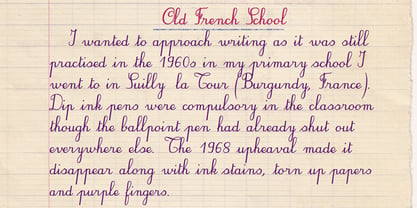
- LD Old Country by Illustration Ink,
$3.00 - WL Rasteroids Old by Writ Large,
$5.00
- MPI Old Style by mpressInteractive,
$5.00
- Goudy Old Style by URW Type Foundry,
$35.99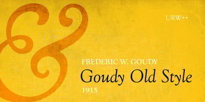
- Bookman Old Style by Monotype,
$40.99
- Abbott Old Style by SoftMaker,
$7.99
- Caslon Old Face by Bitstream,
$29.99 - Old Paris Nouveau by Baseline Fonts,
$24.00 - Old Persian Cuneiform by Deniart Systems,
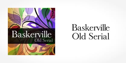
$10.00 - Baskerville Old Serial by SoftMaker,
$-
- Century Old Style by URW Type Foundry,
$35.99
- Poynter Old Style by Font Bureau,
$40.00
- Horley Old Style by Monotype,
$40.99
- Old Favorites JNL by Jeff Levine,
$29.00 - Old Softy NF by Nick's Fonts,
$10.00 - Old Claude LP by LetterPerfect,
$39.00
- Same Old Joke by Bogstav,
$15.00


