10,000 search results
(0.205 seconds)
- Victorian Leaf Ornaments by Gerald Gallo,
$20.00 Victorian Leaf Ornaments are a collection of leaves drawn in the exotic Victorian style. There is an assortment of 47 ornaments all located under the character set keys.
 - Victorian Ornamental Capitals by Intellecta Design,
$27.90 These are the classical arabesques published in Ludwig Petzendorfer's Schriften-Atlas. Eine Sammlung der wichtigsten Schreib- und Druckschriften aus alter und neuer Zeit nebst Initialen, Monogrammen, Mappen, Landeskarten und heraldischen Motiven fur die praktischen Zwecke des Kunstgewerbes, 1889. See Frompac 1889 Arabesques for another example of these arabesques.
 - Victorian Ultra Paraphernalia by Intellecta Design,
$29.90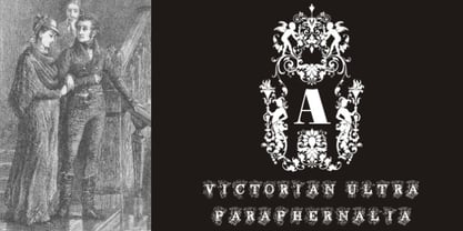
- Victorian Alphabets I by Intellecta Design,
$20.00 Victorian Alphabets I is an incredibly cool and classic display font. Elegant and distinct, this font will most certainly elevate your creations. Add it confidently to your projects, and you will love the results. You have a great set of letters "I" using the uppercases, lowercases and numbers keys on the keyboard.
 - Victorina Black Shadow by John Moore Type Foundry,
$35.00 Victorina Shadow is a fantasy sans letter display, inspired by the Victorian letters whose stylistic influence dominated the scene graph of the nineteenth and Twentieth century. Victorina has a perfect structure rigorous geometry. Victorina comes in several versions, in this set you will find the Shadow version in black and italic to complement the varied repertoire of styles of Victorina family, besides providing small caps and ornaments. Victorina Shadow let to work fine fantasy headlines when they overlap in layers of different styles. Victorina Shadow is a letter designed to recreate, with a contemporary vision, the spirit of those days of the industrial revolution and the early days of modernism.
 - NS Blackbooks Victorian by Novi Souldado,
$35.00 Reminiscing the old era of historical books (seriously, that old), circa 19th century. We crafted the letters by connecting the dots from the past with research for every flow, ornaments, look, and feel, to precisely aim for that perfect shape. Ephemera Blackbooks are born with a dark and robust personality. Feel the European historical mood right away, even with just typing it with your keyboard. You don't even realize when the design is done cause we make it so easy as a one-click-time-machine to your works using Ephemera Blackbooks font. It will be a perfect armory for a vintage headline, old book cover concept, sign, posters, playing cards deck design, vintage labels, beer labels, bar decoration, apparel, merchandising, you name it. OTF Features : Stylistic Set 01 to 07 and Ligature Glyph Count : 355 glyphs Language support : Afrikaans, Albanian, AsuBasque, Bemba, Bena, Breton, Catalan, Chiga, Cornish, Danish, Dutch, English, Estonian, Faroese, Filipino, Finnish, French, Friulian, Galician, German, Gusii, Indonesian, Irish, Italian, Kabuverdianu, Kalenjin, Kinyarwanda, Luo, Luxembourgish, Luyia, Machame, Makhuwa-Meetto, Makonde, Malagasy, Manx, Morisyen, North Ndebele, Norwegian, Bokmål, Norwegian Nynorsk, Nyankole, Oromo, Portuguese, Quechua, Romansh, Rombo, Rundi, Rwa, Samburu, Sango, Sangu, Scottish Gaelic, Sena, Shambala, Shona, Soga, Somali, Spanish, Swahili, Swedish, Swiss German, Taita, Teso, Uzbek (Latin), Volapük, VunjoZulu
 - Air Factory Rounded by Khaito Gengo,
$22.00 Air Factory Rounded was made for soft looking version of the original font Air Factory. Air Factory Rounded is a very simple and modern sans-serif and consisting of four weights. This contemporary typefaces would be good for restaurants, in retail, books, posters, etc. Air Factory Rounded also features various ligatures, stylistic alternates, fractions, and languages as well.
 - Lectori Salutem Sans by HoboArt,
$10.00Is it royal, or is it dandyish? Either way it's sure to catch the eye. Prepare for titling figures any movie executive would be jealous of using. Do you write sci-fi, fantasy, costume, or cult; or is your announcement for an off-beat wedding? Lectori Salutem Sans offers salutations to the reader, and an edge. Lectori Salutem Sans is the sans serif counterpart of the Lectori Salutem font. A postmodern font with slightly romantic features, cut off at the stem. - History Walker GT by Gartype Studio,
$10.00 Inspired by bold and slanted handwriting style, we present to you History Walker, a handwritten font with bold and slanted characters that was comes with alternates and multilingual glyphs to help people around world with that unique accent with this font. History Walker is very suitable like as text, cover book, poem, handwritten style, and more.That way easily change the glyphs to make more unique glyphs.
 - Victorian Exotical Capitals by Intellecta Design,
$25.90 - Tulk's Victorian Banner by Greater Albion Typefounders,
$14.50 Tulk's Victorian Banner revives the tradion of 'Banner' typefaces-lettering within their own lozenge or cartouche, that made such an appealing feature in many old type foundries catalogues. Tulk's Victorian Banner makes a wonderful feature of lettering in any piece of period inspired design. It compleiments our recent Fitzgerald space especially well, but can be used alongside any typeface of your choice where you want to bring a touch of period flamboyance.
 - Victorian Typewriter JNL by Jeff Levine,
$29.00 The titles in various sections of an 1890 catalog for stencil manufacturing supplies were set in metal type that closely resembled the lettering found on a typewriter. These examples became the basis for Victorian Typewriter JNL, which is available in both regular and oblique versions.
 - Victorian Alphabets H by Intellecta Design,
$20.00 Victorian Alphabets H is an incredibly cool and classic display font. Elegant and distinct, this font will most certainly elevate your creations. Add it confidently to your projects, and you will love the results. You have a great set of letters "H" using the uppercases, lowercases and numbers keys on the keyboard. Plus, acquiring the Titivilus font you get GREAT DUO combinantion, like you can see i the banners
 - P22 Victorian Gothic by P22 Type Foundry,
$24.95 P22 Victorian is a font set created in conjunction with the Albright-Knox Art Gallery's exhibition of Victorian-era French artist James Tissot. The fonts developed for the P22 Victorian set are based on historic typefaces dating from the late 19th century. Victorian Gothic was based on a type style called ‘Atlanta’, a simple, expanded width, quirky, yet elegant face similar to ‘Copperplate’. Victorian Swash was inspired by the willowy, delicate face ‘Columbian’, which has also been known in recent years as ‘Glorietta’. The P22 version includes ‘snap-on’ flourishes based on the original 'Columbian' ornamental embellishment designs. Victorian Ornaments features over 150 decorative embellishments.
 - Neuer Weltschmerz by Hanoded,
$15.00 About 7 years ago, I released a beautiful (imho) Art Deco inspired font called Weltschmerz. Weltschmerz was an all-caps font and I always wanted to do a lower case version as well. But as things so often go in life, I never found the time and forgot about it. Some time ago, I ‘rediscovered’ my good old Weltschmerz font and remembered that I wanted to create a lower case version. Without further ado: here is Neuer Weltschmerz (‘New Weltschmerz’). I redid the whole font, better kerning, better spacing, better looks… and with a proper lower case! I did keep the original handwritten look intact - because, well, it IS hand made!
 - Neug Asia by Allouse Studio,
$16.00 Proudly Presenting, Neug Asia. A font duo that will give you an a classy impression! Neug Asia can be display for any titles, logo, product packaging, branding project, megazine, social media, wedding, or just used to express words above the background. Neug Asia come with Multi-Lingual Support. Enjoy the font, feel free to comment or feedback, send me PM or email. Thank You!
 - Fork Brush Vector by Nirmana Visual,
$22.00 Fork Brush inspired by realistic dry brush. all-caps font was hand-drawn with a real acrylic ink, Fork Brush offers beautiful typographic harmony for a diversity of design projects, including logos & branding, social media posts, advertisements & product designs.
 - Hello Friday Vector by Sarid Ezra,
$15.00 Introducing, Hello Friday, a handwritten serif! Hello Friday is an organic font with handwritten feels. This organic font also included double ligatures. Number, symbol, and another punctuation also included in this fonts. Support multilingual. Let this font make your project even more organic and natural!
 - EF Viktors Raven by Elsner+Flake,
$35.00 - Neue Haas Grotesk Text by Linotype,
$33.99The original metal Neue Haas Grotesk™ would, in the late 1950s become Helvetica®. But, over the years, Helvetica would move away from its roots. Some of the features that made Neue Haas Grotesk so good were expunged or altered owing to comprimises dictated by technological changes. Christian Schwartz says Neue Haas Grotesk was originally produced for typesetting by hand in a range of sizes from 5 to 72 points, but digital Helvetica has always been one-size-fits-all, which leads to unfortunate compromises."""" Schwartz's digital revival sets the record straight, so to speak. What was lost in Neue Haas Grotesk's transition to the digital Helvetica of today, has been resurrected in this faithful digital revival. The Regular and Bold weights of Helvetica were redesigned for the Linotype machine; those alterations remained when Helvetica was adapted for phototypesetting. During the 1980s, the family was redrawn and released as Neue Helvetica. Schwartz's revival of the original Helvetica, his new Neue Haas Grotesk, comes complete with a number of Max Miedinger's alternates, including a flat-legged R. Eight display weights, from Thin to Black, plus a further three weights drawn specifically for text make this much more than a revival - it's a versatile, well-drawn grot with all the right ingredients. The Thin weight (originally requested by Bloomberg Businessweek) is very fine, very thin indeed, and reveals the true skeleton of these iconic letterforms. Available as a family of OpenType fonts with a very large Pro character set, Neue Haas Grotesk supports most Central European and many Eastern European languages. - Bebas Neue Semi Rounded by Dharma Type,
$4.99 Bebas Neue SemiRounded is the Bebas Neue with rounded corners. As you know, Bebas Neue is the most widely used free font recently. This semi-rounded version is the new style for more widely use. The basic theory and proportion are same as Bebas Neue but rounded shape gives a warm, soft and natural impression. A bit more rigid than Bebas Neue Rounded. Available at an affordable price.
 - Neue Haas Unica Paneuropean by Linotype,
$65.00Neue Haas Unica by Toshi Omagari: The original purpose behind the creation of the typeface Haas Unica was to provide a sympathetic update of Helvetica. But now the font designer Toshi Omagari has decided to make this typeface his own and has thus significantly supplemented and extended it. In the late 1970s, at the same time at which hot metal typesetting was being replaced by phototypesetting, the Haas Type Foundry commissioned a group of specialists known as "Team '77" consists of Andre Gurtler, Christian Mengelt and Erich Gschwind to adapt Max Miedinger's font The characters of Haas Unica are somewhat narrower than those of Helvetica so that the larger bowls, such as those of the "b" and "d", appear more delicate and have a slightly more pleasing effect. In general, the spacing of Haas Unica was increased to provide for improved kerning and thus enhance the legibility of the typeface in smaller point sizes. Major changes were made to the lowercase "a", in that the curve of the upper bowl became rounder and its spur was eliminated. The form of the "k" was additionally modified to remove the offset leg so that both diagonals originate from the main stem. The outstroke of the uppercase "J" was also significantly curtailed. In addition to many minor alterations, such as to the length of the horizontal bars of the "E", "F" and "G" and to the angle of the tail of the "Q", the leg of the "R" was extended and made more diagonal. In the case of the numerals, the upper curve of the "2" was reduced and the lower loops of the "5" and "6" were correspondingly adapted. The sweep of the diagonal of the "7" was also reduced. Several decades later, Toshi Omagari returned to the original sketches with the objective of reinvigorating this almost totally forgotten typeface. First, however, he needed to revise the drafts prepared by Team '77 to adapt them for digital typesetting. So Omagari carefully adjusted the proportions of the glyphs, achieving a more uniform overall effect across all line weights and removed details that had become redundant for contemporary typefaces. It was also apparent from the old drafts that it had been the case that the original plan was to create more than the four weights that were published. Omagari has added five additional styles, giving his Neue Haas Unica? a total of nine weights, from Ultra Light to Extra Black. He has also greatly extended the range of glyphs. Providing as it does typographic support for Central and European languages, Greek and Cyrillic texts, Neue Haas Unica is now ready to be used for major international projects. In addition, it has been supplied with small caps and various sets of numerals. With its resolute clarity and excellent typographic support, Neue Haas Unica is suitable for use in a wide range of new contexts. The light and elegant characters can be employed in the large point sizes to create, for example, titling and logos while the very bold styles come into their own where the typography needs to be powerful and expressive. The medium weights can be used anywhere, for setting block text and headlines. - Neue Luthersche Fraktur SB by Scangraphic Digital Type Collection,
$39.50 Since the release of these fonts most typefaces in the Scangraphic Type Collection appear in two versions. One is designed specifically for headline typesetting (SH: Scangraphic Headline Types) and one specifically for text typesetting (SB Scangraphic Bodytypes). The most obvious differentiation can be found in the spacing. That of the Bodytypes is adjusted for readability. That of the Headline Types is decidedly more narrow in order to do justice to the requirements of headline typesetting. The kerning tables, as well, have been individualized for each of these type varieties. In addition to the adjustment of spacing, there are also adjustments in the design. For the Bodytypes, fine spaces were created which prevented the smear effect on acute angles in small typesizes. For a number of Bodytypes, hairlines and serifs were thickened or the whole typeface was adjusted to meet the optical requirements for setting type in small sizes. For the German lower-case diacritical marks, all Headline Types complements contain alternative integrated accents which allow the compact setting of lower-case headlines.
 - Neue Haas Grotesk Display by Linotype,
$33.99 The first weights of Neue Haas Grotesk were designed in 1957-1958 by Max Miedinger for the Haas’sche Schriftgiesserei in Switzerland, with art direction by the company’s principal, Eduard Hoffmann. Neue Haas Grotesk was to be the answer to the British and German grotesques that had become hugely popular thanks to the success of functionalist Swiss typography. The typeface was soon revised and released as Helvetica by Linotype AG. As Neue Haas Grotesk had to be adapted to work on Linotype’s hot metal linecasters, Linotype Helvetica was in some ways a radically transformed version of the original. For instance, the matrices for Regular and Bold had to be of equal widths, and therefore the Bold was redrawn at a considerably narrower proportion. During the transition from metal to phototypesetting, Helvetica underwent additional modifications. In the 1980s Neue Helvetica was produced as a rationalized, standardized version. For Christian Schwartz, the assignment to design a digital revival of Neue Haas Grotesk was an occasion to set history straight. “Much of the warm personality of Miedinger’s shapes was lost along the way. So rather than trying to rethink Helvetica or improve on current digital versions, this was more of a restoration project: bringing Miedinger’s original Neue Haas Grotesk back to life with as much fidelity to his original shapes and spacing as possible (albeit with the addition of kerning, an expensive luxury in handset type).” Schwartz’s revival was originally commissioned in 2004 by Mark Porter for the redesign of The Guardian, but not used. Schwartz completed the family in 2010 for Richard Turley at Bloomberg Businessweek. Its thinnest weight was designed by Berton Hasebe.
 - Neue Luthersche Fraktur EF by Elsner+Flake,
$35.00 - MartiniThai Neue Slab V2 by Deltatype,
$39.00 Award winning 2017 font from Demark (Thailand) and G-Mark (Japan) in Graphic Design, MartiniThai Neue Slab is now available with better taste. Deltatype created a better version of MartiniThai Neue Slab V2: refined for better outline, we fine-tuned all outlines for better letterforms. Proportion were adjusted for better consistent. Metrics got new values for increased readability. Kerning, fine-tuned kerning pair for better spacing between the letters. MartiniThai Neue Slab V2 comes in six weights: Thin, Light, Regular, Bold, Extra Bold, Black. Thai Language is included in this package. MartiniThai Neue Slab is a unique slab serif in Thai Script that creates a sense of timeless and contemporary feel and is used by a media provider and nationwide in Thailand.
 - LT Flode Neue News - 100% free

- VelvetQuilt Display font - Personal use only

- Kick The Font - Personal use only

- Kawaii Food Font - Personal use only

- BILLY ARGEL FONT - Personal use only

- FC Basic Font - Unknown license

- A Charming Font - Personal use only

- el&font gohtic! - Unknown license

- <El&Font! Brush> - Unknown license

- El&Font Tag! - Unknown license

- Simpsons Mmmm...Font - Unknown license

- HELLO WEEN FONT - Personal use only

- National First Font - Unknown license

- 20th Century Font - Unknown license


