1,148 search results
(0.014 seconds)
- Script Betiya by Petterco,
$13.00 Betiya is a unique Font. like dance letters, smooth, clean and simple. Betiya is a perfect Font for weddings, events, invitations, companion cards, menu headers, displays, logos, blog sliders, packaging, greeting cards, etc. Betiya includes alternate glyphs and beautiful swirls in fonts including style sets, Ligatures etc. The Open Type feature can be accessed using intelligent Open Type programs such as Adobe Illustrator CS, Adobe Indesign & CorelDraw X6-X7 and Microsoft Word. And this Font has provided PUA unicode (custom coded font). so that all alternative characters can be easily accessed in full by a craftsman or designer. Features: Basic Latin AZ and az Numbers & Punctuation Style Sets & Fasteners PUA Encode (Custom Encoded Fonts) If you don't have a program that supports OpenType features such as Adobe Illustrator and CorelDraw X Version, you can access all the alternative glyphs using Font Book (Mac) or Character Map (Windows). Using Windows Character Map with Adobe Photoshop ( PS)
 - Gotica Lumina by Omine Type,
$24.00Gotica Lumina is a an attempt to make blackletter more legible to the 21st century's eye. It is available in two styles: soft (for text) and sharp (for display). Both of them have an alternate font, which contains stylistic alternate forms for several characters, for a more “traditional” look. Opentype features: four styles of figures and currencies, ligatures (f-ligatures and c-ligatures), historical forms (long-s). - Leticea Bumstead by FontHaus,
$19.95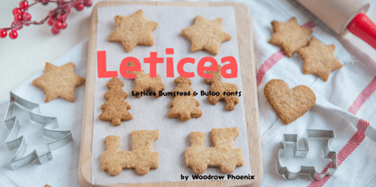
- Vertical Sans by S6 Foundry,
$12.00 Vertical Sans is an extremely condensed sans set in 3 weights offering a balanced, stylish font perfect for branding and communications projects.
 - Huxley Vertical by URW Type Foundry,
$35.99 - Thalweg Poetica by Ani Dimitrova,
$29.00 Thalweg Poetica is a revival font that comes with a story created in 1993 by the Bulgarian artist Ivan Kyosev. It is a sequel to the Thalweg font family completed in 2020. The construction of characters combines the upright character of the Thalweg font and the handwritten character of Thalweg Italic. The font partners perfectly with the Talweg font family and gives designers a new opportunity for expression. Thalweg Poetica contains 4 widths / Normal, Semi Condensed, Condensed & Extra Condensed / and 8 weights ranging from Thin to Black with small caps versions, each style containing more than 1100 glyphs. The font comes with extended coverage of the Latin, Cyrillic, and Greek Scripts. All of the weights are specifically equipped for complex, professional typography with Open Type Features. These features include Small Caps, Ligatures, Discretionary Ligatures, Superscript, Subscript, Tabular Figures, Old-Style Figures, Circled Figures, Arrows, Matching currency symbols, and fraction. The Thalweg Poetica family is ideally suited for small text, books and magazines, branding, posters, as well as web and screen design, headlines, and more. The Regular and Medium weights are perfect for body text and they give an interesting texture to the text. The range of styles gives good flexibility to this family.
 - Gotica Moderna by Intellecta Design,
$25.90a modern blackletter - Vehicle JNL by Jeff Levine,
$29.00Vehicle JNL is a condensed block font similar to that found on many state auto license plates. - Blowing Vesicle by Letterhend,
$19.00 Blowing Vesicle is a retro bold font which will bring you back to 60s feel. This font perfectly made to be applied especially in logo, and the other various formal forms such as invitations, labels, logos, magazines, books, greeting / wedding cards, packaging, fashion, make up, stationery, novels, labels or any type of advertising purpose. Features : uppercase & lowercase numbers and punctuation multilingual ligatures alternates swashes PUA encoded We highly recommend using a program that supports OpenType features and Glyphs panels like many of Adobe apps and Corel Draw, so you can see and access all Glyph variations.
 - LFT Etica Mono by TypeTogether,
$35.00 Milan-based Leftloft studio has produced a third leg to its hit Etica font family: LFT Etica Mono. Meant to be a coder’s go-to font for everyday use as much as a designer’s way to invoke a certain genre, it is part of a broader and more versatile family that already contains almost 80 sans and serif fonts. LFT Etica Mono’s ten weights carry the same modern, recognisable DNA of the Etica family while hewing to the defined requirements of a coding typeface: space, density, distinct forms, and clarity. It uses the same instroke on the ‘c’ and open form of the ‘a’ for which the Etica family is famous, but adds something new in the form of an additional italic style. Monospaced fonts usually incorporate slanted letters as italics, as does LFT Etica Mono, but its default italics have warmer, cursive shapes while the alternate italics are simply slanted. The default ‘a’ is a simplified bowl and stem instead of a two storey shape; the ‘d, f, i, l, t, y’ and others gain an outstroke tail; the ‘e’ is one smooth stroke; and the default ‘k’ is looped. These characters have basic, slanted alternates if the cursive look isn’t desired, and includes a set of arrows and geometric shapes. The monospaced design, by nature, makes the typeface useful in coding and in low readability situations. And how does LFT Etica Mono work from the designer’s perspective? The starting point was the need for a monospaced Etica companion intended for technical applications: captions in graphic layouts, small text, confined or predefined space, and overall tone. Flat terminals and counters maintain the colour and versatility of the original typeface, but choosing between the organic cursive or blunt slanted alphabet will give every layout its own character. Of particular aesthetic interest may be the & and % symbols. Designed to be applied to the common visual environment, the new LFT Etica Mono font family completes a more complex system. One benefit is to give an expressive tone — less serious and more friendly — to something inherently technical, to bytes and bots, to encode the beautiful life.
 - LFT Etica Sheriff by TypeTogether,
$35.00 "LFT Etica, the moralist type family by Leftloft, began at the end of 2000, but its development is ongoing as it expands to fill the astute designer’s needs. The starting point was the common, cold grotesque sans typefaces — ubiquitous and often badly applied in their everyday visual environment. The challenge was to obtain the same force, versatility, and colour, but with a much warmer feel. LFT Etica resides aesthetically somewhere between a grotesque and a humanist sans serif, resulting from a design of soft strokes with open counters and terminals. LFT Etica successfully combines forcefulness and delicacy, wrapping both with sober charm. Milan-based Leftloft studio teamed up with Octavio Pardo to develop 24 additional styles for the very successful LFT Etica type family. This expansion is a direct response to type users’ requests who found in LFT Etica a de facto choice for web design. The new styles come in two series — 12 condensed widths and 12 compressed ones — and have proven versatile in applications where the ratio between information and space becomes an important challenge. Each letter was scrutinised to ensure durability throughout time and adaptability within circumstance, so LFT Etica meets the challenge of balance head-on. With its wide current range of 40 styles and many OpenType features (four sets of numerals, fractions, arrows, and dingbats, as well as stylistic alternates), LFT Etica is a versatile typeface suitable for corporate or casual use, for printed publications as well as web design. The complete LFT Etica family, along with our entire catalogue, has been optimised for today’s varied screen uses."
 - New Venice - Unknown license

- Venice Classic - Unknown license

- Venice Initials by Wiescher Design,
$39.50 Venice Initials are my redesign of a 15th century venetian original by an unknown calligrapher. Unfortunately only parts of the letters existed, so I had to design about half of them myself. Of course I enjoyed doing that. Yours Gert Wiescher
 - Venice Serif by Unio Creative Solutions,
$5.00 Introducing “Venice Serif - Font Family” – a functional serif type system with a sleek structure which gives a strong personality while still maintaining high readability. Developed in three weights with matching obliques. The full set of weights (Light, Regular and Bold) counts more than 350 glyphs. The end result is a family with full multilingual capabilities and a coverage of several languages based on the Latin alphabet. This fashionable font family is the ideal choice for advertising, corporate design, packaging, editorial and branding. Specifications: - Files included: Venice Light, Venice Regular, Venice Bold with corresponding obliques - Multi-language support (Central, Eastern, Western European languages) - OpenType features
 - Venice Bridge by Typestory,
$15.00 Venice Bridge is an elegant and distinct serif font. It has a classy, elegant and modern look that can be used for logos, branding, invitations, stationery, wedding designs, social media posts, and much more! What’s Included : Web Font Ton of glyphs Ligature, Alternate & Swashes Works on PC & Mac Simple installations Accessible in the Adobe Illustrator, Adobe Photoshop, Adobe InDesign, even work on Microsoft Word. PUA Encoded Characters – Fully accessible without additional design software. Thank you for your purchase! That’s it !! Have fun using our font 🙂
 - Venice Magnefia by Krntype Studio,
$16.00 Venice Magnefia Font Duo is a bold synergy font. The composition between thick brush and a clean hand writing is very suitable. this font created with brush marker and gel pen. Venice Magnefia font come for you to use in all your creative and boldness needs.
 - Venice Revolution by RM&WD,
$30.00 This font take inspiration by the Venetian famous typographers in 1500s. Is a font designed to perform better when used in high dimension like Headline in Ad, Titles in Magazines or Blogs, Logos, Naming, Packaging... Is easy to have great result using contextual & stilistic alternatives, ligatures and other SS alternatives, as show in the posters. Is highly raccomended graphic applications with OpenType tab, such Adobe Illustrator or Photoshop or Quark Xpress InDesign, for the use of OpenType Features.
 - Utica JNL by Jeff Levine,
$29.00Utica JNL takes the basic components of Boat Decals JNL and reworks the characters into a bold, block font with thick-and-thin line variations. - Epica Pro by Sudtipos,
$49.00 Epica is a contemporary interpretation of the Venetian Renaissance types. A humanist type family with a contemporary design. This family encompasses different typographic scenarios with emphasis in style and functional equilibrium. Its letterforms show the visual richness of Epica that includes some calligraphic reminiscences perfectly legible in small and display sizes. Its strong personality makes it distinguish, because it perfectly combines the elegance of antique typographies and the forcefulness of contemporary ones. This family has been designed in two different moments. Epica Serif, which have a more classical design, was finished 5 years ago in its first version. The first sketches were drew 8 years ago during the Master of Type Design at the University of Buenos Aires. Through the years was re design in several times to the point of reaching its current version. On the other hand, Epica Sans was completed in 2020 and is the counterpart of Epica Serif. A complementary system designed to enrich the serif version and give new options for hierarchy and composition. This is a versatile type family perfectly fit for books, editorial, and usage in print and on screens. It possesses great legibility in body texts, which makes it ideal for extended reading and supports a variety of languages.
 - Hall Fetica Decompose Italic - Unknown license

- Hall Fetica Narrow Italic - Unknown license

- Hall Fetica Upper Decompose - Unknown license

- Hall Fetica Upper Italic - Unknown license

- Por Siempre Gótica - Personal use only

- Cinquenta Mil Meticais - Unknown license

- British Vehicle JNL by Jeff Levine,
$29.00 Auto license plates in the United Kingdom are made with a typeface originally designed by (and named for) Charles Wright and must meet strict criteria as to type height, weight and spacing. A bold sans serif design; British Vehicle JNL is available in both regular and oblique versions.
 - Vertical Roundpoint JNL by Jeff Levine,
$29.00 Vertical Roundpoint JNL is one of a number of classic hand-lettered typefaces found in a 1941 edition of the Speedball® Lettering Pen instruction book and re-drawn digitally by Jeff Levine.
 - Align Vertical Mono by Mom,
$89.00 Align Vertical Mono has an innovator construction which gives to the designer the ability to align the letters creating beautiful patterns on the page. It was design by the Tyner (typography Designer) Pedro Mascarenhas to fill a gap in type design. With Align Mono Family type will be the leading role of the design. The final result of the art work depends of the choices designer makes for each glyph.
 - Artica Rough Pro by Green Type,
$46.00 Artica Rough Pro is an elegant display typeface. It was inspired by classic Roman letterforms. Artica Rough Pro supports Latin, Cyrillic, modern Greek and Armenian scripts, and includes swash initial, final forms, stylistic alternates and ligatures.
 - Hall Fetica Upper Decompose It - Unknown license

- Venice La Corla by Jolicia Type,
$19.00 Venice La Corla is a breathtaking serif font that embodies timeless elegance and sophistication. This typeface exudes a sense of refinement and grace that is perfect for projects where a touch of classic charm is required. Each character in Venice La Corla is meticulously crafted to provide a harmonious balance between its serifs and elegant lines, resulting in a truly remarkable font. Key Features: 1. Serene Elegance: Venice La Corla's primary hallmark is its serene elegance. The font's graceful serifs and curvaceous letterforms create an atmosphere of sophistication that is suitable for various design applications. 2. Timeless Appeal: Inspired by the romanticism of the Italian city of Venice, this font transports you to an era of classic beauty. Its timeless appeal is perfect for projects that require a touch of nostalgia and charm. 3. Versatile Usage: Venice La Corla is incredibly versatile and adapts effortlessly to different design scenarios. Whether it's a formal wedding invitation, a vintage-inspired poster, or a high-end fashion magazine, this font adds a touch of class to any project. 4. Exceptional Legibility: Despite its ornate elegance, Venice La Corla maintains excellent legibility, making it a practical choice for long passages of text as well as for branding and display purposes. 5. Captivating Details: The font's characters are adorned with captivating details, making it a true work of art. Each letter is thoughtfully designed to enhance the overall visual appeal of your design. Recommended Uses: Venice La Corla is ideal for a wide range of projects, including but not limited to: - Wedding invitations and stationery - Vintage and classic-themed designs - High-end fashion and luxury branding - Editorial design and magazine layouts - Product packaging and labels - Fine art prints - Wine labels and menus for upscale restaurants Incorporate Venice La Corla into your design projects, and you'll instantly elevate the aesthetics, adding a touch of timeless elegance that will captivate your audience.
 - Futura Now for Leica by Monotype,
$53.99For nearly 90 years, Paul Renner’s Futura has been as popular as it is versatile—from children’s books to fashion magazines to the plaque on the Moon. Futura is a typographic icon. Futura Now offers designers a chance to see Futura with fresh eyes. It’s more truly Futura-like than any digital version you’ve ever worked with. “It brings some much-needed humanity back to the world of geometric sans serifs,” says Steve Matteson, Monotype’s Creative Type Director who led the design team. “Despite its reputation as the ultimate modern typeface, Futura Now is surprisingly warm,” he explains. “It’s just as at home set next to a leafy tree as it is next to a stainless-steel table, because it skillfully navigates the border between super-clean geometry and humanist warmth.” Futura Now—the definitive Futura—contains 102 styles, including: new Headline and Text weights; new Script and Display weights and styles; and new decorative variants (outlines, inlines, shadows, and fill). Its contemporary alignment of names and weights makes the family easier to understand and use, and its comfortable Text and judicious Headline subfamilies provide instantly refined spacing. With a large Latin, Greek, and Cyrillic character-set, Futura Now serves a wider international creative community. Futura Now is available both as individual OpenType fonts and as a set of Variable fonts, delivering limitless styles in a tidy digital footprint. - Vatican Rough Letters, 8th c. - Unknown license

- Boneribbon Tall - Unknown license

- Micromoon by Neoglyph Studio,
$15.00 Inspired by futuristic vehicle print designs like seen in Star Trek, Blade Runner, Altered Carbon and the Alien franchise. The goal was a clean, abstract design where horizontal, vertical and diagonal 45 degree lines are the primary guidelines. Features : uppercase and lowercase numbers and punctuation multilingual Ideal for: Logo design Movie promotion Book & magazine print Package design Vehicle print designs Game design
 - Sport Numbers by Gerald Gallo,
$20.00 Sport Numbers contains classic sport number designs, similar to those that appear on sport uniforms and competition vehicles, in the proportions of 6 x 10, 8 x 10, 10 x 10, and 12 x 10, both vertical and oblique. The vertical numbers are located under the character set and the oblique numbers are located under the respective keys of the shift + character set.
 - Conquera by Device,
$39.00 Conquera is an extended caps-only font in five weights plus an inline. It is refined and masculine without being heavy-handed - the angled stokes and pointed vertices lend it a stylish, upmarket Moderne poise. Suitable for man's grooming products, supercar showroom brochures, high-end developments, space vehicles and home technology. Letterspacing at small sizes adds extra sophistication. Includes an alternative A with a triangular crossbar and full international character set.
 - Flanker Ruano by Flanker,
$18.00 The typeface Ruano was inspired from “Lettera cancelleresca formata” by the Vatican calligrapher Ferdinando Ruano, carved and cast in 1926 by Nebiolo of Turin on the advice of Raffaello Bertieri who designed the capital letters and numbers, missing in the original. The difficulty of the design of this chancery font lies in its original vertical layout, bending the calligraphic harmonies to the Gothic style, thus distinguishing it from contemporary cursive alphabets.
 - Pinstripe Limo - Personal use only


