10,000 search results (0.026 seconds)
  1. WARFIELD - Personal use only
  2. Oxona Caps - Personal use only
  3. Spyced by Essqué Productions, $35.00
    This stylized font was inspired by the personal style of the designer’s sister. It has a mixture of Gothic, Arabian, & Persian styles, with elements inspired by thorns and smoke. It can be ideal for projects that require an air of mystery or intrigue, or have an exotic or dangerous flare.
  4. Friendly by Positype, $29.00
    Friendly is an homage to Morris Fuller Benton's adorable Announcement typeface. It is not a strict interpretation, digital revival or reverent reproduction of the original letterforms… but I would be remiss and shady to not acknowledge the letterforms that inspired this typeface. If you are looking for a more accurate 'scanned revival' I would recommend searching "Announcement" on MyFonts. As stated earlier, it is an homage to the original letterforms of the typeface but takes a great bit of freedom tightening the construction up in order to loosen up the movement of the variant letterforms to allow a great deal of usable personality. I enjoy stating this dichotomy… "loosen up to tighten up the forms" and vice versa. It seems counterintuitive or silly but by allowing the letterforms to normalize, I felt more comfortable going back and adding rather indulgent personality. Infused with stylistic alternates, swashes, titling, many many contextual alternates, 9 stylistic sets and 2 stylistic sets with wordmarks, the typeface became far more 'friendly' for me… how could it not? With so many loops, swashes and typographic indulgences, it was bound to be fun. The more elaborate and 'overdone' Friendly got, the more I wanted to slant it. Here's where my thinking differs from MFB's original. I like slanted romans… especially ones with long ascenders, but I do not like much of a slant. It has to be the lettering person in me. It's hard for me to do a completely upright serif and not pair it with an angle, but I did not feel Announcement's 'Italic' offered much and the actual slant needed to be far less. If it's not an italic, I prefer the letters to slant with an angle equivalent to the thickness of the vertical stroke. The Slanted version of Friendly is set at 3.6 degrees, is quite subtle, and very fitting for me. You will find that most characters have a contextual, stylistic, swash and titling alternate assigned to them and some have an echoed alternate to the swash and titling options if the stylistic alt has been selected in tandem. Additionally, all of these are accessible in the glyph palette directly from the base glyph typed or through selecting options through the Stylistic Sets 1–9. Stylistic Sets 10 & 11 are a little different. They are actually configured as complex majuscule ligatures… a result of me getting carried away. Other features like a default old style numeral set and coordinating glyphs have been produced along with case support, ordinals, and more have been added to make it more relevant for contemporary use.
  5. TG Aqsa Grotesque Pro by Tegami Type, $30.00
    TG Aqsa Grotesque Pro is the latest version of the font that was previously released in 2017, TG Aqsa Grotesque. In this latest version there are several optical fixes on each glyphs. In this latest version also added 2 new weights namely black and ultra black so that TG Aqsa Grotesque Pro has 6 fonts of different weights. Still maintaining the sans serif grotesque style coupled with the improvement of the letter form make TG Aqsa Grotesque Pro have a good level of readability when applied as a body text. And this version also has extended latin which will support more than 90+ different languages.
  6. New Lanzelott by Otto Maurer, $12.00
    The New Lanzelott is a brand new Version of an old Font of me called Lanzelott. The new Version get more curves and round Glyphes, it get more Soul. The Serif - Versions are shorter but more exactly. Every Font comes with many Open-type-features and Handmade Kerning. I like the old Version but this much better, much beautyfuller. All Fonts come with the German new big sharp S and a smaler sharp S and the normal sharp S. I you Write SS and want the big sharp S, you have only to make it with the Ligatur-Feature I hope you ll like it...
  7. Mina Jackstone by Letterhend, $19.00
    Mina Jackstone is a SVG typeface with watercolor texture effect. Available in two types, solid version and transparent version. This type of font perfectly made to be applied such as invitations, labels, logos, magazines, books, greeting / wedding cards, packaging, fashion, make up, stationery, novels, labels or any type of advertising purpose. Features : Solid version and svg version numbers and punctuation multilingual ligatures PUA encoded We highly recommend using a program that supports OpenType features and Glyphs panels like many of Adobe apps and Corel Draw, so you can see and access all Glyph variations. How to access opentype feature : letterhend.com/tutorials/using-opentype-feature-in-any-software/
  8. Hoax by More Etc, $18.00
    Introducing Hoax – a pre-worn sans serif with spirit, personality and distinction. This bold and semi-condensed sans serif is inspired by old copy machines and vintage prints. It is lively and eye-catching, ideal for where and when you want to make a lasting impression. Hoax is a celebration of character, a tribute to curiosity. Use this typeface and let everyone know that you mean business. OPENTYPE FEATURES: This font includes over 40 discretionary ligatures of prepositions and common words in English. These OpenType features can be accessed using OpenType friendly applications that allow the use of discretionary ligatures and stylistic sets. MULTILINGUAL SUPPORT: With over 700 glyphs, it has support for more than 150 languages, including Cyrillic script. List of discretionary ligatures: AND, ARE, AT, BY, FOR, EST, FEAT., FROM, IN, IS, OF, ON, OR, OUR, THAN, THAT, THE, TO, WITH, YOUR, CO. Each word is available in both upright and slanted versions. How to use: Activate the discretionary ligatures as you normally do in your OpenType friendly application. When activated, the words are in upright versions. To access the slanted versions, activate the first stylistic set (“Slanted Ligatures”). Happy typing!
  9. View Slant Black ExtExp - Personal use only
  10. Dust Serif - Personal use only
  11. Lido STF - Personal use only
  12. Kanna-W4 - Personal use only
  13. Zeroes - Unknown license
  14. Aerosol - Unknown license
  15. Opus Pix - Personal use only
  16. loco - Personal use only
  17. Effloresce - Unknown license
  18. Adry of Hanabi - Personal use only
  19. Caligari - Unknown license
  20. Unispace - Unknown license
  21. Champignon - Unknown license
  22. Tork - Unknown license
  23. Afterfonts - Unknown license
  24. Blobfont G98 - Unknown license
  25. Pop Up - Unknown license
  26. Capitalis Goreanis - 100% free
  27. Eagles - Unknown license
  28. Hultog - Unknown license
  29. SYSTEM HATCH - Unknown license
  30. Zrnic - Unknown license
  31. Plain Squashed - Unknown license
  32. Hurontario - Unknown license
  33. Angostura - Unknown license
  34. Humanist 970 by Bitstream, $29.99
    Bitstream's version of Adsans originally released by Linotype & Machinery.
  35. Technik Serif by CarnokyType, $25.00
    Technik Serif is a seriffed version of Technik typeface.
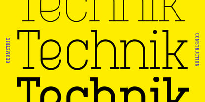
  36. Montada Clean by BRtype, $18.00
    Is the clean version of the acclaimed font Montada.
  37. Brisko Display by Tour De Force, $30.00
    Brisko Display is alternate version of Brisko Sans Black.
  38. Elias by Typemotion, $25.00
    Elias is a digital version of my own handwriting.
  39. Lumier Rounded by Tour De Force, $25.00
    Lumier Rounded is rounded version of our Lumier family.
  40. Vallejo Serif Rounded by Estudio Calderon, $30.00
    The new version of Vallejo Serif includes rounded corners.
Looking for more fonts? Check out our New, Sans, Script, Handwriting fonts or Categories
abstract fontscontact usprivacy policyweb font generator
Processing