10,000 search results
(0.02 seconds)
- Resagnicto - 100% free

- GoodCityModern Plain - Unknown license

- whatever - Unknown license

- Georges - Personal use only

- SWEM - 100% free

- Rogaton - 100% free

- Soul Of Holitter Alternative - 100% free

- DoradoHeadline - 100% free

- Planes-S-Modern - Unknown license

- newsiren - Unknown license

- Berkelium Type - Personal use only

- Insert - Unknown license

- Acacia 23 - Unknown license

- NewMedia - Unknown license

- Vector - Unknown license

- Diode by Funk King,
$5.00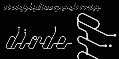 Diode is a modern, versatile script.
 - Arial Narrow OS by Monotype,
$54.99Arial was designed for Monotype in 1982 by Robin Nicholas and Patricia Saunders. A contemporary sans serif design, Arial contains more humanist characteristics than many of its predecessors and as such is more in tune with the mood of the last decades of the twentieth century. The overall treatment of curves is softer and fuller than in most industrial style sans serif faces. Terminal strokes are cut on the diagonal which helps to give the face a less mechanical appearance. Arial is an extremely versatile family of typefaces which can be used with equal success for text setting in reports, presentations, magazines etc, and for display use in newspapers, advertising and promotions. - Arial for Ortho Clinical by Monotype,
$45.99Arial was designed for Monotype in 1982 by Robin Nicholas and Patricia Saunders. A contemporary sans serif design, Arial contains more humanist characteristics than many of its predecessors and as such is more in tune with the mood of the last decades of the twentieth century. The overall treatment of curves is softer and fuller than in most industrial style sans serif faces. Terminal strokes are cut on the diagonal which helps to give the face a less mechanical appearance. Arial is an extremely versatile family of typefaces which can be used with equal success for text setting in reports, presentations, magazines etc, and for display use in newspapers, advertising and promotions. - Silver Lovely by Selotype,
$12.00 Silver Lovely is a script that is both narrow and modern. It is slender, feminine and classy, while still maintaining a friendly feel. Silver Lovely is versatile and will work perfectly for fashion, e-commerce brands, trend blogs, wedding boutiques or any business that wants to appear upscale and chic. With its many different stylistic characters, Silver Lovely is perfect for creating original and functional designs. It has extensive language support and tons of ligatures, alternates, stylistic sets that add visual interest to every letter. The overall feel of the font is elegant, sophisticated with a touch of informal and it is ideal if you want to convey a sense of class and style. Thanks so much for looking.
 - Samsekrat by IbraCreative,
$17.00 Samsekrat is an authentic serif typeface that exudes timeless elegance and sophistication. With its meticulously crafted letterforms, Samsekrat strikes a harmonious balance between tradition and modernity, making it versatile for a range of design applications. The serifs are distinct and refined, lending a classic aesthetic to the typeface, while subtle nuances in letter spacing and stroke weights contribute to its overall grace. Samsekrat’s authenticity shines through in its attention to detail, capturing the essence of traditional serif typography while maintaining a contemporary edge. This typeface is a testament to the craftsmanship and artistry behind authentic design, making it a compelling choice for projects that demand a touch of refined character and enduring style.
 - Arial Unicode by Monotype,
$208.99Arial was designed for Monotype in 1982 by Robin Nicholas and Patricia Saunders. A contemporary sans serif design, Arial contains more humanist characteristics than many of its predecessors and as such is more in tune with the mood of the last decades of the twentieth century. The overall treatment of curves is softer and fuller than in most industrial style sans serif faces. Terminal strokes are cut on the diagonal which helps to give the face a less mechanical appearance. Arial is an extremely versatile family of typefaces which can be used with equal success for text setting in reports, presentations, magazines etc, and for display use in newspapers, advertising and promotions. - Arial Paneuropean by Monotype,
$92.99Arial was designed for Monotype in 1982 by Robin Nicholas and Patricia Saunders. A contemporary sans serif design, Arial contains more humanist characteristics than many of its predecessors and as such is more in tune with the mood of the last decades of the twentieth century. The overall treatment of curves is softer and fuller than in most industrial style sans serif faces. Terminal strokes are cut on the diagonal which helps to give the face a less mechanical appearance. Arial is an extremely versatile family of typefaces which can be used with equal success for text setting in reports, presentations, magazines etc, and for display use in newspapers, advertising and promotions. - Berringer by Hustle Supply Co,
$20.00 Introducing Berringer A Vintage Type Family Berringer is a vintage sans serif family including Textured, Rough & Clean versions as well as Oblique versions of each. Click on the "View All Glyphs Below" image to see every glyph included in each font file. Berringer includes western european characters. Berringer is a versatile sans serif typeface that gives a vintage aesthetic. With it's unique & distinct characteristics it sets itself apart, while also maintaining a strong timeless appeal overall. Rough & Textured versions allow Berringer to be a complete set without the need for 3rd party effects to create a printed look, eliminating a step in the process of finalising your piece. Thank you for checking this out! Jeremy
 - Mensrea by Typogama,
$19.00Mensrea is a versatile display and text superfamily combining 32 different styles into a urban, street, themed design bundle. Based on a functional and condensed sans serif, Mensrea equally includes a large range of complimentary weights that can either be used as stand alone styles or then combined with other weights to create layered design. Two Graffiti styles add a further style contrast with a handwritten and fluid dynamic to contrast the main weights, the Bubble style equally features three extra layers for styling. And lastly, a small set of pictograms have equally been included and feature symbols from office icons to themed police iconography in relation to the overall Mensrea theme. - Sabryne by Subectype,
$15.00 Sabryne is a beautiful and lovely script font. It has a great readability and will add a fun and lovely touch to any design. Sabryne is versatile and can be used on cards, posters, merchandise, book covers, websites, packaging, and basically anywhere you like. The overall feel of the font is warm, elegant and informal and it is perfect if you want to convey a sense of friendliness and style. The script has 250+ lovely glyphs with lots of stylistic variations, ligatures and swashes, which you can mix and match for a more interesting effect. The dancing baseline makes it very casual and full of personality, thus a great addition to every design project.
 - Remora Sans by G-Type,
$39.00 Remora is an extensive new humanist sans serif which comes in 2 style variations, the effervescent Remora Sans and its corporate business partner Remora Corp . Both styles include 5 individual width sets ranging from the condensed W1 to the extra-wide W5. Furthermore, with an impressive 7 weights (Thin to Ultra) and true matching italics in each pack Remora is an ultra versatile super family comprising 140 individual fonts, perfect for any typographic assignment or design brief. Remora was designed by G-Type founder Nick Cooke. Both the Sans and Corp families share the same proportions, with the exception of certain key characters that change the overall appearance. Remora Sans is an exuberant and characterful typeface while Remora Corp, as its name suggests, is a businesslike typeface more suited to corporate typography. Quite early on in the design process Nick decided to give Remora Corp equal billing instead of incorporating these glyphs as alternates or a stylistic set that may get overlooked. “I created two separate families after learning a valuable lesson with one of my earlier typefaces, Houschka”, says Nick. “Houschka contained distinctive rounded A’s W’s and w’s, with ‘straight’ styles as character alternates. Even though style sets and alternates are easy to activate they are rarely used, so after many requests for customised versions of the fonts with the straight characters as defaults it was decided to create the separate ‘Alt’ family. So I cut straight to the chase with the two Remora variants and created two complementary families.” Both sets contain many shared letterforms, but it is the alternate characters that significantly alter the appearance of each font. Remora has been carefully designed for optimum legibility at large and very small sizes. Although fairly monolinear in appearance, especially in the lighter weights, particular attention has been paid to optical correction like the overshoots of the curved characters. Open counters and painstaking attention to detail (e.g. weight contrast between horizontal and vertical strokes, junctions of shoulders and stems etc) all boost readability and make Remora a great choice across all media. Remora Sans and Corp are ‘humanist’ rather than ‘geometric’ in style, meaning they’re not strictly based on rectangles and circles, resulting in a warm and friendlier feel. The slightly ’super-elliptical’ rounded forms create generously attractive curves. Remora has very distinctive italics in that they are only inclined by 8 degrees, but are not just based on slanted uprights. The italic styles are very alluring when used for display at large sizes and the good news is they come bundled free with their respective uprights. Each family also contains many OpenType features including proportional and tabular numbers, small caps, discretionary ligatures, plus five stylistic sets for ultra versatile typography.
 - Remora Corp by G-Type,
$39.00 Remora is an extensive new humanist sans serif which comes in 2 style variations, the effervescent Remora Sans and its corporate business partner Remora Corp. Both styles include 5 individual width sets ranging from the condensed W1 to the extra-wide W5. Furthermore, with an impressive 7 weights (Thin to Ultra) and true matching italics in each pack Remora is an ultra versatile super family comprising 140 individual fonts, perfect for any typographic assignment or design brief. Remora was designed by G-Type founder Nick Cooke. Both the Sans and Corp families share the same proportions, with the exception of certain key characters that change the overall appearance. Remora Sans is an exuberant and characterful typeface while Remora Corp, as its name suggests, is a businesslike typeface more suited to corporate typography. Quite early on in the design process Nick decided to give Remora Corp equal billing instead of incorporating these glyphs as alternates or a stylistic set that may get overlooked. “I created two separate families after learning a valuable lesson with one of my earlier typefaces, Houschka”, says Nick. “Houschka contained distinctive rounded A’s W’s and w’s, with ‘straight’ styles as character alternates. Even though style sets and alternates are easy to activate they are rarely used, so after many requests for customised versions of the fonts with the straight characters as defaults it was decided to create the separate ‘Alt’ family. So I cut straight to the chase with the two Remora variants and created two complementary families.” Both sets contain many shared letterforms, but it is the alternate characters that significantly alter the appearance of each font. Remora has been carefully designed for optimum legibility at large and very small sizes. Although fairly monolinear in appearance, especially in the lighter weights, particular attention has been paid to optical correction like the overshoots of the curved characters. Open counters and painstaking attention to detail (e.g. weight contrast between horizontal and vertical strokes, junctions of shoulders and stems etc) all boost readability and make Remora a great choice across all media. Remora Sans and Corp are ‘humanist’ rather than ‘geometric’ in style, meaning they’re not strictly based on rectangles and circles, resulting in a warm and friendlier feel. The slightly ’super-elliptical’ rounded forms create generously attractive curves. Remora has very distinctive italics in that they are only inclined by 8 degrees, but are not just based on slanted uprights. The italic styles are very alluring when used for display at large sizes and the good news is they come bundled free with their respective uprights. Each family also contains many OpenType features including proportional and tabular numbers, small caps, discretionary ligatures, plus five stylistic sets for ultra versatile typography.
 - Adamant BG - 100% free

- Headey by Alex Couture,
$15.00 Headey is a clean and lining brush script with a bouncing baseline. Include OpenType alternates and common ligatures. Try the alternates and ligatures to give your designs looks good, fresh, casual, stylish, and modern. That's it! I really hope you enjoy it.
 - Solo Beats by PizzaDude.dk,
$17.00 It's clear, fat and juicy - it's my Solo Beats font! It has got that organic feeling of something handmade...and that is exactly what it is. Even though I digitally removed some inkblobs here and there, the handmade look is quite clear!
 - Toxic Brew by PizzaDude.dk,
$15.00 The Toxic Brew font was initially designed to be a Halloween font, but I guess it turned out not so scary in the end. But maybe you can use it for something scary anyway? I've added several versions, and they mix very well
 - Life Cinema Screen by Andrey Ukhanev,
$- This font was inspired by an old photographic film package I found. Over time, the vertical slits in the letters have become more complex and acquired slanted sections. The font is suitable for accidences: headlines, posters... maybe you can suggest something interesting ;)
 - Hey Comrade by Hanoded,
$15.00 Hey Comrade is a very messy script font. It was made with a bamboo satay skewer (which I had soaked in ink). Hey Comrade would look good on book covers, packaging and in magazines. Comes with a 5-year plan of diacritics.
 - Ronsten by Fontron,
$35.00I know there are already quite a few Stencil type fonts but maybe this fills a niche. A very chunky serif stencil where the serifs are closely aligned and help form the the curves of the letters. An Italic is also available. - Love Princes by Sulthan Studio,
$10.00 Love Princes is a handwritten script font that was written using a marker on paper and then I made it into a charming and very natural font, with two very cool writing characters if paired or used in one of your works
 - Ongunkan Atlantis Hollow by Runic World Tamgacı,
$40.00 Atlantis: The Lost Empire is a 2001 I made the alphabet prepared for Atlantis Lost Empire, the first feature-length animated movie of Walt Disney in 2000 years, in 2 versions in accordance with the original. It is suitable for today's use.
 - Macquarie Heavy by Type Associates,
$24.95 Macquarie Heavy was used for a logo back in the mid nineties and never completed until recently when I decided to revive it. It works very well in all-caps blocky headlines and is surprisingly legible in lowers with plenty of strength.
 - Cuckoo by Very Good Fonts,
$19.00Cuckoo was first seen in 1988 when I painted it on a record shop's window. Since then this hand lettered font has been there and done that. Cuckoo is strong, classic and informal display font designed to work well on any job. - Fleurons Two by Wiescher Design,
$39.50Fleurons are embellishments and here is my second round. I again looked at some old ones and made some new, more modern ones. These go very well with my scripts Nadine and Ellida! Yours once more in a beautiful mood, Gert Wiescher - Fleurons V by Wiescher Design,
$39.50 Fleurons are embellishments and here is my fifth set. I again found some nice old ones and made them completely new. These very elaborate ones go extremely well together with my scripts Nadine and Ellida!!! Yours in an elaborate mood, Gert Wiescher


