10,000 search results
(0.023 seconds)
- Cheshire by LetterStock,
$18.00 Cheshire This pair was inspired by poster design that i saw on street, It was crafted by hand specially to add natural handmade feeling in its brand identity than i make it clean with pentool. We improve with handmade to make a retro playful feel, this font is bold so it can look strong if you use it for branding or even title for your poster design with retro playful decorative style. Opentype features Cheshire font has 175 character set included Cheshire Font is very good looking in retro retro playful decorative logotype, labels, t-shirt prints, product packaging, invitations, advertising and others. If you looking for a retro playful font, this item is a great choice to make your design authentic and unique. This fonts works with folowing languages: Afrikaans, Albanian, Asu, Basque, Bemba, Bena, Chiga, Cornish, Danish, English, Estonian, Filipino, Finnish, French, Friulian, Galician, German, Gusii, Indonesian, Irish, Italian, Kabuverdianu, Kalenjin, Kinyarwanda, Low German, Luo, Luxembourgish, Luyia, Machame, Makhuwa-Meetto, Makonde, Malagasy, Malay, Manx, Morisyen, North Ndebele, Norwegian Bokmål, Norwegian Nynorsk, Nyankole, Oromo, Portuguese, Romansh, Rombo, Rundi, Rwa, Samburu, Sango, Sangu, Scottish Gaelic, Sena, Shambala, Shona, Soga, Somali, Spanish, Swahili, Swedish, Swiss German, Taita, Teso, Vunjo, Zulu Thank you for using this font. LS
 - Wooden Nickel NF Pro by CheapProFonts,
$10.00 A nice, black display face - for a retro/western poster look. I have kept the quirky “t”, increased the dot above “i” and “j” slightly, improved the spacing/kerning and modified/added all the usual diacritics. A pretty easy reworking of a good quality font. Nick Curtis says: "An old favorite, Bernhard Antique Bold Condensed, cleaned up and fattened up. Warm, charming, personable … suitable for any occasion." ALL fonts from CheapProFonts have very extensive language support: They contain some unusual diacritic letters (some of which are contained in the Latin Extended-B Unicode block) supporting: Cornish, Filipino (Tagalog), Guarani, Luxembourgian, Malagasy, Romanian, Ulithian and Welsh. They also contain all glyphs in the Latin Extended-A Unicode block (which among others cover the Central European and Baltic areas) supporting: Afrikaans, Belarusian (Lacinka), Bosnian, Catalan, Chichewa, Croatian, Czech, Dutch, Esperanto, Greenlandic, Hungarian, Kashubian, Kurdish (Kurmanji), Latvian, Lithuanian, Maltese, Maori, Polish, Saami (Inari), Saami (North), Serbian (latin), Slovak(ian), Slovene, Sorbian (Lower), Sorbian (Upper), Turkish and Turkmen. And they of course contain all the usual “western” glyphs supporting: Albanian, Basque, Breton, Chamorro, Danish, Estonian, Faroese, Finnish, French, Frisian, Galican, German, Icelandic, Indonesian, Irish (Gaelic), Italian, Northern Sotho, Norwegian, Occitan, Portuguese, Rhaeto-Romance, Sami (Lule), Sami (South), Scots (Gaelic), Spanish, Swedish, Tswana, Walloon and Yapese.
 - Senada by Haksen,
$14.00 Senada is a lovely bouncy script font with a natural & stylish flow. Perfect for making elegant stylish statements - or adding a touch of class to your designs. This script has a multitude of lovely alternates character in its OpenType features - making the font look a beautiful Senada is perfect for many different projects such as logos & branding, invitation, stationery, wedding designs, social media posts, advertisements, product packaging, product designs, label, photography, watermark, special events or anything. What you get: Senada includes capital and lowercase letters, alternates, and Ligatures Numbers + punctuation Foreign language support I highly recommend using a program that supports OpenType features and Glyphs panels such as Adobe Illustrator, Adobe Photoshop CC, Adobe InDesign, or CorelDraw, so you can see and access all Glyph variations. Senada is encoded with Unicode PUA, which allows full access to all additional characters without having special design software. Mac users can use Font Book, and Windows users can use Character Map to view and copy one of the extra characters to paste into your favorite text editor/application. I hope you enjoy the font, please feel free to comment if you have any thoughts or feedback. Or simply send me a PM or email me.
 - Awardos by upirTYPO,
$6.00 Awardos is a complete solution for awards, badges and all kind of certificates. This font allows to mix various borders, laurels and icons to create a very unique badges. To quickly create an unique badge, type any number, any uppercase character and any lowercase character, for example 0Aa, 5Gk, 9Kl, 7Fr etc. To add starfield, start with a symbol (!"#$%&'()*+,). Glyphs included: 12x starfields - characters: ! " # $ % & ' ( ) * + , 16x borders - characters: 0 1 2 3 4 5 6 7 8 9 : ; < = > ? 36x laurels and outer elements - characters: A B C D E F G H I J K L M N O P Q R S T U V W X Y Z À Á Â Ã Ã Ä Å Ç È É Ê 12x crown icons - characters: a b c d e f g h i j k l 12x cup icons - characters: m n o p q r s t u v w x 12x number one digits - characters: y z à á â ã ã ä å ç è é ê It is not required to use a symbol from every category. For example only laurel with crown icon can be used, or only starfield with the cup icon. Awardos Inverse is an inversed version. The outline borders are still included, used symbols are: [ \ ] ^ _ { | } ~ ¢ £ ¤ ¥ ¦ § €
 - Redshift by Rocket Type,
$25.00 Redshift is sans with 12 upright weights and 12 oblique weights. Its a soft edged, spaced out offering from Rocket Type. It supports most extended Latin languages including English, Spanish, French, Italian, German, Polish and Portuguese. The name redshift means the displacement of spectral lines toward longer wavelengths (the red end of the spectrum) in radiation from distant galaxies and celestial objects. The original concept behind the font was that I wanted to create a massive heavy sans which would give the sense of tranquility within the user not unlike watching an object float through space. Redshift was designed by Dathan Boardman during 2016. Strongly rooted in the tradition of other notable geometric sans faces however much attention was paid to create a soothing experience for reading both large and small bodies of text. Each letter was painstakingly modified for optimal readability and warmth. Redshift was designed with the intent to create the ultimate bold header font. From there I wanted create the lighter weights to be readable when set within large bodies of text. Redshift works great for body headers & text as well as for logo design. It looks great juxtaposed with any number of other Rocket Type Fonts.
 - Kingthings Petrock Pro by CheapProFonts,
$10.00 For these fonts I have reworked the spacing a bit, and completely redesigned the "N" as they were calligraphically very wrong. Kevin King says: "Petrock is based on letterforms found in a small city Church in Exeter - from a display case about bell ringing. A lovely simple labeling hand, I think I've done it justice... Petrock Light is a lighter form of Petrock - makes both of them more usable." ALL fonts from CheapProFonts have very extensive language support: They contain some unusual diacritic letters (some of which are contained in the Latin Extended-B Unicode block) supporting: Cornish, Filipino (Tagalog), Guarani, Luxembourgian, Malagasy, Romanian, Ulithian and Welsh. They also contain all glyphs in the Latin Extended-A Unicode block (which among others cover the Central European and Baltic areas) supporting: Afrikaans, Belarusian (Lacinka), Bosnian, Catalan, Chichewa, Croatian, Czech, Dutch, Esperanto, Greenlandic, Hungarian, Kashubian, Kurdish (Kurmanji), Latvian, Lithuanian, Maltese, Maori, Polish, Saami (Inari), Saami (North), Serbian (latin), Slovak(ian), Slovene, Sorbian (Lower), Sorbian (Upper), Turkish and Turkmen. And they of course contain all the usual "western" glyphs supporting: Albanian, Basque, Breton, Chamorro, Danish, Estonian, Faroese, Finnish, French, Frisian, Galican, German, Icelandic, Indonesian, Irish (Gaelic), Italian, Northern Sotho, Norwegian, Occitan, Portuguese, Rhaeto-Romance, Sami (Lule), Sami (South), Scots (Gaelic), Spanish, Swedish, Tswana, Walloon and Yapese.
 - Plumage by Wilton Foundry,
$29.00Plumage is somewhat unusual in that it has elements of calligraphy as well as script in a semi-loose form that gives it a pleasing appearance for both large and small sizes, and interesting flare finish strokes add to its unique character. As I read a dictionary description of "plumage", I realized that in many ways there is a parallel between a bird's plumage and how it is utilized in the context of writing: Plumage varies in pattern and arrangement for different purposes; what it expresses can of course be even more interesting. Plumage is disposable after a season, as new ones become available... imagine, a self-sustaining quill! - I guess that's equivalent to a refill or disposable pen. Historically, quill pens were made from feathers of a variety of birds, each chosen for its special characteristics. The sturdiest and most reliable feathers, however, come from turkeys, swans and geese. Feathers used to make pens are the stiff-spined flight feathers on the leading edge of the bird's wing. Pens for right-handed writers come from the left wing, and pens for left-handers, from the right! Each bird yields 10-12 good quills, and sometimes only 2 or 3 - so small a yield that the geese reared in England could not furnish nearly enough for local demand, and quills were imported from the Continent in large quantities. At one point St Petersburg in Russia was sending 27 million quills a year to the UK. It is said that geese were specially bred by US President Thomas Jefferson (1743-1826) to supply his own vast need for quills - in his lifetime he wrote almost 20,000 letters. The name "Plumage" was selected to pay homage to the noble birds that supplied countless quills for centuries of literary works. Plumage is recommended for any formal or informal invitation, decorations, awards, poetry, plaques, etc. We hope you will have the pleasure of using Plumage. - Barbou by Besnowed,
$19.99 Barbou was originally cut in 1925 by Monotype as a counterpart to Fournier, siblings that were different in design but both based on the work of Pierre-Simon Fournier. Whether by choice, accident or oversight, Fournier was preserved digitally, and Barbou was lost to history. Barbou was notably used by Stanley Morrison, in particular as the face of The Fleuron. I fell in love with Barbou when I saw it, and knew that I wanted to bring it to a new generation of designers and readers. This is a revival of Barbou, a faithful recutting with new weights, characters and many of the best features that modern font technology brings. Particular attention was paid to the original Monotype Barbou 178 specimen sheet. Originally only available in a single weight, Barbou has been recut with a variable weight, providing a large degree of flexibility between Regular and Bold. Barbou excels as a comfortable reading face for books, and the variable weight allows you to fine tune the darkness and texture of the page in a way never before possible. Barbou has a distinctive softness, and this revival of Barbou preserves much of the effect the medium of metal type had on the letterforms. This results in a subtly rounded yet defined type, elegant not worn, with the utmost attention and respect to the smallest of details. Barbou was originally cut with disparate x-heights for roman and italic, and this revival of Barbou features both the original italic, as well as a new italic redesigned at the same height as the roman. In Fournier’s time, roman and italic would not be mixed on the same line, but the type must change to meet the needs of a new generation. Barbou also features unique ligatures and alternates, old style numbers, small caps and a full Greek alphabet. Barbou is perfect for books and anywhere a comfortable reading face is required, and excels in flexibility.
 - ITC Nova Lineta by ITC,
$29.99The ITC Nova Lineta™ design is the first commercial typeface from Slobodan Jelesijevic. As with many typeface designs, it began as simple sketches. “I was working on a packaging design project,” recalls Jelesijevic, “and wanted an informal, slightly cursive design for the type. I could not find anything that matched my need, so I began sketching.” The preliminary design had an elegant yet fresh quality that, once developed, turned out to be perfect for Jelesijevic’s project. After its first use, however, Nova Lineta lay dormant for over a year. Other projects came and went, and new typeface ideas filled Jelesijevic’s notebook. Although Nova Lineta continued to tickle the creative crevices of his mind, no more work was done on the face. Then, in a period between projects, Jelesijevic began to polish the design – and, in the process, created extended and condensed versions to complement the normally-proportioned original. Born in Gornji Milanovac, Serbia in 1951, Jelesijevic graduated with a degree in graphic communication and lettering from the Faculty of Applied Arts in Belgrade. These days, Jelesijevic is sought out not only as a typeface designer, but also as a graphic designer and illustrator. When not working on design projects, he teaches graphic communication at the Faculty of Art in Niš, Serbia. Although it is a casual and inviting design, Nova Lineta has been carefully constructed and refined. As a result, it performs exceptionally well within a wide range of sizes and in a wealth of applications. An ample x-height, open counters and distinctive character shapes also ensure a high level of legibility. And, although at first glance Nova Lineta may appear to be a sans serif design, subtle serifs make their presence known at large sizes. Nova Lineta emanates warmth when used for extensive text, and it has a fresh quality at display sizes. The small family’s range of proportions also provides added flexibility. The result is a friendly yet powerful communication tool in a remarkably modestly-sized package. - Omekashi Font Pro by Norio Kanisawa,
$15.00 I thought that "Anyway cute fonts!", Fancy fonts with pops decorated gorgeous cute illustrations. I tried dressed on the letters as well as wearing my favorite clothes when going out. Although it is lacking in readability, I think whether it is fun to use colors or use them pointwise. Since the decoration is different each character, animals are found in various places, ribbons, hearts, and foods are decorated, so it may be interesting to see it one character at a time. It would be greatly appreciated if you use it, or who looked at it could feel a little happy. <「おめかしふぉんとPro」紹介文> 「とにかくかわいいフォントを!」と思って、文字をかわいいイラストでごてごて派手に飾ったポップでファンシーなフォントです。 お出かけの際にお気に入りの服を着ておめかしをするように、文字にもおめかしをしてみました。 可読性には欠けますが、色を塗ってみたりポイント的に使うと面白いかと思います。 一文字ずつ装飾が違っており、色んなところに動物がいたりリボンやハート、食べ物でデコレーションされているので、一文字ずつ見るのも面白いかもしれません。 使ってくださる方、見てくださる方が少しでも幸せな気分になれれば幸いです。 <スタイルカテゴリー> ファンシー、装飾
 - Etruria by Dima Pole,
$34.00 Font Etruria is based on a real Etruscan inscriptions and realistic accurately simulates the writing of the Etruscans. The idea of the font Etruria is to give an opportunity for anyone to touch the past of mankind! The character of the Etruscan alphabet involves the creation of a font with only uppercase letters. However, I did not limit this font by that. Etruria has not only a lowercase is different from uppercase, but an additional sets of alternative characters. In General, the main characteristic of Etruscan writing is randomness and diversity of characters. Differs from lowercase to uppercase is only the first step on the road to make randomness effect. Next to the aid of the OT features. To recreate the randomness effect, in Etruria there are several OT features (Contextual Alternates, Stylistic Alternates and Stylistic Sets), which built a script to simulate randomness. Additionally, another script creates the effect of random positioning. Together they create incredibly realistic Etruscan inscription. Thus, any of these features can be disabled at will. I also used a small line spacing, because it is characteristic of the Etruscan writing. Actually the Etruscan writings is a mirror of the writings compared with the current European alphabets. I didn't use this feature all the letters, because this would make the font difficult to perceive, but to make the font characteristic of the Etruscan style, Etruria has a few letters in mirror image. However, if for someone it may seem unusual, mirrored letters can be disabled instead of them will appear more familiar to them. Another feature of Etruscan writing is the use instead of a space dotacentered. Font Etruria has this feature, there is a OT feature Stylistic set ss03. Naturally, it also can optionally be disabled. All these features can be used together, separately, or turn it off. The main goal achieved! The text typed in Etruria, creates full impression of these Etruscan inscriptions.
 - Romantically by Abo Daniel,
$13.00 Romantically -the lovely natural signature font- It is classy, it is naturally, it is beauty signature fonts... - Fantastic 417 Ligature I was created 417 ligatures to keep this font looks naturally, al bl cl dl el fl gl hl il jl kl ll ml nl ol pl ql rl sl tl ul vl wl xl yl zl at bt ct dt et ft nt ot pt qt rt st tt ut yt all ell att ett itt ott utt alt elt ilt olt ult atl etl itl otl utl ftl attl ettl ittl ottl uttl ab bb cb eb ib jb mb nb ob sb ub abb ebb ibb obb ubb abl abh ebh ibh obh ubh abt ebt ibt obt ubt ah bh ch eh gh hh ih jh mh nh oh ph rh yh zh ahh ehh ihh ohh uhh ak ek ik kk ok rk sk uk yk zk akk cc dd ee ff mm nn oo pp ss zz am em im om um amm emm imm omm umm amb amh an en in on un ann inn anb anh ank enh inh anl enl ant ent ar er ir or ur arb arh erh irh orh urh ark arl erl url art ert fr urt ce co com ay eel iu ppl erfl Ar Br Cr Dr Er Fr Gr Hr Ir Jr Kr .............and more as you seen on presentation pictures. I am also created it for multilingual characters. àl ál âl ãl äl ål æl œl èl él êl ël ìl íl îl ïl ñl òl ól ôl õl öl ùl úl ûl ül àt át ât ãt ät åt æt ............and more as you seen on presentation pictures. - Swashes Swashes make it completed. You only need adding underscore 2x after lowercase from a to j . For example a__ - Multilingual Support Fonts include punctuations and multilingual support. Romantically is perfect for branding, photography, invitations, quotes, watermarks, advertisements, product designs, labels, and much more! I hope you really enjoy it.. Regards, Abo Daniel
 - Desphalia Pro by Ingo,
$42.00 A classic “American” sans serif with a kink Desphalia belongs to the kind of sans serif fonts that were created in the 19th century. You could also name it “American Gothic”, a sans serif in the style of fonts like Franklin Gothic, News Gothic and similar. Above all, the high x-height characterizes this typeface style, as do the identical heights of uppercase and ascenders. However, I allowed myself a few peculiarities ;-) On the one hand, there is the gently sloping horizontal middle line on letters such as H, E, F, A and e. The M also got gently slanted sides. Some of the lower-case letters have an up- or down-stroke: a d m n p u. This "kink" on the shaft also serves to better distinguish the small l from the capital I — as can be seen clearly with the term »Illinois«. In keeping with the tradition of American typefaces, Desphalia does not have a true italic. Rather, the letters of the “Italic” have the same character forms as the normal upright variant, but in oblique — and so it is not called “Italic” but “Oblique”. Style Set 01: Another American peculiarity is the capital I with dashes above and below. It is included in the Desphalia as an alternate character form. An alternative small l with the “kink” in the ascender is also included — as is a y with the “kink” in the descender. Style Set 02: The corresponding “straight” forms a d l m n p u without the break are included as alternatives in a separate style set. Small caps are uppercase letters that are optically the same size as lowercase letters. They offer a very classy way of emphasis. Desphalia is available in the widths Condensed, Normal and Expanded, the weights include Thin, Light, Book, Bold, Black. Using the variable font, all intermediate levels can be freely selected. The figures are optionally available as tabular figures, proportional lining figures or old style figures.
 - Scriptina Pro by CheapProFonts,
$- This is the 100th font released by CheapProFonts, and I wanted to make something special - so I have chosen to upgrade one of the most popular free fonts ever: the one and only Scriptina by the infamous Fredrick “Apostrophe” Nader! After first cleaning up the outlines, spacing and kerning, Scriptina Pro has been expanded with a set of alternate letters without the loops and swashes, using the OpenType contextual alternates feature to switch them around automatically to avoid too many overlapping and repeating elements. You can also manually turn off the loops and swashes with the OpenType titling and swash features respectively. The originals alternate letters have been incorporated as stylistic alternates (and stylistic set 02) and the ligatures as discretionary ligatures if you should want them. The alternate non-script lowercase z is programmed as stylistic set 01. In addition Scriptina Pro has been given the usual CheapProFonts large multilingual character set, of course. I hope many will enjoy the improvements and additional language support. And, naturally: it is still free! ALL fonts from CheapProFonts have very extensive language support: They contain some unusual diacritic letters (some of which are contained in the Latin Extended-B Unicode block) supporting: Cornish, Filipino (Tagalog), Guarani, Luxembourgian, Malagasy, Romanian, Ulithian and Welsh. They also contain all glyphs in the Latin Extended-A Unicode block (which among others cover the Central European and Baltic areas) supporting: Afrikaans, Belarusian (Lacinka), Bosnian, Catalan, Chichewa, Croatian, Czech, Dutch, Esperanto, Greenlandic, Hungarian, Kashubian, Kurdish (Kurmanji), Latvian, Lithuanian, Maltese, Maori, Polish, Saami (Inari), Saami (North), Serbian (latin), Slovak(ian), Slovene, Sorbian (Lower), Sorbian (Upper), Turkish and Turkmen. And they of course contain all the usual “western” glyphs supporting: Albanian, Basque, Breton, Chamorro, Danish, Estonian, Faroese, Finnish, French, Frisian, Galican, German, Icelandic, Indonesian, Irish (Gaelic), Italian, Northern Sotho, Norwegian, Occitan, Portuguese, Rhaeto-Romance, Sami (Lule), Sami (South), Scots (Gaelic), Spanish, Swedish, Tswana, Walloon and Yapese.
 - Top Speed - Unknown license

- Top Speed Outline - Unknown license

- Top Speed Heavy - Unknown license

- Lido STF by Storm Type Foundry,
$39.00Times with a Human Face: In my article of the same name which appeared in the magazine Font, volume 2000 I described the long and trying story of an order for a typeface for the Czech periodical Lidové noviny (People’s Newspaper). My task was to design a modification of the existing Times. The work, however, finally resulted in the complete re-drawing of the typeface. The assignment, which was on the whole wisely formulated, was to design a typeface which would enable “a smooth flow of information in the reader’s eye”, therefore a typeface without any artistic ambitions, from which everything which obstructs legibility would be eliminated. A year later Lidové noviny had a different manager who in the spring of 2001 decided to resume the cooperation. The typeface itself definitely profited from this; I simplified everything which could be simplified, but it still was not “it”, because the other, and obviously more important, requirement of the investor held: “the typeface must look like Times”. And that is why the above-mentioned daily will continue to be printed by a system version of Times, negligently adjusted to local conditions, which is unfortunately a far cry from the original Times New Roman of Stanley Morison. When I was designing Lido, the cooperation with the head of production of Lidové noviny was of great use to me. Many tests were carried out directly on the newspaper rotary press during which numerous weak points of the earliest versions were revealed. The printing tests have proved that the basic design of this typeface is even more legible and economical than that of Times. The final appearance of Lido STF was, however, tuned up without regard to the original assignment – the merrier-looking italics and the more daring modelling of bold lower case letters have been retained. The typeface is suitable for all periodicals wishing to abandon inconspicuously the hideous system typefaces with their even more hideous accents and to change over to the contemporary level of graphic design. It is also most convenient for everyday work in text editors and office applications. It has a fairly large x-height of lower case letters, shortened serifs and simplified endings of rounded strokes. This is typical of the typefaces designed for use in small sizes. Our typeface, however, can sustain enlargement even to the size appropriate for a poster, an information table or a billboard, as it is not trite and at the same time is moderate in expression. Its three supplementary condensed designs correspond to approximately 80% compression and have been, of course, drawn quite separately. The intention to create condensed italics was abandoned; in the case of serif typefaces they always seem to be slightly strained. I named the typeface dutifully "Lido" (after the name of the newspaper) and included it in the retail catalog of my type foundry. In order to prevent being suspected of additionally turning a rejected work into cash, Lido STF in six designs is available free of charge. I should not like it if the issuing of this typeface were understood as an “act out of spite” aimed against the venerable Times. It is rather meant as a reminder that there really are now alternatives to all fonts in all price categories. - "I Did This!" is a font that carries with it a playful and whimsically handcrafted vibe, making it standout in the realm of typography. Imagine the spirited energy of a child's first drawing or the p...
- Zephyrine by Muksal Creatives,
$10.00 Zephyrine is modern family of Display fonts. Zephyrine has 6 families font, starting from the small Regular and Regular Italic to the largest black and Black Italic. This typeface is versatile and can be used successfully in magazines, posters, branding, websites, etc.*
 - Shire Script by Bean & Morris,
$35.00 Shire Script includes alternate characters and discretionary ligatures to help you create settings when informality is called for. Variety in the lowercase x heights and connectors give an overall effect of handwritten headings and text. However, by considered drawing, legibility is not compromised.
 - IC Havolane by Ironbird Creative,
$7.00 Havolane, A display serif font with a modern vintage twist, ideal for branding, headlines, and packaging. Havolane offers two styles, "Regular" and "Inked," to add versatility and depth to your designs. Perfectly complements sans-serif fonts, making your creations stand out effortlessly.
 - Teaberry Essence by Gassstype,
$22.00 Teaberry Essence is Sweetness Playful Font,elegant. This versatile has a wide range of applications ranging from greeting cards to kids’ crafts, and is guaranteed to add a sweet touch to your next design.social media posts,advertisements,watermark,invitation,stationery and any projects.
 - Monico by Eotype,
$14.00 Monico is a new condense font that is elegance and versatility. This unique font is perfect for creating beautiful logotypes, stunning magazine designs and more. This font can be your solution in completing projects that are equipped with various alternate and ligature collections.
 - Moycen by Muksal Creatives,
$10.00 Introducing Moycen font is the perfect blend between bold, modern and feminine. It's strong yet soft, urban and high fashion. The hard lines with subtle rounded edges gives it a perfect mix of contemporary typography and classic design. Versatile is an understatement.
 - Paz by Sudtipos,
$29.00 Paz, a squarish 4-weight industrial family, ranging from extreme hairline to black. It is ideal for editorial headlines where type plays a major role in the overall design. The fonts were designed by Ariel Di Lisio and digitized by Alejandro Paul.
 - Shapeingo by Hsan Fonts,
$16.00 Shapeingo is a modern elegant typeface that would be perfect for branding, logos, headlines or captions. The font could also work as a stylish text overlay on any background image you like, minimalist and warm while still being versatile enough to use anywhere!
 - MBF Archita by Moonbandit,
$17.00 MBF Archita is a creative font by moonbandit. This typeface takes a funky angle on a digital theme design giving it a non linear flowing dynamic in the overall feel. Archita best use as a title, headline, branding and even typography poster.
 - Harvest Barn by Konstantine Studio,
$15.00 Harvest Barn, a fresh beautiful rustic farmhouse font. Inspired by the rustic home decor concept and farmhouse feels. It would be a perfect mate for branding, logo, rustic wedding concept, home decor, journal, poster quote, vintage flea market promotion, etc. So versatile, right?
 - Amelliz by Stringlabs Creative Studio,
$29.00 Amelliz is an exquisite handwritten font, created with the help of an elegant brush pen. Fall in love with its incredibly versatile style and use it to create gorgeous wedding invitations, beautiful stationary art, eye-catching social media posts, and much more!
 - Iverse Mono by Minor Praxis,
$25.00 Iverse is a monospace font that come with 2 (two) different type of styles, Regular and Bold. The sans serif based structure is clean and versatile and perfect for body copy and display. Suitable for codings, captions, description details, layouts, and posters.
 - Marchey Signature by Typebae,
$12.00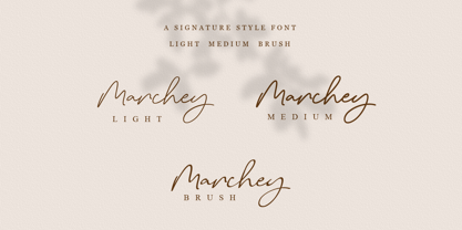 Marchey Signature is a versatile script font. Be mesmerized by its ravishing style and use it to create gorgeous wedding invitations, beautiful stationary art, eye-catching social media posts and more! What's Included? Uppercase & Lowercase Numbers & Punctuation Alternatives & Ligatures Multilingual Support PUA encoded
 - Montesla Diamond by Letterena Studios,
$9.00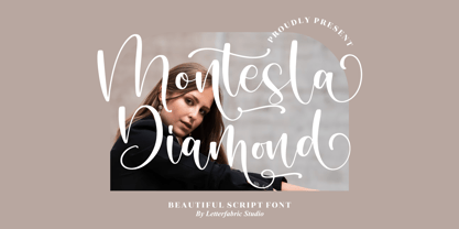 Montesla Diamond is an enchanting handwritten font. This versatile script font has a wide spectrum of applications ranging from greeting cards to headlines. Montesla Diamond is PUA encoded which means you can access all of the amazing glyphs and ligatures with ease!
 - Janji Cinta by Stringlabs Creative Studio,
$29.00 Janji Cinta is a lovely handwritten font, created with the help of a beautiful brush pen. Fall in love with its incredibly versatile style and use it to create gorgeous wedding invitations, beautiful stationary art, eye-catching social media posts, and much more!
 - Amity Signature by Lemonthe,
$13.00 Amity Signature is a stylish and versatile font family featuring four distinct weights: Light, Regular, Medium, and Bold. This collection offers an elegant impression and flexibility for all design needs, such as logos, branding, signatures, posters, labels, product packaging, invitation designs, and more.
 - MBF Nanomaton by Moonbandit,
$19.00 Nanomaton is a thin modern minimalist sans serif display font, with a lot of geometric shape and a bit of futuristic scifi flair. This typeface is versatile enough to be applied to multi-purpose projects. Nanomaton emphasize on clean, clarity and minimalism.
 - Emmy by Emily Lime,
$19.00 Emmy is the second family from this up and coming foundry. A versatile font, Emmy has many different styles to suit your needs. Easy to read and fun to use...it's perfect for a children's book, logo or other cool design project!
 - Simple Monologue by Konstantine Studio,
$15.00 Simple Monologue, a beautiful casual modern calligraphy font. Contemporary script style that hit the trends nowadays. It would be a perfect mate for branding, logo, fashion stuff, cosmetic, apparel, journal, lookbook, greeting cards, a fancy presentation, glamor appearance, magazine. So versatile, right?
 - Wandering Phantom by Letterhend,
$15.00 Introducing Wandering Phantom, a font that beckons you into terror and fascination collide. Whether you're evoking horror aesthetics or weaving a web of scary sophistication, Nightmare Glyph's versatility knows no bounds. Features : Uppercase & lowercase Numbers and punctuation Alternates/Ligatures Multilingual PUA encoded
 - Dreamfoster by Balpirick,
$15.00 Dreamfoster is a cute and sweet handwritten font. Its casual charm makes it appear wonderfully down-to-earth, readable and, ultimately, incredibly versatile. Dreamfoster will look outstanding in any context, whether it’s being used on busy backgrounds or as a standalone headline!


