10,000 search results
(0.023 seconds)
- Bud Easy - Unknown license

- Bud Easy - Unknown license

- Remington - Unknown license

- Big Country by Robert Petrick,
$19.95 Big Country is a versatile bold new font that is great for headlines or product logos. It is an elegant design but can also be used playfully. "Big Country" is easy to read even at fairly small point sizes.
 - Joyscript Two by Jonahfonts,
$35.00 Joyscript-Two is an upgrade of the 'Plain-Joyscript' Font containing many more ligatures which makes it much more versatile and may be applied to many applications including headlines, logos, ads, captions, packaging, bulletins, posters, books and greeting cards.
 - Muraba by NamelaType,
$19.00 Muraba Font is a one-of-a-kind, bold vintage serif display typeface, defined by its distinctively thick, squared-off serifs that offer decorative flair. This versatile typeface is ideal for various applications, including logos, headers, and display text
 - Atlantis by Solotype,
$19.95This is Solotype's alternative sans serif version of the once popular caps-only font Atlanta issued by the Central Type Foundry in St. Louis in 1885. As we often do, we have created a lowercase, adding to its versatility. - Willgray by NicolassFonts,
$35.00 The Willgray family offers three options: A, B, and C, each equipped with 20 fonts. This versatile family is ideal for a wide range of applications, including signage, packaging, brand identity, software, editorial design, and web and screen design.
 - Yang by Wiescher Design,
$39.50 Yang is a new Sans typeface that has a little bit of Ying in it. This combination makes it a very versatile font. Just give it a try and you will see. Yours working on the "Ying", Gert Wiescher
 - Jacaranda JNL by Jeff Levine,
$29.00Jacaranda JNL is a casual and fun font—resembling lettering made with the broad side of a chisel-tipped marker. Perfect for anything that is relaxed and not-too-serious, it is flexible and versatile for many ad projects. - Dutch Brigade by Typefactory,
$14.00 Brickson is a distinct, elegant serif that blends traditional influences into a contemporary aesthetic. Elegantly crafted and easily be matched to an incredibly large set of projects. Use Brickson to achieve an exquisite, yet subtle look and maximum versatility.
 - Midnight Glamour by Typestory,
$10.00 Midnight Glamour is an incredibly elegant and versatile duo font (script and serif). Whether you’re looking for fonts for Instagram or calligraphy scripts for DIY projects, this font will turn any creative idea into a true piece of art!
 - Brickson by Typefactory,
$14.00 Brickson is a distinct, elegant serif that blends traditional influences into a contemporary aesthetic. Elegantly crafted and easily be matched to an incredibly large set of projects. Use Brickson to achieve an exquisite, yet subtle look and maximum versatility.
 - Hypatia by Adobe,
$35.00Hypatia Sans is a geometric sans serif with humanist undertones. Its rich features and wide range of weights make this family both versatile and expressive at larger sizes yet still clear and readable at text sizes in short paragraphs. - Eclipse by Monotype,
$29.99A quirky face with a distinct personality, Eclipse is good for logotypes and packaging. The Eclipse font is not recommended for situations where legibility is essential, but more suited where the overall image is more important than the words. - Sweet Love Land by Persik Flor,
$10.00 Sweet Love Land is a decorative font family with heart-shaped forms, perfect for various uses like weddings, greeting cards, and more. It supports multiple languages, including German and Dutch (ẞ, IJ, ij), making it versatile for creative projects.
 - Venti CF by Connary Fagen,
$35.00 Venti CF is a geometric font family with a warm, engaging character. Inviting and versatile, Venti's subtle human overtones are well suited to headlines, logos, and short text. Venti includes Latin and Cyrillic scripts across eight weights with obliques.
 - Vendetta by Emigre,
$69.00 The famous roman type cut in Venice by Nicolas Jenson, and used in 1470 for his printing of the tract, De Evangelica Praeparatione, Eusebius, has usually been declared the seminal and definitive representative of a class of types known as Venetian Old Style. The Jenson type is thought to have been the primary model for types that immediately followed. Subsequent 15th-century Venetian Old Style types, cut by other punchcutters in Venice and elsewhere in Italy, are also worthy of study, but have been largely neglected by 20th-century type designers. There were many versions of Venetian Old Style types produced in the final quarter of the quattrocento. The exact number is unknown, but numerous printed examples survive, though the actual types, matrices, and punches are long gone. All these types are not, however, conspicuously Jensonian in character. Each shows a liberal amount of individuality, inconsistency, and eccentricity. My fascination with these historical types began in the 1970s and eventually led to the production of my first text typeface, Iowan Old Style (Bitstream, 1991). Sometime in the early 1990s, I started doodling letters for another Venetian typeface. The letters were pieced together from sections of circles and squares. The n, a standard lowercase control character in a text typeface, came first. Its most unusual feature was its head serif, a bisected quadrant of a circle. My aim was to see if its sharp beak would work with blunt, rectangular, foot serifs. Next, I wanted to see if I could construct a set of capital letters by following a similar design system. Rectangular serifs, or what we today call "slab serifs," were common in early roman printing types, particularly text types cut in Italy before 1500. Slab serifs are evident on both lowercase and uppercase characters in roman types of the Incunabula period, but they are seen mainly at the feet of the lowercase letters. The head serifs on lowercase letters of early roman types were usually angled. They were not arched, like mine. Oddly, there seems to be no actual historical precedent for my approach. Another characteristic of my arched serif is that the side opposite the arch is flat, not concave. Arched, concave serifs were used extensively in early italic types, a genre which first appeared more than a quarter century after roman types. Their forms followed humanistic cursive writing, common in Italy since before movable type was used there. Initially, italic characters were all lowercase, set with upright capitals (a practice I much admire and would like to see revived). Sloped italic capitals were not introduced until the middle of the sixteenth century, and they have very little to do with the evolution of humanist scripts. In contrast to the cursive writing on which italic types were based, formal book hands used by humanist scholars to transcribe classical texts served as a source of inspiration for the lowercase letters of the first roman types cut in Italy. While book hands were not as informal as cursive scripts, they still had features which could be said to be more calligraphic than geometric in detail. Over time, though, the copied vestiges of calligraphy virtually disappeared from roman fonts, and type became more rational. This profound change in the way type developed was also due in part to popular interest in the classical inscriptions of Roman antiquity. Imperial Roman letters, or majuscules, became models for the capital letters in nearly all early roman printing types. So it was, that the first letters in my typeface arose from pondering how shapes of lowercase letters and capital letters relate to one another in terms of classical ideals and geometric proportions, two pinnacles in a range of artistic notions which emerged during the Italian Renaissance. Indeed, such ideas are interesting to explore, but in the field of type design they often lead to dead ends. It is generally acknowledged, for instance, that pure geometry, as a strict approach to type design, has limitations. No roman alphabet, based solely on the circle and square, has ever been ideal for continuous reading. This much, I knew from the start. In the course of developing my typeface for text, innumerable compromises were made. Even though the finished letterforms retain a measure of geometric structure, they were modified again and again to improve their performance en masse. Each modification caused further deviation from my original scheme, and gave every font a slightly different direction. In the lower case letters especially, I made countless variations, and diverged significantly from my original plan. For example, not all the arcs remained radial, and they were designed to vary from font to font. Such variety added to the individuality of each style. The counters of many letters are described by intersecting arcs or angled facets, and the bowls are not round. In the capitals, angular bracketing was used practically everywhere stems and serifs meet, accentuating the terseness of the characters. As a result of all my tinkering, the entire family took on a kind of rich, familiar, coarseness - akin to roman types of the late 1400s. In his book, Printing Types D. B. Updike wrote: "Almost all Italian roman fonts in the last half of the fifteenth century had an air of "security" and generous ease extremely agreeable to the eye. Indeed, there is nothing better than fine Italian roman type in the whole history of typography." It does seem a shame that only in the 20th century have revivals of these beautiful types found acceptance in the English language. For four centuries (circa 1500 - circa 1900) Venetian Old Style faces were definitely not in favor in any living language. Recently, though, reinterpretations of early Italian printing types have been returning with a vengeance. The name Vendetta, which as an Italian sound I like, struck me as being a word that could be taken to signifiy a comeback of types designed in the Venetian style. In closing, I should add that a large measure of Vendetta's overall character comes from a synthesis of ideas, old and new. Hallmarks of roman type design from the Incunabula period are blended with contemporary concerns for the optimal display of letterforms on computer screens. Vendetta is thus not a historical revival. It is instead an indirect but personal digital homage to the roman types of punchcutters whose work was influenced by the example Jenson set in 1470. John Downer.
 - The _a e i o u font by Pia Frauss is a visually striking typeface that embodies a unique blend of artistry and emotion, drawing its inspiration from the elemental sounds of the human voice. Crafted w...
- "I Still Know" stands out as a font that carries with it an aura of mystery and a distinct personality that seems to whisper secrets from the depths of its characters. Imagine each letter crafted wit...
- Akakios by Nantia.co,
$12.00 Akakios uppercase font is an adorable hand-made typeface with a lot of charisma. From “hand-written” quotes to product packaging, merchandise, and branding projects, this font is so versatile that it can cover them all. Greek character set included.
 - Avolus by Kaidosan,
$15.00 Avolus is a cool display font, comprised of a modern and unique style. Fall in love with its incredibly versatile style and use it to create gorgeous wedding invitations, beautiful stationary art, eye-catching social media posts, and much more
 - Ratfern by Muksal Creatives,
$10.00 Raftern is a unique and modern family of Sans serif fonts. Simply Conception has 10 families Regular font, starting from the small thin to the largest Heavy. This typeface is versatile and can be used successfully in magazines, posters, branding, websites.
 - Lacerika by Iwm Design,
$10.00 Introducing Lacerika font family, a versatile and sleek sans serif font designed to elevate your projects, whether you're creating a stunning website, captivating app, eye-catching brochure, or unforgettable branding materials. Unlock the potential of your creativity with Lacerika today!
 - Mercenary by Miller Type Foundry,
$35.99 Mercenary is a geometric font family made up of seven weights with italics. Great for almost any use, Mercenary is a versatile workhorse typeface. Mercenary has a neutral feel, allowing it to be used on numerous projects across different platforms.
 - Thitheri by RagamKata,
$14.00 Introducing Thitheri – the font that's here to infuse your creative projects with a delightful '70s retro charm! Thitheri also includes a unique set of 26 special alternates. These alternates provide you with even more creative freedom and versatility for your projects.
 - Sachsenwald by Monotype,
$50.99 Toshi Omagari’s revived Sachsenwald design can be the perfect choice for distinctive headlines and brand identities for music, movies, video games and more. The revised design includes a regular and light weight – maintaining its distinctive design traits and adding more versatility.
 - Camelleon by Balpirick,
$15.00 Camelleon is a monoline handwritten font. Its casual charm makes it appear wonderfully down-to-earth, readable and, ultimately, incredibly versatile. Camelleon will look outstanding in any context, whether it’s being used on busy backgrounds or as a standalone headline!
 - Dear Sunshine by Almarkha Type,
$29.00 Dear Sunshine is sweet and playful, but also elegant. This versatile script font has a wide range of applications ranging from greeting cards to kids’ crafts, and is guaranteed to add a sweet touch to your next design. Thank You.
 - Anantason Reno by Jipatype,
$17.00 Anantason Reno is a versatile sans-serif typeface that offers a range of 162 styles, spanning from thin to black in weight and ultra-condensed to ultra-expanded in width. Its adaptability makes it well-suited for a variety of purposes.
 - Valemon by Balpirick,
$15.00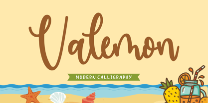 Valemon is a fancy handwritten fonts. It features gorgeous ligatures that make this script incredibly versatile. Whether you’re looking for fonts for Instagram or calligraphy scripts for DIY projects, Valemon will turn any creative idea into a true piece of art!
 - Retrade by Muksal Creatives,
$14.00 Retrade is a unique and modern family of Sans serif fonts. Simply Conception has 9 families Regular font, starting from the small thin to the largest Black. This typeface is versatile and can be used successfully in magazines, posters, branding, websites.
 - SomaSlab Tall by ArtyType,
$19.00 SomaSlab Tall has all the same characteristics as SomaSlab, transferred into a style which has been condensed along the horizontal axis only. Available in 2 weights, XBold & Heavy, with an extended Latin character set and several glyph alternates for maximum versatility.
 - Bread Story by DLetters Studio,
$14.00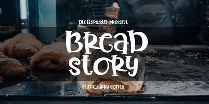 Introducing Bread Story, a set of unique and fun handwritten fonts, the style is simple and friendly. Bread Story is very versatile to implement a variety of creative ideas, such as Crafts, Cakes, T-shirts, Fashion, Quotes, Mugs, and Others.
 - Malamondo by Fenotype,
$19.95 Malamondo is a versatile and effective all caps display font. Each version has 200 interlock ligatures that will help you to create custom looking designs. To access the ligatures you only need to write in CAPS in any Opentype supporting program.
 - Seriatim by David Thometz Design,
$24.95 As seen on Typophile.com, DTD Seriatim is a new and innovative take on the geometric sans-serif, with a wide variety of alternate characters and elegant ornaments to make it a highly versatile type for display or more discreet text use.
 - Chalister by Namara Creative Studio,
$9.00 a classic, clean, and versatile sans-serif font inspired by minimalism contemporary font. Included uppercase, lowercase, numeral, ligatures, alternates and multilingual support. Perfect for headlines, product package / labels, photography, watermark, logos, or any project that requires a classic sans serif.
 - Dalime by Letterena Studios,
$10.00 Dalime is an elegant and stylish serif font. It is PUA encoded which means you can access all of the glyphs and swashes with ease! Fall in love with its incredibly versatile style and use it to create spectacular designs!
 - Sugar Joint by PizzaDude.dk,
$15.00 Sugar Joint is a simple and legible sans serif font. It has a loose and easy look, which makes it very suitable for children's books or toys, candy labels, cereal, or perhaps even labels for organic products. It's 100% handmade!
 - Gangsar by Surotype,
$20.00 Gangsar is a Condensed typefamily, Inspired by Enge Hermes (1935). Having 6 weights including italic version, strong character, Sharp edges and proportional contrast. The typeface is versatile and can be successfully used in Branding, Posters, Magazines, Websites, Mobile Apps, etc.*


