10,000 search results
(0.026 seconds)
- Symcaps Vario X1 by Deniart Systems,
$20.00
- Varius Multiplex Multiformis by Intellecta Design,
$17.90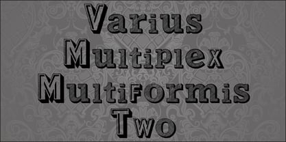
- Symcaps Vario X3 by Deniart Systems,
$20.00
- Hebrew Ariel Tanach by Samtype,
$189.00
- Varet Gothic Soft by Elyas Beria,
$9.00
- Symcaps Vario X2 by Deniart Systems,
$20.00
- Janda Closer To Free - Personal use only

- SPARKS Free for All - Unknown license

- Free Form Retro JNL by Jeff Levine,
$29.00
- Free Form Showcard JNL by Jeff Levine,
$29.00
- Janda Closer To Free by Kimberly Geswein,
$5.00
- Bodoni Classic Free Style by Wiescher Design,
$39.50
- Futurex Variation Alpha Hollow - Unknown license

- Varial Two Super Rounded by Paavola Type Studio,
$21.00
- VelvetQuilt Display font - Personal use only

- Kick The Font - Personal use only

- Kawaii Food Font - Personal use only

- BILLY ARGEL FONT - Personal use only

- FC Basic Font - Unknown license

- A Charming Font - Personal use only

- el&font gohtic! - Unknown license

- <El&Font! Brush> - Unknown license

- El&Font Tag! - Unknown license

- Simpsons Mmmm...Font - Unknown license

- HELLO WEEN FONT - Personal use only

- National First Font - Unknown license

- 20th Century Font - Unknown license

- (el&font BLOCK) - Unknown license

- The Go Font - 100% free

- My Left Font - Unknown license

- Failed Font 2 - Unknown license

- nya-memo Font - Unknown license

- Tour de Font - 100% free

- Sonic Mega Font - Unknown license

- T-piyo Font - Unknown license

- KISS My Font - Unknown license

- The Real Font - Unknown license

- Ste-ani Font - Unknown license

- The Guru Font - Unknown license

- Petit-w Font - Unknown license


