10,000 search results
(0.056 seconds)
- Zany Route by Putracetol,
$22.00 Zany Route is a delightful and rounded typeface designed to rev up the fun in transportation-themed projects. With its playful and engaging style, it's the perfect addition to any creative project. Whether used on its own or combined with any of its eleven thematic variations, Zany Route is sure to transport your designs to a world of joy and adventure. This font offers eleven distinct variations inspired by transportation, including planes, cars, gears, motorcycles, trucks, and more. It's the ideal choice for designs related to transportation, catering to children and crafters alike. Zany Route is your ticket to logos, children's themes, crafting, invitations, packaging, posters, titles, businesses, greeting cards, stickers, children's books, magazines, and any designs connected to the world of transportation.
 - Bandung Style by Sensatype Studio,
$15.00 Bandung is A Beauty Retro Vintage Ligature font that special crafted with carefully to leverage your design project A new font that we created special for branding needs, with unique characters and awesome ligature characters are ready to add value of your brand. It so nice to leverage designer or product owner that need solutions to make their design look more beauty and modern. And specially for Bandung font, We prepared any ligature characters to help you create unlimited variations for your creative needs. Bandung Beauty Retro Vintage Ligature font ready with: Any options to get creative variations (combination of Ligature) Preview as a inspirations that you can do with Bandung font Ready with Lowercase and Uppercase characters Wish you enjoy our font. :)
 - Monotype Goudy by Monotype,
$40.99Over the course of 50 years, the charismatic and enterprising Frederic W. Goudy designed more than 100 typefaces; he was the American master of type design in the first half of the twentieth century. Goudy Old Style, designed for American Type Founders in 1915-1916, is the best known of his designs, and forms the basis for a large family of variants. Goudy said he was initially inspired by the cap lettering on a Renaissance painting, but most of the flavor of this design reflects Goudy's own individualistic style. Recognizable Goudy-isms include the upward pointing ear of the g, the diamond-shaped dots over the i and j, and the roundish upward swelling of the horizontal strokes at the base of the E and L. The italic was completed by Goudy in 1918, and is notable for its minimal slope. Goudy Bold (1916-1919) and Goudy Extra Bold (1927) were drawn not by Goudy, but by Morris Fuller Benton, who was ATF's skillful in-house designer. Goudy Catalogue was drawn by Benton in 1919-1921 and was meant to be a medium weight of Goudy Old Style. Goudy Heavyface was designed by Goudy for Monotype in 1925, and was intended to be a rival to the successful Cooper Black. Goudy Modern was designed by Goudy in 1918; its small x-height, tall ascenders and shorter caps impart a spacious and elegant feeling. Benton designed Goudy Handtooled, the shaded version that has just a hairline of white through its bold strokes. The Goudy faces, especially the bolder weights, have long been popular for display and advertising design. They continue to pop up all over the world, and still look reassuring to our modern eyes." - Goudy Ornate MT by Monotype,
$29.99Over the course of 50 years, the charismatic and enterprising Frederic W. Goudy designed more than 100 typefaces; he was the American master of type design in the first half of the twentieth century. Goudy Old Style, designed for American Type Founders in 1915-1916, is the best known of his designs, and forms the basis for a large family of variants. Goudy said he was initially inspired by the cap lettering on a Renaissance painting, but most of the flavor of this design reflects Goudy's own individualistic style. Recognizable Goudy-isms include the upward pointing ear of the g, the diamond-shaped dots over the i and j, and the roundish upward swelling of the horizontal strokes at the base of the E and L. The italic was completed by Goudy in 1918, and is notable for its minimal slope. Goudy Bold (1916-1919) and Goudy Extra Bold (1927) were drawn not by Goudy, but by Morris Fuller Benton, who was ATF's skillful in-house designer. Goudy Catalogue was drawn by Benton in 1919-1921 and was meant to be a medium weight of Goudy Old Style. Goudy Heavyface was designed by Goudy for Monotype in 1925, and was intended to be a rival to the successful Cooper Black. Goudy Modern was designed by Goudy in 1918; its small x-height, tall ascenders and shorter caps impart a spacious and elegant feeling. Benton designed Goudy Handtooled, the shaded version that has just a hairline of white through its bold strokes. The Goudy faces, especially the bolder weights, have long been popular for display and advertising design. They continue to pop up all over the world, and still look reassuring to our modern eyes." - Franzi by Wannatype,
$26.00 The new sans-serif Franzi typeface family – as neutral as can be, but at the same time individual and striking. Its unmistakable character lies in the detail, with no effect pushing itself to the fore. As a wide-running typeface with a relatively large x-height, the typeface family is perfectly suited to small text sizes but, with its elegant details, it leaves nothing to be desired in display applications either. Originally designed with constructed, often rectangular elements, Franzi has gradually been rounded during the development process and is now less hard in order to guarantee optimal legibility. A total of 20 well-developed fonts are available: 10 line thicknesses from hairline to black, each of which can be upright and italic. The italics are softly and elegantly drawn, while the upright characters appear much more severe. The design appeal reveals itself in the two-storey ‘a’ – a tribute to legibility in body copy; however, for those who prefer the geometric in applications, an alternative single-storey ‘a’ is also available. All styles have small caps, superscript and subscript lowercase letters, lining, non-lining and small caps figures, fractions as well as several ligatures, alternative fonts, symbols and arrows. The Latin uppercase letters are also available as discreet swash variants. In addition to the extended Latin alphabet, the typeface family also includes the complete Greek, Cyrillic and International Phonetic Alphabet IPA. Franzi was created as a further development of an order to produce a sign for a therapy practice in Vienna’s Franz-Hochedlinger-Gasse – hence the name, which is more common as an abbreviation for Franziska than as a diminutive for the male name Franz: Franzi is therefore a hybrid typeface name which has female tendencies.
 - Goudy Handtooled by Monotype,
$40.99Over the course of 50 years, the charismatic and enterprising Frederic W. Goudy designed more than 100 typefaces; he was the American master of type design in the first half of the twentieth century. Goudy Old Style, designed for American Type Founders in 1915-1916, is the best known of his designs, and forms the basis for a large family of variants. Goudy said he was initially inspired by the cap lettering on a Renaissance painting, but most of the flavor of this design reflects Goudy's own individualistic style. Recognizable Goudy-isms include the upward pointing ear of the g, the diamond-shaped dots over the i and j, and the roundish upward swelling of the horizontal strokes at the base of the E and L. The italic was completed by Goudy in 1918, and is notable for its minimal slope. Goudy Bold (1916-1919) and Goudy Extra Bold (1927) were drawn not by Goudy, but by Morris Fuller Benton, who was ATF's skillful in-house designer. Goudy Catalogue was drawn by Benton in 1919-1921 and was meant to be a medium weight of Goudy Old Style. Goudy Heavyface was designed by Goudy for Monotype in 1925, and was intended to be a rival to the successful Cooper Black. Goudy Modern was designed by Goudy in 1918; its small x-height, tall ascenders and shorter caps impart a spacious and elegant feeling. Benton designed Goudy Handtooled, the shaded version that has just a hairline of white through its bold strokes. The Goudy faces, especially the bolder weights, have long been popular for display and advertising design. They continue to pop up all over the world, and still look reassuring to our modern eyes." - Goudy by Linotype,
$39.00Over the course of 50 years, the charismatic and enterprising Frederic W. Goudy designed more than 100 typefaces; he was the American master of type design in the first half of the twentieth century. Goudy Old Style, designed for American Type Founders in 1915-1916, is the best known of his designs, and forms the basis for a large family of variants. Goudy said he was initially inspired by the cap lettering on a Renaissance painting, but most of the flavor of this design reflects Goudy's own individualistic style. Recognizable Goudy-isms include the upward pointing ear of the g, the diamond-shaped dots over the i and j, and the roundish upward swelling of the horizontal strokes at the base of the E and L. The italic was completed by Goudy in 1918, and is notable for its minimal slope. Goudy Bold (1916-1919) and Goudy Extra Bold (1927) were drawn not by Goudy, but by Morris Fuller Benton, who was ATF's skillful in-house designer. Goudy Catalogue was drawn by Benton in 1919-1921 and was meant to be a medium weight of Goudy Old Style. Goudy Heavyface was designed by Goudy for Monotype in 1925, and was intended to be a rival to the successful Cooper Black. Goudy Modern was designed by Goudy in 1918; its small x-height, tall ascenders and shorter caps impart a spacious and elegant feeling. Benton designed Goudy Handtooled, the shaded version that has just a hairline of white through its bold strokes. The Goudy faces, especially the bolder weights, have long been popular for display and advertising design. They continue to pop up all over the world, and still look reassuring to our modern eyes." - Eksja by Protimient,
$29.00 Eksja is a modern slab serif available in four weights, each with a corresponding italic. All the fonts in the family have small caps, the extended latin character set, diacritical f-ligatures, enclosed numerals (numbers in circles) and case-sensitive punctuation. The general design of the typeface has been with a strong human touch in mind. The ends of the serifs have been given a subtle rounding, just enough to take the edge off which, when coupled with the largely humanist structure of the design, creates an open, friendly and approachable design, abandoning the usual geometric severity commonly associated with slab serif typefaces. Eksja contains quite a comprehensive numerals system. Obviously, each font has the standard proportionally and tabularly spaced lining and old-style figures but, crucially, the tabular numerals share the exact same width in each font variant. That means that you can choose to use the thin, regular, bold, black and their italic forms all in the same setting and they will always line up. In addition to the 'normal' numerals there are super-script and sub-script numerals and OpenType fractions that can be automatically composed as you type. There are also the enclosed numerals, numbers inside a circle, that are useful for numerically listing items and, thanks to the wizardry of OpenType, they can contain any number of digits (typically, enclosed numerals are precomposed single digits, only encompassing the 0–9 range, the enclosed numerals in Eksja can go to double digits, triple digits or, in fact, any number of digits*). *The automation of the enclosed numerals is accessed via either "Stylistic Set #1" or "Stylistic Alternates" which requires the use of an application that supports OpenType stylistic sets or stylistic alternates, such as Adobe's InDesign or Photoshop.
 - Cabrito Inverto by insigne,
$- Life’s always more fun when you reverse the stress. The same goes for the new member of the Cabrito family. Cabrito itself is a recently developed slab serif made for the kid’s book The Clothes Letters Wear. Cabrito proved to be more popular than I thought, and I promised I would create an inverted style for this new addition to the font world--a variant that would pair well with the original or even stand well on its own. And so now, here it is. Cabrito Inverto, which features the reversed stress of the strokes from a font’s “normal” traits. Inverted stress fonts are most often associated with cowboys and the Old West. The inverted stress gives it a happy-go-lucky appearance, not to be taken too seriously. It’s a pleasantly rounded, not-so-strictly geometric typeface with handwriting-inspired forms. Whew, that’s a mouthful! Inverto’s bundle of alternates is accessible in any OpenType-enabled program. It contains a workforce of alternates, swashes, and alternate titling caps to embellish the font. Also bundled are swash alternates, aged design and style figures, and compact caps. Peruse the PDF brochure to examine out these solutions in action. OpenType-enabled purposes such as Adobe suite or Quark will allow ligatures and alternates. This font family also includes the glyphs for 72 different languages. Cabrito Inverto does pair well with Cabrito. There is even an extra font weight, Black, for when you want to punch it up a bit. Jeremy Dooley designed Inverto to be a welcoming, day-to-day font family. Use it to express friendliness on just about anything, from candy to food to children’s toys. Cabrito Inverto’s one-of-a-kind visual appearance brings a bundle of fun to the party. Buy Cabrito Inverto to give a boost to your designs every day of the week.
 - Catalpa by TypeTogether,
$35.00 The Catalpa font family is José Scaglione and Veronika Burian’s wood type inspired design for an overwhelming headline presence. It has no regular weights, only four slender and four hulking weights. Catalpa wasn’t made to be normal; it was made to overwhelm, to stand out, to bellow. Catalpa is the first font family within a trilogy that will be released through 2020. Each of the three have a distinct purpose and their own look, but they serve a common goal: to act as a complete family covering an editorial’s wide array of needs. As the first of the three, Catalpa is the bookend font family with a headlining purpose. What requirements are there for a great headline typeface? Distinction, weight, and cohesiveness are a good start. Its distinctiveness must catch attention, it must have a range of weights applicable to its purpose, and its internal consistency and external look must create a cohesive family. Catalpa is a distinct and unified family whose weights are attuned to its single-minded purpose — headlines and large text. Catalpa has only eight styles that are divided into two ranges of weights — four very light weights (Hairline, Thin, Extralight, and Light ) and four very bold ones (Extrabold, Heavy, Black, and Extrablack). The thin and heavy ends of the spectrum also have their own variable fonts, each with one axis of weight so designers can fine-tune their work. The geometric influence of the design is more obvious in the light range, with their line thickness increasing in the classical manner. The bold weights increase more in width and substance to serve well in websites, mobile apps, posters, advertisements, and magazines that aim for impact more than spreading information. As a family, Catalpa gels in big headlines, short sentences, and isolated words. The family has many recognizable features, in the bolder weights especially, like the reversed contrast ‘S, s’ or the angular design of ‘Q, M, W, w, a, f, 2, 3’. Catalpa’s headlining mixture of geometry and quirkiness leaves an impression that is so characteristic of wood type, but designed for substrates and screens.
 - Parten by Surotype,
$20.00 Parten a typeface inspired by old motel signage. Available in two styles Regular and italic with alternative characters such as Stylistic Alternates, Stylistic Set, and Swash Variant. Parten very suitable to use on many of your design projects such as : Signage, Logotype, Headline, Packaging, and more. To enable the style alternative, you need a program that supports the opentype features.
 - Zipline by Device,
$39.00 Zipline is a geometric sans built from a folded line or ribbon. Contemporary and stylish, with a certain decorative flair. There are three variants that can can be freely mixed for effect - a solid version, a decorative lined version, and a half-solid version. Most effective used in short words or phrases at larger sizes, where the details can be appreciated.
 - Shine of Love by Namara Creative Studio,
$9.00 Cute and Playful display fonts crafted with heart, especially for you. It is perfect for children-themed designs, Such as t-shirt designs, story books, packaging, children’s activity or school projects, posters, greeting cards, valentine’s crafts, and more! Come in 03 variants : Regular, Shadow and Fun. So add it to your creative ideas and notice how it makes them stand out!
 - Hermist by Sans And Sons,
$9.00 Hermist - Elegant Serif Font by Sans and Sons Meet our Elegant Serif Font Duo – Extra Light and Italic. The Extra Light variant radiates timeless charm with delicate strokes, while the Italic adds a creative touch with its gentle slant. Together, they bring a natural, graceful beauty to your messages. With Elegant Style this is perfect for branding, logos, invitation, masterheads and more.
 - Tabela by aspect type,
$25.00 Tabela is a family of typefaces inspired by the aesthetics of monospaced fonts. Its design, based on the monospaced font, preserves its characteristic elements. Perfect for headlines, titles and logotypes, it also has an alternative, more neutral stylistic variant for projects that do not require such distinctive lettering. Its wide array of diacritics allows it to be used in most European languages.
 - NL Seasalt by Nicky Laatz,
$25.00 A breath of fresh air! Seasalt typeface was designed to emulate natural-looking handwritten notes. Opentype ligatures are included to make the typeface appear more realistic and last but not least, it includes a doodles font - arrows, scribbles and scrawls to help your designs pop! The typeface comes in three different variants to suit the look you are after : Upright, Regular and Slanted.
 - Lore by Dawnland,
$13.00 Lore - A handwritten Old English font for past, present & future Tomes, Bibles & Grimoires! Lore comes in 3 variants x 2 (regular & hollow) with different upper case letters: Nokturnia - ordinary Pandemonia - fiery swirls and curls Nekromantea - straight and harsh. The hollow versions, preferably used for headlines and display text, are the original hand drawn versions with more anchor points and intentional uneven line work.
 - Fruehling by RMU,
$30.00 Fruehling, first released by the Klingspor Brothers foundry in 1914, is a rather calligraphic blackletter font designed by Rudolf Koch. This font was completely redrawn and redesigned for contemporary usage. The font comes with old-style figures, and the letters d, e, g, n, and t have swash variants. It is recommended to use also the OT feature Discretionary Ligatures.
 - Allencon by Scriptorium,
$18.00Allencon is a lovely font based on freehand calligraphy. It has a bold, decisive look, with various aspects of the characters regularized to give a consistent appearance in print while preserving the personality of the lettering. It includes variant versions of many of the characters, particularly elongated characters for the ends of words at the ends of lines - great for poetry. - Mangoli by Gatype,
$14.00 Hi all, there is a new modern and unique Mangoli sant font, please have it immediately for a quality project. It comes in many styles, including fasteners. OpenType features include style sets, character variants, start and end forms, and multilingual support. The Mangoli font is suitable for branding logos, poster designs, t-shirts, invitations, designs for children, and editorial designs. Hope you enjoy!
 - Tabela Soft by aspect type,
$25.00 Tabela is a family of typefaces inspired by the aesthetics of monospaced fonts. Its design, based on the monospaced font, preserves its characteristic elements. Perfect for headlines, titles and logotypes, it also has an alternative, more neutral stylistic variant for projects that do not require such distinctive lettering. Its wide array of diacritics allows it to be used in most European languages.
 - Bright Almond by Zeenesia Studio,
$16.00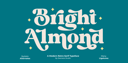 Introducing Bright Almond Bright Almond is a modern and elegant serif font. Bright Almond is well-suited for advertising, branding, logotypes, packaging, titles, headlines and editorial design. I created more much alternates variant and much natural ligatures to make this font very classy and look so beauty. Bright Almond was built with open type features make your project will be perfect.
 - Owah Tagu Siam NF by Nick's Fonts,
$10.00Not your garden-variety utility typeface but, if you need a faux Thai font, this is the one for you. The upper and lowercase positions feature variant letterforms, so you can mix and match to create JUST the look you're after. This font contains the complete Latin language character set (Unicode 1252) plus support for Central European (Unicode 1250) languages as well. - Holand Century by Fargun Studio,
$19.00 Holand Century is classified as a contemporary display grotesque font. It features sharp and dynamic strokes, a strong contrast between thick and thin lines, and delicate pointed grotesque elements. Its extensive set of styles, versatile usage, and support for various languages make it a valuable tool for designers looking to create clean, elegant, and visually striking typography for a wide range of applications.
 - Divina by Sudtipos,
$35.00 Divina is a Latinized digitization of one of German calligraphy master Rudolph Koch's typefaces. The original typeface, Kurrent, was designed in 1927 and cut in 1935. Its shapes are a variant of the German script to be used as a model for writing in schools at the time. This is the first time Koch's rendition of this particular blackletter calligraphy was ever digitized.
 - Unnerving JNL by Jeff Levine,
$29.00 Unnerving JNL is a distorted/distressed version of Adhesive Serif Letters JNL (of which the original design was modeled after some vintage gummed letters used for signage). This new variant evokes a feeling of apprehension, dread or fear and can be applied to any project with a spooky or sinister theme. Unnerving JNL is available in both regular and oblique versions.
 - Sugar Magic by Zeenesia Studio,
$15.00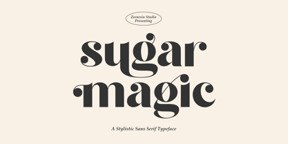 ntroducing Sugar Magic Sugar Magic is a modern and elegant sans serif font. Sugar Magic is well-suited for advertising, branding, logotypes, packaging, titles, headlines and editorial design. I created more much alternates variant and much natural ligatures to make this font very classy and look so beauty. Sugar Magic was built with openType features make your project wil be perfect.
 - Quadrivium NF by Nick's Fonts,
$10.00A classic typeface with timeless appeal, based on the venerable Weiss Initials II, designed by Eric Rudolf Weiss for Bauersche Gießerei in 1931. Essentially a monocase font, this version also includes variants located at lowercase a, e and g. Both versions of this font contain the Unicode 1252 (Latin) and Unicode 1250 (Central European) character sets, with localization for Romanian and Moldovan. - Santi by Latinotype,
$39.00 Santi, our new grotesque font offers 9 weight variants along with their corresponding italics. This typeface perfectly blends a classic character with sublime modern touches, creating a striking aesthetic without resorting to fanfare. Santi's versatility transcends current trends and gives it a timeless quality. This typeface blends effortlessly into classic or contemporary projects, offering a perfect balance between the familiar and the innovative.
 - Brendiva by Digitype Studio,
$20.00 Introducing the Brendiva font family, a display font with 14 variants, comprising 7 upright and 7 italicized characters. Its clean and orderly design imparts a professional impression, while the high contrast in certain letters adds a unique and beautiful touch. It is perfectly suited for diverse design projects including logos, branding, magazines, packaging, labels, books, fashion, novels, makeup, and any advertising purpose.
 - OL Hebrew Qumran Torah by Dennis Ortiz-Lopez,
$30.00 This font contains every variant found in the Hebrew Bible such as the “mutilated” Waw in Numbers 25: verse 12, the small Heh in Genesis 2: verse 4 and the Nun Inversum before Numbers 10: verse 35 and after verse 36 and elsewhere as well as certain oversized consonants such as the Shin with hireq from the beginning of the Song of Songs.
 - Mango Vintage by Zeenesia Studio,
$16.00 Introducing Vintage Mango Vintage Mango is a modern and elegant sans serif font. Vintage Mango is well-suited for advertising, branding, logotypes, packaging, titles, headlines and editorial design. I created more much alternates variant and much natural ligatures to make this font very classy and look so beauty. Vintage Mango was built with open type features make your project will be perfect.
 - Stonecross by Scriptorium,
$18.00People are always asking us for chiseled-stone style fonts, so we thought we'd give them what they want, but with a slightly different spin. Stonecross has the look of classic Celtic uncial lettering as it would look if it was cut in stone, with some fanciful variant character forms and the nicks and chips which give it the look of stone. - Masserini by Studio Sun,
$16.00 Masserini is inspired by the 20's art deco era of colorful posters, fonts, and typography with a vintage flair. With its strong geometric shapes and letters, like a style of sans serif that was used in signs and posters during that time period. This collection consists of a variety of widths, weights, and variants to suit your creative needs.
 - Norden Display by Asgeir Pedersen,
$19.99 The name Norden means “the Nordic”, as in the geographical area or its countries. Inspired by the simplicity of Nordic and Scandinavian design, the Norden fonts give you clarity of expression, beyond the usual geometric look and feel of traditional sans-serifs. Open and spacious, the shapes of the glyphs play both with and against each other. Round and soft versus square and solid, a basic curve versus a straight line, creating a detached yet distinct style of expression, from the light-as-air Hairline to dark and Bold. The Display variant has diagonal as well as slightly rounded ends, similar to the Standard version but with and edge, so to say. As its name suggests, this font is intended for use in headlines and/or for small chunks of text at medium and large sizes. Norden comes in three variants: Standard, Round and Display.
 - Korneuburg Slab Regular, crafted by the talented designer flö rastbichler, beautifully marries the timeless essence of slab serif fonts with contemporary design nuances, creating a versatile and robu...
- Kobern by The Northern Block,
$19.30 A strong, horizontal sans serif typeface. The letterforms distinct lateral emphasis combined with condensed proportions helps improve readability and use of space across layouts. Ideally suited for a wide range of modern applications, details include 9 weights with italics, 540 characters, 5 variations of numerals, manually edited kerning and Opentype features.
 - Charme by Linotype,
$29.99In 1957, Helmut Matheis designed Charme for the Ludwig and Mayer type foundry, located in Frankfurt am Main, Germany. This informal script is of medium weight and has some variation of color. The caps are flowing and the lower case letters are close fitting. Their is a bold companion, called Slogan. - Cocomate by 4RM Font,
$35.00 Inspired by classic art, the cocomate font is the epitome of beauty and strong authenticity that is embodied in the art of typography. made with the characteristic variations of italic contrast and bold size in the letters. suitable for use in graphic designs such as logos, labels, packaging and others.
 - Slow Foot by PizzaDude.dk,
$15.00 What's the hurry? Take your time! Take the first step with your Slow Foot and something (good) will show! :) A fun font with contextual alternates that leaves you with 6 different versions of each letter. That's really nice when you want to spice up the variation of letters as you write.