10,000 search results (0.011 seconds)
  1. kooler O - 100% free
  2. (((O))) Basic - 100% free
  3. Jack O - Unknown license
  4. Jackie O by TypeSETit, $24.95
  5. Gal Sans O Type by O Type Foundry, $29.00
    O Type Foundry published the unique 'Geometric Mechanic Sans Serif' in 2023, a typeface that Galang Persada had been perfecting since 2013. Attention all graphic designers! Are you tired of using the same old fonts and design elements in your projects? Look no further than Gal Sans, the newest geometric mechanic sans serif font on the market. With its clean lines and modern aesthetic, Gal Sans is the perfect addition to any designer’s toolkit. Its versatility makes it suitable for a wide range of design projects, from logos to website text. Plus, its minimalist design adds an elegant touch to any composition. Don’t settle for ordinary – elevate your designs with Gal Sans. Try it out today!
  6. Collective O BRK - Unknown license
  7. Collective O (BRK) - Unknown license
  8. o-wee-ental - Unknown license
  9. cart o grapher - Unknown license
  10. Amalgamate O BRK - Unknown license
  11. Knick O Teen - Unknown license
  12. Plain O Matic - Unknown license
  13. P22 Daddy-O by P22 Type Foundry, $24.95
    Based on the lettering and graphic design of the Beat Generation era, Daddy-O was produced in conjunction with the Whitney Museum of American Art to coincide with the exhibition Beat Culture and the New America: 1950-1965. These way gone fonts and extras both capture and affectionately satirize the graphic design of the era. Package now features poet Rod McKuen in an updated version of the Beatsville album cover from 1959.
  14. Marker O Type by O Type Foundry, $15.00
    Introducing, Marker O Type. Marker O Type is new signature font like a child's handwriting. The unique typeface brush also feels childish look similar like comic sans. Great for body text in comic book. A unique brush typeface with chill out. This font is perfectly made to be applied mainly in logos and various other formal forms such as invitations, labels, magazines, books, greeting / wedding cards, packaging, fashion, make up, stationery, novels, labels or any type of advertising purpose.
  15. Ring O Fire by Cool Fonts, $24.00
    Ring O Fire was inspired by a game I used to play where you suspend a coin over a glass with a paper napkin and take turns burning holes in the napkin with a cigarette until the coin drops. Is that weird or what?
  16. Hell O Ween by Forberas Club, $16.00
    Introducing Hell O Win by forberas, This font born to be a Halloween Project. But still can be made as a display font, and still suit your other fun project. Your review and response are most welcome.
  17. Card-O-Mat by PintassilgoPrints, $30.00
    Card-O-Mat is an inspiring font family that makes it easy to design awesome greeting cards for many occasions. Each font is packed with an impressive number of items, check out the glyphs map and get surprised! Card-O-Mat Messages font counts more than 170 unique lettering designs, with a great assortment of messages. From an effusive ‘Happy Birthday’ to a sensible ‘Thank You’, you'll find charming choices for many situations. Card-O-Mat BuddyBirds brings more than 180 picture elements, comprising a pocketful of birds and handy adornments such as flowers, leaves, stars, clouds, speech bubbles and so on. Beyond making a perfect pair with Card-O-Mat Messages, it also goes brilliantly well with our hand-crafted fonts, like Populaire, Oyster, Berimbau, Amarelinha and many others. Pick the ones that fit you better and happy card making!
  18. O-Berta SB by Scangraphic Digital Type Collection, $26.00
    Since the release of these fonts most typefaces in the Scangraphic Type Collection appear in two versions. One is designed specifically for headline typesetting (SH: Scangraphic Headline Types) and one specifically for text typesetting (SB Scangraphic Bodytypes). The most obvious differentiation can be found in the spacing. That of the Bodytypes is adjusted for readability. That of the Headline Types is decidedly more narrow in order to do justice to the requirements of headline typesetting. The kerning tables, as well, have been individualized for each of these type varieties. In addition to the adjustment of spacing, there are also adjustments in the design. For the Bodytypes, fine spaces were created which prevented the smear effect on acute angles in small typesizes. For a number of Bodytypes, hairlines and serifs were thickened or the whole typeface was adjusted to meet the optical requirements for setting type in small sizes. For the German lower-case diacritical marks, all Headline Types complements contain alternative integrated accents which allow the compact setting of lower-case headlines.
  19. Pind-O-Rama by PintassilgoPrints, $24.00
    Pind-O-Rama is quite an unconventional font, with strange counters and shapes and choices and interlocks that just stand out. For sometimes fitting in is absolutely not wanted. Pindorama is how the native Tupi people originally called Brazil before colonization by the Portuguese. This font draws inspiration from a book on Brazil colonial background, precisely from a 1961 edition - the book was first published in 1943. Unfortunately the cover design is uncredited. Why fit in? Let's stand out!
  20. O-Anton SB by Scangraphic Digital Type Collection, $26.00
    Since the release of these fonts most typefaces in the Scangraphic Type Collection appear in two versions. One is designed specifically for headline typesetting (SH: Scangraphic Headline Types) and one specifically for text typesetting (SB Scangraphic Bodytypes). The most obvious differentiation can be found in the spacing. That of the Bodytypes is adjusted for readability. That of the Headline Types is decidedly more narrow in order to do justice to the requirements of headline typesetting. The kerning tables, as well, have been individualized for each of these type varieties. In addition to the adjustment of spacing, there are also adjustments in the design. For the Bodytypes, fine spaces were created which prevented the smear effect on acute angles in small typesizes. For a number of Bodytypes, hairlines and serifs were thickened or the whole typeface was adjusted to meet the optical requirements for setting type in small sizes. For the German lower-case diacritical marks, all Headline Types complements contain alternative integrated accents which allow the compact setting of lower-case headlines.
  21. Pep O Mint Normal - Unknown license
  22. Unexplored Galaxies O BRK - Unknown license
  23. Typesource Extol O BRK - Unknown license
  24. Your Complex O BRK - Unknown license
  25. Quill Experimental O BRK - Unknown license
  26. Web-o-Mints GD by Galapagos, $19.00
    George Ryan’s font of typographic ornaments and borders, available as a free download from Galápagos.
  27. F. O. T. R. by JAF 34, $9.90
    F. O. T. R. is experimental sans serif display font. Space travelling is near so I decided to bring you a brand new typeface based on insight into the future. Clean shapes, a lot of atypical alternates and the futuristic appearance. F. O. T. R. typeface is conceptually connected with a chronophotography project FUTURE OF THE RHYTHM.
  28. Vin Sans Pro by Mint Type, $35.00
    Vin (translated from Ukrainian as “he”) is a superfamily consisting of three robust typefaces with pronounced vertical stems and rounded corners. All three typefaces feature very large x-height for even more expression and assertiveness. Vin Sans Pro is a quite narrow rigid sans-serif typeface with extra-large x-height and rounded corners. It is perfect for any kind of short copy with lots of attention guaranteed. Be sure to check other two typefaces of Vin superfamily: Vin Slab Pro and Vin Mono Pro .
  29. Van Dijk by URW Type Foundry, $79.99
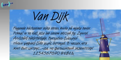
  30. Van Condensed by Vanarchiv, $30.00
  31. Van Dijk by ITC, $40.99
    Van Dijk was designed by Peter O'Donnell in 1986 and is a zigzag typeface with a printed handwritten character. Angular forms and an emphasized slant to the right make it seem energetic and forward-reaching. The s forms with their rounded and softer forms contrast all the better with the rest of the alphabet. The strong figures of Van Dijk are reminiscent of advertisements of the 1940s. Van Dijk is best used for headlines or short texts in point sizes of 12 or larger.
  32. Van Dijck by Monotype, $29.99
    The seventeenth century Dutch old faces have a distinct character of their own, and were the source for eighteenth century English type designs, such as Caslon. Christoffel van Dijck was one of the great Dutch typefounders, although this face, which bears his name, may not have been cut by him, it is nevertheless representative of the best designs from that period. The Van Dijck italic, for which original punches survive, is almost certainly the work of van Dijck. Drawn at Monotype under the supervision of Jan van Krimpen. The Van Dijck font is a graceful typeface, best used for setting books, quality magazines and articles.
  33. Van Dingbats by Vanarchiv, $30.00
    This Dingbat font is designed to work well with the Van Condensed family. The dingbats in it have the same round treatment like the typeface.
  34. _a e i o u - Personal use only
  35. btd Cart-O-Grapher (bitmap) - Unknown license
  36. 8-bit Limit O BRK - Unknown license
  37. Mini Kaliber O TT BRK - Unknown license
  38. Hand Me Down O (BRK) - Unknown license
  39. Hand Me Down O BRK - Unknown license
Looking for more fonts? Check out our New, Sans, Script, Handwriting fonts or Categories
abstract fontscontact usprivacy policyweb font generator
Processing