10,000 search results
(0.043 seconds)
- Blue Parrot JNL by Jeff Levine,
$29.00The original inspiration for Blue Parrot came from a short scene in the classic film Casablanca. For just a few seconds, the exterior of Ferrari's Blue Parrot night club is shown, complete with a wonderful hand-lettered sign... all in capital letters. Blue Parrot JNL was originally released in 2006, and it wasn't long before a few people noted that the font would also look good with a lower case alphabet. The idea of adding in lower case kicked around for a couple of years until Jeff Levine finally completed a revision of the font. In this version there's also an expanded character set thanks to the creative input of Michael Hagemann of Font Mesa. - Stereofidelic - 100% free

- Kremlin Emperor - Unknown license

- Narrative BF by Bomparte's Fonts,
$39.00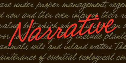 A cool handwritten script with a warm and friendly voice.
 - Code 128 - 100% free

- Bavaroir by URW Type Foundry,
$39.99 Bavaroir looks like a techno party in the throne room of Neuschwanstein: grandiose, original and still high-tech, modern, stylish and chic? anything but lifeless. The design experiment was to create a sans serif based on ?dropping endings?. Something between elegance and protest, Bavaroir coquettishly hides its edges. Although pretty narrow in design, Bavaroir still flows easily, openly and well readably, even in very small sizes. Bavaoir was designed for the URW++ FontForum.
 - glow-carro-danish-spiik - Unknown license

- Boneribbon Tall - Unknown license

- ThamesCondensed - Unknown license

- U.S.A. Condensed - Personal use only

- DS CenturyCapitals - Unknown license

- MandarinD - Unknown license

- KG Like A Skyscraper - Personal use only

- Garota Sans - Personal use only

- Walkway Condensed SemiBold - Unknown license

- Garota Sans SC - Personal use only

- Globet - Personal use only

- WinterthurCondensed - 100% free

- Erbar by URW Type Foundry,
$49.99Erbar or Erbar Grotesk, designed by Jakob Erbar (Ludwig & Mayer) in the early 1920s, is a truly key design from a historical viewpoint. None other than Paul Renner studied Erbar and used this knowledge in the design of his famous Futura. Erbar is a beautiful constructive Grotesk perfectly mirroring the Zeitgeist of the 1920s. The newly expanded Erbar family of URW++ comes in nine styles, of which seven have been digitally remastered recently in URW's design studio (light, book, medium, bold, italic, bold italic). - Ornella by URW Type Foundry,
$39.99 Ornella is a very typical art nouveau typeface that perfectly fits into the series of URW++ Jugendstil fonts released in the last couple of years. Ornella was reworked, redesigned, completed and digitally remastered by Ralph M. Unger for URW++, based on specimen taken from old font catalogues.
 - View Roman Black - Personal use only

- MicroExtendFLF - Unknown license

- Gradl No1 by URW Type Foundry,
$39.99 Gradle Nr. 1 is yet another new art nouveau design in the URW++ library. It was reworked, redesigned, completed and digitally remastered by Ralph M. Unger for URW++, based on hand-drawn upper case characters by M. J. Gradl, about in 1900. Gradl Nr. 1 is a caps-only font perfectly suited for posters and signage.
 - New Bayreuth by URW Type Foundry,
$39.99 New Bayreuth is a new and improved version of the original Bayreuth font (Friedrich Hermann Ernst Schneidler, 1932). New Bayreuth was reworked, redesigned, completed and digitally remastered by Ralph M. Unger for URW++, based on specimen taken from old font catalogues. Besides Ganz Grobe Gotisch and Legende, New Bayreuth is the third type design by Schneidler that URW++ brought back to (digital) life.
 - Urban by URW Type Foundry,
$49.99 URW Urban follows the trend of pattern fonts. Each character has been provided with an individual pattern created with a special stamp technique. To create a vivid typeface, there is a stylistic alternate for nearly every character. In this way the grotesque has a modern, unconventional look. URW Urban reflects a metropolitan lifestyle and is perfect for themes like party, music, sport and film.
 - Nimbus Sans by URW Type Foundry,
$35.00 The first versions of Nimbus Sans have been designed and digitized in the 1980s for the URW SIGNUS sign-making system. Highest precision of all characters (1/100 mm accuracy) as well as spacing and kerning were required because the fonts should be cut in any size in vinyl or other material used for sign-making. During this period three size ranges were created for text (T), the display (D) and poster (P) for small, medium and very large font sizes. In addition, we produced a so-called L-version that was compatible to Adobe’s PostScript version of Helvetica. Nimbus was also the product name of a URW-proprietary renderer for high quality and fast rasterization of outline fonts, a software provided to the developers of PostScript clone RIPs (Hyphen, Harlequin, etc.) back then. Also in the 80s, a new, improved version of the Nimbus Sans, namely Nimbus Sans Novus was designed. Nimbus Sans Novus was conceptually developed entirely with URW’s IKARUS system, i.e. all styles harmonize perfectly with each other in terms of line width, weight, proportions, etc. On top of that, Nimbus Sans Novus contains more styles than Nimbus Sans. Now, Nimbus Sans is also available as Round (like the popular URW fonts Futura Round and Eurostile Round). The Round versions are intended to facilitate the work of designers and typographers. The fonts can be used directly, without further preparatory work in graphic programs as finished, high-quality Rounds.
 - Nimbus Sans Round by URW Type Foundry,
$35.99 The first versions of Nimbus Sans have been designed and digitized in the 1980s for the URW SIGNUS sign-making system. Highest precision of all characters (1/100 mm accuracy) as well as spacing and kerning were required because the fonts should be cut in any size in vinyl or other material used for sign-making. During this period three size ranges were created for text (T), the display (D) and poster (P) for small, medium and very large font sizes. In addition, we produced a so-called L-version that was compatible to Adobe’s PostScript version of Helvetica. Nimbus was also the product name of a URW-proprietary renderer for high quality and fast rasterization of outline fonts, a software provided to the developers of PostScript clone RIPs (Hyphen, Harlequin, etc.) back then. Also in the 80s, a new, improved version of the Nimbus Sans, namely Nimbus Sans Novus was designed. Nimbus Sans Novus was conceptually developed entirely with URW’s IKARUS system, i.e. all styles harmonize perfectly with each other in terms of line width, weight, proportions, etc. On top of that, Nimbus Sans Novus contains more styles than Nimbus Sans. Now, Nimbus Sans is also available as Round (like the popular URW fonts Futura Round and Eurostile Round). The Round versions are intended to facilitate the work of designers and typographers. The fonts can be used directly, without further preparatory work in graphic programs as finished, high-quality Rounds.
 - Craggy by Ingrimayne Type,
$7.95 Craggy has a narrow, spidery, irregular set of letters. Its creepy, Halloween spirit makes it ideal for scary stories and similar uses. The family has three base styles: condensed, regular, and bold. Each comes with an oblique and backslanted version yielding a complete family of nine members.
 - Corporate S by URW Type Foundry,
$180.99 The Corporate ASE typeface trilogy was designed by Prof. Kurt Weidemann, a well-known German designer and typographer, from 1985 until 1990. This superb trilogy consisting of the Corporate A (Antiqua), Corporate S (Sans Serif), and Corporate E (Egyptian) is a design program of classical quality, perfectly in tune with each other. Weidemann says: “My ASE trilogy, quite like triplets, is in perfect harmony and covers all needs of modern typography!” Initially exclusively designed for DaimlerChrysler as a corporate font, the ASE trilogy may be now licensed and used without restriction. URW++ digitized the ASE for DaimlerChrysler and Prof. Weidemann and is the exclusive licensing agent for this outstanding and extremely popular typeface program. Meanwhile, URW++ enhanced the Corporate ASE family in regular, bold, italic, and bold italic by Greek, Cyrillic, and all additional Latin characters to cover Eastern Europe including the Baltic Rim, Romania and Turkey. Corporate ASE in regular, bold, italic, and bold italic is now available in the WGL 4 character complement.
 - Corporate S WGL by URW Type Foundry,
$210.99 The Corporate ASE typeface trilogy was designed by Prof. Kurt Weidemann, a well-known German designer and typographer, from 1985 until 1990. This superb trilogy consisting of the Corporate A (Antiqua), Corporate S (Sans Serif), and Corporate E (Egyptian) is a design program of classical quality, perfectly in tune with each other. Weidemann says: “My ASE trilogy, quite like triplets, is in perfect harmony and covers all needs of modern typography!” Initially exclusively designed for DaimlerChrysler as a corporate font, the ASE trilogy may be now licensed and used without restriction. URW++ digitized the ASE for DaimlerChrysler and Prof. Weidemann and is the exclusive licensing agent for this outstanding and extremely popular typeface program. Meanwhile, URW++ enhanced the Corporate ASE family in regular, bold, italic, and bold italic by Greek, Cyrillic, and all additional Latin characters to cover Eastern Europe including the Baltic Rim, Romania and Turkey. Corporate ASE in regular, bold, italic, and bold italic is now available in the WGL 4 character complement.
 - Corporate A WGL by URW Type Foundry,
$210.99 The Corporate ASE typeface trilogy was designed by Prof. Kurt Weidemann, a well-known German designer and typographer, from 1985 until 1990. This superb trilogy consisting of the Corporate A (Antiqua), Corporte S (Sans Serif), and Corporate E (Egyptian) is a design program of classical quality, perfectly in tune with each other. Weidemann says: "My ASE trilogy, quite like triplets, is in perfect harmony and covers all needs of modern typography!" Initially exclusively designed for DaimlerChrysler as a corporate font, the ASE trilogy may be now licensed and used without restriction. URW++ digitized the ASE for DaimlerChrysler and Prof. Weidemann and is the exclusive licencing agent for this outstanding and extremely popular typeface program. Meanwhile, URW++ enhanced the Corporate ASE family in regular, bold, italic, and bold italic by Greek, Cyrillic, and all additional Latin characters to cover Eastern Europe including the Baltic Rim, Romania and Turkey. Corporate ASE in regular, bold, italic, and bold italic is now available in the WGL 4 character complement.
 - SmallTypeWriting - 100% free

- Oaxaqueña Tall - Personal use only

- Nimbus Sans Novus by URW Type Foundry,
$89.99 The first versions of Nimbus Sans have been designed and digitized in the 1980s for the URW SIGNUS sign-making system. Highest precision of all characters (1/100 mm accuracy) as well as spacing and kerning were required because the fonts should be cut in any size in vinyl or other material used for sign-making. During this period three size ranges were created for text (T), the display (D) and poster (P) for small, medium and very large font sizes. In addition, we produced a so-called L-version that was compatible to Adobe’s PostScript version of Helvetica. Nimbus was also the product name of a URW-proprietary renderer for high quality and fast rasterization of outline fonts, a software provided to the developers of PostScript clone RIPs (Hyphen, Harlequin, etc.) back then. Also in the 80s, a new, improved version of the Nimbus Sans, namely Nimbus Sans Novus was designed. Nimbus Sans Novus was conceptually developed entirely with URW’s IKARUS system, i.e. all styles harmonize perfectly with each other in terms of line width, weight, proportions, etc. On top of that, Nimbus Sans Novus contains more styles than Nimbus Sans.
 - Theo Ballmer by URW Type Foundry,
$39.99 The Theo Ballmer font family is based on Theo’s design ideas which were completed by his son Theo Ballmer (Thierry’s father), and digitized by Thierry, with the help of URW++ and their Ikarus technology. Theo Ballmer is available in 3 x 5 variants: condensed, regular, expanded each in 5 weights. Theo Ballmer is a masterpiece, which fills a historical gap and provides a real font family from the Bauhaus era.
 - Technotyp by URW Type Foundry,
$39.99 The digital font Technotyp is based on the hot metal typeface created by the German typographer and type designer Herbert Thannhaeuser (1898-1963) for the former East German type foundry Typoart in Dresden. In the typography book ‘Der Schriftsetzer’ (Fachbuchverlag, Leipzig, 1952), by Paul Fritzsche, this absolutely beautiful slab serif design is presented in all its variations. Fritzsche remarked that – because of its rather condensed form and its relatively long ascenders – the 'Werkschrift' of the Technotyp (comparable with our 'Regular') seemed to be very well suited to serve as a text face, and recommended for this purpose that the face be cut for the composing machine. However, this never happened and the entire Technotyp family was made available for hand composition only. This is finally changing and being remedied for good now: URW++ proudly presents the new digital version of this really charming font family with its distinct flavor of the 1950s, adding it to the other digital renditions of Herbert Thannhaeuser fonts at URW++, namely Garamond No. 4 and Magna. The original Typoart family had an italic style for the light version only. The new digital version of Technotyp includes italic styles for the regular, medium and bold weights as well, enhancing the family to meet today’s standards and requirements for professional type setting. To further increase its usefulness, Cyrillic faces were created, too. True to the standard for all digital fonts at URW++, the character set for Technotyp covers all West- and East European languages.
 - BStyle - 100% free

- Marin by URW Type Foundry,
$39.99 Marin, a name that is associated with water and ships, looks very confident and follows the ideas of Eurostile, but in a stencil design. Marin was designed for the URW++ FontForum.
 - Bodoni Unique by Monotype,
$29.99This Bodoni caps only font was an experiment from Dave Farey how tall such a Bodoni could be elongated in its design. It reminds to the look of a fence, but in large sizes it may fit on a narrow window. - Veritas by Altered Ego,
$45.00Veritas is a serif text family. It is a narrow-width typeface, with a taller x-height than Times Roman for added legibility, but maintains a similar character count in text. It is typeface designed for publication, newspaper (anywhere where narrow columns are necessary) and identity design. It is exquisitely spaced and kerned, even in European characters. The Digital Type Review states "...Veritas is one of the most important contributions ... from any independent foundry."


