10,000 search results
(0.032 seconds)
- Signpost by Studio K,
$45.00
- Quick Remarks by Sarid Ezra,
$17.00
- 1906 Fantasio Auriol by GLC,
$38.00
- Fall in Love by Namara Creative Studio,
$20.00
- Fox Cupid by Fox7,
$16.00
- Valley by Illushvara,
$10.00
- Spooky Pumpkin by HandletterYean,
$15.00
- Watched by Dumadi,
$25.00
- HT Espresso by Dharma Type,
$19.99
- Sign Production JNL by Jeff Levine,
$29.00 - SK Primo by Shriftovik,
$16.00
- Energetica by Balpirick,
$15.00
- Cantiqe by XdCreative,
$25.00
- Another Grotesk by Aleksandrs Golubovs,
$32.00
- Slate by Monotype,
$34.99
- Cloister Black BT is a distinctive and historic typeface that traces its origins back to the late 19th and early 20th centuries, embodying the transition from Gothic to modern type designs. Character...
- Leroy by Andinistas,
$39.95
- Kidprint by Monotype,
$50.99 - ALT Ayame by ALT,
$-
- Kidprint Paneuropean by Monotype,
$92.99 - Burton's Nightmare is a captivating display font that appears as if sprung from the feverish dreams of a storyteller who dances on the edge of whimsy and the macabre. Its design pays homage to the go...
- Imagine a world where letters decide to throw a grand costume ball, dressing up in their medieval finest, complete with flourishes, curls, and an air of aristocratic elegance. The font GloucesterInit...
- Bleeding Freaks is a font that resonates with the essence of horror, suspense, and a touch of macabre artistry. It's a font that belongs to the decorative or display category, crafted with the intent...
- Bisaya 1880 - Unknown license

- Geared Up - Unknown license

- Hurstmonceux by Anthony Prudente,
$20.00
- Barbiela Script by Bosstypestudio,
$14.00
- Virile by Monotype,
$29.99 - Friendly Christmas by Yoga Letter,
$18.00
- Show Card Roman JNL by Jeff Levine,
$29.00
- Hebrew Saphire Tanach by Samtype,
$189.00
- Revelry Deco JNL by Jeff Levine,
$29.00
- See Saw by Jonahfonts,
$22.00
- Headline Nouveau JNL by Jeff Levine,
$29.00
- Chucklots by Maulana Creative,
$14.00
- Satinwoods by Maulana Creative,
$13.00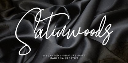
- Mayoritte by Maulana Creative,
$14.00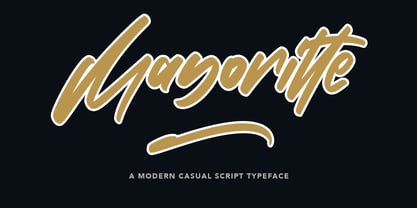
- Maeve by Bonez Designz,
$30.00
- Boeuf Au Joost NF by Nick's Fonts,
$10.00 - Crayon En Folie by Hanoded,
$15.00

