10,000 search results
(0.032 seconds)
- Wide House by Letterhend,
$16.00 Introducing Wide House, a playful and charming hand-written font that will add a touch of whimsy to your designs. This font has a casual and relaxed vibe that makes it perfect for projects that require a friendly and approachable feel. The letters are slightly wider than usual, giving it a modern yet comfortable appearance. Wide House works well for various design projects especially in logo, and the other various formal forms such as invitations, labels, logos, magazines, books, greeting / wedding cards, packaging, fashion, make up, stationery, novels, labels or any type of advertising purpose. Features : Uppercase & lowercase Numbers and punctuation Alternates & Ligatures Multilingual PUA encoded We highly recommend using a program that supports OpenType features and Glyphs panels like many of Adobe apps and Corel Draw, so you can see and access all Glyph variations.
 - Graffick Wide by Graffiti Fonts,
$12.99Halfway between graffiti & typeography you find styles like Graffick™. These fonts are derived directly from hand written letters made mechanically perfect to behave more like common digital fonts. - Wide Display by Gaslight,
$20.00 Unicase wide slab-serif with numerous alternatives and decorative elements. In Ribbon styles kerning for black ribbons released as Discretionary Ligatures. Lets do wide!
 - Latin Wide by URW Type Foundry,
$35.00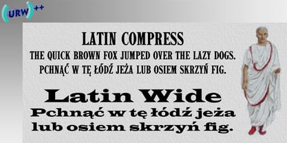
- Clarendon Wide by Canada Type,
$24.95 By overwhelming popular demand, this is the wide display companion to Canada Type's Clarendon Text family. It comes in ten styles: regular, medium, bold, with small caps and oldstyle Figures counterparts, as well as stencil and sketch versions of the regular and the bold. All the fonts come equipped with superscripts/numerators, denominators, and scientific inferiors. The OpenType fonts also contain automatic fractions and class-based kerning. The Clarendon Wide fonts are available in all popular formats. Language support includes Western, Central and Eastern European character sets, as well as Baltic, Esperanto, Maltese, Turkish, and Celtic/Welsh languages.
 - Impact Wide by Geoffrey Lee,
$21.00Impact wide was developed from the designer's original drawings for the production of 'Impact' metal type, with many detail changes because of the density of the letters. These include the restoration of the bevelled i and j dots of the original. Character maps show some useful alternative characters in both roman and italic. Included are a crossbar numeral 1, mirror quotes and some sorts which were cast in metal but never reproduced in digitized versions of the typeface. There is also a font-specific Euro symbol. (Impact is a trademark of The Type Museum, London). - Stempel Garamond LT by Linotype,
$29.99 Opinion varies regarding the role of Claude Garamond (ca. 1480–1561) in the development of the Old Face font Garamond. What is accepted is the influence this font had on other typeface developments from the time of its creation to the present. Garamond, or Garamont, is related to the alphabet of Claude Garamond (1480–1561) as well as to the work of Jean Jannon (1580–1635 or 1658), much of which was attributed to Garamond. In comparison to the earlier Italian font forms, Garamond has finer serif and a generally more elegant image. The Garamond of Jean Jannon was introduced at the Paris World’s Fair in 1900 as Original Garamond, whereafter many font foundries began to cast similar types. The famous Stempel Garamond interpretation of the 1920s remains true to the original Garamond font with its typical Old Face characteristics. The bold italic was a modern addition at the end of the 1920s and the small caps provided an alternative to the standard capital letters. In the mid 1980s, a light version was added to Stempel Garamond. Since its appearance, Stempel Garamond has been one of the most frequently used text fonts.
 - 1592 GLC Garamond by GLC,
$38.00 This family was inspired by the pure Garamond pattern set of fonts used by Egenolff and Berner, German printers in Frankfurt, at the end of the sixteenth century. All the experts said it was the best and most complete set of the time. The italic style used with it was Granjon’s, as in 1543 Humane Jenson. A few fleurons from the same printers have been added. It can be used variously for web-site titles, posters and flyers design, publishing texts looking like ancient ones, or greeting cards, various sorts of presentations, as a very elegant and legible font... This font supports very large sizes as easily as small sizes, remaining very smart, elegant and fine. Its original cap height is about five millimeters. Decorated letters like 1512 Initials, 1550 Arabesques, 1565 Venetian, 1584 Rinceau from GLC Foundry, can be used with this family without anachronism.
 - Garamond Simoncini SH by Scangraphic Digital Type Collection,
$26.00Since the release of these fonts most typefaces in the Scangraphic Type Collection appear in two versions. One is designed specifically for headline typesetting (SH: Scangraphic Headline Types) and one specifically for text typesetting (SB Scangraphic Bodytypes). The most obvious differentiation can be found in the spacing. That of the Bodytypes is adjusted for readability. That of the Headline Types is decidedly more narrow in order to do justice to the requirements of headline typesetting. The kerning tables, as well, have been individualized for each of these type varieties. In addition to the adjustment of spacing, there are also adjustments in the design. For the Bodytypes, fine spaces were created which prevented the smear effect on acute angles in small typesizes. For a number of Bodytypes, hairlines and serifs were thickened or the whole typeface was adjusted to meet the optical requirements for setting type in small sizes. For the German lower-case diacritical marks, all Headline Types complements contain alternative integrated accents which allow the compact setting of lower-case headlines. - Garamond 96 DT by DTP Types,
$89.00A revival design by Malcolm Wooden of DTP Types Limited. - Garamond No. 2 by URW Type Foundry,
$35.99 - Celtic Garamond Pro by CheapProFonts,
$10.00 A classical proportioned text font - with a Celtic twist! Perfect for that oldstyle look, but still very readable. I have cleaned up the outlines, improved the spacing and kerning, modified a few letterforms - and then expanded the character set by 440%! A bolder weight has now also been created, and a rough version for a more antique look. ALL fonts from CheapProFonts have very extensive language support: They contain some unusual diacritic letters (some of which are contained in the Latin Extended-B Unicode block) supporting: Cornish, Filipino (Tagalog), Guarani, Luxembourgian, Malagasy, Romanian, Ulithian and Welsh. They also contain all glyphs in the Latin Extended-A Unicode block (which among others cover the Central European and Baltic areas) supporting: Afrikaans, Belarusian (Lacinka), Bosnian, Catalan, Chichewa, Croatian, Czech, Dutch, Esperanto, Greenlandic, Hungarian, Kashubian, Kurdish (Kurmanji), Latvian, Lithuanian, Maltese, Maori, Polish, Saami (Inari), Saami (North), Serbian (latin), Slovak(ian), Slovene, Sorbian (Lower), Sorbian (Upper), Turkish and Turkmen. And they of course contain all the usual "western" glyphs supporting: Albanian, Basque, Breton, Chamorro, Danish, Estonian, Faroese, Finnish, French, Frisian, Galican, German, Icelandic, Indonesian, Irish (Gaelic), Italian, Northern Sotho, Norwegian, Occitan, Portuguese, Rhaeto-Romance, Sami (Lule), Sami (South), Scots (Gaelic), Spanish, Swedish, Tswana, Walloon and Yapese.
 - Garamond Simoncini SB by Scangraphic Digital Type Collection,
$26.00Since the release of these fonts most typefaces in the Scangraphic Type Collection appear in two versions. One is designed specifically for headline typesetting (SH: Scangraphic Headline Types) and one specifically for text typesetting (SB Scangraphic Bodytypes). The most obvious differentiation can be found in the spacing. That of the Bodytypes is adjusted for readability. That of the Headline Types is decidedly more narrow in order to do justice to the requirements of headline typesetting. The kerning tables, as well, have been individualized for each of these type varieties. In addition to the adjustment of spacing, there are also adjustments in the design. For the Bodytypes, fine spaces were created which prevented the smear effect on acute angles in small typesizes. For a number of Bodytypes, hairlines and serifs were thickened or the whole typeface was adjusted to meet the optical requirements for setting type in small sizes. For the German lower-case diacritical marks, all Headline Types complements contain alternative integrated accents which allow the compact setting of lower-case headlines. - Garamond No. 4 by URW Type Foundry,
$35.00
- Garamond Nova Pro by SoftMaker,
$9.99 Garamond Nova Pro is one of the fonts of the SoftMaker font library. It is a modern interpretation of the classic Garamond style. SoftMaker’s Garamond Nova Pro typeface family contains OpenType layout tables for sophisticated typography. It also comes with a huge character set that covers not only Western European languages, but also includes Central European, Baltic, Croatian, Slovene, Romanian, and Turkish characters. Case-sensitive punctuation signs for all-caps titles are included as well as many fractions, an extensive set of ligatures, and separate sets of tabular and proportional digits.
 - Garamond Simoncini EF by Elsner+Flake,
$35.00
- Garamond Rough Pro by Elsner+Flake,
$59.00 With its animated contours, and set in an appropriate size, the Garamond Rough typeface attempts to simulate printed hot metal typesetting. Its roughened edges make it appear softer and less crisp, and, thus, takes the harshness out of the type image. The size of the offered type complement as well as the number of its affiliated symbols makes it ideal for differentiated text setting. Furthermore, its display types make surprising visual accents possible. The origins of the design of Garamond Rough go back to the middle of the 16th century. They are ascribed to Claude Garamond who was one of the first typographers who designed typefaces specifically for the setting of books. During the course of the past centuries and decades, many different variations and new design interpretations of the Garamond typeface were developed to accommodate the most diverse typesetting and printing practices in many different countries. As such, today’s designers can take advantage of a comprehensive digital repertoire for text and display applications. Translation Inga Wennik
 - ITC Garamond Handtooled by ITC,
$34.99Claude Garamond (ca. 1480-1561) cut types for the Parisian scholar-printer Robert Estienne in the first part of the sixteenth century, basing his romans on the types cut by Francesco Griffo for Venetian printer Aldus Manutius in 1495. Garamond refined his romans in later versions, adding his own concepts as he developed his skills as a punchcutter. After his death in 1561, the Garamond punches made their way to the printing office of Christoph Plantin in Antwerp, where they were used by Plantin for many decades, and still exist in the Plantin-Moretus museum. Other Garamond punches went to the Frankfurt foundry of Egenolff-Berner, who issued a specimen in 1592 that became an important source of information about the Garamond types for later scholars and designers. In 1621, sixty years after Garamond's death, the French printer Jean Jannon (1580-1635) issued a specimen of typefaces that had some characteristics similar to the Garamond designs, though his letters were more asymmetrical and irregular in slope and axis. Jannon's types disappeared from use for about two hundred years, but were re-discovered in the French national printing office in 1825, when they were wrongly attributed to Claude Garamond. Their true origin was not to be revealed until the 1927 research of Beatrice Warde. In the early 1900s, Jannon's types were used to print a history of printing in France, which brought new attention to French typography and the Garamond" types. This sparked the beginning of modern revivals; some based on the mistaken model from Jannon's types, and others on the original Garamond types. Italics for Garamond fonts have sometimes been based on those cut by Robert Granjon (1513-1589), who worked for Plantin and whose types are also on the Egenolff-Berner specimen. Linotype has several versions of the Garamond typefaces. Though they vary in design and model of origin, they are all considered to be distinctive representations of French Renaissance style; easily recognizable by their elegance and readability. ITC Garamond? was designed in 1977 by Tony Stan. Loosely based on the forms of the original sixteenth-century Garamond, this version has a taller x-height and tighter letterspacing. These modern characteristics make it very suitable for advertising or packaging, and it also works well for manuals and handbooks. Legible and versatile, ITC Garamond? has eight regular weights from light to ultra, plus eight condensed weights. Ed Benguiat designed the four stylish handtooled weights in 1992." In 1993 Ed Benguiat has designed Handtooled versions. - Garamond Antiqua Pro by RMU,
$50.00 A font classic as a RMU redesign - a small yet mighty family with a West and Central European character set plus Cyrillic. All three styles include small caps and oldstyle figures.
 - Kidings by Intellecta Design,
$18.90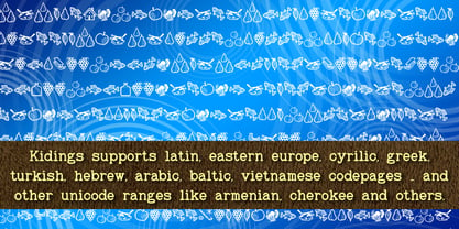
- Wisely by Mili + Wise,
$12.00 Perfect for writing out uplifting quotes for instagram posts, wall art or greeting cards. It will also be there for you if you need to design some charming packaging or branding. Suitable for short and sweet quotes, as well as longer meaningful paragraphs. Designed and kerned with care and love to make using it a breeze. Wisely is packed with lovely features: contextual alternates to give the text this hand-written look you need many stylistic alternates for uppercase and lowercase ligatures multilingual support with accented characters for international designers
 - Tide by Suomi,
$35.00 A surprisingly readable script based on flow of water.
 - Wired by Identikal Collection,
$23.00 - Wile by Monotype,
$29.99This exclusive Monotype design by Cynthia Hollandsworth is named after a popular executive, Don Wile of Agfa Compugraphic as a gift on his retirement. Agfa Wile is a classic Old Style font with wedge-shaped serifs and open proportions, and is suitable for both text and display uses. Agfa Wile's capital letters are influenced by inscriptional forms. - Widy by Pasternak,
$12.00 Wide font family is a geometric sans serif font, which features 9 styles. It’s based on the Futura developed by Paul Renner and neo sans-serif fonts. At the same time, it has significant stylistic differences. Massive lengthy letters are among the unique features of this font. They will help you come up with the perfect composition. The letters have optical compensation, while a circle is the main figure of the fonts. Due to wide fonts, your project will have modern and fresh design. The composition will keep its contrast regardless of a background you’ve chosen. The Widy family includes 9 styles: Thin, Extra Light, Light, Semi Light, Regular, Medium, Semi Bold, Bold and Extra Bold. Each of them also has Italic variation. The fonts are perfect for both graphic design projects (posters, brand identities, logotypes) and simple interface design, which needs the necessary style.
 - Angular - Unknown license

- Angular by BA Graphics,
$45.00A very contemporary design can be used in any application from headlines to text. Angular serifs give this design a strong base. - regularJoe by JOEBOB graphics,
$49.00 A handwritten but very clean and organized font that's a little bold and a little slanted. Soon to be followed by its evil twin: irregularJoe.
 - Urge Text by Eclectotype,
$30.00 It started with an italic, or to be more precise, half an italic. The slanted styles of Urge Text exhibit a certain bipolarity, the tops of glyphs having a standard italic form, the bottoms of glyphs being more Roman in their construction. This sturdy footing really locks the italics to the baseline, making them very legible while still being distinct from the uprights. The same bipolar approach didn't work very well in upright styles, so the Romans are more toned down. Ranging from the almost monoline, Egyptian style light weights to higher contrast ‘Modern’ bolds, there is much potential for use in typographically demanding scenarios. The family consists of six weights, normal and condensed widths, all with italics, making a total of 24 fonts; it’s a highly usable text typeface with an array of OpenType features. All styles include small caps, multiple figure styles (proportional- and tabular-, oldstyle and lining, small cap proportional figures, numerators, denominators, superscript and subscript), standard ligatures, alternate forms (stylistic sets), automatic fractions, case sensitive forms, and a handy (perhaps!) ‘percent off’ ligature in the discretionary ligatures feature.
 - Rigular Script by Gloow Studio,
$18.00 Rigular Script has inspirated from retro style and funky designs like signs and old poster. This font comes with an extra extrude to make the font look more retro/unique and save your time on making it. Font has an opentype features that allow you to modify it as you like as needed. Andala perfect for poster, logo, book covers, tshirt designs, packaging and more. Features : Uppercase Lowercase Number Punctuation Ligature Multilingual Language PUA encode Opentype Features Just enjoy with our product! Thank you
 - Garamont Amsterdam SB by Scangraphic Digital Type Collection,
$26.00Since the release of these fonts most typefaces in the Scangraphic Type Collection appear in two versions. One is designed specifically for headline typesetting (SH: Scangraphic Headline Types) and one specifically for text typesetting (SB Scangraphic Bodytypes). The most obvious differentiation can be found in the spacing. That of the Bodytypes is adjusted for readability. That of the Headline Types is decidedly more narrow in order to do justice to the requirements of headline typesetting. The kerning tables, as well, have been individualized for each of these type varieties. In addition to the adjustment of spacing, there are also adjustments in the design. For the Bodytypes, fine spaces were created which prevented the smear effect on acute angles in small typesizes. For a number of Bodytypes, hairlines and serifs were thickened or the whole typeface was adjusted to meet the optical requirements for setting type in small sizes. For the German lower-case diacritical marks, all Headline Types complements contain alternative integrated accents which allow the compact setting of lower-case headlines. - Garamont Amsterdam EF by Elsner+Flake,
$35.00 - Garamont Amsterdam SH by Scangraphic Digital Type Collection,
$26.00Since the release of these fonts most typefaces in the Scangraphic Type Collection appear in two versions. One is designed specifically for headline typesetting (SH: Scangraphic Headline Types) and one specifically for text typesetting (SB Scangraphic Bodytypes). The most obvious differentiation can be found in the spacing. That of the Bodytypes is adjusted for readability. That of the Headline Types is decidedly more narrow in order to do justice to the requirements of headline typesetting. The kerning tables, as well, have been individualized for each of these type varieties. In addition to the adjustment of spacing, there are also adjustments in the design. For the Bodytypes, fine spaces were created which prevented the smear effect on acute angles in small typesizes. For a number of Bodytypes, hairlines and serifs were thickened or the whole typeface was adjusted to meet the optical requirements for setting type in small sizes. For the German lower-case diacritical marks, all Headline Types complements contain alternative integrated accents which allow the compact setting of lower-case headlines. - Amsterdamer Garamont Pro by SoftMaker,
$14.99 Amsterdamer Garamont Pro is one of the fonts of the SoftMaker font library.
 - LTC Fleurons Garamont by Lanston Type Co.,
$24.95
- BD Engraved Regular - Unknown license

- Korneuburg Slab Regular - Personal use only

- D3 Ghostism-Regular - Unknown license

- Boodas.de | My | Regular - Unknown license

- Mute Fruit Regular - Unknown license


