7,763 search results (0.032 seconds)
  1. Amantea Script by Create Big Supply, $25.00
    Experience the enchanting allure of Amantea Script, a stunning and delicate font that embodies elegance and grace in every stroke. With its thin and flowing style, this script font captures the essence of sophistication, making it the perfect choice for a wide range of design projects. Amantea Script is a true gem for those seeking to create captivating wedding invitations that leave a lasting impression. Its intricate and graceful curves evoke a sense of romance and beauty, adding a touch of magic to any special occasion. The versatility of this font extends beyond weddings, as it effortlessly enhances stationary art, creating stunning pieces that exude refinement and style. In the realm of digital design, Amantea Script shines on social media platforms, effortlessly captivating audiences with its captivating charm. Whether it's engaging posts, inspiring quotes, or eye-catching advertisements, this font adds an element of sophistication and allure that commands attention. With its extensive language support, Amantea Script opens up a world of possibilities. From English to Spanish, French to German, and beyond, you can seamlessly incorporate this font into your projects, ensuring that your message reaches a global audience. Amantea Script comes complete with a wide range of features, including alternate characters and ligatures, allowing you to create unique and personalized designs. The font is PUA encoded, providing easy access to a plethora of stunning glyphs that add depth and flair to your creations.
  2. Bleeding Cowboys Pro by CheapProFonts, $10.00
    A very popular grungy font, now made even more useful! With this Pro version you have the possibility to tone it down a bit - I have made alternate letters without swashes (use the OpenType Swash feature to switch them) and without so much bleed (use the OpenType Stylistic Alternates/ss01 feature). And then you can turn it up again by adding six different swashes to any letter! Write { or after a letter to add a swash to the right side, _ will add one below. Added fun and language support! ALL fonts from CheapProFonts have very extensive language support: They contain some unusual diacritic letters (some of which are contained in the Latin Extended-B Unicode block) supporting: Cornish, Filipino (Tagalog), Guarani, Luxembourgian, Malagasy, Romanian, Ulithian and Welsh. They also contain all glyphs in the Latin Extended-A Unicode block (which among others cover the Central European and Baltic areas) supporting: Afrikaans, Belarusian (Lacinka), Bosnian, Catalan, Chichewa, Croatian, Czech, Dutch, Esperanto, Greenlandic, Hungarian, Kashubian, Kurdish (Kurmanji), Latvian, Lithuanian, Maltese, Maori, Polish, Saami (Inari), Saami (North), Serbian (latin), Slovak(ian), Slovene, Sorbian (Lower), Sorbian (Upper), Turkish and Turkmen. And they of course contain all the usual “western” glyphs supporting: Albanian, Basque, Breton, Chamorro, Danish, Estonian, Faroese, Finnish, French, Frisian, Galican, German, Icelandic, Indonesian, Irish (Gaelic), Italian, Northern Sotho, Norwegian, Occitan, Portuguese, Rhaeto-Romance, Sami (Lule), Sami (South), Scots (Gaelic), Spanish, Swedish, Tswana, Walloon and Yapese.
  3. Storyville by Canada Type, $29.95
    This is the redrawn and expanded version of an alphabet Rebecca Alaccari made back in 2009 as a bespoke font for a tourism agency looking to recapture the appeal of New Orleans after the hurricane Katrina disaster robbed it of its core industries. The brief back then was to "revive the unique spirit of what always made Nola great for new adults, which is the excellent combination of history, romance, food and music." No word of a lie, the brief actually contained "new adults." Storyville contains two interchangeable sets of forms drawn in the doodly, loose and organic way now conspicuously popular with today's young designers, almost every one of whom thinks they will get to design something for a boutique coffee bar somewhere. Well, this whole thing perhaps means freedom, youth, fun, happiness, good stuff like that. But just in case, a little caution doesn't hurt: Use this font only if you know what you're doing. We don't want to go back to the 1990s. Please. We were nearly done for by that exposure the first time around. The ligatures feature in this font does some pseudo-randomization, so the forms in doubled letters don't repeat. Serious fun can be had by also applying the stylistic alternates feature, or picking a letter in the middle of a setting and disabling the ligatures feature. Or various sequences of all that. If you don't like any of that stuff, just forget about it. Uh, wutever.
  4. Font - Unknown license
  5. Flakes - Unknown license
  6. TooMuchCoffee - Unknown license
  7. BirminghamBold - Unknown license
  8. Roughie-Light - Unknown license
  9. ImperatorPlaque - Unknown license
  10. Adva Sagur MF by Masterfont, $59.00
    Highly legible single stroked font family in 3 weights. Use for titles, signage, captions etc.
  11. Hyper Fatos by Bisou, $15.00
    Crafted with passion in La Chaux-de-Fonds, Switzerland, the Hyper Fatos typography was born in a moment of pure delight as the creator (Bisou) indulged in a delicious pizza. Inspired by the excitement and satisfaction that come from the most indulgent culinary pleasures, he designed this unique typography to capture the essence of gluttony and the irresistibility of the most appetizing dishes. Hyper Fatos was meticulously crafted to evoke an undeniable sense of indulgence. Its boldness and rounded forms bring to mind juicy hamburgers, crispy fries, and donuts overflowing with icing. It's the perfect typography for fast-food restaurant signs, tantalizing menus, or even advertising campaigns for giant burgers and decadent milkshakes. Picture Hyper Fatos in bright letters above a hot dog stand, and you'll see lovers of greasy food rushing to satisfy their most voracious cravings. This typography is the ultimate choice to whet your customers' appetites and encourage them to indulge in culinary delight.
  12. Interzone by MYSTERIAN, $9.00
    This type crept up the sense that it was made in Eastern Europe by poorly trained urbanites from a crippled nation, or that it is the remains of a contemporary gothic (like Eckmann) stencil. The choice of what this type signifies is up to the public. Lately I like the idea of 'putting on' (in McLuhan's sense) a genre of idea that is somewhat different from my tradition's beliefs, and fitting a core category of that toward a teleological/eschatological advantage. Therefore postmodernist/apocalyptic carelessness (which I may 'put on' by using this type) is how I abstain from the cravings of immortality, or more so that wanting it is pointless. It’s stands as memento morí; that I will have to die someday. I have to become less, He must become more. Of course, Interzone may signify a classic Joy Division track from Unknown Pleasures as well as the Cold Warish ongoings of conflicted eastern European life. I considered naming this Lunik 9.
  13. Golden Metafor by Kulokale, $17.00
    Thanks for checking out Golden Metafor! It's a classy, cold serif font with beautiful characters and also ligatures which makes it easy for you to create a logo for your personal branding and your business beautifully. Golden Metafor is perfect for many different projects such as logos & branding, invitation, stationery, wedding designs, social media posts, advertisements, printed quotes, product packaging, product designs, label, photography, watermark, special events or anything. I highly recommend using a program that supports OpenType features and Glyphs panels such as Adobe Illustrator, Adobe Photoshop CC, Adobe InDesign, or CorelDraw, so you can see and access all Glyph variations. This font is encoded with Unicode PUA, which allows full access to all additional characters without having special design software. Mac users can use Font Book, and Windows users can use Character Map to view and copy one of the extra characters to paste into your favorite text editor / application. Thank you.
  14. Hyper Turfu by Bisou, $10.00
    Made in La Chaux-de-Fonds (Switzerland), HyperTurfu was born during the shooting of “The Return of Hyperturfu Xpress 2”. A GoPro on a lego electric train, meters and meters of rails, an empty industrial space, loads of puppets, paper, cardboard, pizza boxes, lights, hot glue and a bunch of friends preparing a one shot scene for a month. The title of the movie was made out of lego pieces, painted with golden spray and hanged over the rails. It was the first inspiration for this awsome superbold font. HyperTurfu is thought from ground up to give a strong impact. It’s gothic retro science fiction 80’s style makes it best suitable for metal music albums or posters. As the “Banco” font it works perfectly with short texts for advertisement, bar, cofee shops concert places or even fancy hairdresser. Just hang it over a pet shop and see what cool animals will come in.
  15. Globet - Personal use only
  16. Philomena Script by Letterhend, $16.00
    Philomena is a signature script that brings the classy and luxury look. The natural feel of the signature works perfect for those who needs a typeface for headline, logotype, apparel, invitations, branding, packaging, advertising etc. This font is comes in uppercase, lowercase, punctuation, symbols, numerals, stylistic set alternate, ligatures, etc., as well as multilingual support.
  17. Anachak by Jipatype, $25.00
    Anachak font, Is a square structure. It emphasizes the sharpness of the serif, giving it a strong and formidable feeling. Suitable for headlines for various publications such as Packaging, Print Ad, Etc. Available in 18 styles. - ฟอนต์ อาณาจักร โครงสร้างเหลียมมีเชิง ขับเน้นความคมแหลมคมตรงช่วงจบเส้น และฐานเชิง ให้ความรู้สึกหนักแน่น น่าเกรงขาม ยิ่งใหญ่ และดุร้าย เหมาะสำหรับการพาดหัวสำหรับสิ่งพิมพ์ต่างๆ เช่น Packaging, Print Ad, Etc มีให้ถึง 18 สไตล์ เลือกใช้ได้ตามความเหมาะสม
  18. HansHand - Unknown license
  19. ImperatorBronze - Unknown license
  20. ImperatorSmallCaps - Unknown license
  21. LBC Cool 2 - Unknown license
  22. Bruce - Unknown license
  23. Lou - Unknown license
  24. Bamboo - Unknown license
  25. Bridgnorth - Unknown license
  26. Bach - Unknown license
  27. Quub by OneSevenPointFive, $10.00
    An excellent choice for Logo design, Headlines, Titles, All caps text, etc. Feedback: https://forms.gle/iY8Zswmsg689m95M8
  28. Fartitudo by Tour De Force, $25.00
    A bit provocative, catchy and bouncy family for modern package designs, posters, labels, t-shirts etc.
  29. Musaf MF by Masterfont, $59.00
    High readability with an historic flavor, this elegant font family is great for signage, headline etc.
  30. Evening River by Letterhend, $19.00
    Introducing, Evening River an elegant display typeface. this font is perfect for headline, packaging, branding, etc.
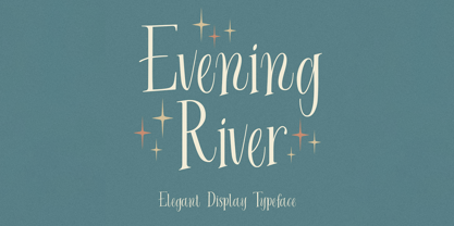
  31. Adva Open MF by Masterfont, $59.00
    Highly legible single stroked stencil font family in 3 weights. Use for titles, signage, captions etc.
  32. The Lohengrin font is a compelling display font that captures the essence of historical artistry and craftsmanship within its letterforms. Created by Dieter Steffmann, a renowned German typographer a...
  33. Victorian Initials One is a captivating font that immediately transports you back to the elegance and intricacy of the Victorian era. Created by Dieter Steffmann, a typeface designer known for his pa...
  34. FEMME is an intriguing and evocative typeface that embodies a fluid and expressive aesthetic, designed to capture attention at first glance. While I'm crafting a fictional description given there isn...
  35. Ah, KG Seven Sixteen, a font that confidently saunters into the world of typography, tipping its hat with a cheeky grin. Crafted by the whimsical wand of Kimberly Geswein, it's as if this font was sp...
  36. Sailor '87 is a captivating typeface that beckons with the romance and adventure of the open sea, invoking the nostalgic spirit of the 1980s. Its design elegantly merges the robustness of traditional...
  37. The Minster No 1 font, by Paul Lloyd Fonts, is a distinct and beautifully crafted typeface that exudes an aura of both historical gravitas and whimsical elegance. This font captures the essence of tr...
  38. "Walk the Plank," a distinctive creation by Teabeer Studios, sails through the visual seas with a piratical charm that's both adventurous and whimsically menacing. This font captures the essence of p...
  39. Bank Sans EF by Elsner+Flake, $35.00
    With its extended complement, this comprehensive redesign of Bank Gothic by Elsner+Flake offers a wide spectrum for usage. After 80 years, the typeface Bank Gothic, designed by Morris Fuller Benton in 1930, is still as desirable for all areas of graphic design as it has ever been. Its usage spans the design of headlines to exterior design. Game manufacturers adopt this spry typeface, so reminiscent of the Bauhaus and its geometric forms, as often as do architects and web designers. The creative path of the Bank Gothic from hot metal type via phototypesetting to digital variations created by desktop designers has by now taken on great breadth. The number of cuts has increased. The original Roman weight has been augmented by Oblique and Italic variants. The original versions came with just a complement of Small Caps. Now, they are, however, enlarged by often quite individualized lower case letters. In order to do justice to the form changes and in order to differentiate between the various versions, the Bank Gothic, since 2007 a US trademark of the Grosse Pointe Group (Trademark FontHaus, USA), is nowadays available under a variety of different names. Some of these variations remain close to the original concept, others strive for greater individualism in their designs. The typeface family which was cut by the American typefoundry ATF (American Type Founders) in the early 1930’s consisted of a normal and a narrow type family, each one in the weights Light, Medium and Bold. In addition to its basic ornamental structure which has its origin in square or rectangular geometric forms, there is another unique feature of the Bank Gothic: the normally round upper case letters such as B, C, G, O, P, Q, R and U are also rectangular. The one exception is the upper case letter D, which remains round, most likely for legibility reasons (there is the danger of mistaking it for the letter O.) Because of the huge success of this type design, which follows the design principles of the more square and the more contemporary adaption of the already existing Copperplate, it was soon adopted by all of the major type and typesetting manufacturers. Thus, the Bank Gothic appeared at Linotype; as Commerce Gothic it was brought out by Ludlow; and as Deluxe Gothic on Intertype typesetters. Among others, it was also available from Monotype and sold under the name Stationer’s Gothic. In 1936, Linotype introduced 6pt and 12pt weights of the condensed version as Card Gothic. Lateron, Linotype came out with Bank Gothic Medium Condensed in larger sizes and a more narrow set width and named it Poster Gothic. With the advent of photoypesetters and CRT technologies, the Bank Gothic experienced an even wider acceptance. The first digital versions, designed according to present computing technologies, was created by Bitstream whose PostScript fonts in Regular and Medium weights have been available through FontShop since 1991. These were followed by digital redesigns by FontHaus, USA, and, in 1996, by Elsner+Flake who were also the first company to add cursive cuts. In 2009, they extended the family to 16 weights in both Roman and Oblique designs. In addition, they created the long-awaited Cyrillic complement. In 2010, Elsner+Flake completed the set with lowercase letters and small caps. Since its redesign the type family has been available from Elsner+Flake under the name Bank Sans®. The character set of the Bank Sans® Caps and the Bank Sans® covers almost all latin-based languages (Europe Plus) as well as the Cyrillic character set MAC OS Cyrillic and MS Windows 1251. Both families are available in Normal, Condensed and Compressed weights in 4 stroke widths each (Light, Regular, Medium and Bold). The basic stroke widths of the different weights have been kept even which allows the mixing of, for instance, normal upper case letters and the more narrow small caps. This gives the family an even wider and more interactive range of use. There are, furthermore, extensive sets of numerals which can be accessed via OpenType-Features. The Bank Sans® type family, as opposed to the Bank Sans® Caps family, contains, instead of the optically reduced upper case letters, newly designed lower case letters and the matching small caps. Bank Sans® fonts are available in the formats OpenType and TrueType.
  40. Sadi Sans by Koray Özbey, $19.00
    Sadi Slab is designed to be used on small scales like book texts, newspapers, magazines etc. Also its large counters make the font suitable for digital screens. The anatomy of the typeface gives a formal appearance which is a more fitting choice for subjects like law, finance, medical science etc. Another member of Sadi family is Sadi Slab.
Looking for more fonts? Check out our New, Sans, Script, Handwriting fonts or Categories
abstract fontscontact usprivacy policyweb font generator
Processing