7,763 search results
(0.032 seconds)
- Tessie Dingies by Ingrimayne Type,
$9.95 A tessellation is a shape that can be used to completely fill the plane--simple examples are isosceles triangles, squares, and hexagons. The TessieDingie fonts contain tessellation shapes that can be used to construct tessellation patterns. The repeating unit, which may contain only one of the shapes or a several of the shapes, is on one key so making patterns is trivial with these fonts. TessieDingieAbstract contains abstract shapes that tessellate. TessieDingiePictures contains shapes that resemble real world objects, such as birds, animals, tools, and vehicles. Make sure the leading is the same as font size or the rows will not line up. Tessellation patterns are eye-catching and visually appealing, which is the reason that they have long been popular in a variety of decorative situations, such as quilting.
 - The LOVE-BOX font crafted by the talented designer deFharo stands as a unique and enchanting typeface that captivates with its distinctive style and charm. It embodies a perfect blend of creativity a...
- Pushkin is a font that seems to embrace the art of storytelling with each letter it forms. Just hearing the name, you can almost feel the romantic brushstrokes of history and literature it's named af...
- The KG Falling Slowly font, designed by the talented Kimberly Geswein, is a beautifully crafted typeface that captures the essence of gentle motion and delicate grace. As its name subtly suggests, th...
- Scriptina Pro by CheapProFonts is an exquisite font that has captivated the hearts of designers and typographers with its elegant and whimsical charm. A refined version of the original Scriptina font...
- Font Anastasia, with its artistic and elegant demeanor, brings a compelling presence to the world of typography. Though diverse interpretations of this font may exist due to the evolving nature of de...
- As of my last update in April 2023, the font named "Nymph" does not correspond to a widely recognized typeface in the extensive catalogs of digital fonts. However, the concept of a font named "Nymph"...
- PaddingtonSC - Unknown license

- National First Font - Unknown license

- Paddington - Unknown license

- Addict - Unknown license

- Paddington - Unknown license

- The ReGGoeS by Wontenart,
$25.00 Type Cartoon edition for food, like a crispy snack or anything else, such as fun, happy, cute and etc. thank you :D
 - Alquitran Rust by RodrigoTypo,
$45.00 Alquitran Rust is a dirty version of Alquitran Pro thought of extreme sports, magazines, covers etc .. Alquitran Rust contains alternatives and Cyrillic.
 - Thug Rose by Epiclinez,
$18.00 Thug Rose is a bouncy hand-lettered script font. This smooth hand-lettered script font is suitable for logos, headlines, branding, etc.
 - Beautiful Sky by Epiclinez,
$19.00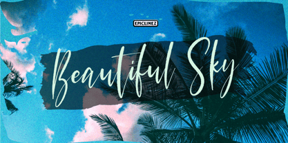 Beautiful Sky is a handwritten signature script font. This authentic script font is suitable for logos, headlines, branding, apparels, Instagram quotes, etc.
 - Herencia by Sudtipos,
$39.00 A script designed by Diego Giaccone and digitized by Alejandro Paul. A beautiful and sophisticated rough calligraphy for in packaging, cards, etc.
 - LD Cursive by Illustration Ink,
$3.00Your grade school teacher would be proud of this smooth flowing handwriting font. Perfect for any formal invitation, newsletter, scrapbook layout, etc. - Takeshimura by Epiclinez,
$18.00 Takeshimura is a funky brush font with a very strong character. Very cool if use for logos, headlines, brandings, posters, apparel, etc.
 - BK Monolith by Konst.ru,
$- Font with perspective for names, logotypes, titles, headers, topics etc. Font includes only uppercase letters with two alternative designs for each letter.
 - P22 Freely by IHOF,
$24.95 A loosely-written, slightly irregular but very legible handwriting style. Useful for the personal touch on menus, advertisements, greeting cards, flyers etc.
 - Yacimiento - Personal use only

- State Machine by Barnbrook Fonts,
$30.00 State Machine is a display typeface inspired by lettering applied to American and Russian Cold War-era military vehicles. It also features an alternate character set inspired by 1970s hand-made political banners. The name State Machine is a term found in both political theory and computer programming. The theoretical definition describes the political and bureaucratic organisation of a state as well as the repressive state apparatuses such as the military and police. Max Weber describes the state as "a human community that (successfully) claims the monopoly of the legitimate use of physical force within a given territory". In computer programming, a state machine is a mathematical model of computation used to design computer programs. It is conceived as an abstract machine that is in one of a finite number of states. It can change from one state to another when initiated by a triggering event or condition. Taken at a wider conceptual level, when these two definition are combined the meaning becomes analogous to a tool (such as a philosophical idea) with which to transform a society.
 - Milonguita by Sudtipos,
$49.00 Milonga is one of the most characteristic dances of Argentina and it is usually compared to Tango. However, couples perform shorter and more energetic movements when dancing to the beat of Milonga. In addition, while Tango evokes the idea of nostalgia and reminiscence, Milonga conjures up more light-hearted memories in people's minds. Milonguita was designed so that readers can experience the passion and spontaneity of this dancing style through words. Users can play with the upwards and downwards patterns of the letters creating different images and textures and thus, making texts flow smoothly and naturally, just as a warm piece of Milonga would. The irregularity of the strokes conveys emotions and establishes a bond between the font and the sensitivity of the writer. The result will be a typographic combination of elegance, energy and rhythm which will surely reach the heart of the reader. Milonguita comes in all font formats, including a Opentype version plenty of built-in alternates and a simulated random code. Digitized by Alejandro Paul.
 - Linotype Rezident by Linotype,
$29.99Flyers, Intros from James Bond films and PlayStation games as well as the typeface Senator from Zuzane Licko inspired the Dutch designer Paul van der Laan to create his font Linotype Rezident. To its design, van der Laan says, I was designing a business card for a friend and I had a certain mood in mind for the typography. I tried to capture this mood in a couple of sketches, drew a few characters directly onscreen and just expanded them into a typeface." And so began Linotype Rezident, with its cool, technical and constructivist appearance which brings to mind computers and virtual reality. And the name? " The name of the font comes from the game Resident Evil. One of the main characters in the game is called Leon and the typeface was initially drawn for a friend of mine called Leon. It also refers to the city of The Hague - where I live and got my education - since it's often called 'de residentie'", where the queen and parliament of The Netherlands are seated." - Bousni Carre by Linotype,
$29.99The Bousni family's six faces display links unexpected by most readers of western alphabets. Inspired by both by Arabic calligraphy, and contemporary bitmap design, Bachir Soussi Chiadmi created this playful series of faces. Letters in each of the six typefaces link together, but not in the ways normally expected from script fonts. Suited for a wide array of fun functions, Bousni Carre and Bousni Ronde (each available in Light, Medium, and Bold weights) bring new a style and flavor to your collection. All six fonts in the Bousni family are included in the Take Type 5 collection from Linotype GmbH. The Bousni family espouses similar construction traits with other fonts from Linotype. Specifically, the straight lines and joints in the three Bousni Carre fonts are based off of a grid system similar to Anlinear, another member of the Take Type 5 collection from Linotype GmbH. The letter connections throughout the Bousni family are similar to Arabic kashidas, a typographic feature found recently in many non-Arabic typefaces, such as Linotype Atomatic." - Marcinelle by Fando Fonts,
$4.00 The origin of this family is the classic French-Belgian comics. The screams and onomatopoeia of these comics have so much personality that I needed to create a typeface family that would allow the designer to really replicate them. But this family has many more applications: packaging, logos, posters, signage, packaging, branding, etc. With its wide variety of glyphs you can make your sound effects, logos, etc. in most Latin languages.
 - Scrapt Script by Brainware Graphic,
$12.00 ScraptScript is a classic casual script typeface inspired by signpainter and autotechno typography, developed with a little bit bold and contrast on horizontal stroke. Comes with a lot of opentype features, ScraptScript also supports multilingual covering Latin based language (Latin Extended-A & Latin Extended Additional), including Celtic, Sami, Maltese, Turkish, England, USA, Germany, France, Italy, Poland & etc. ScraptScript would be nice on logo design, posters, etc. with any design characteristic.
 - Andron 2 EIR Corpus by SIAS,
$34.90 SIAS opens a new chapter in Irish vernacular typography: the Andron-2-Irish font family. The genes of the insular typographic heritage have been blended with the timeless classical style of the versatile Andron series. Whereas most Irish-style fonts available more or less stick to ancient designs, Andron-2-EIR is different: it’s an entirely new design in which Irishness meets the beauty of a matured Venetian Roman text face. Envision a new horizon for setting Irish text in its own visual mode! Now you can utilize Italics, Semibold and Small capitals for Irish just as you have been doing in other languages for a long time. But the icing on the cake is the fifth font: Andron Irish Middlecase honours the rich medieval tradition of Ireland by a special uncial-style glyph set. It corresponds to the Andron MC series. Last but not least the Irish type connoisseur will relish this font package for it’s unique utilization of Opentype functionality. In Opentype-aware applications, by just ticking a box you can switch to the special insular forms of s and r. By ticking another box you can transform the text from modern-day orthography to the traditional spelling with lenited consonants. This built-in intelligence has never been implemented in any Irish font before. Briefly, the Opentype substitution features are: [Ligatures] – default basic f-ligatures; [Descretionary Ligatures] – more ligatures for typographic reason, mainly t- and long-s-combinations; [Style set 1] – turns all lowercase r and s into their insular glyph variants; [Style set 2] – replaces all consonant-h digraphs by dotted consonants (ḃċḋḟġṁṗṡẛṫ, ḂĊḊḞĠṀṖṠṪ), works for lowercase, uppercase and upper-lowercase alike; [Style set 3] – provides another range of additional special ligatures (for Regular and Italic only); [Oldstyle figures] – turns the default lining figures into proportional oldstyle figures. Andron Irish will also perfectly combine with every other Andron product in mixed settings. For an overview please go to the SIAS main page. For a quick reference go to Andron Latin, Andron Greek, Andron English or Andron MC. For more wonderful new Irish fonts look at Hibernica and Ardagh!
 - Arabetics Symphony by Arabetics,
$59.00 Arabetics Symphony is a Sans Serif Latin typeface with a comprehensive support for the Arabetic scripts, including Quranic texts. It is designed with a uniform glyph thickness and weight throughout, using a combination of simplified and clear open lines and curves and plenty of spikes and visual hints to compensate for the missing Latin serifs or traditional cursive Arabic calligraphic influence. This type family is suitable for both text and display applications. Additional Latin spacing is added to match an overall open-looking Arabic and is further maintained by a careful implementation of a typical Latin font kerning process. The design of this font family, including metrics and dimensions, was intended to make its Latin harmonize with other Arabetics foundry fonts. Arabetics Symphony fully supports MS 1252 Western and 1256 Arabic code pages, in addition to all the transliteration characters required by the ALA-LC Romanization tables. Users can either select an accented character directly or form it by keying the desired combining diacritic mark following an unaccented character. For Arabic, it fully supports Unicode 6.1, and the latest Arabic Supplement and Extended-A Unicode blocks. The Arabic design of this font family follows the Mutamathil Taqlidi design style with connected glyphs, emphasizing vertical strokes to bring added harmony, and utilizing slightly varying x-heights to match that found in Latin. The Mutamathil Taqlidi type style uses one glyph for every basic Arabic Unicode character or letter, as defined by the Unicode Standards, and one additional final form glyph, for each freely-connecting letter of the Arabic cursive text. Arabetics Symphony includes the required Lam-Alif ligatures in addition to all vowel diacritic ligatures. Soft-vowel diacritic marks (harakat) are selectively positioned with most of them appearing on similar high and low levels—top left corner—, to clearly distinguish them from the letters. Tatweel is a zero-width glyph. Keying the “tatweel” key (shft-j) before Alif-Lam-Lam-Ha will display the Allah ligature. Arabetics Symphony includes both Arabic and Arabic-Indic numerals, in addition to generous number of punctuation and mathematical symbols. Available in both OpenType and TrueType formats, it includes two weights, regular and bold, each has normal, Italic, and left-slanted styles.
 - Trevor by TypeTogether,
$36.80 Teo Tuominen’s Trevor took its first breath as a revival of an 18th century antiqua, but culminated in an entirely new and good-natured family. Trevor is an affable slab serif in nature: both heavy and kind. Known for their familiarity and their dark colour, the terminals of slab serifs put additional weight along the line to maintain an inky presence. Their clunky forms reveal slight immaturity and arouse the reader’s sympathy for the subject at hand. Trevor connects with others by consciously riding the line between being personal and commanding. One goal with Trevor was to pair the robust nature of a low contrast slab serif with more sophisticated elements, such as the ball terminals. So wherever one looks in Trevor, rounded corners rule the day, softening the overall appearance by mimicking ink spread made by old metal type. The easygoing look is tempered by very few inktraps and sharp corners, mostly to the inside of characters and in acute angles. Whatever Trevor is paired with, it has an altruistic outlook in that it sees the best in others. It’s the neighbourly type family — the neighbour you actually want. Trevor’s almost monolinear weight and high x-height give it a typewriter look in the extralight and light weights, but the whole family was made to work with many other font styles, design work, and information structures. It certainly finds its home in packaging and advertising, its sturdy verticality and narrowness fit the needs of headlines and intro text, and its seven weights are primed for plays and involved text needing many layers of distinction. The black weight is treated like a separate display style with altered ball terminals and serifs to capitalise on the added heft. Trevor’s seven roman weights cover the Latin A Extended glyph set to bring its kindly and commanding outlook to your projects. Along with alternate version of the ‘R’ in the black weight, its OpenType features include both tabular and proportional lining and oldstyle figures, ligatures, and fractions. The complete Trevor family, along with our entire catalogue, has been optimised for today’s varied screen uses.
 - Lisbeth by TypeTogether,
$39.00 Louisa Fröhlich’s Lisbeth is the charming all-italic trailblazer that handles branding and text with internal vividness. With no roman style, it’s an italic-only family whose creation was guided by imagination instead of restrictive writing tools. Some type families aren’t sure what they want. Lisbeth proceeds with the utmost confidence on its own terms — it’s a feisty three-dimensional thespian amidst the cast of strait-laced characters you’re used to. With branding and magazine usage in mind, Lisbeth addresses the distinct challenges of text and display in a characterful way. The curves of the text weights show a soft angularity, emphasising the handwritten quality and the subtle twist inside the letters. The stroke’s carefully balanced contrast is more pronounced in the vibrant heavier weights but almost absent in the graceful structure of the thin weight. The angle of the letters is almost upright and the x-height is relatively large, so longer texts can be read comfortably and without effort. Lisbeth is slightly condensed and so uses a smaller area to efficiently impart much information. So if a type design can be thought of as the clothing letters wear, then Lisbeth is an energetic, freely flowing stroke wrapped around practical and efficient letter proportions. Another highlight of the family is the quirky high-contrast display style, easily catching every eye. The design concept of the twisted stroke shows at the extreme here and makes the letters dance a little on the page. Even though the shapes behave wildly, every letter is carefully balanced in itself so that the rhythmic repetition of the lettershapes results in an even and harmonic total picture. Lisbeth’s five text weights (from thin to bold) perform excellently in text settings, and its funky display style amps up the internal shimmer within each glyph. It supports numerous languages (Latin-A extended) and comes with ligatures and contextual alternates to produce beautiful typography. The character set contains proportional lining and oldstyle figures, tabular figures, subscripts, superscripts, and fractions. The complete Lisbeth family, along with our entire catalogue, has been optimised for today’s varied screen uses.
 - Arabetics Latte by Arabetics,
$59.00 Arabetics Latte is a Latin Serif typeface with a comprehensive support for the Arabetic scripts, including Quranic texts. While its seemingly-idiosyncratic Latin design eliminates the excessive usage of serifs and offsets the visual effects of several geometrically-intense glyphs, its Times Romanesque proportions gives a full nod to the beginnings of Latin types and produces an overall stable look-and-feel of a classical Serif style, making it suitable for both text and display applications. Liberal spacing is maintained throughout to match that of the Arabic text and is further supplemented by a careful implementation of a typical Latin kerning. The overall design of this font, including metrics and dimensions, was intended to make its Latin harmonize well with most other Arabetics foundry fonts. Arabetics Latte fully supports MS 1252 Western and 1256 Arabic code pages, in addition to all the transliteration characters required by the ALA-LC Romanization tables. Users can either select an accented character directly or form it by keying the desired combining diacritic mark following an unaccented character. For Arabic, it fully supports Unicode 6.1, and the latest Arabic Supplement and Extended-A Unicode blocks. The Arabic design of this font family follows the Mutamathil Taqlidi design style with connected glyphs, emphasizing vertical strokes to bring added harmony, and utilizing slightly varying x-heights to match that found in Latin. The Mutamathil Taqlidi type style uses one glyph for every basic Arabic Unicode character or letter, as defined by the Unicode Standards, and one additional final form glyph, for each freely-connecting letter of the Arabic cursive text. Arabetics Latte includes the required Lam-Alif ligatures in addition to all vowel diacritic ligatures. Soft-vowel diacritic marks (harakat) are selectively positioned with most of them appearing on similar high and low levels—top left corner—, to clearly distinguish them from the letters. Tatweel is a zero-width glyph. Keying the tatweel key (shft-j) before Alif-Lam-Lam-Ha will display the Allah ligature. Arabetics Latte includes both Arabic and Arabic-Indic numerals, in addition to generous number of punctuation and mathematical symbols. Available in both OpenType and TrueType formats, it includes two weights, regular and bold, each has normal, Italic, and left-slanted styles.
 - TT Chocolates by TypeType,
$39.00 Introducing the third reincarnation of TT Chocolates! The popular typeface was updated to stay up-to-date with the latest requirements and trends in design! TT Chocolates is an elegant Humanist sans serif with a dense typesetting and well-balanced proportions similar to the classical tradition. This font's nice and friendly nature makes it seem like something close and familiar. It has earned a reputation among designers as the perfect font for confectionery, but the application range of the TypeType's "sweetest" typeface goes well beyond that! In 2023, we decided to do a full-scale font update referring to extensive sans-serif market research. We figured out where the trends are headed and what users want—this information helped us enhance TT Chocolates. Specifically, we introduced a new Condensed font version, a narrow font style with the authentic proportions of the standard version. At the same time, TT Chocolates Condensed boasts a more expressive personality than the base subfamily, which allows designers to solve even more creative tasks using only one typeface. The third version of TT Chocolates has become even more modern and advanced. A large number of characters, various OpenType features, and stylistic sets make the font suitable for multiple purposes and tasks. TT Chocolates is a perfect match for both branding and layouts. The font's dynamic shapes make it easy to read in small point sizes, allowing the eye to move effortlessly across the line. This typeface can also be used in web design due to the TrueType manual hinting option. TT Chocolates 3.000 includes: 29 font styles: 14 roman, 14 italic, and one variable font; Condensed version consisting of 14 new font styles; Carefully crafted contours; Optimized font rhythm and completely new kerning; Enhanced italics in basic subfamily; Variable font with three axes of variation: width, weight, and slant; 32 OpenType features, counting in 13 new ones; 901 characters in each font style—the character set has grown compared to the previous version, which had 629 characters in each font style; 230+ languages support, including the new ones: 35 Cyrillic-based and 16 Latin-based. Elevate your design's appeal with TT Chocolates!
 - Asterisk Sans Pro by Eclectotype,
$45.00 The market for humanistic sans serif type families is saturated, so what can a new release add, and what does it take to stand out from the crowd? Asterisk Sans Pro (named after my favourite glyph to make) aims to be a highly versatile type family; massively useful due to its pan-European language support and bounty of OpenType features which make it the ideal choice for demanding typography. The look is contemporary; details which give the fonts character at large sizes all but disappear when small, making the middle weights suitable for large chunks of text. The family ranges from a hairline ultra light to a pretty weighty black – a must in a new typeface. Asterisk Sans Pro supports Latin, modern Greek and Cyrillic, with localized forms for Bulgarian, Serbian and Macedonian to boot. This is rare enough, but to have small caps for all these scripts in both upright and italic fonts is a big plus. Your client may not need all this language support right now, but this typeface gives them the option to grow while keeping a consistent look, and at a similar price point to families with a much narrower scope. The ability to customize Asterisk Sans Pro through the use of Stylistic Sets in OpenType savvy layout programs means you are really in control. Want more italic forms in the uprights? Go for it. A more Roman italic? Easy! The spurless m, n, r and u, accessible through SS13 give a graphic, almost bauhaus feel. The Dutch IJ glyph can be changed to a much cooler thing using SS14, and the family even supports ij-acute. Other OpenType features include a wealth of numeral styles (tabular and proportional, lining and oldstyle, plus small cap figures, numerators, denominators, subscript and superscript) and automatic fractions. There are also case-sensitive forms for all caps settings, a bunch of useful arrows, and superscript lower case Latin letters. All in, there are well over 1200 glyphs per font, making Asterisk Sans Pro an invaluable tool in your typeface arsenal, great for everything from corporate identities to editorial work, apps to cookbooks.
 - Elio & Oliver v2 by SilverStag,
$19.00 Embark on a journey of refined typography with the Elio & Oliver Font Family v2, an exquisite upgrade that seamlessly integrates italics into its nine meticulously crafted weights, so you will get 18 fonts, 9 weights - from Thin to Black, and an italics version for each of them. Inspired by the timeless elegance and undeniable allure of Italy, this sans serif typeface captures the essence of sophistication and refinement, now enhanced with a touch of expressive flair. Italic Magnificence - A Symphony of Style The new italics bring a captivating dimension to the Elio & Oliver family, adding a graceful fluidity and dynamic rhythm to your designs. Each italic weight complements its corresponding roman counterpart, creating a cohesive and harmonious visual aesthetic. Unveiling the Full Spectrum of Elegance From the delicate Ultra Light to the bold intensity of Black, Elio & Oliver v2 offers an expansive range of weights, allowing you to tailor your designs to any project or mood. Whether you're crafting elegant editorial layouts, crafting impactful branding materials, or crafting sophisticated digital interfaces, this font family seamlessly adapts to your creative vision. Language Versatility for Global Impact Recognizing the power of language diversity, Elio & Oliver v2 boasts full language support, enabling you to communicate your message effectively to a global audience. With seamless compatibility across English, Italian, French, Spanish, and beyond, this font embraces the richness and cultural nuances of diverse languages. Captivate Attention, Leave a Lasting Impression Elio & Oliver v2 elevates your creative projects to new heights of sophistication, infusing them with an aura of refined elegance. Its graceful curves, captivating italics, and versatile weights will effortlessly capture attention and leave a lasting impression on viewers. Step into the Realm of Timeless Design Immerse yourself in the world of Elio & Oliver v2, where every letter narrates a story and every curve embodies the essence of impeccable design. Let the spirit of Italian chicness and timeless elegance guide your creative endeavors. Unleash the Power of Elio & Oliver v2 and Elevate Your Designs Discover Elio & Oliver v2 and transform your creative projects into masterpieces of timeless elegance. Join the ranks of designers who elevate their work with this exquisite typeface and unleash the power of sophisticated typography. Happy creating everyone!
 - Laima by TypeTogether,
$39.00 Laima is the brush-formed stencil from Bogidar Mascareñas that will create an ovation for branding, album art, upscale venues, and packaging. If wide appeal, attention to detail, or international reach is necessary for your brand, consider Laima’s high-calibre design as your personal ambassador. The general font user is accustomed to stencil typefaces that have a brute look to them — industrial, mechanical, restrictive, or even militarised. Stencils are commonly used because they serve a function, like spray-painting over template letters, giving the reader a warning that must be heeded for safety, or a command to follow immediately. Wooden crates and grunge art are the medium and black or red paint are the norm. Laima, instead, creates a stencil from the world of calligraphy to turn all this on its head. Laima’s 12 stencil styles (six roman and six italic) use the junctures of calligraphic strokes as an opportunity to achieve an uncommon stencil effect, shifting to create unexpected shapes and the illusion of twisted, disconnected overlaps. Inspired by “Arte Nueva de Escribir”, an engravings book published by Francisco Palomares in 1776, Laima progressed well beyond its beginning as a Type and Media Master’s project at KABK, The Hague (NL). It sometimes required completely new character shapes to accommodate the space needed for clear diacritic marks, and was further enhanced with flourishes and alternates for liveliness and variety in individual or branded work. Laima’s italic begins with swashes and uses OpenType features to automatically turn them off with more than two successive capital letters. Use one swashed character for a drop cap, two for ligatured fun, turn them on or off at your discretion, or change the ascender length and swash shape to suit your creative need. With two styles of numerals and stylistic sets for final forms, Laima’s 12 styles and hundreds of Latin-based languages can turn simple words into an occasion that would immediately benefit high-class brands and special uses. Set that article title, release that new product, code your best-looking UI yet, letterpress that business card, and print that gourmet label. Whatever is next, Laima is the unexpected stencil partner to introduce it to an expectant world.
 - National First Font Dotted - Unknown license

- Sesame Street - Unknown license

- HaydenPanettiereBats demo - Unknown license


