820 search results
(0.018 seconds)
- Andes Rounded by Latinotype,
$29.00 Andes Rounded, designed by Daniel Hernández, is a display typeface that has neo-humanist characteristics. Its different terminals, among other elements, give it a look of mixed typography. Andes is a typeface with 10 Upright weights, 10 Italics & Condensed versions, ranging from Ultra Light to Black, each of the same x-height. This typeface contains additional italic glyphs (a, y, z, g) that help to emphasise text or words. Andes is based on the design of Merced and both of them share several features. This type is well-suited for use in retail, magazines, logotypes, books, etc.
 - Airco Std by Typofonderie,
$59.00 Designed between italic and script styles Airco is a typeface designed between italic and script styles. The letterform finish is rounded. Designed ultra slanted (27°), the shapes evoke a fast and assertive movement. The result is a human typeface, dynamic, that will visually work well in technology and sport, without ever being dry, rigid or dehumanized. The structure of the letters is influenced by Renaissance italics, at the difference that in the case of Airco, the lowercases and capitals are visually homogeneous thanks to the giants lowercases. In fact, the default numerals can be used in capital as well lowercases settings.
 - Neue Frutiger Vietnamese by Linotype,
$29.00 Neue Frutiger Vietnamese''' was developed by a team of designers and font engineers from the Monotype Studio under the direction of Monotype type director Akira Kobayashi. The family is available in 10 weights from Ultra Light to Extra Black, with matching italics. Neue Frutiger Vietnamese embodies the same warmth and clarity as Adrian Frutiger's original design, but allows brands to maintain their visual identity, and communicate with a consistent tone of voice, regardless of the language. It is part of the Neue Frutiger World collection, offering linguistic versatility across environments – suited to branding and corporate identity, advertising, signage, wayfinding, print, and digital environments.
 - Gaspo Slab by Latinotype,
$26.00 Gaspo Slab is a fresh slab serif typeface that features esthetically pleasing curves, strong serifs, ample counters, humanist proportions and ink traps. The result is a very functional font with a contemporary design and highly readable at small sizes. Gaspo Slab consists of 7 weights, from Ultra Light to Black, with matching italics. This family comes with a 434-character set that includes European diacritics, tabular figures, alternative characters, numerators and fractions, making it possible to use the font in 128 different languages. The font is well-suited for headlines, medium-length text, magazines, newspapers, advertising, corporate use and product design.
 - Neue Frutiger Arabic by Linotype,
$79.00 Neue Frutiger Arabic was created by Nadine Chahine and a team of designers and font engineers from the Monotype Studio, under the direction of Monotype type director Akira Kobayashi. The family is available in 10 weights from Ultra Light to Extra Black. Neue Frutiger Arabic embodies the same warmth and clarity as Adrian Frutiger's original design, but allows brands to maintain their visual identity, and communicate with a consistent tone of voice, regardless of the language. It is part of the Neue Frutiger World collection, offering linguistic versatility across environments – suited to branding and corporate identity, advertising, signage, wayfinding, print, and digital environments.
 - Comma Base by Martin Majoor,
$- Comma Base is a sans typeface for it has no serifs. No wait, it is a typical serif typeface because it has a high contrast. Strictly speaking, Comma Base is a missing link between serif and sans, offering the best of both worlds. Comma Base supports several OpenType features for advanced typographic control. It consists of 16 styles, 8 weights from Hairline to Ultra, in both roman and italic. Comma Base is a uniwidth font. This means changing a text from normal to bold doesn’t effect the set width, a professional feature that is highly appreciated by graphic designers.
 - Bergie Seltzer by Hanoded,
$15.00 It could be you’ve never heard of Bergie Seltzer - and neither had I. Basically, Bergie Seltzer is the fizzing sound an iceberg makes when it melts. We are having a bit of a heat wave right now, so I needed to give this font a ‘cool’ name! Bergie Seltzer font is a cool, all caps display font. It has a slightly eroded look (like a melting iceberg if you will) and a laid back attitude. Use it for your summer magazines, your ultra-cool websites and your bottles of fizzy drink! Just don’t melt the polar cap!
 - VLNL Brokken by VetteLetters,
$35.00 'Brokken’ is the Dutch word for ‘chunks’. They are the hearty specialty of the house, prepared by the ship’s cook Donald DBXL Beekman. Nice'n'greasy and monospaced, you'll always find a decent way to cram the letters in. Brokken is straightforward, straight-lined with beveled corners, and all caps. For the ones who have to watch their weight, or who simple don’t like their fonts to be too fatty, DBXL designed a diet version called Brokken Light. With their big contrast, both weights combine very well and are great for making ultra-compact ribbon headlines or stacking vertically.
 - BIG is, as its name suggests, enormous, because with just three letters, it says more than others on a full line. It's an ultra-wide, ultra-black, and ultra-expressive typeface, designed to occupy ...
- Drummer by Harvester Type,
$20.00 Drummer is a large futuristic font family inspired by the Expansion TV series, old science fiction book covers and Honda Prelude and Porsche logos. The family contains a large number of styles and a lot of language support. 54 styles, 6 in width (Ultra Condensed, Condensed, Normal, Expanded, Extra Expanded, Ultra Expanded) and 9 in weight (Thin, Extra Light, Light, Regular, Medium, Semi Bold, Bold, ExtraBold, Black). The font also has a variable version. 573 glyphs, including 40 alternate characters. A lot of work has been done on the font. The fillets on the symbols have been well worked out and tested for a better visual and practical experience. The font combines the monospacing of many characters combined with kerning, which makes it very convenient for many purposes, such as vertical typography. The font is good in all sizes, both small and large, which makes it possible to use it anywhere. Branding, logos, titles, posters, texts, covers, merch, prints, web, titles, banners, games and design in games and much more. In the near future, it is planned to add another axis of variability - the slant. Consequently, the family itself will increase. It is also planned to add a small case (capital). If you want to say something about the font or get a font in other formats, then write to the mail: bunineugene@gmail.com .
 - BIG Slant, with a decisive 16° slant, brings speed, contemporaneity, and an unmistakable look —as its name suggests, enormous, because with just three letters, it says more than others in a full lin...
- Unblessed by Gassstype,
$27.00 Unblessed is Horror And Scary Typeface Font with ligature and Multilanguage support dramatic movement. Best for halloween poster, horror poster, childrenbook, cartoon,comic.This font is great for your next creative project such as logos, printed quotes, invitations, cards, product packaging, headers, Logotype, Letterhead, Poster, Label, and etc.
 - Horror Monster by Yoga Letter,
$18.00 "Horror Monster" is a scary horror font. It has a writing texture with small holes in each letter. This font is equipped with uppercase, lowercase, numerals, punctuation, and multilingual support. This font is perfect for posters, banners, stickers, Halloween, horror movie titles, action movies, and more.
 - Craggy by Ingrimayne Type,
$7.95 Craggy has a narrow, spidery, irregular set of letters. Its creepy, Halloween spirit makes it ideal for scary stories and similar uses. The family has three base styles: condensed, regular, and bold. Each comes with an oblique and backslanted version yielding a complete family of nine members.
 - Quad Ultra, crafted by the innovative minds at Font Fabric, stands out as a distinct and powerful typeface designed to capture attention and make a bold statement. This typeface is characterized by i...
- Parisine Std by Typofonderie,
$59.00 Ultra legible forceful sanserif in 32 fonts Parisine was born as official parisian métro signage typeface. This family of typefaces has become over years one of the symbols of Paris the Johnston for the London Underground or the Helvetica for the New York Subway. The Parisine was created to accompany travelers in their daily use: ultra-readable, friendly, human while the context is a priori hostile. Meanwhile, Parisine is now a workhorse and economical sanserif font family, highly legible, who can be considered as a more human alternative to the industrial-mechanical Din typeface family. More human, but not fancy: No strange “swashy” f, or cursive v, w etc. on the italics, to keep certain expected regularity, important for information design, signages, and any subjects where legibility, sobriety came first. Born as signage typeface family, the various widths and weights permit a wider range of applications. In editorial projects, the Compress version will enhances your headlines, banners, allowing ultra large settings on pages. The Narrow version will be useful as direct compagnon mixed to standard width version when the space is limited. The various Parisine typeface subfamilies Parisine is organised in various widths and subsets, from the original family Parisine, Parisine Gris featuring lighter versions of the usual weights and italics, Parisine Clair featuring extra light styles, to Parisine Sombre with his darker and extremly black weights as we can seen in Frutiger Black or Antique Olive Nord. Many years of adjustments were necessary to refine this complex family. Initially, Parisine was designed by Jean François Porchez in 1996 for Ratp to solely fulfil the unique needs of signage legibility. Parisine remain the official corporate typeface of the public transport in Paris, the worldwide capital for tourism, and now integral part of the French touch. Directly related, Parisine Office was initially created for Ratp’s internal and external communication, Parisine Office is available at Typofonderie too. Not connected with Ratp and public transports, Parisine Plus was created as an informal version of Parisine. Parisine: Introducing narrow and compressed families About Parisine Parisine helps Parisians catch the right bus Observateur du design star of 2007
 - Reepy by The Design Speak,
$100.00 Reepy is a font designed with horror in mind and works for all your scary needs. The design concept was designed with Tim Burton and Jordan Peele's "Us". It is ideal to be used in communicating something a creepy or frightening and this is where the name comes from.
 - GrindelGrove by Laura Worthington,
$19.00 GrindelGrove is a spooky display face that suggests deep dark woods, long-lost treasure maps, and cautionary fables. Its bark-like texture and v-shaped letterforms lends an air of eerie mystery, a perfect complement for scary novels, haunted houses, and strange happenings. See what’s included! http://bit.ly/2bIDfOf
 - The Night Lamp by Putracetol,
$28.00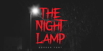 The Night Lamp is a horror style display font. Inspired from horror thriller movie. This font designed for Halloween, Horror, Thriller and Scary theme projects. The Night Lamp would be perfect for logo, quotes, apparel, comic, cover books, cards, posters, or anything that requires a horror or scarylook!
 - Bungler by Bogstav,
$17.00 This font is a strange mixture of sweet strawberry cake and horrifying terror! :) Meaning that the font can be used for something pretty scary (such as a horror poster) or something quite innocent (like products for children) It resembles fat brushstrokes, but clearly it was drawn with a pen.
 - Charons Obol by Hanoded,
$20.00 Charon's Obol is a scary, brushed typeface. It was created using cheap paint and stiff brushes - hence the rough texture of the glyphs. Using this font will ensure you a safe passage across the river styx - just don't pay the ferryman until he gets you to the other side…
 - Oyukis Ghost by Hanoded,
$10.00 Oyuki's Ghost is a scary typeface made with a steel pen and Chinese Ink. The name comes from a painting by Maruyama Okyo (1733–1795), which depicts his mistress who died young. Maruyama Okyo claimed she haunted him in his sleep. The font comes with extensive language support.
 - Akrampus by Mvmet,
$10.00 Akrampus is a scary Christmas display font. You can use it for anything ranging from t-shirts, book designs, and greeting cards to stickers and posters, or anything that needs a casual touch. Fall in love with its incredibly versatile style, and use it to create lovely designs!
 - Lunturan by Differentialtype,
$10.00 Hello this is a Lunturan, display font with a blood theme or something melted. Lunturan can be used for all kinds of scary or melting themed purposes. This font is designed to be a true favourite, it has the potential to take any of your creative ideas to the highest level!
 - Adora Normal PRO by preussTYPE,
$53.90 German type designer Ingo Preuss created this sans Super-family between 2010 and 2015. The family has 84 weights, ranging from Light to Ultra in Normal, Compact, Condensed and Compressed (including italics). It comes in OpenType format with extended language support. All weights contain ligatures, superior characters, proportional lining figures, tabular lining figures, proportional old style figures, lining old style figures, matching currency symbols, fraction- and scientific numerals and matching arrows. The “Adora PRO family” is ideally suited for advertising and packaging, editorial and publishing, logo, branding and creative industries, poster and billboards, small text, wayfinding and signage as well as web and screen design.
 - TG Aqsa Grotesque Pro by Tegami Type,
$30.00 TG Aqsa Grotesque Pro is the latest version of the font that was previously released in 2017, TG Aqsa Grotesque. In this latest version there are several optical fixes on each glyphs. In this latest version also added 2 new weights namely black and ultra black so that TG Aqsa Grotesque Pro has 6 fonts of different weights. Still maintaining the sans serif grotesque style coupled with the improvement of the letter form make TG Aqsa Grotesque Pro have a good level of readability when applied as a body text. And this version also has extended latin which will support more than 90+ different languages.
 - Mojodelic by Mysterylab,
$21.00 Looking for a font with that certain... umm... special mojo? Mojodelic might just be the niche font that you need to create that unique statement — one that really pops off the page. While this typeface certainly grooves with the 1960s – 1970s vintage psychedelic and pop art look, it's also a perfect fit with retro 1990s party-way-too-hard youth culture graphics. With its ultra-bold reverse-contrast design and whimsical little curlies, this one's got equal parts silliness and swagger. Try it on skateboard graphics, retro message t-shirts, apparel logos, beverage labeling, candy packaging, teen/tweener marketing, greeting cards... you name it. Enjoy.
 - FF Clan by FontFont,
$68.99 Polish type designer Lukasz Dziedzic created this sans FontFont between 2006 and 2008. The family has 84 weights, ranging from Thin to Ultra in Compressed, Condensed, Narrow, Medium, Wide, and Extended (including italics) and is ideally suited for advertising and packaging, editorial and publishing, logo, branding and creative industries, poster and billboards, small text, wayfinding and signage as well as web and screen design. FF Clan provides advanced typographical support with features such as ligatures, small capitals, case-sensitive forms, fractions, super- and subscript characters, and stylistic alternates. It comes with a complete range of figure set options – oldstyle and lining figures, each in tabular and proportional widths.
 - Adora Compressed PRO by preussTYPE,
$53.90 German type designer Ingo Preuss created this sans Super-family between 2010 and 2015. The family has 84 weights, ranging from Light to Ultra in Normal, Compact, Condensed and Compressed (including italics). It comes in OpenType format with extended language support. All weights contain ligatures, superior characters, proportional lining figures, tabular lining figures, proportional old style figures, lining old style figures, matching currency symbols, fraction- and scientific numerals and matching arrows. The “Adora PRO family” is ideally suited for advertising and packaging, editorial and publishing, logo, branding and creative industries, poster and billboards, small text, wayfinding and signage as well as web and screen design.
 - Neue Frutiger Variable by Linotype,
$328.99 The Neue Frutiger Variable Set is a single font file that features three axes: Weight, Width and Italic. The Weight axis has a range from Ultra Light to Extra Black. The Width axis provides a range of condensed values. The Italic axis is a switch between upright and italic. Variable fonts act as a complete family of fonts in a single file. The new Variation font feature is supported by a growing number of desktop design applications, and more importantly by all the major web browsers. Variable fonts provide a variety of benefits to web and print designers and developers including flexible, responsive typography.
 - Mijas by Eurotypo,
$42.00 Mijas Ultra font was designed specially as a headlines and caption text for advertising, packaging and Publishing design. It has strong visual impact, a persuasive personality and seduction appeal throughout its organic shapes. This versatile typeface is quite useful for creating logotypes, a variety of alternates and swash tails in three different styles and length were drawn for most letters, plenty of vowel-focused ligatures, it covers all Latin-based languages. Please refer to quick reference manual included. Mijas is a little white town located at a mountainside above the blue Mediterranean Sea, in the heart of the Costa del Sol. It has high contrast, small counterforms and friendly climate.
 - Trade Convention JNL by Jeff Levine,
$29.00 An ad for the annual Variety Club Convention appeared in the March 18, 1940 issue of "The Film Daily. The main headline was hand lettered in a classic Art Deco "solid" style of sans serif - ultra bold and with no counters - but had one additional feature: 'engraved' lines to the left of each character. This has now been expanded into the digital typeface Trade Convention JNL, which is available in both regular and oblique versions. Variety Clubs (now know as Variety - The Children's Charity) was founded in Pittsburgh, Pennsylvania in 1928 by entertainers specifically to aid children. Their history can be found at https://variety.org/who-we-are/history
 - FF Fontesque Sans by FontFont,
$59.99 Canadian type designer Nick Shinn created this display, script, and sans FontFont in 2001. The family has 8 weights, ranging from Ultra Light to Extra Bold (including italics) and is ideally suited for advertising and packaging, festive occasions, film and tv, music and nightlife as well as software and gaming. FF Fontesque Sans provides advanced typographical support with features such as ligatures, alternate characters, case-sensitive forms, and stylistic alternates. It comes with a complete range of figure set options – oldstyle and lining figures, each in tabular and proportional widths. This FontFont is a member of the FF Fontesque super family, which also includes FF Fontesque.
 - Stefani by Okaycat,
$19.50 Stefani EHYO was designed ultimately with pure simplicity in mind, to carry an inviting, friendly style. The result is an ultra clean look with versatility: useful for either full bodies of text or for a nice headliner. The simplified smooth forms are highly legible and carefully well-matched, so can even be used over a busy background or at very small point settings. Stefani is extended, containing the full West European diacritics & a full set of ligatures, making it suitable for multilingual environments and publications. Choose Stefani for any application where you want solid readable text, any time you want a pleasant and clean feel to your presentation.
 - Gotcha by Nicky Laatz,
$15.00 Say hello to GOTCHA! A versatile new marker font with bounce and vigor and a a super-sexy-casual vibe! The Gotcha fonts are incredibly versatile , from street urban, to styled fashionista, to hearty food branding - whatever the weather, Gotcha! has you covered :) Gotcha! comes with a set of alternate upper and lower case letters, and a second set of lowercase letters - this way you can write one word in a million different ways - and keep things ultra natural looking. A comprehensive set of double letter ligatures are also included. Gotcha! also comes with an “Extras Font” which include textured swashes and splatters/grit to add some pizazz to your design.
 - Boronia by Studioways,
$10.00 Meet Boronia, Studioways' latest typeface release! This six weight family was developed with the single idea of redefining the simple sans serif to pair with any style of font family. It is meant to blend with a variety of media, from editorial to bridal and fashion. The Boronia family weights range from an ultra sexy thin to a voluptuous bold, each with a companion italic, making it the 'perfect type' for all tastes. Each font supports the standard Western European character set. So scoop up this great sans serif font, BORONIA, and start making your work shine! Buy them individually or get a great deal on the family pack!
 - Adora Compact PRO by preussTYPE,
$53.90 German type designer Ingo Preuss created this sans Super-family between 2010 and 2015. The family has 84 weights, ranging from Light to Ultra in Normal, Compact, Condensed and Compressed (including italics). It comes in OpenType format with extended language support. All weights contain ligatures, superior characters, proportional lining figures, tabular lining figures, proportional old style figures, lining old style figures, matching currency symbols, fraction- and scientific numerals and matching arrows. The “Adora PRO family” is ideally suited for advertising and packaging, editorial and publishing, logo, branding and creative industries, poster and billboards, small text, wayfinding and signage as well as web and screen design.
 - Along Sans Grande by Brenners Template,
$19.00 Along Sans Grande is an ultra condensed sans serif font family developed based on the typeface styles of the Along Sans Geometric Font Family. In the case of the black weight with the largest change in the size of the stem, the size is 180:140:100, respectively. And, the thin weight style has the same proportion of stem size. Some Glyphs that need to support the stem alone remain a size 222 for Black Weight. These interpolation rules are sufficient to complement the rhythm and readability of the whole family. This family is perfect for special titling works, logo designs, and cool showcases.
 - Black-Out by Wordshape,
$25.00 Bohemian Modern slab stencil display font Black–Out is a result of three things: the need for a distinctive ultra-black display typeface, an admiration for slab-serifs and Clarendons, and the love of systematic stencil type. Fusing all the desires together resulted in Black–Out. What was the inspiration for designing the font? Slab serifs + Clarendons + systematic stencil type = Black-Out! What are its main characteristics and features? It is a massive chunk of type, contemporary in nature while also harking back to the sun-drenched Modernism of California of the 1970s. Usage recommendations: Display type for use in materials that are meant to evoke a range of emotions.
 - Neue Frutiger Hebrew by Linotype,
$79.00 Neue Frutiger Hebrew was created by Yanek Iontef and a team of designers and font engineers from the Monotype Studio, under the direction of Monotype type director Akira Kobayashi. The family is available in 10 weights from Ultra Light to Extra Black, with matching italics. Neue Frutiger Hebrew embodies the same warmth and clarity as Adrian Frutiger’s original design, but allows brands to maintain their visual identity, and communicate with a consistent tone of voice, regardless of the language. It is part of the Neue Frutiger World collection, offering linguistic versatility across environments – suited to branding and corporate identity, advertising, signage, wayfinding, print, and digital environments.