10,000 search results
(0.032 seconds)
- Dj Courageous - Unknown license

- Andron 2 by SIAS,
$44.90 The sister fonts Andron 2 English and Andron 2 Deutsch provide a groundbreaking new possibility to render literature text bodies in a sophisticated traditional and yet modern way of type. In German typographic history there has once been a long-lasting struggle called the Frakturstreit (the blackletter quarrel). It was about wether German text ought to be composed in blackletter or rather in Roman type, a question upon which even Goethe, Schiller and other period celebrities got grey over time. However, blackletter type remained alive and has just recently seen an astonishing renaissance. This is not about a blackletter revisionism or some ‘mixture’ concept arguably bridging the gap between either worlds. Andron 2 English and Andron 2 Deutsch offer a new approach to circumvent that old antagonism. As for the lowercase letters I applied certain features of blackletter type onto the glyphs – but entirely abandoned the principle of the broken stroke as such. The result is a lowercase alphabet in the classical Andron style which may be considered an attractive alternative for text in English, German or even other languages. So it’s no longer entirely about choosing between ‘modern’ Roman or ‘ancient’ blackletter only. Andron 2 English Regular and Andron 2 Deutsch Regular feature the same lowercase glyphs but differ in the majuscules (Andron 2 English has normal Latin capitals). ++++ 2012 + NEW! +++ In response to its growing popularity we now present five new fonts as part of the Andron 2 series. Andron 2 English is completed by an Italic and a Bold font. Andron 2 Deutsch now contains three interesting alternative fonts: Italic, Scriptive and Laendlich. Last but not least – A new set of wonderful classical typographic ornaments is part of the Italic and Scriptive fonts. – You can also purchase these ornaments separately as “Andron Ornamente”.
 - Compatil Fact by Linotype,
$50.99Compatil is the first comprehensive type system which enables all typographical elements to be used to full effect in order to reproduce the message conveyed by text information. Four different type styles with a total of 16 weights including italics have been merged into a unique typographical network. There are now no limits to the font user's creativity. The system is a product of technical innovation and constitutes a new design approach which meets the highest aesthetic standards. For almost two years, a team of experts from Linotype has been working with initiator Professor Olaf Leu under the direction of Silja Bilz, Erik Faulhaber and Reinhard Haus to create the Compatil type system. Despite the Internet and TV, it is essential today to be able to absorb information quickly by being able to read it with ease. A fact that is becoming increasingly important both on-screen and on paper. It is the role of the font to increase legibility and to ensure typographically perfect results for text design work. The new Compatil type system meets all these needs. The Compatil is a part of the Platinum Collection. The following four different styles are available: Compatil Exquisit, Compatil Fact, Compatil Letter and Compatil Text. Compatil is available in various font formats: 16 separate OT Pro fonts including the small caps and Adobe Central European character set for OpenType-supporting applications like Adobe InDesign, or as 32 separate OpenType Com fonts for office communication, with the following special features: 1. Optimized display capabilities for computer screens eXcellent Screen Fonts (XSF-quality). 2. An extended, international character set, which supports 48 different languages for Microsoft Office applications like MS Word or as 64 PostScript fonts, which can be used in non-OpenType-supporting applications like Quark XPress. - Compatil Fact Paneuropean by Linotype,
$103.99Compatil is the first comprehensive type system which enables all typographical elements to be used to full effect in order to reproduce the message conveyed by text information. Four different type styles with a total of 16 weights including italics have been merged into a unique typographical network. There are now no limits to the font user's creativity. The system is a product of technical innovation and constitutes a new design approach which meets the highest aesthetic standards. For almost two years, a team of experts from Linotype has been working with initiator Professor Olaf Leu under the direction of Silja Bilz, Erik Faulhaber and Reinhard Haus to create the Compatil type system. Despite the Internet and TV, it is essential today to be able to absorb information quickly by being able to read it with ease. A fact that is becoming increasingly important both on-screen and on paper. It is the role of the font to increase legibility and to ensure typographically perfect results for text design work. The new Compatil type system meets all these needs. The Compatil is a part of the Platinum Collection. The following four different styles are available: Compatil Exquisit, Compatil Fact, Compatil Letter and Compatil Text. Compatil is available in various font formats: 16 separate OT Pro fonts including the small caps and Adobe Central European character set for OpenType-supporting applications like Adobe InDesign, or as 32 separate OpenType Com fonts for office communication, with the following special features: 1. Optimized display capabilities for computer screens eXcellent Screen Fonts (XSF-quality). 2. An extended, international character set, which supports 48 different languages for Microsoft Office applications like MS Word or as 64 PostScript fonts, which can be used in non-OpenType-supporting applications like Quark XPress. - Compatil Letter by Linotype,
$50.99Compatil is the first comprehensive type system which enables all typographical elements to be used to full effect in order to reproduce the message conveyed by text information. Four different type styles with a total of 16 weights including italics have been merged into a unique typographical network. There are now no limits to the font user's creativity. The system is a product of technical innovation and constitutes a new design approach which meets the highest aesthetic standards. For almost two years, a team of experts from Linotype has been working with initiator Professor Olaf Leu under the direction of Silja Bilz, Erik Faulhaber and Reinhard Haus to create the Compatil type system. Despite the Internet and TV, it is essential today to be able to absorb information quickly by being able to read it with ease. A fact that is becoming increasingly important both on-screen and on paper. It is the role of the font to increase legibility and to ensure typographically perfect results for text design work. The new Compatil type system meets all these needs. The Compatil is a part of the Platinum Collection. The following four different styles are available: Compatil Exquisit, Compatil Fact, Compatil Letter and Compatil Text. Compatil is available in various font formats: 16 separate OT Pro fonts including the small caps and Adobe Central European character set for OpenType-supporting applications like Adobe InDesign, or as 32 separate OpenType Com fonts for office communication, with the following special features: 1. Optimized display capabilities for computer screens eXcellent Screen Fonts (XSF-quality). 2. An extended, international character set, which supports 48 different languages for Microsoft Office applications like MS Word or as 64 PostScript fonts, which can be used in non-OpenType-supporting applications like Quark XPress. - La Chic by Cultivated Mind,
$39.00 The La Chic family comes loaded with an extended character set of 575 glyphs covering a range of languages and alternate versions of letterforms for display use. La Chic's Ligature feature comes with the standard fi and fl ligatures, as well as ff, ffi and ffl ligatures. La Chic Pro's Stylistic Alternates feature adds a little more flair to the mix with mildly flourished Capitals, scripted so that when typeset in all caps, only the first Capital will be flourished to preserve readability and avoid unsightly collisions. La Chic Pro's Stylistic Alternates feature also includes automatic Initial & Final lowercase letterforms that will automatically swap to avoid any letter collisions as you type. La Chic's Swash Alternates feature takes the flair even further with elegantly flourishing Capitals, also scripted so that when typeset in all caps, only the first Capital will be flourished to preserve readability and avoid unsightly collisions. The complete lowercase is also substituted for a flourishing lowercase set. By enabling BOTH the Stylistic Alternates and Swashes features, automatic Initial & Final lowercase letterforms that will automatically swap to avoid any letter collisions as you type including the flourishing swashes lowercase. But there's still more style and flair yet. All features have Special Titling Swap-Out Ligatures for the following words "and", "of", "at", "from", "by", "and the" when typed in Parenthesis (whether typeset in Capitals or lowercase). All features also include a small batch of Special Long Flourish characters enabled by typing an underscore after each letter (IE: H_, L_, t_ ,and w_). And there's STILL MORE. 51 additional letters not blended into any of the Opentype features are accessible by way of a Glyph map in compatible programs and/or system options to customize your La Chic designs even further.
 - Compatil Text by Linotype,
$50.99Compatil is the first comprehensive type system which enables all typographical elements to be used to full effect in order to reproduce the message conveyed by text information. Four different type styles with a total of 16 weights including italics have been merged into a unique typographical network. There are now no limits to the font user's creativity. The system is a product of technical innovation and constitutes a new design approach which meets the highest aesthetic standards. For almost two years, a team of experts from Linotype has been working with initiator Professor Olaf Leu under the direction of Silja Bilz, Erik Faulhaber and Reinhard Haus to create the Compatil type system. Despite the Internet and TV, it is essential today to be able to absorb information quickly by being able to read it with ease. A fact that is becoming increasingly important both on-screen and on paper. It is the role of the font to increase legibility and to ensure typographically perfect results for text design work. The new Compatil type system meets all these needs. The Compatil is a part of the Platinum Collection. The following four different styles are available: Compatil Exquisit, Compatil Fact, Compatil Letter and Compatil Text. Compatil is available in various font formats: 16 separate OT Pro fonts including the small caps and Adobe Central European character set for OpenType-supporting applications like Adobe InDesign, or as 32 separate OpenType Com fonts for office communication, with the following special features: 1. Optimized display capabilities for computer screens eXcellent Screen Fonts (XSF-quality). 2. An extended, international character set, which supports 48 different languages for Microsoft Office applications like MS Word or as 64 PostScript fonts, which can be used in non-OpenType-supporting applications like Quark XPress. - Adelle by TypeTogether,
$52.00 While Adelle is a slab serif typeface conceived by Veronika Burian and José Scaglione specifically for intensive editorial use, mainly in newspapers, magazines, and online, its personality and flexibility make it a true multipurpose typeface. Adelle’s superior screen rendering and cross-platform consistency has also made it one of our most popular webfonts. The intermediate weights deliver a neutral look when used in text sizes, providing the usual robustness expected in a newspaper font. The unobtrusive appearance, excellent texture, and slightly dark colour allow it to behave flawlessly in continuous text, even in the most unforgiving editorial applications. As it becomes larger in print, Adelle shows its personality through a series of measured particularities which make it easy to remember and identify. Its energetic character, so inherent to slab serif fonts, becomes evident when used for subheadings and headlines. A condensed series of seven weights with matching italics expand Adelle’s possibilities. This extension provides flexible solutions in situations where saving space is vital but losing legibility is not an option. The new condensed series shares the same personality, proportions, and skeleton of the Adelle family, creating an harmonious texture when combined. Be sure to check out the companion to Adelle, Adelle Sans, to complete the look of your design with the intended personality and flexibility. Awards – Third prize for Latin text typeface in the 2009 Granshan Type Design Competition – Won Gold for Original Typeface in the 2010 European Design Awards – Selected in the first Ukrainian typeface competition in 2010 – Exhibited at the Rutenia Calligraphy & Typography Festival (http://rutenia.org.ua/en/index_u.html) in Kyiv, 2010 – Selected in the 2011 Type Directors Club Tokyo Exhibition – Selected in Communication Arts 2011 Typography Annual – Selected in Yearbook of Type I, 2013 – Part of the exhibition «Call for Type» and subsequent book Neue Schriften (New Typefaces)
 - FM Bolyar Sans Pro by The Fontmaker,
$29.00 This is Bolyar Sans font family. For us it is a dream-come-true. It took more than 1 year hard work to transform the existing Bolyar Pro from Serif to Sans Serif version. The result really surprised even us from The Fontmaker and we decided to develop it in 9 instead of 7 weights. So at the end we created 7 different styles of Bolyar sans each consisting from 9 precise weights. Bolyar Sans is not just another font family in our portfolio - it is the essence from all our efforts thru the past 5 years to create a powerful type tool that could easily meet very diverse and complex demands of modern design. Furthermore, like all its predecessors, Bolyar Sans is a type concept created by Designers for Designers. If you are in wine and spirits industry, packaging design, or you just love to work with strong headlines that effortlessly could turn into brand logos, then you should definitely try our Bolyar Sans. It is designed for this. Of course there are plenty of different features like multilingual support, ligatures, alternates, we even added adaptive over- and underlining to make it even more complex in its use. Bolyar Sans pairs perfectly with other members of Bolyar Family - Pro , Ornate and Typecraft . So as you see Bolyar is developed as a type platform with own character and style. By using it you could be vintage, classic, modern, soft, even bold, rough and ornate. It is a visual bridge between different typographic periods united under Bolyar name. With our Sans version we aim to be contemporary and to provide powerful type tool to those designers who often love to swim between past and modernity.
 - MMC Insignia by MMC-TypEngine,
$30.00 MMC Insignia, is an Iconic & Emblematic Neogothic Geometric Capitals Display… Assembled by Trivial Squares and Diagonals Symbols Pattern from a puzzled grid Aftermath!! Includes Stylistic Alternates!! +Extra Monospaced Figures. In 22 styles, with Obliques, both for single display and layer Typesetting, plus OpenType Features & Bonus Blocks Fonts! MMC Insignia is a Small Caps Typeface, which default lowercases character set is included in the Pro family, its cursive version, apart from it, has also Exclusive Stylistic Alternates… Its atmosphere stands by on both Corporative to Decorative, Modern, Fashion, Federalist, Bohemian, Romantic, Ludic, Treasured Look, Etc. This Display font-family is the result of the repeated applications of this unique infamous Icon or Symbol, of two counterpointed triangles, implicit as hourglasses, in order to compose an innovative and unprecedented typographic pattern and modulation concept through the letterforms, in an extremely Geometric style. The Graphic Sign used throughout this type, is a remarkable trend used already in Logos of different businesses, whose most famous case refers to a famous International Bank, which doesn’t need to be mentioned, as it is instantly associated! This characteristic innovation was the main motivation while creating this type. Usage Suggestions: Type Fancy Titling texts, Display Remarkable Logos, Branding Projects, Labels, Emblems, Fashion Patterns, or in everything Noble and designed for Excellence as a type of Insignia, or distinguished marks and attributes of Royalty and Power!! That’s also forwardly, the reason why it was named MMC Insignia… TIPS: 1-Combine styles into innumerous possibilities of Chromatic Typesetting, by ‘central pasting’ layers… You may dislocate layers for improvisations! 2-USE BLOCK “FREE-STYLES” 1 & 2 also to add default 3D! Change 3D directions by switching Block 1 to Block 2, that way you can Zig-Zag words and lines. *Also shift the block layer up to bottom limit, it makes the 3D direction turn upside down. Greetings! André, MMC-TypEngine.
 - Storyteller - Personal use only

- Kolm Keltek by 2D Typo,
$36.00 Kolm Keltek is a collection of ornaments organized into two font files. The ornaments can be divided into two groups: Friezes (borders) and Rapports (patterns). All ornaments belong to the Celtic culture. These ornaments are taken from manuscripts. This makes the font exclusive and unique among other digital collections of ornaments. These patterns perfectly suit to be used in the design of invitations, diplomas, certificates or other printed materials in historical style design. Kolm Keltek - Demo Guide contains basic examples of how to combine the ornaments that significantly facilitates the use of the collection. Kolm Keltek is one of the many high-quality ornamental fonts offed by the 2D Typo foundry.
 - As of my last update in early 2023, a font directly named "Family Guy" specifically designed to mimic the title logo or typography used in the popular American animated sitcom "Family Guy" does not h...
- Retiro Std by Typofonderie,
$59.00 Full of life Hispanic Didot in 2 optical sizes Retiro is a daring interpretation of Spanish typography. Severe, austere and yet, full of life, Retiro is a vernacular version of Castilian and Andalusian in a typical Didot. Named after a lovely park in Madrid, Retiro started life as a a bespoke typeface designed to give a unique voice to the magazine Madriz. In 2006, the founder of Madriz was looking for a Didot for his new magazine. The Didot is the archetypal typeface used in high-end magazines. Retiro is a synthesis of these high contrast styles mixed with an Hispanic mind. Result is then, after 2-3 years of work, a typeface with countless variations to establish typographic shades adapted to different sections and pages of the Madriz. In 2014, it was necessary to further revise the typeface before its launch at Typofonderie. In order to keep its originality, the unique weight was retained, but complemented with optical size variants to set highly contrasted headlines into various sizes, visually balanced. How to use Retiro optical sizes? Each font provided in Retiro family is named according to the scale of body size: 24 pt and 64 pt. Of course, these names are referring to the body sizes used in typographic design. In the “glorious old days,” the letterpress period, it was customary to cut punches directly to the size at which typefaces would be used. The punchcutter had to visually adapt his design to the engraving size. The aim was to optimize the best contrast and general weight, but also to respect both design’s and reader’s needs. In Retiro’s case, intended for large titling sizes, it’s an adaptation of this ancient practice for our contemporary uses. Although each font is named by a typographic point size, do not feel obliged to use this font at this precise size, but why not, in larger or smaller. It’s rather the concept of gradients that must be preserved in layouts, rather than strictly size numbers. It’s up to the designer to select the right font size for his own designs. Granshan Awards 2012 Creative Review Type Annual 2011 Designpreis 2011 Club des directeurs artistiques, 41e palmarès Type Directors Club 2010 Certificate of Type design Excellence
 - Gondola SD - 100% free

- Bola - Unknown license

- The Underwood1913 font by Gilles Le Corre is a striking typeface that vividly captures the essence and nostalgic charm of early 20th-century typewriting. Inspired by the Underwood No. 5 typewriter, w...
- Blakecats by Maulana Creative,
$11.00 Blakecats is a quirky handwritten font. With chunky bold stroke, upright and fun character with a bit of ligatures. To give you an extra creative work. Blakecats font support multilingual more than 100+ language. This font is good for logo design, Social media, Movie Titles, Books Titles, a short text even a long text letter and good for your secondary text font with sans or serif. Make a stunning work with Blakecats font. Cheers, MaulanaCreative
 - Hounslow by Device,
$29.00 Hounslow is closely related to Acton in structure, and takes the latter’s simple block construction into the third dimension. Three variants – open, solid and shadow – can be freely mixed in one setting for effect. Originally designed solely in the italic variant, an upright was added by request. A further unreleased set with a range of line weights was later commissioned by the New York Times magazine, and used extensively in their television supplement.
 - Conspirates by Maulana Creative,
$14.00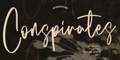 Conspirates is an upright signature script font. With high contrast stroke, fun character with a bit of ligatures. To give you an extra creative work. Conspirates font support multilingual more than 100+ language. This font is good for logo design, Social media, Movie Titles, Books Titles, a short text even a long text letter and good for your secondary text font with sans or serif. Make a stunning work with Conspirates font. Cheers, MaulanaCreative
 - Core Narae by S-Core,
$59.00 CoreNarae is an upright, casual handwriting style font and all glyphs have been hand-crafted. This typeface is live and friendly because of its bending strokes and rhythmic feeling, so it is good for fun text for posters, headers or cards. Supported codepages are MS Windows 1252 Latin1 and MS Windows 949 Korean consisting of 11,172 Korean letters and Symbols except Chinese. This font will make your works more friendly and emotional.
 - Grotbox by Aah Yes,
$4.95Grotbox is an interesting, if not startling, distressed punk font. There are two varieties: one with upright characters; the other with the characters rotated out of whack for extra informality. Legibility is maintained, despite the wild industrial feel of the typeface, and it's designed to grab the attention. The zip package contains both OTF and TTF versions - install either OTF or TTF, not both versions of a font on the same machine. - Dellycia by Febri Creative,
$15.00 Dellycia is a modern handwritten font with a subtle touch. It comes in 2 styles, namely upright and italic. This font is designed with a powerful OpenType feature in mind. It includes multilingual support, numbers, punctuation, ligature, alternate and much more. It is suitable for graphic design and use of any screen. Dellycia is great for the web, brands, product promotions, product names, companies and also for other projects and will make your design perfect.
 - Volatter by Maulana Creative,
$11.00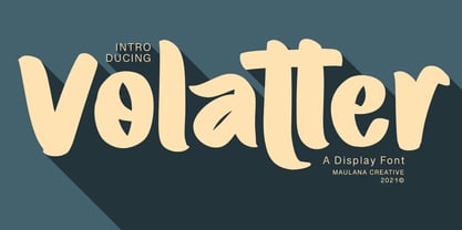 Volatter is simply handwritten display font with natural hand drawn, clean bold stroke, uprights and fun character. To give you an extra creative work. Volatter font support multilingual more than 100+ language. This font is good for logo design, Social media, Movie Titles, Books Titles, a short text even a long text letter and good for your secondary text font with sans or serif. Make a stunning work with Volatter font. Cheers, MaulanaCreative
 - Cosen by Larin Type Co,
$16.00 Cosen is an elegant, modern and contrast sans-serif font family, and a great fashionable solution for your project. It includes upright and Italic style, each of them has four weights from thin to bold. This is a multi-purpose font that is perfect for fashion project, it is contrasted, modern and easy to read. With it, you can create logos, banners, use in advertising, packaging, book covers and magazines, headings, descriptions and much more.
 - Sherika by Seniors Studio,
$15.00 Sherika is a cool and authentic sans serif font family. Seven weights plus matching italics. Simple geometry with nuance that adds warmth. t’s a perfect choice for branding, magazines, posters, advertising, packaging, headlines, logos, web, print etc. 14 styles: 7 uprights and matching italics. 232 glyphs. Latin based languages. OpenType features, including ligatures. Variable Font Includes. If you need help or advice, please contact me by e-mail "seniorsstudio@gmail.com" Thank you!
 - Kari by Positype,
$39.00 Kari is a complete redraw and expansion of the award-winning typeface originally released in 2005. Featuring both upright and ‘italic’ styles, this soft and curvy script is perfect for packaging, expressive headlines, and fun settings. Feature-rich and flexible, Kari is stocked full of alternate characters, swashes, titling options, expanded numeral sets, new dingbats, and a lot more… and for the first time, the much-requested ‘Medium’ weight is now available.
 - Venture Point by Maulana Creative,
$14.00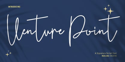 Venture Point is a modern signature script font. With upright consist mono-line stroke, fun character. To give you an extra creative work. Venture Point font support multilingual more than 100+ language. This font is good for logo design, Social media, Movie Titles, Books Titles, a short text even a long text letter and good for your secondary text font with sans or serif. Make a stunning work with Venture Point font. Cheers, Maulana Creative
 - DIN 2014 by ParaType,
$47.00 A contemporary interpretation of the famous DIN typeface. Regular style suits for long texts, while Light and Bold variations work well in large sizes. The typeface includes 24 styles: 6 upright and 6 normal-width italics, as well as 6 Narrow and 6 Condensed styles. The typeface was designed by Vasily Biryukov and released by Paratype in 2015. The set of Condensed styles was added by Alexander Lubovenko and Isabella Chaeva in 2022.
 - Caberolla by Maulana Creative,
$12.00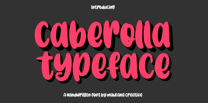 Caberolla is a quirky handwritten font. With chunky bold stroke, upright and fun character with a bit of ligatures. To give you an extra creative work. Caberolla font support multilingual more than 100+ language. This font is good for logo design, Social media, Movie Titles, Books Titles, a short text even a long text letter and good for your secondary text font with sans or serif. Make a stunning work with Caberolla font. Cheers, MaulanaCreative
 - Praxis Next Variable by Linotype,
$314.99Praxis Next Variable Italic is a single font file that features an italic design with two axes: Weight and Width. For your convenience, the Weight and Width axes have preset instances The Weight axis has a range from Light to Ultra. The Width axis provides a range of condensed values. This Italic font is provided as an option to customers who do not need Roman (uprights), and want to keep file sizes to a minimum. - Aurellia by Maulana Creative,
$11.00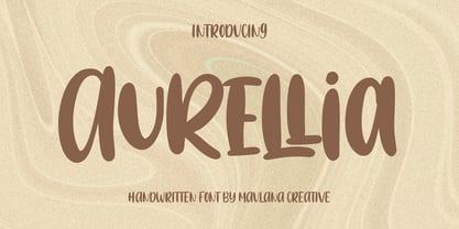 Aurellia is a simply casual Handwritten font. With bold stroke, uprights and fun character with a bit of ligatures. To give you an extra creative work. Aurellia font support multilingual more than 100+ language. This font is good for logo design, Social media, Movie Titles, Books Titles, a short text even a long text letter and good for your secondary text font with sans or serif. Make a stunning work with Aurellia font. Cheers, MaulanaCreative
 - Cholasette by Maulana Creative,
$15.00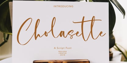 Cholasette is casual script font, with clean high contrast stroke, upright and fun character. It has Opentype features ligatures of character, To give you an extra creative work. Cholasette font support multilingual more than 100+ language. This font is good for logo design, Social media, Movie Titles, Books Titles, a short text even a long text letter and good for your secondary text font with sans or serif. Make a stunning work with Cholasette font.
 - Gramary by Maulana Creative,
$14.00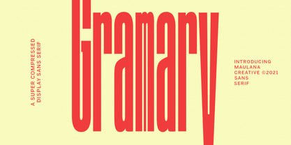 Gramary is a Super Compressed display font. With bold weight stroke, upright and fun character with a bit of ligatures. To give you an extra creative work. Gramary font support multilingual more than 100+ language. This font is good for logo design, Social media, Movie Titles, Books Titles, a short text even a long text letter and good for your secondary text font with script. Make a stunning work with Gramary font. Cheers, MaulanaCreative
 - Osande by XdCreative,
$20.00 Osande is a modern sans serif font with neo-Grotesque touch, more homogenous forms with minimal stroke contrast. Osande the font family contains 3 basic forms: italics, obliques, and upright. Each of which has 7 different weights ( Thin, Extra Light, Light, Regular, Medium, Semibold, and Bold ). Osande can easily be matched to an incredibly large set of projects, so add it to your creative ideas and notice how it makes them stand out! Thank you.
 - JennerikInformal by Ingrimayne Type,
$9.95 JennerikInfml is a friendly, casual typeface family that has the appearance of neat hand printing. It began as the italics to Jennerik, but I ended up separating it and giving it a different set of upper-case letters. Although its lower-case letters were designed as italics, it was originally published in 1992 with three weights as upright letters without a slant or skew. The revision of 2020 added the oblique or slanted styles.
 - Butterjam by Maulana Creative,
$16.00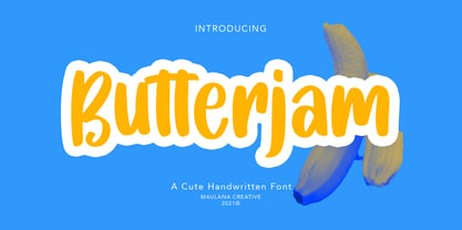 Butterjam is handwritten font, with bold stroke, uprights and fun character. It has Opentype features ligatures of character, To give you an extra creative work. Butterjam handwritten font support multilingual more than 100+ language. This font is good for logo design, Social media, Movie Titles, Books Titles, a short text even a long text letter and good for your secondary text font with sans or serif. Make a stunning work with Butterjam font. Cheers, MaulanaCreative
 - Whiskey State by Mans Greback,
$59.00 Whiskey State strides onto the canvas like a cowboy entering a saloon: Tall, confident, and impossible to ignore. The font boasts an impressive height, stretching upwards with the same vigor as plumes of smoke rising from a smoldering campfire. Every letter stands upright and proud, imbued with the spirit of the Old West, yet exuding a contemporary coolness and innovativity. Its serifs aren't just appendages; they are expressions, giving the typeface its unique, assertive character.
 - GHEA Aram by Edik Ghabuzyan,
$40.00 GHEA Aram is a super family font. It has 10 upright weights and their Italics. GHEA Aram supports Central European, Armenian and Cyrillic language systems. The weights from Regular to Bold and their Italics can be used as text fonts. The weights thinner than Regular and thicker than Bold can be used as Display fonts. It is an easily readable two side serif high contrast font but the eyes don't get tired while reading.
 - Hopipolla by Maulana Creative,
$14.00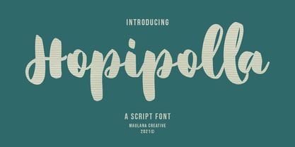 Hopipolla is a high contrast handwritten script font. upright and fun character with a bit of ligatures. To give you an extra creative work. Hopipolla font support multilingual more than 100+ language. This font is good for logo design, Social media, Movie Titles, Books Titles, a short text even a long text letter and good for your secondary text font with sans or serif. Make a stunning work with Hopipolla font. Cheers, Maulana Creative


