10,000 search results
(0.022 seconds)
- Erotokritos - Unknown license

- Porspican Serif - 100% free

- Hanseat by profonts,
$41.99 Hanseat is a profonts typeface family by Ralph M. Unger, heavily inspired by Germany’s official DIN 1451 Engschrift. Originally, the German DIN (Deutsches Institut für Normung / German Committee for Industrial Standardization) typefaces were taken as the standard traffic fonts for street signs and house numbers. During the 1980s, the DIN fonts became digitally available for sign making systems, initially again primarily for traffic sign purposes. However, later on, the DIN fonts became also popular in the world of designers and art directors. Hanseat is a modern, contemporary interpretation of the DIN fonts, responding to the ever growing demand for such typeface designs reflecting the spirit of the industrial area.
 - Berling by URW Type Foundry,
$35.99 Berling is an old style typeface based on the classical Venetian model used by Aldus Manutius at the end of the fifteenth century. Berling was first cut by the Berling foundry in 1951 with further weights released in 1958. The Berling font family is intended primarily for setting text in books~ journals and magazines.
 - 2010 Cancellaresca Recens by GLC,
$38.00 This font was inspired by the Cancellaresca pattern (look at our 1491 Cancellaresca and 1610 Cancellaresca), in particular Spanish one, from Francisco Lucas, who was working in the late 1500s. It is a modern variation, including West European accented characters and a lot of initial and final alternates (not in the Mac TT version for technical reasons).
 - Estrangelo Edessa by Microsoft Corporation,
$49.00The Estrangelo Edessa was developed by The Syriac Computing Institute and Microsoft to support the Syriac script. Syriac is written from right to left, like Arabic and Hebrew. You computer system must be properly enabled with keyboard layout and text input services (IME) to use this font. The Syriac letter forms in Estrangelo Edessa were designed by Paul Nelson and George Kiraz. The design is based on types from an Ohioan press, probably designed after a 1954 Estrangelo Monotype font. The Monotype font was designed with the assistance of R. Draguet, and in turn is based on an 1851 type used in Estrangelo Talada. Some symbols, including numerical symbols are based on the monospaced Courier type design. The Estrangengelo Edessa font first appeared in Windows XP. - Journal by ParaType,
$25.00 Journal type family is a low-contrast text face of the Ionic-Legibility group. It was designed at the Polygraphmash Type Design Bureau in 3 styles in 1951–53 by Lev Malanov and Elena Tsaregorodtseva. The fonts were based on Cyrillic version of Excelsior that was developed in 1936 in Moscow by professor Michael Shchelkunov, Nikolay Kudryashev et al., that in its turn was based on Excelcior by Chauncey H. Griffith, 1931, Mergenthaler Linotype. Digital version was developed in ParaGraph (ParaType) in 1991. In 2012–13 designer Natalia Vasilyeva made some corrections in original digital data, extended character set and add bold italic style. The family was rereleased in ParaType in 2013.
 - Sprint - Unknown license

- Via Sans by Latinotype,
$26.00 Via sans is a font inspired by classics like Steile Futura and Din 1451, with neo-humanist characteristics. It was designed as a font for fast reading from a distance, which saves horizontal space in the text composition, making it a very good alternative when composing long phrases in reduced spaces, with high readability in various sizes due to its ample counters. With round corners that reduce the irradiation that reflective materials in signs produce. This family is composed by 8 fonts, 4 weight variations and 4 inclination variations, which include European accents marks, ligatures, fractions, ordinals and tabular numbers, in addition to a pictogram set that complement applications for wayfinding and maps.
 - FF DIN Stencil Variable by FontFont,
$524.99 FF DIN: the famous, faithful and first revival of DIN 1451. FF DIN originates in the lettering models from the German standard DIN 1451, and is considered the perfect standard typeface due to the methodical and engineered nature of its design. The FF DIN family breathes an atmosphere of versatility and authority, FF DIN Stencil follows the same design principles with extra flair. The bridges are arranged vertically, which usually replaces the thinnest parts of the strokes — offering depth in your headlines. Go loud and scale up, as the weights get heavier, the width of the bridges skillfully expand and contract, enabling FF DIN Stencil to provide confidence in volume, and in any chosen style. Also made available as a Variable font, creatives can design hyper specific variations to thrive in any design space, and even to animate movement from one state to the next. Get innovative with the entire FF DIN family, FF DIN Stencil’s spacing and kerning is identical to FF DIN, this enables swapping between any FF DIN font without changes in word length or line breaks. For true FF DIN fans, FF DIN Slab and FF DIN Stencil designed by Albert-Jan Pool, Antonia Cornelius and Achaz Reuss, can be seen as harmonious companions to the FF DIN family, rather than alternatives. Bestowed with its parents distinctive DNA, all the FF DIN extensions open up new possibility with their own unique qualities, but stay true to the FF DIN design philosophy of engineered precision.
 - FF DIN Stencil by FontFont,
$50.99 FF DIN: the famous, faithful and first revival of DIN 1451. FF DIN originates in the lettering models from the German standard DIN 1451, and is considered the perfect standard typeface due to the methodical and engineered nature of its design. The FF DIN family breathes an atmosphere of versatility and authority, FF DIN Stencil follows the same design principles with extra flair. The bridges are arranged vertically, which usually replaces the thinnest parts of the strokes — offering depth in your headlines. Go loud and scale up, as the weights get heavier, the width of the bridges skillfully expand and contract, enabling FF DIN Stencil to provide confidence in volume, and in any chosen style. Also made available as a Variable font, creatives can design hyper specific variations to thrive in any design space, and even to animate movement from one state to the next. Get innovative with the entire FF DIN family, FF DIN Stencil’s spacing and kerning is identical to FF DIN, this enables swapping between any FF DIN font without changes in word length or line breaks. For true FF DIN fans, FF DIN Slab and FF DIN Stencil designed by Albert-Jan Pool, Antonia Cornelius and Achaz Reuss, can be seen as harmonious companions to the FF DIN family, rather than alternatives. Bestowed with its parents distinctive DNA, all the FF DIN extensions open up new possibility with their own unique qualities, but stay true to the FF DIN design philosophy of engineered precision.
 - Swing Vote JNL by Jeff Levine,
$29.00 A 1964 piece of sheet music entitled “Old Soldiers Never Die (They Just Fade Away)” was based on the farewell speech General Douglas MacArthur gave to Congress on April 19, 1951. This particular edition of the song sheet had part of his speech (as well as its title) hand lettered in a free-form sans serif reminiscent of the lettering done by such noted lettering artists as Paul Coker and Saul Bass. The casual and playful style of this type design became the inspiration for Swing Vote JNL, which is available in both regular and oblique versions.
 - Bolster by Denis Masharov,
$25.00 The font extra bold slab serif with reverse contrast, he refers to the “Italian” or “wood types”. This decorative display font is designed for use in large sizes, suitable for the lettering, the major labels, headers, logotypes. Ideal for embedding images. It's an all-caps font, but there are biform variants of a, e, m, n and u, so you can mix things up to create more interesting headlines. This font contains the complete Latin language character set (Unicode 1252) plus support for Cyrillic (Unicode 1251), Central/Eastern Europe (Unicode 1250), Baltic (Unicode 1257) and Turkish (Unicode 1254) languages as well.
 - Candida by Bitstream,
$29.99German designer Erbar drew the Candida typeface for the Ludwig & Mayer foundry shortly before his death in 1935. The typeface was released posthumously in 1936. An italic designed by Walter Höhnisch was published the following year and a reworked version was produced in 1945. Bold weights followed in 1951. Thanks to its clarity and readability in small sizes, the Candida family remained popular in the digital age. - Festival by Monotype,
$29.99 The Festival Titling font was cut by Monotype in 1950 as the official display face for the Festival of Britain which was staged in 1951. Used for all official Festival announcements, Festival Titling was made available for general use in 1952. The festive feel of this design together with the clean glitter and novelty make it a useful face for display and advertising use.
 - URW DIN by URW Type Foundry,
$49.99 The digital outline fonts, DIN 1451 Fette Engschrift and Fette Mittelschrift were created by URW in 1984 and are the basis for all DIN font families. Both typefaces were designed for the URW SIGNUS system and were mainly used for the production of traffic signs. They have since become so popular in other areas that we have developed a complete DIN font family with 48 styles in OpenType Pro: URW DIN. It is semi-condensed, which is unique among the DIN fonts, so it has a broad spectrum of typographic uses. Its large x-height makes it perfect for use in e-publishing (web, apps, e-Books etc) and its adjusted stroke width between the regular and bold weights enhances its quality and distinguishability in print.
 - Baltica by ParaType,
$30.00Designed at Polygraphmash type design bureau in 1951-52 by Vera Chiminova, Isay Slutsker, et al. Based on Candida of Ludwig&Mayer, 1936, by Jakob Erbar. This typeface has the characteristics of slab-serif, but serifs are much thinner. The capitals are of generous width, x-height is large. Good legibility in small sizes makes this typeface useful in newspaper and magazine typography, while strong character shapes provide for pleasant display lines. The digital version in 3 weights was designed at Polygraphmash by Alexander Tarbeev in 1988. Small capitals, additional Bold, Extra Bold, and Extra Condensed styles were developed by Manvel Shmavonyan and released by ParaType in 2008. - Revival 565 by ParaType,
$30.00 Revival 565 is the Bitstream version of type Berling. The face was created by Karl-Erik Forsberg for the Swedish Berling foundry in 1951, with other weights added in 1958. The design is an old style roman, particularly useful for books, journals, and other text applications. Despite the fact that it has higher contrast than most old style typefaces, Berling has the classic features of old style romans with its small x-height, and ascenders that exceed the height of the capital letters. Berling is good for text settings as well as display work. Cyrillic version was developed for ParaType by Manvel Shmavonyan in 2008.
 - Don Quixote - Personal use only

- !Lestatic CSS - 100% free

- Llynfyrch Fwyrrdynn SemiBold - Unknown license

- Guttural - Unknown license

- Fluidum by Monotype,
$29.99 Aldo Novarese designed the Fluidum typeface in 1951. As its name implies, the design is very fluid. This high contrast script face curls and twists across the line. It is sort of a cross between Giambattista Bodoni's cursive letters, and Aldo Novarese's later, heavier designs, like Microgramma, Eurostile, and Sprint. Fludium should be set in very large pint sizes. It is perfect for invitations, greeting cards, and fine logos.
 - DIN Next Rounded by Monotype,
$56.99 The name DIN refers to the Deutsches Institut für Normung (in English, the German Institute for Standardization). The typeface began life as the DIN Institute's standard no. DIN 1451, published in 1931. It contained several models of standard alphabets for mechanically engraved lettering, hand-lettering, lettering stencils and printing types. These were to be used in the areas of signage, traffic signs, wayfinding, lettering on technical drawings and technical documentation. Rooted in earlier designs for Germany's railway companies, the alphabets were based on geometric shapes in order to be easily reproducible using compass and ruler. In post-1945 West Germany, the DIN alphabets were widely used, for instance on most road signs. They became available as fonts that were appreciated by designers for their industrial, somewhat quirky and “non-typographic” look and feel. From the 1990s onwards, more refined versions became available for use in book and magazine typography. DIN Next is a typographically corrected and expanded version of this quintessential 20th-century design. DIN Next Rounded is its softer, friendlier version.
 - Red Amaretto by Paweł Burgiel,
$38.00 Red Amaretto is a script typeface influenced by different ancient writing styles. All characters are handwritten by use ink and flat nib pen on coarse paper, scanned, digitized and optimized for best quality without lost its handwritten visual appearance. Coarse glyphs edges are easy visible at medium and higher sizes. Character set support all official and semi-official languages in European Union writen in latin, cyrillic and greek scripts. Supported codepages: 1250 Central (Eastern) European, 1251 Cyrillic, 1252 Western (ANSI), 1253 Greek, 1254 Turkish, 1257 Baltic. Include also spacing characters (M/1, M/2, M/3, M/4, M/6, thin, hair, zero width space etc.) for professional text formatting. OpenType TrueType TTF (.ttf) font file include installed OpenType features: Access All Alternates, Localized Forms, Fractions, Alternative Fractions, Ordinals, Superscript, Tabular Figures, Proportional Figures, Case-Sensitive Forms, Stylistic Alternates, Contextual Alternates, Stylistic Set 1, Stylistic Set 2, Contextual Ligatures. Include also kerning as single 'kern' table for maximum possible backwards compatibility with older software.
 - P22 Posada by P22 Type Foundry,
$24.95 Mexican printmaker Jose Guadalupe Posada (1851-1913) created a massive variety of material—broadsheets, cards, advertisements, posters, etc.—which largely represented a defense of the common man and a manifestation of the horrible and gruesome events of the day. Posada often cut his own lettering that looked like more decorative versions of Gothic wood types. His most notable imagery comes from his Calaveras celebrating the Day of the Dead. Calaveras often represent effigies of living people depicted as skeletons going about their daily activities. These are often humorous and playful in a way that helps bridge this world with the beyond. This font family contains two small caps style fonts and one Extras font containing 60 images.
 - Rush Twist by madeDeduk,
$14.00 Rust Twist is a font duo signature and sans display. Signature includes more than 145 ligatures to make everything look natural handmade signature and sans display come out with a lot alternative and ligature so you can be much creative with your designs. Feature Uppercase & Lowercase Number & Symbol International Glyphs Multilingual support Alternative Ligature Hope you enjoy it.
 - Shutterbug JNL by Jeff Levine,
$29.00 On April 20, 1950, film comedian Jerry Lewis indulged his love of cameras by opening up Jerry Lewis’ Camera Exchange on Vine Street in Hollywood. It closed in 1951. Thanks to an image preserved within newsreel footage of the shop’s grand opening night, a glimpse of the post-Art Deco signage with its unusual, block style lettering inspired a digital version. Highly unusual and best for novelty projects, Shutterbug JNL is available in both regular and oblique versions.
 - Antique Condensed by Wooden Type Fonts,
$15.00 A revival of one of the popular wooden type fonts of the 19th century, suitable for text or display, medium and bold weights.
 - Espinosa Nova by Estudio CH,
$- Espinosa Nova is a revival based on the types used by Antonio de Espinosa, the most important Mexican printer of the sixteenth century and very probably the first punchcutter anywhere in the American continent (1551). In 2010, its main fonts were awarded two certificates of excellence: one by TDC2 (Type Directors Club Typeface Design Competition), one by Tipos Latinos (Biennial of Latin American Typography). According to Robert Bringhurst, it is “an unusually intelligent family of type, reaching back to one of the most exciting moments in typographic history and reaching forward to the typographic future”. All of the fonts intended for setting text include small caps, five sets of figures (oldstyle and lining, both proportional and tabular, plus tabular small caps), many f and long s ligatures, and capital sharp S (U+1E9E). In addition, the Capitular fonts allow to create interesting effects by overlapping layers. This family feels very comfortable in books, but it can be used everywhere a touch of classic & elegance is required.
 - Anthem Park by Maulana Creative,
$14.00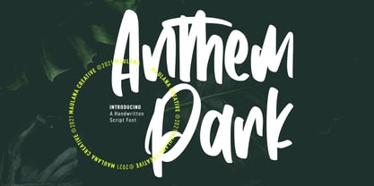 Anthem Park is a handwritten script font. With medium felt tip stroke, Condensed and fun character with a bit of ligatures. To give you an extra creative work. Anthem Park font support multilingual more than 100+ language. This font is good for logo design, Social media, Movie Titles, Books Titles, a short text even a long text letter and good for your secondary text font with sans or serif. Make a stunning work with Anthem Park font. Cheers, MaulanaCreative
 - Bebopalula by Studio K,
$45.00 No prizes for guessing this font family was inspired by the 1950s - the sounds (Buddy, Eddie, Elvis), the styles (polka dots, petticoats and Dior's New Look), and the kitsch, from furry dice above the dashboard to plaster ducks over the mantlepiece! A particular point of reference is the furnishings and fabrics of the Fifties (with their distinctive kidney shapes and angular curves) as showcased in the Festival of Britain 1951. See also my other fun fonts Barrowboy, Calypso and Pier Arcade.
 - Decima Nova Pro by TipografiaRamis,
$39.00 Decima Nova Pro is a geometric sans serif typeface family, built in eight styles. The typeface is ideal for use in display sizes, but also is quite legible in text and is well suited for editorial and brand design. Features include extended language support, small caps, multiple numeral styles, slashed zero, ligatures... Decima Nova Pro is released as font family in OpenType format with a Latin Western 1252, Eastern European 1250, Baltic 1257, Turkish 1254 and Cyrillic 1251 character set.
 - Ability by Scholtz Fonts,
$15.00 Ability is a family of stylish and contemporary handwriting fonts that combine the vigor of hand-drawn fonts such as Affable with the elegance of fonts such as Blythe. What is unusual about Ability is that it enables a word to be formed from a group of letters in a variety of ways: not only the conventional linking of letters as in a cursive script or the placing of letters close to each other on a common baseline, but it uses the overlapping of the swashes and swirls that contribute to the individuality of the characters to integrate the letters into a single word. Ability comes in a number of styles: Legacy - Regular (medium weighted and the basic type of the other styles); - Black (a vigorous and dramatic version of Regular); - Condensed Medium - Condensed Light - Linear 45 (medium-weight font made from a mono-width line) - Linear 25 (light-weight font made from a mono-width line) Suggestions for use: - wedding stationery - greeting cards - valentines day media - beauty products media - lingerie tags - women’s magazine pages - classical music media - award certificates - magazine pages The font is fully professional: carefully letterspaced and kerned. It contains over 235 characters - (upper and lower case characters, punctuation, numerals, symbols and accented characters are present). It has all the accented characters used in the major European languages.
 - Lazov - Unknown license

- Romance Fatal Goth Premium - Personal use only

- VTC-TribalThreeFree - Personal use only

- WATERCOLORS CLEAN PERSONAL USE - Personal use only

- Kerater - Personal use only

- Capital by Aboutype,
$24.99A pen stroke Roman with a medium thick to thin contrast and slightly flared stroke endings. Capital was designed for all media and works best at 30 point and above. Capital requires subjective display kerning and compensation.


