10,000 search results
(0.251 seconds)
- Sansumi-ExtraBold - Unknown license

- NoweAteny by Linotype,
$29.99Linotype Nowe Ateny is part of the Take Type Library, which features the winners of Linotype’s International Digital Type Design Contest from 1994 to 1997. Designed by Dariusz Nowak-Nova, Nowe Ateny is a frantic handwriting font whose capital letters include technical-looking grid lines and end points. These seem to anchor the letters without reducing their volatility. The font consciously lacks elements which increase legibility, sacrificing them for the sake of more design oriented ideals. Nowe Ateny is thus good for headlines in larger point sizes, especially when the look of the text is as important as its content. - Sansumi - Unknown license

- KG Lego House - Personal use only

- Rockwell by Monotype,
$40.99 Whether you call them slab serif, square serif, or Egyptian, you know them when you see them – sturdy, nearly monoweight designs with blunt, straight-edged serifs and a no-nonsense attitude. The Rockwell® Nova family is a fine example of this appealing and eminently usable type style. This is a design that is both robust and adaptable. Marked by the flat top-serifs on the cap A, unusual Q tail and high-legibility two-storied lowercase a, Rockwell has a bit of handmade charm that distinguishes it from the cool, more modern interpretations of the slab serif style. The family is excellent for branding, headlines and other display uses. The simple shapes and hearty serifs also make it a good choice for short blocks of textual content in both print and on-screen environments. The light and bold weights are perfect for setting blocks of text copy, while the extra bold and condensed designs bring authority to display copy. Throw in a little color, and you amp up Rockwell’s messaging power. The regular and italic designs perform handsomely, in the most modest of screen resolutions. With four weights of normal proportions, each with a complementary italic, and three condensed designs, two with italics, the family is a commanding and versatile graphic communicator. Rockwell’s large x-height, simple character shapes and open counters, make for an exceptionally legible design. It should not, however, be set so tight that its serifs touch, as this will erode legibility and impair readability. A benefit to Rockwell’s slab serifs, however, is that the design combines beautifully with both sans serif typefaces and a variety of serif designs. Rockwell OpenType® Pro fonts have an extended character set supporting Greek, Cyrillic, most Central European and many Eastern European languages, in addition to providing for the automatic insertion of ligatures and fractions. Looking for its perfect pairing? Look no further than ITC Berkeley Old Style, Between™, ITC Franklin Gothic®, Harmonia Sans™, Metro® Nova or Frutiger® Serif.
 - Naguel by RodrigoTypo,
$25.00 With only 2 pesos, this font can be the most fun! multilanguage and special for titles!
 - Dewave by Luxfont,
$12.00 Introducing a distorted wavy Sans Serif font family. Interesting combination of elongation and distortion is embodied in the Dewave typeface. This font family is best suited for headlines and short text as an eye-catching accent. Due to its appearance, the font is well suited for the entertainment industry and everything connected with it both in offline life and in online projects. Dewave family has two types of tilt in different directions and 2 types of distortion - calm and strong, and all this is done in 3 types of thickness - this gives a lot of freedom of choice for the use of the font in the design. Features: Distorted letters in waveform 12 fonts in family: - 2 types of tilt - 3 thicknesses - 2 types of distortion Kerning ld.luxfont@gmail.com
 - PR Swirlies 05 by PR Fonts,
$10.50 Suitable for separating paragraphs, or framing text, this set of swirlies ornaments is drawn with a pointed brush, for a higher contrast appearance than swirlies 1 , 2, and 4. It also has a companion member, with a rough finish, called “Sand Drift”, suitable for natural, earthy subject matter. “Sand Drift” combines well with the following PR Fonts Items: Bramble Wood 2, Bramble Wood 1, Cauldron, Swirlies 1 Sand Drift, Hallow Doodles 1, Hallow Doodles 2.
 - Back ttf - Unknown license

- Alfatih by PojolType,
$14.00 This Alfatih font is inspired by calligraphy writing, with modern classic characters. We can use this font for calligraphy book writing, Quran cover writing, film titles, t-shirt designs, magazine titles, web, posters, book titles, logos, country names, brands, billboards. Alfatih font, offers you: 1. Uppercase characters (All uppercase letters, 4 models) 2. Ligature (22 two-letter characters) and Alternate Styles 2. Ligature (8 characters three letters) with alternative styles, we can use it for logos 3. Multilingual Support (Europe Latin West), Numbers and Punctuation
 - Drip - Unknown license

- Zar2 Casual by SzarDesign,
$19.95 Zar-2 Casual is great for informal fun graphics, pairs well with Zar-2 Script.
 - NT Fest by Novo Typo,
$26.00 Fest is a highly detailed, ornamental unicase typeface for display use. Designed by Novo Typo - (typo)graphic designers from Amsterdam - The Netherlands. Fest is perfect for designing sophisticated logos, fashionable headings or other beautiful display typography. The glyph set of Fest contains a lot of extra elegant glyphs, swooshes and ligatures.
 - Round Page by Patria Ari,
$15.00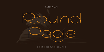 Round Page is an elegant round typeface with 2 weight and 2 styles. This font is a combination between modern, beauty and simplicity. With this typeface, you can use it for branding, merchandise, magazine cover, headline, logo, powerpoint templates design, and many more. What's included? Uppercase Characters Lowercase Characters Multilingual support. Hope you enjoy the products.
 - Child's Play Trial Version - Unknown license

- Zar2 Script by SzarDesign,
$19.95 Zar-2 Script a brush inspired script with flair, designed to work with Zar-2 casual
 - Old Mac Donald NF by Nick's Fonts,
$10.00Two typefaces from Farmer & Little's 1867 specimen book, entitled Antique No. 2 and Antique Light Extended, provided the inspiration for this happy family of antique charmers. Both versions of this font include the complete Latin 1252, Central European 1250 and Turkish 1254 character sets. - Elliot_Swonger - Unknown license

- Acid - Unknown license

- Module 4-4 by Sébastien Truchet,
$40.00 Sébastien Truchet designed a modular typographic system during his last year in the School of Fine Arts of Besançon. The system is made of a unique grid and 6 modules which are the components to build several typefaces. The most radical is the "2-2". The last one is the "10-12". This is the 4-4. It is built into a square grid. Four modules in width and in height. This font proposes to you two appearances : the caps are blackest and the small letters are more open.
 - Nimbus Sans by URW Type Foundry,
$35.00 The first versions of Nimbus Sans have been designed and digitized in the 1980s for the URW SIGNUS sign-making system. Highest precision of all characters (1/100 mm accuracy) as well as spacing and kerning were required because the fonts should be cut in any size in vinyl or other material used for sign-making. During this period three size ranges were created for text (T), the display (D) and poster (P) for small, medium and very large font sizes. In addition, we produced a so-called L-version that was compatible to Adobe’s PostScript version of Helvetica. Nimbus was also the product name of a URW-proprietary renderer for high quality and fast rasterization of outline fonts, a software provided to the developers of PostScript clone RIPs (Hyphen, Harlequin, etc.) back then. Also in the 80s, a new, improved version of the Nimbus Sans, namely Nimbus Sans Novus was designed. Nimbus Sans Novus was conceptually developed entirely with URW’s IKARUS system, i.e. all styles harmonize perfectly with each other in terms of line width, weight, proportions, etc. On top of that, Nimbus Sans Novus contains more styles than Nimbus Sans. Now, Nimbus Sans is also available as Round (like the popular URW fonts Futura Round and Eurostile Round). The Round versions are intended to facilitate the work of designers and typographers. The fonts can be used directly, without further preparatory work in graphic programs as finished, high-quality Rounds.
 - Nimbus Sans Round by URW Type Foundry,
$35.99 The first versions of Nimbus Sans have been designed and digitized in the 1980s for the URW SIGNUS sign-making system. Highest precision of all characters (1/100 mm accuracy) as well as spacing and kerning were required because the fonts should be cut in any size in vinyl or other material used for sign-making. During this period three size ranges were created for text (T), the display (D) and poster (P) for small, medium and very large font sizes. In addition, we produced a so-called L-version that was compatible to Adobe’s PostScript version of Helvetica. Nimbus was also the product name of a URW-proprietary renderer for high quality and fast rasterization of outline fonts, a software provided to the developers of PostScript clone RIPs (Hyphen, Harlequin, etc.) back then. Also in the 80s, a new, improved version of the Nimbus Sans, namely Nimbus Sans Novus was designed. Nimbus Sans Novus was conceptually developed entirely with URW’s IKARUS system, i.e. all styles harmonize perfectly with each other in terms of line width, weight, proportions, etc. On top of that, Nimbus Sans Novus contains more styles than Nimbus Sans. Now, Nimbus Sans is also available as Round (like the popular URW fonts Futura Round and Eurostile Round). The Round versions are intended to facilitate the work of designers and typographers. The fonts can be used directly, without further preparatory work in graphic programs as finished, high-quality Rounds.
 - Hog Bold - HMK - Unknown license

- KG Counting Stars by Kimberly Geswein,
$5.00 The uppercase letters have no stars and the lowercase letters have stars. This provides 2 unique options for titles.
 - pf_zappa - Unknown license

- Agent Red - Unknown license

- Rasstapp 1.0 - Unknown license

- Gloriana - Unknown license

- Heleodora by Andinistas,
$39.95The unconventional structure of this typographic family was inspired in my fonts: Rosadelia, alcira, Navaja, Ninja 1, and Ninja 2. - PR Swirlies 03 by PR Fonts,
$10.30 This set of swirlies oraments is drawn with a pointed brush, for a higher contrast appearance than Swirlies 1 & 2.
 - Old Republic - Unknown license

- Fanchy by ArimaType,
$19.00 Fanchy Created from our explorations inspired by retro 70s style and pop culture visual designs such as comics, cartoons, and old posters. Strong bold character with groovy style makes us feel the retro vibe and brings us to the 70s. Fanchy Comes with beautiful characters and curves consisting of 6 sets of styles. Contains 2 regular and italic styles, 2 shadow styles and 2 outline styles. This font is best used for headings, logotypes, quotes, apparel designs, posters, flyers, packaging, book covers, and much more.
 - PreCursive by Graffiti Fonts,
$9.99 This set of two fonts is intended for use by kindergarden & 1st grade teachers or anyone else teaching young children how to write. 2 Fonts are included, PreCursive Lined has the upper, lower & dotted mid line & the the Regular has only the letters.
 - ASTRALYS by Cerri Antonio,
$37.00 Astralys is a linear decorative font, works very well as a type of identity logo, poster and 3d works. It continues the tradition of precedent Xova but with a hard linear impact. Its interesting to note that with it its possible to play with straight corners to create endless couplings geometric styles and beyond. Caps only fonts.
 - Old Republic - Unknown license

- Old Republic - Unknown license

- Old Republic - Unknown license

- Balig Script by Panatype Studio,
$7.00 Balig Script is signature pen script, available in 2 fonts with 2 styles ( Normal & Bold ), and includes Swashes. It's perfect for signatures, logo type, weddings, posters, brochure or any display use. Balig Script comes with more OpenType features like Stylistic Alternates, Initial Forms, Terminal Forms, and also Standard Ligatures make this font more natural and letter nicely.
 - Norman by Resistenza,
$45.00 Get to know Norman, elegant and fashion forward. This new condensed and high contrast serif font is based on expansion giving a sense of self confidence. The oblique ax was specially added to get a contemporary and innovative sense. Norman is young and idealist, he has a distinctive sense of style. A complete set of ligatures and stylistic alternates is included, this will help the designer to customize and give a special look to any layout. We recommend to use it for big title, magazine, editorial purposes and display. Norman Family contains 2 styles, Regular and Italic, both fonts have another version a bit heavier called Regular 2 and Italic 2.
 - Remarcle - 100% free


