10,000 search results
(0.05 seconds)
- Halencia by Letterhend,
$16.00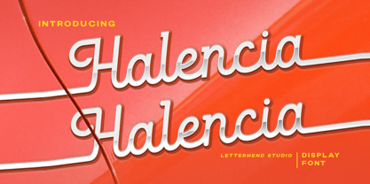 Halencia is a bold monoline script with a touch of vintage look and feel. This type of font perfectly made to be applied especially in logo, headline, signage and the other various formal forms such as invitations, labels, logos, magazines, books, greeting / wedding cards, packaging, fashion, make up, stationery, novels, labels or any type of advertising purpose. Features : uppercase & lowercase numbers and punctuation multilingual alternates / swashes and ligatures PUA encoded We highly recommend using a program that supports OpenType features and Glyphs panels like many of Adobe apps and Corel Draw, so you can see and access all Glyph variations.
 - Railyouth by Letterhend,
$19.00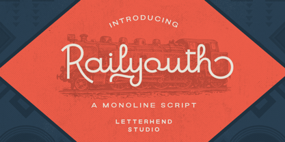 Railyouth is a bold monoline script with a touch of vintage look and feel. This type of font perfectly made to be applied especially in logo, headline, signage and the other various formal forms such as invitations, labels, logos, magazines, books, greeting / wedding cards, packaging, fashion, make up, stationery, novels, labels or any type of advertising purpose. Features : uppercase & lowercase numbers and punctuation multilingual alternates / swashes and ligatures PUA encoded We highly recommend using a program that supports OpenType features and Glyphs panels like many of Adobe apps and Corel Draw, so you can see and access all Glyph variations.
 - Saltburg by Letterhend,
$17.00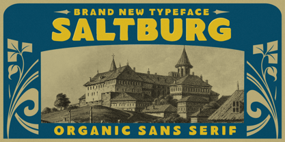 Introducing, Saltburg, an strong and bold sans serif with a touch of vintage look and feel. This type of font perfectly made to be applied especially in logo, headline, signage and the other various formal forms such as invitations, labels, logos, magazines, books, greeting / wedding cards, packaging, fashion, make up, stationery, novels, labels or any type of advertising purpose. Features : uppercase & lowercase numbers and punctuation multilingual alternates swashes and ligatures PUA encoded We highly recommend using a program that supports OpenType features and Glyphs panels like many of Adobe apps and Corel Draw, so you can see and access all Glyph variations.
 - Moraline Script by Letterhend,
$19.00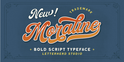 Introducing, Moraline - a standout bold script with a touch of vintage look and feel. This type of font perfectly made to be applied especially in logo, headline, signage and the other various formal forms such as invitations, labels, logos, magazines, books, greeting / wedding cards, packaging, fashion, make up, stationery, novels, labels or any type of advertising purpose. Features : uppercase & lowercase numbers and punctuation multilingual alternates / swashes and ligatures PUA encoded We highly recommend using a program that supports OpenType features and Glyphs panels like many of Adobe apps and Corel Draw, so you can see and access all Glyph variations.
 - Dare by Device,
$39.00 Dare is a bold, single-weight titling font in capitals only. It is built from flat-pen strokes, with looping bowls and sharp, incised darts. It borrows a pinch of the hand-drawn swagger of Bauer's Cartoon (designed in 1936 by H. A. Trafton), used as Dan Dare's signature logo in the British boy's comic Eagle, and also the upward-pointing serifs of machine-moderne typefaces such as Dynamo (designed by K. Sommer for Ludwig & Mayer in 1930). Suitable for book covers, magazines, branding, packaging – any place where an impactful, contemporary statement is required, but still with an undertone of 20th century tradition.
 - Kiwi by Atlantic Fonts,
$26.00 Kiwi gives natural energy to every project with its sweet and spirited forms and a variety of tasty options. Be bold using it as all-caps including its fun set of discretionary double-letter ligatures, or be distinctly playful, combining upper-lower, with bushels of loosely interlocking ligatures. Kiwi font family also includes delicious Kiwi Fruits, a striking and juicy collection of graphic fruit illustrations by illustrator, Amy Dietrich. For inviting packaging, magazine, and books, or say, a cool-looking apple for your cider pressing party invite, Kiwi is a great pick. Shown here with Quince font, also by Atlantic Fonts.
 - The Bardian by Letterhend,
$19.00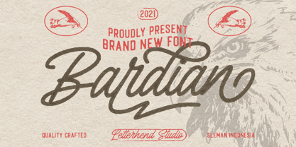 Introducing, Bardian - a bold monoline script with a touch of vintage look and feel. This type of font perfectly made to be applied especially in logo, headline, signage and the other various formal forms such as invitations, labels, logos, magazines, books, greeting / wedding cards, packaging, fashion, make up, stationery, novels, labels or any type of advertising purpose. Features : uppercase & lowercase numbers and punctuation multilingual alternates / swashes and ligatures PUA encoded We highly recommend using a program that supports OpenType features and Glyphs panels like many of Adobe apps and Corel Draw, so you can see and access all Glyph variations.
 - Stay Dreaming by Set Sail Studios,
$16.99 Introducing Stay Dreaming SVG Font! An expressive, streetwise script font with a fast flow and dry textures to the max. It's a bold choice of typography ideal for injecting a confident, custom-made style to your design project. Stay Dreaming is packed full of extra features; The script font includes a full alternate set of characters, as well as a set of 26 Swashes, these fast strokes are ideal for underlining the script font and giving your text that extra flair & customized feel. Language Support is provided for; English, French, Italian, Spanish, Portuguese, German, Swedish, Norwegian, Danish, Dutch, Finnish, Indonesian, Malay.
 - Fauna by Pasternak,
$12.00 Fauna is a stylish font inspired by hi-fi elements combined with square forms and straight lines. It also has the features of Constructivism, including solidity, emphasis on geometric shapes, and austerity. Bold futuristic characters make this font an ideal option for the development of a minimalistic and recognizable design, necessary for any modern project. It’s perfect for the creation of logos, titles, social media posts, posters, and ads. Due to the clear and eye-catching design of the characters, the font will surely attract your audience. It includes all basic symbols and characters. Plus, Fauna features proper kerning and supports several languages.
 - Frontage by Juri Zaech,
$20.00 Frontage is a charming layered type system with endless design possibilities using different combinations of fonts and colors. Achieve a realistic 3D effect by adding the shadow font or just use the capital letters of the regular and bold cut for stark artwork. The typeface’s design is based on a simple grid, which creates the friendly, handcrafted look of facade signs. It is generously spaced for maximum impact of your message. As a display typeface Frontage loves color and is suitable for headlines and logotypes. Details include 224 characters in six styles and manually edited kerning.
 - Londers by Letterhend,
$19.00 Introducing, Londers - a standout bold script with a touch of vintage look and feel. This type of font perfectly made to be applied especially in logo, headline, signage and the other various formal forms such as invitations, labels, logos, magazines, books, greeting / wedding cards, packaging, fashion, make up, stationery, novels, labels or any type of advertising purpose. Features : Uppercase & lowercase numbers and punctuation multilingual alternates / swashes and ligatures PUA encoded We highly recommend using a program that supports OpenType features and Glyphs panels like many of Adobe apps and Corel Draw, so you can see and access all Glyph variations.
 - Fd Forever Young by Fortunes Co,
$12.00 Forever Young is A disco 70s retro font is a typeface that captures the bold, flashy, and vibrant style of the disco era, which was popular in the 1970s. These fonts are characterized by their unique design elements that reflect the disco culture. with funky shapes Disco fonts often feature unconventional and geometric shapes, such as curves, swirls, and exaggerated serifs. Retro fonts are widely used in various design projects, branding, posters, and packaging to create a sense of nostalgia or capture the essence of a particular era. They are versatile and can be customized to fit a wide range of creative applications.
 - Queen Michelly by Zamjump,
$17.00 Introducing "Queen Michelly" - a Serif font family that's "two-faced" with modern and vintage. If you're using Vintage Retro : Access your OpenType features to access a large selection of alternative fonts and ligatures, pick the font you like from a wide variety of variations to get the vintage look you're looking for. Vary between a light and heavy vintage look based on the number of letters you change. Due to its dual personality, Queen Michelly is a very versatile font, covering a wide variety of projects, from bold magazine images, to wedding invitations, to branding, poster design, and more. Inclouded : - Multilanguage
 - Iki Mono by CAST,
$45.00 Iki Mono is a multifaceted monospaced typeface designed for publishing and coding. Its sans serif structure displays some letterforms (as well as a degree of contrast) that are reminiscent of 19th-century grotesques, while in the non-oblique versions the letters have been very slightly slanted leftwards. Like typewriter typefaces Iki Mono has to cope with the limitations of a width system that forces shapes into a specific space. This extensive type family of forty weights and styles – from Compressed Thin to ExtraExpanded Bold, including their slanted versions – takes its name ‘Iki’ from the Japanese word for breath.
 - Janice by Canada Type,
$24.95 Janice is a revival and expansion of a 1960s Mecanorma film type called Putty Bold. It’s thick, flowing, happy and oozes psychedelia. Unlike many art nouveau/hippy faces of the era, this font comes with a lowercase that expands its functionality to quite a few applications, like design aimed at kids and young adults. It’s also one of those fonts that feel right at home being warped, scaled and manually squeezed for packaging and poster design. Janice comes with over 400 glyphs. It contains a few stylistic alternates and support for the majority of Latin languages.
 - MyPimp by Type Associates,
$45.00 The concept of a bold connected script with a hand lettered feel has been on my bucket list for decades. I imagined a pretentious, ornate, swashy look, a variety of word-end embellishments, heaps of ligatures and underscores. It took a weekend workshop on Python Scripting at Type@Cooper in San Francisco reinforcing the smarts of Opentype to make it happen. Hand drawn on paper using broad pen strokes for reference, the design was the easy part. The real work was in the back-end and self-imposed rigorous testing. Download a comprehensive pdf User Guide at this link.
 - Weiss Modern Gothic by Jvne77 Studio,
$25.00 Weiss Modern Gothic is the first digital re-creation with a lot of improvements of a late seventies well-known edited typeface by Bauer. At the time known as Weiss Initials Extra Bold or Weiß Modern Gothik, the design was inspired by the famous Weiß Initialen N°2 drawn by Emil Rudolf Weiß (1875-1942); also father of the non-less famous "Neuland" typeface. Strangely, this beauty seemed abandoned while sister-flared faces like Friz Quadrata, Flange, Serif Gothic or Romic are in a new wave of revival. Hoping this one will not again disappear... Happy new life.
 - Manufacturer JNL by Jeff Levine,
$29.00 Manufacturer JNL is a reinterpretation of the classic type face Venus Extra Bold Extended, and is available in both regular and oblique versions. According to Wikipedia: “Venus or Venus-Grotesk is a sans-serif typeface family released by the Bauer Type Foundry of Frankfurt am Main, Germany from1907 onwards. Released in a large range of styles, including condensed and extended weights, it was very popular in the early-to-mid twentieth century. It was exported to other countries, notably the United States, where it was distributed by Bauer Alphabets Inc, the U.S. branch of the firm.”
 - Candelize by Graphicfresh,
$16.00 Introducing our Art Deco Font: a classic yet modern and elegant typeface that adds a touch of sophistication to your logo designs. Inspired by the iconic Art Deco movement, this versatile font is perfect for creating sleek and stylish editorial layouts. It's clean lines and geometric shapes bring a sense of timeless beauty to any project. Whether you're designing a magazine, website, or branding materials, our Art Deco Font Editorial will elevate your work to new levels of elegance and professionalism. Embrace the allure of Art Deco and make a bold statement with our captivating font.
 - Midnight Diner by Roland Hüse Design,
$30.00 Did your client just say ‘can you make it pop’? Then you already know you got it on lock. Introducing: Midnight Diner! A multi-layered dimensional script font family featuring thin, bold, outline and shadow capabilities, with a left-leaning slant to boot. You can experiment with various layer combinations and colour! How fun is that? Being effortlessly casual, retro and elegant all in one, you can play it up or down to your liking – perfect for display graphics, logos, signages, packaging, lifestyle imagery, invitations and more. It features a diverse range of stylistic alternates, contextual alternates, and standard ligatures, ensuring that you’ve countless options to choose from for your design work. This font family is delicately crafted and well thought out with every little detail in mind, to ensure its ease and versatility when used! Midnight Diner is a collaboration between lettering artist and calligrapher, Leah Chong (www.leahdesign.sg) and typeface designer, Roland Huse (www.rolandhuse.com). Product Content: Midnight Diner Layered Font - Thin (TTF) Midnight Diner Layered Font - Bold (TTF) Midnight Diner Layered Font - Outline (TTF) Midnight Diner Layered Font - Shadow (TTF) Font Guide PDF https://drive.google.com/file/d/1KPSf-gGrhX3wyaImEAmlJICERNbxu2IN/view?usp=sharing Font Guide Youtube Video https://youtu.be/GtZ8E7Y7wnQ 6 Bonus SVGs (TTF): Midnight Diner SVG - Red Yellow Midnight Diner SVG - Black Pink Midnight Diner SVG - Blue Green Midnight Diner SVG - Orange Yellow Midnight Diner SVG - Purple Pink Midnight Diner SVG - Black White Font Features: Latin character set: Uppercase & Lowercase A - Z Stylistic Alternates Contextual Alternates Standard Ligatures Numerals, Currency Symbols & Punctuation Accented Characters To access all features of Midnight Diner such as stylistic alternates etc., it's highly recommended to use professional design software such as Adobe Illustrator, Adobe Photoshop, Adobe InDesign or Procreate (via the ‘add text' feature).
 - Starlit Neon by Ditatype,
$29.00 Starlit Neon is a delightful display font that combines the elegance of rounded letterforms with the captivating allure of neon lights. With its bold uppercase characters and unique design, this typeface adds a touch of playfulness and charm to your projects. The defining feature of Starlit Neon lies in its rounded letterforms, which exude a sense of softness and approachability. Each letter is meticulously crafted with smooth curves, creating a harmonious and pleasing aesthetic. The rounded shapes give the font a friendly and welcoming appearance, while the neon style adds a touch of excitement and vibrancy. Inspired by the mesmerizing glow of neon signs, Starlit Neon infuses a sense of enchantment and allure into each character. The font captures the captivating charm of neon lights, casting a radiant glow that evokes a magical atmosphere. In some letters, you'll find additional subtle accent lines, which enhance the overall composition with a touch of sophistication. The uppercase letterforms of Starlit Neon are bold and assertive, commanding attention with their rounded shapes. Each letter of Starlit Neon is thoughtfully crafted to strike a balance between rounded shapes and legibility. The uppercase characters are distinct and easily recognizable, ensuring your message remains clear and impactful. The additional subtle accent lines in select letters add an extra touch of visual interest, elevating the font's overall composition. Find out more ways to use this font by taking a look at the font preview. Features: Alternates Multilingual Supports PUA Encoded Numerals and Punctuations Starlit Neon perfect for designs like headlines, logos, and eye-catching titles that seek to make a bold statement with a touch of whimsy. Whether you're creating posters, branding materials, digital artwork, or anything in between, this font will infuse your projects with a sense of joy and uniqueness. It particularly shines in applications related to entertainment, children's products, beauty, and lifestyle themes. Find out more ways to use this font by taking a look at the font preview. Thanks for purchasing our fonts. Hopefully, you have a great time using our font. Feel free to contact us anytime for further information or when you have trouble with the font. Thanks a lot and happy designing.
 - Voynich - Personal use only

- Quasix by Typodermic,
$11.95 Introducing Quasix—the typeface that defies logic! With its compact industrial headline design, this font is the perfect choice for anyone looking to add an edge to their design work. But beware, its quirky design might have you scratching your head at first. Just like the inside of a machine, Quasix is full of moving parts, each with its own unique purpose—but don’t worry, you don’t have to be an engineer to appreciate its beauty. This typeface is perfect for those who want to convey the concept of engineering devices without using typical techno typefaces or cliche physical symbols like gears and bolts. Quasix will elevate your design to the next level, and its versatility makes it suitable for a range of themes, from retro to modern and even futuristic. Don’t be afraid to get creative with Quasix—this typeface was made to be bold and unconventional. Let it take center stage and watch as it transforms your design into something truly unique. Quasix defies convention and breaks the mold, making it the perfect choice for those who aren’t afraid to think outside the box. Try it out and see for yourself! Most Latin-based European writing systems are supported, including the following languages. Afaan Oromo, Afar, Afrikaans, Albanian, Alsatian, Aromanian, Aymara, Bashkir (Latin), Basque, Belarusian (Latin), Bemba, Bikol, Bosnian, Breton, Cape Verdean, Creole, Catalan, Cebuano, Chamorro, Chavacano, Chichewa, Crimean Tatar (Latin), Croatian, Czech, Danish, Dawan, Dholuo, Dutch, English, Estonian, Faroese, Fijian, Filipino, Finnish, French, Frisian, Friulian, Gagauz (Latin), Galician, Ganda, Genoese, German, Greenlandic, Guadeloupean Creole, Haitian Creole, Hawaiian, Hiligaynon, Hungarian, Icelandic, Ilocano, Indonesian, Irish, Italian, Jamaican, Kaqchikel, Karakalpak (Latin), Kashubian, Kikongo, Kinyarwanda, Kirundi, Kurdish (Latin), Latvian, Lithuanian, Lombard, Low Saxon, Luxembourgish, Maasai, Makhuwa, Malay, Maltese, Māori, Moldovan, Montenegrin, Ndebele, Neapolitan, Norwegian, Novial, Occitan, Ossetian (Latin), Papiamento, Piedmontese, Polish, Portuguese, Quechua, Rarotongan, Romanian, Romansh, Sami, Sango, Saramaccan, Sardinian, Scottish Gaelic, Serbian (Latin), Shona, Sicilian, Silesian, Slovak, Slovenian, Somali, Sorbian, Sotho, Spanish, Swahili, Swazi, Swedish, Tagalog, Tahitian, Tetum, Tongan, Tshiluba, Tsonga, Tswana, Tumbuka, Turkish, Turkmen (Latin), Tuvaluan, Uzbek (Latin), Venetian, Vepsian, Võro, Walloon, Waray-Waray, Wayuu, Welsh, Wolof, Xhosa, Yapese, Zapotec Zulu and Zuni.
 - Avionic by Grype,
$16.00 The aviation world contains loads of stylish logotypes, from handwritten scripts to geometric styles and so on. The Avionic Condensed family finds its origins of inspiration in the Air China company logotype, and from there has been expanded upon to create a large stylistic family of 40 fonts. Avionic celebrates the geometric sans serif styling of the original logotype, evolving beyond the condensed all capital set logo to include a lowercase designed in parity with the original design style, as well as many weights and widths to offer a fresh diversity. Each subfamily includes a full standard character set with expansive international support of latin based languages, and 5 weights jumping from book to black, along with 5 accompanying obliques. This family is ready to chart a course for your design destination, whatever it may be. Here's what's included with the Avionic Family bundle: 370 glyphs per style - including Capitals, Lowercase, Numerals, Punctuation and an extensive character set that covers multilingual support of latin based languages. 5 weights in each subfamily: Book, Regular, Bold, Heavy, & Black. • 4 widths in the collection: Condensed, Regular, Wide, and Extra Wide. Accompanying Obliques with each weight/width style. Fonts are provided in TTF & OTF formats. The TTF format is the standard go to for most users, although the OTF and TTF function exactly the same. Here's why the Avionic Collection is for you: You're in need of a dynamic geometric font with a variety of weights and widths for your designs You're an aviation junkie and have to have anything inspired by Air China You love the style of Bank Gothic, but really want something just a little different You are looking for a pseudo-techno style font family with versatility You just like to collect quality fonts to add to your design arsenal
 - DuerersMinuskeln - 100% free

- Flaemische Kanzleischrift - Personal use only

- ZentenarZier - Unknown license

- TrixieExtra - Unknown license

- Roundpoint Pen JNL by Jeff Levine,
$29.00 Roundpoint Pen JNL is based on instructional lettering found in an old Speedball® Pen textbook. The effect of a round nib pen letter evokes the charm of the 1920s or 1930s.
 - San Giuseppe by Mans Greback,
$59.00 San Giuseppe is a serif font with finesse and unique charm. Inspired by the romantic, ornate style of the Victorian era and the bold, captivating geometry of Art Deco, San Giuseppe is the perfect blend of neo-classic and vintage aesthetics. This serif font family is designed to infuse your work with an air of grace and refinement that is sure to leave a lasting impression. Ideal for wine labels, luxury branding and high-end packaging, San Giuseppe is an all-capitals font, featuring a stunning array of alternate characters that allow you to create a truly bespoke typographical experience. With its fine, intricate serifs and delicate, artistic letterforms, this font is a testament to the beauty and craftsmanship of yesteryear, created for a modern setting. The San Giuseppe font family consists of six high-quality styles: In addition to the Regular font, it is provided in both Bold and Light, and each of the weights as Italic. The font is built with advanced OpenType functionality and has a guaranteed top-notch quality, containing stylistic and contextual alternates, ligatures and more features; all to give you full control and customizability. It has extensive lingual support, covering all Latin-based languages, from Northern Europe to South Africa, from America to South-East Asia. It contains all characters and symbols you'll ever need, including all punctuation and numbers.
 - Core Sans N SC by S-Core,
$15.00 Core Sans N SC is the Small Caps version of the Core Sans N that is a part of the Core Sans Series (Core Sans N SC, Core Sans N Rounded, Core Sans M, and Core Sans G). Letters in the Core Sans N SC Family are designed with genuine neo-grotesque and neutral shapes without any decorative distractions. The spaces between individual letter forms are precisely adjusted to create the perfect typesetting. The Core Sans N SC Family consists of 3 widths (Condensed, Normal, Extended), 9 weights (Thin, ExtraLight, Light, Regular, Medium, Bold, ExtraBold, Heavy, Black), and Italics for each format. It also supports WGL4, which provides a wide range of character sets (CE, Greek, Cyrillic and Eastern European characters). Each font includes support for Tabular numbers, Arrows, Box drawings, Geometric shapes, Block elements, Mathematical operators, Miscellaneous symbols and Opentype Features such as Proportional Figures, Numerators, Denominators, Superscript, Scientific Inferiors, Subscript, Fractions and Standard Ligatures. The Core Sans N SC Family provides both OpenType (.OTF) and TrueType (.TTF) versions in the same package. We highly recommend it for use in books, web pages, screen displays, and so on.
 - Core Sans WHH Sub NR by S-Core,
$15.00The Core Sans NR Family is a part of the Core Sans Series, such as Core Sans N, Core Sans N SC, Core Sans M, and Core Sans G. This family is the rounded version of Core Sans N family. Letters in the Core Sans NR Family are designed with genuine neo-grotesque and neutral shapes without any decorative distractions. The spaces between individual letter forms are precisely adjusted to create the perfect typesetting. The Core Sans NR Family consists of 3 widths (Condensed, Normal, Extended), 9 weights (Thin, ExtraLight, Light, Regular, Medium, Bold, ExtraBold, Heavy, Black), and Italics for each format. It also supports WGL4, which provides a wide range of character sets (CE, Greek, Cyrillic and Eastern European characters). Each font includes support for Tabular numbers, Arrows, Box drawings, Geometric shapes, Block elements, Mathematical operators, Miscellaneous symbols and Opentype Features such as Proportional Figures, Numerators, Denominators, Superscript, Scientific Inferiors, Subscript, Fractions and Standard Ligatures. The Core Sans NR Family provides both OpenType (.OTF) and TrueType (.TTF) versions in the same package. We highly recommend it for use in books, web pages, screen displays, and so on. - Core Sans NR by S-Core,
$15.00 The Core Sans NR Family is a part of the Core Sans Series, such as Core Sans N, Core Sans N SC, Core Sans M, and Core Sans G. This family is the rounded version of Core Sans N family. Letters in the Core Sans NR Family are designed with genuine neo-grotesque and neutral shapes without any decorative distractions. The spaces between individual letter forms are precisely adjusted to create the perfect typesetting. The Core Sans NR Family consists of 3 widths (Condensed, Normal, Extended), 9 weights (Thin, ExtraLight, Light, Regular, Medium, Bold, ExtraBold, Heavy, Black), and Italics for each format. It also supports WGL4, which provides a wide range of character sets (CE, Greek, Cyrillic and Eastern European characters). Each font includes support for Tabular numbers, Arrows, Box drawings, Geometric shapes, Block elements, Mathematical operators, Miscellaneous symbols and Opentype Features such as Proportional Figures, Numerators, Denominators, Superscript, Scientific Inferiors, Subscript, Fractions and Standard Ligatures. The Core Sans NR Family provides both OpenType (.OTF) and TrueType (.TTF) versions in the same package. We highly recommend it for use in books, web pages, screen displays, and so on.
 - Core Sans WHH Head NR by S-Core,
$15.00The Core Sans NR Family is a part of the Core Sans Series, such as Core Sans N, Core Sans N SC, Core Sans M, and Core Sans G. This family is the rounded version of Core Sans N family. Letters in the Core Sans NR Family are designed with genuine neo-grotesque and neutral shapes without any decorative distractions. The spaces between individual letter forms are precisely adjusted to create the perfect typesetting. The Core Sans NR Family consists of 3 widths (Condensed, Normal, Extended), 9 weights (Thin, ExtraLight, Light, Regular, Medium, Bold, ExtraBold, Heavy, Black), and Italics for each format. It also supports WGL4, which provides a wide range of character sets (CE, Greek, Cyrillic and Eastern European characters). Each font includes support for Tabular numbers, Arrows, Box drawings, Geometric shapes, Block elements, Mathematical operators, Miscellaneous symbols and Opentype Features such as Proportional Figures, Numerators, Denominators, Superscript, Scientific Inferiors, Subscript, Fractions and Standard Ligatures. The Core Sans NR Family provides both OpenType (.OTF) and TrueType (.TTF) versions in the same package. We highly recommend it for use in books, web pages, screen displays, and so on. - Geomatrix by Type Innovations,
$39.00 The font Geomatrix is an original design by Alex Kaczun. It is a dynamic stencil interpretation based on his extremely successful Contax Pro family of geometric sans typefaces. Geomatrix is a contemporary stencil typeface based on generous proportions and clean, crisp lines.The stencil treatment is balanced visually with the stem weight of the font which creates a uniformity and harmony within the design. Geomatrix makes for easy reading and is ideal for long lines of copy. It exudes a strong sense of sophistication for a true stencil design. However, this is no ordinary stencil typeface. That's putting it mildly. Geomatrix is a font on STEROIDS! This unique OpenType font incorporates hundreds of CAPITAL alternate letter forms and glyph substitutions, automatically and on the fly, within InDesign and other Open Type applications. To turn this feature on, just typeset ALL CAPS and go into InDesign's OpenType>Stylistic Sets and select Set 1 from the menu. Turn character kerning from Metrics to Optical, adjust tracking to minus 20-30, and start typing to create some visually interesting letter substitutions and unique word combinations. Geomatrix was specifically designed to take advantage of the OpenType format, allowing the Graphic Designer a unique tool to achieve the desired degree of possible visual typographic effects. And finally, the character sets in Geomatrix have been expanded to include old-style figures and all Eastern European accented glyphs. Strap in and hold on to your seats. A revolution in new font technologies has begun! GEOMATRIX IMPORTANT PLEASE READ HOW TO ACCESS "ALTERNATE" STYLISTIC "SET 1" LETTER FORMS: Geomatrix is a unique OpenType font which incorporates hundreds of CAPITAL alternate letter forms and glyph substitutions, automatically and on the fly, within InDesign and other OpenType applications. To turn this feature on, just typeset ALL CAPS and go into InDesign\'d5s OpenType>Stylistic Sets and select "Set 1" from the menu. Turn character kerning from Metrics to Optical, adjust tracking to minus 20-30, and start typing to create some visually interesting letter substitutions and unique word combinations. This feature "stylistic set 1" can be toggled "on" or "off" anytime, allowing you to go back and forth, or select only the letters that you want to change. Geomatrix was specifically designed to take advantage of the OpenType format, allowing the Graphic Designer a unique tool to achieve the desired degree of possible visual typographic effects. And finally, the character sets in Geomatrix have been expanded to include old-style figures and all Eastern European accented glyphs. Strap in and hold on to your seats. A revolution in new font technologies has begun!
 - ITC Bodoni Seventytwo by ITC,
$29.99Giambattista Bodoni (1740-1813) was called the King of Printers; he was a prolific type designer, a masterful engraver of punches and the most widely admired printer of his time. His books and typefaces were created during the 45 years he was the director of the fine press and publishing house of the Duke of Parma in Italy. He produced the best of what are known as modern" style types, basing them on the finest writing of his time. Modern types represented the ultimate typographic development of the late eighteenth and early nineteenth centuries. They have characteristics quite different from the types that preceded them; such as extreme vertical stress, fine hairlines contrasted by bold main strokes, and very subtle, almost non-existent bracketing of sharply defined hairline serifs. Bodoni saw this style as beautiful and harmonious-the natural result of writing done with a well-cut pen, and the look was fashionable and admired. Other punchcutters, such as the Didot family (1689-1853) in France, and J. E. Walbaum (1768-1839) in Germany made their own versions of the modern faces. Even though some nineteenth century critics turned up their noses and called such types shattering and chilly, today the Bodoni moderns are seen in much the same light as they were in his own time. When used with care, the Bodoni types are both romantic and elegant, with a presence that adds tasteful sparkle to headlines and advertising. ITC Bodoni™ was designed by a team of four Americans, after studying Bodoni's steel punches at the Museo Bodoniana in Parma, Italy. They also referred to specimens from the "Manuale Tipografico," a monumental collection of Bodoni's work published by his widow in 1818. The designers sought to do a revival that reflected the subtleties of Bodoni's actual work. They produced three size-specific versions; ITC Bodoni Six for captions and footnotes, ITC Bodoni Twelve for text settings, and ITC Bodoni Seventytwo - a display design modeled on Bodoni's 72-point Papale design. ITC Bodoni includes regular, bold, italics, Old style Figures, small caps, and italic swash fonts. Sumner Stone created the ornaments based on those found in the "Manuale Tipografico." These lovely dingbats can be used as Bodoni did, to separate sections of text or simply accent a page layout or graphic design." - ITC Bodoni Twelve by ITC,
$29.99Giambattista Bodoni (1740-1813) was called the King of Printers; he was a prolific type designer, a masterful engraver of punches and the most widely admired printer of his time. His books and typefaces were created during the 45 years he was the director of the fine press and publishing house of the Duke of Parma in Italy. He produced the best of what are known as modern" style types, basing them on the finest writing of his time. Modern types represented the ultimate typographic development of the late eighteenth and early nineteenth centuries. They have characteristics quite different from the types that preceded them; such as extreme vertical stress, fine hairlines contrasted by bold main strokes, and very subtle, almost non-existent bracketing of sharply defined hairline serifs. Bodoni saw this style as beautiful and harmonious-the natural result of writing done with a well-cut pen, and the look was fashionable and admired. Other punchcutters, such as the Didot family (1689-1853) in France, and J. E. Walbaum (1768-1839) in Germany made their own versions of the modern faces. Even though some nineteenth century critics turned up their noses and called such types shattering and chilly, today the Bodoni moderns are seen in much the same light as they were in his own time. When used with care, the Bodoni types are both romantic and elegant, with a presence that adds tasteful sparkle to headlines and advertising. ITC Bodoni™ was designed by a team of four Americans, after studying Bodoni's steel punches at the Museo Bodoniana in Parma, Italy. They also referred to specimens from the "Manuale Tipografico," a monumental collection of Bodoni's work published by his widow in 1818. The designers sought to do a revival that reflected the subtleties of Bodoni's actual work. They produced three size-specific versions; ITC Bodoni Six for captions and footnotes, ITC Bodoni Twelve for text settings, and ITC Bodoni Seventytwo - a display design modeled on Bodoni's 72-point Papale design. ITC Bodoni includes regular, bold, italics, Old style Figures, small caps, and italic swash fonts. Sumner Stone created the ornaments based on those found in the "Manuale Tipografico." These lovely dingbats can be used as Bodoni did, to separate sections of text or simply accent a page layout or graphic design." - ITC Bodoni Ornaments by ITC,
$29.99Giambattista Bodoni (1740-1813) was called the King of Printers; he was a prolific type designer, a masterful engraver of punches and the most widely admired printer of his time. His books and typefaces were created during the 45 years he was the director of the fine press and publishing house of the Duke of Parma in Italy. He produced the best of what are known as modern" style types, basing them on the finest writing of his time. Modern types represented the ultimate typographic development of the late eighteenth and early nineteenth centuries. They have characteristics quite different from the types that preceded them; such as extreme vertical stress, fine hairlines contrasted by bold main strokes, and very subtle, almost non-existent bracketing of sharply defined hairline serifs. Bodoni saw this style as beautiful and harmonious-the natural result of writing done with a well-cut pen, and the look was fashionable and admired. Other punchcutters, such as the Didot family (1689-1853) in France, and J. E. Walbaum (1768-1839) in Germany made their own versions of the modern faces. Even though some nineteenth century critics turned up their noses and called such types shattering and chilly, today the Bodoni moderns are seen in much the same light as they were in his own time. When used with care, the Bodoni types are both romantic and elegant, with a presence that adds tasteful sparkle to headlines and advertising. ITC Bodoni™ was designed by a team of four Americans, after studying Bodoni's steel punches at the Museo Bodoniana in Parma, Italy. They also referred to specimens from the "Manuale Tipografico," a monumental collection of Bodoni's work published by his widow in 1818. The designers sought to do a revival that reflected the subtleties of Bodoni's actual work. They produced three size-specific versions; ITC Bodoni Six for captions and footnotes, ITC Bodoni Twelve for text settings, and ITC Bodoni Seventytwo - a display design modeled on Bodoni's 72-point Papale design. ITC Bodoni includes regular, bold, italics, Old style Figures, small caps, and italic swash fonts. Sumner Stone created the ornaments based on those found in the "Manuale Tipografico." These lovely dingbats can be used as Bodoni did, to separate sections of text or simply accent a page layout or graphic design." - ITC Bodoni Brush by ITC,
$29.99Giambattista Bodoni (1740-1813) was called the King of Printers; he was a prolific type designer, a masterful engraver of punches and the most widely admired printer of his time. His books and typefaces were created during the 45 years he was the director of the fine press and publishing house of the Duke of Parma in Italy. He produced the best of what are known as modern" style types, basing them on the finest writing of his time. Modern types represented the ultimate typographic development of the late eighteenth and early nineteenth centuries. They have characteristics quite different from the types that preceded them; such as extreme vertical stress, fine hairlines contrasted by bold main strokes, and very subtle, almost non-existent bracketing of sharply defined hairline serifs. Bodoni saw this style as beautiful and harmonious-the natural result of writing done with a well-cut pen, and the look was fashionable and admired. Other punchcutters, such as the Didot family (1689-1853) in France, and J. E. Walbaum (1768-1839) in Germany made their own versions of the modern faces. Even though some nineteenth century critics turned up their noses and called such types shattering and chilly, today the Bodoni moderns are seen in much the same light as they were in his own time. When used with care, the Bodoni types are both romantic and elegant, with a presence that adds tasteful sparkle to headlines and advertising. ITC Bodoni™ was designed by a team of four Americans, after studying Bodoni's steel punches at the Museo Bodoniana in Parma, Italy. They also referred to specimens from the "Manuale Tipografico," a monumental collection of Bodoni's work published by his widow in 1818. The designers sought to do a revival that reflected the subtleties of Bodoni's actual work. They produced three size-specific versions; ITC Bodoni Six for captions and footnotes, ITC Bodoni Twelve for text settings, and ITC Bodoni Seventytwo - a display design modeled on Bodoni's 72-point Papale design. ITC Bodoni includes regular, bold, italics, Old style Figures, small caps, and italic swash fonts. Sumner Stone created the ornaments based on those found in the "Manuale Tipografico." These lovely dingbats can be used as Bodoni did, to separate sections of text or simply accent a page layout or graphic design." - ITC Bodoni Six by ITC,
$40.99Giambattista Bodoni (1740-1813) was called the King of Printers; he was a prolific type designer, a masterful engraver of punches and the most widely admired printer of his time. His books and typefaces were created during the 45 years he was the director of the fine press and publishing house of the Duke of Parma in Italy. He produced the best of what are known as modern" style types, basing them on the finest writing of his time. Modern types represented the ultimate typographic development of the late eighteenth and early nineteenth centuries. They have characteristics quite different from the types that preceded them; such as extreme vertical stress, fine hairlines contrasted by bold main strokes, and very subtle, almost non-existent bracketing of sharply defined hairline serifs. Bodoni saw this style as beautiful and harmonious-the natural result of writing done with a well-cut pen, and the look was fashionable and admired. Other punchcutters, such as the Didot family (1689-1853) in France, and J. E. Walbaum (1768-1839) in Germany made their own versions of the modern faces. Even though some nineteenth century critics turned up their noses and called such types shattering and chilly, today the Bodoni moderns are seen in much the same light as they were in his own time. When used with care, the Bodoni types are both romantic and elegant, with a presence that adds tasteful sparkle to headlines and advertising. ITC Bodoni™ was designed by a team of four Americans, after studying Bodoni's steel punches at the Museo Bodoniana in Parma, Italy. They also referred to specimens from the "Manuale Tipografico," a monumental collection of Bodoni's work published by his widow in 1818. The designers sought to do a revival that reflected the subtleties of Bodoni's actual work. They produced three size-specific versions; ITC Bodoni Six for captions and footnotes, ITC Bodoni Twelve for text settings, and ITC Bodoni Seventytwo - a display design modeled on Bodoni's 72-point Papale design. ITC Bodoni includes regular, bold, italics, Old style Figures, small caps, and italic swash fonts. Sumner Stone created the ornaments based on those found in the "Manuale Tipografico." These lovely dingbats can be used as Bodoni did, to separate sections of text or simply accent a page layout or graphic design."


