10,000 search results
(0.061 seconds)
- Trevor by TypeTogether,
$36.80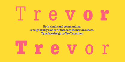 Teo Tuominen’s Trevor took its first breath as a revival of an 18th century antiqua, but culminated in an entirely new and good-natured family. Trevor is an affable slab serif in nature: both heavy and kind. Known for their familiarity and their dark colour, the terminals of slab serifs put additional weight along the line to maintain an inky presence. Their clunky forms reveal slight immaturity and arouse the reader’s sympathy for the subject at hand. Trevor connects with others by consciously riding the line between being personal and commanding. One goal with Trevor was to pair the robust nature of a low contrast slab serif with more sophisticated elements, such as the ball terminals. So wherever one looks in Trevor, rounded corners rule the day, softening the overall appearance by mimicking ink spread made by old metal type. The easygoing look is tempered by very few inktraps and sharp corners, mostly to the inside of characters and in acute angles. Whatever Trevor is paired with, it has an altruistic outlook in that it sees the best in others. It’s the neighbourly type family — the neighbour you actually want. Trevor’s almost monolinear weight and high x-height give it a typewriter look in the extralight and light weights, but the whole family was made to work with many other font styles, design work, and information structures. It certainly finds its home in packaging and advertising, its sturdy verticality and narrowness fit the needs of headlines and intro text, and its seven weights are primed for plays and involved text needing many layers of distinction. The black weight is treated like a separate display style with altered ball terminals and serifs to capitalise on the added heft. Trevor’s seven roman weights cover the Latin A Extended glyph set to bring its kindly and commanding outlook to your projects. Along with alternate version of the ‘R’ in the black weight, its OpenType features include both tabular and proportional lining and oldstyle figures, ligatures, and fractions. The complete Trevor family, along with our entire catalogue, has been optimised for today’s varied screen uses.
 - Anselm Serif by Storm Type Foundry,
$63.00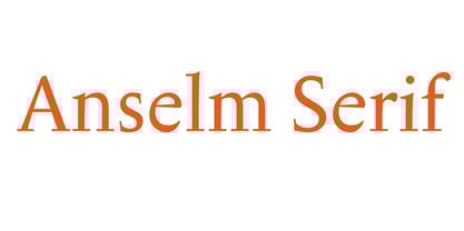 One of the good practices of today’s type foundries is that they release their type families as systems including both serif and sans serif type. Usually, the sources of inspiration need to be well tried with time and practice, since production of a type family is such a laborious and complex process. From the beginning, it needs to be clear that the result will be suited for universal use. Such systems, complete with the broad, multi-lingual variations permitted by the OpenType format, have become the elementary, default instrument of visual communication. Non-Latin scripts are useful for a wide scope of academic publications, for packaging and corporate systems alike. And what about outdoor advertisement designated for markets in developing countries? Cyrillics and Greek have become an integral part of our OpenType font systems. Maybe you noticed that the sans serif cuts have richer variety of the light – black scale. This is due to the fact that sans serif families tend to be less susceptible to deformities in form, and thus they are able to retain their original character throughout the full range of weights. On the other hand, the nature of serifed, contrasted cuts does not permit such extremes without sacrificing their characteristic features. Both weights were drawn by hand, only the Medium cut has been interpolated. Anselm Ten is a unique family of four cuts, slightly strengthened and adjusted for the setting in sizes around 10 pt and smaller, as its name indicates. The ancestry of Anselm goes back to Jannon , a slightly modified Old Style Roman. I drew Serapion back in 1997, so its spirit is youthful, a bit frisky, and it is charmed by romantic, playful details. Anselm succeeds it after ten years of evolution, it is a sober, reliable laborer, immune to all eccentricities. The most significant difference between Sebastian/Serapion and Anselm is the raised x-height of lowercase, which makes it ideal for applications in extensive texts. Our goal was to create an all-round type family, equally suitable for poetry, magazines, books, posters, and information systems.
 - Laima by TypeTogether,
$39.00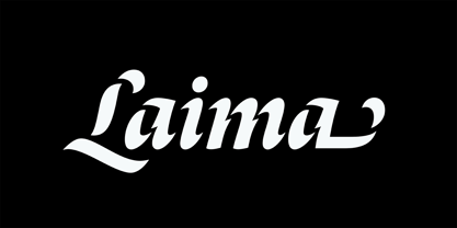 Laima is the brush-formed stencil from Bogidar Mascareñas that will create an ovation for branding, album art, upscale venues, and packaging. If wide appeal, attention to detail, or international reach is necessary for your brand, consider Laima’s high-calibre design as your personal ambassador. The general font user is accustomed to stencil typefaces that have a brute look to them — industrial, mechanical, restrictive, or even militarised. Stencils are commonly used because they serve a function, like spray-painting over template letters, giving the reader a warning that must be heeded for safety, or a command to follow immediately. Wooden crates and grunge art are the medium and black or red paint are the norm. Laima, instead, creates a stencil from the world of calligraphy to turn all this on its head. Laima’s 12 stencil styles (six roman and six italic) use the junctures of calligraphic strokes as an opportunity to achieve an uncommon stencil effect, shifting to create unexpected shapes and the illusion of twisted, disconnected overlaps. Inspired by “Arte Nueva de Escribir”, an engravings book published by Francisco Palomares in 1776, Laima progressed well beyond its beginning as a Type and Media Master’s project at KABK, The Hague (NL). It sometimes required completely new character shapes to accommodate the space needed for clear diacritic marks, and was further enhanced with flourishes and alternates for liveliness and variety in individual or branded work. Laima’s italic begins with swashes and uses OpenType features to automatically turn them off with more than two successive capital letters. Use one swashed character for a drop cap, two for ligatured fun, turn them on or off at your discretion, or change the ascender length and swash shape to suit your creative need. With two styles of numerals and stylistic sets for final forms, Laima’s 12 styles and hundreds of Latin-based languages can turn simple words into an occasion that would immediately benefit high-class brands and special uses. Set that article title, release that new product, code your best-looking UI yet, letterpress that business card, and print that gourmet label. Whatever is next, Laima is the unexpected stencil partner to introduce it to an expectant world.
 - mortis - Unknown license

- Goondocks PB by Pink Broccoli,
$14.00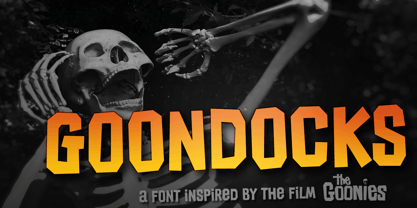 HEY YOU GUYS! Goondocks PB is a faithful recreation of the titling font from 1985 film, "The Goonies". This was a lot of fun to recreate and flesh out, and it has that purposefully awkward appeal that a lot of Pink Broccoli fonts are imbued with. With a pseudo unicase styling, wonky blockish style lettering, and that visceral tieback to the 80's, Goondocks brings back fond memories, perfect for those unorthodox creative designs.
 - Jams And Jellies JNL by Jeff Levine,
$29.00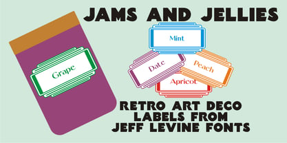 Based on a vintage set of kitchen labels, Jams and Jellies JNL is a font containing 52 of the most common names for jams, jellies and preserves as well as a blank label for creating your own flavor choices. Note: While this font may be used in many commercial advertising applications, any manufacture for retail sale of a complete set (or portion thereof) of these labels requires a special license from the font's author.
 - Graffiti Bomerang by Nirmana Visual,
$22.00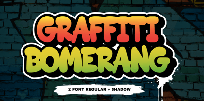 Graffiti Bomerang is a bold display font that captures the rebellious spirit of street art. Its thick, uppercase letters feature jagged edges and unique embellishments that evoke the look of spray-painted graffiti. This font is perfect for creating eye-catching titles and headlines for urban-inspired designs, music posters, and other projects that require an edgy and daring style. The font’s bold and unapologetic personality is sure to make a statement.
 - Morthix by Lone Army,
$17.00Introducing our latest font, which features fluid and flowy curves reminiscent of liquid. This font's contemporary style makes it perfect for use in headers and futuristic designs, adding a creative touch that's sure to catch the eye. Its elegant and modern appearance creates a striking impression, making it ideal for designs that need to stand out. With this font, you can create a unique and eye-catching look that's perfect for any project. - Lesthone by Nathatype,
$29.00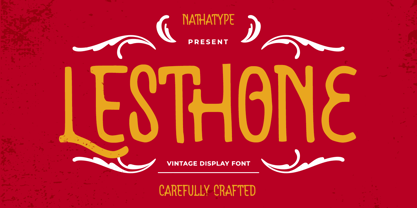 Lesthone is a display font that seamlessly merges vintage aesthetics with modern elegance. The rounded shapes of Lesthone contribute to its friendly looks. Each letter has its own personality, and this contributes to the font's handcrafted appeal. On the other hand, the most standout characteristic of Lesthone is its slightly rough texture that add a rustic charm. This font includes beautiful ornaments as a bonus. Lesthone fits in headlines, logos, branding materials, and many more.
 - Happy Ramadan by Nathatype,
$25.00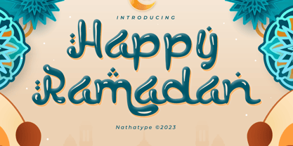 Happy Ramadan is a delightful display font that captures the spirit of the sacred month with a touch of playfulness and warmth. Happy Ramadan is not just a font; it's a celebration of the Ramadan spirit with a playful twist. It's a versatile choice to convey cultural richness, joy, and a welcoming atmosphere. The characters in Happy Ramadan are crafted with soft, rounded shapes that evoke a sense of joy and friendliness. The font's letterforms resemble bubbles, creating a unique and whimsical appearance that adds an element of fun to your text. In addition, you can also enjoy the features here. Features: Alternates Multilingual Supports PUA Encoded Numerals and Punctuations Happy Ramadan fits in headlines, logos, posters, flyers, branding materials, greeting cards, print media, editorial layouts, and many more designs. Find out more ways to use this font by taking a look at the font preview. Thanks for purchasing our fonts. Hopefully, you have a great time using our font. Feel free to contact us anytime for further information or when you have trouble with the font. Thanks a lot and happy designing.
 - Featherful by Ditatype,
$29.00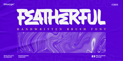 Introducing Featherful, a handwritten brush font that embraces the bold and vibrant strokes of a paintbrush. With Featherful, you have a handwritten brush font that speaks the language of artistry. The characters in Featherful boast generous proportions, ensuring a visually striking impact in any design. The thick weight enhances the font's presence, making it suitable for various creative applications. What sets Featherful apart is its rounded letter shapes, creating a friendly and approachable vibe. The details within each letter mimic the expressive strokes of a paintbrush, adding an authentic and artistic touch. Enjoy the features here. Features: Ligatures Stylistic Sets Multilingual Supports PUA Encoded Numerals and Punctuations Featherful fits in headlines, logos, posters, flyers, branding materials, greeting cards, print media, editorial layouts, and many more designs. Find out more ways to use this font by taking a look at the font preview. Thanks for purchasing our fonts. Hopefully, you have a great time using our font. Feel free to contact us anytime for further information or when you have trouble with the font. Thanks a lot and happy designing.
 - Hefuma by Twinletter,
$13.00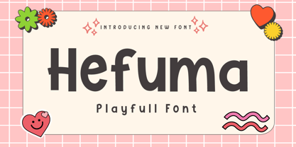 Introducing “Hefuma Font” – Where Playfulness Meets Typography! Dive into the world of creativity with Hefuma Font, a playful display font that’s set to infuse charm and imagination into your designs. Hefuma Font adds a delightful twist to your projects, making it ideal for anything from children’s books to eye-catching posters. Its whimsical style captures attention and brings a sense of joy to your work. Crafted with meticulous detail, Hefuma Font’s unique design invites readers to explore your content with curiosity. Its playful appearance radiates creativity, making it the perfect choice for projects that aim to stand out. With Hefuma Font, the possibilities are endless. Use it to inject a sense of fun into your designs and watch as your creations come to life with personality and flair. No matter the creative endeavor, Hefuma Font is your trusted companion for adding a playful touch to your work. Embrace the world of creativity, and let Hefuma Font elevate your designs to new heights. – PUA Encoded Characters – Fully accessible without additional design software.
 - ITC Tactile by ITC,
$29.99ITC Tactile is a puzzle of subtle typographic contradictions. Capitals have traditional epigraphic proportions, but the lowercase has a uniform optical width. Light weights are stately and elegant, but bold designs are almost jolly. This paradoxical alphabet even combines two distinctively different serif designs. Designer Joe Stitzlein says, “I wanted to create a modern and dynamic serif face that draws its forms from antiquity. I also wanted to have as much fun as possible with the drawing and architecture of each letter. Hopefully I've created a very legible typeface that grabs the reader's eye in a nice, 'tactile' way.” The apparent inconsistencies of the design are the result of careful consideration. Of the seemingly odd serif design, Stitzlein explains, “The transitional serif is an entry point for the eye into the letterform, and the long slab is an exit, leading to the next letter.” The result is a typeface that's easy to read at text sizes but offers surprising details when enlarged to display sizes, setting ITC Tactile apart from more traditional designs. While this is his first commercial typeface design, Stitzlein has ample experience creating custom typefaces for corporate branding, including companies such as Silicon Graphics and Sempra Energy. His graphic design business has served a wide range of clients, including Apple Computer and the 2002 Salt Lake City Olympics. The ITC Tactile family is available in three weights, with complementary italic designs and a suite of small caps for each of the roman designs. Stitzlein drew the small caps to match the height of the lowercase x-height, which enables “bi-form” or “unicase” setting in display copy. - Diotima Classic by Linotype,
$29.99Diotima Classic is a total upheaval for the 21st century of Gudrun Zapf von Hesse's mid-20th-century Diotima, one of the most beautiful types ever cast in metal. Its roots lay in a calligraphic sheet written by Gudrun Zapf von Hesse. The text was the Hyperion to Diotima" by Friedrich Hölderlin; Diotima is the name of a Greek priestess in Plato's dialogue about love. In the philosopher's imagination, she should appear slim and beautiful. In 1948, Gudrun Zapf von Hesse finished the typeface's Roman. The Diotima family was released as a metal typeface for hand setting by D. Stempel AG in 1951-53. This original Diotima is a festive design particularly suited to invitations, programs, and poems. The delicate Italic drew attention to text passages that should be emphasized. Linotype's previous digital Diotima only had one weight, which looked great in display sizes, but was too thin for text setting. Diotima Classic has four weights. The new Regular has more robust serifs and thicker hairlines, making it more appropriate for text sizes. The Diotima variation with finer serif remains under the name Light. Gudrun Zapf von Hesse also took the opportunity in 2008 to add an extremely heavy weight to the family. In comparison to the old Diotima, letterforms of the Diotima Classic are more harmonious and balanced. The rhythm of the Italic letters in Diotima Classic is more consistent. The lining figures of the Diotima Classic align with caps, and the letter spacing of the tabular lining figures in Diotima Classic is significantly better. The forms of the figures have been improved as well." - As of my last update in early 2023, the font named "Ptarmigan" is not one of the widely recognized or mainstream fonts, such as Helvetica, Times New Roman, or Arial, which have broad applications and...
- Billiboldy by Gie Studio,
$10.00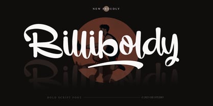 Are you planning to do an amazing piece of work to make lots of people smile happily while taking your hat off every time? If so, this is the right time to give your work a little touch with a sincere and elegant writing. Introducing Billiboldy- A New Bold Script Font Billiboldy is a cursive and thick lettered handwritten bold script font, crafted to give your headlines and logotype projects a stylish touch. This font reads as strong, dynamic and can add tons of nostalgic character to your designs. This font includes Multilingual Options to make your branding globally acceptable. Features: - Ligatures - Stylistic Sets - Multilingual Support - PUA Encoded - Numerals and Punctuation - Special underscore character 7 style - Special doodles for front and back of letters or sentences Thank you for your visit and downloading premium fonts from Gie Studio
 - UXB by astroluxtype,
$30.00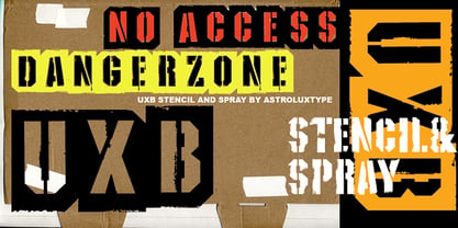 UXB Stencil and its companion UXB Spray contain both the stencil and the sprayed letters in two fonts. The font is a headline display uppercase only character set, which is duplicated in the lowercase keys, identical in form (except for an alternate “Z”). No need to remember to hit the caps lock, the font will work with lowercase key strokes. UXB Spray is also a headline display uppercase only character set but, includes a few “drip” characters (find them in the lowercase key positions) these apply when you have held the spraycan over the stencil too long and made a mess. Use separately or together for a maximum design explosion. The fonts used together with color can create many nice design effects- by offsetting characters and putting one font in front of the other for a second effect. UXB it’s an emergency.
 - Bages by Craft Supply Co,
$20.00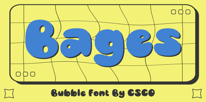 Introduction to Bages – Bubble Font Bages – Bubble Font is a dynamic and cheerful display font, inspired by the playful shapes of bubbles and balloons. Ideal for catchy displays, this font captures attention instantly, making it perfect for creative and fun-filled projects. Design Features Every character in Bages – Bubble Font mimics the round, buoyant nature of bubbles. The design incorporates smooth, rounded edges, giving a floating effect akin to balloons. This unique style brings a joyful and lively flair to any design, ensuring it stands out with its playful aesthetics. Versatile Applications This font’s versatility is noteworthy, suitable for a variety of design purposes. It’s excellent for party invitations, children’s books, and marketing materials, adding a fun twist to traditional text. Moreover, its engaging style is ideal for educational content, making learning more appealing to young audiences.
 - Ah, "Future Earth" by Yautja – a font that's not your everyday Helvetica or Times New Roman. No sir, this font is what happens when typography decides to go on a space odyssey and ends up at a rave p...
- Stay Drips by Ditatype,
$29.00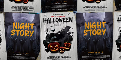 Stay Drips is an interesting, unique font in capital letters with uneven edge lines and ink drop details to give lovely, dynamic visual effects. The letters have soft brush wipes, and the ink drop details on some letter parts show a unique nuance of organic and artistic touch. The font’s unique, flexible characteristics can carry on various design styles such as formal, creative, and experimental ones. Designs with this font will express strong, amazing, unique impressions. In addition, bright and contrast colors will outstand this dynamic font that is more applicable for big text sizes to be greatly legible. You can also enjoy the available features here. Features: Multilingual Supports PUA Encoded Numerals and Punctuations Stay Drips fits best for various design projects, such as brandings, quotes, printed products, merchandise, social media, etc. Find out more ways to use this font by taking a look at the font preview. Thanks for purchasing our fonts. Hopefully, you have a great time using our font. Feel free to contact us anytime for further information or when you have trouble with the font. Thanks a lot and happy designing.
 - Playful Garden by Yumna Type,
$25.00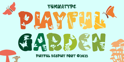 Playful Garden is a display font inspired by garden plants, such as flowers, leaves, and other plants. The letters are round and organic portraying natural shapes of garden views. This font’s unique characteristic is that all of the letters are in capitals to show dramatic, prominent displays. Such big letter sizes help emphasize the messages delivered. Furthermore, such a garden-themed display font is able to create calm, quiet situations to apply for nature designs or organic and eco-friendly products. Overall, it is the right option for you to show unique, interesting displays. Moreover, Playful Garden provides a clipart in accordance with the font theme as a bonus and features you can enjoy. Features: Multilingual Supports PUA Encoded Numerals and Punctuations Playful Garden fits best for various design projects, such as brandings, headings, magazine covers, quotes, printed products, merchandise, social media, etc. Find out more ways to use this font by taking a look at the font preview. Thanks for purchasing our fonts. Hopefully, you have a great time using our font. Feel free to contact us anytime for further information or when you have trouble with the font. Thanks a lot and happy designing.
 - Zonttife by Twinletter,
$13.00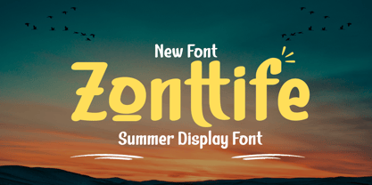 Introducing “Zonttife Font” – Embrace the Summer Vibe! Unlock the essence of summer in your designs with Zonttife Font. This stunning display font is your gateway to infusing every project with the vibrant spirit of the season. Zonttife Font’s unique style instantly transports your text into the heart of summer. Whether you’re working on beach-themed posters, sun-soaked party invitations, or any other creative endeavor, this font will bring your designs to life with a touch of summer magic. Crafted with meticulous attention to detail, Zonttife Font ensures that your text radiates the warmth and playfulness of summer. Its versatility shines through in various design applications, from tropical brochures to poolside banners. But that’s not all – Zonttife Font also supports multiple languages, making it accessible to a global audience. No matter where your creative journey takes you, Zonttife Font will help you express the sun-soaked vibes of summer. Embrace the summer vibes and let your designs bask in the sunny glow of Zonttife Font. Elevate your creativity and infuse the spirit of the season into every project. – PUA Encoded Characters – Fully accessible without additional design software.
 - Vintage Stages by Ditatype,
$29.00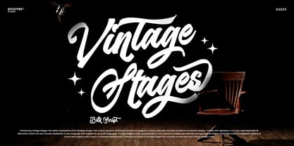 Vintage Stage is a gracefully designed script font that captures the essence of classic calligraphy with a modern twist. Crafted with a weight that is delicately balanced—not too thick nor too thin—this font offers a subtle elegance and a versatile appearance. The consistent sizing ensures that the font maintains a rhythmic flow, resembling traditional handwriting, but with the clarity and readability required in contemporary design. The relatively low contrast of the strokes further enhances the font’s legibility while maintaining a soft and approachable feel. One of the most captivating characteristics of Vintage Stage is the inclusion of swinging ends on select letters. In addition, enjoy the features here. Features: Ligatures Stylistic Sets Multilingual Supports PUA Encoded Numerals and Punctuations Vintage Stage fits in headlines, logos, posters, flyers, branding materials, greeting cards, print media, editorial layouts, and many more designs. Find out more ways to use this font by taking a look at the font preview. Thanks for purchasing our fonts. Hopefully, you have a great time using our font. Feel free to contact us anytime for further information or when you have trouble with the font. Thanks a lot and happy designing.
 - Valenzka by UICreative,
$23.00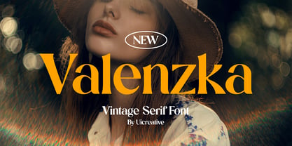 Introducing our new product the name Valenzka Vintage Serif Fon. Modern Serif font that feels beautiful classy, elegant, and modern. This font is perfectly suited for a wide variety of projects, such as signature, stationery, logo, wedding, typography quotes, magazine or book covers, website headers, clothing, branding, packaging design, and more. Also for fashion-related branding or editorial design and displays both masculine and feminine qualities.
 - Imagine a font that decided to throw on a tuxedo, sip a glass of exquisite wine, and then, mid-sip, dash off to join a carnival. That, my friend, is Reprise Script by Avid Technology. It's like the h...
- Once upon a time in the digital kingdom, there was a font named Tempora LGC Uni, crafted by the master hands of Alexey Kryukov. This intrepid typeface embarked on a journey to unite the realms of let...
- Once upon a time, in the bustling metropolis of Typography Town, there lived a unique and rather intriguing font named EU-Sym. This font wasn't your typical character in the neighborhood, like the bo...
- Zombie Brush by Ditatype,
$29.00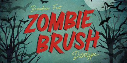 Zombie Brush is a haunting script font that brings the undead to life with its eerie charm and brush-style appearance. Designed intentionally in large letters, this typeface commands attention and exudes a sense of horror and intrigue. Each letter is meticulously crafted with brush-like strokes, adding a touch of handcrafted artistry to the font. The brush-style appearance of this font evokes a sense of chaos and unpredictability, as if the letters were created by an unsteady hand under the influence of dark forces. The large size of the letters enhances the font's imposing presence, making it impossible to ignore. For the best legibility you can use this font in the bigger text sizes. Enjoy the available features here. Features: Multilingual Supports PUA Encoded Numerals and Punctuations Zombie Brush fits in headlines, logos, movie posters, flyers, branding materials, print media, editorial layouts, headers, and zombie-themed projects. Find out more ways to use this font by taking a look at the font preview. Thanks for purchasing our fonts. Hopefully, you have a great time using our font. Feel free to contact us anytime for further information or when you have trouble with the font. Thanks a lot and happy designing.
 - Rosalline Handwritten by Ditatype,
$29.00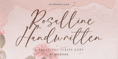 Rossaline Handwritten is a lovely script font of which characteristics are the connections between letters to look like a naturally connected handwriting that leaves the impression of this font being organically, spontaneously written in order to add a firm personal touch. This font has various line thicknesses to show high letter contrasts to strengthen the font’s firm, clear impressions. Besides, the letters’ height variety, meaning that some of the letters are higher than the others, makes Rossaline Handwritten more interesting and dynamic. However, the connected letters can cause difficulty to read in small text sizes, so that you need to be more careful to use this font by adjusting it to your needs. In addition, you may enjoy the available features here as well. Features: Ligatures Multilingual Supports PUA Encoded Numerals and Punctuations Rossaline Handwritten fits best for various design projects, such as brandings, quotes, invitations, name cards, greeting cards, printed products, merchandise, social media, etc. Find out more ways to use this font by taking a look at the font preview. Thanks for purchasing our fonts. Hopefully, you have a great time using our font. Feel free to contact us anytime for further information or when you have trouble with the font. Thanks a lot and happy designing.
 - River Stone by Yumna Type,
$16.00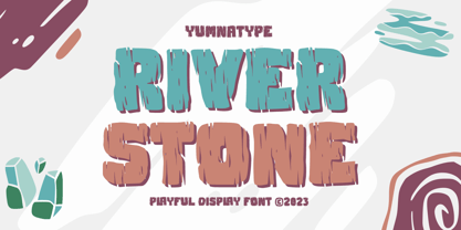 It may be difficult to find a font with characters and legibility rates when creating impactful visual designs. Amid the abundance of ordinary font options, the branding and marketing processes can remain stagnant because the absence of unique fonts will increase the risk of your visual designs getting blended with other people’s designs and be left forgotten. For that reason, we would be glad to introduce you to River Stone, a font to give you assistance to create prominent visual designs quickly and easily. River Stone is an uppercased display font in textured letter shapes with which it shows firm, eye-catchy impressions. The font’s textures can add dimensions to the letters’ displays and live up the design nuances. With the use of uppercases, this font is capable of protruding the desired messages and make the design displays more attractive. Its unique shapes will affect the legibility rate of the font, therefore, you need to use this font for big text sizes for a better legibility reason. In addition, this font provides you a clipart as a bonus and you can make use of the available features here as well. Features: Multilingual Supports PUA Encoded Numerals and Punctuations River Stone fits best for various design projects, such as brandings, posters, banners, headings, magazine covers, quotes, printed products, merchandise, social media, etc. Find out more ways to use this font by taking a look at the font preview. Thanks for purchasing our fonts. Hopefully, you have a great time using our font. Feel free to contact us anytime for further information or when you have trouble with the font. Thanks a lot and happy designing.
 - Paul6 - Unknown license

- Deft Brush by wearecolt,
$16.00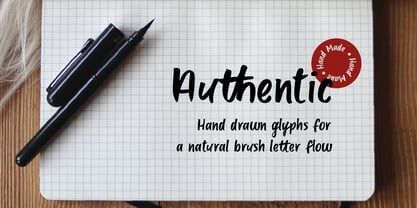 A beautiful brush font created directly from original drawn characters. Deft Brush features a number of ligature and alternative glyphs to add to the hand drawn look. A great front for bold headlines, titles and crafty logotypes. Available as both .otf and .woff
 - Sweet Tea PW by Patty Whack Fonts,
$24.00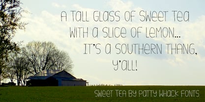 Sweet Tea is a thin, handwritten and simplistic font reminds me of the simple, yet serene days on the front porch swing with a Summer breeze. Sipping an ice cold glass of sweet tea on a hot, sunny day -- there's nothing better.
 - Silver Pearl by Aestherica Studio,
$12.00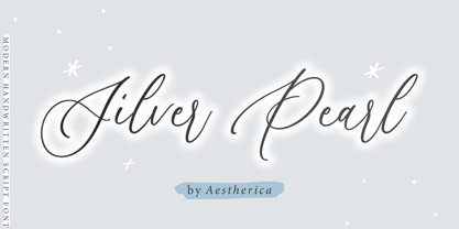 Introducing the new fun handwritten dont by Aestherica Studio. Proudly presenting Silver Pearl. Silver Pearl is perfect for product packaging, branding project, magazines, social media, wedding, and more. Silver Pearl has also multilingual support. Enjoy the font, feel free to comment or feedback.
 - Ollivette Elite by Chank,
$59.00Fly your inner geek flag with this cool new "Eleet" typewriter font. It's kinda like a wonky internet translator that converts normal text into leet-speak, so you can exchange encoded love notes with cyber-hackers and goofy-gamers. The actual glyphs in this font are interchangeable with the more logical Ollivette typewriter font, but here the characters have all been moved around to create stylized interpretation of similar glyphs. So "ELEET" could also be typed "31337". Except you don't have to think about it. Get it? Got it? Good! 3NJ0¥ TH15 ƒØÑ+ & U53 !† 0FT3N. - Right Swipe by Din Studio,
$25.00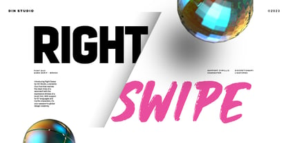 Right Swipe is a fantastic sans serif brush font duo. The sans serif font, in the Right Swipe, is the epitome of simplicity and elegance. Designed in uppercase, it boasts clean lines and a minimalist aesthetic, making a versatile look. This sans serif typeface is all about timeless sophistication and modern appeal. In contrast to its sans serif, the brush font adds a touch of creativity and spontaneity to the duo. The brush font's characters are made in round shapes and consistent proportions, creating a harmonious appearance. Each letter is meticulously crafted with fluid strokes, evoking a sense of warmth and approachability. Together, this duo offers a harmonious balance of elegance and creativity. This combination of a simple and refined sans serif font with a warm and inviting brush font allows you to strike the perfect tone for your design projects. In addition, enjoy the features here. Features: Multilingual Supports PUA Encoded Numerals and Punctuations Right Swipe fits in headlines, logos, posters, flyers, branding materials, print media, editorial layouts, and many more vintage-inspired designs. Find out more ways to use this font by taking a look at the font preview. Thanks for purchasing our fonts. Hopefully, you have a great time using our font. Feel free to contact us anytime for further information or when you have trouble with the font. Thanks a lot and happy designing.
 - Magma Cracks by Yumna Type,
$25.00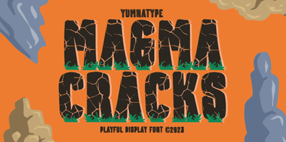 People often have trouble finding a perfect, prominent font to express the project values. You need an instantly attractive font that is able to stand out your designs for something unique and special without consuming a lot of time and costing some money. For that reason we have everything you need. Magma Cracks is a capitalized display font in a visually attractive design along with the big, round, high contrast, cracking letter designs as its unique characteristics. It is suitably applicable for any unique, different font designs to help you emphasize your messages in the graphic designs. This font’s cracking designs can express dramatic, prominent nuances and give unique textures resulting in the artistic displays. Magma Cracks provides a clipart in accordance with the font theme as a bonus and features you can enjoy. Features: Multilingual Supports PUA Encoded Numerals and Punctuations Magma Cracks fits best for various design projects, such as brandings, headings, magazine covers, quotes, printed products, merchandise, social media, etc. Find out more ways to use this font by taking a look at the font preview. Thanks for purchasing our fonts. Hopefully, you have a great time using our font. Feel free to contact us anytime for further information or when you have trouble with the font. Thanks a lot and happy designing.
 - Monthir by Ditatype,
$29.00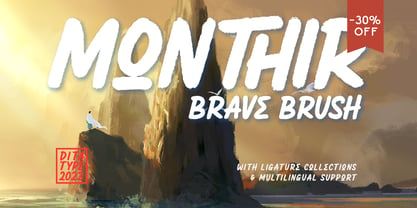 It may be a hard challenge to find an attractive, prominent font in a unique way amid the abundant font options available. Due to the significant reason to find the right font to deliver appropriate messages and emotions, we would like to introduce you to the Monthir, the perfect choice to express any of your project designs. Monthir is a capitalized brush font in brush details to produce authentic looking handwriting displays. The font’s bold, firm displays which are the advantages of such a font can create more interesting, prominent designs. Besides, people can feel closer to the brands or designs created through its personal, natural nuances. The letters’ proportions are relatively consistent, yet its dramatic, bold styles are suitably applied for bigger text sizes rather than the text body. Features: Multilingual Supports PUA Encoded Numerals and Punctuations Monthir fits best for various design projects, such as brandings, posters, banners, headings, magazine covers, quotes, invitations, name cards, printed products, merchandise, social media, etc. Find out more ways to use this font by taking a look at the font preview. Thanks for purchasing our fonts. Hopefully, you have a great time using our font. Feel free to contact us anytime for further information or when you have trouble with the font. Thanks a lot and happy designing.
 - Noam Text by TypeTogether,
$69.00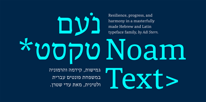 Adi Stern’s Noam Text shows that typographic progress is often in the small things — in the perfecting of familiar traditions and in staying loyal to the spirit of what came before. It can’t really be called progress unless it honours its history. In this way, TypeTogether is happy to introduce Noam Text: A Hebrew and Latin serif font that builds on its heritage with the twin tools of honour and progress. Since 1908, the Frank-Rühl fonts have dominated the Hebrew book and newspaper market. Noam Text’s design goal was to create a coherent family with both Latin and Hebrew serif text typefaces, each authentic to its own script, and which would serve as an alternative to last century’s predecessor. In short order, users will recognise Noam Text as a source of progress in its bilingual abilities. Hebrew and Latin have opposite reading directions, creating many issues: opposing directionality of the open counters; vertical stress in Latin, but horizontal in Hebrew; fewer extenders in Hebrew; and no Hebrew capital letters. All these have been taken into account in Noam Text’s modern design. Of unique importance — all punctuation marks have a Hebrew version, which makes each script complete and uncompromising. Among other technologically advanced details, Noam Text was programmed for all expected scenarios of mixing Hebrew, Latin, figures, and punctuation. Noam Text is intended mostly for setting long texts, so it strives to achieve maximum legibility in minimum space with its large x-height, short and fairly condensed Latin capitals, large and open counters, and low contrast. Originally derived from the Hebrew, the shallow horizontal curves and strong baseline serifs provide dynamism and enhance the reading flow. Noam Text Latin’s italic is rounded and reading friendly, is condensed to generate a lighter texture than the roman, and has a flowing stance. These virtues help it endure harsh printing conditions and subpar inks and paper. Noam Text’s three total weights provide a proper solution for integrating texts in both scripts, as well as a contemporary alternative for use in books, newspapers, and magazine design. Aligned with TypeTogether’s commitment to produce high-quality type for the global market, the complete Noam Text family displays an impressive amount of discretion, applying to wide use-cases by not edging too close to religious motifs or imbibing in secular indulgence. This means Noam Text can be the go-to family across the board and capitalise on the desire for clear typographic progress in this modern age.
 - We The People by K-Type,
$20.00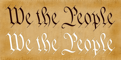 This typeface is extrapolated from the ‘We the People’ calligraphy of the handwritten US Constitution Preamble which employed a style based on German Text and Square Text exemplars from George Bickham’s penmanship copy-books, the most celebrated being The Universal Penman published in 1743. The original Constitution document was transcribed onto parchment by Jacob Shallus, a Pennsylvania Assistant Clerk, over a weekend in 1787. Shallus’s biographer, Arthur Plotnik (The Man Behind the Quill, 1987), notes that he was paid $30, a modest monthly wage at the time. He also suggests that the calligraphic headings, ‘We the People’ and ‘Article’, may have been inserted by Shallus’s 14 year old trainee son, Francis, “The manner in which the ‘Article’ headings are squeezed into the space Shallus allowed for them suggests a second hand—and perhaps not a very experienced one.” The unconventional backslant of the headings would seem to support this contention, and at the end of the document there is perhaps a novice’s inconsistency in the structure of the letter n between that used for ‘done’ and those used for ‘In Witness’. However, one has to admire the elegant swagger of the wavy t, h and l which the K-Type font extends to the b, f and k. Also, the simpler, Schwabacher-style W, an enlarged version of the lowercase w, is a little less flamboyant than the capital W from the German and Square texts in Bickham’s manuals. For designers using OpenType-aware applications, the typeface includes some Alternates, including a Bickham-style W, the letters t, h and n with added flourishes, two simpler forms of the A, and a few roman numerals for numbering articles. Also some ornamental flourishes and a round middle dot/decimal point. Punctuation marks are drawn in square, calligraphic style, but an alternative round period/full stop, for use with currency and numerals, is available at the period centered position (though placed on the baseline), accessed by Shift Option 9 on a Mac, or Alt 0183 on Windows. The full phrase, ‘We the People’, has been placed at the trademark keystroke and can be accessed by Option 2 (or Shift Option 2) on a Mac, or Alt 0153 on Windows. For designers who find the backslant awkward or unpleasant, the licensed typeface also includes two additional fonts which have a vertical aspect that may be more conducive to graphic design layouts. ‘We The People Upright’ and ‘We The People Upright Bold’ both retain the distinctive style, and the heavier weight is only slightly emboldened, just enough to add some punch.

