10,000 search results
(0.224 seconds)
- Frogurt by Missy Meyer,
$14.00 Frogurt is a soft, plump, rounded slab serif font full of fun! Its fat curves make me think of frozen yogurt, and I've always preferred the shorthand "frogurt" to "fro-yo." I was inspired by a 30-year-old hand-carved wooden sign; when I went to try to find a font with a similar look, I couldn't really find anything soft and funky enough! It was a real Goldilocks situation: that one was too thin, that one's corners were too sharp, that one's baseline was too strict. So since I couldn't find something I liked, I made something I liked! I gave Frogurt big pillowy slab serifs, a slightly irregular baseline, and just enough tilt and variation to be fun while still keeping things really clean and readable. The outlines are cleaned up and sharp, so Frogurt will work well for both printing and cutting. Frogurt clocks in with just over 570 glyphs total, including all of the basics (A-Z, a-z, 0-9, and a ton of punctuation), plus over 310 extended Latin characters for language support, and over 50 alternates and ligatures to add some variety and flair. Frogurt is PUA-encoded for easy access to all characters.
 - Vernaccia by Eurotypo,
$32.00 Last year I went to visit a friend in Tuscany. One day he took me to meet his neighbor, a nice old man; Mr. Giulio. After giving us a tour of his small vineyard, he insisted us to try his production: a delicious Vernaccia! When his wife left the bottle containing the gold liquid on the table, I fell in love with the label: it was handwritten by herself, as if to highlight the "homemade" feature. As a tribute to this beautiful and hardworking couple, I asked permission to be inspired to make a typeface ... and here goes! The family Font Vernaccia... Vernaccia is a type family of four fonts: Regular, Bold, Condensed and Condensed Italic. Is a modern and casual calligraphy family font. As an exclusively Open Type release, with 759 glyphs and 45 ornaments, it has several special alternatives for all letters with lots of possibility and an infinity of combinations. Most of the ornaments can be used alone, but really were especially designed to combine with the different glyphs. There are plenty of options to allow you to create something unique and special: standard and discretionary ligatures, several swashes and stylistics alternates for each letter, catchwords, tails that can be added to the beginning or end of each letter, ornaments, and much more. These lovely fonts have already an extended character set to support Western European languages. Vernaccia was made to make your project more beautiful and attractive! Have fun with it!
 - Hagemann JNL by Jeff Levine,
$29.00 One of the most enduring type styles of the Art Deco era is Huxley Vertical. Its clean lines and stylish appeal have transcended changing times and tastes. Many typefaces have been inspired by the original, including the model used to create this font. The design was found in the book "Lettering and Alphabets", first published in 1946 by J. Albert Cavanagh. By re-drawing it from scratch, the missing numerals, punctuation, special characters and accents were added. Hagemann JNL and its oblique version are named in honor of one of Jeff Levine's friends within the type design community -- Michael Hagemann of Font Mesa.
 - Arya by TipoType,
$19.90 Arya is a display typeface, based on Roman proportions. It has three versions, differentiated by the amount of the drawn lines. Single is solid. Double is sturdy but light. Triple is versatile and includes alternatives. They can be combined in layers. Capsule versions (White and Black) are designed to do quick, simple and elegant labels.
 - Bendungan Signature by Chococreator,
$15.00 Bendungan Signature Handwritten is a Beauty and Minimalist font with beautiful ligature, character specials and multilingual support. This is a very versatile font that works well in large and small sizes. Bendungan Signature Handwritten is perfect for branding projects, Logo designs, Clothing Branding, product packaging, magazine headers, or just as a stylish text overlay for any background image. Features: Ligature The A-Z alternative Numbers & Punctuation Accented characters HOW TO ACCESS ALTERNATIVE CHARACTERS Open the glyph panel: In Adobe Photoshop, open Window - glyphs In Adobe Illustrator, open Type - glyphs
 - Shampoerna Betoel by Taznix Creative,
$9.00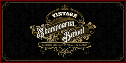 Shampoerna Betoel is an elegant and classic blackletter font. Fall in love with its incredibly versatile style and use it to create spectacular designs! Shampoerna Betoel Typeface includes a full set of character A-Z, as well as multi-lingual support, currency figures, numerals, and punctuation. What's Included : Standard glyphs Ligature Works on PC & Mac Simple installations Accessible in the Adobe Illustrator, Adobe Photoshop, Adobe InDesign, even work on Microsoft Word. PUA Encoded Characters - Fully accessible without additional design software. Fonts include multilingual support for; ä ö ü Ä Ö Ü ß ¿ ¡
 - Sandiaga by Arendxstudio,
$16.00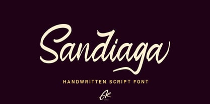 Sandiaga is a handwritten script font that is designed to suit the needs of consumers who focus on the custom style. Sandiaga comes with OpenType features such stylistic alternates, stylistic sets & ligatures good for logotypes, posters, badges, book covers, t-shirt design, packaging and more. Features : • Character Set A-Z • Numerals & Punctuations (OpenType Standard) • Accents (Multilingual characters) • Ligature • Alternate There it is! I really hope you enjoy it - comments & likes are always welcome and accepted. More importantly, don't hesitate to send a message if you have a problem or question.
 - Wood Type Calendar JNL by Jeff Levine,
$29.00 Wood Type Calendar JNL is a set of components for making monthly calendar pages. Based on a set of vintage wood type numbers, the dates 1 through 31 are found on the "A-Z" and "a-e" keys; the 23/30 and 24/31 ligatures are on the "f" and "g" keys. On the "h" and "i" keys are blank outline and solid blocks for balancing the calendar layout. The "j" through "u" keys have the names of the months, and the "1" through "7" keys contain the days of the week.
 - Winter Break by Supersemarletter,
$10.00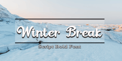 Winter Break is a sweet and flowing handwritten font. It looks stunning on wedding invitations, thank you cards, quotes, greeting cards, logos, business cards and every other design which needs a handwritten touch. Honestly it works perfectly for headlines, logos, posters, packaging, T-shirts and much more. Font Features : • Regular version • Character set A-Z in uppercase and lowercase • Numerals & Punctuation • Accented Characters • Multiple Languages Supported Recommended to use in Adobe Illustrator or Adobe Photoshop with opentype feature. If you have questions, just send me a message and I'm glad to help.
 - Sulaiman by Arendxstudio,
$15.00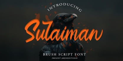 Sulaiman is a handwritten script font that is designed to suit the needs of potential buyers who focus on the custom style. Sulaiman comes with OpenType features such stylistic alternates, stylistic sets & ligatures, and it's perfect for logotypes, posters, badges, book covers, t-shirt design, packaging and more. Features : • Character Set A-Z • Numerals & Punctuations (OpenType Standard) • Accents (Multilingual characters) • Ligature • Alternates There it is! I really hope you enjoy it - comments & likes are always welcome and accepted. More importantly, don't hesitate to send a message if you have a problem or question.
 - Winter Winds by Arendxstudio,
$14.00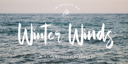 Winter Winds Handwritten Typeface is a font with distinctive handwritten characters, perfect for branding projects, logos, wedding designs, media posts, advertisements, product packaging, product designs, labels, photography, watermarks, invitations, stationery, and any project who need handwritten feel. Features : • Character Set A-Z • Numerals & Punctuations (OpenType Standard) • Accents (Multilingual characters) • Ligature • Alternate There it is! I really hope you enjoy it - comments and likes are always welcome and accepted. More importantly, don't hesitate to send a message if you have a problem or question. Now just read this, go there and make it happen.
 - Matthias by Arendxstudio,
$16.00 Matthias is a brush script font with distinctive handwritten characters perfect for branding projects, logos, wedding designs, media posts, advertisements, product packaging, product designs, labels, photography, watermarks, invitations, stationery, and any project who need handwritten dishes. Features : • Character Set A-Z • Numerals & Punctuations (OpenType Standard) • Accents (Multilingual characters) • Ligature • Swash There it is! I really hope you enjoy it - comments & likes are always welcome and accepted. More importantly, don't hesitate to send a message if you have a problem or question. Now just read this, go there and make it happen :)
 - Qibtiyah by Arendxstudio,
$16.00 Qibtiyah is a brush script font with distinctive handwritten characters perfect for branding projects, logos, wedding designs, media posts, advertisements, product packaging, product designs, labels, photography, watermarks, invitations, stationery, and any project who need handwritten designs. Features : • Character Set A-Z • Numerals & Punctuations (OpenType Standard) • Accents (Multilingual characters) • Ligature • Swash There it is! I really hope you enjoy it - comments & likes are always welcome and accepted. More importantly, don't hesitate to send a message if you have a problem or question. Now just read this, go there and make it happen :)
 - Gravesend Sans by Device,
$39.00 Smart, legible and elegant, Gravesend Sans is a based on the unique typeface used for the iconic grass-green signage for the Southern Railway. In existence from 1923 to 1948, when the network was nationalised, the Southern Railway linked London with the Channel ports, South West England, the South coast resorts and Kent. The same design was also used for the ‘hawkeye’ signs on the London, Midland and Scottish Railway, differentiated by black letters on a yellow background. Reference for each letter was taken from vintage ‘target’ station nameplates and other platform signage. The rarest letters were the Q, seen in Queens Road Battersea, the X, seen in East Brixton, and the Z, used in Maze Hill, site of an infamous train crash in 1958. Being hand-made, the letters often differ in width and thickness. There was no lower case. The Bluebell Railway, a heritage steam line, runs over part of the old Southern Railway network and uses a very similar type. The design of the numbers differed considerably, but here have been taken from the Device 112 Hours font Smokebox. As well identifying platforms, they were used on the front of the steam engine’s smokebox, hence the name, and stylistically are more in keeping with the letters than some of the squarer versions that can be seen in old photographs. William Caslon IV is credited with the first Latin sans-serif type, shown in a 1816 Caslon specimen book. ‘Two Lines English Egyptian’, as it was called, was caps-only, and there are several other correlations between that type design and this one. Includes a selection of authentic arrows and manicules, plus abbreviated ligatures such as ‘St.’ (Saint or Street) ‘Rd.’ (Road) and ‘Jn.’ (Junction). The Cameo version includes many graphic banner elements that can be freely combined.
 - Malabar by Linotype,
$29.99 Malabar is a type family for extensive text. Its design was developed with a nod toward newspapers. Malabar's characters are seriffed and of the Old Style genre. A strong diagonal axis is apparent within the curves. Sturdy serifs help strengthen the line of text in small point sizes, as well as define the overall feeling of the face. Malabar's x-height is very high, a deliberate choice that makes the most important parts of lowercase letters visibly larger in tiny settings. The height of the capital letters is also rather diminutive, allowing for better character fit, as well as eliminating a bit of clumsiness in German, which often includes quite a few uppercase letters. Diacritical marks and additional alphabetic forms required by many Western, Central, and Eastern European languages are naturally a part of the character set, including those needed in the Baltic states, for Romanian, and for Turkish. Malabar's accents are bold and direct, sitting well with their base glyphs. The family includes three weights, each with a companion Italic. Malabar Regular is equipped with small caps, and both it and Malabar Italic include oldstyle figures. All members of the family have both proportional and tabular-width lining figures, as well as special variants of certain punctuation marks vertically adjusted for all-caps text setting. Malabar is informed both by contemporary ideas of typeface design (sheared terminals, the wider-drawn s) as well as by 16th-century masters. Malabar Heavy and Heavy Italic are very loud; their blackness almost shouts out from the page. The Regular's wedge serifs become more slab-ish in nature as the letters' weight increases. Malabar Heavy and Heavy Italic are best relegated to headline use only. Malabar Bold and Bold Italic may be used for text emphasis, a job for which the Heavy is to dark. Malabar received a Certificate of Excellence in Type Design at the Type Directors Club of New York TDC2 competition in 2009.
 - WizarMagi Script by Ililion,
$12.00 WizarMagi Script is a font design with a variety of fantasy and magic styles. The font features a unique customization for each uppercase letter, and a magical glitter style for the lowercase letters. It has accentuation in both uppercase and lowercase. Can be used for a variety of designs, limited only by your creativity.
 - RadioTime by John Moore Type Foundry,
$24.95 A funny look with the spirit of the radio’s golden age, RadioTime is a typeface based on the handwritten alphabets of the ’30, ’40 and ’50. RadioTime comes with two styles: Regular and Tooled, in standards connected letters to imitated continuos handwritting and it’s provided with specials characters like swash, terminals, lower case numbers as well as an unlinked set of characters. RadioTime comes also with a wide kind of icons and ornaments. All this features provides the Word with the fun spirit and speed of those times of bustle. Radio Time was a winner in "Tipos Latinos 2010", The Fourth Biennial of Latin-American Typography. RadioTime Icons offers a thorough and well drawn vintage collection of 63 icons that tells the story of the glory days of radio, charts, dials, automobiles, airplanes and people who set the mood of those days.
 - Psychotropic Experience by Mysterylab,
$12.00 Here's a unique and unusual font pack in the tradition of late 1960s psychedelic poster and album cover styles. Perfect for that flaming psychedelia vibe from the Haight-Ashbury scene in the Summer of Love era. Combine Regular and Fill versions to create a two-toned design for a super offbeat and eye-catching look. Once loaded on your system, the three versions of the font show in your menu as the following three "weights": Psychotropic Experience Regular, Psychotropic Experience Fill, and Psychotropic Experience Solid. The 3-alphabet collection works together seamlessly to allow you to assign one color to the body of the letter, and a second color to the inset fill areas. Just copy your text block, paste in place, reassign the font to the Fill version, choose a complimentary color, and off you go. All caps Fonts.
 - Abominio by Unio Creative Solutions,
$9.00 Abominio is a captivating display typeface featuring an innovative design of recurring chiseled forms. This font aims to capture the spirit of maximalism culture, offering a valuable asset for consumer-oriented designs, allowing them to stand out in a in a sea of competitors. With its bold and experimental appearance, Abominio remains true to the letters of the Latin alphabet. This unique characteristic is well-suited to capture and hold the attention of easily distracted viewers, extending their focus for a few more vital seconds. Designers now have the opportunity to explore their creativity, creating both refined and daring combinations for eye-catching headlines, titles, or graphic design projects that aim to convey strength and artistic innovation. Specifications: - Included: Abominio Regular, Abominio Oblique, Abominio Variable - Multi language support (Central, Eastern, Western European Languages) - OpenType Features Thanks for viewing, Unio.
 - Candy Lovely by Good Java Studio,
$25.00 Candy Lovely - Cute Handwritten Font make from handlettering ideas in typeface. This font includes full of Alphabetical glyphs, Numerals, and punctuation. This is so perfect for invitations, monograms, wedding, fashion, branding, label, handlettering or logotype.
 - October Quirky by Good Java Studio,
$20.00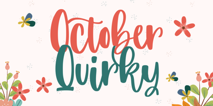 October Quirky - Cute Quirky font make from handlettering ideas in typeface. This font includes full of Alphabetical glyphs, Numerals, and punctuation. This is so perfect for invitations, monograms, wedding, fashion, branding, label, handlettering or logotype.
 - Conversation Hearts by Harald Geisler,
$- Conversation Hearts are inspired by the sweethearts and conversation hearts that can be found all over the US and Britain, but not in Germany. A source of endless fun and surprise. As a typographer to me they are also a surprising document of written communication. Most people complain that nowadays the inscriptions are not as sweet as they used to be. While they used to held romantic and promising inscriptions like “Be True” “Sweet Talk”, today they carry “Tweet me” “Ur Hot” and “Party Girl”. So i took this as a motivation to work with conversation sweetheart on a conceptial inspirational and typographical level. The obvious: every letter pressed on the keyboard brings out a conversation heart that starts with the letter - i.e. L = Loverboy, H = Heartless but what to write? Since i didn't want to reproduce the old “Fax me” and “Email me” I had to come up with something new. Something with a personal relation and of course something that I Love - what else could i write in the shape of the heart? So I tried to access my upper subconsciousness and looked for two words for every letter in the alphabet. One for the capital letter pressed and one word for the lowercase letter. Resulting in a Kurt Schwitters worthy assemblage of vocables "Post-office" “Internship” “Zebra” “Answers” etc. It is not easy to read a text set in Conversation Hearts but easier as a text set in Zapf-Dingbats. To sparkle the visual appearance uppercase letters are filled hearts with “carved” inscription, while lowercase letters are an outlined heart with written inscription. Conversations Hearts is a part of the Light Hearted Font Collection that is inspired by a recording of Jean Baudrillard with the title, "Die Macht der Verführung" (The Power of Seduction) from 2006. Further inspiration came from the article, "The shape of the heart: I'm all yours". The heart represents sacred and secular love: a bloodless sacrifice. by British writer Louisa Young printed in EYE magazine (#43) London, 2002.
 - Cora by TypeTogether,
$49.00 Cora is a sans serif with an experimental bent, offering a large x-height, some contrast of stroke weight, and capitals inspired by classical lettering. The large x-height gives it a voice with a little more volume so that those in the back of the room have no trouble hearing. Because the letters seem slightly large, Cora remains clear at smaller point sizes. It is a typeface intended to perform well on screen without losing its attraction in print and the nature of its shapes allows for condensation or expansion without becoming severely distorted. The uppercase exhibits classical proportions found in ancient Roman inscriptions, which provides opportunities for setting titles in all caps. Cora Opentype Pro has a full range of numerals for every use, small caps, the most common open type features and supports many languages that use the latin extended alphabet. It is available in a range of three weights plus Italics. CoraBasic is a reduced version of Cora. It is still an OT-font but without any particular features except of a set of ligatures, class-kerning and language support including CE and Baltic.
 - Pasto by Antipixel,
$15.00 Pasto is a fun and charming display type family of two styles with four weights each. 'Print' is a textured irregular stamp style, and 'Sharp' is a straightforward soft-edged type with clean strokes. It is clean, playful, and expressive, with a lightweight structure and fairly aired inner space. Pasto is perfect for display use and intended for medium and large settings. Still, it can be used in smaller point sizes for short sentences or words, providing a softer, delicate look. Pasto has three alternating alphabets that slightly differ from one another. Thanks to the Contextual Alternates, these alphabets are automatically replaced to avoid the same letterforms and textures appearing next to each other, creating a more spontaneous look when typing. This OT Feature is available for all the Sharp and Print styles. Some of Pasto's features are ligatures, stylistic alternates, numerators, fractions, special characters, currency symbols, and a glyph coverage that ensures extended language support.
 - AJ Quadrata by Adam Jagosz,
$25.00 Once, Blackletter was a calligraphy style. Full of ligatures, with letters bumping into each other to create an unapologetic picket-fence pattern. Some even claimed that the regularity improved legibility! But then Blackletter was cast into metal, and only a handful of established ligatures survived, while most interletter connections were disentangled. Everyone since followed suit, and hundreds of years later, digital Blackletter fonts were modelled mostly on the metal fonts that prevailed rather than the original handwriting. Up until now! AJ Quadrata is an authentic revival of the textura quadrata hand, and its major inspiration is a 15th-century Latin manuscript of the Bible from Zwolle, the Netherlands. The typeface is delivered in two flavors. The default cut is a modern take on textura quadrata that can be useful for today and tomorrow. The standard ligatures feature employs nearly all letters. The tittle of i retains its original, hasty squiggle form (except for the Turkish localization). Discretionary ligatures include medieval ligatures da, de, do, pa, pe, po (and their mixed-case counterparts!). Stylistic sets allow to use historic letter variants such as long s and rotunda r, closed-counter a, and alternate capitals. AJ Quadrata Medieval is perfect for setting Latin. Default forms of capital F, H and O are swapped with the alternates. The squiggles above i only appear for disamibiguation nearby m, n or u, as in original manuscripts. Discretionary ligatures and historic variants are promoted to the standard ligatures feature to make room in the discretionary ligatures feature for a variety of scribal abbreviations. Dedicated stylistic sets include medieval punctuation and justification alternates — glyphs with elongated terminals used for lengthening lines that end up too short. The Rubrum styles can be layered and colored to create the illuminated effect on the capital letters. Besides a faithful rendition of extended Latin including Vietnamese, numerous synthetic additions are included: polytonic Greek, Armenian, and Cyrillic (with Bulgarian and Serbian/Macedonian localizations). Both flavors of the typeface can be considered a starting point that can be further customized using OpenType features, including Stylistic Sets (some features differ between AJ Quadrata and AJ Quadrata Medieval): ss01 Alt E ss02 Descending F / Roman F ss03 Uncial H / Roman H ss04 Angular O / Round O ss05 Contextual closed-counter a ss06 Diamond-dot i j / Always dotted i, j ss07 Contextual rotunda r / No r rotunda ss08 Contextual long s / No long s ss09 Dotless y ss10 Serbian Cyrillic ss11 Alt Cyrillic de ss12 Alt Cyrillic zhe ss13 Alt Cyrillic sha ss14-ss17 [reserved for future use] ss18 Scribal punctuation ss19 Alt linking hyphen ss20 Justification alternates
 - ITC Kallos by ITC,
$29.99ITC Kallos is the work of British designer Phill Grimshaw, a text typeface family with traditional calligraphic flair. It is the result of Grimshaw's first experiments with text typeface design. The long ascenders and descenders of the lowercase alphabet lend them a look of sophisticated elegance. The capitals display the unmistakable influence of the pen and the proportions of classic inscriptional forms. - Barbies by OtterType,
$22.00 Barbies is an outstanding display font for your inner princess. You can use it for a variety of design projects like posters, business cards, birthday and wedding invitations, games, covers, social media posts, quote photos, branding, editorials, and much more. Decorative curves add an amazing touch to create some cute accents. Barbies is a multilingual font, also supporting Cyrillic alphabet.
 - Silhouette Signature by Hanzel Space,
$25.00 Here I present a full Aesthetic Silhouette font with original handwriting. The design looks stunning and attractive with a natural touch. I made this font for those of you who are in need for branding purposes, taglines, websites, invitations, logos, cards, magazines and so on. Full Set of standard alphabet and punctuation Extra set of ending swashed lowercase Handwritten ligatures Happy creating! Cheers!
 - La Paz by Underground,
$24.90 La Paz is a typeface created to emulate handwriting. It consists of three different alphabets which are interleaved to provide variations in height, weight and inclination, typical of handwriting. In addition it has tens of ligatures, ornaments and opentype programming that help to recreate human gestures. It's ideal for use in small sizes for designs with a warm imprint and with manual gestures.
 - Rage Italic by ITC,
$40.99 Rage Italic is the work of American designer Ron Zwingelberg. It was one of the first casual brush style scripts with a rough, textured edge. The initial-like capitals complement a lowercase alphabet which links together to create the look of true handwriting. Rage Italic font is ideal for work that should have the spontaneous look of pen writing on parchment.
 - CF Santiago by Contrafonts,
$28.00 This alphabet has only capital and small caps. With several alternative characters (A, R, Y) in different style groups. The capitals are even more flexible, with alternatives for Uncial inspiration. In addition to ligatures symbols and various groups of numbers. Of course we use Opentype for a expanded use in modern software for layout and graphic design. Compatible with mac and PC.
 - P22 Alpha Roman by IHOF,
$39.95 This font is a slightly calligraphic roman font with one major difference. In place of the upper case characters, there are decorative lower case “Drop Caps” accentuated by a decorative rendering of the alphabet in script form. As enlarged decorative caps—great for beginning paragraphs set in any number of fonts including the lower case included in the font itself.
 - Trisquare by Davide Romito,
$41.00 Trisquare is an Experimental Display Typeface, which is inspired by the strokes of the Fraktur alphabet but developed through the composition of triangular and square shapes. It has a particular ancient soul with a digital taste but is not monospaced. Trisquare is good to use for Branding, Signage, Packaging, Advertising, Headlines, Magazines, Book titles, or everything you want to use it for.
 - Gaveto by Absonstype,
$19.00 Gaveto is the Geometric Sans Serif with 2 styles (Clean and Rough) with combine uppercase and lowercase looks and feel nice balanced. Provide with ligatures in Uppercase variant style make the design letter looks nice. Honestly it works perfectly for headlines, logos, posters, packaging, T-shirts and much more. Font Features : Regular version Rough version Character set A-Z in Uppercase and Lowercase Ligatures Numerals & Punctuation Accented Characters Multiple Languages Supported Recommended to use in Adobe Illustrator or Adobe Photoshop with opentype feature. Ligatures feature is default setting in Adobe Illustrator or Adobe Photoshop in Uppercase character. So when you want not to use the ligatures. Open glyphs panel : In Adobe Photoshop choose tool Window Character and then please click fi symbol In Adobe Illustrator choose tool Window Type Open Type and then please click fi symbol If you have questions, just send me a message and I’m glad to help. Have a great day, Absonstype
 - Pantera by Lián Types,
$39.00 ROARRR! THE STYLES -Pantera Pro is the most complete style, and although its default look is mono-rhythmic it gets really playful and crazy like the examples of the posters by just activating the Decorative Ligatures button in the Open-type Panel of Adobe Illustrator. However, I recommend using also the Glyphs Panel because there you'll find much more variants per letter. Pantera Pro is in fact, coded in a way the combination of thicknesses will always look fantastic. -Pantera Black Left, and Pantera Black Right are actually “lite” versions of Pantera Pro: They have very little Open-Type code, so what you see here is what you get. Pantera Black Left has its left strokes thick, while Pantera Black Right has its right strokes thick. -Pantera White is a lovely member in this family that looks lighter and airy, hence its name. With the feature Standard Ligatures activated (liga) the font gets very playful. -Pantera Caps is based on sign painters lettering and since it follows the same pointed brush rules as the other styles, it matches perfectly. -Pantera Claws like its name suggests, is a set of icons that were done by our dear panther. THE STORY It is said that typography can never be as expressive as calligraphy, but sometimes it can get close enough. I tend to think that calligraphic trials, in order to work well as potential fonts, need first to go through very strict filters before going digital: While calligraphy is synonym of freedom (once its rules are mastered), type-design, in the other hand, has its battlefield a little tighter and tougher. When I practice pointed brush lettering, there are so many things happening on the paper. And most of them are delicious. The ones who know my work may see that although many of my fonts are very expressive, my handmade brush trials are much more lively than them. With that in mind, this time I tried to go further and rescue more of those things that are lost in the process of thinking type when first sketches are calligraphic. I wondered if I could create something wild, hence its name Panther, by understanding the randomness that sometimes calligraphy conveys and turning it to something systemic: With Pantera, I created an ordered disorder. Like it happens a lot in many kinds of lettering styles, in order to enrich the written word the scribe mixes the thickness of the strokes and the width of the letters. Like one of my favorite mentors say (1), they make thoughtful gestures Some lively strokes go down with a thick, while some do that with a thin. Some letters are very narrow, meaning some of them will need to be very wide to compensate. Why not?. The calligrapher is always thinking on the following letters, and he/she designs in his head the combination of thicks and thins before he/she executes them. He/she knows the playful rhythm the words will have before writing them. It takes time and skill to master this and achieve graceful results. Going back to the font, in Pantera, this combination of varying thicknesses and widths of letters were Open-Type coded so the user will see satisfactory results by just enabling or disabling some buttons on the glyphs panel. I'm very pleased with the result since it’s not very easy to find fonts which play with the words' rhythm like Pantera does, following of course, a strong calligraphic base. I believe that if you were on the prowl for innovative fonts, this is your chance to go wild and get Pantera! NOTES (1) Phrase by Yves Leterme. In fact, it’s the title of a book by him. EPILOGUE Esta fuente está dedicada a mi panterita
 - Compliments by E-phemera,
$20.00 Compliments was inspired by a few hand-lettered words on a 1930s brochure by Western Union entitled “The Yellow Blank is Correct for Every Social Need.” It is now available in OpenType format with contextual alternates for a better script effect.
 - Surfbars by Creative Toucan,
$13.90 Surfbars is a handmade multi-language Latin / Cyrillic font that was inspired by surfing, sand, and playful style. Comes in Regular, Italic, Underlines, and Splashes This font includes a full set of fun and unique uppercase and lowercase letters, numerals, and a large range of punctuation. Overall it contains more than 760 glyphs with 220 alternatives and +10 interesting ligatures, swashes, and underlines. With this font, you have complete freedom to use and combine various different letters, alternatives, and ligatures, by that you can be sure that your design or any kind of project will be a unique masterpiece. Also, the combination and usage of different letters and ligatures gives you the opportunity to have fun and at the same time create your own unique style. THE PRODUCT CONTAINS: • More than 760 glyphs, 220 alternatives, 60 ligatures which are unique and playful • This font includes Latin Plus diacritics. • Surfbars support Latin Plus languages (Latin Multilingual language support) • Surfbars support the Cyrillic alphabet. Ideal for loud messages. Made with flat marker adding realistic moves in it. Very interesting to use for logos, name tags, handwritten quotes, product packaging, merchandise, social media & greeting cards. Also, ideal to make t-shirts designs and other clothing products.
 - Sassoon Infant by Sassoon-Williams,
$48.00 An upright typeface family developed to meet the demand for letters to produce pupil material for handwriting as well as for reading. Upright letters with extended ascenders and descenders are ideal on screen. They facilitate word recognition. The exit strokes link words together visually, and in handwriting they lead to spontaneous joins along the baseline leading logically to a joined-up hand. Teachers can print desk strips, charts of letter families and alphabet friezes, as well as consistent material across the curriculum. Together these typefaces provide a valuable resource for special needs teachers. When starting point and stroke direction has been learned, the arrow font (Tracker B) can be dropped and the simpler Tracker font used. Tracker B font, with its direction arrows helps pupils to start in the correct place. Motor movements can be refined by keeping inside the line. When starting and direction is no problem, the arrow can be dropped and the plain Tracker font used. When starting point and stroke direction have been learned, the arrow font (Dotted B) can be dropped and the simpler Dotted font used. Free to download resources How to access Stylistic Sets of alternative letters in these fonts Purchasers of this font package may use their Order Number to receive a free Copybook PDF by Rosemary Sassoon recommended for effective teaching
 - Trocadero Pro by RMU,
$35.00 In 1927 Albert Auspurg cut Trocadero for the Trennert foundry in Hamburg. This new version is not a mere digitalization, but many letterforms were altered and updated, and missing links in the complete alphabet had been drawn afresh. Out came a beautiful cursive font with a certain charm of its own which covers beside the West European languages also those of Central Europe and Turkish.
 - Romsey Duo by Supfonts,
$16.00 Romsey is a modern and minimalistic serif font combined with a sloppy handwritten font. This combination creates a clean and luxurious style in your designs Thanks so much for checking out my shop, and please get in touch if you have any questions! Romsey Font Features: - Full Set of standard alphabet and punctuation - Handwritten ligatures - PUA Encoded - no special software needed to access extra characters - Multilingual Characters