10,000 search results
(0.115 seconds)
- Burgstaedt Antiqua by Linotype,
$29.99At first glance, Burgstaedt Antiqua looks like an old typewriter face, or rather like a typeface from a typewriter that has gone hopelessly wrong! Only after your second glance will you see this font for what it really is - a thoroughly new text face. Several features of Burgstaedt Antiqua, and its companion italic face, are worth special attention: First, the terminal styles of the letters vary throughout the alphabet. This gives text set in Burgstaedt Antiqua a slightly jittery feeling. A second interesting feature is the lowercase q", which takes the form of a shrunken-down uppercase "Q". Burgstaedt Antiqua Regular and Burgstaedt Antiqua Italic may be used in both text and headlines. For use in text, we recommend employing a slightly larger point size (12 pt or 14 pt and above). British designer Richard Yeend designed this family in 2002. - Big D NF by Nick's Fonts,
$10.00 Another Speedball pen alphabet from master draftsman Ross George, this face is bold and lively. Both versions of this font support the Latin 1252, Central European 1250, Turkish 1254 and Baltic 1257 codepages.
 - Vataga by ParaType,
$25.00Non-alphabetic typeface based on Yana Kutyina drawings. It includes 82 images of human faces as well as several typical interjections. Designed by Yana Kutyina and Andrey Belonogov. Released by ParaType in 2008. - Testament by Canada Type,
$24.95 From the standpoint of calligraphy, a font family of capitals and uncials makes perfect sense. The Roman square capitals, the quadrata, are matched by round capitals of older Greek origin; the word "uncus" means hook-shaped like a beak or talon. Interrelated and often interchangeable, these capital letters served as book hands for both the Latin West and the Greek-speaking East before they evolved into minuscule alphabets. The Testament family is based on the few formal capital manuscripts of the Bible, Virgil and Homer that have survived from the ancient world. Throughout the Middle Ages both uncials and square capitals were used, often together, for headings and initial characters. By their nature the Roman capitals are the voice of Caesar and hold the place of authority, while the uncials speak for the Church in a balanced relationship. In ancient times church and state were not as separate as they are now, and the alphabets were not as different as typographic tradition has made them. In this calligraphic rendering it is clear that they are of the same substance and can be written in the same style, conveying even to the modern eye the eternal and classical quality of epic and scripture. Testament comes in all popular font formats, and includes support for a vaster-than-usual range of Latin-based languages.
 - AM Godina by Errea Type,
$10.00 Godina was born from the interest in learning and deepening in the basic forms and how they are combined to compose a typographic system. The name, a tribute to the town of La Almunia de Doña Godina, the town for which the author of the typography connects. La Almunia is a crossroads in the typography designer's travels, a link between his family and friends. It combines the scent of a straight and modular typeface with sinuous and curved shapes, which make it a fun and playful typeface.
 - Neudoerffer Fraktur by Linotype,
$29.99Johann Neudörffer the Elder's 1538 writing manual fascinated the German designer Helmut Bomm for years. Together with Albrecht Dürer and Hieronymus Andreä, Neudörffer helped create Fraktur, perhaps the most Germanic of all the blackletter styles. As a tribute to this master, and bringing its letterforms to a 21st century public, Boom released the Neudoerffer Fraktur family through Linotype in 2009. Neudoerffer Fraktur's appearance is based very much in handwriting, and Bomm had already begun using letters from prototype versions of this typeface as early as the 1990s. For years, Neudoerffer Fraktur'sletters would appear secretly and seductively in design projects like historical sign restorations or heraldry pieces. The sources that Bomm used while drawing the typeface were images from Jan Tschichold's Treasures of Calligraphy" and Albert Kapr's "Schriftkunst." The Neudoerffer Fraktur family has four separate fonts. Any user of Adobe CS applications should consider licensing Neudoerffer Fraktur Regular (the font without any numeral suffixes). This font contains three different OpenType stylistic sets. Users can pick and choose which versions of the letters that they would like to set. Anyone using Quark XPress, Microsoft Word, or other applications without support for Stylistic Sets should license Neudoeffer Fraktur Regular 1, Neudoeffer Fraktur Regular 2, and Neudoeffer Fraktur Regular 3. Each of these three fonts has letters with slightly different style of flourish, and all three may be combined with each other. Neudoerffer Fraktur Regular 1 is optimal for longer texts; Neudoerffer Fraktur Regular 2 contains alternate letters, and well as more ornamented capitals; Neudoerffer Fraktur Regular 3's letters have a stronger calligraphic accent." - Nutcase by ArtyType,
$29.00 Nutcase is a perfect example of a font that principally designed itself. I created a hexagonal template (the most economical form in nature by the way) and took out the center to increase the decorative element. I played around with it, creating some pleasing characters at first but it soon became clear it would translate into a complete alphabet, so I set to work applying the idea to both upper and lower cases. It wasn't all straight forward though, avoiding awkward characters and retaining legibility took a little perseverance but it eventually paid off. I thought of this primarily as a decorative display face but having tested it out, found it reads surprisingly well as body copy too.
 - Barcore by Barkar Designs,
$12.00 This font was designed to create unique typography in graphic design. It consists of one style and only capital letters. It is deliberately complicated by the addition of styles and lines that are not traditional for the latin or cyrillic alphabet, which adds zest, makes you look closely. The uniqueness of this font also lies in the fact that it is made in a geometric style using only square angles or perfect rounding in glyphs. This font will add futurism to your project, the unusual font always looks stylish and memorable. I am sure that the font will come in handy for those who want to add something new, modern and unique to their work.
 - Bourton Text by Kimmy Design,
$25.00 Bourton Text is a modern sans-serif typeface family perfect for both text type settings and display purposes. While it’s not a layering type family like its brother, Bourton, it come packed with features, extras and over 2,000 characters that make it stand on its own. HISTORY Bourton Text is a new take of the Bourton family that was one of the best-selling and favorite fonts of 2016. After countless requests for lowercase alphabet, or suggestions for a font pairing with Bourton, this new text setting family is based on the original shapes of Bourton. DESIGN & CREATION In taking Bourton Base was the starting point as they narrowest width and boldest weight. From there, lowercase shapes were designed that matched the aesthetic and details of the popular capitals. As Bourton was a heavy display font, some small tweaks were done to make it more fitting for smaller text settings, including reducing the letter-spacing and reworking some counters. Some areas needed complete reconstruction, such as the figures. The design of those began anew with a style that worked with the capitals and lowercase but also as a standalone set. Currency shapes were updated to match the numerals. Punctuation was also reimagined to work better in smaller type settings. Diacritics and extended language support was also updated and expanded to include full Latin plus language support for 219 latin based language spoken in 212 countries. Once the basic alphabet for Bourton Text Bold Narrow was formed, the font was expanded in both weight and width. Taking the weight from Bold down to Hairline, it allowed for more range in use. The typeface needed to be expanded in order to reach better as a book weight and width, in addition to a regular width, a wider version was create as well. FEATURES Once the extremes were set in place, small capital forms were designed for text and display purposes. These also allow for nested capital letters, lifted small caps and other display features offered in the typeface. One of the most popular fonts in the Bourton layering font family is Bourton Line. This led to an experimentation with rounded Bourton Text completely and thus a complete set of duplicated characters with rounded terminals. By using the Opentype Panel, a rounded font is a single click away. Every feature has been carefully thought out and updated across the entire font. In total, Bourton boasts over 2,300 glyphs, 42 font files with 3 widths and 7 weights in upright and italic.
 - Ritz Stencil JNL by Jeff Levine,
$29.00Browsing online auctions and other webs sites often unearths wonderful examples of lettering from the past. A perfect example is Ritz Stencil JNL, modeled after a page from a 1930s-era lettering book. Although this font has similar characteristics to other better-known designs, there are enough unique differences to let it stand on its own as a great example of the Art Deco era. - Gens De Baton by HiH,
$10.00 Gens De Baton is based on a charming lower case alphabet that appeared in the Almanach des Enfants pour 1886 (Paris 1886) under the heading “Amusing Grammar Lessons.” Gens De Baton means simply “Stick People.” The unknown designer turned the bare letter forms into drawings of people for the enjoyment of the children for whom the almanac was intended. The letter forms themselves were based on the French Romain du Roi (King’s Roman), except for the ‘g’ and the ‘j’ -- which were based on Baskerville. The letters ‘w’ and ‘y’ were not included, as they are seldom seen in French. We have left the letters somewhat rough, as they appeared in the Almanach des Enfants , resisting the temptation to clean up all the lines and render them with digital perfection. We have used our HiH Firmin Didot to supply an upper case and auxiliary characters, as Didot was originally a modified version of Romain du Roi. It is interesting to observe the contrast between the polished look of the Didot upper case and the rough, hand-drawn look of the lower case. Purchasers of this font have our permission to use it for the amusement of adults as well as children. We recommend setting Gens De Baton at 24 points or larger.
 - Shifters by Arendxstudio,
$17.00 Shifters Handwritten Script is a font with distinctive handwritten characters and is perfect for branding projects, logos, wedding designs, media posts, advertisements, product packaging, product designs, labels, photography, watermarks, invitations, stationery, and any project that needs a handwritten touch. Features Character Set A-Z , Numerals & Punctuations (OpenType Standard), Accents (Multi-lingual characters), Ligatures. There it is! I really hope you enjoy it. Comments and likes are always welcome and accepted. More importantly, don't hesitate to send a message if you have a problem or question. Now just read this, go there and make it happen.
 - Klasted by Arendxstudio,
$18.00 Klasted Brush Script Font is a font with distinctive handwritten characters perfect for branding projects, logos, wedding designs, media posts, advertisements, product packaging, product designs, labels, photography, watermarks, invitations, stationery, and any project that needs a handwritten feel. Features : • Character Set A-Z • Numerals & Punctuations (OpenType Standard) • Accents (Multilingual characters) • Ligature • Swash There it is! I really hope you enjoy it - comments & likes are always welcome and accepted. And more importantly, don't hesitate to send a message if you have a problem or question. Now just read this, go there and make it happen!
 - Bilal by Arendxstudio,
$16.00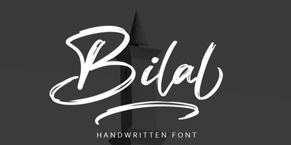 Bilal is a script font with distinctive handwritten characters, perfect for branding projects, logos, wedding designs, media posts, advertisements, product packaging, product designs, labels, photography, watermarks, invitations, stationery, and any project which needs a handwritten feel. Features : • Character Set A-Z • Numerals & Punctuations (OpenType Standard) • Accents (Multilingual characters) • Ligature • Swash There it is! I really hope you enjoy it - comments & likes are always welcome and accepted. More importantly, don't hesitate to send a message if you have a problem or question.Now just read this, go there and make it happen :)
 - Outbacker by Rook Supply,
$14.00 With Outbacker you're not just getting a typical a-z font. You're getting a font that has over 100 alternate glyphs, so that you can use the font to write phrases a ton of different ways. So, if you're looking for the perfect 'R', you have 6 additional options to choose from in addition to what's programmed for the default uppercase and lowercase characters. Choose more sharp characters if you're going for something more aggressive, or more rounded characters if you want something with more of a laid back flow.
 - Blarks by Zamjump,
$12.00 Blarks is a unique font with a strong character. The inspiration for making this font is from several e-sport and typography logos that I have seen on various websites, where I found ideas to make fonts that could be applied without having to use another application to change it. Blarks is ideal for logos, event titles, quotes, product packaging, clothing, or anything that requires a turbo typographic boost. It is perfect for titles and logos. Type any a-z using this font, and you will get a unique font arrangement and strong character.
 - Righteous by Arendxstudio,
$19.00 Righteous is a font with distinctive handwritten characters, perfect for branding projects, logos, wedding designs, media posts, advertisements, product packaging, product designs, labels, photography, watermarks, invitations, stationery, and any project that needs a handwritten touch. Features : • Character Set A-Z • Numerals & Punctuations (OpenType Standard) • Accents (Multi-lingual characters) • Ligatures • Alternates • Swashes There it is! I really hope you enjoy it - comments & likes are always welcome and accepted. More importantly, don't hesitate to send a message if you have a problem or question.Now just read this, go there and make it happen.
 - Hollister by Arendxstudio,
$18.00 Hollister is a modern script font created with a natural brush. This font is very beautiful when combined with era now design concepts. Hollister comes with OpenType features such stylistic alternates, stylistic sets & ligatures which are good for logotype, poster, badge, book cover, t-shirt design, packaging and much more. Features : Character Set A-Z, Numerals & Punctuations (OpenType Standard), Accents (Multilingual characters), Ligatures, Swashes. There it is! I really hope you enjoy it - comments & likes are always welcome and accepted. More importantly, don't hesitate to send a message if you have a problem or question.
 - Xenophone Pro by CheapProFonts,
$10.00 The letters in Xenophone were created from hand-drawn figures in which coins were traced around to create curves and circles. Some capital letters resembles symbols from the greek and International Phonetic Alphabet. ALL fonts from CheapProFonts have very extensive language support: They contain some unusual diacritic letters (some of which are contained in the Latin Extended-B Unicode block) supporting: Cornish, Filipino (Tagalog), Guarani, Luxembourgian, Malagasy, Romanian, Ulithian and Welsh. They also contain all glyphs in the Latin Extended-A Unicode block (which among others cover the Central European and Baltic areas) supporting: Afrikaans, Belarusian (Lacinka), Bosnian, Catalan, Chichewa, Croatian, Czech, Dutch, Esperanto, Greenlandic, Hungarian, Kashubian, Kurdish (Kurmanji), Latvian, Lithuanian, Maltese, Maori, Polish, Saami (Inari), Saami (North), Serbian (latin), Slovak(ian), Slovene, Sorbian (Lower), Sorbian (Upper), Turkish and Turkmen. And they of course contain all the usual "western" glyphs supporting: Albanian, Basque, Breton, Chamorro, Danish, Estonian, Faroese, Finnish, French, Frisian, Galican, German, Icelandic, Indonesian, Irish (Gaelic), Italian, Northern Sotho, Norwegian, Occitan, Portuguese, Rhaeto-Romance, Sami (Lule), Sami (South), Scots (Gaelic), Spanish, Swedish, Tswana, Walloon and Yapese.
 - P22 Acropolis by P22 Type Foundry,
$24.95 P22 Acropolis is P22's tribute to the enduring contribution of Classical Greece to world culture. This set features two typefaces in the style of ancient Greek stone carvings (one modern: Now, and one of authentic ancient Greek characters: Then) and 52 graphic extras drawn from coinage and vase paintings.
 - AM Sans One by URW Type Foundry,
$39.99 When designing AM Sans One, it was a great challenge for me to develop a modern sans serif, which despite the large number of existing fonts in this sector has its own unique character. Starting point for the design concept was the cap O, designed as a rectangle with rounded corners, and not as usual as a circle or oval. The O should form the basis for the whole alphabet. Another feature are the characters with oblique starting and end strokes such as "A, V, W". These have not exactly straight, diagonal lines, but have a slight curvature. Thus, these letters do not look too geometric. Also the cap K deviates slightly from the usual shape which makes AM Sans One different from other already existing fonts. I could well imagine applying this font for areas such as engineering or architecture.
 - Bayer Sans by Victory Type,
$20.00Bayer Sans, is based on the typography of the Austrian-born artist Herbert Bayer. Bayer worked as a teacher and graphic designer at the Bauhaus, a revolutionary German art school, during the 20's. His specialty was commercial art and he had many "radical" views on typography and its interaction with society. Bayer felt that written language should be merely a graphic version of spoken language. Thus, he advocated a single alphabet without majuscules and miniscules. Bayer's designs are simple, geometric letterforms that lend themselves to lowercase form. This font, based on the typography of Bayer and his students at the Bauhaus Werkstatt (studio), was digitally modeled by Noah Rothschild. Bayer Sans features a complete character set including European characters, alternate letters with adjusted widths and designs and ligatures. Included are the "f" characters and a special linked double-o. - Distopia by Unio Creative Solutions,
$5.00 Distopia is a contemporary type system which focus on clarity and legibility, developed in two weights with true matching italics. Distopia includes, as previously said, two contrasting versions: Light and Regular with corresponding true italics. This font family combines modernist shapes with slight grotesque touches. Each variant was designed with an attentive optical evaluation; curves, details and spaces were specifically tweaked to better suit the requirements of a highly-legible typeface. The end result is a family with full multilingual capabilities and a coverage of several languages based on the Latin alphabet; Distopia aims to become your next typographic companion. Specifications: - Files included: Distopia Light, Distopia Regular with corresponding true italics - Multi-language support (Central, Eastern, Western European languages) - OpenType features Thanks for viewing, Unio.
 - Chow Fun - Unknown license

- BDR A3MiK by Typedifferent,
$35.00 The BDR A3MIK is an uppercase alphabet with alternatives including European/Eastern European, Russian Cyrillic, Greek and Japanese Katakana characters. Its strong, constructive, futuristic appearance works perfectly for titling in science fiction related media.
 - Union Telegraph NF by Nick's Fonts,
$10.00Discovered in The Zanerian Manual of Alphabets and Engrossing was this quaint charmer, called simply "Italic Roundhand". The manual touts this face as plain, practical and rapid; it's lovely, luscious and nostalgic, as well. - Rayna by melifonts,
$5.00 Rayna is a simply beautiful handwritten font that is suitable for scrapbooking, notes to friends, and stylish logos. It is both elegant and versatile, including both Latin and Cyrillic alphabets with support for most European languages. This delicate typeface's swooping curls and sweet lines are the perfect addition to your handwritten font collection!
 - Wide Chamfer JNL by Jeff Levine,
$29.00 Inside the pages of an untitled sign painting textbook (circa 1902) was an example of the classic chamfered sans serif alphabets used by tradesmen of the time. This version was wider than most, and perfect for a digital version called Wide Chamfer JNL, which is available in both regular and oblique versions.
 - Superstar Grotesk by Not Bad Typeface,
$30.00 Superstar Grotesk is a free interpretation of the first Cyrillic versions of Royal Grotesk and Akzidenz Grotesk, later the "Roublennaya" typeface is the same irremovable pop artist who lingered in the top of the typographic charts until the digital era, and formed the image of the Cyrillic alphabet in the 20th century.
 - Cocosignum by Zetafonts,
$39.00 Cocosignum takes inspiration from the typography of the italian thirties. The imperial uppercase with its propaganda deco overtones is softened by a cursive lowercase geometric script in the Corsivo Italico version. It comes in two styles and five weights, covering over forty languages using latin alphabet, as well as Greek and Cyrillic.
 - Handmade Nouveau JNL by Jeff Levine,
$29.00 An example of Art Nouveau lettering (complete with its unusual characters and varying shape widths) was found in a sample from the vintage publication "Modeles de Lettres Artistiques" ("Models of Artistic Letters"). This classic design is now available digitally as Handmade Nouveau JNL, in both regular and oblique versions.
 - Katzenjammer by Hanoded,
$15.00 Katzenjammer is a German word meaning 'Cat's Wail' - it is used to describe a hangover. Katzenjammer font is a slightly eroded, squarish typeface, which would be ideal for headlines, packaging, posters and websites. This all caps font comes with different upper and lower case glyphs and a non-eroded set of alternates for the lower case - for those who like their alphabet nice and neat.
 - Ed McGuinness by Comicraft,
$39.00 Fighting American and all around Superman Ed McGuinness joins our Masters of Comic Book Art with a font inspired by his gamma ray saturated handwriting! Ed is officially a friend of Comicraft and a big smile in Hulk form! Now a small slice of this Jolly Green Giant is available as an alphabet waiting for puny humans to arrange in words of no more than two syllables.
 - Bousni Ronde by Linotype,
$29.99The Bousni family's six faces display links unexpected by most readers of western alphabets. Inspired by both by Arabic calligraphy, and contemporary bitmap design, Bachir Soussi Chiadmi created this playful series of faces. Letters in each of the six typefaces link together, but not in the ways normally expected from script fonts. Suited for a wide array of fun functions, Bousni Carre and Bousni Ronde (each available in Light, Medium, and Bold weights) bring new a style and flavor to your collection. All six fonts in the Bousni family are included in the Take Type 5 collection from Linotype GmbH. The Bousni family espouses similar construction traits with other fonts from Linotype. Specifically, the straight lines and joints in the three Bousni Carre fonts are based off of a grid system similar to Anlinear, another member of the Take Type 5 collection from Linotype GmbH. The letter connections throughout the Bousni family are similar to Arabic kashidas, a typographic feature found recently in many non-Arabic typefaces, such as Linotype Atomatic." - Bousni Carre by Linotype,
$29.99The Bousni family's six faces display links unexpected by most readers of western alphabets. Inspired by both by Arabic calligraphy, and contemporary bitmap design, Bachir Soussi Chiadmi created this playful series of faces. Letters in each of the six typefaces link together, but not in the ways normally expected from script fonts. Suited for a wide array of fun functions, Bousni Carre and Bousni Ronde (each available in Light, Medium, and Bold weights) bring new a style and flavor to your collection. All six fonts in the Bousni family are included in the Take Type 5 collection from Linotype GmbH. The Bousni family espouses similar construction traits with other fonts from Linotype. Specifically, the straight lines and joints in the three Bousni Carre fonts are based off of a grid system similar to Anlinear, another member of the Take Type 5 collection from Linotype GmbH. The letter connections throughout the Bousni family are similar to Arabic kashidas, a typographic feature found recently in many non-Arabic typefaces, such as Linotype Atomatic." - Flow Handscript by Taner Ardali,
$26.00 Main idea of this font depends on creating a “well designed handwriting typeface”. With general brush script characteristics, this font is also designed in detail letter by letter to create the best geometric values. It is particularly designed to achieve better connections between letters as well as the best rhythm for words. It is not just a hand brush typeface, Flow handscript is a high quality designed typeface that can be used for graphic design like packaging, branding, poster design and invitations.
 - Deco Spot Initials JNL by Jeff Levine,
$29.00 A set of rounded Art Deco initials set inside circular borders was found amongst the pages of the vintage French lettering book "Modèles de Lettres Modernes par Georges Léculier”. Now made into a digital font called Deco Spot Initials JNL, these classic letter forms are available in both the original white-on-black version and as a black-on-white alternate design.
 - Linotype Funny Bones by Linotype,
$29.00Linotype Funny Bones is part of the Take Type Library, chosen from the contestants of the International Digital Type Design Contests of 1994 and 1997. The font was designed by the German artist Ingo Preuss and is available in two weights, one and two. Linotype Funny Bones one consists of two different alphabets containing only capital letters and offers a variety of interesting combinations. Weight two and one set of capitals of weight one are somewhat light and delicate, while the other set of capitals of weight one are of a strongly constructed nature, which makes for a good contrast. The carefully constructed details of the font detract from its legibility, but Linotype Funny Bones is perfect for short texts and headlines in point sizes larger than 12. - Lucida Console by Monotype,
$50.99 Kris Holmes and Charles Bigelow designed Lucida Console in 1993 for on-screen console and terminal emulation windows that needed monospaced fonts with sturdy letter shapes. Lucida Console has simple, clear, robust letterforms, a big x-height, and economical fitting. It looks large on-screen and in print but takes up less space than traditional typewriter and monospaced fonts. Its short capitals were originally technical adaptations to user interfaces on computers, but its compact look and active italic appeals to typographers and designers for a wide variety of uses, including in games and digital devices. The Lucida Console family has 675 glyphs in each font, and supports the WGL and W1G character sets. This includes the Extended Latin, Greek, and Cyrillic alphabets along with a generous set of symbols, box-draw, and graphical characters.
 - St Croce Pro by Storm Type Foundry,
$29.00 Our eye is able to join missing parts of worn letters back into undisturbed shapes. We tend to see things better than they really are. Thanks to this ability we ignore faults of those close to us as we can’t accept the fact that every once in a while we convene with an impaired entity. Typography is merely a man’s invention, hence imperfection and transience, albeit overlooked, are its key features. This typeface is based on worn-out letterings on tombstones in the St. Croce basilica in Florence. For hundreds of years, microscopic particles of marble are being taken away on the soles of visitors: the embossed figures become fossilised white clouds, fragments of inscriptions are nearing the limits of legibility. First missing are thin joins and serifs, then the main strokes finally slowly diminish into nothingness over time. Unlike an archaeologist, for whom even completely featureless stele is valuable, the typographer must capture the proper moment of wear, when the type is not too “new” but also not too much decimated. Such typeface is usable for catalogue jackets, invitations and posters. Calligraphy is a natural human trait. To write is to create characters of reasonable beauty and content, according to the nature of the writer. A natural characteristic of architecture is to create an aesthetic message very similar to the alphabet. A doric column, the gabled roof, the circle of the well plan: these are the basic shapes from which all text typeface is derived.
