10,000 search results
(0.039 seconds)
- Mixed Tape by Ksenia Belobrova,
$35.00 Mixed Tape is a brush typefamily inspired by music and based on calligraphy. It has 3 different styles so that you can choose which you need or combine them as you like. Mixed Tape Regular is a casual neutral brush script, Mixed Tape Small is a more elegant variation and Mixed Tape Capitals is an energetic, probably even brutal brush script. You can freely play with the three of them creating your typographic compositions. You can use Mixed Tape for posters, prints, menus, packaging, book covers and headlines, cards and as a starting point for logotypes. Mixed Tape has a lot of alternates and ligatures which are built into the ‘Liga’ feature that is turned on by default. It also has swashes, titles, fractions, ordinals and case sensitive forms. Let’s all enjoy good music and typography!
 - African Jungle by Scholtz Fonts,
$19.00Dominated by a vigorous, african-inspired, jungle-like pattern, this contemporary, 21st century, sans serif font - African Jungle - contains an eclectic mix of elements from the 20th century. It combines gentle curves with base and caps-line transgressions but is substantially more rounded than in most commercial-style sans serif faces. Terminal strokes are slightly rounded and occasional elements are strongly rounded. The African-inspired pattern fill is suggestive of dense vegetation without being too literal. African Jungle is readable and can be successfully used for headers in presentations, magazines etc, and for display use in newspapers, advertising and promotions. Professionally kerned and spaced with 256 characters. - Silky by Sensatype Studio,
$15.00 A Sans serif that we created special for elegant branding needs, with extra ligatures in unique shape will be ready to add value of your brand. It so nice to leverage designer or product owner that need solutions to make their design look more classy and modern. And specially for this font, We prepared any ligatures characters to help you create unlimited variations for your creative needs. Silky Sans serif font ready with: Any options to get creative variations (combination of Ligatures) Preview as a inspirations that you can do with Silky font Ready with Lowercase and Uppercase characters Wish you enjoy our font. :)
 - Parisine Office Std by Typofonderie,
$59.00 Humanistic sanserif in 4 fonts The Parisine Office typeface family can be considered as the text version of the Parisine. When Parisine xheight fit Helvetica large xheight, Parisine Office is more close to Gill Sans in term of proportion, as it was developed for Ratp, the public transport in Paris to allow compatibility with documents set in Gill Sans without changing the length of text. Parisine Office by default is a humanistic sanserif available in 4 fonts perfect for text setting. The design of the italic lowercases is more cursive than in Parisine. About Parisine Parisine helps Parisians catch the right bus Observateur du design star of 2007
 - Olivany by Sensatype Studio,
$15.00 A new Sans serif that we created special for branding needs, with extra ligature in unique shape add value of your brand. It so nice to leverage designer or product owner that need solutions to make their design look more stylish and modern. And specially for Young font, We prepared any ligatures, and any alternate characters to help you create unlimited variations for your creative needs. Olivany Modern Beauty sans serif font ready with: Any options to get creative variations (combination of Alternate and Ligatures) Preview as a inspirations that you can do with Olivany font Ready with Lowercase and Uppercase characters Wish you enjoy our font!
 - Cynosure by Device,
$39.00Cynosure is a humanist sans with a subtle thick/thin stress. This gives it a clean, sharp elegance and precision that can be missing in some more familiar monoline sans faces. The wide range of weights and the matching reweighed italics make it a versatile solution where a consistent appearance across a broad range of applications is required. Its clear and inarguable design make it suitable for a wide variety of uses, from corporate to entertainment, text to headline, signage, logotypes, magazines and reports. The italics retain the design of the upright across all characters, again ensuring consistency. Includes tabular, lining and old-style numerals. - Bridge Style by Sensatype Studio,
$15.00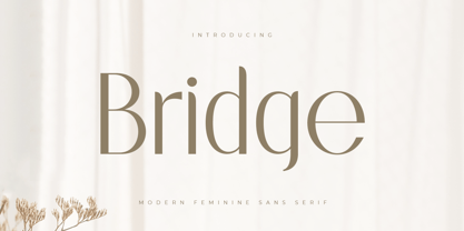 A Sans serif that we created special for elegant branding needs, with extra ligatures in unique shape will be ready to add value of your brand. It so nice to leverage designer or product owner that need solutions to make their design look more classy and modern. And specially for this font, We prepared any ligatures characters to help you create unlimited variations for your creative needs. Bridge Sans serif font ready with: Any options to get creative variations (combination of Ligatures) Preview as a inspirations that you can do with Bridge font Ready with Lowercase and Uppercase characters Wish you enjoy our font. :)
 - Magic Growing by Sensatype Studio,
$15.00 A Sans serif that we created special for elegant branding needs, with extra style will be ready to add value of your brand. It so nice to leverage designer or product owner that need solutions to make their design look more elegant and modern. And specially for this font, We prepared any Styles to help you create unlimited variations for your creative needs. Magic Growing Elegant Sans Serif Font ready with: Any styles to get creative variations (regular, bold, italic, bold italic) Preview as a inspirations that you can do with Magic Growing font Ready with Lowercase and Uppercase characters Wish you enjoy our font. :)
 - Qatana by Ixipcalli,
$20.00 La tipografía Qátana es una tipografía inspirada en el estilo románico serif y sans serif. Su estilo elegante y de fácil lectura ha logrado ser una tipografía esencial para redacciones de documentos, textos o libros. Cuenta con tres pesos bien marcados que dan un juego visual de resaltados y tenues. Además de las formas itálicas. The Qátana typeface is a typeface inspired by the Romanesque serif and sans serif style. Its elegant and easy-to-read style has become an essential typeface for writing documents, texts, or books. It features three well-marked weights that give a visual play of highlights and lows. In addition to the italic forms.
 - Nurnberg by Vintage Voyage Design Supply,
$20.00 Nürnberg (Nuremberg in eng.) New blackletter-sans font family in modern look with contrasts elements in six widths. Impressive style with non-typical Blackletter uppercases as alternates and normal Sans as standard. In the company with good-looking lowercases and their alternates you can get outstanding result for your project. Six widths give you wide range of use. Massive Bold or Black will be really good in none-long magazine headlines, some logos or cafe/bar signs, menu's or coffeeshops. Medium or Regular is for normally (not giant) text blocks or any of accented texts. Light and Thin are good in big pt. Short word forms or numerals is just awesome.
 - Basically by Sensatype Studio,
$15.00 An Elegant Modern Sans Serif font that we created special for elegant branding needs, with extra alternates in unique shape will be ready to add value of your brand. It so nice to leverage designer or product owner that need solutions to make their design look more classy and modern. And specially for Basically font, We prepared any alternate characters to help you create unlimited variations for your creative needs. Basically Elegant Modern Sans Serif ready with: Any options to get creative variations Preview as a inspirations that you can do with Basically font Ready with Lowercase and Uppercase characters Wish you enjoy our font. :)
 - Hellosin by Keristyper Studio,
$14.00 Hellosin is a sans serif-based typeface that has curly and elegant looks with a bunch of alternates that will make your design even more stunning and stand out. This font is good for logo design, Social media, Movie Titles, Books Titles, short text even long text letters, and good for your secondary text font with sans or serif. Featured: Standard Uppercase & Lowercase Numeral & Punctuation Multilingual : ä ö ü Ä Ö Ü ß ¿ ¡ Alternate & Ligature PUA encoded We recommend programs that support the OpenType feature and the Glyphs panel such as Adobe applications or Corel Draw. so you can use all the variations of the glyphs. Hope you enjoy our fonts!
 - Rosane by Sensatype Studio,
$15.00 A new Sans serif that we created special for branding needs, with extra ligature in unique shape add value of your brand. It so nice to leverage designer or product owner that need solutions to make their design look more stylish and modern. And specially for satisfy font, We prepared any ligatures, and any alternate characters to help you create unlimited variations for your creative needs. Satisfy sans serif font ready with: Any options to get creative variations (combination of Alternate and Ligatures) Preview as a inspirations that you can do with Satisfy font Ready with Lowercase and Uppercase characters Wish you enjoy our font!
 - Beauty Culture by Letterhend,
$17.00 Beauty Culture is a pair of font that brings the modern and luxury feel. The Bold sans combined with the natural hand writing script are the perfect match for you who needs a typeface for headline, logotype, apparel, invitation, branding, packaging, advertising etc. Features : 2 fonts (sans serif and script font) uppercase & lowercase numbers and punctuation multilingual alternates & ligatures PUA encoded We highly recommend using a program that supports OpenType features and Glyphs panels like many of Adobe apps and Corel Draw, so you can see and access all Glyph variations. How to access opentype feature : letterhend.com/tutorials/using-opentype-feature-in-any-software/
 - Gradl Initialen ML by HiH,
$12.00 Max Joseph Gradl designed Art Nouveau jewelry in Germany. At least some of his designs were produced by Theodor Fahrner of Pforzheim, Germany -- one of the leading manufacturers of fine art jewelry on the Continent from 1855 to 1979. I don't know if he designed for Fahrner exclusively, but every example I found was produced by that firm. I assume it was also the same M.J, who edited a book, Authentic Art Nouveau Stained Glass which was reissued by Dover and is still available. For an artist as accomplished as Gradl was, he is very tough to research. There just does not seem to have been much written about him. The jeweler is visible in most of his typeface designs. They exhibit a sculptural quality as if they were modeled in clay (or gold) rather than drawn on paper. His monograms, especially, reflect that quality. Those shown in plates 112 through 116 in Petzendorfer actually appear to have been designed specifically for fabricating in the form of gold or silver pendents. Of the initial letters that came out of Germany during this period, these by Gradl seem unusually open and lyrical. They seem to be dancing on the page, rather than sitting. Please note that Gradl designed only the decorated initials. All other characters supplied were extrapolated by HiH, including the accented initials. Orn.1 (unicode E004) is based on a jeweled gold clasp designed by Gradl (please check out Gallery Image on Myfonts.com). Also included are an art nouveau girl’s face, a swan and the face from Munch’s “Scream”, from scans of old printer’s ornaments. Gradl Initialen M represents a major extension of the original release, with the following changes: 1. Added glyphs for the 1250 Central Europe, the 1252 Turkish and the 1257 Baltic Code Pages. Added glyphs to complete standard 1252 Western Europe Code Page. Special glyphs relocated and assigned Unicode codepoints, some in Private Use area. Total of 341 glyphs. Both upper & lower case provided with appropriate accents. 2. 558 Kerning Pairs. 3. Added OpenType GSUB layout features: salt, dlig, ornm and kern. 4. Revised vertical metrics for improved cross-platform line spacing. 5. Refined various glyph outlines. 6. Alternative characters: 16 upper case letters (with gaps in surrounding decorations for accents above letter). 8. Four Ornaments: face1, face2, swan and orn1 (silhouette of Gradl clasp) The zip package includes two versions of the font at no extra charge. There is an OTF version which is in Open PS (Post Script Type 1) format and a TTF version which is in Open TT (True Type)format. Use whichever works best for your applications.
 - Vinetters by Ingrimayne Type,
$6.50 Vinetters has letters on the alternating leaves of a vine. It is monospaced and uses the OpenType contextual alternatives (calt) feature to alternate leaves as the vine snakes its way across the page, putting leaves with the base down between leaves with the base up. The family has two styles, one with transparent leaves and the other with solid leaves, and these two styles can be used in layers to add color. The family has a large set of accented characters but omits some symbols that are used primarily in technical text. Spaces between words can be left blank or filled with connecting vine using the brackets, trademark-infinity, doubledagger-summation, radical-approximatelyequal, or fi-fl characters. The characters on the leaves are derived from the typeface IngrianaCasual. Topics for which using Vinetters may be appropriate include trees, plants, leaves, nature, changing seasons, and outdoor life.
 - Mr Lucky by Hipopotam Studio,
$22.00 Mr Lucky is Mr Happy's slab brother and a hand-drawn narrow typeface designed for one of our books. You can layer different styles over the background style to achieve lots of colorful effects. Use just one style to get a single color letter or set Fill over Background or Stripped Background to get a two color mode. Mr Lucky has upper and lowercase characters with up to three alternate glyphs and special alternate uppercase diacritics. Build in OpenType Contextual Alternates feature will automatically set alternate glyphs depending on frequency of appearance of the same character (even in web font but only in HTML5 browsers). The script doesn’t throw random glyphs. For example in the word “HIPPOPOTAMUS” you will automatically get three different “P” glyphs and two “O” glyphs. It really works great but of course you can always fine tune it by hand.
 - Garuda by Campotype,
$49.00 Garuda typeface, featuring the shape and style based on "Garuda Pancasila", the state symbol of the Republic of Indonesia. Garuda is a mythical bird in the Javanese puppet stories, is very similar to the eagle. At the typeface we can find more ligatures beside than the standard. Within Garuda at least encoded 792 glyphs per weight onto major codepage: win 1252, 1250, 1254, 1257 including Mac OS Roman. It is containing more OpenType features such as swash, contextual alternate, stylistic, figures/number, and a few bit ornaments. The typeface has a pretty good readability and legibility even in small sizes. So it is useful for short texts (text length? Whom fear) for print and screen material. Usage on headlines, posters, titles, or something like that, can utilize ornament lines as a sweetener. Please find more information about the OpenType Manual of this typeface on the gallery page (pdf).
 - Edgethorn by Up Up Creative,
$16.00 Edgethorn is a beautiful, italic-only transitional serif typeface that was born after I became obsessed with a few small paragraphs of italic text on a type specimen broadside from 1785. Working on this type revival allowed me to delve much more deeply than I ever have before into type history and typeface classification, and I’ve included some type history for you with your download so that you can play around with the smattering of historical characters I included (like the medial s). Although it is based on centuries-old typefaces, Edgethorn is elegant, timeless, and perfect for 21st century projects. Edgethorn includes approximately 525 glyphs — including 64 standard and discretionary ligatures and a handful of contextual alternates and character variants — and supports over 200 languages. The OpenType features can be very easily accessed by using OpenType-savvy programs such as Adobe Illustrator and Adobe InDesign.
 - Ruthless Drippin TWO - Personal use only

- Some Weatz Symbols - Personal use only

- Sculptors Hand - Personal use only

- Blockography - Personal use only

- Ruthless Wreckin TWO - Personal use only

- Let Me Ride - Personal use only

- Rider Wide - Personal use only

- First Lyrics - Personal use only

- Barkants - Personal use only

- Second Lyrics - Personal use only

- R-2014 Eroded - Personal use only

- FabFours by Ingrimayne Type,
$5.00 A tessellation is a pattern in which a shape or tile fits together with copies of itself to fill the plane with no gaps or overlaps. One type of tessellation is formed with sides of center-point rotation, that is, one half of an edge is rotated 180 degrees to form the other half. If a square template is made with sides of identical center-point rotation, there are exactly four shapes that are possible. If these shapes or tiles are fit together not edge to edge but vertex to vertex, the result is a checkerboard-like pattern of tiles and voids. However, the voids have four edges formed by the four possible shapes that the tiles can have, so the voids are limited to the same four shapes that that make up the tiles. The FabFours have 22 tile families that allow a wide variety of fascinating patterns. They form one, two, three, and four tile tessellation. Eleven of the seventeen symmetry groups can be formed with these patterns. In each tile family two of the shapes have two possible orientations, one shape has four possible orientations, and one has eight, for a total of 16 tiles. Each font has two families, one on letters A-P the other on a-p. For some of the families there are also other tiles using the same edge but using triangular and hexagonal templates. To get proper results, the leading must be set equal to the point size of the font. I discovered these fabulous families and their decorative possibilities as I was working on a book about tessellations. I have not been able to find anyone else who has written about these families of four and their decorative possibilities when arranged vertex to vertex.
 - Ignazio by Figuree Studio,
$18.00 Ignazio is a powerfull sans serif font family with modern touches. A balance of hard lines and smooth curve makes them able to stand on their own dynamically Ignazio includes all-caps fonts Features - Support for MAC or PC - Simple installation for Adobe Illustrator, Corel Draw, Photoshop, or Procreate (New Updated) - Support Multi-language Ignazio works great in any branding, logos, magazines, films. The different styles give you a full range to explore a whole host of applications.
 - Quanta by Alphabets,
$17.95Quanta was designed without reference to existing sansserif faces. As an original design, Quanta draws on principles of letterform developed during my studies of lettercarving (in Wales with Ieuan Rees) and Roman proportion. My intention was to produce a highly legible and adaptable sans-serif, initially intended to be a TrueType GX font, then as a Multiple Master font, later as a five weight range from extremely thin to extra black. A related uncial design will be released shortly. - Ben by Motokiwo,
$20.00 Ben is a simple sans serif font that we made for use on projects that require a touch of elegance. We believe simplicity is the ultimate form of sophistication and give all the idea to Ben. This font is a mirror of our personality. Ben consist of 18 faces (9 weights with italics). All fonts include uppercase, lowercase, numeral, punctuation, and special characters. The weights will give you dynamic control to use Ben in any typography projects.
 - Moire by Microsoft Corporation,
$39.00Moire™ Regular is a block-style sans serif font designed by Jim Ford in the spirit of typefaces popular during the 1950's. The Moire Regular font is slightly more streamlined for a more contemporary voice than its predecessors. Moire Regular is useful for all modern display settings in signs, publications, reports and presentations. The Moire Regular font will also reproduce well in on-screen uses from User Interfaces to web graphics. Character set: Latin 1. - Textbook New by ParaType,
$30.00 Designed for ParaType in 2007 by Isabella Chaeva. The type is based on Bukvarnaya (TextBook) photocomposing version designed in 1987 by Emma Zakharova. The initial Bukvarnaya for metal composition was created at Polygraphmash in 1958 by Elena Tsaregorodtseva. It was developed for primers and the first level school textbooks. An early sans serif ('Grotesque') with half-closed static letterforms. For use in book and magazine typography, advertising and headlines. Also may be useful as screen font.
 - Metricor by Hotam,
$40.00 Metrica circle is a sans-serif type family of five weights. It was designed by Hotam Mahmadiev. The fonts are based on simple and clean geometric forms. The font contains more than 1700 glyphs. Supported languages: Afrikaans, Albanian, Belarusian, Bosnian, Bulgarian, Catalan, Croatian, Czech, Danish, Dutch, English, Estonian, Finnish, French, German, Greek, Hungarian, Icelandic, Italian, Latvian, Lithuanian, Macedonian, Maltese, Norwegian, Polish, Portuguese, Romanian, Russian, Serbian, Slovak, Slovenian, Spanish, Swedish, Turkish, Ukrainian, Tajik, Uzbek, Vietnamese, Zulu, and other.
 - Neue Power by Power Type,
$15.00 Neue Power is a contemporary sans serif display font family in 6 weights plus 12-degree of obliques. It supports 75+ Languages (Latin Based) followed by the Grotesk typefaces, perfect for various design needs, including Branding (Identity), Logotype, Printing to On-Screen/Digital Reading, Posters, Caption, Headline, Body Text, or Captions. Neue Power Typeface will give you a nice way of aesthetic communication for your design project. Available from Light — Ultra plus obliques in a total of 12 Fonts.
 - Puck by Type.p,
$28.00 Puck is a Rounded Sans Serif font that comes in 20 styles from Thin to Black, including italics. Its design, which features rounded edges, open terminals, and extended width, along with generous negative space, ensures easy readability across different sizes. It's a versatile choice for various applications like print, banners, and branding. Plus, it maintains its adorable appeal on social media platforms like Instagram. Puck's design brings a blend of elegance and cuteness to any project.
 - Toms Finger by CozyFonts,
$20.00 Toms Finger Family fonts is a hand drawn sans serif series containing Regular weight (Toms Finger), Bold weight (Toms Thumb), and Light weight (Toms Pinky). Drawn entirely using his finger tip on a tablet Tom created this font to be user-friendly for Notes, Signs, Posters, Ads, Captions or anything where the writer wants to convey a casual, non invasive voice in the copy. Toms Finger Family is legible in a wide range of sizes in all weights.


